4,583 search results
(0.026 seconds)
- Typewriter 1950 Tech Mono by TypoGraphicDesign,
$29.00 The typeface Typewriter 1950 Tech Mono is designed for the Typo Graphic Design font foundry in 2017 by Manuel Viergutz. A display slab serif type for headlines. Based on an old typewriter machine from 1950. Plus state-of-the-art OpenType-features like contextual alternates (calt), decorative ligatures e. g. type the word “LOVE” for ❤ and the word “SMILE” for ☺ and Versal Eszett (German Capital Sharp S). For use in magazines, posters, headlines and advertisement, plus as webfont for decorative headlines. Character Set: Latin Extended (Adobe Latin 3). 1490 glyphs with 5× A–Z, 5× a–z, 5× 0–9 and 290+ extra icons like arrows, dingbats, symbols, geomatric shapes, catchwords and many alternative letters. Have fun with this font & use the DEMO-FONT (with reduced glyph-set) FOR FREE! How To Use – OpenType-Features ■ In Adobe Photoshop and Adobe InDesign, font feature controls are within the Character panel sub-menu → OpenType → Discretionary Ligatures … Checked features are applied/on. Unchecked features are off. ■ In Adobe Illustrator, font feature controls are within the OpenType panel. Icons at the bottom of the panel are button controls. Darker ‘pressed’ buttons are applied/on. ■ Additionally in Adobe InDesign and Adobe Illustrator, alternate glyphs can manually be inserted into a text frame by using the glyphs panel. The panel can be opened by selecting Window from the menu bar → Type → Glyphs. Or use sign-overview of your operating system. ■ For a overview of OpenType-Feature compatibility for common applications, follow the myfonts-help http://www.myfonts.com/help/#looks-different ■ Font Name: Typewriter 1950 Tech Mono ■ Font Weights: Regular + Negative + Black + Mono + Icons + DEMO (with reduced glyph-set) ■ Font Category: Slab Serif Display for Headline Size ■ Font Format:.otf (OpenType Font for Mac + Win) + .ttf (TrueType Font) ■ Glyph Set: 1490 glyphs ■ Language Support: 28+ for Latin Extended (Adobe Latin 3). Afrikaans, Albanian, Catalan, Croatian, Czech, Danish, Dutch, English, Estonian, Finnish, French, German, Hungarian, Icelandic, Italian, Latvian, Lithuanian, Maltese, Norwegian, Polish, Portugese, Romanian, Slovak, Slovenian, Spanisch, Swedish, Turkish, Zulu ■ Specials: 290+ decorative extras like icons for arrows, dingbats, emojis, symbols, geometric shapes, catchwords + German Capital Eszett. ■ Open Type Features: Kerning (kern), Stylistic Set 1 (ss01) … Stylistic Set 6 (ss06), Ornaments (ornm), Titling (titl), Localized Forms (locl), Subscript (subs) Superscript (sups), Ordinals (ordn), Oldstyle Figures (onum), Lining Figures (lnum), Fractions (frac), Denominators (dnom), Numerators (numr), Standard Ligatures (liga), Contextual Alternates (calt) e. g. Stylistic Set-Loop and Decorative Ligatures (dlig) e. g. type the word “LOVE” for ❤ or “SMILE” for ☺ ■ Design Date: 2017–2018 ■ Type Designer: Manuel Viergutz
 - As of my last update, I don't have direct access to databases or the internet to provide real-time or highly specific descriptions of lesser-known or proprietary fonts, such as "PetalGlyph" by Essqué...
- Lovato by Philatype,
$35.00 Lovato is a family of five fonts, perfect for branding applications, books, or poster designs that require a clear, sharp, stylish tone. The styles range from an elegant, delicate light weight up to a brazen, commanding black weight. This original Latin-serif family, designed by Kosal Sen, has primarily a geometric construction, with hints of details inspired by inscriptional lettering, all coalescing to fit a contemporary palette.
 - Café Brasil by Sofia Mohr,
$39.00 Café Brasil is a font designed to represent coffee, especially for use in packaging, brand titles, logos and menus. Based on the shape of a coffee bean, Café Brasil has delicate details and ligatures that represent the liquid, foam and steam of a good cup of coffee. In March 2014, Café Brasil was chosen to be part of the main exhibition at the “Tipos Latinos 2014”.
 - Roicamonta by Aga Silva,
$24.99 Roicamonta font looks very feminine and delicate. Perfect fit for invitations, greeting cards and other printing where soft and elegant writitng is required. The design stems from Copperplate calligraphy and comes in two styles - upright and italic. This family consists of six font files overall, each file contains over 1200 glyphs. Complete with variety of swashes and fancy ligatures. All engineered and included in handy otf format.
 - Suprala by S6 Foundry,
$19.00 Suprala is a contemporary delicate humanist serif typeface, with beautifully balanced forms, perfect for branding and communications projects. Suprala’s round, elegant, and classically elegant design, supports all major Latin-based languages in twelve styles. True italics advance the aesthetics, bringing energy and making it suitable for modern applications. The Suprala character set incorporates numerous OpenType features - additional symbols, stylistic alternates, and unique ligatures both standard and discretionary.
 - Hot Cup Cake by Olivetype,
$18.00 Hot Cup Cake is a relaxed, fashionable and delicate script font. It looks beautiful on a variety of designs requiring a personalized style, such as wedding invitations, thank you cards, weddings, greeting cards, logos and so on. Hot Cup Cake font contains is supporting 66 languages, which includes: Afrikaans Albanian Catalan Danish Dutch English Estonian Finnish French German Italian Norwegian Portuguese Spanish Swedish Zulu.
 - Aslock by Ergibi Studio,
$19.00 Aslock is a display serif font that embraces classic modern vibes and look elegant. Its delicate curves and refined details create a sense of sophistication Aslock brings a touch of charm and sophistication to branding, With its versatility and contemporary appeal Uppercase I hope you enjoy this font. If you have any questions please don't hesitate to drop me a message :) Big Thanks ~ Ergibi Studio
 - HT Libreria by Dharma Type,
$19.99 This font consists of thin lines, we get very delicate impression.The straight lines are regularly arranged, at the same time, this font has very beautiful curved lines. So its overall atmosphere is intelligent and sophisticated. Holiday Type Project offers retro hand drawing scripts. Inspired by retro script on shopfront lettering, wall paint advertisements in Italy around 1950s. Check out the script fonts from Holiday Type!
 - Dorchester Script MT by Monotype,
$29.99Dorchester Script font, released in 1939 by Monotype, was widely accepted by high society for calling cards, announcements, and invitations. Dorchester Script is nearly upright with lowercase letters that have loops and generous ascenders and descenders and capitals with delicate, curly flourishes. Besides the usual job work, such as letterhead and business cards, Dorchester Script font can be used sparingly for serious display work. - Ajuslly by Stringlabs Creative Studio,
$29.00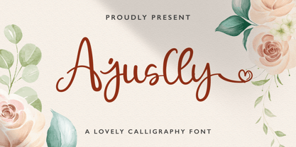 Ajuslly is an incredibly distinct, delicate and timeless handwritten font. It looks stunning on wedding invitations, thank you cards, quotes, greeting cards, logos, business cards and every other design which needs a handwritten touch. This font is PUA encoded which means you can access all of the glyphs and swashes with ease! It features a varying baseline, smooth lines, gorgeous glyphs and stunning alternates.
 - ITC Samuel by ITC,
$29.99ITC Samuel is a delicate and lively calligraphy font designed by Phill Grimshaw. Every detail has been worked to create harmony. The stroke contrast, the light brush character, the graceful forms all give ITC Samuel the spontaneity and individuality typical of handwriting. The font includes several ligatures and is legible even in smaller point sizes. ITC Samuel is perfect for invitations, greeting cards and other personal correspondence. - Display Hatched by Greater Albion Typefounders,
$16.50 Display Hatched is ideal for posters with an industrial theme and is designed as a complement to Greater Albion’s “Singwriter Standard” typeface. All glyphs are diagonally shaded giving just a delicate touch of ‘industrial edge’ which is so ‘on trend’ at the moment. Display Hatched includes small capitals and title forms, as well as three forms of numerals. Bring a little industrial grit to your next project!
 - Blossoming Constellation by Letterhanna Studio,
$19.00 Introducing "Blossoming Constellation," a free-spirited handwritten font that gracefully weaves the celestial allure of constellations with the untamed beauty of blossoming flowers. Each letter in this font carries the essence of a wandering spirit, capturing the whimsy and wonder of the universe. With its flowing lines and delicate details, "Blossoming Constellation" invites you to express your creativity with the boundless freedom of a free spirit.
 - Final Destination by Aldedesign,
$25.00 Final Destination is a delicate, elegant, and flowing handwritten font. It has beautiful and well balanced characters and as a result, it matches a wide pool of designs. This font is PUA encoded which means you can access all of the glyphs and swashes with ease! Each Font Has: Stylish modern handwritten script Beautiful Swash (Ending tail) Beautiful Titling (Beginning tail) Special Ligatures Multilingual Support
 - Sweet blink play by Sulthan Studio,
$10.00 Sweet Blink is a cute and friendly handwritten font duo that is perfect for creating charming and playful designs. Its delicate and whimsical letters feature playful curves and loops, giving it a warm and inviting personality. This font is perfect for invitations, greeting cards, and other projects that require a personal and charming touch. The font’s cute and friendly personality is sure to make viewers smile.
 - Persian Ruby by Si47ash Fonts,
$10.00 It's not fragile, it's delicate! :D A Arabic font (Persian typeface), as a gift for you type lovers! This font does not support any Latin characters. Just Persian and Arabic. You can get this font for free by buying another Si47ash Font: https://www.myfonts.com/foundry/si47ash-fonts/ Let me know when you did it and I will send you a promo-code: shahabsiavash [at] gmail [dot] com
 - Karlsen by TypeUnion,
$30.00 Designed and built in London by TypeUnion, Karlsen is a structured, functional typeface which embraces harmony, flow and versatility. The Karlsen Family is made up of 14 styles, which range from a delicate thin, all the way through to a substantial Extra-bold and each carry a versatility for multiple applications and uses. Karlsen provides extensive language support to provide a flexible, substantial user experience.
 - Love Struck by Letterhend,
$14.00 Combining handcraft serif and simple script, Love Struck is an authentic typeface that gracefully marries a delicate and refined aesthetic with a hint of rustic charm. Features : Uppercase & lowercase Numbers and punctuation Multilingual PUA encoded We highly recommend using a program that supports OpenType features and Glyphs panels like many of Adobe apps and Corel Draw, so you can see and access all Glyph variations.
 - Amberine by Hazztype,
$15.00 Amberine is a captivating reverse contrast script font that defies convention with its unique and striking design. The thick, bold lines flow gracefully, creating a sense of dynamism and movement, while the delicate, thin strokes provide an elegant contrast. This font evokes a sense of drama and sophistication, making it perfect for titles, branding, invitations, and any design where you want to make a bold statement.
 - Linotype Supatropic by Linotype,
$29.99Linotype Supatropic is part of the Take Type Library, chosen from the entries of the Linotype-sponsored International Digital Type Design Contests of 1994 and 1997. This fun font from German designer Isabell Laxa is generously decorated with delicate flower silhouettes which are reminiscent of Asian flower chains and subtropical flora. Linotype Supatropic is meant exclusively for headlines in point sizes of 18 or larger. - Nat Flight by ParaType,
$30.00 This elegant family of fonts, suitable for both text and display, is narrow in fit and characterized by a unique feature: in the capital B, P, and R, the stroke of the bowl does not quite meet with the stem. The design is noticeably calligraphic with a dynamic and delicate character, especially in the italics. Its subtleties can best be appreciated when set in large point sizes.
 - Mitchell Wesley by Fargun Studio,
$18.00 Mitchell Wesley is a beautiful Handwritten Font, A beautifully handcrafted font combined with brush style that’ll make your guests sing and elevate your projects! Every stroke, and curve was created to entice happiness and elegance. It suitable for wedding invitation, greeting cards, T-Shirt, Logo or any design that you create. Comes with a complete set of standard characters, Alternates, Ligatures, Punctuation & International glyphs
 - Juke Joint JNL by Jeff Levine,
$29.00 Although many pieces of sheet music used standardized backgrounds and metal type for their titles and information, there are hundreds of songs with innovative illustrations and clever typography beckoning potential buyers with their cover art. Whether the era was Post-Victorian, Art Nouveau or Art Deco, the sheer variety of eye-catching images offered visual enticement to the potential customer whilst browsing the local music shop.
 - Clarisone by Prestige Artsy Studio,
$25.00 Clarisone is a delicate yet classy modern sans serif font. Designed specifically for clean projects in mind — perfect for creating word mark logos, monograms, quotes, product packaging, invitations, magazines and more... The simplicity of Clarisone introduces a professional, and modern touch to any of your future projects. With its high class clean smooth curves — Clarisone is the perfect font to have in your design arsenal.
 - Bauer Bodoni by Linotype,
$45.99 Giambattista Bodoni (1740-1813) was called the King of Printers; he was a prolific type designer, a masterful engraver of punches and the most widely admired printer of his time. His books and typefaces were created during the 45 years he was the director of the fine press and publishing house of the Duke of Parma in Italy. He produced the best of what are known as "modern" style types, basing them on the finest writing of his time. Modern types represented the ultimate typographic development of the late eighteenth and early nineteenth centuries. They have characteristics quite different from the types that preceded them; such as extreme vertical stress, fine hairlines contrasted by bold main strokes, and very subtle, almost non-existent bracketing of sharply defined hairline serifs. Bodoni saw this style as beautiful and harmonious-the natural result of writing done with a well-cut pen, and the look was fashionable and admired. Other punchcutters, such as the Didot family (1689-1853) in France, and J. E. Walbaum (1768-1839) in Germany made their own versions of the modern faces. Even though some nineteenth century critics turned up their noses and called such types shattering and chilly, today the Bodoni moderns are seen in much the same light as they were in his own time. When used with care, the Bodoni types are both romantic and elegant, with a presence that adds tasteful sparkle to headlines and advertising. The Bauer Bodoni was done by Heinrich Jost for Bauer Typefoundry in 1927. This version has finer details of the original Bodoni types. It works well for headlines, logos, advertising.
 - Fragrance by Scholtz Fonts,
$15.00 Fragrance was inspired by script styles of the twentieth century, and brought into the early 21st century with extravagant, sweeping, upper-case letters and smaller "x" height. Fragrance Antique is a new style for the delicate, feminine Fragrance font. Fragrance Antique retains its elegance, but has a deconstructed, grunged appearance, making it perfect for "ancient" manuscripts, medieval wedding stationery, greeting cards and graffiti style advertising material. The font has a delicate, feminine style reminiscent of elusive perfumes, its elegance emphasized by the contrast between upper and lower case characters. Upper case swashes extend outwards, slashing across or underlining more demure lower case letters. Fragrance is perfect for wedding stationery, greeting cards, lingerie, flowers, perfume and cosmetic advertising, book covers and magazine pages. The font contains over 272 characters - (upper and lower case characters, punctuation, numerals, symbols and accented characters are present). It also includes "open-type"characters to enhance the flow of the text. It has all the accented characters used in the major European languages.
 - Mynaruse Flare by insigne,
$39.99 Mynaruse Flare is a new version of the Mynaruse superfamily. This version eliminates the elongated serifs of the original, and instead stems end with a flare. You will find that the thinner weights are delicate and beautiful, while the heavier weights provide impact and strength. Mynaruse is inspired by the elegant and regal Roman inscriptional types. The face shines in environments that require elegance and splendor. The eight weights of Mynaruse flare range from a subtle, delicate thin to a heavy and powerful Black weight. Mynaruse Flare includes many useful OpenType features, including a set of swash alternates, alternate titling forms, ligatures and miscellaneous alternates. OpenType-capable applications such as Quark or the Adobe suite can take full advantage of the automatically replacing ligatures and alternates. This family also includes the glyphs to support a wide range of languages. This is a titling font that is ideal for logotypes, posters or other high-end luxury applications.
 - Diamond Braille by Echopraxium,
$5.00 Here is a "Decorative Braille font". The initial design was indeed drawn on a K.I.S.S digital sketchpad, the Windows default drawing tool (Microsoft Paint, classic version). A. Glyph Concept The Braille 2x3 dot matrix is weaved around a diamond-shape. a.1. Each "dot" is represented by a "right-angle isocel triangle". a.2. Braille dots in Diamond Braille a.2.I. "Dots" are outside the diamond for first Braille row (Braille dots 1, 4) and third Braille row (Braille dots 3, 6). a.2.II. "Dots" are inside the diamond for second Braillle row (Braille dots 2, 5). a.3. Diamond lattice Glyphs are connected horizontally (to/bottom diamond's corners) and vertically (left/right corners) to each other (see poster 5). a.4. Special Glyphs - Space: its is either empty ("Empty cell") or a "non Braille shape" { _, ° } depending on your display needs (as explained in b.3.II) - 6 dots: { £, =, û } - 6 empty dots: { ç, ¥ } B. Font user guide b.1. Lowercase glyphs { A..Z } In these glyphs the "dots" are represented as a white right-angle isocel triangle filled with a smaller black triangle. b.2. Uppercase glyphs { a..z } In these glyphs, the "dots" are represented as an empty triangle (this is an "empty dot"). b.3. 'Space' vs 'Empty Cell' b.3.I. 'Space' - 'Space' glyph is an empty shape - '¶' glyph (at the end of each line in Microsoft Word) is also an empty shape b.3.II. 'Empty cell' glyphs: _ (underscore), ° (degree). In these glyphs there are 2 "empty dots" at top and bottom corners of the diamond, which differentiates them from regular Braille glyphs (which dont have a "dot in the middle"). b.4. Diamond Lattice To display text as a 'diamond lattice', replace each 'Space' by an 'Empty cell' (as explained in b.3.II, see poster 5) b.5. Connectors The connector glyphs allow the creation of "circuit like" designs (see poster 1). Here are the connector glyphs: { µ, à, â, ä, ã, è, é, ê, ë, î, ï } b.6. Domino feature Some Glyphs represent numbers 1..6 in a way which is similar than on dominos (see poster 6) C. Posters Poster 1: the "Font Logo", it displays "Diamond Braille" text together with the Connectors feature. Poster 2: a pangram which is published on pangra.me ( "Adept quick jog over frozen blue whisky mix" ). Poster 3: an illustration of the Domino feature. Poster 4: a DiamondBraille version of the Periodic table. Poster 5: illustration of the Diamond lattice using only 6 dots ( û ) and 6 empty dots ( ç ) glyphs.
 - Klip Klop by Samuelstype,
$24.00 Designed by Hans Samuelson in 2023. With two weights and many variations Klip Klop offers a large set of characters for playful lettering. The flavouring is strong avant garde and the build is strict geometrical with even stroke thickness throughout. One unusual feature is that the bottom and top horizontal strokes are centered on the baseline and capital height. This renders the same optical size between the thin and the medium but different actual heights and baselines. Use it for Headlines or signage in any medium! Klip Klop!
 - Linotext by Linotype,
$29.99Linotext was designed by Morris Fuller Benton in 1901 and first appeared with the name Wedding Text with American Type Founders in Jersey City, where its metal forms were cut by hand. The font was so popular that its forms soon began appearing with other font foundries under different names, Elite Kanzlei with D. Stempel AG, Comtesse with C.F. Rühl, etc. Its ornamental forms are not considered very legible by today’s standards and Linotext should therefore be used for headlines and short texts in point sizes 12 or larger. - Ryman Gothic by W Type Foundry,
$25.00 Ryman Gothic is inspired by American Wood Types and Gothic Typefaces, mainly in the work of Edwin Allen and Morris Fuller Benton. The result is a hybrid combining gothic proportions with the contrast of wood types. While drawing consonants guided by gothic proportions, vowels were designed slightly wider, making them not only more legible when it comes to long text designs, but also more attractive. Ryman Gothic comes in 8 weights plus its matching italics, ranging from Thin to Heavy. Each weight includes extended language support (Latin + Cyrillic + Greek), ligatures, arrows and more.
 - Dahaut by Scriptorium,
$12.00Dahaut is a stylized, modernistic uncial variation. The idea for this font came from a small sample of hand lettering in a title on a book by Peter Tremayne. The idea of a bolder, more angular variation on uncial script seemed intriguing, so we developed it into a full font. It should work very well for titles and catches the eye by presenting traditional uncial letter forms in an almost futuristic style. For those who care about such things, the name comes from a princess in a Breton folk story. - Sellomitha by YuliusParyadi,
$11.00 Sellomitha (Handwritten/Script) is made according to its name which symbolizes charm and charisma. She is glamorous and wants to be the center of attention.This font is readable, catchy, and easy to use. This font is suitable for quotes, logo designs, magazines, business cards, and many other design projects. Sellomitha is includes: - full set uppercase and lowercase letter; - numerals; - multilingual support; - large number of punctuations; - more than 30 ligatures, and swash. Please add this font as your favourite hit like button, or follow me. I'll very happy for that and appreciated it.
 - Zania by Agnieszka Ewa Olszewska,
$20.00 Zania is a display typeface. Its characteristic element is cutting in the stem that makes this font very memorable and easy to recognize. Contains stylistic alternates, ligatures, diacritics, and OpenType features that will help you make your project more unique. Has an experimental vibe and nice movement from left to the right thanks to serifs placed in the top left and bottom right part of the letter. It has smooth edges that make it look more friendly. The letter contrast is high. Looks good in logotypes, branding, magazine titles, book covers, posters.
 - Canava Grotesk by Arodora Type,
$50.00 The Canava Grotesk represents simplicity. Its clean and plain appearance ensures high readability. This font increases compatibility for your UI/UX designs and makes your designs more understandable. It offers you support in many languages. Canava's fluid functionality is achieved through multiple OpenType features such as case sensitive forms, contextual and stylistic alternatives. The standard set of numbers includes tabular figures and symbols, top and bottom numbers, numerators and denominators, as well as fractions. Thanks to its corporate structure, Canava can be shaped and used in accordance with many design trends.
 - ITC Souvenir Monospaced by ITC,
$34.99The Souvenir typeface was originally drawn by Morris Fuller Benton in 1914 as a single weight for the American Type Founders company. It was revived in 1967 by Photo-Lettering and optimized for phototypesetting equipment. ITC was formed in 1971 and, with the help of Photo-Lettering, introduced ITC Souvenir as one of its first font families. ITC Souvenir was designed by Ed Benguiat and comes in four weights, each with a matching italic. In 1983, Ned Bunnel's ITC Souvenir Monospaced was released; this is a monospace version of ITC Souvenir. - NaNa Rounded Pro by Naghi Naghachian,
$85.00NaNa Rounded Pro Font family is designed by Naghi Naghashian. The character set of this Font family supports most western languages including: Afrikaans, Basque, Breton, Catalan, Danish, Dutch, English, Finnish, French, Gaelic, German, Icelandic, Indonesian, Irish, Italian, Norwegian, Portuguese, Sami, Spanish, Swahili and Swedish. There are 17 additional symbol characters: euro, litre, estimated, omega, pi, partialdiff, delta, product, summation, radical, infinity, integral, approxequal, notequal, lessequal, greaterequal, and lozenge. It also includes the characters necessary to support the following central European languages: Croatian, Czech, Estonian, Hungarian, Latvian, Lithuanian, Polish, Romanian, Serbian (Latin), Slovak, Slovenian and Turkish. - Fontazia AquaFlorium by Deniart Systems,
$15.00 Fontazia AquaFlorium is a new addition to our Fontazia series , featuring an assortment of flowers and aquatic accents inspired by the idea that not only sponges can live at the bottom of the sea, flowers can too. When in need of aquatic accents or modern floral decorations, this combination of dingbats are sure to do the trick. Like other type, you can easily add them to any text document or if splicing and dicing artwork is your game, these will add a little pizzazz to all your designs.
 - Franklin Gothic by URW Type Foundry,
$39.99 By 1915, all the major foundries offered families of sans serifs, sometimes called Gothic in the USA. Franklin was a response suitable for countries in the vanguard of the machine age. Designed by Morris Benton in 1903-1912, Franklin has preserved its own personality ever since. The ITC Franklin Gothic font family is a redrawing by ITC that keeps the original strength intact, meeting the demand for a strong typeface. ITC Franklin Gothic is better read in display sizes and considered a standard in the newspaper and advertising fields.