10,000 search results
(0.03 seconds)
- HS Alnada by Hiba Studio,
$60.00 HS Alnada is a modern OpenType Arabic Typeface. It is a modern Kufi / Naskh hybrid and keeps the balance between its construction and calligraphic angular cuts. This typeface supports Arabic, Persian, Urdu and Kurdish variants and it is available in five weights: light, regular, medium, bold and black. They are refined with enhanced legibility and are ideally suited to advertising, extended texts in magazines, newspapers, book and publishing, and creative industries, meeting the purposes of various designs for all tastes.
 - SF Rasmi by Sultan Fonts,
$29.99 Rasmi font It is a font for print and the web. Especially for coordinating university and school books, scientific research, exams, government and corporate correspondence, and coordinating financial, judicial, and diplomatic documents. The Rasmi font family includes four weights: thick for headlines, bold for subheadings, medium for body text, and thin for footnotes and explanations. The font supports Arabic, Latin, Persian, Urdu, and Kurdish languages. The graphic designer can use Rasmi variable font to reach wider options in working with the text.
 - NCS Radhiumz by Namara Creative Studio,
$12.00 NCS Radhiumz is a modern powerful quality sans serif font with great versatility. This extended font can be used for bold editorial statements, graphic heavy prints or just as a simple logo. This new type will definitely make your designs stand out and unique. Included 08 variant to choose : Light Light Italic Regular Italic Bold Bold Italic Bold Rounded Bold Shadow Included uppercase, lowercase, numerals, punctuations, multilingual support, and some alternates & ligatures.
 - Times New Roman PS Cyrillic by Monotype,
$67.99In 1931, The Times of London commissioned a new text type design from Stanley Morison and the Monotype Corporation, after Morison had written an article criticizing The Times for being badly printed and typographically behind the times. The new design was supervised by Stanley Morison and drawn by Victor Lardent, an artist from the advertising department of The Times. Morison used an older typeface, Plantin, as the basis for his design, but made revisions for legibility and economy of space (always important concerns for newspapers). As the old type used by the newspaper had been called Times Old Roman," Morison's revision became "Times New Roman." The Times of London debuted the new typeface in October 1932, and after one year the design was released for commercial sale. The Linotype version, called simply "Times," was optimized for line-casting technology, though the differences in the basic design are subtle. The typeface was very successful for the Times of London, which used a higher grade of newsprint than most newspapers. The better, whiter paper enhanced the new typeface's high degree of contrast and sharp serifs, and created a sparkling, modern look. In 1972, Walter Tracy designed Times Europa for The Times of London. This was a sturdier version, and it was needed to hold up to the newest demands of newspaper printing: faster presses and cheaper paper. In the United States, the Times font family has enjoyed popularity as a magazine and book type since the 1940s. Times continues to be very popular around the world because of its versatility and readability. And because it is a standard font on most computers and digital printers, it has become universally familiar as the office workhorse. Times?, Times? Europa, and Times New Roman? are sure bets for proposals, annual reports, office correspondence, magazines, and newspapers. Linotype offers many versions of this font: Times? is the universal version of Times, used formerly as the matrices for the Linotype hot metal line-casting machines. The basic four weights of roman, italic, bold and bold italic are standard fonts on most printers. There are also small caps, Old style Figures, phonetic characters, and Central European characters. Times? Ten is the version specially designed for smaller text (12 point and below); its characters are wider and the hairlines are a little stronger. Times Ten has many weights for Latin typography, as well as several weights for Central European, Cyrillic, and Greek typesetting. Times? Eighteen is the headline version, ideal for point sizes of 18 and larger. The characters are subtly condensed and the hairlines are finer." - Times New Roman Seven by Monotype,
$67.99In 1931, The Times of London commissioned a new text type design from Stanley Morison and the Monotype Corporation, after Morison had written an article criticizing The Times for being badly printed and typographically behind the times. The new design was supervised by Stanley Morison and drawn by Victor Lardent, an artist from the advertising department of The Times. Morison used an older typeface, Plantin, as the basis for his design, but made revisions for legibility and economy of space (always important concerns for newspapers). As the old type used by the newspaper had been called Times Old Roman," Morison's revision became "Times New Roman." The Times of London debuted the new typeface in October 1932, and after one year the design was released for commercial sale. The Linotype version, called simply "Times," was optimized for line-casting technology, though the differences in the basic design are subtle. The typeface was very successful for the Times of London, which used a higher grade of newsprint than most newspapers. The better, whiter paper enhanced the new typeface's high degree of contrast and sharp serifs, and created a sparkling, modern look. In 1972, Walter Tracy designed Times Europa for The Times of London. This was a sturdier version, and it was needed to hold up to the newest demands of newspaper printing: faster presses and cheaper paper. In the United States, the Times font family has enjoyed popularity as a magazine and book type since the 1940s. Times continues to be very popular around the world because of its versatility and readability. And because it is a standard font on most computers and digital printers, it has become universally familiar as the office workhorse. Times?, Times? Europa, and Times New Roman? are sure bets for proposals, annual reports, office correspondence, magazines, and newspapers. Linotype offers many versions of this font: Times? is the universal version of Times, used formerly as the matrices for the Linotype hot metal line-casting machines. The basic four weights of roman, italic, bold and bold italic are standard fonts on most printers. There are also small caps, Old style Figures, phonetic characters, and Central European characters. Times? Ten is the version specially designed for smaller text (12 point and below); its characters are wider and the hairlines are a little stronger. Times Ten has many weights for Latin typography, as well as several weights for Central European, Cyrillic, and Greek typesetting. Times? Eighteen is the headline version, ideal for point sizes of 18 and larger. The characters are subtly condensed and the hairlines are finer." - Times New Roman WGL by Monotype,
$67.99 In 1931, The Times of London commissioned a new text type design from Stanley Morison and the Monotype Corporation, after Morison had written an article criticizing The Times for being badly printed and typographically behind the times. The new design was supervised by Stanley Morison and drawn by Victor Lardent, an artist from the advertising department of The Times. Morison used an older typeface, Plantin, as the basis for his design, but made revisions for legibility and economy of space (always important concerns for newspapers). As the old type used by the newspaper had been called Times Old Roman," Morison's revision became "Times New Roman." The Times of London debuted the new typeface in October 1932, and after one year the design was released for commercial sale. The Linotype version, called simply "Times," was optimized for line-casting technology, though the differences in the basic design are subtle. The typeface was very successful for the Times of London, which used a higher grade of newsprint than most newspapers. The better, whiter paper enhanced the new typeface's high degree of contrast and sharp serifs, and created a sparkling, modern look. In 1972, Walter Tracy designed Times Europa for The Times of London. This was a sturdier version, and it was needed to hold up to the newest demands of newspaper printing: faster presses and cheaper paper. In the United States, the Times font family has enjoyed popularity as a magazine and book type since the 1940s. Times continues to be very popular around the world because of its versatility and readability. And because it is a standard font on most computers and digital printers, it has become universally familiar as the office workhorse. Times?, Times? Europa, and Times New Roman? are sure bets for proposals, annual reports, office correspondence, magazines, and newspapers. Linotype offers many versions of this font: Times? is the universal version of Times, used formerly as the matrices for the Linotype hot metal line-casting machines. The basic four weights of roman, italic, bold and bold italic are standard fonts on most printers. There are also small caps, Old style Figures, phonetic characters, and Central European characters. Times? Ten is the version specially designed for smaller text (12 point and below); its characters are wider and the hairlines are a little stronger. Times Ten has many weights for Latin typography, as well as several weights for Central European, Cyrillic, and Greek typesetting. Times? Eighteen is the headline version, ideal for point sizes of 18 and larger. The characters are subtly condensed and the hairlines are finer."
 - Times New Roman by Monotype,
$67.99 In 1931, The Times of London commissioned a new text type design from Stanley Morison and the Monotype Corporation, after Morison had written an article criticizing The Times for being badly printed and typographically behind the times. The new design was supervised by Stanley Morison and drawn by Victor Lardent, an artist from the advertising department of The Times. Morison used an older typeface, Plantin, as the basis for his design, but made revisions for legibility and economy of space (always important concerns for newspapers). As the old type used by the newspaper had been called Times Old Roman," Morison's revision became "Times New Roman." The Times of London debuted the new typeface in October 1932, and after one year the design was released for commercial sale. The Linotype version, called simply "Times," was optimized for line-casting technology, though the differences in the basic design are subtle. The typeface was very successful for the Times of London, which used a higher grade of newsprint than most newspapers. The better, whiter paper enhanced the new typeface's high degree of contrast and sharp serifs, and created a sparkling, modern look. In 1972, Walter Tracy designed Times Europa for The Times of London. This was a sturdier version, and it was needed to hold up to the newest demands of newspaper printing: faster presses and cheaper paper. In the United States, the Times font family has enjoyed popularity as a magazine and book type since the 1940s. Times continues to be very popular around the world because of its versatility and readability. And because it is a standard font on most computers and digital printers, it has become universally familiar as the office workhorse. Times?, Times? Europa, and Times New Roman? are sure bets for proposals, annual reports, office correspondence, magazines, and newspapers. Linotype offers many versions of this font: Times? is the universal version of Times, used formerly as the matrices for the Linotype hot metal line-casting machines. The basic four weights of roman, italic, bold and bold italic are standard fonts on most printers. There are also small caps, Old style Figures, phonetic characters, and Central European characters. Times? Ten is the version specially designed for smaller text (12 point and below); its characters are wider and the hairlines are a little stronger. Times Ten has many weights for Latin typography, as well as several weights for Central European, Cyrillic, and Greek typesetting. Times? Eighteen is the headline version, ideal for point sizes of 18 and larger. The characters are subtly condensed and the hairlines are finer."
 - Times New Roman Small Text by Monotype,
$67.99In 1931, The Times of London commissioned a new text type design from Stanley Morison and the Monotype Corporation, after Morison had written an article criticizing The Times for being badly printed and typographically behind the times. The new design was supervised by Stanley Morison and drawn by Victor Lardent, an artist from the advertising department of The Times. Morison used an older typeface, Plantin, as the basis for his design, but made revisions for legibility and economy of space (always important concerns for newspapers). As the old type used by the newspaper had been called Times Old Roman," Morison's revision became "Times New Roman." The Times of London debuted the new typeface in October 1932, and after one year the design was released for commercial sale. The Linotype version, called simply "Times," was optimized for line-casting technology, though the differences in the basic design are subtle. The typeface was very successful for the Times of London, which used a higher grade of newsprint than most newspapers. The better, whiter paper enhanced the new typeface's high degree of contrast and sharp serifs, and created a sparkling, modern look. In 1972, Walter Tracy designed Times Europa for The Times of London. This was a sturdier version, and it was needed to hold up to the newest demands of newspaper printing: faster presses and cheaper paper. In the United States, the Times font family has enjoyed popularity as a magazine and book type since the 1940s. Times continues to be very popular around the world because of its versatility and readability. And because it is a standard font on most computers and digital printers, it has become universally familiar as the office workhorse. Times?, Times? Europa, and Times New Roman? are sure bets for proposals, annual reports, office correspondence, magazines, and newspapers. Linotype offers many versions of this font: Times? is the universal version of Times, used formerly as the matrices for the Linotype hot metal line-casting machines. The basic four weights of roman, italic, bold and bold italic are standard fonts on most printers. There are also small caps, Old style Figures, phonetic characters, and Central European characters. Times? Ten is the version specially designed for smaller text (12 point and below); its characters are wider and the hairlines are a little stronger. Times Ten has many weights for Latin typography, as well as several weights for Central European, Cyrillic, and Greek typesetting. Times? Eighteen is the headline version, ideal for point sizes of 18 and larger. The characters are subtly condensed and the hairlines are finer." - Times New Roman PS Greek by Monotype,
$67.99In 1931, The Times of London commissioned a new text type design from Stanley Morison and the Monotype Corporation, after Morison had written an article criticizing The Times for being badly printed and typographically behind the times. The new design was supervised by Stanley Morison and drawn by Victor Lardent, an artist from the advertising department of The Times. Morison used an older typeface, Plantin, as the basis for his design, but made revisions for legibility and economy of space (always important concerns for newspapers). As the old type used by the newspaper had been called Times Old Roman," Morison's revision became "Times New Roman." The Times of London debuted the new typeface in October 1932, and after one year the design was released for commercial sale. The Linotype version, called simply "Times," was optimized for line-casting technology, though the differences in the basic design are subtle. The typeface was very successful for the Times of London, which used a higher grade of newsprint than most newspapers. The better, whiter paper enhanced the new typeface's high degree of contrast and sharp serifs, and created a sparkling, modern look. In 1972, Walter Tracy designed Times Europa for The Times of London. This was a sturdier version, and it was needed to hold up to the newest demands of newspaper printing: faster presses and cheaper paper. In the United States, the Times font family has enjoyed popularity as a magazine and book type since the 1940s. Times continues to be very popular around the world because of its versatility and readability. And because it is a standard font on most computers and digital printers, it has become universally familiar as the office workhorse. Times?, Times? Europa, and Times New Roman? are sure bets for proposals, annual reports, office correspondence, magazines, and newspapers. Linotype offers many versions of this font: Times? is the universal version of Times, used formerly as the matrices for the Linotype hot metal line-casting machines. The basic four weights of roman, italic, bold and bold italic are standard fonts on most printers. There are also small caps, Old style Figures, phonetic characters, and Central European characters. Times? Ten is the version specially designed for smaller text (12 point and below); its characters are wider and the hairlines are a little stronger. Times Ten has many weights for Latin typography, as well as several weights for Central European, Cyrillic, and Greek typesetting. Times? Eighteen is the headline version, ideal for point sizes of 18 and larger. The characters are subtly condensed and the hairlines are finer." - Times New Roman PS by Monotype,
$67.99In 1931, The Times of London commissioned a new text type design from Stanley Morison and the Monotype Corporation, after Morison had written an article criticizing The Times for being badly printed and typographically behind the times. The new design was supervised by Stanley Morison and drawn by Victor Lardent, an artist from the advertising department of The Times. Morison used an older typeface, Plantin, as the basis for his design, but made revisions for legibility and economy of space (always important concerns for newspapers). As the old type used by the newspaper had been called Times Old Roman," Morison's revision became "Times New Roman." The Times of London debuted the new typeface in October 1932, and after one year the design was released for commercial sale. The Linotype version, called simply "Times," was optimized for line-casting technology, though the differences in the basic design are subtle. The typeface was very successful for the Times of London, which used a higher grade of newsprint than most newspapers. The better, whiter paper enhanced the new typeface's high degree of contrast and sharp serifs, and created a sparkling, modern look. In 1972, Walter Tracy designed Times Europa for The Times of London. This was a sturdier version, and it was needed to hold up to the newest demands of newspaper printing: faster presses and cheaper paper. In the United States, the Times font family has enjoyed popularity as a magazine and book type since the 1940s. Times continues to be very popular around the world because of its versatility and readability. And because it is a standard font on most computers and digital printers, it has become universally familiar as the office workhorse. Times?, Times? Europa, and Times New Roman? are sure bets for proposals, annual reports, office correspondence, magazines, and newspapers. Linotype offers many versions of this font: Times? is the universal version of Times, used formerly as the matrices for the Linotype hot metal line-casting machines. The basic four weights of roman, italic, bold and bold italic are standard fonts on most printers. There are also small caps, Old style Figures, phonetic characters, and Central European characters. Times? Ten is the version specially designed for smaller text (12 point and below); its characters are wider and the hairlines are a little stronger. Times Ten has many weights for Latin typography, as well as several weights for Central European, Cyrillic, and Greek typesetting. Times? Eighteen is the headline version, ideal for point sizes of 18 and larger. The characters are subtly condensed and the hairlines are finer." - Sunny Dream by Letterhend,
$17.00 Sunny Dream is a font duo package contain a bold sans serif with rough script which looks great to be paired especially for vintage and adventure theme! This font duo is purposely made for headline, display or logotype, and signature which need a standout appearing. This font is also suitable to be applied especially in logo, and the other various formal forms such as invitations, labels, logos, magazines, books, greeting / wedding cards, packaging, fashion, make up, stationery, novels, labels or any type of advertising purpose. Features : Bold and Script uppercase & lowercase numbers and punctuation multilingual alternates & ligatures PUA encoded We highly recommend using a program that supports OpenType features and Glyphs panels like many of Adobe apps and Corel Draw, so you can see and access all Glyph variations.
 - ITC Adderville by ITC,
$29.99On a cold winter's night, George Ryan, of Galápagos Design Group, began musing on the possibilities for a “truly original” sans serif typeface. What came out of his musing, and his always-present sketchpad, was ITC Adderville, a typeface whose visual impact is immediate and strong. Ryan explains how he did it: “The rounded ends of its strokes and their skewed baseline contact create an illusion of dancing feet. The tops of lowercase stems emit serif buds, suggesting transition into or out of the serifed form. The spear-like lowercase stroke terminators, along with other distinctive elements such as the stylized reticulation of the lowercase 'g' segments, the salute of that same character's spur, and the bold, non-self-conscious 'i' and 'j' dots, all contribute to the playful and unique nature of this design.” The result is a friendly, lively type family whose graduated weights -- book, medium, and heavy -- lend themselves especially well to use at small display sizes and in short blocks of text. - East Botany by Reyrey Blue Std,
$16.00 Say Hi to East Botany. A new bold and stylish font with modern, groovy and retro look. It comes with large selection of alternate glyphs to give your any project to a unique design. East Botany is perfect for luxury logo and branding, classy editorial design, woman magazine, cosmetic brand, fashion promotional, blog design, modern advertising design, card invitation, art quote, book/cover title, and modern and more. Features : · All Uppercase and Lowercase · Number & Symbol · Supported Languages · Alternates and Ligatures · PUA Encoded
 - Morgalina Vintage by Agny Hasya Studio,
$12.00 Morgalina Vintage Is a Serif Display Font With a Retro Vintage Style Bold Typeface, Modern Classic Yet Decorative. It Comes in 2 (Two) Styles (Regular and Italic) Including Slants, and Is Created With Stylistic Alternatives and Ligatures. Featured With Uppercase and Lowercase, Numeral and Punctuation, Multilingual Support, and Opentype Features. Perfect for Your Design Projects Like Logos, Branding, Advertising, Product Designs, Stationery, Magazine Designs, Book/Cover Title Designs, Photography, Art Quotes, Wedding Designs, Fashion Designs, Special Events, Labels, Product Packaging, and More.
 - Climora Duo by XdCreative,
$29.00 Introducing Climora Duo CLIMORA SERIF is a typeface with a feminine taste, with a touch of old style paired with an elegant Climora Script its a perfect combination for your various design needs. CLIMORA Serif has 14 style and 7 weights, - from Thin to Bold and Matching oblique. and 1 Elegant Climora Script that supports multiple languages. Hope you enjoy with Climora Family Thank you
 - Benhard by Holis.Mjd,
$14.00 BENHARD is a display font with masculine characteristics suitable for old or modern styles, this font can be combined with a sans-serif font suitable for poster fonts, logos, headlines, titles on book covers, films, content and others.
 - Mogila Display by Letterfreshstudio,
$15.00 Mogila is a display font with a touch of style that's cheerful, elegant and strong. So it is suitable for use in product design and appearance, both in modern or vintage designs. OpenType feature with several alternative characters that allow you to mix and match letter pairs to suit your design. Mogila also includes 4 different styles, namely Regular,Italic, Bold and Outline which are made with different styles but still have the same characters. Mogila is included in a display font so it is very suitable for use in titles, poster products, logos, book menus, websites, books, t-shirts, posters, book covers, labels, business cards, branding, print templates and many other designs according to your needs. Mogila includes a complete set of upper and lowercase letters, as well as multi-language support, punctuation, ligatures and alternatives. Thank you very much for looking and Enjoying it!
 - The Angella Script Duo by madjack.font,
$10.00 The Angella Script Duo is a hand brush font created with brush and ink. This typeface is ideal for use in bold watercolour designs or handwritten styles, such as blog titles, posters, wedding elements, t-shirts, clothing, book covers, business cards, greeting cards, branding, merchandise, etc. Contains the complete set: - Uppercase - Lowercase - alternative - fasteners - Punctuation - number - Multilingual support. How to access all alternative characters, using the Windows Character Map with Photoshop: - https://www.youtube.com/watch?v=Go9vacoYmBw How to access all alternative characters using Adobe Illustrator: - https://www.youtube.com/watch?v=XzwjMkbB-wQ
 - Sanstooy by Letterlite Studio,
$13.00 Sanstooy Cute Display Font Sanstooy - a super fun and playful hand-lettered bold typeface. It is perfect for headings, flyer, greeting cards, product packaging, book cover, printed quotes, logotype, apparel design, album covers, etc. What's Included : - Standard & Multilingual glyphs - Ligature - Alternate - Works on PC & Mac - Simple installations - Accessible in the Adobe Illustrator, Adobe Photoshop, Adobe InDesign, even work on Microsoft Word. - PUA Encoded Characters - Fully accessible without additional design software. - Fonts include multilingual support for; Afrikaans, Danish, Dutch, French, German, Indonesian, Irish, Italian, Norwegian, Portuguese, Scottish, Spanish, Swedish, Swiss. Hope you enjoy with our font!
 - Bollolo by YuliusParyadi,
$11.00 Bollolo (Handwritten) is a fun and playful font. Bollolo name is made from bolo-bolo which is mean lets be friend. This font is readable, catchy, and easy to use. This font is suitable for quotes, logo designs, kids toys, story book, and many other design projects. Bollolo is includes: - full set uppercase and lowercase letter; - numerals; - multilingual support; - large number of punctuations; - ligatures. Please add this font as your favorite, hit like button, or follow me. I'll very happy for that and appreciated it.
 - Stifin by Maulana Creative,
$22.00 Stifin handwritten display font. Bold stroke, fun character with a bit of ligatures and alternates. To give you an extra creative work. Stifin font support multilingual more than 100+ language. This font is good for logo design, Social media, Movie Titles, Books Titles, a short text even a long text letter and good for your secondary text font with script or serif. Make a stunning work with Stifin handwritten display font. Cheers, Maulana Creative
 - Undine Soul by Maulana Creative,
$15.00 Undine Soul blackletter display font. Bold stroke, fun character with a bit of ligatures and alternates. To give you an extra creative work. Undine Soul font support multilingual more than 100+ language. This font is good for logo design, Social media, Movie Titles, Books Titles, a short text even a long text letter and good for your secondary text font with script or serif. Make a stunning work with Undine Soul font. Cheers, Maulana Creative
 - Roter Hoody by HansCo,
$15.00 Roter Hoody font is a retro serif and bold display font. You will get three types of fonts in this pack, Regular, Outline and Shadow version. Use this display font to add that special retro touch to any design idea you can think of! Very suitable for logotype, Stickers, Packaging design, Cricut Project, headlines, brand identity, t shirt or apparel industry, posters, magazines, books, YouTube, Instagram, websites, or any of your creative design projects. Enjoy!
 - Blakecats by Maulana Creative,
$11.00 Blakecats is a quirky handwritten font. With chunky bold stroke, upright and fun character with a bit of ligatures. To give you an extra creative work. Blakecats font support multilingual more than 100+ language. This font is good for logo design, Social media, Movie Titles, Books Titles, a short text even a long text letter and good for your secondary text font with sans or serif. Make a stunning work with Blakecats font. Cheers, MaulanaCreative
 - MC Masitro by Maulana Creative,
$13.00 Masitro is a rounded flare serif Display font. Bold stroke, fun character with a bit of ligatures and alternates. To give you an extra creative work. Masitro font support multilingual more than 100+ language. This font is good for logo design, Social media, Movie Titles, Books Titles, a short text even a long text letter and good for your secondary text font with script or serif. Make a stunning work with Masitro font. Cheers, MaulanaCreative
 - Askale by Mantra Naga Studio,
$20.00 Askale - Victorian Vintage Display Font. This typeface has many alternatives with swashes that can make your lettering/logotype more attractive. Bold serifs and more swash on each character make this font even more unique. This font is very suitable to be applied, especially to logos, and various other formal forms such as invitations, labels, logos, magazines, books, greeting / wedding cards, packaging, fashion, make up, stationery, novels, labels or any type. advertising purposes.
 - New West by Fontysia,
$15.00 New West is a modern clean soft round sans serif font. With bold stroke, fun character. To give you an extra creative work. New West font support multilingual and ligatures. This font is good for logo design, branding design, Social media, Movie Titles, Books Titles, a short text even a long text letter and good for your secondary text font with sans or serif. Make a stunning work with New West font.
 - Norges by Maulana Creative,
$14.00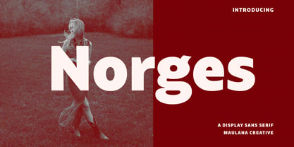 Norges is a contemporary sans display font. With bold stroke, fun character with a bit of ligatures and alternates. To give you an extra creative work. Norges font support multilingual more than 100+ language. This font is good for logo design, Social media, Movie Titles, Books Titles, a short text even a long text letter and good for your secondary text font with Script. Make a stunning work with Norges font. Cheers, Maulana Creative
 - Mooschak by Maulana Creative,
$14.00 Mooschak is a bouncy fat handwritten display font. With bold contrast stroke and fun character. To give you an extra creative work. Mooschak font support multilingual more than 100+ language. This font is good for logo design, Social media, Movie Titles, Books Titles, a short text even a long text letter and good for your secondary text font with sans or serif. Make a stunning work with Mooschak font. Cheers, Maulana Creative
 - Fourthyla by Maulana Creative,
$14.00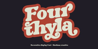 Fourthyla is a handwritten Serif display font. With bold stroke, fun character with a bit of ligatures and alternates. To give you an extra creative work. Fourthyla font support multilingual more than 100+ language. This font is good for logo design, Social media, Movie Titles, Books Titles, a short text even a long text letter and good for your secondary text font with script. Make a stunning work with Fourthyla font. Cheers, Maulana Creative
 - Owlmoons by Maulana Creative,
$12.00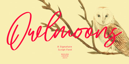 Owlmoons is casual signature font, with bold stroke, slanted and fun character. It has Opentype features ligatures of character, To give you an extra creative work. Owlmoons font support multilingual more than 100+ language. This font is good for logo design, Social media, Movie Titles, Books Titles, a short text even a long text letter and good for your secondary text font with sans or serif. Make a stunning work with Owlmoons font.
 - MC Vanisse by Maulana Creative,
$16.00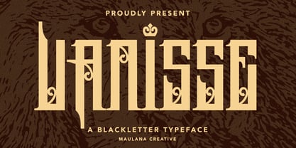 Vanisse is a modern Decorative Display font. Bold stroke, fun character with a bit of ligatures and alternates. To give you an extra creative work. Vanisse font support multilingual more than 100+ language. This font is good for logo design, Social media, Movie Titles, Books Titles, a short text even a long text letter and good for your secondary text font with script or serif. Make a stunning work with Vanisse font. Cheers, Maulana Creative
 - Brihes Quzam by Maulana Creative,
$16.00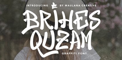 Brihes Quzam graffiti display font. Bold stroke, fun character with a bit of ligatures and alternates. To give you an extra creative work. Brihes Quzam font support multilingual more than 100+ language. This font is good for logo design, Social media, Movie Titles, Books Titles, a short text even a long text letter and good for your secondary text font with script or serif. Make a stunning work with Brihes Quzam font. Cheers, Maulana Creative
 - MC Crucio by Maulana Creative,
$21.00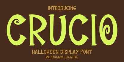 Crucio display font. Bold stroke, fun character with a bit of ligatures and alternates. To give you an extra creative work. Crucio font support multilingual more than 100+ language. This font is good for logo design, Social media, Movie Titles, Books Titles, a short text even a long text letter and good for your secondary text font with script or serif. Make a stunning work with Crucio display font. Cheers, Maulana Creative
 - Atheroll by Maulana Creative,
$15.00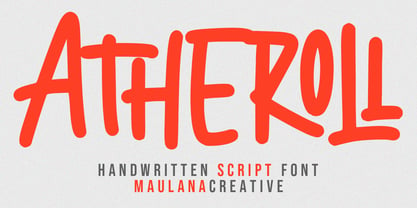 Atheroll is a fancy handwritten font. With bold stroke, fun character with a bit of ligatures and alternates. To give you an extra creative work. Atheroll font support multilingual more than 100+ language. This font is good for logo design, Social media, Movie Titles, Books Titles, a short text even a long text letter and good for your secondary text font with sans or serif. Make a stunning work with Atheroll font. Cheers, Maulana Creative
 - MC Ringlock by Maulana Creative,
$15.00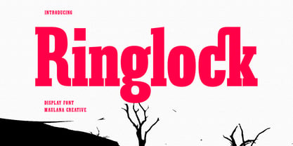 Ringlock is a Slab serif Display font. Bold stroke, fun character with a bit of ligatures and alternates. To give you an extra creative work. Ringlock font support multilingual more than 100+ language. This font is good for logo design, Social media, Movie Titles, Books Titles, a short text even a long text letter and good for your secondary text font with script or serif. Make a stunning work with Ringlock font. Cheers, Maulana Creative
 - Northern Mount by FontsByCheeks,
$14.00 A modern, high impact, display font - Northern Mount is the first in the four part collection of fonts designed by Chike Newman-Greaves. Starting life as a side project on his creative bucket list, and now with over 550+ glyphs, Northern Mount is the perfect font for a bold ad campaign, key artwork or comic book cover. Its high bars and long stems take inspiration from an Art Deco era, its lowercase letters - clean, minimal.
 - MC Vatteo by Maulana Creative,
$14.00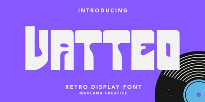 Vatteo is a retro decorative display font. Bold stroke, fun character with a bit of ligatures and alternates. To give you an extra creative work. Vatteo font support multilingual more than 100+ language. This font is good for logo design, Social media, Movie Titles, Books Titles, a short text even a long text letter and good for your secondary text font with script or serif. Make a stunning work with Vatteo font. Cheers, Maulana Creative
 - Asakusa by Maulana Creative,
$18.00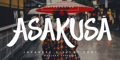 Asakusa is a japanese modern display font. Bold stroke, fun character with a bit of ligatures and alternates. To give you an extra creative work. Asakusa font support multilingual more than 100+ language. This font is good for logo design, Social media, Movie Titles, Books Titles, a short text even a long text letter and good for your secondary text font with script or serif. Make a stunning work with Asakusa font. Cheers, Maulana Creative
 - MC Heizel Font by Maulana Creative,
$22.00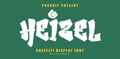 Heizel graffiti display font. Bold stroke, fun character with a bit of ligatures and alternates. To give you an extra creative work. Heizel font support multilingual more than 100+ language. This font is good for logo design, Social media, Movie Titles, Books Titles, a short text even a long text letter and good for your secondary text font with script or serif. Make a stunning work with Heizel graffiti display font. Cheers, Maulana Creative