10,000 search results
(0.245 seconds)
- Blackout - 100% free

- Planet N - Personal use only

- LEGO BRIX - Personal use only

- Viper Squadron Solid - Unknown license

- End of Path - Unknown license

- Be Aggressive - Unknown license

- Hadriatic - Personal use only

- Parasight - Unknown license

- Battleforce 5 - Personal use only

- Feldicouth Norm - Unknown license

- Kremlin Samovar - Unknown license

- Half SunBurst-w4-02 - Unknown license

- Amerika - Unknown license

- Haarlemmer by Monotype,
$29.00 Haarlemmer is a recreation of a never-produced Jan Van Krimpen typeface that goes one step beyond authentic: it shows how he wanted it to be designed in the first place. The original, drawn in the late 1930s, was created for the Dutch Society for the Art of Printing and Books and was to be used to set a new edition of the Bible, using Monotype typesetting. Hence the problem: fonts for metal typesetting machines like the Linotype and Monotype had to be created within a crude system of predetermined character width values. Every letter had to fit within and have its spacing determined by a grid of only 18 units. Often, the italic characters had to share the same widths as those in the roman design. Van Krimpen believed this severely impaired the design process. The invasion of Holland in World War II halted all work on the Bible project, and the original Haarlemmer never went into production. Flash forward about sixty years. Frank E. Blokland, of The Dutch Type Library, wanted to revive the original Haarlemmer, but this time as Van Krimpen would have intended. Blokland reinterpreted the original drawings and created a typeface that matched, as much as possible, Van Krimpen's initial concept. While Van Krimpen's hand could no longer be on the tiller, a thorough study of his work made up for his absence. The result is an exceptional text family of three weights, with complementary italic designs and a full suite of small caps and old style figures. Van Krimpen would be proud.
 - Libertat by Elyas Beria,
$9.00 In a not-too-distant future, humanity was ruled by a powerful, technologically advanced empire known as the Synod. The Synod controlled all forms of communication, and through this, they controlled the minds of the people. But a small group of rebels, known as the Resistance, had managed to evade the Synod's surveillance and formed a secret underground movement. They were determined to overthrow the Synod and restore freedom to the people. One of the Resistance's key members was a young artist named Trystån. He had a unique talent for creating powerful, visually striking posters that captured the spirit of the Resistance's message and spread it to the masses. Trystån had just completed a new poster, one that would be critical to the Resistance's plans. It depicted a single, outstretched hand holding a traditional Kimarii laser staff, with the words "Libertat!" emblazoned across the top. The poster featured a striking and powerful font that perfectly captured the spirit of the Resistance's message. The font was a combination of bold lines, elegant confident curves, and strong angles, giving it a sense of strength and determination. The lettering was large and prominent, filling up much of the poster, making it hard to miss. The letters seemed to be almost carved into the surface, giving the impression of something that was permanent and unshakable. The font was colored in dark shades, and was a sans serif typeface, that gives the message a very modern and current feel yet also feels vintage and retro, connecting the present with the struggles of the past. And with multilingual support, the typeface ensured that the message of the Resistance could be disseminated in every language on the planet. The background was minimalistic and in contrast, with a neutral palette, with just a hint of a sand-like color, representing the harsh conditions of the land that the people were fighting for their rights. The focus was all on the lettering, and how it conveyed the message. The poster was indeed a moving piece of graphic design, with its strong, striking font, and powerful imagery. It was clear that Trystån had put a lot of thought and care into its design. The poster, he hoped, would connect with people on an emotional level and inspire them to rise up against the oppression of the Synod Empire. The poster was set to be distributed at a major rally in the capital, where the Resistance was hoping to gain the support of thousands of citizens. But the Synod was not about to let this happen. They had long suspected the existence of the Resistance and had been working to infiltrate their ranks and discover their plans. The night before the rally, the Synod launched a surprise raid on the Resistance's hideout, capturing Trystån and several other members of the Resistance. Trystån was thrown into sand pits and interrogated by the Synod's top agents. They wanted to know everything about the Resistance's plans, including the details of the poster and the rally. Trystån, knowing the importance of the poster, refused to give in, even under the harshest of conditions. Meanwhile, the rally was drawing near, and the Resistance was desperate to get the poster out to the public. They knew that it was their only hope of gaining the support they needed to overthrow the Synod. They came up with a plan to smuggle the poster out of the hideout, but it would be a risky endeavor. As the rally began, the Resistance made their move, slipping the poster into the hands of the crowd. Trystån's poster had made a big impact in the rallies, and soon it became the symbol of hope for the resistance, and the visual representation of their struggle for freedom. The poster had become the catalyst for the revolution, and it would be remembered for many years to come as the symbol of the fight for freedom and democracy. The image of the outstretched hand holding the Kimarii laser staff struck a chord with the people, and they began to rise up against the Synod's oppression. Trystån, still locked away in the sand pits behind a stasis feild, could only imagine the scene unfolding outside. But he knew that his work had helped to spark a revolution, and he felt a sense of pride and accomplishment. The Resistance, with the help of the rally, was able to overthrow the empire, and Trystån was released, celebrated as a hero and hailed as the artist who helped to bring about the new era of freedom and democracy. The poster Trystån had designed had become the symbol of a new era, and it would hang in museums and public places as a reminder of the power of resistance and art, in the face of oppression. Features: regular and light weights numbers and punctuation multilingual characters
 - Adipura by Just Lett,
$15.00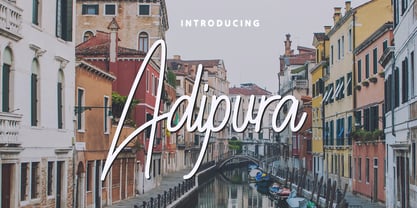 Adipura is a script and handwritten font, and is perfect for your all design project such as wedding invitation design, book cover design, banners, logos, short quotes, flyer designs, typography, signatures, and more. Features: ~ UPPERCASE ~ lowercase ~ Numeral and Punctuation ~ Multilingual Accent
 - Kaldera by Letterena Studios,
$17.00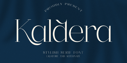 Kaldera is a modern and classic serif typeface that has its own unique style and exquisite look. This font is perfect for elegant and luxurious logos, book or movie title designs, fashion brands, magazines, clothes, lettering, quotes, and so much more.
 - Ines by DSType,
$40.00 Ines is a full featured typeface with seven weights and italics, including Small Capitals, smart fractions and several ligatures. Ines was specially designed for books, with a slight short x-height, making the ascenders and descenders more elegant and tall.
 - Boocr by OneSevenPointFive,
$20.00 Boocr, a display family crafted for company logos, game/book/movie titles, landing pages, branding, posters, banners, packaging, etc. Designed with powerful open-type features - 11 stylist sets, ligatures, numerators-denominators, fractions and so on. Whether it's for dominating, subtle or even playful headlines, Boocr is amazingly suitable for all. Give feedback - https://bit.ly/3FlmhDS
 - FF Cube by FontFont,
$62.99 Danish type designer Jan Maack created this display and sans FontFont in 2008. The family has 18 weights, ranging from Light to Bold in Condensed, Normal, Expanded, and Extra Expanded (including italics) and is ideally suited for advertising and packaging, logo, branding and creative industries, poster and billboards as well as sports. FF Cube provides advanced typographical support with features such as ligatures, alternate characters, case-sensitive forms, and stylistic alternates. It comes with tabular oldstyle and tabular lining figures.
 - Biago by Letteralle,
$29.00 Typeface in 70s and 80s became the inspiration for Biago. soft and bold are the characteristics of Biago. The large and rounded legs make Biago unique and different from other serif fonts. Biago brings a warm, friendly, unique, and simple impression. Biago is intended for display purposes, such as large headlines, titles, logos, or anything that requires special characteristics and attention. Biago's five width, will give you the flexibility to express your interface and design. Italic and alternate versions are also included.
 - Drama by Studio&Story,
$19.00 Say hello to Drama, an independent dramatic and rebellious script font. It allows you to create a gentle and bold and eye catching handmade lettering design. With free flowing, fast motion and dry texture it will give a feeling of authentic typography for your project. Created for beautiful logos, Branding projects, Posters, Blog posts, Social media, Advertising and more! What you get: Drama - A handwritten script font, With upper & lowercase characters, numerals and a large range of punctuation. Additionally includes 30 ligatures, alternate and extra set of 6 hand-drawn swashes for perfect finishing touch . Multilingual support for various languages including: English, Italian, French, Polish, German, Swedish, Spanish, Danish, Dutch, Portuguese, Norwegian, Malaya, Indonesian, Finnish, Filipino. Malaya. You can check in preview.
 - Brother Dreams by Ditatype,
$29.00 Brother Dreams is a captivating brush font that exudes a raw and artistic vibe. With its bold capitalized letterforms and ragged edges, this typeface brings a unique and rebellious touch to your designs. The defining feature of Brother Dreams lies in its rugged and ragged edges, giving the font a handcrafted and slightly distressed appearance. This font is designed with expressive brush strokes, capturing the essence of brush calligraphy. The bold capitalized letterforms command attention, making a powerful statement with their unconventional and untamed style. Inspired by the untamed spirit of artistic expression, Brother Dreams embodies a sense of creativity and authenticity. The rough and ragged edges add a touch of uniqueness and individuality to each letter, as if they were painted with passion and emotion. This font embraces imperfection and celebrates the beauty of artistic spontaneity. Each letter of Brother Dreams is meticulously crafted to maintain its boldness and legibility while embracing the rugged and ragged edges. The resulting composition is a balance of artistic expression and readability. This font allows your message to stand out with its raw energy and rebellious charm. Enjoy the various features available in this font. Features: Multilingual Supports PUA Encoded Numerals and Punctuations Brother Dreams is ideal for headlines, titles, logos, and any design that requires a lively and energetic display. Whether you're working on posters, packaging, branding materials, or any project that needs a touch of liveliness, this font will bring a contagious sense of cheer. Find out more ways to use this font by taking a look at the font preview. Thanks for purchasing our fonts. Hopefully, you have a great time using our font. Feel free to contact us anytime for further information or when you have trouble with the font. Thanks a lot and happy designing.
 - Headlock by Hanoded,
$15.00 Headlock is a handmade serif. My 6 year old son just had his first real Judo exam and the one thing he excels at is the headlock. Headlock comes with double letter ligatures and all the diacritics you need, plus basic Cyrillic!
 - J Scott Campbell by Comicraft,
$29.00 Cliffhanger's top-selling DANGER GIRL creator and artist, Jeff Campbell, also topped our first MASTERS OF COMIC BOOK ART poll. Originally Jeff wanted his font to be wholly exclusive to the DANGER GIRL book, but we begged him, we pleaded with him and, eventually, we took photographs of him (in compromising positions with his "models") and he relented. Now, at long last we are making this slick and stylish font available as a part of our catalog, and you no longer need be a stranger to danger. See these families related to J Scott Campbell: J Scott Campbell Lower & J Scott Campbell Sketchbook .
 - Tolkiens Christmas by Kaer,
$19.00 Hey guys! Once I got a book "Letters From Father Christmas" by J.R.R. Tolkien. He wrote them for the children every December from 1920 to 1943. I totally fell in love with the calligraphy in those letters. Now I created a font and you can use it to write your own letter from the North Pole. I've also redrawn stamps and patterns from that book, so you can decorate your blank. It's Icons font style. You'll get: Regular and Icons styles Numbers and symbols Multilingual support and alternative symbols Thanks! Feel free to request to add characters you need: kaer.pro@gmail.com
 - Testament by Canada Type,
$24.95 From the standpoint of calligraphy, a font family of capitals and uncials makes perfect sense. The Roman square capitals, the quadrata, are matched by round capitals of older Greek origin; the word "uncus" means hook-shaped like a beak or talon. Interrelated and often interchangeable, these capital letters served as book hands for both the Latin West and the Greek-speaking East before they evolved into minuscule alphabets. The Testament family is based on the few formal capital manuscripts of the Bible, Virgil and Homer that have survived from the ancient world. Throughout the Middle Ages both uncials and square capitals were used, often together, for headings and initial characters. By their nature the Roman capitals are the voice of Caesar and hold the place of authority, while the uncials speak for the Church in a balanced relationship. In ancient times church and state were not as separate as they are now, and the alphabets were not as different as typographic tradition has made them. In this calligraphic rendering it is clear that they are of the same substance and can be written in the same style, conveying even to the modern eye the eternal and classical quality of epic and scripture. Testament comes in all popular font formats, and includes support for a vaster-than-usual range of Latin-based languages.
 - Masked Hero by Linecreative,
$18.00 Introducing "Masked Hero," a dynamic and commanding font that stands tall as a bold, oblique, all-cap typeface. This font is not just a collection of letters; it's a visual narrative of strength, speed, and superhero prowess. "Masked Hero" takes typography to new heights by incorporating uppercase letters adorned with intricate wing patterns, elevating your design into a powerful champions. The uppercase characters in "Masked Hero" aren't just letters; they're symbols of superheroic identity, each adorned with wing-like patterns that evoke a sense of flight and strength. These letters become the emblem of your design, embodying the essence of masked heroes ready to leap into action. To provide designers with unparalleled flexibility, "Masked Hero" is equipped with alternates for both uppercase and lowercase letters. This feature allows you to customize the appearance of your text, giving you the creative freedom to push the boundaries of typographic design. The alternates enhance the visual impact of your message, ensuring that every word becomes a statement. With a sharp and bold aesthetic, "Masked Hero" is tailor-made for projects that demand speed, strength, and a touch of superhero flair. Whether you're designing a logo for a masked vigilante, creating dynamic sports-themed graphics, or crafting the name of a superhero, this font is your ally in making a bold statement. Masked Hero offers you: 1. 4 options of letters, All Caps (All options of the characters are included in one font) 2. Numbers and Punctuation 3. Multilingual Support (Latin Western Europe)
 - Prillwitz Pro by preussTYPE,
$49.00 Johann Carl Ludwig Prillwitz, the German punch cutter and type founder, cut the first classic Didot letters even earlier than Walbaum. The earliest proof of so-called Prillwitz letters is dated 12 April 1790. Inspired by the big discoveries of archaeology and through the translations of classical authors, the bourgeoisie was enthused about the Greek and Roman ideal of aesthetics. The enthusiasm for the Greek and Roman experienced a revival and was also shared by Goethe and contemporaries. »Seeking the country of Greece with one’s soul«. All Literates who are considered nowadays as German Classics of that time kept coming back to the Greek topics, thinking of Schiller and Wieland. The works of Wieland were published in Leipzig by Göschen. Göschen used typefaces which had been produced by until then unknown punch cutter. This punch cutter from Jena created with these typefaces master works of classicist German typography. They can stand without any exaggeration on the same level as that of Didot and Bodoni. This unknown gentleman was known as Johann Carl Ludwig Prillwitz. Prillwitz published his typefaces on 12th April 1790 for the first time. This date is significant because this happened ten years before Walbaum. Prillwitz was an owner of a very successful foundry. When the last of his 7 children died shortly before reaching adulthood his hope of his works was destroyed, Prillwitz lost his will to live. He died six months later. His wife followed him shortly after. The typeface Prillwitz as a digital font was created in three optical styles (Normal, Book and Display). The typeface Prillwitz Press was created especially for a printing in small sizes for newspapers. »Prillwitz Press« combines aesthetic and functional attributes which make written text highly readable. It was originally designed for a newspaper with medium contrast to withstand harsh printing conditions. Its structure is quite narrow which makes this typeface ideal for body text and headlines where space is at premium. For the Normal – even more for the Book – a soft and reader-friendly outline was created through a so-called »Schmitz« and optimized in numerous test prints. The arris character and the common maximal stroke width contrast of the known classicist typefaces (Didot/Bodoni) were edited by the study of the original prints. This was also done in order to reach a very good readability in small type sizes. This typeface is perfectly suited to scientific and belletristic works. Accordingly it has three styles: Regular, Bold and Italic as Highlighting (1). The typeface Prillwitz is a complete new interpretation and continuing development of the conservated originals from 1790. They have been kept in the German Library in Leipzig. It was always given the priority to keep the strong roughness and at the same time optimizing the readability of this striking font. The type family has all important characters for an efficient and typographic high quality work. ----------- (1) Accentuation of particular words or word orders (e.g. proper names, terms etc.). Typographic means for Highlighting could be Italic, SmallCaps or semi-bold.
 - Black Mortal by Yoga Letter,
$30.00 "Black Mortal" is an elegant and unique block font. This font is perfect for logos, movie titles, business branding, stickers, book titles, banners, posters, Halloween, Black Friday, and more. Equipped with uppercase, lowercase, numerals, punctuation, and multilingual support
 - Evil Eye by Goodigital13,
$20.00 Suitable for various media, posters, banners, brochures, and various merchandising such as t-shirts, totte bags, stickers and much more perfect for display such as label, apparel, fashion, sticker, books, poster, and many more! Complete with OpenType features.
 - NF Elena by NicolassFonts,
$17.00 NF Elena was designed by Nikolay Savchuk. NF Elena was created on base Katerina sans-serif typeface. It is brilliantly suited for graphic design and display use and perfect for magazines, newspapers, books, websites, brand identity, and advertising.
 - Hebrew Stencil by Samtype,
$49.00 This is a modern Sans Serif font. There are 12 letters This font is for logos, covers and small texts and children books This font has the modern Hebrew punctuation: Shevana, Kamatz Katan, Dagesh Hazak, and Cholam Chaser.
 - Baskerville by Bitstream,
$29.99 John Baskerville spared no effort to create the ultimate typographic book. He prepared deep black inks and smoothed paper to show to full effect the letters that he had John Handy cut from his own brilliant designs, based on a lifetime of calligraphy and stonecutting. Punches and matrices survive at the Cambridge University Press. The present design is an accurate recutting, with particular attention to George W. Jones’ revision from the metal of Baskerville’s English (14pt) roman and italic in 1929 for Linotype & Machinery Ltd; Mergenthaler Linotype imported this design to the USA two years later.
 - TT Phobos by TypeType,
$35.00 TT Phobos useful links: Specimen | Graphic presentation | Customization options TT Phobos is a pliable display serif with a soft and gentle character. The features of the typeface are the moderate contrast between bold and thin strokes, pliable visual compensators, and the counter-clockwise bend of internal ovals. In addition to 6 weights and 6 italic, TT Phobos also includes two original decorative fonts, inline and stencil. Despite its pliability and display character, TT Phobos is dynamic enough and is well suited for text arrays even in large text blocks. The serifs of letters are completely asymmetrical and bring in dynamics when reading the text from left to right. Thanks to the harmonious contrast of black and white forms and internal negative spaces of the letters, as well as its broad letter spacing, the typeface is well read in small sizes. In this case, the character of the letters is completely preserved, partially thanks to the exaggerated elegant visual compensators. The ornamental pattern used in TT Phobos Inline varies for capital and lowercase letters. Capital letters implement a more complex double inline with a rhombic element in the middle, and in the lower case features a simplified form of the inline, made in a single movement. Thanks to the original cutting, TT Phobos Stencil stands out for its expression, and the rounded cuts add even more visual style to the font. TT Phobos consists of 14 faces: 6 weights (Light, Regular, DemiBold, Bold, ExtraBold, Black), 6 Italics, inline and stencil. There are 17 ligatures in TT Phobos, including several Cyrillic ones. The typeface has stylistic alternates, which adds an italic effect to the upright fonts, and a little solemnity of the upright version to the italics. In addition, we have not forgotten about the old-style figures and other useful OpenType features, such as ordn, sups, sinf, dnom, numr, onum, tnum, pnum, liga, dlig, salt (ss01), frac, case.
 - Fairmont by Solotype,
$19.95This is one of the Victorian standards for job printing issued by the Barnhart Brothers and Spindler Foundry about 1891. It looks old without being decorative, a good counterpoint to fancier types in today¹s old fashioned typography. - Proxemic by Sarid Ezra,
$15.00 Proxemic is a bold sans based font with unique lowercase that will make your logo and design looks advance and modern. With the unique characteristic lowercase, this font can make your logo even more stunning only with simple steps. You can use this font for any purpose, especially to make logotype. You can mix and match the uppercase and lowercase to make your logo more advanced. This font also comes with number, symbol, and multilingual support!
 - Vibrant Victory by Hipfonts,
$17.00 Introducing Vibrant Victory, a stunning and captivating font that will inject a burst of energy into your designs. With its bold, thick lines and playful geometric shapes, this typeface exudes a sense of joy and excitement. Its carefully crafted design captures the essence of modern aesthetics while maintaining a unique and charming appeal. Whether you're creating eye-catching headlines, vibrant logos, or engaging posters, Vibrant Victory is the perfect choice to convey a sense of dynamism and positivity.
 - Chiffon by SilkType,
$35.00 Chiffon is a serif, display typeface. With high contrast and elegant curves. Chiffon includes three different versions of ‘c’ and ‘e’, which are carefully placed throughout the typeface, paired seamlessly with the following glyph. However, OpenType features and stylistic sets make the alternate forms available for the user to choose from as they see fit. Velour is available in 5 weights, from Extra light to Semi Bold, and supports Western, Central, and South-Eastern European languages.
 - Travax by Flawlessandco,
$9.00 Introducing "Travax" - A Futuristic Sport Font. Elevate your designs to new dimensions with "Travax," a bold and futuristic sport font that embodies the spirit of progress and competition. There's some connected letters and some alternates that suitable for any graphic designs. This font support for some multilingual. Also contains uppercase A-Z and lowercase a-z, alternate character, numbers 0-9, and some punctuation. If you need help, just write me! Thanks so much for checking out my shop!


