10,000 search results
(0.154 seconds)
- Hatchet Job by Wing's Art Studio,
$10.00 Hatchet Job - A Halloween Brush Font Unleashed onto an unsuspecting public this Halloween, Hatchet Job is a brush font inspired by the slasher and cabin-in-the-woods horror movies and comics typical of the 1970s and 80s. This textured all-caps design takes its visual style from old cabins, ghost ships and axe-splintered wood that can only spell danger! With a bold brush strokes and frayed edges, it offers the tools to leave your readers nerves in tatters! The Hatchet Job font family includes all-caps uppercase and lowercase characters, along with numerals, punctuation, symbols and language support. Also included are a complete set of alternative characters and additional paint marks, drips and splashes. Wingsart Studio Design Tip! The uppercase and lowercase characters work great when mixed in an alternating fashion, with shapes that combine to create a dynamic, un-hinged look that's perfect for the Halloween season. Add the alternatives and paint marks into the mix and you'll have yourself a title or header design that looks truly custom-made.
 - Creamy Chalk by Allouse Studio,
$16.00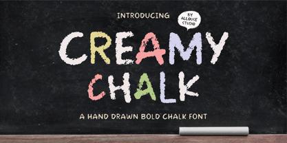 Proudly Presenting, Creamy Chalk A Hand Drawn Bold Chalk Font. Creamy Chalk is perfect for any titles, logo, product packaging, branding project, megazine, social media, wedding, or just used to express words above the background. Creamy Chalk also come with Multi-Lingual Support. Enjoy the font, feel free to comment or feedback, send me PM or email. Thank You!
 - Glamour Absolute by Nicky Laatz,
$42.00 Introducing "Glamour Absolute" - A brand new "two-faced" bold serif with both modern and vintage curves. A Two-faced beauty : Modern or Vintage If you are going Vintage Retro : Access your OpenType features to access the large selection of alternate letters and ligatures, select the letters you like from the large variety to get the vintage look you are after. Vary between a light and heavy vintage look based on how many letters you alter. If you are going Modern Chic : Just type with regular letters :) Play with your letter spacing to add even more class to your designs. Due to its split personality , Glamour Absolute is a very versatile font, covering a wide range project types, from bold magazine imagery , to wedding invitations, to branding, poster design and so much more.
 - Monvar by Flavortype,
$15.00 Monvar, A new Cooper with layered typefaces. It’s Simple, Bold, Versatile, and Friendly feel that you get in Monvar Typefaces. Monvar comes with 5 Layers : (that you can mix and match the looks as you like) Base Inset Outline Shadow 1 Shadow 2 Monvar Created with an All Caps that the uppercase are using an initial swashes. Perfect fitted layer to give you a more contrast, more bold look of the title. Every glyphs including the alternate characters are curated for the best and possible without eliminate characteristic of this fonts. Our creation on the display to give you a reference what it looks like on your project. such as Branding, Header, Logotype, Poster, Magazine, Packaging, Food Menus, and etc. It shows that Monvar clearly can accommodate various design style.
 - Janeiro by IKIIKOWRK,
$19.00 Proudly present Janeiro - Vintage Bold Font, created by ikiiko. Janeiro a bold font that personifies masculinity and retro vibes! This font dances in a contemporary setting with a fluidity that evokes the energy of the past. In a world where conformity sometimes takes center stage, Janeiro boldly challenges convention and invites everyone to join in a colorful and energetic parade. It's more than just a font; it's a typographic carnival that welcomes you to experience the joy of expression and the flow of creativity. This font is very suitable for making a poster, vintage or retro stuff, fashion brand, magazine layout, food & beverages packaging, quotes, or simply as a stylish text overlay to any background image. What's Included? Uppercase & Lowercase Numbers & Punctuation Multilingual Support Works on PC & Mac
 - Beyond Belief by Comicraft,
$19.00 Fact or Fiction? Are you troubled by strange noises in your font folder? Do you experience feelings of dread in Illustrator, Photoshop or Procreate? Have you or any of your family ever been haunted by an ampersand, cedilla or tilde? If the answer is yes, please don’t wait another minute. BEYOND BELIEF is ready to Believe YOU! Six weights of non-judgmental understanding and faith in everything you have to say -- even the most outrageous font conflicts and naming “coincidences”. Some say this font resembles our tall, friendly sans-serif font Tall Tales, but we don't know what they're talking about. Beyond Belief includes six fonts (Regular, Italic, Bold, Bold Italic, Heavy & Heavy Italic) with upper and lower case alphabets, automatic alternate letters, Crossbar I Technology and Western & Central European language support.
 - Queen Sipur by Forberas Club,
$16.00 Queen Sipur is pretty style modern font. Nice to application for cute, funny, playful, cartoon, birthday and cover book.
 - Meridia Script by Jonahfonts,
$19.95 Legible connected-script. Applications include captions, fashion headlines, packaging, invitations, cards, posters, ads, greeting cards, book jackets, and covers.
 - Brougham by Jonahfonts,
$25.00 Brougham keeps its legibility with a strong presence. Usage recommendations: Captions, packaging, cards, posters, ads, book jackets and manuals.
 - Georgeanna MF by Masterfont,
$59.00 Renamed font (was Georgia) and refined outlines to make it stand out on your next book jacket or tatoo.
 - Dotee by Gaslight,
$10.00 Dotee inspirit by lettering from soviet book. Dotee is fat decorative font with numerous cut style ligatures and alternatives.
 - Rabbit On The Moon by Hanoded,
$10.00 This font is ideal for cartoons, greeting cards and children's books, as it has a happy 'feel' to it.
 - Asikue by Kereatype,
$14.00 Asikue is a soft serif font family inspired by the 70’s retro styles that bring chunky retro typography to the modern era. Asikue consists of 10 styles from Regular to Extra Bold with each matching Oblique. Asikue includes Asikue have Opentype features: Alternate, Ligature, Swashes, etc providing you with a variety of captivating custom text arrangements. Whether it's a fancy retro-inspired, logo, or engaging bold header text Asikue is able to deliver.
 - FF Atma Serif by FontFont,
$72.99 American type designer Alan Dague-Greene created this serif FontFont in 2001. The family has 8 weights, ranging from Book to Black (including italics) and is ideally suited for book text and editorial and publishing. FF Atma Serif provides advanced typographical support with features such as ligatures, small capitals, petite capitals, alternate characters, case-sensitive forms, and fractions. It comes with a complete range of figure set options – oldstyle and lining figures, each in tabular and proportional widths.
 - Keizer by Talavera,
$40.00 Keizer is a serif display typeface freely inspired by the display metal fonts of the early XXth century, reminiscent of those used in cartographic and book design. Its five versions display an open-face, an inline-flared, outline and decorated capitals, and an essential titling high-contrasted serif face. Keizer works well both on print and screen, ideal for book covers, posters and logos. Every weight includes small caps, petite caps, stylistic alternates and a neat set of ornaments.
 - Matao Serif by Identitype Co,
$15.00 Mataö is a bold and gorgeous and is great for headlines and elegant designs with a vintage and classic flair. Mataö's contrasting lines and curved terminals give a sleek, elegant look to logos, holiday cards, wedding invitations, quotes, advertisements, and more. Mataö is a versatile typeface that's full of character and one you'll come back to time and again. Make your awesome design layout with Mataö.
 - Mantika Informal Paneuropean by Linotype,
$67.99Jürgen Weltin's Mantika Informal is pretty difficult to categorize, but very easy to like. This particularly reader-friendly typeface in regular and bold weights, brings to the table the informal fluidity of a script, the consistency of an inclined italic, and the open and airy forms and contrast of a humanist sans. The result is a warm, approachable, and very legible typeface that is never static and staid, but rather invites an attentive, reading eye. The original idea behind Mantika Informal lay in the challenge to create a typeface for setting children's books. German designer Jürgen Weltin aimed to create a reading typeface for those just starting to learn how to read. On the one hand, it should help create clear word-images; on the other, its letterforms should remain uncomplicated but resist mechanical and industrial sterility. Mantika?s subtle cursive lines stress the printed word's connection with handwriting, in addition to making the transition from school writing exercises to printed texts seamless and effortless. The resulting slightly organic and cursive forms that developed during the design process are so captivating that Mantika Informal may be used for a multitude of unintended applications - anywhere a friendly and informal yet sophisticated character could lend a helping hand, Mantika is there, giving a fresh accent to anything from packaging design to food products. With a broad character set encompassing support for Cyrillic and Green, Mantika Informal's two fonts make for a versatile and dynamic typeface that surely will find its place in a broad range of applications. - Mantika Informal by Linotype,
$50.99 Jürgen Weltin's Mantika Informal is pretty difficult to categorize, but very easy to like. This particularly reader-friendly typeface in regular and bold weights, brings to the table the informal fluidity of a script, the consistency of an inclined italic, and the open and airy forms and contrast of a humanist sans. The result is a warm, approachable, and very legible typeface that is never static and staid, but rather invites an attentive, reading eye. The original idea behind Mantika Informal lay in the challenge to create a typeface for setting children's books. German designer Jürgen Weltin aimed to create a reading typeface for those just starting to learn how to read. On the one hand, it should help create clear word-images; on the other, its letterforms should remain uncomplicated but resist mechanical and industrial sterility. Mantika?s subtle cursive lines stress the printed word's connection with handwriting, in addition to making the transition from school writing exercises to printed texts seamless and effortless. The resulting slightly organic and cursive forms that developed during the design process are so captivating that Mantika Informal may be used for a multitude of unintended applications - anywhere a friendly and informal yet sophisticated character could lend a helping hand, Mantika is there, giving a fresh accent to anything from packaging design to food products. With a broad character set encompassing support for Cyrillic and Green, Mantika Informal's two fonts make for a versatile and dynamic typeface that surely will find its place in a broad range of applications.
 - Xunga by Huy!Fonts,
$17.00 Xunga is a cheerful display typeface. My goal was to design a font able to fit any layout with boldness and playfulness, mixing a sign painter taste in the uppercase and some of my crappy calligraphic reverse contrast explorations with the flat brush for the lowercase. I designed several of widths to fit the page, and though about a different way of expanding the family shifting the horizontal stress axis to move the letter weight in different heights, making a 15 fonts family, suitable for making bold layouts. Xunga has an extended character set for European languages as well as Vietnamese, and shows all its potential with OpenType-savvy applications. Every font includes ligatures, catchwords in discretional ligatures, contextual alternates to avoid conflictive glyph pairs and localized forms to avoid problems with several glyphs and languages.
 - Stellar by Monotype,
$29.99Robert Hunter Middleton drew the original design of Stellar for the Ludlow Typograph Company in Chicago. Work began in the late 1920s, when Middleton was asked to create a sans serif type family to compete with European imports of Futura and Kabel. Stellar was Middleton's attempt to raise the ante. Where Futura and Kabel were geometric in design and monotone in weight, Stellar was based on roman character proportions and stroke weighs were stressed. In the late 1990s, Dave Farey took on the task of reviving the Stellar design. While Ludlow cut Stellar in a full range of point sizes, the family was limited to just a roman and bold design. Farey's revival is twice as large a family. It ranges from a very light called Stellar Nova to a very bold called Zeta In between are Lyra and Epsilon. - Steeplechase by BA Graphics,
$45.00A decorative Barnum-like design. Great for headlines with that circus type atmosphere; will also work for Christmas, western and children's books and ads. - EraMax 123 by Our House Graphics,
$15.00 EraMax 123 is a multi-layered display geometric sans serif, meant to be set BIG, for large, colourful statements. It's the perfect face for packaging, posters & branding, where a strong, colourful voice is needed... Did I mention posters? The "Max" in EraMax comes from the ultra bold weight, but also, and mainly as a tip of the hat to Peter Max, the designer and artist, known for creating so many images which have come to be emblematic of the sixties and seventies. The bold gradient effects in some of his posters were the inspiration behind the dotted and striped layers. This font's vintage flavour truly stand out in a retro setting, but also has a modern flavour that lends it the flexibility to work well in a more contemporary context. This is the second of what is to be an extended family of typefaces based on the original hand painted signage found in the T. H. & B Railway station in Hamilton Ontario, a classic Art Moderne building, designed by the New York architectural firm of Fellheimer and Wagner for the Toronto Hamilton and Buffalo Railway line and completed in 1933.
 - Serpentine by Image Club,
$29.99Dick Jensen (USA) designed Serpentine, is a contemporary-looking display font, for the Visual Graphics Corporation in 1972. With the rise of digital typesetting and desktop publishing, this typeface quickly became both popular and ubiquitous. This dynamic, wide, boxy design is identifiable via tiny triangular swellings at the stroke endings - what might be called semi-serifs. Serpentine is available in six different font styles: Light, Light Oblique, Medium, Medium Oblique, Bold, and Bold Oblique. Serpentine" is a greenish rock that sometimes resembles a serpent's skin, and is often used as a decorative stone in architecture. Though this font doesn't seem at all snaky or sinuous, it does have an architectural, stone-like solidity. The subtle, almost non-existent curves and semi-serifs keep it from being too stern or cold. Although the underlying strokes of each weight are similar, the six members of the Serpentine font family all present their own individual personalities. Serpentine Light lends itself well to text for onscreen displays, for instance, while the numbers from typeface's heavier weights are seen around the world on soccer jerseys! Additionally, the oblique styles convey a streamlined sense of speed, furthermore lending Serpentine well to sport and athletic applications (especially the faster, high-speed varieties). Because of its 1970s pedigree, Serpentine has come to be known as a genuine "retro" face. This makes the typeface even more appropriate for display usage, in applications such as logo design, magazine headlines, and party flyers. If you like Serpentine, check out the following similar fonts in the Linotype portfolio: Copperplate Gothic (similar serifs) Eurostile (similar width) Princetown (another "athletic" font) Insignia (similar "techno" feeling)" - Serpentine by Linotype,
$29.00Dick Jensen (USA) designed Serpentine, is a contemporary-looking display font, for the Visual Graphics Corporation in 1972. With the rise of digital typesetting and desktop publishing, this typeface quickly became both popular and ubiquitous. This dynamic, wide, boxy design is identifiable via tiny triangular swellings at the stroke endings - what might be called semi-serifs. Serpentine is available in six different font styles: Light, Light Oblique, Medium, Medium Oblique, Bold, and Bold Oblique. Serpentine" is a greenish rock that sometimes resembles a serpent's skin, and is often used as a decorative stone in architecture. Though this font doesn't seem at all snaky or sinuous, it does have an architectural, stone-like solidity. The subtle, almost non-existent curves and semi-serifs keep it from being too stern or cold. Although the underlying strokes of each weight are similar, the six members of the Serpentine font family all present their own individual personalities. Serpentine Light lends itself well to text for onscreen displays, for instance, while the numbers from typeface's heavier weights are seen around the world on soccer jerseys! Additionally, the oblique styles convey a streamlined sense of speed, furthermore lending Serpentine well to sport and athletic applications (especially the faster, high-speed varieties). Because of its 1970s pedigree, Serpentine has come to be known as a genuine "retro" face. This makes the typeface even more appropriate for display usage, in applications such as logo design, magazine headlines, and party flyers. If you like Serpentine, check out the following similar fonts in the Linotype portfolio: Copperplate Gothic (similar serifs) Eurostile (similar width) Princetown (another "athletic" font) Insignia (similar "techno" feeling)" - Trolley JNL by Jeff Levine,
$29.00 The Art nouveau era sheet music "Goodbye Sweet Old Manhattan Isle" (1905) offers up a classic hand lettered sans reflective of that era. It is available digitally as Trolley JNL in both regular and oblique versions.
 - Plowright by Scriptorium,
$18.00Plowright is a new font based on hand lettering from the 1880s. It's a great example of the style we often associate with signmaking in the old west, with a lot of quirks and original character. - Batcave by Neoglyph Studio,
$5.00 A futuristic cyberpunk display font design. Ideal for: music advertising comic books videogames book cover design toy package design
 - Avenir Next Thai by Linotype,
$79.00 Avenir Next Pro is a new take on a classic face—it’s the result of a project whose goal was to take a beautifully designed sans and update it so that its technical standards surpass the status quo, leaving us with a truly superior sans family. This family is not only an update though; in fact it is the expansion of the original concept that takes the Avenir Next design to the next level. In addition to the standard styles ranging from ultralight to heavy, this 32-font collection offers condensed faces that rival any other sans on the market in on and off—screen readability at any size alongside heavy weights that would make excellent display faces in their own right and have the ability to pair well with so many contemporary serif body types. Overall, the family’s design is clean, straightforward and works brilliantly for blocks of copy and headlines alike. Akira Kobayashi worked alongside Avenir’s esteemed creator Adrian Frutiger to bring Avenir Next Pro to life. It was Akira’s ability to bring his own finesse and ideas for expansion into the project while remaining true to Frutiger’s original intent, that makes this not just a modern typeface, but one ahead of its time. Avenir Next Variables are font files which are featuring two axis, weight and width. They have a preset instance from UltraLight to Heavy and Condensed to Roman width. The preset instances are: Condensed UltraLight, Condensed UltraLight Italic, Condensed Thin, Condensed Thin Italic, Condensed Light, Condensed Light Italic, Condensed, Condensed Italic, Condensed Demi, Condensed Demi Italic, Condensed Medium, Condensed Medium Italic, Condensed Bold, Condensed Bold Italic, Condensed Heavy, Condensed Heavy Italic, UltraLight, UltraLight Italic, Thin, Thin Italic, Light, Light Italic, Regular, Italic, Demi, Demi Italic, Medium, Medium Italic, Bold, Bold Italic, Heavy, Heavy Italic.
 - Avenir Next Rounded by Linotype,
$42.99Avenir Next Pro is a new take on a classic face—it’s the result of a project whose goal was to take a beautifully designed sans and update it so that its technical standards surpass the status quo, leaving us with a truly superior sans family. This family is not only an update though; in fact it is the expansion of the original concept that takes the Avenir Next design to the next level. In addition to the standard styles ranging from ultralight to heavy, this 32-font collection offers condensed faces that rival any other sans on the market in on and off—screen readability at any size alongside heavy weights that would make excellent display faces in their own right and have the ability to pair well with so many contemporary serif body types. Overall, the family’s design is clean, straightforward and works brilliantly for blocks of copy and headlines alike. Akira Kobayashi worked alongside Avenir’s esteemed creator Adrian Frutiger to bring Avenir Next Pro to life. It was Akira’s ability to bring his own finesse and ideas for expansion into the project while remaining true to Frutiger’s original intent, that makes this not just a modern typeface, but one ahead of its time. Avenir Next Variables are font files which are featuring two axis, weight and width. They have a preset instance from UltraLight to Heavy and Condensed to Roman width. The preset instances are: Condensed UltraLight, Condensed UltraLight Italic, Condensed Thin, Condensed Thin Italic, Condensed Light, Condensed Light Italic, Condensed, Condensed Italic, Condensed Demi, Condensed Demi Italic, Condensed Medium, Condensed Medium Italic, Condensed Bold, Condensed Bold Italic, Condensed Heavy, Condensed Heavy Italic, UltraLight, UltraLight Italic, Thin, Thin Italic, Light, Light Italic, Regular, Italic, Demi, Demi Italic, Medium, Medium Italic, Bold, Bold Italic, Heavy, Heavy Italic. - Boston Skyline by Set Sail Studios,
$16.00 Boston Skyline is a carefully hand-crafted duo of premium Sans & Script fonts, designed to create a bold, authentic, and timeless lettering combination. The contrasting yet complimentary strong sans and free-flowing script lend themselves perfectly as primary and secondary fonts for logo designs, product packaging, eye catching quotes and display text. Here’s what’s included in this product: Boston Skyline Rough • A hand drawn script font with authentic textures built-in. Contains upper & lowercase characters, all punctuation and numerals. Boston Skyline Rough Alt • This is a second version of Boston Skyline Rough, with a completely new set of upper & lowercase characters. If you wanted to avoid letters looking the same each time to recreate a custom-made style, or try a different word shape, simply switch to this font for an additional layout option. Boston Skyline Sans Rough • A bold Sans font with a built-in rough 'letterpress' texture. Contains uppercase characters, all punctuation and numerals. Boston Skyline Swashes • This font contains 26 swashes, perfect for underlining your script text and adding some extra custom flair. Simply install this font separately and type any a-z character when using this font to generate a swash. Clean Versions • Are included for all fonts with textures completely removed and edges smoothed. Language Support; All fonts support English, French, Italian, Spanish, Portuguese, German, Swedish, Norwegian, Danish, Dutch, Finnish, Indonesian, Malay, Hungarian, Polish, Turkish, Slovenian
 - Merry Brook by Letterhend,
$19.00 Merry Brook is a beautiful signature script based on manual hand writing. The stylistic alternate, ligatures and the tick and thin stroke kk make this font looks a real hand writing instead of typing a font. This type of font perfectly made to be applied especially in logo, and the other various formal forms such as invitations, labels, logos, magazines, books, greeting / wedding cards, packaging, fashion, make up, stationery, novels, labels or any type of advertising purpose.
 - LAMPOH by Afkari Studio,
$13.00 LAMPOH - The Handmade Scratch Display Font LAMPOH is an artistic and captivating handmade display font, meticulously crafted by a talented type designer to bring uniqueness and authenticity to your creative projects. With its scratch-inspired design, LAMPOH stands out as a one-of-a-kind font that exudes a raw and artisanal charm, making it perfect for various artistic endeavors. Every character in LAMPOH has been meticulously hand-drawn with love and passion, ensuring that each glyph carries a distinct and organic feel. The imperfections and irregularities of the scratch strokes add an element of human touch, providing a genuine and authentic character to the font. LAMPOH comes in both regular and bold styles, giving you the flexibility to choose the perfect weight for your design needs. The regular style boasts elegance and subtlety, while the bold style makes a powerful statement, ideal for headlines and emphasis. LAMPOH's versatile design makes it an ideal choice for a wide range of projects. Whether you're creating eye-catching headlines, attention-grabbing posters, logo designs, merchandise branding, or anything that requires a touch of artistic flair, LAMPOH will effortlessly enhance the visual appeal of your work. The uppercase characters of LAMPOH are bold and expressive, demanding attention with their captivating presence. On the other hand, the lowercase letters bring a touch of playfulness, offering quirky alternatives to add delightful variations to your text. LAMPOH comes complete with a set of thoughtfully crafted standard characters and ligatures, allowing you to elevate your designs even further. These unique elements enhance the font's versatility, making it easy to create visually engaging and harmonious compositions. LAMPOH is designed to seamlessly integrate into various design software, making it effortless to use in your preferred creative tools. From Adobe Illustrator to Photoshop, InDesign, and beyond, the font's compatibility ensures a smooth and hassle-free design process. LAMPOH's high-quality design ensures that it looks equally stunning in both print and digital formats. Whether you're producing posters, brochures, social media graphics, websites, or any other project, this font will consistently deliver outstanding results. LAMPOH is not just a font; it's a work of art that adds a touch of human craftsmanship to your creative projects. With its handmade scratch-inspired design, versatile usage, and expressive characters, LAMPOH brings a unique and authentic flair to any design. Unlock your creativity and let LAMPOH illuminate your artistic vision with its captivating charm. Choose between regular and bold styles to create striking and memorable designs that leave a lasting impression on your audience.
 - Xylo by ITC,
$29.99Xylo is a rugged, no-nonsense typeface that was originally designed in 1924 by the Benjamin Krebs type foundry in Frankfurt am Main, Germany. Even back then, Xylo must have been very popular; the design made it at least as far as England. In 1995, after finding its design in an old London printer's reference book, the Letraset Type Studio faithfully converted Xylo into digital format. A time-proven display face, Xylo will convey a feeling of power and strength in any application. Best used big in headlines or logos; Xylo exudes an expressionistic and art deco spirit that just as much at home today as it was during the roaring 20s! - FS Rosa by Monotype,
$52.99 FS Rosa is a free-spirited and optimistic serif typeface – reminiscent of those used on fanzines, film sequences and book covers of the 1970s, such as Cooper and Windsor, it has a laid-back nature with a touch of rebellion. It also reminds of type used in colourful protest graphics by nun-turned-designer Corita Kent, and its personality is akin with brands like Whole Foods - positive rather than preachy. While unconventional, it’s sensible enough to work perfectly for socially conscious brands, magazines, websites and campaigns that want a fairer and more responsible world. Hand-drawn digitally, FS Rosa is warm and open-minded – its irregular letterforms are rounded, with soft terminals, a large x-height and wide apertures. But it is also quirky and eclectic, with irregular shapes – its short ascenders and descenders have slanted serifs, its uppercase forms have unusually low crossbars and the letters are filled with oddities and surprises. The typeface looks to stand out against a sea of homogenous, geometric sans serifs, and celebrates beauty through imperfection. It comes in five weights of Thin, Light, Regular, Bold and Black. The heavier weights make an impact and are great for loud, headline statements. The Regular weight is functional, balanced and robust for text, and the lighter weights have an elegance and contemporary beauty. FS Rosa is eclectic yet with its soft roundness, also positive and progressive. Its name, inspired by the phrase “rose-tinted glasses”, reflects its optimism.
 - Austin Pen by Three Islands Press,
$29.00 Empresario Stephen F. Austin (1793-1836) is considered by many the “Father of Texas” for leading the first Anglo-American colony into the then-Mexican territory back in the 1820s. A few years later, while on a diplomatic mission to Mexico City, Austin was arrested on suspicion of plotting Texas independence and imprisoned for virtually all of 1834. During this time he kept a secret diary of his thoughts and musings—much of it written in Spanish. Austin Pen is my interpretation of Austin’s scribblings in this miniature prison journal (now in the collection of the wonderful Dolph Briscoe Center for American History, in the Texas city that bears his name). The little leather-bound book is filled with notes in ink and pencil—some of the faded penciled pages traced in ink years later by Austin’s nephew Moses Bryan. A genuine replication of 19th century cursive, Austin Pen has two styles: a fine regular weight, along with a bold style that replicates passages written with an over-inked pen. Each is legible and evocative of commonplace American penmanship of two centuries ago.
 - Pocka by Blankids,
$15.00 Hello, Are you looking for a bold playful font? Do you want of creating Something that stand out and inspire creativity, imagination, and endless fun? Wait no more, we will give you the best choice. Pocka a Playful Font Pocka a Playful Font, Inspiring from Playful typography. This font is perfect for a design that makes it more attractive and playful. made with a very good level of aesthetics making this font suitable for book cover, poster, packging, merchandise, logotype and much more. Pocka font includes Multilingual Support, among others : Afrikaans, Albanian, Asu, Basque, Bemba, Bena, Breton, Catalan, Chiga, Cornish, Danish, Dutch, English, Estonian, Faroese, Filipino, Finnish, French, Friulian, Galician, German, Gusii, Indonesian, Irish, Italian, Kabuverdianu, Kalenjin, Kinyarwanda, Luo, Luxembourgish, Luyia, Machame, Makhuwa, Meetto, Makonde, Malagasy, Manx, Morisyen, North Ndebele, Norwegian Bokmål, Norwegian Nynorsk, Nyankole, Oromo, Portuguese, Quechua, Romansh, Rombo, Rundi, Rwa, Samburu, Sango, Sangu, Scottish Gaelic, Sena, Shambala, Shona, Soga, Somali, Spanish, Swahili, Swedish, Swiss German, Taita, Teso, Uzbek (Latin), Volapük, Vunjo, Zulu FEATURES : Uppercase Lowercase Number Punctuation Multilingual PUA Encode Opentype
 - Brogles by Blankids,
$15.00 Hello, Are you looking for a bold rounded font? Do you want of creating Something that stand out and inspire creativity, imagination, and endless fun? Wait no more, we will give you the best choice. Brogles a Playful Rounded Font Brogles a Playful Rounded Font, Inspiring from Playful typography. This font is perfect for a design that makes it more attractive and playful. made with a very good level of aesthetics making this font suitable for book cover, poster, packging, merchandise, logotype and much more. Brogles font includes Multilingual Support, among others : Afrikaans, Albanian, Asu, Basque, Bemba, Bena, Breton, Catalan, Chiga, Cornish, Danish, Dutch, English, Estonian, Faroese, Filipino, Finnish, French, Friulian, Galician, German, Gusii, Indonesian, Irish, Italian, Kabuverdianu, Kalenjin, Kinyarwanda, Luo, Luxembourgish, Luyia, Machame, Makhuwa, Meetto, Makonde, Malagasy, Manx, Morisyen, North Ndebele, Norwegian Bokmål, Norwegian Nynorsk, Nyankole, Oromo, Portuguese, Quechua, Romansh, Rombo, Rundi, Rwa, Samburu, Sango, Sangu, Scottish Gaelic, Sena, Shambala, Shona, Soga, Somali, Spanish, Swahili, Swedish, Swiss German, Taita, Teso, Uzbek (Latin), Volapük, Vunjo, Zulu FEATURES : Uppercase Lowercase Number Punctuation Multilingual PUA Encode Opentype
 - Aston Script Pro by TRF,
$25.00 Aston Script is a calligraphy script font that comes with very beautiful changing characters, a kind of classic decorative copper script with a modern touch, designed with high detail to bring stylish elegance. Aston Script is attractive as a typeface that is smooth, clean, feminine, sensual, glamorous, simple and very easy to read, because there are many fancy letter connections. I also offer a number of viable style alternatives for many letters. The classic style is perfect to be applied in various formal forms such as invitations, labels, restaurant menus, logos, fashion, make up, stationery, novels, magazines, books, greeting / wedding cards, packaging, labels or any type of advertising purpose. Aston Script has 1330+ glyphs and 1039 alternative characters, including various language support. With OpenType features with alternative styles and elegant ligatures. The OpenType feature does not work automatically, but you can access it manually and for the best results needed for your creativity in combining this Glyph variation. ? New Update, Now the Aston Script font has been updated or has two styles with the Aston Script Bold version.
 - Boldsky by Blankids,
$15.00 Hello, Are you looking for a bold playful font? Do you want of creating Something that stand out and inspire creativity, imagination, and endless fun? Wait no more, we will give you the best choice. Boldsky a Playful Font Boldsky a Playful Font, Inspiring from Playful typography. This font is perfect for a design that makes it more attractive and playful. made with a very good level of aesthetics making this font suitable for book cover, poster, packging, merchandise, logotype and much more. Boldsky font includes Multilingual Support, among others : Afrikaans, Albanian, Asu, Basque, Bemba, Bena, Breton, Catalan, Chiga, Cornish, Danish, Dutch, English, Estonian, Faroese, Filipino, Finnish, French, Friulian, Galician, German, Gusii, Indonesian, Irish, Italian, Kabuverdianu, Kalenjin, Kinyarwanda, Luo, Luxembourgish, Luyia, Machame, Makhuwa, Meetto, Makonde, Malagasy, Manx, Morisyen, North Ndebele, Norwegian Bokmål, Norwegian Nynorsk, Nyankole, Oromo, Portuguese, Quechua, Romansh, Rombo, Rundi, Rwa, Samburu, Sango, Sangu, Scottish Gaelic, Sena, Shambala, Shona, Soga, Somali, Spanish, Swahili, Swedish, Swiss German, Taita, Teso, Uzbek (Latin), Volapük, Vunjo, Zulu FEATURES : Uppercase Lowercase Number Punctuation Multilingual PUA Encode Opentype
 - Kross Neue Grotesk by Designova,
$15.00 Kross Neue Grotesk is a minimalist sans-serif typeface family of 16 fonts featuring the finest design made with attention to every detail. Created with a special focus on minimalism and simplicity in typography, this typeface can transform your design projects to another level of visual appeal. Handcrafted and designed with powerful OpenType features in mind, each weight includes extended language support including Western European & Central European sets. A total of 268 glyphs are included. Kross Neue Grotesk is a perfect choice for graphic design, text presentation, web design, print and display use. The typeface can be an amazing option for beautiful branding, logo / logotype design projects, marketing graphics, banners, posters, signage, corporate identities as well as editorial design. Adding extra letter-spacing for the Caps will make this font perfect for minimal headlines and logotypes as shown in promo images here. Kross Neue Grotesk typeface family comes with a total of 12 fonts having 6 weights (Thin / Light / Book / Regular / Bold / Heavy) as well as Italic versions of all weights.