10,000 search results
(0.042 seconds)
- Periodical JNL by Jeff Levine,
$29.00 Periodical JNL is based on one the many stylized titles from the cover of the 1920s Spanish magazine "Nuevo Mundo" (New World). Each cover displayed a beautiful piece of period artwork along with the magazine's name in different lettering styles of the time (Art Nouveau and early Art Deco). The original design features an "engraved" look and now has an oblique counterpart. Also available are solid versions (without the inside lines) in both regular and oblique styles.
 - Doubledecker by Hanoded,
$15.00 I love riding English double decker buses! I haven’t been on one lately, but for some reason I had an image of a red double decker bus in my head when I made this font. Doubledecker is a bold, cartoon-like, handmade font. It comes in regular and dots, plus a bonus doodle font called Doubledecker Stuff. Use it for any design that needs a tad of loud, a pinch of unusual and a wee bit of polka.
 - Malinsha by Arterfak Project,
$15.00 Introducing Malinsha, a vintage brush font created from manual hand-lettering. Inspired by retro signage and modern calligraphy, Malinsha has a bold letterform that perfect for displays. Available in Regular and Distressed that you can mix and match to be fit your theme. Malinsha equipped with hundreds of alternates characters that ease you to create an amazing typographic design! Malinsha is perfect for logo, logotype, apparel, merchandise, poster, website, label, signage & storefront, badge, packaging, greeting cards, and much more!
 - Smothy Bubble by HansCo,
$15.00 Smothy Bubble is a cute and fun display font with bubble style. You will get three types of fonts in this pack, Regular, Bubble and Shadow version. Use this display font to add that special bubble touch to any design idea you can think of! Very suitable for logotype, Stickers, Packaging design, Cricut Project, headlines, brand identity, t shirt or apparel industry, posters, magazines, books, YouTube, Instagram, websites, or any of your creative design projects. Enjoy!
 - Nishyad by Maulana Creative,
$14.00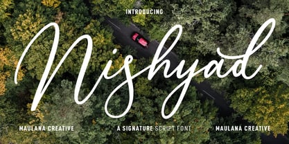 Nisyhad is an unique signature script font. With regular contrast stroke, fun character with a bit of ligatures and alternates. To give you an extra creative work. Nisyhad font support multilingual more than 100+ language. This font is good for logo design, Social media, Movie Titles, Books Titles, a short text even a long text letter and good for your secondary text font with sans or serif. Make a stunning work with Nisyhad font. Cheers, MaulanaCreative
 - Destinys by Maulana Creative,
$14.00 Destinys Script and Sans Font Duo is a modern script and display sans font. With regular marker stroke and bold sans stroke, fun character with some of ligatures. To give you an extra creative work. Destinys Script and Sans font support multilingual more than 100+ language. This font is good for logo design, Social media, Movie Titles, Books Titles, a short text even a long text. Make a stunning work with Destinys Script and Sans font. Cheers, MaulanaCreative
 - Oblonga by Eurotypo,
$28.00 Oblonga shows thin, elegant lines. The continuity of the trace is only suggested through the curves of the letters, a soft effect of bonding that maintains the identity of each character. Oblonga is an Art-Déco font proposed in a modern key, a revival performed without aggression. More than three hundred glyphs (regular and Italic) that ensure legibility in Central-European and Slavic languages, enriched by some appropriate discretionary ligatures that enhance the charme of a time gone away.
 - Oldion by Locomotype,
$19.00 Oldion is a captivating display font, draws inspiration from the boundless realms of science fiction and modern technology. With its distinctive and futuristic accents adorning each letter, Oldion breathes life and dynamism into your projects. Available in both regular and rounded styles, infuses a touch of innovation and intrigue into your designs. Oldion is your ideal choice for a wide range of creative applications, from commanding movie posters and attention-grabbing headlines to captivating packaging and distinctive logotypes.
 - Argot by K-Type,
$20.00 Argot is inspired by condensed grotesque letterforms and would be a monolinear sans except for an unorthodox disparity between inner and outer shapes. Elegantly curved outlines contrast starkly with austere rectangular counters, suggesting a no-frills functionality, 20th century modernism, or an unsettling discordance. The squared off inner spaces also add clarity and crispness. Argot is available in three widths — Wide, Normal and Narrow. Each width is supplied in three weights — Regular, Bold and Black — with corresponding italics (obliques).
 - Hitshot Signature by Maulana Creative,
$12.00 Hitshot is an expressive signature brush script font. With regular brush stroke, slanted and fun character with some of ligatures and lowercase alternates. To give you an extra creative work. Hitshot font support multilingual more than 100+ language. This font is good for logo design, Social media, Movie Titles, Books Titles, a short text even a long text letter and good for your secondary text font with sans or serif. Make a stunning work with Hitshot font. Cheers, MaulanaCreative
 - MC Rasteira by Maulana Creative,
$16.00 Rasteira is an elegant classical display serif font. Regular contrast stroke, fun character with a bit of ligatures and alternates. To give you an extra creative work. Rasteira font support multilingual more than 100+ language. This font is good for logo design, Social media, Movie Titles, Books Titles, a short text even a long text letter and good for your secondary text font with script or serif. Make a stunning work with Rasteira font. Cheers, Maulana Creative
 - Drawlers by Letterhend,
$14.00 Drawlers is a organic sans with stencil versionthat effortlessly infuses your designs with a touch casual and a dash of classic. Its unique type- maekt it perfect choice for any projects especially in logo, and the other various formal forms such as invitations, labels, logos, magazines, books, greeting / wedding cards, packaging, fashion, make up, stationery, novels, labels or any type of advertising purpose. Features : Regular & Stencil Version Uppercase & lowercase Numbers and punctuation Alternates & Ligatures Multilingual PUA encoded
 - Humanism by Prominent and Affluent,
$30.00 Inspired by the urban typography, which later led to a grotesque style. It can be used for bold editorial statements graphic heavy prints or just as a simple logo. This new type will definitely make your designs stand out and unique. Its robust, strong and contemporary form makes it perfect for any project that needs the extra strength. Humanism is available from A to Z in the regular and italic style, developed in an urban style.
 - Maryam by Outras Fontes,
$24.00 Maryam is an Outras Fontes type family designed by Ricardo Esteves Gomes. With moderate contrast, these fonts have elegant and very legible forms even in small x-height sizes. There are more then 70 ligatures in each font, providing a lot of letterform variations that make this type family looks like a real handwriting on a page. It is currently available in two versions (Regular and Alternate) that you can combine with each other as you wish.
 - Apothecary by Pixel Colours,
$26.00 Apothecary is a modern stylish font duo that includes a sweet flowing script font and a typewriter font made from an authentic typewriting. Combine both fonts to create beautiful logos and branding. Design professional apothecary and botanical labels and packaging or make elegant wedding invitations. Includes: Apothecary regular: a script flowy monoline font Apothecary typewriter: an antique typewriter font perfect for small texts, taglines or info Lowercase and uppercase characters Numerals, alternates and ligatures. Language support
 - Lalalo by Cuda Wianki,
$25.00 Lalalo is a casual, modern sans-serif font family based on hand-lettering. It's oval letter shapes provide soft and friendly appearance. Lalalo font is very legible with a warm touch perfectly suited for children books. Lalalo family consists of 6 weights ( Extra Light, Light, Regular, Semibold, Bold, ExtraBold). You can use it with normal fill or outlined. You can mix various colors and stroke widths to gain interesting results. There is also a set of nice frames available.
 - Greenhorn by Juraj Chrastina,
$29.00 Greenhorn is a hand-traced comic type for headlines. Funky, irregular and smiling. The first inspiration comes from the unique lettering of a classic czech cartoonist.
 - Agrafie by Linotype,
$29.99This typeface was developed by Roland John Goulsbra in 1995. Almost like the printing of a child, the irregular forms of Agrafie make a unique impression. - Roundel by K-Type,
$20.00 Roundel is a paradoxical, modern heraldic typeface. It is a display face of simple, angular and curved shapes, with each main glyph contained within a circle.
 - Cumbre by Antipixel,
$22.00 Cumbre is a slanted display type with unorthodox anatomy, a dynamic rhythmic structure, movement expression, and intense visual language. An eccentric rebel with ribbon-like moves, a balanced extrovert that makes meticulous use of ink traps. Both the name and design got inspiration from mountain peaks. "Cumbre" in Spanish means summit, and that's the motive for the spiked design and the angular serrated structure. Cumbre is built by balancing sharp angles and venturous curves. The stems are spiky, and they vary in width. Cumbre is slanted and unicase. It has condensed proportions, moderate weight contrast, spacious counters, pointy terminals, and square ink traps. Cumbre is meant for large display settings to make the most out of the precise outlines and the clean intersections. The font styles: 'Sharp' has straight paths and precise intersections. 'Round' has the same outlines but with round corners. 'Stamp' has irregular wavy contours and heavy swelling at intersections.
 - Foobar Pro - 100% free

- Alloca Mono by Daniel Gamage,
$29.99 To break from the rigidity of a typical monospaced font, Alloca includes weights that go above and beyond. From the wire-thin to the ultra-bold, you’ll be able to do a lot with one monospaced family. With OpenType features like slashed zeros, old style numerals, and case-sensitive forms, Alloca is versatile. It's great for displaying code, showcasing data, or even flowing your body copy. It has broad language support, too, with localized forms for Vietnamese, Polish, Catalan, and Dutch, to name a few.
 - Lytiga Pro by Mint Type,
$- Lytiga Pro is a modern sans-serif typeface with a pronounced techy feel. The family contains 48 fonts: 8 weights from thin to black, 3 widths, and italics. Each font includes a variety of OpenType features: four sets of digits, superior and inferior digits, slashed zero, and a full set of small caps. Rich language support includes all the main Latin-based languages as well as Cyrillic script. The rhythm and character of the typeface makes it suitable for both display and text use.
 - 6th Aniversario by deFharo,
$21.00 6th Aniversario is a rounded condensed typography, handwritten and elegant, perfect for writing good advertising titles in graphic design of posters, flyers or publications in general where space saving and readability is required. Includes the Bitcoin symbol (ligatures): b# The Commercial version includes: - 492 glyphs. Latin Extended-A • OTF & TTF - OpenType Functions: Fractions, Alternate Annotation Forms, All Alternates, Superscript, Superiors, Slashed Zero, Superior letters, Localized Forms, Numbers Small Caps, Inferiors, Scientific Inferiors, Discretionary Ligatures, Numerators, Standard Ligatures, Subscript, Extended Fractions, Ordinals, Denominators, Oldstyle Figures, Historical Forms.
 - Gallicide by MuSan,
$12.00 Gallicide is a Handmade Modern Vintage Textured Display Typefaces. This fonts is combining the style of modern handwritten style and classic vintage looks. It comes with 3 Styles (Rough, Reglar and Outline). This font will look good on any retro design like poster, t-shirt, label, logo etc.
 - FS Brabo Paneuropean by Fontsmith,
$90.00Worldly Even though it’s a new arrival, FS Brabo has seen the world. Designed by a Brazilian working in London and studying in Belgium under a Dutchman, it’s certainly well-travelled. And it was inspired by the extraordinary archive of early book typefaces at the world-renowned Plantin-Moretus Museum in Antwerp, while Fernando Mello was attending Frank Blokland’s Expert class Type Design course at the Plantin Institute of Typography. It was there that Fernando became engrossed in the collection of early metal type, matrices, punches and type samples by figures such as Garamond and Granjon. So much so that he took on the mighty task of developing ‘a beautiful, functional, serifed text font’ of his own. Heroic FS Brabo’s journey from sketch to font family took an epic three years, starting in Antwerp, continuing at Fontsmith in London, and reaching its conclusion back in Fernando’s home city of São Paulo. No wonder Fernando was reminded of another titanic face-off: that of Antwerp’s Roman hero of legend, Silvius Brabo, and the evil ogre, Antigoon. Brabo came to the town’s rescue after the tyrannical giant had been charging ships’ captains extortionate taxes and chopping off the hands of those who refused to pay up. Having finally downed Antigoon after a long and terrible duel, Brabo cut off the giant’s own hand and threw it into the river Scheldt, unwittingly giving the town its name: the Dutch for ‘hand-throw’ is hand werpen. What better way for Fernando to name his literary typeface than after the hero of Antwerp’s oldest tale? The garalde factor FS Brabo is not a revival, but a very much a contemporary, personal interpretation of a garalde – a class of typeface originating in the 16th century that includes Bembo, Garamond and Plantin, with characteristically rounded serifs and moderate contrast between strokes. Brabo’s ‘ct’ and ‘st’ ligatures, upper-case italic swashes and contextual ending ligatures – ‘as’, ‘is’, ‘us’ – all preserve the beauty and character of traditional typefaces, but its serifs are chunkier than a garalde. Their sharp cuts and squared edges give them a crispness at text sizes, helping to bring a beautifully bookish personality to hardworking modern applications. A workhorse with pedigree It may give the appearance of a simple, four-weight typeface, but FS Brabo has hidden depths beneath its simplicity and beauty. OpenType features such as cap italic swashes, contextual ending swashes – programmed only to appear at the end of words – and stylistic alternatives make this a complete and well-equipped typeface. Comprehensive testing was carried out at text and display sizes, too, to prevent counters from filling in. All of which makes FS Brabo a very modern take on a traditional workhorse serif typeface: colourful and versatile enough to adorn not just editorial projects but also signage, advertising and logotypes. - FS Brabo by Fontsmith,
$80.00 Worldly Even though it’s a new arrival, FS Brabo has seen the world. Designed by a Brazilian working in London and studying in Belgium under a Dutchman, it’s certainly well-travelled. And it was inspired by the extraordinary archive of early book typefaces at the world-renowned Plantin-Moretus Museum in Antwerp, while Fernando Mello was attending Frank Blokland’s Expert class Type Design course at the Plantin Institute of Typography. It was there that Fernando became engrossed in the collection of early metal type, matrices, punches and type samples by figures such as Garamond and Granjon. So much so that he took on the mighty task of developing ‘a beautiful, functional, serifed text font’ of his own. Heroic FS Brabo’s journey from sketch to font family took an epic three years, starting in Antwerp, continuing at Fontsmith in London, and reaching its conclusion back in Fernando’s home city of São Paulo. No wonder Fernando was reminded of another titanic face-off: that of Antwerp’s Roman hero of legend, Silvius Brabo, and the evil ogre, Antigoon. Brabo came to the town’s rescue after the tyrannical giant had been charging ships’ captains extortionate taxes and chopping off the hands of those who refused to pay up. Having finally downed Antigoon after a long and terrible duel, Brabo cut off the giant’s own hand and threw it into the river Scheldt, unwittingly giving the town its name: the Dutch for ‘hand-throw’ is hand werpen. What better way for Fernando to name his literary typeface than after the hero of Antwerp’s oldest tale? The garalde factor FS Brabo is not a revival, but a very much a contemporary, personal interpretation of a garalde – a class of typeface originating in the 16th century that includes Bembo, Garamond and Plantin, with characteristically rounded serifs and moderate contrast between strokes. Brabo’s ‘ct’ and ‘st’ ligatures, upper-case italic swashes and contextual ending ligatures – ‘as’, ‘is’, ‘us’ – all preserve the beauty and character of traditional typefaces, but its serifs are chunkier than a garalde. Their sharp cuts and squared edges give them a crispness at text sizes, helping to bring a beautifully bookish personality to hardworking modern applications. A workhorse with pedigree It may give the appearance of a simple, four-weight typeface, but FS Brabo has hidden depths beneath its simplicity and beauty. OpenType features such as cap italic swashes, contextual ending swashes – programmed only to appear at the end of words – and stylistic alternatives make this a complete and well-equipped typeface. Comprehensive testing was carried out at text and display sizes, too, to prevent counters from filling in. All of which makes FS Brabo a very modern take on a traditional workhorse serif typeface: colourful and versatile enough to adorn not just editorial projects but also signage, advertising and logotypes.
 - Kiperman by Harbor Type,
$29.00 🏆 Selected for Tipos Latinos 9. 🏆 Selected for the 13th Biennial of Brazilian Graphic Design. 🏆 Hiii Typography 2018 Merit Award. Kiperman is a text typeface designed in honor of Henrique Leão Kiperman, founder of the publishing house Artmed, now Grupo A. Its forms are simple and straightforward, with no unnecessary embellishments that could disturb the reading. The fonts are slightly narrower than normal, which yields higher efficiency without compromising reading comfort. Besides that, its italics are not just a slanted version of the romans, but rather a separate drawing. With a slope of 8°, its calligraphic structure provides the right amount of emphasis when necessary. The Kiperman typeface works best when setting books, magazines, ebooks and websites. It will also work very well in branding and packaging projects where a sober typeface is needed. The inspiration for the design came from the personality of the honoree. Just as Henrique always wanted to stay away from spotlights, the Kiperman typeface was designed so that it would not call attention to itself or impose any obstacles in the understanding of the text. In this way, the fonts revere Henrique’s legacy by respecting and honoring the published content. Henrique Leão Kiperman began his career in 1958, selling medical books in travels through the interior of the Brazilian states of Paraná and Santa Catarina. In 1973, he opened a bookstore in downtown Porto Alegre, the Artes Médicas Sul, and a few years later edited his first book. Since then, his company has grown to become one of the most important publishers in Brazil in the area of scientific, technical and professional books, with more than 2400 active titles distributed among the McGraw Hill, Bookman, Artmed, Penso and Artes Médicas imprints. Henrique passed away in 2017 at the age of 79. The Kiperman type family has been commissioned by Grupo A and is available for licensing. This was the way found for the fonts to be read by more people, spreading some of his spirit around the world.
 - Motorway by K-Type,
$20.00 MOTORWAY is the companion typeface to TRANSPORT, the British road sign lettering. The Motorway alphabet was created for the route numbers on motorway signage, and is taller and narrower than the accompanying place names and distances which are printed in Transport. However, for Motorway Jock Kinneir and Margaret Calvert created only the numbers 0 to 9, the capitals A, B, E, M, N, S and W, ampersand, slash, parentheses and a comma. So, although the lettering made its first appearance on the Preston bypass in 1958, K-Type Motorway is the first complete typeface and contains all upper and lower case letters, plus a full complement of punctuation, symbols and Latin Extended-A accented characters. As with the Transport alphabet the starting point was Akzidenz Grotesk, Motorway taking inspiration from condensed versions. Changes were mainly driven by a quest for legibility, resulting in some reduced contrast between horizontal and vertical strokes, and Gill-esque straight diagonal limbs on the 6 and 9, and high vertex for the M. Kinneir and Calvert designed the limited range of characters in two weights; a SemiBold 'Permanent' weight for use as white letters on blue motorway signs, and a Bold 'Temporary' weight for heavier black letters on yellow non-permanent signage. In addition to creating full fonts in both original weights, the K-Type family adds a new Regular weight, plus a set of italics, completing a highly usable condensed typeface which, while rooted in history, is fully functional for both print and web usage. The K-Type fonts are spaced and kerned normally, simply increase the tracking to recapture the generous spacing of motorway signage.
 - Soul Lotion by TypoGraphicDesign,
$19.00 CONCEPT/CHARACTERISTICS The typeface “Soul Lotion” is a sans serif font for display sizes. Constructed, clear and simply with monoline character. The round and unadorned look is modern & simple. APPLICATION AREA The modern, clear and simply sans serif font “Soul lotion” would be happy as a display typeface in headline size on the following areas and there simply feel good: Logos/Wordmarks, party flyer, album covers, CD covers, Poster design, video game design, and much more as display typeface for print and digital magazines, books and websites. TECHNICAL SPECIFICATIONS Headline Font | Display Font | Sans Serif Font “Soul Lotion” OpenType Font (Mac + Win) with 6 styles (regular, bold, light + 3x italic) & 354 glyphs. Incl. accents, alternative letters, ligatures & €. Desktop Font (.otf) + Web Font (.svg, .eot, .woff) KONZEPT/BESONDERHEITEN Die Schrift »Soul Lotion« ist ein serifenloser Font für Headlinegrößen. Konstruiert, klar und einfach mit gleichbleibender Strichstärke. Die runden und schnörkellosen Formen wirken modern & schlicht. EINSATZGEBIETE Die moderne, klare und einfache Sans Serif Schrift »Soul Lotion«, würde sich als Auszeichnungsschrift in Headlinegröße über folgende Einsatzgebiete sehr freuen und sich dort schlicht wohlfühlen: Logos/Wortmarken, Flyer für fast jede Party, PlattenCover, CD-Cover, PlakatDesign, Videospiel Design, als Headlineschrift für print und digitale Magazine, Bücher und Webseiten u.v.m. TECHNISCHE INFORMATIONEN Headline Font | Display Font | Sans Serif Font »Soul Lotion« OpenType Font (Mac + Win) mit 6 Schriftschnitten (regular, bold, light + 3x italic) & 354 Glyphen. Inkl. diakritisches Zeichen, alternative Buchstaben, Ligaturen & €. Desktop Font (.otf) + Web Font (.svg, .eot, .woff)
 - Mirielle by Typadelic,
$19.00Mirielle is curvy yet angular at the same time. Whimsical yet orderly. As with all Typadelic fonts, this script typeface is unique and original, with a playful twist. - Barranom by PojolType,
$12.00 This Barranom font is great for logos, branding, apparel and headlines. This typeface encapsulates a wide variety of nuances, apparently, opposing elements like technology with friendly angular shapes.
 - Monoline Deco JNL by Jeff Levine,
$29.00 Monoline Deco JNL is a thin, elegant typeface that is reminiscent of the Art Deco Streamline influence of the 1930s and 1940s, complete with angular and truncated characters.
 - Qasiru by Phoenix Group,
$13.00 Qasiru is a messy handwriting font with a theme of fun and love, it has bold and irregular lines, but fits perfectly in the whole lettering. Thank you
 - Duos Pro by Underware,
$50.00 Duos Pro, a script for illusionists, comes in 10 styles. Whatever style you pick: apply this speedy monolinear handwriting font in large sizes, because it is made for catching the attention. Take Duos Sharp, which comes with speedy strokes and sharp endings in light, regular and black weights. Or pick Duos Round, and its 3 styles with a softer voice and round endings. Some people call those endings “funky ball noses“, an odd but appropriate description. Round styles look more like round tip speedball lettering, but contrary to most speedball letterings they're written with a very high speed. Especially Duos Round Black is more cuddlesome than its sharper counterpart. For an even more intuitive feel, we added two more sets: Duos Brush & Duos Paint. Duos Brush combines monoline strokes with brush beginnings and endings, for that graphical, freshly lettered touch. A closer look will reveal how its brushed tails vary all the time. Duos Paint is made up out of rough & artistic painted strokes, with all its accompanying shortcomings. In contradiction to the finesses of lighter weights, Duos Paint Black scores in being the most nonchalant and impressionistic. Poésie brutale! As well as having the option to choose between (or mix) these 10 styles, Duos Pro has additional hidden functionalities. For example, every style has many alternate lettershapes and ligatures, offering various different results and lengths to display every single word. Or manually add one of the swashes for more emphasis. A bonus font, Duos Tools, includes tool icons, strokes and banners. If that ain’t enough, throw in some polysemic letters for smart, ambiguous communication if you like. Want to become a signpainter? Then be a signpainter. Always wanted to be an artist? This is your chance! Duos Pro boosts your look. Make your visual vocabulary as grandiose, dramatic, sensitive or picturesque as you want. But whatever you do, don't hesitate to apply Duos Pro “short & big”!
 - Square Cat by Lalelum,
$12.99 This is a blocky typeface with thick lines and no serifs. It's a modern design with a hint of vintage lettering with a thicker vertical line on one side of each letter. Most letters are square shaped. The two styles are regualar and hollow, with the hollow style having the thicker areas hollowed out.
 - Grafilone by Linotype,
$29.99Linotype Grafilone is part of the Take Type Library, which features winners of Linotype’s International Digital Type Design Contest. In creating his font, Bo Berndal combined elements of the constructed and Art Deco styles. Slender and angular, Grafilone is mechanically exact and coolly resesrved. A distinguishing characteristic is the combination of angular and sloping strokes, which give the font a dynamic feel. Grafilone is particular good as a headline font and for initials when combined with constructed sans serif fonts. - Rabiosa - Personal use only

- Released - Personal use only

- Domestic Manners - Unknown license


