10,000 search results
(0.048 seconds)
- Mordred - Unknown license

- Running shoe - Unknown license

- VomZom - Unknown license

- CarawayBold - Unknown license

- SF Chrome Fenders Condensed - Unknown license

- HURTMOLD_ - Personal use only

- Perestroika - Unknown license

- Nanosecond Thick BRK - Unknown license

- ambulance shotgun - Unknown license

- Kiloton - Unknown license

- SF Archery Black Outline - Unknown license

- Xtreme Chrome - Unknown license

- SF Collegiate - Unknown license

- stamPete - Unknown license

- ! Jamiroquai ! - Unknown license

- Jute Basket by Yumna Type,
$12.00 A beautiful and easy-to-style font duo to elevate your design, Jute Basket. What sets this font duo is the display font that is made all in caps characters. This design choice is sure to give title and header text a big presence on any pages. Unlike the display style, the script font less domineering though you can use it to express a feeling of joy, cute, and serene You also get 15 illustrations as special extra that you can use as you wish. Features: Multilingual Supports Uppercase and lowercase PUA Encoded Numerals and Punctuation This font would looks great on your branding, logos, social media quotes, stickers, posters, wall art, merchandise, social media, and many more. Get more inspiration about how to use it by seeing the font preview. Thank you for purchasing our fonts. If you have any further questions, don't hesitate to contact us. Happy Designing.
 - Nevaeh by Kufic Studio,
$15.00 Nevaeh which also stands for Heaven if read backward, it is a unique rounded and stylized font family. Nevaeh has a futuristic and minimalist look, and the creativity depends on the use of the font set. Nevaeh includes; Nevaeh Light, Nevaeh Light Italic, Nevaeh Regular, Nevaeh Italic, Nevaeh Bold, Nevaeh Bold Italic, Nevaeh Extra Bold, & Nevaeh Extra Bold Italic. The font has a simple and minimalist factor with all main characters, the font is specially made for those who are in the printing and branding fields.
 - Jamel by Sensatype Studio,
$15.00 Jamel is a Modern Luxury Elegant Sans Serif Font with Sharp shape make your design look classy and elegant A new San Serif Font that we created special for Headline, Title and more stand out typography needs, with extra ligature that will add your variations. It's so perfect to add your style and headline overview. And specially for Luxury font, we crafted for unique style and modern feels so enjoy to create any project that will show your main idea out. Jamel Modern Luxury Elegant Sans Serif Font ready with: Any options to get creative variations (combination of Ligature Characters) Preview as a inspirations that you can do with Jamel font Ready with All characters Wish you enjoy our font. :)
 - Crafting Island by Tigade Std,
$20.00 Crafting Island. You are right!! This font that is intended for the crafting world (not only island). This is a cute, happy, sweet font that is suitable for any theme or seasonal use. It can enhance your crafting products for a better look. It comes with some alternate glyph that are accessible via All Alternate (easy access by using Adobe Illustrator or Photoshop). It is suitable for Logo, Cards, Branding, Social Media, YouTube Thumbnail, Advertisement, Posters, any many others. Features: - Standard Characters (Uppercase and Lowercase) - Numerals - Punctuation - International Characters - Ligatures - Alternate Characters Extras: - Crafting Island Paintbrush Style - Crafting Island Flower Style Disclaimer: Clips arts shown in the posters/images are not included. It is for promotional purpose. Enjoy designing and stay safe! Tigadestd
 - HandMade by Misprinted Type,
$39.00 Handmade is based on my own handmade lettering, which is inspired by vernacular and ornamental type. It has the naive personality from street hand-painted signs from Brazil and that charm and elegance of vintage ornamental fonts. Each letter has its own style and the font comes with 2 uppercase variations, meaning you can mix them in order to write words without repeating the same character. The font has a handmade warmth feel to it, which is ideal for projects that demand the craftsmanship look or just that modern, grunge, fun type that goes well with tons of different styles. If that was not all, Handmade also comes with an EPS vector set with 16 vector and hand-drawn ornaments! Enjoy!
 - Saint Mighuel by Scratch Design,
$10.00 Introducing Saint Mighuel modern script font, using handdrawn technique by using a dry brush effect to get a rich texture. This font is very beautiful for wedding invitation design, logotype, quote, name card, header, fashion design, YouTube video thumbnails, social media, video tittle, etc. This font uses modern style in calligraphy to make it look dynamic in every trend of design. This style is very popular and authentic for so many design occasion. You can use this font to make any creative art lettering with your own characters, make a beautiful project, promote your brands or projects. Please enjoy this font and make a beautiful design..have fun! Product Content : • Character Set A-Z • Numerals & Punctuations • Multilingual characters • Ligature • Stylistic Alternates
 - Stormy Youth by LomoHiber,
$16.00 I'm happy to present my Stormy Youth font. It has been drawn with a marker pen and a swift hand. Stormy Youth has intentionally overlapping letters to remind street style and give an underground look. Initially, I planned to make it as only uppercase, so feel free to use it this way. Stormy Youth is great for aggressive/rebel design style for teenagers. Stormy Youth Features: Can be used as uppercase font Set of alternates and ligatures for most common double letters Carefully tuned kerning (preview above doesn't always show it correctly for some reason) Swashes Wide Latin language support If you have some issues or questions, please let me know: lhfonts@gmail.com Hope you'll enjoy using Stormy Youth! You may also like my new font fracaso
 - Yearling by Chank,
$99.00 The Yearling fonts are inspired by old propaganda poster letter forms of the 20th century. However, they're also intended to work well in modern communications as well. Yearling was originally created to look good via fax (LOL!), and because it's based on a very rigid grid (like pixels on your screen), this font family also works well on smartphones and modern tablets, too. Short on curves and diagonals, these letterforms are a celebration of horizontal and vertical. But most importantly, this font is simple and clean and clear and direct. Nothing fancy here, just the facts, as modern as can be. Recently updated with extra language support for many voices across the world.
 - Lighters by Sarid Ezra,
$15.00 Lighters is a light and minimalist logo font family with unique lowercase that will make your logo and design looks more clean and simple. With three weight styles that you can use together will make your design more cool . You can use this font for any purpose, especially to make logotype and poster design. You can mix and match the uppercase and lowercase to make your logo more advanced. This font also comes with number, symbol, and multilingual support!
 - This Little Piggy by Hanoded,
$10.00 This Little Piggy is a cute, kiddy-style font. A little haphazard, a little messy, but funny and happy. Great for wishing-well cards or books.
 - Ebony by TypeTogether,
$35.00 Some typefaces need time to ripen; Burian and Scaglione made the first sketches for Ebony back in 2008, but it took a few years of maturing in a drawer to be developed into a multi-functional type family. While keeping in tune with TypeTogether’s focus on complex typographic structures needed for magazine, newspapers and books —whether printed or digital—, Ebony goes far beyond editorial use and promises great performance in branding and advertising. The range of dark weights with taut and powerful curves can boost any headline, while the lighter styles create an approachable and clean feel in blocks of continuous text. Ebony does not fall short on aiding legibility either; letterforms have a distinct direction of ductus and features like the top serif on ‘l’ help making them clearly distinguishable from each other. It is a type family that cleverly seeks a balance between the openness and legibility of humanist sans serifs and the striking and more regularised character of grotesques. The letter-shapes feature generous counters and open terminals with crisp angles, and daringly grow both in colour and width as the fonts get bolder. Infused with this strength, Ebony also shows a quirky side in some of her shapes; the vertical fractions, the at-symbol, the old-style numbers, … The predominantly slanted style of the italics is broken up in some letterforms, such as ‘a e f l’, that are more in line with a classic cursive appearance. This, together with a forceful italic angle, ensure a change in texture within a block of text, despite sharing the same letter weight and width with the uprights. With 18 styles, tending towards the heavier part of the weight-spectrum, this face has a powerful quality!
 - Bibliophile Script by Sudtipos,
$79.00 A friend once jokingly told me that what I really do is mine extinct arts for parts to use in modern things, like going to the scrapyard to pick up bumpers, quarter-panels and dashboards off of Datsuns and Ponies to build a shiny new Ferrari. I still kind of grin at that, but I certainly do spend a lot of time looking at old things and imagining ways they would work today. This shiny new Ferrari here is called Bibliophile, and it contains scrap heap parts from various pages by Louis Prang, the Prussian-American printer and publisher who inspired my Prangs fonts. This is my second engagement with the late 19th century man, and it’s quite a bit more intricate than just an italic Didone with a connected lowercase. Bibliophile marries Round Hand calligraphy with Italian capitals, two styles not often relayed in the same alphabet, but work together beautifully when combined well. When you combine them well with a few long-practised tricks of the trade, then mix in a few trusted features from my previous work over the years, you get my usual crazy exuberance, like 17 different shapes for the d, 21 different forms for the y, endings, beginnings, swashes, ornaments, and so on. It’s no secret that I can get carried away when I’m so consumed by an idea. — Bibliophile comes in 2 weights, each of them with over 900 glyphs covering all the latin languages. Bibliophile also comes with a bold weight, something I’m always reluctant to do with something as adventurous and complex as the structure of this historical mashup. But I couldn’t chase away the idea of increasing the contrast while maintaining the hairlines in a lowercase this narrow. Part of it was the curiosity about the outcome, and part was the sheer challenge of it. I think it turned out OK. Words set in either weight will show delicateness and elegance, and the more time you spend inside the font and micro-manage the setting, the more ways you will find to magnify either. Bibliophile can be as muted or luxurious as you want it to be. This is the kind of alphabet that fits well in fashion marketing and high-end packaging, from the very subdued to the super-exquisite. Enjoy the gleaming new vehicle made with freshly polished old parts.
 - McKnight Kauffer by K-Type,
$20.00 McKnight Kauffer is a casual sans derived from poster and book cover lettering by the American designer, Edward McKnight Kauffer, who mainly worked in England through the 1920s and 1930s. The style owes much to Louis Oppenheim's Fanfare of 1927, but without the Germanic blackletter inflection. The two display fonts, regular and outline, have a playful art deco feel, and share spacing and kerning so can be overlapped for bicolor effects.
 - Victorian Alphabets W by Intellecta Design,
$20.00 Victorian Alphabets is a incoming family of complete victorian style alphabets, researched and developed upon a comprehensive number of vintage books, magazines and catalogues from XIX century. The "Victorian Alphabets W" font has just W' designs, performing 52 different W's to your use. Here at MyFonts you can get more TWENTY fonts of this family, wih a very and atractive array of alphabets and letters to complete your artwork
 - Tieban by WNGSTD,
$10.00 Tieban font family is composed of 14 styles that perfectly complement each other. You can use them to create a logo or use for your business, branding, t-shirts, book covers, stationery, marketing, blogs, magazines, and more. Language support 29 languages: Afrikaans, Albanian, Basque, Belarusian, Danish, Dutch, English, Estonian, Faroese, Filipino, Finnish, French, Galician, German, Icelandic, Indonesian, Irish, Italian, Macedonian, Malay, Mongolian, Norwegian Bokmål, Portuguese, Russian, Serbian, Spanish, Swahili, Swedish, Zulu
 - Christmas Valentine by Mvmet,
$16.00 Christmas Valentine is a lovely comic display font. You can use it for anything ranging from t-shirts, book designs, and greeting cards to stickers and posters, or anything that needs a casual touch. If you want to use it for Christmas or Valentine themed designs, it will be your perfect font to pick. Fall in love with its incredibly versatile style, and use it to create lovely designs!
 - Soothing Along by Mvmet,
$18.00 Soothing Along is a fun and playful grunge handmade font. You can use it for anything ranging from t-shirts, book designs, and greeting cards to stickers and posters, or anything that needs a casual touch. If you want to use it for Christmas or Valentine themed designs, it will be your perfect font to pick. Fall in love with its incredibly versatile style, and use it to create lovely designs!
 - Groovy Christmas by Mvmet,
$16.00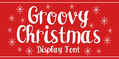 Groovy Christmas is a playful script display font. You can use it for anything ranging from t-shirts, book designs, and greeting cards to stickers and posters, or anything that needs a casual touch. If you want to use it for Christmas or Valentine themed designs, it will be your perfect font to pick. Fall in love with its incredibly versatile style, and use it to create lovely designs!
 - Black Circuit by Greentrik6789,
$18.00 This font is inspired by electronic circuit board which have stripes of various thicknesses. With very high contrast, this font is perfect for posters, banners, movie tittles, book tittles, advertising, and various other needs. The Black Circuit font also comes with an outline style that you can use to add a futuristic feel to your designs. Create your unique design with various alternative characters available in the Black Circuit font.
 - Richard Kailay by Silverdav,
$18.00 Introducing, Richard Kailay font, with an elegant style, is here to give a luxurious impression to your design, made with consistent strokes so as to produce works that will perfect your design, there are many alternates and ligatures to add a luxurious impression to your design. Richard Kailay is very suitable for Branding, Logos, Magazines, handicrafts, quotes, book covers, wedding invitations, and more. If you have any questions, Please Contact Us
 - Nouveau Riche JNL by Jeff Levine,
$29.00 Within the pages of an early-1900s instructional book on show card lettering was found a marvelous example of an alphabet that typifies the Art Nouveau movement of the era and served as the inspiration for Nouveau Riche JNL. Angular, artistic and reminiscent (in some ways) of ancient Greek lettering, this design has many unusual letterforms. Check out the interpretive K and R for the best examples of this art style.
 - Donnager by Harvester Type,
$15.00 Donnager is a rough, hard and futuristic typeface. It is inspired by square shapes, dystopia and futurism. The name is inspired, like the font itself, by the Dead Space universe. I can just see this font on the cover of some dystopian comic book! The font has alternate glyphs. The uses are unlimited, as there are different styles, weights, and even a variant version. Logos, posters, headers, branding, prints and more!
 - Kazootie by Chank,
$99.00 Kazootie was inspired by cut-paper shapes and named after the hand puppet character Rootie Kazootie in a 1950s children's television show. Kazootie is a light-hearted and fun display font with a big, strong voice and crisp confident stride. Best for headlines and larger text in picture books, Kazootie is all caps, but you can type your letters in uppercase or lowercase to access two different variants of the style.
 - Comic Adore by Mvmet,
$16.00 Comic Adore is a fun script display font. You can use it for anything ranging from t-shirts, book designs, and greeting cards to stickers and posters, or anything that needs a casual touch. If you want to use it for Christmas or Valentine themed designs, it will be your perfect font to pick. Fall in love with its incredibly versatile style, and use it to create lovely designs!
 - Bentley Floyd by Differentialtype,
$10.00 Bentley Floyd is a display font family designed to enhance the appearance of any document or presentation you create. This font can also be used for logo fonts, brochures, pamphlets, billboards, book covers, magazine covers, or product promotions. This font will support the appearance of every product promotion that you make. This font consists of 18 styles from thin to black, which will add more options to your mix.


