10,000 search results
(0.02 seconds)
- Capo by Alias,
$60.00 The intention with Capo was to make a typeface with a pinched, angled connection between curves and verticals. We have explored this incised, cut motif previously on typefaces, most notably Noah, Sabre and Harbour. These have focussed more specifically on stone-cut forms. For Capo we wanted to mix the expressive quality of its ‘pinch’ idea with an overall aesthetic that could be applied to text rather than headline. So Capo has something of the function and warm, organic quality of Grotesque style typefaces. In Capo’s Bold and Black weights the sharpness of the letter shapes is more dramatic and emphasised, making for great effect for large-sized text. Why Capo? A capo is a device used on the neck of a stringed (typically fretted) instrument to shorten the playable length of the strings by pinching or clamping them in place, hence raising the pitch.
 - Nature Boy by Adorae Types,
$20.00 Nature Boy was born in a fantasy world of old, where you can find magic, elegance, dreams and fun all together... just like nature in its purest form with its leafy curves and shapes that make it peacefully enjoyable. Soft and simple yet fairly ornamental, attributes that create an enchanting atmosphere but keep the texts legible at the same time when combined. Nature Boy can bring life and magic to every design, from editorial to posters, brands and packagings. Just picture this font on any product intended to move your soul and take you on a journey into a different and most beautiful place and time and let the adventure begin. This font family is made up of optically corrected regular, italic and bold types. All of them contain functional ligatures with alternative glyphs for texts and words to be dynamical and fluently graphed.
 - Private Sans by ParaType,
$30.00 Private Sans is a three styles family of humanistic sans serif based on broad pen calligraphy. Its noticeable distinctions -- a vivid irregular nature which is not typical for usual Cyrillic text faces. Characters of the font have visible “inthasis”, soft terminals and slanted axis in internal ovals. The name of the font reflects an intention to design a typeface for personal messages. It can be used in blogs, e-mails, personal Web pages -- the places where author wants to show his personal attitude and invite visitors to enter his intimate space. It also usable for memoirs, autobiographies, interviews, and for those kind of literature that deals with feelings and emotional experience. The font family was designed by Olga Karpushina on the base of her graduate work of Type and Typography course in British Higher School of Art and Design. Released by ParaType in 2010.
 - UniOpt by ParaType,
$25.00 An experimental font designed by Viktor Kharyk in Op Art style. UniOpt is based on free brush technique similar to experimental lettering of the early decades of the 20th century; for instance to ‘Graficheskaya Azbuka’ (‘Graphic ABC’) by Peter Miturich and works by Victor Vasareli. The face is legible even at small sizes and quite useful to an original display matter, initials and logos. The rigid double-wide structure allows to create complicated decorative works using vertical composition. Interesting that diacritical marks are also placed inside of character square fields and don’t destroy geometrical order. The decorative abilities of the font are increased by inverted versions of characters that may be used in different combinations including in color. The character set contains expanded Latin, Greek and Cyrillic ranges. UniOpt was awarded for type design excellence at TypeArt’05 Contest in Moscow. Licensed by ParaType in 2006.
 - Paranoid Android by Comicraft,
$29.00Fonts are Inhuman and Human Fonts are IN! Now, the Comicraft Cybernetics Corporation is proud to announce the first in a new line of fonts with GFP... Genuine Font Personalities. Paranoid Android is an outer alloy, inner void, solitary solenoid GFP prototype -- you can tell, can't you? Finally a font that knows its place as a digital servant to the human race. What will Comicraft think of next? No, don't bother to answer that, Comicraftsmen are fifty thousand times more intelligent than you and even they don't know the answer. Warning: Nothing left to be enjoyed, every diode rheumatoid*, terminally Paranoid Android is not so much a font, and more a kind of electronic sulking device. Share and Enjoy! *The moving parts on the left side of this font are in a solid state. It may sit in a corner and rust, or just fall apart where it's standing. - Quarzo by Corradine Fonts,
$39.95 This script font is inspired by the flexible nib strokes to create a concatenation of refinement with character mixing the contrast with pronounced but rounded angles. This angles along with the inktraps give the font a better performance when printing. Texts will have a very even rhythm due to its consistency on the stroke’s angle and spacing. The words can receive a dramatic touch by using the wide range of glyphs with curly and refined ornamentation. There are lots of caps and number variants dressed up with a variety of swashes. Also, two sets of versatile ornaments will be found: a first set of ending flourishes that match with any lowercase letter and a second set of independent flourishes to be placed around the words. Quarzo will give a great sophistication level to invitations, cards, tags, menus, advertising and packaging. Its character map covers Western and Central European characters.
 - Ongunkan All Runics Unicode by Runic World Tamgacı,
$250.00 The product of 5 months of work. This unicode font supports 1 latin and 16 ancient languages. When you install this font, the latin alphabet will appear if you do not have the appropriate software. Although there are other unicode fonts that print these ancient texts, this font has the design I use in all my fonts. That's the difference. You can easily use this font with related software. https://www.babelstone.co.uk/Software/BabelPad.html you can choose my font with babelstone babelpad software at this address and write it here and then copy and paste it to the relevant place. This font includes the following languages. Latin, Old Hungarian, Old Turkic, Old Italic, Runic, Tifinagh, Lycian, Lydian, Carian ,Phoenician, Cypriot, Ogham, Old South Arabian, Old North Arabian, Includes, Old Percian, and Ugaritic. This is a unicode font. Please learn how to use it and buy it.
 - ABTS Crestwing by Albatross,
$19.95 ABTS Crestwing is a unique initial font with extraordinary flexibility and beauty. There are 5 wing styles to choose from. The wings are accessed through typing numbers. The 5 pairs are: [1, 2] [3, 4] [5, 6] [7, 8] & [9, 0]. The odd numbers in the pairs will give you a left wing, and the even numbers will give you a right wing. The letters are separated into upper and lowercase. Uppercase has a crest point, the lowercase does not, giving you the ability to string letters together to form words and phrases, and place the tip of the crest above the letter of your choosing. Optional endcaps are available using the brackets on your keyboard "[, ]." This allows you to cap off a word if you wish not to use a wing to do so. Crestwing is both beautiful and unique, and works best at large sizes.
 - Clarks by PintassilgoPrints,
$45.00 Clarks is a modular typeface built from a work by Lygia Clark, one of the giants of Brazilian postwar art. Packed in a font equipped with clever OpenType programming, there are at least 7 different designs for each letter, thus allowing, or rather, proposing, boldly unconventional compositions. The font is programmed to cycle all these different lettershapes, avoiding repetition. The user can also manually pick up preferred forms in a glyph palette. There are choices to both keep and to defy readability and it's almost hypnotic to play with these. Lygia Clark used to invite viewers to touch her works and so we did with her 'Planes in Modulated Surface no. 4', from 1957: we fragment it and turned and inverted and recombined it. Now we return it as audacious typography and invite you to put it to work in your designs. Keep it bold and have fun! Cheers!
 - Marmellata Jar 02 by Fontscafe,
$39.00 So you just designed a night club brochure, and now need to change gears to help you make a design that oozes with love and togetherness? Let our Marmellata fonts help you get into the mood! A part of our Marmellata package and also available individually, the Jar 02 is something to be tried to be believed. This font takes you to that special place in your heart, reserved for your most cherished memories... It is great because of its simplicity, very much like all things from childhood! Don’t get us wrong though, this is not just a ‘childish’ font. While it would work great for children’s designs, we believe it would also be very fitting in designs that call for a touch of nostalgia, love, comfort, well-being and happiness. And yes, we agree that all children remind us of all of the above!
 - Chapman by James Todd,
$40.00 Chapman is the result of spending too many hours staring at the often all-capital engraver typefaces from long-gone foundries. The wide serifs, high contrast, and various widths seem to have so much character but also remain so neutral. From these references, Chapman began to emerge. It seemed natural that the lowercase would be based on a Scotch Roman model, much like the original all-capital faces. Chapman does not pull directly from any one source but from the genres themselves. It was, from the beginning, the goal to create a typeface that would be relatively neutral but not boring; an adaptable solution that works anywhere and, depending on the chosen width, can be squeezed or stretched to fit anywhere. The idiosyncrasies of the original designs are tamed in some places and turned up in others. The result is something familiar but unique and contemporary.
 - Archie by Canada Type,
$39.95 Archie is a wide attention-grabber based on a simple geometric alphabet drawn in the early 1930s by Dutch calligrapher and lettering artist Martin Meijer. This digital family expands considerably on the original letters, adding biform shapes, small caps, italics across the board, and support for many Latin-based languages. Archie's eye-catching forms are meant for clear, seamless and strong message delivery. In its upright styles, strong vertical strokes emphasize the sense of confidence and importance, and in its italics, that emphasis is further affirmed by a natural sense of urgency. This kind of alphabet is perfect for display typography aiming at the glance-and-go crowd. When used properly and placed prominently, no eye can escape it. The basic Archie family is comprised of six basic fonts, while the Pro set combines all three uprights in one font and all three italics in another.
 - Librum Sans by Hackberry Font Foundry,
$24.95 This is the companion sans family to make the Librum serif families work as well as they do. By companion, I do mean stylistically compatible. But mainly, they have the same vertical metrics. So they work very well for run-in heads, inline character styles, and all the rest of the needs in large books with complex formatting. They are designed for use in InDesign, and they work very well in that environment. The fonts use the same OpenType feature files as the rest of the Librum families. The feature files for the italic and bold are more limited—as I have rarely used things like that [over the past 20+ years]. The character shapes are a bit whimsical. The original ancestor of this book design sans was a very playful font I released as Aerle. It’s been calmed down a lot but is still loose and friendly. For a great deal, see Librum Book Design Group , for a package containing all fifteen fonts!
 - Cable beach by Gatype,
$12.00 Cable beach Script is an elegant calligraphy font, it's casual and pretty. Can be used for various purposes. such as logos, product packaging, wedding invitations, branding, headlines, signage, labels, signatures, book covers, posters, quotes and more. Cable beach Script is encoded with PUA Unicode, which allows full access to all additional characters without having to special design. software. Mac users can use Font Book, and Windows users can use the Character Map to view and copy any additional characters to paste into your favorite text. To enable the OpenType Stylistic alternative, you need a program that supports OpenType features such as Adobe Illustrator CS, Adobe Indesign & CorelDraw X6-X7, Microsoft Word 2010 or a later version. and there are additional ways to access alternatives, using the Character Map (Windows),Nexus Font (Windows), Font Book (Mac) or a software program such as PopChar (for Windows and Mac). If you need any help or suggestions please contact me via email "chaidirgata@gmail.com" Thank you for your purchase!.
 - Aldine 401 by ParaType,
$30.00Aldine 401 is a Bitstream version of Bembo type family. It was designed on the base of artwork of Francesco Griffo for Aldus Manutius. Originally the font appeared in “De Aetna” in 1495 — the book by Pietro Bembo about his journey to Mount Etna. Griffo’s design was one of the first old style typefaces followed by Garamond. It was the forerunner for the standard text types in Europe for the next two centuries. A modern version of Bembo was designed at Monotype under the supervision of Stanley Morison in 1929. Aldine 401 is still very popular in book design due to its well-proportioned classic letterforms and lack of peculiarities. Italic was based on the handwriting of Giovanni Tagliente. Books and other texts set in Aldine 401 can encompass a large variety of subjects and formats because of its classical beauty and high readability. Cyrillic version was developed by Isabella Chaeva and released by ParaType in 2008. - Molto by TypeTogether,
$49.00 Xavier Dupre’s Molto font family is a tonal master, creating tenderness in a slab serif and tempering toughness with flourishes. Slab serifs created their original niche by their ability to grab attention and overwhelm, which caused them to be seen as strong, dominant, and desired fonts, especially in advertising. Slab serifs are the result of placing defined edges on something meant to take up an inordinate amount of space, rather than meant to be graceful. Molto updates this concept to allow a greater, and gentler, range in the lighter weights. Molto’s nine weights are defined by their intended use. The two extreme weights (Hair and Fat) act as display partners for magazines, titles, and posters. The Hair weight is runway ready with its sturdy serifs, breathy internal space, and stable lettershapes that were designed both to perform and impress. Molto’s Fat weight packs maximum punch in a believable way. Its wide and deliberate curves contrast against thin connections and landing strip stems. Molto can be put to perfect use in a fashion magazine using swashy Hair headlines set against its darkest weight. Molto’s seven intermediate weights, with their classic and legible shapes, are meant for texts of all sizes. The notches on diagonals, distinct numerals, and acute terminals grant benefits from caption sizes up to headings. Molto’s refined light weights and punchy heavy weights set the stage for a swashy surprise — alternate capital letters act as refined garments laid atop its concrete skeleton. The Molto font family rejects saving space in favour of intensifying shapes, placing maximum weight on the edges for better legibility and impact. Latin-based digital and printed designs will benefit from Molto’s design voice and breadth. This means UI, video, and online text, and print materials like dictionaries, packaging, advertising, and branding can all put Molto’s robust forms to multipurpose use. Molto successfully creates balance in a slab serif design: an opinionated and striking type family, stalwart in captions and exuberant in display, thanks to swashes which add some originality to the slab category.
 - Blog Script by Sudtipos,
$39.00 Technology is making it so that we’re all connected without the need for the physical-presence kind of being connected. That is strange, fascinating, and has a certain magnetism that is very difficult to resist. What’s at stake is no less than the transformation of centuries of human behaviour, and that’s part of the fascination. But while our existence morphs and we rush headlong into our socially minimalist future, we use our present culture to helplessly signal our nostalgia about our past. We know what our future will be missing, and we’re already full of nostalgia about it, but we know that what little we can do about isn’t going to affect the outcome that much. So, almost in full hindsight now, the DIY implosion of the past few years must have really been a reaction to our technological dis/connection. In typography, the minimalist future is already here, with something as austere as the sans serif having become the preferred expression of progress and fortune, both part of the connected isolation we are undergoing. But when physical interaction must take place, like coffee shops and gin joints, our organic alphabets ride high and mighty. That sense of human heritage — elegance and exuberance in our writing, the use of flaws to charmingly brand our own individualism — keeps turning up in all kinds of places, most unexpected of which is the digital world. The overall message seems to be that we’re still creative, imaginative, and unique. In the digital world, on blogs where we write about our puny music and fashion preferences, we’re just articulating this individualism of ours, this third domain of existence our future seems eager to dismiss. These were the thoughts behind Blog Script, the second collaboration between Carolina Marando and Alejandro Paul, after their successful stint with the Distillery set of fonts. This typeface comes in two weights, alternates for most letters, and a strong aesthetic rooted in individuality and freedom of spirit. Use it to be alone together, to tell the world that we’re still human, for now.
 - Penicillin AOE by Astigmatic,
$19.95 Penicillin is a psuedo thematic/destructive typestyle, looking more like a grunge/deteriorated or stencil typestyle, but actually a typestyle made to look as if formed of bacteria cells. From the fungus that breeds the bacteria that heals, comes a highly readable typestyle to add a little offbeat degeneration look to any design. The end result, a little funky fungus of a font, easy to read and fun to look at...let Penicillin cure your design ailments!
 - FabFours by Ingrimayne Type,
$5.00 A tessellation is a pattern in which a shape or tile fits together with copies of itself to fill the plane with no gaps or overlaps. One type of tessellation is formed with sides of center-point rotation, that is, one half of an edge is rotated 180 degrees to form the other half. If a square template is made with sides of identical center-point rotation, there are exactly four shapes that are possible. If these shapes or tiles are fit together not edge to edge but vertex to vertex, the result is a checkerboard-like pattern of tiles and voids. However, the voids have four edges formed by the four possible shapes that the tiles can have, so the voids are limited to the same four shapes that that make up the tiles. The FabFours have 22 tile families that allow a wide variety of fascinating patterns. They form one, two, three, and four tile tessellation. Eleven of the seventeen symmetry groups can be formed with these patterns. In each tile family two of the shapes have two possible orientations, one shape has four possible orientations, and one has eight, for a total of 16 tiles. Each font has two families, one on letters A-P the other on a-p. For some of the families there are also other tiles using the same edge but using triangular and hexagonal templates. To get proper results, the leading must be set equal to the point size of the font. I discovered these fabulous families and their decorative possibilities as I was working on a book about tessellations. I have not been able to find anyone else who has written about these families of four and their decorative possibilities when arranged vertex to vertex.
 - Lovely Valentine by Gilar Studio,
$16.00 Lovely Valentine is a was inspired by a recent trip to London, England where I happened upon a bustling pub with beautiful typographic signage. Lovely Valentine delivers a multitude of Opentype features, For a number of capital and lowercase letters, large swashes expand above and below the characters. Contextual swashes are also applied to some characters when placed at the beginning or end of a word adn mettalian font as bonus This font is made in a modern style with a very beautiful beginning and ending.elegantly,very casual and suitable for your various design needs I'ts.Perfect for logo,branding, tittle, social media posts, advertisements, product packaging, product designs, label, photography, watermark, special event,magazine,web design. The alternative characters were divided into several Open Type features such as Swash, Stylistic Sets. The Open Type features can be accessed by using Open Type savvy programs such as Adobe Illustrator, Adobe InDesign, Adobe Photoshop Corel Draw X version, And Microsoft Word. And this Font has given PUA unicode (specially coded fonts). so that all the alternate characters can easily be accessed in full by a craftsman or designer. You can mix and match with Opentype feature: More than 395 of glyphs Alternates Titl Uppercase Stylistic sets from ss01 to ss02 Multilingual Language If you don't have a program that supports OpenType features such as Adobe Illustrator and CorelDraw X Versions, you can access all the alternate glyphs using Font Book (Mac) or Character Map (Windows). To Access Alternate Characters Click The Link Below: Adobe illustrator CS https://www.youtube.com/watch?v=geL0Ye02Ryk Adobe illustrator CC https://www.youtube.com/watch?v=V25yiUh8BcE Ms Word https://www.youtube.com/watch?v=HxkhZiCuwEw Coreldraw X7 https://www.youtube.com/watch?v=UBVsufJjons Adobe Photoshop CC https://www.youtube.com/watch?v=BYKXl58AdNY Indesign CS https://www.youtube.com/watch?v=HgZTCxKG14Q Check my other Font here : https://gilarstudio.com/
 - Pecos by BA Graphics,
$45.00Extreme look. - Miss - Unknown license

- Olde Crilt by Graffiti Fonts,
$19.99With 2 full alphabets & a full array of symbols & decorations this style can look elegant or insane. New English is easy to customize for infinite unique looks. - New English by Graffiti Fonts,
$34.99 With 2 full alphabets & a full array of symbols & decorations this style can look elegant or insane. New English is easy to customize for infinite unique looks.
 - Yexivela by Typo5,
$9.95A beautiful unusual handwriting. It works good at any size and adds a weird look. Its exaggerated features give it a truly unique look while keeping legibility. - Candillas by Forberas Club,
$16.00 This Candillas font is made with a marker that has a curve that looks beautiful to look at and can be used for a variety of purposes.
 - Scan by Breauhare,
$19.95 Scan is literally a barcode font, made of actual barcodes, shaped in De Stijl style. It is a monospace, all-caps font with two different barcodes per letter. These offer the user a choice of a heavier look with the upper case and a lighter look with the lower case. Numbers and letters each have their own distinct barcodes. Also included are an alternate K and R. This font offers numerous ways to create artistic presentations with its unusual design. In certain contexts it has a foreboding look of impending doom, or a cool, cutting edge futuristic look, which lends itself to artwork for album covers, video games, movies, television, novels, and more. It can even have a whimsical look with the use of different colors for its individual bars. Some renderings reveal a ridged or textured look, even a 3D or three dimensional look. Scan gives the user a very high degree of creative potential! Digitized by John Bomparte.
 - French Deco JNL by Jeff Levine,
$29.00 A wide and thin hand lettered Art Deco design from the vintage French lettering book "L'Art du Tracé Rationnel de la Lettre" was the inspiration for French Deco JNL; available in both regular and oblique versions.
 - Krete by BluHead Studio,
$29.00 BluHead Studio continues its collaboration with British designer Roy Preston by producing Krete, Roy’s latest text family. This first release of 12 weights includes Light, Book, Regular, Medium, Bold, and Black, each with a drawn italic.
 - Wavy Lines by Patria Ari,
$15.00 Introducing Wavy Lines – wave line font in uppercase and lowercase. This font can use to support your project to make design more beautiful. Wavy Lines suitable for book cover, merchandise, poster, title, quotes, and many more!
 - Hebrew Sevilha Tanach by Samtype,
$149.00 This is Classic Hebrew Sefardi Font. This is a beautiful typeface to invitations, posters, cover books and small texts. All diacritic marks for vocalization are present (Nikud), including shevana, kamats katan, cholam chaser and dagesh hazak.
 - Heywa by DawnCreative.Id,
$13.00 Heywa is a nature styled, handwritten font with a mixture of ornaments that adds classic and vintage styles to it. It is very well suited to be used for book titles, bands, movies, advertising, and more.
 - Hebrew Sevilha Std by Samtype,
$49.00 This is Classic Hebrew Sefardi Font. This is a beautiful typeface to invitations, posters, cover books and small texts. All diacritic marks for vocalization are present (Nikud), including shevana, kamats katan, cholam chaser and dagesh hazak.
 - Punavuori by Fenotype,
$14.95 Punavuori is a clean geometric unicase font. It's best for display use in magazines, books & posters. Punavuori font was originally designed in 2002. Now it's been remade with the complete character set and five different versions.
 - Bestigna by Tony Type Studio,
$12.00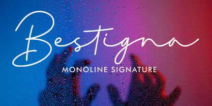 Bestigna is a signature style script font with stunning characters. It can be used for various purposes, such as logos, product packaging, wedding invitations, branding, headlines, signage, labels, signatures, book covers, posters, quotes and much more.
 - Hollows by Daily Studio,
$16.00 Hollows is a display font decorated with smooth wave surfaces. This font is suitable for cards, book covers, posters, and logos. It contains full uppercase, lowercase, punctuation, and standard multilingual support. It also contains alternate styles.
 - Zincand by Maulana Creative,
$12.00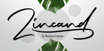 Zincand Modern Script Font Give your designs an authentic handcrafted feel. "Zincand Modern Script Font" is perfectly suited to signature, stationery, logo, typography quotes, magazine or book cover, website header, clothing, branding, packaging design and more.
 - Northbrook JNL by Jeff Levine,
$29.00 A monoline spurred sans serif typeface named “Elandkay” from the 1895 Cleveland Type Foundry specimen book was the design model for Northbrook JNL. This Art Nouveau-influenced design is available in both regular and oblique versions.
 - Leveller NF by Nick's Fonts,
$10.00 A typeface from the 1883 MacKellar, Smiths and Jordan specimen book, called Roundhead, offered the pattern for this rollicking headline face. Both versions support the Latin 1252, Central European 1250, Turkish 1254 and Baltic 1257 codepages.
 - Gentle Ghostly by Supfonts,
$19.00 Gentle Ghostly will be perfect for halloween lettering, beautiful frame for your home, book covers, greeting cards, logos, marketing, magazines or anything that requires cute handwritten lettering :) What's inside: - Gentle Ghostly Script - Multilingual support - Cricut support
