10,000 search results
(0.062 seconds)
- Judith by Maulana Creative,
$13.00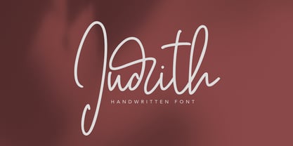 Give your designs an authentic brush handcrafted feel. Judith is perfectly suited to signature, stationery, logo, typography quotes, magazine or book cover, website header, flyer, clothing, branding, packaging design and more. Thanks for use this font. MaulanaCreative
 - Droobie NF by Nick's Fonts,
$10.00 An offering from the 1910 specimen book from Inland Type Foundry, originally called Drew, provided the pattern for this engaging little face. Both versions support the Latin 1252, Central European 1250, Turkish 1254 and Baltic 1257 codepages.
 - Asterica by Maulana Creative,
$12.00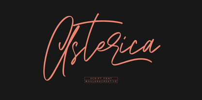 Give your designs an authentic brush handcrafted feel. Asterica is perfectly suited to signature, stationery, logo, typography quotes, magazine or book cover, website header, flyer, clothing, branding, packaging design and more. Thanks for use this font. MaulanaCreative
 - Brothest by Maulana Creative,
$12.00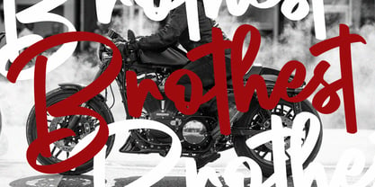 Brothest Street Swag Font Give your designs an authentic handcrafted feel. Brothest Street Swag Font is perfectly suited to logo, stationery, branding, typography quotes, magazine or book cover, website header, clothing, branding, packaging design, restaurant and more.
 - Gotlicks by Maulana Creative,
$14.00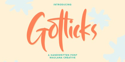 Gotlicks Handwritten Display Font Give your designs an authentic handcrafted feel. Gotlicks Handwritten Display Font is perfectly suited to logo, stationery, branding, typography quotes, magazine or book cover, website header, clothing, branding, packaging design, restaurant and more.
 - River Rocks by Maulana Creative,
$10.00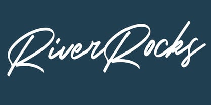 Give your designs an authentic handcrafted feel. "River Rocks Brush" is perfectly suited to signature, stationery, logo, typography quotes, magazine or book cover, website header, clothing, branding, packaging design and more. Thanks for use this font ~ Maulana
 - Spacetroops by Maulana Creative,
$14.00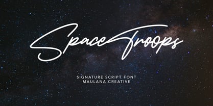 Give your designs an authentic brush handcrafted feel. Spacetroops is perfectly suited to signature, stationery, logo, typography quotes, magazine or book cover, website header, flyer, clothing, branding, packaging design and more. Thanks for use this font. MaulanaCreative
 - Joanna Solotype by Monotype,
$29.99Joanna Solotype is a headline typeface with Art Deco influence. The geometric shapes of the characters are emphasized by the three-line thick strokes. Use the Joanna Solotype font for book jackets and posters, signage and packaging. - Cardiolla by Maulana Creative,
$14.00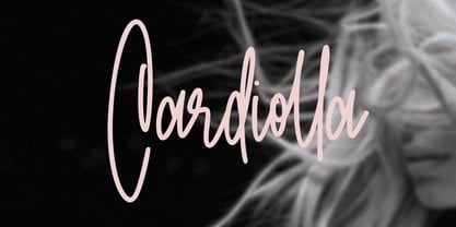 Give your designs an authentic brush handcrafted feel. Cardiolla is perfectly suited to signature, stationery, logo, typography quotes, magazine or book cover, website header, flyer, clothing, branding, packaging design and more. Thanks for use this font. MaulanaCreative
 - Linotype Cineplex by Linotype,
$29.99A typeface that shows its root in stencil lettering. Dario Muhafara created a modern sans serif type family which is ideally suited for cool, technical themes. A small caps font offer a widely usage in book production. - Stereomantic by Maulana Creative,
$15.00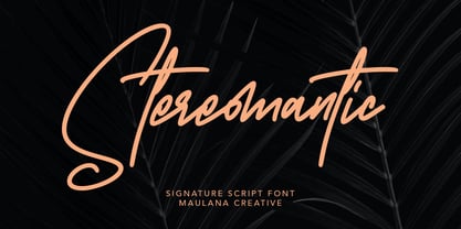 Give your designs an authentic brush handcrafted feel. Stereomantic is perfectly suited to signature, stationery, logo, typography quotes, magazine or book cover, website header, flyer, clothing, branding, packaging design and more. Thanks for use this font. MaulanaCreative
 - Alphasoil by Maulana Creative,
$12.00 Give your designs an authentic handcrafted feel. "Alphasoil Signature Font" is perfectly suited to signature, stationery, logo, typography quotes, magazine or book cover, website header, clothing, branding, packaging design and more. Thanks for use this font ~ Maulana
 - Bucktooth by Tymime Fonts,
$35.00 Bucktooth is a cartoony typeface, inspired by vintage funny-animal comic books, suitable for children's entertainment, packaging or movie titles. Fancier and more upscale than your usual toon font, Bucktooth is fun with a touch of class.
 - Juxtapose by Maulana Creative,
$11.00 Give your designs an authentic brush handcrafted feel. "Juxtapose" is perfectly suited to signature, stationery, logo, typography quotes, magazine or book cover, website header, flyer, clothing, branding, packaging design and more. Thanks for use this font. MaulanaCreative
 - Machinkly by Maulana Creative,
$13.00 Give your designs an authentic handcrafted feel. "Machinkly Display Font" is perfectly suited to poster, stationery, logo, typography quotes, magazine or book cover, website header, clothing, branding, packaging design and more. Thanks for use this font ~ Maulana
 - Skribler by Cool Fonts,
$24.00 Here’s a scratchy skribly font you can use to make something look grungy or use it reversed and it looks like it was scratched on a wall or something.
 - Wedding by HiH,
$10.00 Wedding Regular was originally designed by Morris Fuller Benton for ATF and released as Wedding Text in 1901. It is a lighter version of his ENGRAVER'S OLD ENGLISH of the same period. Wedding Regular is based on the Textura style of blackletter that continued in popularity in England into the 16th century, long after the Dutch, French and Italians had moved to a Roman model that expressed the Renaissance humanism of the period. Wedding Headline is a still lighter version of the regular text face, suitable for setting larger sizes while still preserving the delicacy of the decorative hairlines. Textura continues in use in England and the United States for newspaper mastheads, gift shop signs, wedding invitations and programs and other applications where a feeling of tradition is desired. I recently saw an 1980ish photo of a “Tubby Isaac” sign in London using textura. I believe Benton’s design captures that feeling without being heavy-handed and still remaining quite readable for eyes accustomed to Roman lettering. Both Wedding Regular and Wedding Headline convey a comfortable familiarity. These two fonts may be purchased together at an attractive discount or they may be purchased separately. The full character set may be found in the pdf file that you can download from the gallery section. The two monks (alt-0172 and alt-0177) are from a set of sixteenth century decorative initial letters by Gering and Renbolt. Please note that there are two different eszetts, the blackletter style at alt-0126 and the antiqua style at the alt-0223.
 - Jantar Flow by CAST,
$45.00 Jantar Flow is a humanist sanserif type family tailored for continuous reading for both printing and screen. With its large x-height and low contrast it also performs very well in captions, side notes, and short paragraphs set in small sizes. Jantar Flow Italic is distinct and readable. Following a proper italic construction, it shows the fun side of the family yet keeps the features of the upright. Jantar Flow – as well as its teammate Jantar Sharp – comes in seven weights from ExtraLight to Heavy, each with accompanying italics. It has a tabular and proportional set of figures in both old style and lining options, and also a special set of hybrid figures sitting between x-height and capitals. Superscripts and subscripts are provided together with a vast collection of diacritics covering all European languages as well as a set of case-sensitive characters. Jantar, the pairing superfamily. ‘Jantar’ is an old Polish name for ‘amber’, a fossilised resin – a substance that is robust and organic at the same time. These qualities somehow reflect the feeling behind the Jantar families, ‘Flow’ and ‘Sharp’. Jantar Flow was designed along with Jantar Sharp. As part of the Jantar superfamily these two faces are perfectly paired: though not based on the same skeleton, they share the same design parameters and the same character set, but each one works independently with its peculiar features. Designed for publishing for print and web, as well as for branding, the Jantar superfamily was inspired by common font pairings of the digital age like Helvetica/Times or Verdana/Georgia. Jantar Flow and Jantar Sharp communicate with individual yet complementing voices, just like two trained acrobats can perform alone but also know well how to perform together.
 - Verdana Pro by Microsoft,
$40.00 The Verdana typeface family was designed specifically to address the challenges of on-screen display. Verdana was originally designed by world-renowned type designer Matthew Carter, and tuned for screen display by the leading TrueType hinting expert, Tom Rickner. The Verdana fonts are unique examples of type designed specifically for the computer screen.The Verdana family received a major update in 2011 as a collaboration between The Font Bureau, Monotype Imaging and Matthew Carter. The original Verdana family included only four fonts: regular, italic, bold and bold italic. The new and expanded Verdana Pro family contains 20 fonts in total. The Verdana Pro and Verdana Pro Condensed families each contain 10 fonts: Light, Regular, Semibold, Bold and Black (each with matching italic styles).Verdana exhibits characteristics derived from the pixel rather than the pen, the brush or the chisel. The balance between straight, curve and diagonal were meticulously tuned to ensure that the pixel patterns at small sizes are pleasing, clear and legible. Commonly confused characters, such as the lowercase i j l, the uppercase I J L and the number 1, have been carefully drawn for maximum individuality - an important characteristic of fonts designed for on-screen use. Another reason for the legibility of the Verdana fonts on the screen is their generous width and spacing.Designed by David Berlow and David Johnathan Ross of the Font Bureau, with typographic consultation by Matthew Carter, the new Verdana Pro includes a variety of advanced typographic features including true small capitals, ligatures, fractions, old style figures, lining tabular figures and lining proportional figures. An OpenType-savvy application is required to access these typographic features. The expanded weights and completely new condensed range of fonts provide designers with an expanded palette of typographic options for use in print and on-screen, in both small text sizes and headlines.
 - Anteri Signature by Mans Greback,
$59.00 Anteri Signature is a beautifully crafted handwriting font that exudes a cute and feminine charm. With its cursive calligraphy style, this font brings a delightful touch to your creative projects, making them feel personal and inviting. Ideal for personal branding, stationery, greeting cards, and social media posts, Anteri Signature is a versatile font that adds a heartwarming and elegant touch to your designs. The font is characterized by its swash alternates, allowing you to create a truly customized and unique typographical experience. Use underscore _ anywhere in a word to make a swash. Example: Love_letter Features available when downloaded: Use multiple underscores to make longer underlines. Use % at the end of any word to make a swash letter. Example: Scrap__book% Write # before or after any word to make a tail letter. Example: #cuteness# The Anteri Signature font family includes four high-quality styles to suit various design needs: Regular: The perfect balance of elegance and playfulness Bold: A stronger, more assertive presence for impactful designs Italic: Adds a touch of whimsy and flair to your text Bold Italic: Combines the assertiveness of bold with the expressive nature of italic Built with advanced OpenType functionality, Anteri Signature ensures top-notch quality and provides you with full control and customizability. It includes stylistic alternates, ligatures, and other features to make your designs truly unique. The font is built with advanced OpenType functionality and has a guaranteed top-notch quality, containing stylistic and contextual alternates, ligatures and more features; all to give you full control and customizability. It has extensive lingual support, covering all Latin-based languages, from Northern Europe to South Africa, from America to South-East Asia. It contains all characters and symbols you'll ever need, including all punctuation and numbers.
 - Andron 2 by SIAS,
$44.90 The sister fonts Andron 2 English and Andron 2 Deutsch provide a groundbreaking new possibility to render literature text bodies in a sophisticated traditional and yet modern way of type. In German typographic history there has once been a long-lasting struggle called the Frakturstreit (the blackletter quarrel). It was about wether German text ought to be composed in blackletter or rather in Roman type, a question upon which even Goethe, Schiller and other period celebrities got grey over time. However, blackletter type remained alive and has just recently seen an astonishing renaissance. This is not about a blackletter revisionism or some ‘mixture’ concept arguably bridging the gap between either worlds. Andron 2 English and Andron 2 Deutsch offer a new approach to circumvent that old antagonism. As for the lowercase letters I applied certain features of blackletter type onto the glyphs – but entirely abandoned the principle of the broken stroke as such. The result is a lowercase alphabet in the classical Andron style which may be considered an attractive alternative for text in English, German or even other languages. So it’s no longer entirely about choosing between ‘modern’ Roman or ‘ancient’ blackletter only. Andron 2 English Regular and Andron 2 Deutsch Regular feature the same lowercase glyphs but differ in the majuscules (Andron 2 English has normal Latin capitals). ++++ 2012 + NEW! +++ In response to its growing popularity we now present five new fonts as part of the Andron 2 series. Andron 2 English is completed by an Italic and a Bold font. Andron 2 Deutsch now contains three interesting alternative fonts: Italic, Scriptive and Laendlich. Last but not least – A new set of wonderful classical typographic ornaments is part of the Italic and Scriptive fonts. – You can also purchase these ornaments separately as “Andron Ornamente”.
 - Entropic Brush by Mans Greback,
$59.00 Entropic Brush is a striking fat brush font that boasts a wild and rustic charm. Its decorative display style makes it perfect for logotypes, headlines, and other eye-catching design elements. The font's heavy, oak-like strokes and thick brush texture give it a bold and distinctive character. Ideal for projects that require a strong, natural presence, Entropic Brush is a versatile font that adds a sense of raw energy and untamed beauty to your designs. Its unique aesthetic makes it a great choice for branding materials that need to convey a sense of rugged, organic elegance. With hundreds of swashy and decorative alternates, Entropic brush is sure to give you a customized appearance – like a truly hand-drawn paintbrush design. Use characters _ ¤ # after any word to make a swash. Example: Spline_ Sonic¤ Brush# Use multiple _ ¤ # to make swashes of different lengths. Example: Superhuman______ (Download required.) The Entropic Brush font family includes four high-quality styles to suit various design needs: Regular: A bold statement with a natural, rustic appearance Bold: An even heavier presence for more impactful designs Italic: Adds an expressive, dynamic touch to your text Bold Italic: Combines the assertiveness of bold with the energy of italic Built with advanced OpenType functionality, Entropic Brush ensures top-notch quality and provides you with full control and customizability. It includes stylistic alternates, ligatures, and other features to make your designs truly unique. The font is built with advanced OpenType functionality and has a guaranteed top-notch quality, containing stylistic and contextual alternates, ligatures and more features; all to give you full control and customizability. It has extensive lingual support, covering all Latin-based languages, from Northern Europe to South Africa, from America to South-East Asia. It contains all characters and symbols you'll ever need, including all punctuation and numbers.
 - PG Gothique by Paulo Goode,
$30.00 This is my addition to a long line of traditional gothic typefaces. As you can probably tell, PG Gothique is inspired by classics such as Trade Gothic, News Gothic, Franklin Gothic, Alternate Gothic, and Gothic Gothic. Well, maybe not the last one... But Paulo, we have all those already, why would we want to add PG Gothique to our collection? This typeface has many subtle design nuances that differentiates itself from its historical influences. Also, this is possibly the most comprehensive Latin gothic font family released to date. It has 99 fonts that cover pretty much every style you could ever need, and if you do require more, this family is available as a single variable font that covers all the weights and widths in between. PG Gothique is designed to handle a multitude of applications, from branding projects, to titles, body text, user interfaces, and film poster credits. This type family has a style that will suit the purpose. There are 99 fonts in this family, ranging from Thin to Ultra weights across six widths in both roman and italic*. Activate Stylistic Set 1 and you will get the alternate slab serif-style capital “I” that offers improved legibility when placed adjacent to a lowercase “l”. PG Gothique has an extensive character set that covers every Latin European language. If you would prefer PG Gothique as a single variable font, please choose PG Gothique Variable. Test drive PG Gothique today – both the Regular and Italic fonts are offered as a free download. See full details and hi-res examples at https://paulogoode.com/pg-gothique Key features: 9 Weights 6 Widths 99 Fonts Small Caps Old Style Figures European Language Support (Latin) 600+ Glyphs per font *Compressed weights do not include italics.
 - Harri Text by Blancoletters,
$39.00 Harri Text is more than an extension of Harri. It shares its origin, a certain flavour and a great deal of its idiosyncrasies, but while Harri is an uppercase-only typeface intended for display uses, Harri Text is conceived as a text type family, including a new extra-light weight, italics, small caps and other additions that make it suitable for editorial purposes. As its predecessor Harri Text addresses several concerns regarding the dualism neutrality vs. idiosyncrasy, or in other words, how local features meet global design in the context of a modern society (as is the case in the Basque Country in recent times). The origin of Harri Text —vernacular Basque lettering for the most part— is full of idiosyncrasies and peculiarities that, while giving them its special character, may hinder readability in some cases. The default set in Harri Text tones its essence down a little bit. It is still present, although less obstrusive. Stylistic sets 1, 2 and 3 are a chance to recover gradually this essence modifying some characters —specially the characteristic design of letter A– for those who seek a more local flavour. Stylistic set 4, on the other hand, does the opposite job, this is, removes asymmetrical serifs and other small details in order to create a more neutral atmosphere. Any traces to its origin are this way diluted resulting in a crisp and clean incise variant. Stylistic set 6 is available in the italic styles. It provides a more fluid and cursive flavour to some letters in case a calligraphic mood is desired. Harri Text comes with 1054 glyphs in its character set (1078 in the italics) with support for more than 220 languages.
 - Aure Zeritha by Aure Font Design,
$23.00 Aure Zeritha emotes the unassuming charm of fairytale romance. The modestly adorned forms of this decorative serif font engage the reader with a subtext of innocence. Zeritha brings an ingenuous romance to text and titles and a guileless promise of adventure to astrological expressions and chartwheels. The breadth of typographic textures revealed in its bold and italic forms is given depth by the charm of its small-caps and the delight of its curly alternates. Zeritha is an original design developed by Aurora Isaac, first released in the LP glyphset in 2011. After more than a decade in development, 2018 marks the release of the CJ and KB glyphsets, available in regular, italic, bold, and bold-italic. The CJ glyphset is a full text font supporting a variety of European languages. A matching set of small-caps complements the extended lowercase and uppercase glyphsets. Supporting glyphs include standard ligatures, four variations of the ampersand, and check-mark and happy-face with their companions x-mark and grumpy-face. Numbers are available in lining, oldstyle, and small versions, with numerators and denominators for forming fractions. Companion glyphs include Roman numerals, specialized glyphs for indicating ordinals, and a variety of mathematical symbols and operators. The CJ glyphset also includes an extended set of glyphs for typesetting Western Astrology. These glyphs are also available separately in the KB glyphset: a symbol font re-coded to allow easy keyboard access for the most commonly used glyphs. Aure Zeritha stands its own as a text font, but for extended text, try pairing Zeritha with its distant cousin, Aure Declare. Use Zeritha where the fairytale romance is needed; use Declare for tight text and practical contrast. Give Aure Zeritha a trial run! You may discover a permanent place for this font family in your typographic palette. AureFontDesign.com
 - CA Coronado by Cape Arcona Type Foundry,
$19.00 CA Coronado is a nice display font for use in titles, logos and headlines. With its used look it creates a friendly and human feeling. Upper- and lower-case characters differ in details and can be mixed to get a vivid look. For the best authentic look, the ‘Regular’ can be used as filling and complements the Shadow-style.
 - Modulus by Andrew Footit,
$30.00 Modulus is a clean, minimal, modern sans typeface. It looks smooth in any layout with its sleek rounded lines, use it for your magazines, brochures and editorial layouts. Modulus makes awesome headings, it looks great on its own or with imagery, body copy looks neat and tidy. Modulus is one to add to your font collection.
 - Chalysta by BaronWNM,
$12.00 Introduces an old lettering style font. looks elegant, luxurious and classy. Chalysta is a form of handwriting with a sideways drag, which looks like it was handwritten in old scripts. Each lowercase has an alternate pull before the letter to make it look more natural. Very suitable for use in branding, wedding invitations, quotes, cards, etc.
 - Silver Thunder by Olivetype,
$18.00 Looking for a unique and badass font to add some edge to your designs? Look no further than Silver Thunder. This graffiti-inspired font is a good option for apparel, posters, headlines, magazines, and more. With its cool black metal aesthetic, Silver Thunder will give your work a truly one-of-a-kind look. Thank You!
 - Declaration by Vladimir Nikolic is an evocative and historical typeface that commands attention through its thematic and visual references to the past. Its design is heavily influenced by the handwri...
- Apud Display by DSType,
$26.00 Apud Display is the perfect companion for Apud. With its refined high contrast and sharpness, Apud Display has the vitality and rigor of modern typefaces, every time you need your display setting to shine.
 - Dream Script by Lián Types,
$49.00 One of my dreams as a type-designer was making a good looking chancery cursive. Full of life, like some of the best calligraphers around the world do on their artworks. With Julian Waters, John Stevens and Denis Brown (just to name a few of them) (1) chancery, or italic script, was transformed into a new, exciting and very fresh style of calligraphy mainly at the end of 20th Century. Dream Script may be that dream named above made true. I have been practicing chancery in the way I learnt from those calligraphers for many years now. Making a font out of my ink-sketches was a tough work, since they were closer of -being art- than of -being type-. However, this font rescues many aspects of handmade calligraphy: You have to look at it really close to notice it is actually a font, and that was one of my goals. The secret of a good looking chancery is on its subtle details: pen angle is constantly changing, even on the strokes which seem straight. Capitals and swashes have to be done a little faster than lowercase letters. The rhythm has to be even, in spite of its playful look. The fact that makes Dream look alive is that it has many alternates per glyph. This makes each word look unique like it happens in calligraphy: you will find alternates for the beginning/ending of a word/phrase, some for the middle of it, some interchangeable. Also, to accompany the script, you will find Dream Caps, which was inspired in the eternally beautiful trajan capitals. Place them like I did on the posters and you will have great results for sure. The font works great in small, middle and big sizes and can be a great selection for magazines, wedding invitations, perfumes, and posters. Close your eyes, and Dream with me... TECHNICAL Dream Script Pro is the most complete style, it contains all the alternates and ligatures (OT programmed, better if you use Adobe applications) If you plan to use the font for text, be sure to activate the less decorative capitals, which are placed in the “salt” group of alternates. Dream Script Standard has less glyphs than the Pro one, it contains just some ligatures for a better legibility. (OT programmed, better if you use Adobe applications) NOTES (1) Not only are they great artists, but also good people, who are always willing to share with their students all what they know. I would also like to thank Ricardo Rousselot, whose work inspired me this time to make “The Dream Script” exlibris; and to Alisara Tareekes, a very talented friend which international calligraphy conferences gave me: She kindly helped me with some tips to make this font better.
 - Glorius Signature by Krakenbox Studio,
$15.00 Glorius is a fashionable sophisticated signature-style script with its own unique curves and an elegant inky flow. Its elegant, classy, and modern look will make your designs look lovely.
 - Monkey Pants by PizzaDude.dk,
$17.00Ever seen a monkey with pants? Probably would look silly, and that's excactly how this font looks! A jumpy, weird and funny font - unpredictable and ready for ounzes of fun! - Galiano by DearType,
$49.00 Galiano is an elegant combination of a script and a narrow modern serif. It is slender, feminine and classy, while still maintaining a friendly feel. Galiano is versatile and will work perfectly for fashion, e-commerce brands, trend blogs, wedding boutiques or any business that wants to appear upscale and chic. With its 1500+ glyphs the Galiano Script is perfect for creating original and functional designs. It has extensive language support and tons of ligatures, alternates, stylistic sets and swashes that add visual interest to every letter. The Galiano Font Family in a nutshell: - Galiano - a dancing baseline script with signature loops for ascenders and descenders - Galiano Inline - similar feel to Galiano, notably featuring a standartized x-height - Galiano Text - a simpler version of the script with no fancy loops for ascenders and descenders and no swashes and alts. - Galiano Serif + Italics - perfect for headlines - Galiano Ornaments - a set of 80 beautiful ornaments to embellish your typography. You can use the Galiano Family for high-end logotypes and magazine headlines, but let’s not forget greeting cards, invitations, posters, book covers, ads and the various web and screen usages. The overall feel of the font is elegant, sophisticated with a touch of informal and it is ideal if you want to convey a sense of class and style.
 - FS Benjamin by Fontsmith,
$80.00 Stone and steel FS Benjamin is a flared serif typeface designed by Stuart de Rozario. Consisting of 12 styles ranging from Light, Book, Regular, Medium, SemiBold and Bold with Italics it has clear, delicate letterforms, punctuated with brutal chiselled angles. With a pure and crafted feel to the forms the typeface has traditional roots but has been designed to work in a contemporary setting. Archetypal proportions in terms of x-height to cap height and ascender to descender ratio, allow the typeface to feel familiar and be legible in all platforms. Delicate brutalism Inspired by the contrasts of London and named after Big Ben, FS Benjamin was designed by Stuart de Rozario and founder, Jason Smith. Walking around London Jason was inspired by the juxtaposition of the old and the new. Glass and steel architecture can often be found amongst traditional signage and coats of arms seen around the City. These surroundings sparked an idea to create a modern design based on an alphabet that would traditionally be carved from stone. “Much of the typography we see today is so similar. I thought what if we created a typeface with traditional roots but modernised it to sit amongst the punk and noise of the streets of London? Old with new. Business with busyness. This is what London is all about.” Jason Smith
 - Fnord by Monotype,
$23.99 Fnord is a contemporary humanist serif typeface, it is ideally suited for display purposes, titling, headline copy and branding. The family has been designed to be highly versatile, containing a total of 23 fonts. Each font features discretionary ligatures, swash alternates and true small caps. The overall design is clean and simple with a little bit of rebelliousness thrown in for good measure – Fnord does not conform to the traditional serif blueprint. Fnord’s design has been strongly influenced by the complex, thought-provoking and mischievous works of authors Robert Anton Wilson and Robert Shea from the 1970s. I was re-reading their work while sketching the initial letterforms and realised that some of the proportions and angles were coinciding with some themes that run through the books – particularly the numbers 5, 17, 23, 40 and 93, which are key to this font family’s spacing and geometry. I found it both very interesting and enjoyable to play with a specific theme and purpose for creating this typeface. I am sure you will enjoy working with it in your own design projects. Key features: • 5 Weights in 4 Styles – Roman, Italic, Condensed and Extended • 3 Additional Display Styles in 1 Weight – Engraved, Inline and Woodcut • Small Caps, Alternates, Swashes and Discretionary Ligatures • Full European character set • 680 glyphs per font.
 - Rainy Stars by Mans Greback,
$59.00 Rainy Stars is an irresistibly adorable, naive sans-serif font that captures the magic of a child's imagination. With its round, cute, and cartoon-like letterforms, this font adds a touch of whimsy and playfulness to your designs, perfect for projects aimed at children, nature, or rustic themes. The soft, bold strokes and charming personality of Rainy Stars make it a delightful choice for comic books, illustrations, and any creative work that aims to evoke the innocent joy of a toddler's world. The Rainy Stars font family includes six delightful styles to suit various design needs: The weights Light, Regular and Bold for balancing and impact, as well as each thickness as Italic for a touch of movement. Use asterisk * to make a star. Use multiple asterisks to make different space symbols. Example: Magic**Planet (Download required) Built with advanced OpenType functionality, Rainy Stars ensures top-notch quality and provides you with full control and customizability. It includes stylistic and contextual alternates, ligatures, and other features to make your designs as unique and enchanting as the font itself. Rainy Stars offers extensive lingual support, covering all Latin-based languages, from Northern Europe to South Africa, from America to South-East Asia. It contains all the characters and symbols you'll ever need, including all punctuation and numbers.
 - Sketchnote by Delve Fonts,
$29.00 The Sketchnote typeface was born of necessity: designer Mike Rhode needed a series of hand-drawn fonts to illustrate and produce his book, “The Sketchnote Handbook.” Because of its origin, this typeface was designed to be practical and convey the human character and quirks of his normal handwriting and hand-drawn lettering. The family is comprised of five fonts: Sketchnote Text in Regular, Bold, and Italic, the somewhat compressed and bold Sketchnote Square for headlines, and the playful Sketchnote Dingbats. Sketchnote Text is a casual script with a slightly bouncy baseline. In order to mimic the differences present in natural handwriting, OpenType features are built-in that automatically switch between multiple versions of each letter or number. In total, over 240 alternates in each of the text fonts are employed, making for a more authentic appearance. The warm texture of Sketchnote is the result of actual ink-spread on paper captured in the scans of written letterforms and was intentionally left intact during the digitization process to preserve that feeling. Rhode created Sketchnote Square as a display type to complement Sketchnote Text. Drawn instead of written, the letters often have neat little happenstance voids within the strokes. Sketchnote Dingbats features a selection of icons, rules, and arrows to provide some functional and fun tidbits, handy for bringing additional life to any design.
 - Flamante Sans by deFharo,
$8.00 Flamante Sans is a group of eight corporate typographies of geometric construction, without serifs and neo-grotesque style, are fonts with an excellent readability for titles, short texts or for use in signage. The group of fonts is made up of 4 weights: Light, Book, Medium & Bold plus their respective italics. This initial development of Flamante Sans typography has been the basis for the drawing of the "Flamante family" fonts composed of 5 styles (Sans, Serif, SemiSlab, Round & Stencil) making a total of 40 fonts that are perfect corporate use, advertising or editorial titles or signage of public spaces for example. They include the Bitcoin symbol. Swiss-style fonts built on a 4 ◊ 6 building grid, formed with 144 x 119 units (Medium version), two digits taken from the fibonacci and Perrin sequences, these measures define the width and height of the vertical and horizontal antlers and the overall proportion of the font. The metrics and kerning have been carefully set up for fluent reading in paragraph texts. ================================== - OpenType Features: Standard Ligatures, Additional languages, All Alternates, Alternate Annotation Forms, Superscript, Kerning, Superiors, Capital Spacing, Localized Forms, Superior letters, Discretionary Ligatures, Subscript, Fractions, Slashed Zero, Inferiors, Extended Fractions, Scientific Inferiors, Ordinals, Denominators, Oldstyle Figures, Numerators, Historical Forms, Historical Ligatures. They include the Bitcoin symbol. - 500 glyphs. Latin Extended-A ï OTF & TTF