10,000 search results
(0.052 seconds)
- Guyad by Maulana Creative,
$11.00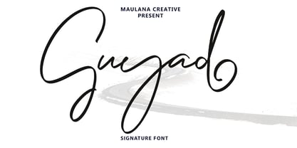 Guyad is a Casual script font. With bold mono-line stroke, slant and fun character with a bit of ligatures. To give you an extra creative work. Guyad font support multilingual more than 100+ language. This font is good for logo design, Social media, Movie Titles, Books Titles, a short text even a long text letter and good for your secondary text font with sans or serif. Make a stunning work with Guyad font. Cheers, MaulanaCreative
 - Manekin by Say Studio,
$17.00 Manekin is Beauty Bold Script Font with a Beauty vintage style.This font is also equipped with 40+ stylistic Alternates and ligatures and also multi-language support which further adds to the creativity in using this font. This font is perfect for your creative projects such as Logotype, printed quotes, invitations, cards, product packaging, headers, Letterhead, Apparel , Web design, Magazine, Book, etc. FEATURES: - Uppercase - Lowercase - Punctuation and Marks - Symbols - 40+ stylistic Alternates & Ligatures Thanks, Have a wonderful Day, Say Studio
 - Chuglet by Maulana Creative,
$14.00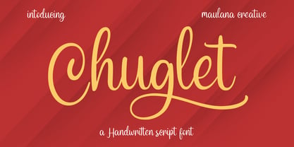 Chuglet is a cursive script font. With bold contrast stroke, fun character with a bit of ligatures and alternates. To give you an extra creative work. Chuglet font support multilingual more than 100+ language. This font is good for logo design, Social media, Movie Titles, Books Titles, a short text even a long text letter and good for your secondary text font with sans or serif. Make a stunning work with Chuglet font. Cheers, Maulana Creative
 - Maylow by Maulana Creative,
$14.00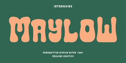 Maylow is an expressive freestyle handwritten display script font. With bold consist stroke, fun character with a bit of ligatures and alternates. To give you an extra creative work. Maylow font support multilingual more than 100+ language. This font is good for logo design, Social media, Movie Titles, Books Titles, a short text even a long text letter and good for your secondary text font with sans or serif. Make a stunning work with Maylow font. Cheers, Maulana Creative
 - MC Castroy by Maulana Creative,
$18.00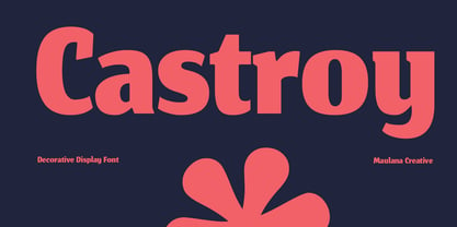 Castroy is a modern Decorative flared serif Display font. Bold stroke, fun character with a bit of ligatures and alternates. To give you an extra creative work. Castroy font support multilingual more than 100+ language. This font is good for logo design, Social media, Movie Titles, Books Titles, a short text even a long text letter and good for your secondary text font with script or serif. Make a stunning work with Castroy font. Cheers, Maulana Creative
 - Ergonic by Maulana Creative,
$18.00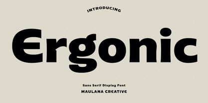 Ergonic is a Modern display sans serif font. With Bold stroke, fun character with a bit of ligatures and alternates. To give you an extra creative work. Ergonic font support multilingual more than 100+ language. This font is good for logo design, Social media, Movie Titles, Books Titles, a short text even a long text letter and good for your secondary text font with sans or serif. Make a stunning work with Ergonic font. Cheers, Maulana Creative
 - Gromhins by Maulana Creative,
$14.00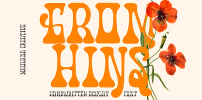 Gromhins is a decorative psychedelic display font. With bold high contrast stroke, fun character with a bit of ligatures and alternates. To give you an extra creative work. Gromhins font support multilingual more than 100+ language. This font is good for logo design, Social media, Movie Titles, Books Titles, a short text even a long text letter and good for your secondary text font with sans or serif. Make a stunning work with Gromhins font. Cheers, Maulana Creative
 - Mynalos by Maulana Creative,
$11.00 Mynalos is a condensed sans serif font. With bold tall sharp edge stroke, fun character with a bit of ligatures and alternates. To give you an extra creative work. Mynalos font support multilingual more than 100+ language. This font is good for logo design, Social media, Movie Titles, Books Titles, a short text even a long text letter and good for your secondary text font with sans or serif. Make a stunning work with Mynalos font. Cheers, Maulana Creative
 - MC Attrey by Maulana Creative,
$18.00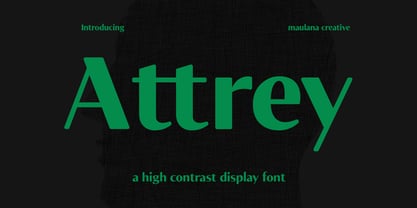 Attrey is a high contrast sans display font. Bold contrast stroke, fun character with a bit of ligatures and alternates. To give you an extra creative work. Attrey font support multilingual more than 100+ language. This font is good for logo design, Social media, Movie Titles, Books Titles, a short text even a long text letter and good for your secondary text font with script or serif. Make a stunning work with Attrey font. Cheers, Maulana Creative
 - Hide Seek by Maulana Creative,
$12.00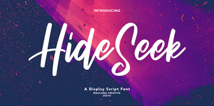 Hide Seek is a Script Display font. With bold stroke, condensed and fun character with a bit of ligatures. To give you an extra creative work. Hide Seek font support multilingual more than 100+ language. This font is good for logo design, Social media, Movie Titles, Books Titles, a short text even a long text letter and good for your secondary text font with sans or serif. Make a stunning work with Hide Seek font. Cheers, MaulanaCreative
 - MC Recall Hipe by Maulana Creative,
$16.00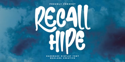 Recall Hipe handmade display font. Bold stroke, fun character with a bit of ligatures and alternates. To give you an extra creative work. Recall Hipe handmade display font support multilingual more than 100+ language. This font is good for logo design, Social media, Movie Titles, Books Titles, a short text even a long text letter and good for your secondary text font with script or serif. Make a stunning work with Recall Hipe handmade display font. Cheers, Maulana Creative
 - MC Riegal by Maulana Creative,
$16.00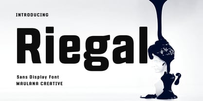 Riegal is a Square-is sans Display Tech font. Bold stroke, fun character with a bit of ligatures and alternates. To give you an extra creative work. Riegal font support multilingual more than 100+ language. This font is good for logo design, Social media, Movie Titles, Books Titles, a short text even a long text letter and good for your secondary text font with script or serif. Make a stunning work with Riegal font. Cheers, Maulana Creative
 - MC Leftrag by Maulana Creative,
$14.00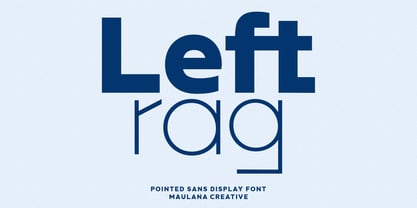 Leftrag is a contemporary sans serif display font. Bold stroke, fun character with a bit of ligatures and alternates. To give you an extra creative work. Leftrag font support multilingual more than 100+ language. This font is good for logo design, Social media, Movie Titles, Books Titles, a short text even a long text letter and good for your secondary text font with script or serif. Make a stunning work with Leftrag font. Cheers, Maulana Creative
 - Freezink by Maulana Creative,
$12.00 Freezink is a modern Decorative sans serif Display font. Bold stroke, fun character with a bit of ligatures and alternates. To give you an extra creative work. Freezink font support multilingual more than 100+ language. This font is good for logo design, Social media, Movie Titles, Books Titles, a short text even a long text letter and good for your secondary text font with script or serif. Make a stunning work with Freezink font. Cheers, Maulana Creative
 - Bruna by Antonio Lechuga,
$35.00 Its open counters and large x height give it excellent performance in small sizes. On the other hand, its curved diagonals, generous width and soft shapes give it a friendly but functional personality for a wide range of messages and voices. We recommend the four most extreme weights (Thin, ExtraLight, Black, and Heavy) for large sizes starting at 18 points, and the five intermediate weights (Light, Book, Regular, Medium, and Bold) for small sizes starting at 7 points.
 - Ramexon by Just Font You,
$18.00 Ramexon was born from the breakthrough mindset of experimental typography and anti-design trend in the graphic design industry nowadays. To create something new, fresh, and loud for your visual presence in this saturated world. With bold, boxy, strong, yet remarkable shape in every character, makes Ramexon is the perfect font to state born-different works. Perfectly fit for logo, branding, gaming, esport design, poster, music video, album artwork, cover, book, packaging, merchandise, apparel, fashion, and many more.
 - MC Embar Wisteh by Maulana Creative,
$15.00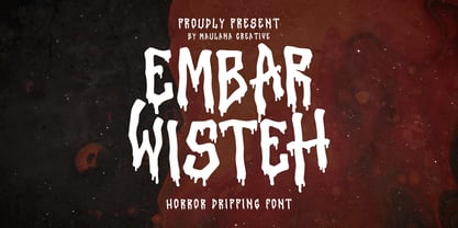 Embar Wisteh horror dripping font. Bold stroke, fun character with a bit of ligatures and alternates. To give you an extra creative work. Embar Wisteh horror dripping font support multilingual more than 100+ language. This font is good for logo design, Social media, Movie Titles, Books Titles, a short text even a long text letter and good for your secondary text font with script or serif. Make a stunning work with Embar Wisteh horror dripping font. Cheers, Maulana Creative
 - Konnekta by Maulana Creative,
$15.00 Konnekta is a condensed decorative display font. With bold consist stroke, fun character with a bit of ligatures and alternates. To give you an extra creative work. Konnekta font support multilingual more than 100+ language. This font is good for logo design, Social media, Movie Titles, Books Titles, a short text even a long text letter and good for your secondary text font with sans or serif. Make a stunning work with Konnekta font. Cheers, Maulana Creative
 - MC Nabir House by Maulana Creative,
$15.00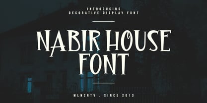 Nabir House is a vintage horror decorative display font. Bold stroke, fun character with a bit of ligatures and alternates. To give you an extra creative work. Nabir House font support multilingual more than 100+ language. This font is good for logo design, Social media, Movie Titles, Books Titles, a short text even a long text letter and good for your secondary text font with script or serif. Make a stunning work with Nabir House font. Cheers, Maulana Creative
 - Sunsetstill by Maulana Creative,
$16.00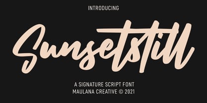 Sunsetstill is a casual signature script font. With bold felt-tip stroke, slanted and fun character with a bit of ligatures. To give you an extra creative work. Sunsetstill font support multilingual more than 100+ language. This font is good for logo design, Social media, Movie Titles, Books Titles, a short text even a long text letter and good for your secondary text font with sans or serif. Make a stunning work with Sunsetstill font. Cheers, MaulanaCreative
 - Firon by Maulana Creative,
$14.00 Firon is a modern Decorative Display font. Bold strokes, fun character with a bit of ligature and alternates. To give you extra creative work. Firon font support multilingual more than 100+ language. This font is good for logo design, Social media, Movie Titles, Books Titles, short text even long text letters, and good for your secondary text font with script or serif. Make stunning work with Firon font. This is all caps font style. Cheers, Maulana Creative
 - Wendor Misra by Maulana Creative,
$23.00 Wendor Misra fire display font. Bold stroke, fun character with a bit of ligatures and alternates. To give you an extra creative work. Wendor Misra font support multilingual more than 100+ language. This font is good for logo design, Social media, Movie Titles, Books Titles, a short text even a long text letter and good for your secondary text font with script or serif. Make a stunning work with Wendor Misra fire display font. Cheers, Maulana Creative
 - MC Milesheart by Maulana Creative,
$13.00 Milesheart is a decorative handwritten sans display font. With bold block stroke, fun character with a bit of ligatures and alternates. To give you an extra creative work. Milesheart font support multilingual more than 100+ language. This font is good for logo design, Social media, Movie Titles, Books Titles, a short text even a long text letter and good for your secondary text font with sans or serif. Make a stunning work with Milesheart font. Cheers, Maulana Creative
 - Joquell by Maulana Creative,
$14.00 Joquell is a Classic sans serif display font. Bold stroke, fun character with a bit of ligatures and alternates. To give you an extra creative work. Joquell font support multilingual more than 100+ language. This font is good for logo design, Social media, Movie Titles, Books Titles, a short text even a long text letter and good for your secondary text font with script or serif. Make a stunning work with Joquell font. Cheers, Maulana Creative
 - Croxypraxis by Maulana Creative,
$13.00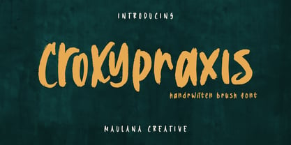 Croxypraxis is a fancy handwritten brush font. With bold rough brush stroke, fun character with a bit of ligatures and alternates. To give you an extra creative work. Croxypraxis font support multilingual more than 100+ language. This font is good for logo design, Social media, Movie Titles, Books Titles, a short text even a long text letter and good for your secondary text font with sans or serif. Make a stunning work with Croxypraxis font. Cheers, Maulana Creative
 - MC Seatlon by Maulana Creative,
$15.00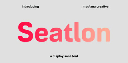 Seatlon is an almost square sans serif display font. With bold stroke, fun character with a bit of ligatures and alternates. To give you an extra creative work. Seatlon font support multilingual more than 100+ language. This font is good for logo design, Social media, Movie Titles, Books Titles, a short text even a long text letter and good for your secondary text font with script or serif. Make a stunning work with Seatlon font. Cheers, Maulana Creative
 - MC Coretras by Maulana Creative,
$13.00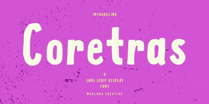 Coretras is an organic handwritten sans serif font. With bold brush stroke, fun character with a bit of ligatures. To give you an extra creative work. Coretras font support multilingual more than 100+ language. This font is good for logo design, Social media, Movie Titles, Books Titles, a short text even a long text letter and good for your secondary text font with sans or serif. Make a stunning work with Coretras font. Cheers, Maulana Creative
 - MC Jungle Hype by Maulana Creative,
$12.00 Jungle Hype is a modern display typeface font. With bold stroke, fun character with a bit of ligatures and alternates. To give you an extra creative work. Jungle Hype font support multilingual more than 100+ language. This font is good for logo design, Social media, Movie Titles, Books Titles, a short text even a long text letter and good for your secondary text font with sans or serif. Make a stunning work with Jungle Hype font. Cheers, Maulana Creative
 - Katvondy by Maulana Creative,
$14.00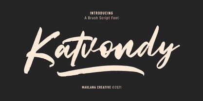 Katvondy is a marker handwritten font. With slanted bold marker stroke, fun character with a bit of ligatures and swashes. To give you an extra creative work. Katvondy font support multilingual more than 100+ language. This font is good for logo design, Social media, Movie Titles, Books Titles, a short text even a long text letter and good for your secondary text font with sans or serif. Make a stunning work with Katvondy font. Cheers, MaulanaCreative
 - Loveables Magazino by Maulana Creative,
$16.00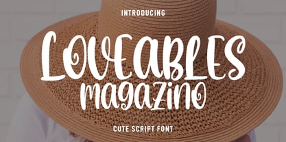 Loveables Magazino is a fancy handwritten font. With bold contrast stroke, fun character with a bit of ligatures. To give you an extra creative work. Loveables Magazino font support multilingual more than 100+ language. This font is good for logo design, Social media, Movie Titles, Books Titles, a short text even a long text letter and good for your secondary text font with sans or serif. Make a stunning work with Loveables Magazino font. Cheers, Maulana Creative
 - Krimson by Maulana Creative,
$15.00 Krimson is a bouncy fat cutter handwritten font. With bold stroke, fun character with a bit of ligatures and alternates. To give you an extra creative work. Krimson font support multilingual more than 100+ language. This font is good for logo design, Social media, Movie Titles, Books Titles, a short text even a long text letter and good for your secondary text font with sans or serif. Make a stunning work with Krimson font. Cheers, Maulana Creative
 - Kingslaw by Maulana Creative,
$16.00 Kingslaw is a retro display script font. With Bold contrast stroke, fun character with a bit of ligatures and alternates. To give you an extra creative work. Kingslaw font support multilingual more than 100+ language. This font is good for logo design, Social media, Movie Titles, Books Titles, a short text even a long text letter and good for your secondary text font with script or signature. Make a stunning work with Kingslaw font. Cheers, MaulanaCreative
 - Great Bromwich by Greater Albion Typefounders,
$14.95 Great Bromwich takes the ideas in Greater Albion's Bromwich family that little bit further. It can be used on its own, or as a compliment to Bromwich. Great Bromwich uses specially re-designed large and small capitals, to enable that bold headline statement to be made with impressive Edwardian flair. In the spirit of railway travel posters and illustrated news journals, its a wonderful font for poster design, or for book covers and other work with a period theme.
 - MC Qewsa by Maulana Creative,
$15.00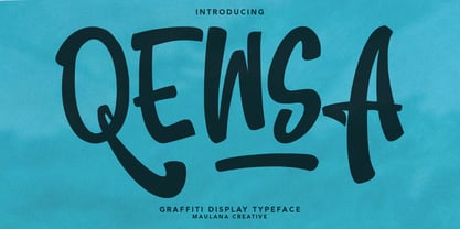 Qewsa graffiti display typeface. Bold stroke, fun character with a bit of ligatures and alternates. To give you an extra creative work. Qewsa graffiti display typeface support multilingual more than 100+ language. This font is good for logo design, Social media, Movie Titles, Books Titles, a short text even a long text letter and good for your secondary text font with script or serif. Make a stunning work with Qewsa graffiti display typeface. Cheers, Maulana Creative
 - Mc Handy by Maulana Creative,
$12.00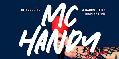 Mc Handy is a casual handwritten display font. With bold stroke, fun character with a bit of ligatures and alternates. To give you an extra creative work. Mc Handy font support multilingual more than 100+ language. This font is good for logo design, Social media, Movie Titles, Books Titles, a short text even a long text letter and good for your secondary text font with sans or serif. Make a stunning work with Mc Handy font. Cheers, MaulanaCreative
 - MC Woasther by Maulana Creative,
$21.00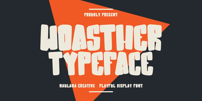 Woasther typeface playful display font. Bold stroke, fun character with a bit of ligatures and alternates. To give you an extra creative work. Woasther typeface playful display font support multilingual more than 100+ language. This font is good for logo design, Social media, Movie Titles, Books Titles, a short text even a long text letter and good for your secondary text font with script or serif. Make a stunning work with Woasther typeface playful display font. Cheers, Maulana Creative
 - Jeklin by Maulana Creative,
$16.00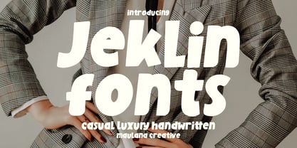 Jeklin is a cute handwritten sans font. With bold stroke, fun character with a bit of ligatures and alternates. To give you an extra creative work. Jeklin font support multilingual more than 100+ language. This font is good for logo design, Social media, Movie Titles, Books Titles, a short text even a long text letter and good for your secondary text font with sans or serif. Make a stunning work with Jeklin font. Cheers, Maulana Creative
 - Virus Cursed by Maulana Creative,
$14.00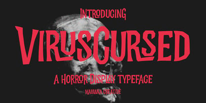 Virus Cursed is a Horror Vibe Decorative display font. With Bold Sharp stroke, Upright and fun character with a bit of ligatures. To give you an extra creative work. Virus Cursed font support multilingual more than 100+ language. This font is good for logo design, Social media, Movie Titles, Books Titles, a short text even a long text letter and good for your secondary text font with Script. Make a stunning work with Virus Cursed font. Cheers, Maulana Creative
 - MC Fatlip by Maulana Creative,
$16.00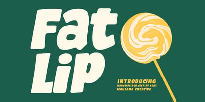 Fatlip is a casual slanted handwritten font. With bold consiststroke, fun character with a bit of ligatures and alternates. To give you an extra creative work. Fatlip font support multilingual more than 100+ language. This font is good for logo design, Social media, Movie Titles, Books Titles, a short text even a long text letter and good for your secondary text font with sans or serif. Make a stunning work with Fatlip font. Cheers, Maulana Creative
 - Portland Grotesk by QUADRAAT,
$35.00 Portland Grotesk is a grotesque sans serif typeface with chubby proportions in 5 weights Light - Regular - Medium - SemiBold - Bold and supports all latin languages. Easy to use and easy to read. The character set contains 1109 glyphs with a wide range of alternates characters and includes: - Small Capitals - Fractions - Superiors, denominators - Open type features such as case sensitive, standard ligatures and several stylistics sets Portland Grotesk fits perfectly for all types of communication (Books, magazines, posters)