10,000 search results
(0.018 seconds)
- Big Heroes by Typefactory,
$14.00 Big Heroes is playful font which puts a smile on your projects and will inspire you to create something fun and memorable. It is perfect for headings, flyer, greeting cards, product packaging, book cover, printed quotes, logotype, apparel design, album covers, etc
 - Abonity by Dhan Studio,
$21.00 Abonity is a modern handwritten font, with stylized characters that look quirky but interesting to use in a variety of modern designs such as clothing, invitations, tittle books, stationery designs, quotes, branding, logos, greeting cards, t-shirts, packaging designs, posters and more.
 - Pique-Nique NF by Nick's Fonts,
$10.00 The 1895 specimen book from American Type Founders included the pattern for this face, originally called Outing—Art Nouveau with a laid-back vibe. Both versions of this font support the Latin 1262, Central European 1250, Turkish 1254 and Baltic 1257 codepages.
 - Brooky by Gatype,
$14.00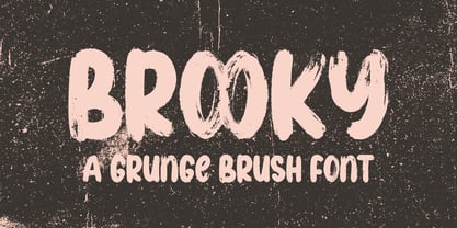 Brooky is a modern, handwritten font, with stylized characters that look unique but are attractive for use in a variety of modern designs such as clothing, invitations, book titles, stationery designs, quotes, branding, logos, greeting cards, t-shirts, packaging designs. , posters and more.
 - Melvens by Ronny Studio,
$21.00 Melvens is an experimental combination font. includes 2 fonts that have very different styles and appearances, but make this font look unique. This font is perfect for your design needs such as poster design, logo design, branding, social media design, books, magazines, etc.
 - Fattty by Drawwwn,
$15.00 Fattty is a chunky fun font with plenty of wobbly bits. It's perfect for bold brands and funky projects. It's friendly curves are a great fit in kids books or on chubby posters. But remember, say it loud I'm fat and I'm proud!
 - Threefonte by Girinesia,
$13.00 Hello guys... We proud presenting our new font. It's name THREEFONTE. THREEFONTE is cute and unique stacked font. THREEFONTE would perfect for kids poster, t shirt, flyer, cover children book, cartoon, comic , cristmast invitation, greting card, valentine card, new year party and etc.
 - Banknote 1948 by Ingo,
$39.00 A very expanded sans serif font in capital letters inspired by the inscription on a bank note Old bank notes tend to have a very typical typography. Usually they carry decorative and elaborately designed markings. For one thing, they must be practically impossible to forge and for another, they should make a respectable and legitimate impression. And in the days of copper and steel engravings, that meant nothing less than creating ornate, shaded or otherwise complicated scripts. Designing the appropriate script was literally in the hands of the engraver. That’s why I noticed this bank note from 1948. It is the first 20 mark bill in the then newly created currency ”Deutsche Mark.“ All other bank notes of the 1948 series show daintier forms of typography with an obvious tendency toward modern face. The 1949 series which followed shortly thereafter reveals the more complicated script as well. For whatever reason, only this 20 mark bill displays this extremely expanded sans serif variation of the otherwise Roman form applied. This peculiarity led me in the year 2010 to create a complete font from the single word ”Banknote.“ Back to those days in the 40’s, the initial edition of DM bank notes was carried out by a special US-American printer who was under pressure of completing on time and whose engravers not only engraved but also designed. So that’s why the bank notes resemble dollars and don’t even look like European currency. That also explains some of the uniquely designed characters when looked at in detail. Especially the almost serif type form on the letters C, G, S and Z, but also L and T owe their look to the ”American touch.“ The ingoFont Banknote 1948 comprises all characters of the Latin typeface according to ISO 8859 for all European languages including Turkish and Baltic languages. In order to maintain the character of the original, the ”creation“ of lower case letters was waived. This factor doesn’t contribute to legibility, but this kind of type is not intended for long texts anyway; rather, it unfolds its entire attraction when used as a display font, for example on posters. Banknote 1948 is also very suitable for distortion and other alien techniques, without too much harm being done to the characteristic forms. With Banknote 1948 ingoFonts discloses a font like scripts which were used in advertising of the 1940’s and 50’s and were popular around the world. But even today the use of this kind of font can be expedient, especially considering how Banknote 1948, for its time of origin, impresses with amazingly modern detail.
 - Mollusca Font Trio by Ferry Ardana Putra,
$10.00 Mollusca is font that include three amazing typefaces! First, you will get a Mollusca Display - a bold and fun display typeface which is very suited for your cartoony design. It also included Mollusca Display Extruded version which can be useful for any doodle-like style! Then, second typeface is Mollusca script - a script and and stylistic typeface that include ligatures and unique feel! Combine both of display and script version to make your outstanding design! The last but not least, you will get super unique handcrafted doodle font which we called Mollusca doodle! This three-musketeers will make an incredible combo for your beloved project! Don't forget, we also give you a beautiful ornaments to make your combo more perfect! This font is really perfect for logo design, t-shirt, vintage and cartoony badge, quotes, branding, packaging, comic, cartoon design, cute wallpaper, book cover, etc. Mollusca features: A full set of upper & lowercase characters Numbers & punctuation Multilingual language support PUA Encoded Characters Swashes and Ligatures Ligatures OpenType Features Doodle Font! Ornaments Bonus For more information about accessing alternative, you can see this link: http://adobe.ly/1m1fn4Y Tutorial for Mollusca font trio: https://youtu.be/p4S4216jq1A
 - Neue Aachen by ITC,
$40.99 Impressed by the quality of the Aachen typeface that was originally designed for Letraset in 1969 and extended to include Aachen Medium in 1977, Jim Wasco of Monotype Imaging has extended this robust display design to create an entire family. Derived from the serif-accented Egyptienne fonts dating to the early 20th century, Aachen has serifs that are very solid but considerably shorter than those of its precursor. The incorporated geometrical elements, such as right angles and straight lines, provide the slender letters of Aachen with a slightly technological, stencil-like quality. Despite this, the effect of Aachen is by no means static; its dynamism means that this typeface, originally designed for use in headlines, has come to be used with particular frequency in sport- and fitness-related contexts. Jim Wasco, for many years a type designer at Monotype Imaging, recognized the potential of Aachen and decided to extend the typeface to create an entire typeface family. He appropriated the existing Aachen Bold in unchanged form and first created the less heavy cuts, Thin and Regular. Wasco admits that he found designing the forms for Thin a particular challenge. It took him several attempts before he was able to achieve consistency within the glyphs for Thin and, at the same time, retain sufficient affinity with the original Aachen Bold. But he finally managed to adapt the short serifs and the condensed and slightly geometrical quality of the letters to the needs of Thin. The weights Light, Book, Medium and Semibold were generated by means of interpolation. Supplemented by Extralight and Extrabold, the new Neue Aachen can now boast a total of nine different weights. Wasco initially relied on his predilection for genuine cursives in his designs for the Italic cuts. But it became apparent with these first trial runs that the soft curves of cursives did not suit Aachen and led to the loss of too much of its original character. Wasco thus decided to compromise by using both inclined and cursive letters. Neue Aachen Italic is somewhat narrower than its upright counterparts; the lower case 'a' has a closed form while the 'f' has been given a descender, but the letters have otherwise not been given additional adornments. The range of glyphs available for Neue Aachen has been significantly extended, so that the typeface can now be used to set texts not only in Western but also Central European languages. Wasco has also added a double-counter lowercase 'g' while relying on the availability of alternative letters in the format sets for the enhancement of the legibility of Neue Aachen when used to set texts. The seven new weights and completely new Italic variants have enormously increased the potential applications of Aachen and the range of creative options for the designer. While the Bold weights have proved their worth as display fonts, the new Book and Regular cuts are ideal for setting text. And the subtlety of Ultra Light will provide your projects with a quite unique flair. The new possibilities and opportunities in terms of design and applications that Neue Aachen offers you are not restricted to print production; you can also create internet pages thanks to its availability as a web font.
 - Carrot and Strawberry by HIRO.std,
$17.00 Carrot and Strawberry is a Playful Serif Font. This font describes about fun, cute, easy going, and easy to use. FEATURES - Support Opentype Features - Support Ligatures - Numbering and Punctuations - PUA Encoded Characters - Multilingual Support - Works on PC or Mac USE Carrot and Strawberry works great in craft, any product packaging, book, logotype, magazine, editorial, quotes and any projects that need all about cute and fun taste. Enjoy using! Thanks. HIRO.std
 - Left Hand Path by Dawnland,
$19.00 Part casual but legible. Part strict but playful. All handwriting. With 6 weights ranging from thin to black and slanted and back-slanted variants it is easy to find a suiting style for your project. A perfect font for invitations, notes, signage, children’s books and comics Left hand Path comes with a full set of extended latin glyphs and ligatures for double letters for a varied handwritten look and feel.
 - Verger Junior by David Engelby Foundry,
$25.00 Verger Junior is a serif font designed for editorial design, books, and magazines. But not constrained by anything but your fantastic imagination! Verger Junior is a part of the Verger Font Family. Junior is a moderate redesign with a ... specifik Ten-version for small text (footnotes, picture texts etc.) slightly narrower width a more conventional italic style new swash family Don't let its classic look fool you. It’s a working horse!
 - Oh Honey by Diana Kohne,
$16.00 Oh Honey is a handmade, feminine, new retro serif font made in 2021 by an artist who wanted to create an organic font to stand out in a world of rigid letterforms. Use Oh Honey for logos, headings, packaging, weddings, self help and fiction book covers and anywhere where you want to stand out with artsy sophistication. According to one font enthusiast, "This font is the typographic zeitgeist!"
 - Utopia by Adobe,
$29.00Utopia, created by Robert Slimbach and presented by Adobe in 1992, was intended to solve a number of typographic problems related to office correspondence. This demanded versatility, so Slimbach created a font family with cuts for text, for titles, extra bold for headlines, small caps, all caps with numerals, old face numerals, fractions, ligatures and scientific markings. Not just its forms, but also its aesthetics make the balanced, elegant Utopia suitable for any use. - Nada Fraktur by Johan Elmehag,
$19.00 Nada Fraktur is a modern geometrical blackletter made to serve your hip intentions. Think hip-hop album sleeves, your local t-shirt print shop, and Tumblr-boy action. The goal with this typeface is to blend medieval aesthetic with sharp modern cuts. You could say that the font is sort of monospaced, but it is not. The typeface includes an extended character set to support Central and Eastern European as well as Western European Languages.
 - Iso Metrix NF by Nick's Fonts,
$10.00This typeface takes most of its design cues from Isonorm, developed by the International Standards Organisation in Switzerland in 1980. In this version, the overall design has been homogenized to eliminate some of the anomalous forms in the original. Suitable for both text and headlines with a cutting edge vibe. All versions contain the complete Latin 1252, Central European 1250, Turkish 1254 and Baltic 1257 character sets, with several language-specific localizations. - Futurity by Hooper Type,
$9.00 A dystopian, CAPS only, title font used primarily for big type - so headlines in magazines, newspapers and articles. Though also amazing for posters and fdlyers where you want to grab attention. Futuristic values of a sans, which incorporate cut away elements that reflect reality - nothing's perfect - or invoke shadows when reversed out. Uppercase gives you a hard-edged version, lowercase keys will give you a rounded CAPS version, softer on the eye. Enjoy!
 - Cartoon Cavalcade JNL by Jeff Levine,
$29.00 There are times when a customer might look over a dingbat font and like a few of the images because they suit a particular need, but hesitates on purchasing the font because enough of those images isn't available. For all of the lovers of vintage letterpress cartoon cuts, Cartoon Cavalcade JNL collects sixty two assorted images from many of the Jeff Levine Fonts dingbat collections and places them within one singular file.
 - Otterco by Adam Ladd,
$24.00 Otterco is a geometric sans serif with varied round and narrow characters. Blending a touch of retro and modern qualities, this typeface is clean and neutral but not boring. It’s professional yet unique and fun. The contrast in character widths creates a distinct visual rhythm and the vertical cut terminals keep it consistent, strong, and sharp looking. Constructed with a large x-height and low stroke contrast, it can fit a variety of applications.
 - Mosse by Deltatype,
$49.00 Mosse is an extraordinary sans-serif typeface that designed for improve readability, formal but casual, with straight cut at terminal and reverse angled at spur and finial give a little bit sweet. Mosse is simple and identical, come with nine weights allowed you to use the right weight to the right proportions. Mosse also support many languages, thanks to extended latin glyphs. Mosse come with standard Adobe Latin 4 glyphs, world-ready and mark2mark support.
 - Felicity by Fenotype,
$35.00 Felicity is a tightly cut heavyweight display serif. Felicity has strict kerning and it creates strong looking words just by typing - but if you need even more try any of Felicity’s many OpenType features: Discretionary Ligatures, Stylistic, Titling or Swash Alternates. Felicity has also a small selection of ornaments you can from the Character Window. Felicity is also equipped with Contextual Alternates and Standard Ligatures that prevents letters from colliding. Both features are automatically on.
 - Scradl by Luxfont,
$35.00 Welcome to the world of Scradl - where fonts become the tool of the cutter and the artist at the same time. These letters, as if cut out of paper without preliminary drawings, are rough, angular and full of character. The main font is the canvas for your creativity. Additional variations add a stroke, shadow, or even a sticker effect, creating a harmonious visual interaction. Features: - Multilingual - Kerning - Ability to adapt letters to other languages
 - Fresh Anemone by Seemly Fonts,
$14.00 Fresh Anemone is a cute and quirky display font. It will add an incredibly joyful touch to your designs. Add this beautiful display font to each of your creative ideas and notice how it makes them stand out!
 - Best Kids by Awan Senja,
$14.00 Best Kids is a cute and quirky display font. It will add an incredibly joyful touch to your designs. Add this beautiful display font to each of your creative ideas and notice how it makes them stand out!
 - Funcy Kids by Stringlabs Creative Studio,
$29.00 Funcy Kids is a cute and quirky display font. It will add an incredibly joyful touch to your designs. Add this beautiful display font to each of your creative ideas and notice how it makes them stand out!
 - Dead Meal by Fonts of Chaos,
$10.00 Dead Meal is a cute hand made font made for pixel art style. Yes a mix of handmade pixel font style. Say like that is weird but trust me, it's simple useable for print works and web works.
 - Creamy Delight by Awan Senja,
$14.00 Creamy Delight is a cute and quirky display font. It will add an incredibly joyful touch to your designs. Add this beautiful display font to each of your creative ideas and notice how it makes them stand out!
 - Bittle Birdy by HansCo,
$15.00 Whimsical, charming and undeniably cute: Bittle Birdy is, as the name suggests, the perfect font for making any kid’s or baby-themed project stand out! This font is perfect for elegant logo design, packaging or invitation cards. Enjoy!
 - Antique by Storm Type Foundry,
$26.00The concept of the Baroque Roman type face is something which is remote from us. Ungrateful theorists gave Baroque type faces the ill-sounding attribute "Transitional", as if the Baroque Roman type face wilfully diverted from the tradition and at the same time did not manage to mature. This "transition" was originally meant as an intermediate stage between the Aldine/Garamond Roman face of the Renaissance, and its modern counterpart, as represented by Bodoni or Didot. Otherwise there was also a "transition" from a slanted axis of the shadow to a perpendicular one. What a petty detail led to the pejorative designation of Baroque type faces! If a bookseller were to tell his customers that they are about to choose a book which is set in some sort of transitional type face, he would probably go bust. After all, a reader, for his money, would not put up with some typographical experimentation. He wants to read a book without losing his eyesight while doing so. Nevertheless, it was Baroque typography which gave the world the most legible type faces. In those days the craft of punch-cutting was gradually separating itself from that of book-printing, but also from publishing and bookselling. Previously all these activities could be performed by a single person. The punch-cutter, who at that time was already fully occupied with the production of letters, achieved better results than he would have achieved if his creative talents were to be diffused in a printing office or a bookseller's shop. Thus it was possible that for example the printer John Baskerville did not cut a single letter in his entire lifetime, for he used the services of the accomplished punch-cutter John Handy. It became the custom that one type founder supplied type to multiple printing offices, so that the same type faces appeared in various parts of the world. The type face was losing its national character. In the Renaissance period it is still quite easy to distinguish for example a French Roman type face from a Venetian one; in the Baroque period this could be achieved only with great difficulties. Imagination and variety of shapes, which so far have been reserved only to the fine arts, now come into play. Thanks to technological progress, book printers are now able to reproduce hairstrokes and imitate calligraphic type faces. Scripts and elaborate ornaments are no longer the privilege of copper-engravers. Also the appearance of the basic, body design is slowly undergoing a change. The Renaissance canonical stiffness is now replaced with colour and contrast. The page of the book is suddenly darker, its lay-out more varied and its lines more compact. For Baroque type designers made a simple, yet ingenious discovery - they enlarged the x-height and reduced the ascenders to the cap-height. The type face thus became seemingly larger, and hence more legible, but at the same time more economical in composition; the type area was increasing to the detriment of the margins. Paper was expensive, and the aim of all the publishers was, therefore, to sell as many ideas in as small a book block as possible. A narrowed, bold majuscule, designed for use on the title page, appeared for the first time in the Late Baroque period. Also the title page was laid out with the highest possible economy. It comprised as a rule the brief contents of the book and the address of the bookseller, i.e. roughly that which is now placed on the flaps and in the imprint lines. Bold upper-case letters in the first line dramatically give way to the more subtle italics, the third line is highlighted with vermilion; a few words set in lower-case letters are scattered in-between, and then vermilion appears again. Somewhere in the middle there is an ornament, a monogram or an engraving as a kind of climax of the drama, while at the foot of the title-page all this din is quietened by a line with the name of the printer and the year expressed in Roman numerals, set in 8-point body size. Every Baroque title-page could well pass muster as a striking poster. The pride of every book printer was the publication of a type specimen book - a typographical manual. Among these manuals the one published by Fournier stands out - also as regards the selection of the texts for the specimen type matter. It reveals the scope of knowledge and education of the master typographers of that period. The same Fournier established a system of typographical measurement which, revised by Didot, is still used today. Baskerville introduced the smoothing of paper by a hot steel roller, in order that he could print astonishingly sharp letters, etc. ... In other words - Baroque typography deserves anything else but the attribute "transitional". In the first half of the 18th century, besides persons whose names are prominent and well-known up to the present, as was Caslon, there were many type founders who did not manage to publish their manuals or forgot to become famous in some other way. They often imitated the type faces of their more experienced contemporaries, but many of them arrived at a quite strange, even weird originality, which ran completely outside the mainstream of typographical art. The prints from which we have drawn inspiration for these six digital designs come from Paris, Vienna and Prague, from the period around 1750. The transcription of letters in their intact form is our firm principle. Does it mean, therefore, that the task of the digital restorer is to copy meticulously the outline of the letter with all inadequacies of the particular imprint? No. The type face should not to evoke the rustic atmosphere of letterpress after printing, but to analyze the appearance of the punches before they are imprinted. It is also necessary to take account of the size of the type face and to avoid excessive enlargement or reduction. Let us keep in mind that every size requires its own design. The longer we work on the computer where a change in size is child's play, the more we are convinced that the appearance of a letter is tied to its proportions, and therefore, to a fixed size. We are also aware of the fact that the computer is a straightjacket of the type face and that the dictate of mathematical vectors effectively kills any hint of naturalness. That is why we strive to preserve in these six alphabets the numerous anomalies to which later no type designer ever returned due to their obvious eccentricity. Please accept this PostScript study as an attempt (possibly futile, possibly inspirational) to brush up the warm magic of Baroque prints. Hopefully it will give pleasure in today's modern type designer's nihilism. - Brutalista by Latinotype,
$29.00 Brutalista is a typeface inspired by the architectural brutalist style, which seeks to use the expression of raw or raw material. In graphic design it has been used to break rules and attract attention. His drawing has its roots in grotesque and neo-grotesque sources from the early twentieth century, but with a current style. It has a medium x height, clear counterforms, low contrast, which give it versatility and functionality. Peculiar cuts and drawings are also used in some characters, which give them personality It is an ideal font for headlines and brands, but also for when you need to present simple and clear information.
 - Persepolis by Si47ash Fonts,
$19.00 Childish but heavyweight! A rounded bubbly heavy font that was designed for texts related to kids and children. With its melted and soft forms, it brings delight and makes your letters to be pleasant to be read. Apadana font support Persian, Arabic and also Basic Latin. A joyful choice for all the designers and creatives. Shahab Siavash, the designer has done more than 30 fonts and got featured on Behance, Microsoft, McGill University research website, Hackernoon, Fontself, FontsInUse,... Astaneh text and headline font which is one of his latest designs, already got professional typographers, lay-out and book designers' attention as well as some of the most recognizable publications in Arabic/Persian communities.
 - Golden Clouds by Anastasia Kuznetsova,
$22.00 Say hello to Golden Clouds :) A charming and cute font duo with handwritten letters and doodles!! Bring some irresistible fun to your design with Golden Clouds Font Duo! This playful font duo consists of a fast-flowing signature font and a charming font with small capital letters as the perfect companion. But that's not all - the set also includes a bonus Doodle font containing hand-drawn drawings designed to give your "Golden Clouds" fonts the appeal of handmade. Golden Clouds Script • A clean, smooth handwritten signature font containing uppercase and lowercase characters, numbers and a wide range of punctuation marks. Golden Clouds SmallCaps • Clean, charming handwritten font with capital letters. Golden Clouds Doodles • A set of hand-drawn drawings designed in combination with Script and Small Caps fonts. Just set it as your own font and enter any character to create each drawing. "Golden Clouds" is ideal for everyday use in greeting cards, illustrations, quotes, original branding, book covers, children's books, packaging and much more :) Font Features: A-Z; a-z character set; 1 language (English); numbers and punctuation marks, symbols. Fonts can be opened and used in any software that can read standard fonts, even in MS Word. No special software is required to get started. It is recommended to use it in Adobe Illustrator or Adobe Photoshop. Made with love and magic ♡ Thank you for reading it, and do not hesitate to send me a message if you have any questions! ~ Anastasia
 - Joy Of Reading by Typephases,
$25.00The theme in these illustrations is the pleasure of books and reading wherever you are, at any time. This series collects illustrations of people enjoying the pleasure of reading in the most diverse places and situations, some of them frankly absurd and funny, ranging from children reading tales to a witch with her magic brewing manual. A fraction of the contained images comes from other Whimbats, but most of them are exclusive. We hope you will feel like reading and start reading a good book! These illustrations are ready to use at any size and in any application (their vectorial format ensures they can be scaled to any size with no loss of sharpness). They can be used out of the box, or easily customized in any graphics program, adding colour or texture, resizing, combining... the variety of suggested uses is huge, from small spot illustrations to full-page layouts. Use them to great effect in magazine spreads, advertisements, stationery, packaging, bulletins or poster creative designs. - Rahere Sans Inline by ULGA Type,
$22.00 Rahere Sans Inline is a bold, no-nonsense display font featuring an inline that imbues the design with classic overtones while still looking modern. It’s imposing without being overpowering and practical but not boring. As part of the expanding Rahere typeface family, Rahere Sans Inline is specifically designed to complement both Rahere Sans and Rahere Roman Display, pairing beautifully when used for headings, stand-out quotes or drop caps. Whether you’re in design, marketing or advertising, Rahere Sans Inline is a versatile display font suitable for all types of applications including: Design, advertising - posters, leaflets, brochures, adverts, books and banners Publishing - magazine covers and editorials and book covers Music, film - DVDs and CDs Announcements - offers, events, birthdays and anniversaries Rahere Sans Inline is a capitals-only font with small caps in the lowercase slots and matching numerals, plus a few ligatures. The following languages are supported: Western Europe, Vietnamese, Central/Eastern Europe, Baltic, Turkish and Romanian.
 - Funny Business JNL by Jeff Levine,
$29.00 The hand lettered title on the sheet music for "Gee, But I'd Like to Make You Happy" (from the 1930 MGM motion picture "Good News") presented a conundrum. Some of the lettering was a classic Art Deco "thick and thin" design while the others resembled comic book title lettering. Leaning toward the comic book style, the conflicting letters were revised and the finished result became Funny Business JNL; available in both regular and oblique versions.
 - Thursday Afternoon by Bogstav,
$15.00 Nothing is as it really should be with Thursday Afternoon. The x-height is jumpy, letters are not in their right places, lines are crunchy, serifs are uneven...the list goes on...but in the end, Thursday Afternoon turns out as a legible and functional font. It has most of the moves from classic serif fonts, but then again it has a mind of its own!
 - Cool Beans by Comicraft,
$19.00 Can you dig it, man? Comicraft's Jazzy "JG" Roshell, just swung by after playing bongos down at the coffee bar in his black turtleneck sweater, stove-pipe trousers, dark glasses and beret. Check out the rad Tiki corners on our freshest font, COOL BEANS and you'll want to snap your fingers, put on some Miles Davis and take the next train out of Squaresville, um, Daddio.
 - Happy Summer by Creaditive Design,
$14.00 Happy Summer is a cute display font, featuring well rounded characters. It will add an incredibly joyful touch to your designs. Add this beautiful font to each of your creative ideas and notice how it makes them stand out!
 - Sreilack by Brithos Type,
$11.00 Sreilack is a cute, flowing and thick lettered display font. It will add an incredibly joyful touch to your designs. Add this beautiful display font to each of your creative ideas and notice how it makes them stand out!