10,000 search results
(0.027 seconds)
- Herralds by Heyfonts,
$13.00 Herralds is a graffiti display font . Herralds is a free-style font that has the characteristics of street art that shows freedom and is filled with unique characters to make your projects stand out.
 - Festive Descriptions by Ake,
$14.00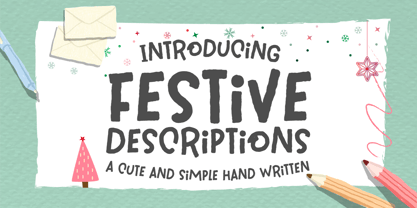 Festive Descriptions is a cute and simple lettered handwritten font that can be used for all chalkboard quotes or teaching material! Its authentic look will add a personal and realistic feel to your designs.
 - Doowop JNL by Jeff Levine,
$29.00The good old days of rock and roll... Kids hanging out under the streetlights singing four-part harmony... Relive those days with Doowop JNL - a fun and playful font with a decidely 50s flair! - Kassena by Scholtz Fonts,
$19.00Gently rounded in shape, Kassena is reminiscent of the round thatched huts of the Zulu people. The triangular motif is inspired by the designs used in the decorative crafts of the Nguni African tribes. - The Spooky Night by AEN Creative Studio,
$14.00 The Spooky Night is an incredibly unique and interesting display font. Add it to your creative Halloween themed ideas and notice how it will make them stand out! The only limit is your imagination!
 - Diversa Std by DSType,
$10.00 DSType proudly presents Diversa Std, the same system as Diversa, but with separate styles: Serif, Serif Stencil, Inline, Soft Serif, Sans, Sans Stencil, Slab, Slab Stencil and Baroque. Diversa Std: Because uniformity still sucks!
 - Remind Him by Seemly Fonts,
$12.00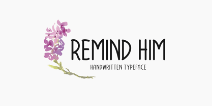 Remind Him is a cute and simple lettered handwritten font that can be used for all chalkboard quotes or teaching material! Its authentic look will add a personal and realistic feel to your designs.
 - Dreaming Christmas by Seemly Fonts,
$14.00 Dreaming Christmas is a striking display font. It can easily be matched to an incredibly large set of projects, so add it to your creative ideas and notice how it makes them stand out!
 - Seventeen Winter by Sipanji21,
$9.99 Seventeen Winter is a cute and fashionable font duo with signature and regular touch it was created to help you designing makes gorgeous logos, posters, wedding invitations, blog posts, social media, apparel and more!
 - Relic Island 2 by Jehansyah,
$9.00 This is a font with a pretty vintage look You can express your design looks old-fashioned but has a modern feel, with several options that you can use and develop your work perfectly
 - Winter Wonderland by Ake,
$12.00 Winter Wonderland is a cute and simple lettered handwritten font that can be used for all chalkboard quotes or teaching material! Its authentic look will add a personal and realistic feel to your designs.
 - Poozer by Cool Fonts,
$24.00 Poozer is a hand drawn stencil font that started out as a doodle and ended up on a custom skate deck. It has a nice organic, painted feel. Definitely not your usual stencil font.
 - Glaudusa by Bosstypestudio,
$12.00 Glaudusa is a new calligraphy font which is fresh, funny, interesting and with a cute heart that can be connected. It is suitable for greeting cards, branding materials, business cards, quotes, posters, and more!
 - Seek Truth by Seemly Fonts,
$12.00 Seek Truth is a straightforward lettered display font. Add it to your original ideas to see how it helps them stand out since it can be readily suited to a huge range of projects.
 - Tangent Slice by The Arborie,
$11.00 Looking for a structured font that screams elegance? You've found it. This handmade font is modern yet is a tinge of retro to give you a unique combination that is sure to stand out.
 - Uyuni by Alejandro Arrojo,
$20.00 An imperfect handwriting and retro style font. Informal, authentic and very versatile. Lover of adventure travel, alternative sports, and home cooking. It feels more comfortable in large sizes but also can tell little stories.
 - Well Hope by Seemly Fonts,
$12.00 Well Hope is a cute and simple lettered handwritten font that can be used for all chalkboard quotes or teaching material! Its authentic look will add a personal and realistic feel to your designs.
 - Good Wish by Seemly Fonts,
$14.00 Good Wish is a striking display font. It can easily be matched to an incredibly large set of projects, so add it to your creative ideas and notice how it makes them stand out!
 - Splendid Moment by Seemly Fonts,
$12.00 Splendid Moment is a cute and simple lettered handwritten font that can be used for all chalkboard quotes or teaching material! Its authentic look will add a personal and realistic feel to your designs.
 - Happy Moment by Seemly Fonts,
$12.00 Happy Moment is a cute and tall lettered handwritten font that can be used for all chalkboard quotes or teaching material! Its authentic look and feel will add a realistic feel to your designs.
 - Jumping World by Seemly Fonts,
$14.00 Jumping World s an incomparable display font. It can easily be matched to an incredibly large set of projects, so add it to your creative ideas and notice how it makes them stand out!
 - Dualis by Volcano Type,
$19.00The DUALIS, aka the serif-detesting Garamond, combines specifics of 2 typeclasses: Sans Serif & Antiqua. When the Garamond is too old fashioned and the Optima is worn out, the Dualis will fit the gap. - CentreForward by The Northern Block,
$12.80 CentreForward is an 8 font family consisting of 4 weights with italics. A smooth modular font that draws on ideas observed in the 1982 Football World Cup. Influential players: Paolo Rossi, Socrates, Zico & Tardelli.
 - Tulip by Bogusky 2,
$24.50We found little girls just love to see their names in flowers, so we put the metal to the petal. The license agreement states that you can take this font apart with no limits. - Contraform by Gleb Guralnyk,
$14.00 Hello! Introducing a high contrast font named Contraform. It's a geometric shape bold typeface with modern creative look. This font includes lots of multilingual characters (check out a screenshot with available letters and signs).
 - Anodina by Stefano Giliberti,
$15.00 Anodina is a font family with human features but symmetric in its soul. It supports 114 languages, features a total of 508 glyphs and includes an italicized version for each of the 5 weights.
 - Brownstone Sans by Sudtipos,
$59.00 One design sparks another. As Alejandro Paul experimented with the strokes and curves of the monoline script Business Penmanship, he discovered interesting new forms and shapes that didn't fit the Spencerian theme of that typeface. These forms simmered in Ale’s subconscious over the next three years, during which time he visited New York City, pored over rare type specimen books in the New York Public Library, and explored Brooklyn’s neighborhoods. Brownstone, the face born from these explorations, is an original 21st-century design, yet one subtly infused with historical and cultural references -- keen observers might spot influences from decorative typefaces of 19th-century foundries. And just as faces from that era were influenced by contemporary architecture, the frames included with Brownstone echo the ornate iron railings of Park Slope’s row houses. (There’s also a slight 1960s vibe to Brownstone, of novelty swash-sans photocompositing faces, that can be played up at your discretion.) Influences aside, Brownstone has broad appeal to modern audiences. A soft, monoline sans-serif, with elements of Swiss geometry (see the ‘k’ and ‘x’), its marriage of highly legible, draftsman-like letterforms with decorative swashes and ornaments reflects the old-meets-new aesthetic of the DIY craft culture seen in Brooklyn and other urban centers. It’s ornamental but unfussy, romantic but understated. Brownstone includes character sets for Latin-based languages, including Western and Eastern European, Baltic, Turkish, Maltese, Celtic and Welsh. Over 1500 glyphs, including small capitals, swash characters, alternates, and ligatures, in both Light and Thin weights. Ornamental frames are also included in both weights. The Brownstone Frames fonts are available as separate fonts in the new Brownstone Slab family.
 - VLNL Melk by VetteLetters,
$29.99 At VetteLetters we like food but we also appreciate our drinks. Yes, of the non-alcoholic kind as well. Like milk. Contrary to what Arnold Schwartzenegger once said, Milk is not just for babies. It contains a whole lot of stuff that is genuinely good for you. Like proteins, carbohydrates, minerals (calcium a.o.) and many vitamins. One time visiting The Hague, Donald DBXL spotted a tile tableau on a brick wall, advertising a dairy factory called ‘De Sierkan’. Yellow sans serif letters on a bright blue background, dating back to the late 19th century, immediately grabbed DBXL’s attention. Especially because the tableau showed both regular and bold letters with some lovely peculiarities here and there. De Sierkan appeared to have been a milk factory solely operating in The Hague from 1879 until 1961. A number of these wall adverts are still to be seen in The Hague streets today. Photos were taken for later reference. Later is now, the lettering has been digitized, missing characters added, and VLNL Melk sees the light of day. VLNL Melk is an all-caps geometric display sans serif family of three weights, Regular, Bold and Black. The basic shape of the letters is a rectangle with rounded corners, leaving a sturdy no-nonsense look and feel. It has a distinct historic aura, but with both feet in this digital day and age. It can equally well be used for the logo of a hipster coffee place, as the cover of a historic novel. Actually, VLNL Melk kan be applied in a wide range of designs like logos, posters, flyers, book covers and magazine headlines.
 - Space Armada by Wing's Art Studio,
$10.00 Space Armada - A Science-Fiction Font for Out of this World Designs! Space Armada is inspired by a 1980s interpretation of the future, referencing blockbuster sci-fi action movies of the period, along with the emerging video-game consoles and home computer technologies. It's nine unique fonts are designed to work together in a variety of ways, so you can layer it's different styles on top of each other to retro-futuristic effect!* Here's an example of how it works: Start by placing the Regular font on top of the Bold for a simple base outline. Add contrasting gradients to both fonts for an instant metallic or chrome effect. Take it a step further with one of the readymade Outlines for an embossed look. Overlay the Wireframe font for a glimpse inside the machine! This looks particularly good when you apply a glow effect and reduce it's opacity so the other layers show through. That's just one way to use it. Check out my visuals for more usage ideas! You can also follow my short tutorial! Space Armada is an all-caps font with unique uppercase and lowercase characters, along with a range of alternatives for experimentation with different looks. It also includes punctuation, numerals and language support, plus a selection of underlines and symbols. It's a highly customisable font, perfect for retro designs such as movie titles, posters, games, book covers and more! Every care has been taken to ensure that all fonts align perfectly when layering. Due to the variations in how different software handles text tracking, some minor tweaking may be required for pixel perfect alignment.
 - Diediedie - Unknown license

- Mandalay - Unknown license

- Alpha Dance - Unknown license

- Kastella Script by Mans Greback,
$79.00 Kastella Script is essentially an artist's dream tool. It feels as if you're not just typing but crafting a visual narrative, almost like putting the finishing touches on a piece of design art. It's not about the text; it's about the story it tells. The font is equipped with heavy letterforms and a range of stylistic swashes, providing a versatile toolset for modern design projects, from branding to editorial layouts. Use underscore _ to make an underline. Example: Bea_uty Use multiple underscore for different swashes. Example: Super____human Kastella Script is built with advanced OpenType functionality and has a guaranteed top-notch quality, containing stylistic and contextual alternates, ligatures, and more features; all to give you full control and customizability. It has extensive lingual support, covering all Latin-based languages, and includes all the characters and symbols you'll ever need. Behind this exquisite creation is Mans Greback. Known for pushing the boundaries of type design, Greback has ventured into the intricacies of aesthetic diversity with Kastella Script. His portfolio is a testament to his versatility and daring, turning simple alphabets into powerful visual narratives.
 - PF DIN Mono by Parachute,
$45.00 PF DIN Mono is the latest addition to the ever-growing set of DIN super-families by Parachute. It was based on its proportional counterpart DIN Text Pro but was completely redesigned to reflect its new identity. DIN Mono is a monospace typeface which is comprised of characters with fixed width. Traditionally, monospaced fonts have been used to create forms, tables and documents that require exact text line lengths and precise character alignment. DIN Mono, on the other hand, can prove to be more than a useful typeface for technical applications. In the world of proportionality, DIN Mono stands out as a fresh new alternative to the popular standard, particularly for publishing and branding applications. Additional care was given to the aesthetic form and its pleasing characteristics. The spacing attributes of the glyphs were redefined and legibility was further improved by revising or changing the shape of the letterforms. Furthermore, kerning was not included in order to preserve the monospace nature of this typeface. The family consists of 12 weights including true-italics. Currently, it supports Latin, Eastern European, Turkish and Baltic.
 - Greek by Scholtz Fonts,
$8.95The Greek font started from an experiment with designing fonts based on a geometric grid. I joined the points on the grid with straight lines to form the various characters and found that this resulted in a font that closely resembled Greek writing (derived from inscriptions carved in stone) of ancient times. I continued to develop this theme but I now accentuated the look and feel of Greek writing. The three styles shown are the results of this development. I did not kern or letterspace the individual letters since this would have been out of character with the orignal Greek writing. This means that the font is mono-spaced. At a later stage I may produce more refined and "modern" versions of these fonts. Surprisingly, the Greek SCF styles are very readable. The font is fully professional in terms of its character set. It contains over 235 characters - (upper and lower case characters, punctuation, numerals, symbols and accented characters are present). In fact, it has all the accented characters used in the major European languages. - Lust Hedonist by Positype,
$50.00 Check out the new Lust Pro & Lust Pro Didone to see how the series has grown and evolved. Confident, voluminous and versatile, Lust is an exercise in indulgence—an attempt to create something over the top and vastly useful. Lust Hedonist pushes contrast almost to the limit. The letterforms, especially the Script style are very self-indulgent for me, dare I say Hedonistic, and how I like to see letter masses taken to extreme contrast. The series unapologetically channels Herb Lubalin, but produced with a deliberate, contemporary twist. There is an intentional slyness infused in the letterforms—the extreme thick and thin lines flow effortlessly without becoming gratuitous. It’s always just enough, not too much. What makes the type series so appealing? The curves. When asked to describe the letterforms, most people unwittingly allude to the human form, using adjectives usually reserved for describing physical traits… creating all-too-familiar comparisons. Summerour has grown to accept this as unavoidable and reasonable given his acknowledgement of its influences and has provided nuances within the letterforms to accentuate that.
 - Bouquet by Serebryakov,
$39.00 Bouquet font is a cursive fat typeface influenced by brush writing and skilfully flavored with elements of fractur. The result is really amazing – a font with bespoke personality, strong unique presence and classy standing out amongst the other look. Type designer Dzianis Serabrakou really did well in every single letterform, aperture, curve and line, but this was probably below satisfactory and he didn’t stop here – Denis developed the font to a higher level by making it fully open-type compatible. Bouquet supports large set of multilingual diacritics plus a beautifully designed set of Cyrillic characters. Additionally you will be able to use also ligatures and really lots of alternative symbols to bring more life, versatility and personalization in your work. Initially Bouquet has been designed as a logo font – it is so identical that could easily turn every brand name into logo icon. Furthermore this font is perfect for designing t-shirts, typographic posters, packaging etc and it is highly recommended for letterpress as well as for normal offset and screen printing.
 - Mr Gabe by Leksen Design,
$- Check out Mr Gabe in motion! Mr Gabe is a typeface designed to dance. Not that it’s a flamboyant display face, but that it has a liveliness, especially in its heavier weights, that dances across the page. And the letters include a selection of exuberant flourishes that can be used to kick up a ruckus or make a sweeping gesture. Mr Gabe is a high-contrast serif typeface with vertical stress, a “modern” face in traditional type terms. Even in the regular weight, the contrast between thick and thin strokes is very obvious. Designer Andrea Leksen has given many of the lowercase letters ball terminals, teardrop shapes that make Mr Gabe seem decorated even when most of its letter forms are conservative. If you need more bells and whistles, or perhaps revolving mirror balls and dancing shoes, you can explore the font’s collection of ornaments and decorative borders. Mr Gabe comes in four weights, from Regular to Black, with italics for each. Each font includes over 57 ligatures, 31 illustrations and borders, small caps and proportional oldstyle numerals.
 - Ornable by Casloop Studio,
$16.00 Meet Ornable Typeface, your font of choice for a captivating blend of Renaissance, Art Nouveau, Medieval, and Art Deco vibes. This single-weight typeface is designed for those seeking a font that embodies a rich tapestry of artistic nuances. With 35 meticulously crafted ligatures, Ornable ensures your text is not just seen but experienced. Dive into the charm of fractions for precise numerical representation and case-sensitive forms for a perfect interplay of uppercase and lowercase letters. Stand out effortlessly with the inclusion of a unique arrow symbol, adding a modern touch to your designs. Ornable adapts seamlessly to various themes, from the classic allure of Renaissance to the bold geometry of Art Deco. Whether you're crafting posters or logos, Ornable celebrates your creativity with sharp lines and intricate details. It's the ideal choice for projects that demand a touch of mystique and retro charm. Capture the essence of artistic movements with this typeface and step into a world where past and future converge – embrace Ornable and redefine the boundaries of your creative expression.
 - Linotype Mega by Linotype,
$29.00Linotype Mega is part of the Take Type Library, chosen from the entries of the Linotype-sponsored International Digital Type Design Contests of 1994 and 1997. The fun schrift of German designer Till F. Teenck is available in three weights whose names are word plays in themselves. Mega in (which we hope the font will be) contains relatively light, somewhat irregularly-drawn characters which look as though they were printed by hand and the characters are set rather far apart from each other. This weight is good for short and middle length texts in point sizes of 10 and larger. Mega normal is anything but. The characters are the outline forms of Mega in and their larger width reduces the distance between them. This weight is generally a headline font. Mega out is a very heavy weight and is the filled-in version of Mega normal. The characters flow into each other and look almost like silhouettes. The reduced legibility makes this font suitable exclusively for headlines in larger point sizes.


