10,000 search results
(0.041 seconds)
- Thinly Disguised JNL by Jeff Levine,
$29.00 The hand lettered thin, variable width slab serif text appearing on the cover of a souvenir photo book for the 1933 Chicago World's Fair Exposition is the basis for Thinly Disguised JNL.
 - Notebook Scribble by Mariess,
$7.00 A hand drawn font thats perfect for kids cards, scrap-booking and photo annotation etc.. Full set of alternative characters included. Comes with CSS and HTML code plus all web compatible formats.
 - Deco Geometric Stencil JNL by Jeff Levine,
$29.00 Deco Geometric Stencil JNL was inspired by an example of a vintage Art Deco stencil type design seen in the Steven Heller-Louise Fili book "Stencil Type" (published by Thames and Hudson).
 - Blackflower by TypeFaith Fonts,
$6.00 Blackflower Typeface is a handdrawn brush font. It's brutal, rough and messy, with ligatures to avoid twice the same glyph. You can use it for labeling, clothing, books, magazines and album covers.
 - Hebrew Caligraphic Stam by Samtype,
$125.00 Beautiful font, good for posters and small books and folders. This is a complete font with all diacritic marks (Nikud and Taamim) and also shevana, kamatz katan, dagesh hazak and holam chaser.
 - Albegos by Letterena Studios,
$17.00 Albegos is a stylish and elegant serif font. This typeface is perfect for an elegant & luxury logo, book or movie title design, fashion brand, magazine, clothes, lettering, quotes, and so much more.
 - Draconian by madeDeduk,
$15.00 Draconian is a old school typeface with cool character! Draconian perfect for poster design, book covers, merchandise, fashion campaigns, newsletters, branding, advertising, magazines, greeting cards, album covers, and quote designs and more.
 - Amulet by G-Type,
$39.00 Amulet evolved after a trip to Dublin, Ireland. It has a Celtic calligraphic influence which must have subconsciously come from looking at ancient manuscripts and the Book of Kells in Trinity College.
 - Amie by Greater Albion Typefounders,
$14.00 Amie is a friendly Sans Serif display face, with a hint of hand drawn flair. Ideal for poster work, album covers, book covers and for bringing an element of friendly style anywhere.
 - Magistan by Letterena Studios,
$9.00 Magistan is a distinct and vintage styled slab serif font. It will create elegant & luxurious logos, books or movie title designs, fashion brands, magazine covers, clothes, lettering, quotes, and so much more.
 - Nevan by Dasukreation,
$10.00 Nevan is a geometric display font. It features all caps, stylistic alternates feature, plus supports multilingual languages. It's perfect for logos, book covers, movie posters, games, and much more! Caps Only Fonts.
 - The Monster by Maulana Creative,
$10.00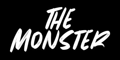 Give your designs an authentic brush handcrafted feel. The Monster is perfectly suited to signature, stationery, logo, typography quotes, magazine or book cover, website header, flyer, clothing, branding, packaging design and more.
 - Sales Slip JNL by Jeff Levine,
$29.00 Sales Slip JNL is derived from the core lettering of Sales Book JNL, an outline font with a cast shadow; modeled from wood type examples found in an old printer's supply catalog.
 - Gold&Song by Letterena Studios,
$17.00 Gold&Song is a modern and classic serif font that has its own unique style. This typeface is perfect for luxury logos, books, fashion brands, magazines, apparel, quotes, and so much more.
 - JH Haroun by JH Fonts,
$120.00 JH Haroun is based on the calligraphic Thuluth script; It includes over two thousand glyphs and smart Kashidas to simulate the actual calligraphy. It is ideal for titles, book covers, greeting cards .........
 - Monaz by Craft Supply Co,
$20.00 Introduction to Monaz – Bubble Font Monaz – Bubble Font, a playful and airy display font, is inspired by the lightness and roundness of bubbles and balloons. Perfect for creating eye-catching headings, logos, and children’s books, this font not only grabs attention but also serves as an ideal choice for fun and whimsical projects. Design and Aesthetics In its design, Monaz – Bubble Font features characters that resemble bubbles, with rounded edges and a bouncy feel. Furthermore, the letters mimic the floating appearance of balloons, thus adding a cheerful and lighthearted touch to any design. Additionally, its rounded forms are easy on the eyes, ensuring readability while preserving its playful charm. Versatility and Usage Monaz – Bubble Font boasts high versatility, fitting a variety of design needs effortlessly. Not only does it shine in party invitations and product packaging, but it also excels in promotional materials. Moreover, its effectiveness extends to educational materials for children, making learning engaging with its friendly appearance. As a result, its readability and unique style make it a top choice for designers seeking to add a fun element to their projects. Accessibility and Appeal Designed for a wide audience, Monaz – Bubble Font features a simple and clear style that is easy to read. It appeals to all ages, capturing the whimsy of childhood while still being sophisticated enough for adult projects. In summary, this font brings a unique joy and playfulness to any design, making it a valuable addition to any font collection.
 - Salma Alfasans by Alifinart Studio,
$10.00 Salma Alfasans is a modern sans serif font, created on February 25, 2021. The main inspiration for this font is its modern geometry and bold design, but looks elegant and smooth. This font is well-crafted and has almost no contrast at all. The advantage of the Salma Alfasans font is that it is very appropriate when used as a heading, but also looks good when used as body text. With many weight options, you can freely adjust the design scenario based on your needs. Salma Alfasans is very good for logos, branding, books (headings, sub headings, and body text), invitations, business cards and others. SALMA ALFASANS UPDATE VERSION 2.0 Update Details: - New designs and mayor changes - Tabular and proportional lining figures - Tabular and proportional oldstyle figures - Stylistic set for a, l, y, and G - Numerator, denominator, and fractions - New ligatures for ff, fi, fj, ft, fk, ffk, and more - Case sensitive, and - Arrows Language Support: Afrikaans, Albanian, Asu, Basque, Bemba, Bena, Breton, Catalan, Chiga, Cornish, Danish, Dutch, English, Estonian, Filipino, Finnish, French, Friulian, Galician, German, Gusii, Indonesian, Irish, Italian, Kabuverdianu, Kalenjin, Kinyarwanda, Luo, Luxembourgish, Luyia, Machame, Makhuwa-Meetto, , Makonde, Malagasy, Manx, Morisyen, North Ndebele, Norwegian Bokmål, Norwegian Nynorsk, Nyankole, Oromo, Portuguese, Quechua, Romansh, Rombo, Rundi, Rwa, Samburu, Sango, Sangu, Scottish Gaelic, Sena, Shambala, Shona, Soga, Somali, Spanish, Swahili, Swedish, Swiss German, Taita, Teso, Uzbek (Latin), Volapük, Vunjo, Zulu. Thank you. Alifinart Studio alifinart@gmail.com Instagram | Behance
 - Jetworld by Nelson Borhek Press,
$12.00 Jetworld is the space-age typeface with the retro-forward look. Jetworld’s tapered and weighted parabolic-arch curves interplay with its rigid, straight verticals and horizontals to create an unexpected but pleasing motion and a rhythm that is constantly changing. Jetworld is an OpenType font that speaks of clean space-age design, midcentury optimism, and the promise of new frontiers. Jetworld gives a midcentury-modern or retro-futuristic look to book covers, magazine layouts, posters, and album covers. But Jetworld is adaptable, too. With hints of ancient cuneiform writings mixed with the look of markings on an alien spaceship, Jetworld spans eons. And Jetworld’s large character set includes multi-lingual support and many other special characters. That means Jetworld can be used for more than just headlines and more than just English. Jetworld combines a distinctive personality with surprising readability. Jetworld is unusual in that it is not descended from handwriting or calligraphy. Instead, Jetworld was inspired by midcentury modern architecture and consumer goods. Think of the parabolic arches seen in midcentury masterpieces like the Theme Building at Los Angeles International Airport, the TWA terminal at JFK Airport in New York, and even the cartoon architecture of “The Jetsons” television show. Think of boomerang-patterned Formica countertops and tabletops, or arch-shaped “hairpin” legs on midcentury furniture. Jetworld’s character shapes were inspired by all of these. Jetworld—direct from the world of the future to you.
 - Morris by HiH,
$10.00 Morris is a four-font family produced by HiH Retrofonts and based on the work of the very English William Morris. William Morris wanted a gothic type drawn from the 14th century blackletter tradition that he admired both stylistically and philosophically. He drew from several sources. His principal inspiration for his lower case was the 1462 Bible by Peter Schoeffer of Mainz; particularly notable for the first appearance of the ‘ear’ on the g. The upper case was Morris’s amalgam of the Italian cursive closed caps popular throughout the 12th through 15th centuries, a modern example of which is Goudy’s Lombardic Capitals. The gothic that Morris designed was first used by his Kelmscott Press for the publication of the Historyes Of Troye in 1892. It was called “Troy Type” and was cut at 18 points by Edward Prince. It was also used for The Tale of Beowulf. The typeface was re-cut in at 12 points and called “Chaucer Type” for use in The Order of Chivalry and The Works of Geoffrey Chaucer. Morris' objective is designing his gothic was not only to preserve the color and presence of his sources, but to create letters that were more readable to the English eye. ATF copied Troy and called it Satanick. Not only was the ATF version popular in the United States; but, interestingly, sold very well in Germany. There was great interest in that country in finding a middle ground between blackletter and roman styles -- one that was comfortable for a wider readership. The Morris design was considered one of the more successful solutions. Our interpretation, which we call Morris Gothic, substantially follows the Petzendorfer model used by other versions we have seen, with the following exceptions: 1) a larger fillet radius on the upper arm of the H, 2) a more typically broadpen stroke in place of the foxtail on the Q, which I do not like, 3) inclusion of the aforementioned ear on the g and 4) a slightly shorter descender on the y. We have included five ornaments, at positions 0135, 0137, 0167, 0172 and 0177. The German ligatures ‘ch’ & ‘ck’ can be accessed using the left and right brace keys (0123 & 0125). Morris Initials One and Morris Initials Two are two of several different styles of decorative initial letters that Morris designed for use with his type. He drew from a variety of 15th century sources, among which were Peter Schoeffer’s 1462 Mainz Bible and the lily-of-the-valley alphabet by Gunther Zainer of Augsburg. Each of the two initial fonts is paired with the Morris Gothic lower case. Morris Ornaments is a collection of both text ornaments and forms from the surrounding page-border decorations.
 - Selfie Neue Sharp by Lián Types,
$29.00 INTRODUCTION When I started the first Selfie back in 2014 I was aware that I was designing something innovative at some point, because at that time there were not too many, (if any) fonts which rescued so many calligraphy features being at the same time a monolinear sans. I took inspiration from the galerías’ neon signs of my home city, Buenos Aires, and incorporated the logic and ductus of the spencerian style. The result was a very versatile font with many ligatures, swashes and a friendly look. But… I wasn’t cognizant of how successful the font would become! Selfie is maybe the font of my library that I see the most when I finally go out, (type-designers tend to be their entire lives glued to a screen), when I travel, and also the font that I mostly get emails about, asking for little tweaks, new capitals, new swashes. Selfie was used by several renowned clients, became part of many ‘top fonts of the year’ lists and was published in many magazines and books about type-design. These recognitions were, at the same time, cuddles for me and my Selfie and functioned as a driving force in 2020 to start this project which I called Selfie Neue. THE FONT "Selfie for everything" Selfie Neue, because it’s totally new: All its glyphs were re-drawn, all the proportions changed for better, and the old and somehow naive forms of the first Selfie were redesigned. Selfie Neue is now a family of many members (you can choose between a Rounded or a Sharp look), from Thin to Black, and from Short to Tall (because I noticed the feel of the font changed notoriously when altering its proportions). It also includes swashy Caps, which will serve as a perfect match for the lowercase and some incredibly cute icons/dingbats (designed by the talented Melissa Cronenbold, see also Selfie Neue Rounded for more!) which, as you see in the posters, make the font even more attractive and easy to use. You'll find tons of alternates per glyph. It's impossible to get tired with Selfie! Like it happened with the old Selfie, Selfie Neue Sharp was thought for a really wide range of uses. Magazines, Book-covers, digital media, restaurants, logos, clothing, etc. Hey! The font is also a VF (Variable Font)! So you can have fun with its two axes: x-height and weight, in applications that support them. Let me take a New Sharp Selfie! TECHNICAL If you plan to print Selfie Neue VF (Rounded or Sharp), please remember to convert it to outlines first. The majority of the posters above have the "contextual" alternates activated, and this makes the capitals a little smaller. I'd recommend deactivating it if you plan to use Selfie for just one word. Use the font always with the "fi" feature activated so everything ligatures properly. The slant of the font is 24,7 degrees, so if you plan to have its stems vertical, you may use Selfie with that rotation in mind. THANKS FOR READING
 - Maestro by Canada Type,
$24.95 Out of a lifelong inner struggle, Philip Bouwsma unleashes a masterpiece that reconciles classic calligraphy with type in a way never before attempted. Maestro takes its cue from the Italian chancery cursive of the early sixteenth century. By this time type ruled the publishing world, but official court documents were still presented in calligraphy, in a new formal style of the high Renaissance that was integrated with Roman letters and matched the refined order of type. The copybooks of Arrighi and others, printed from engraved wood blocks, spread the Italian cancellaresca across Europe, but the medium was too clumsy and the size too small to show what was really happening in the stroke. Arrighi and others also made metal fonts that pushed type in the direction of calligraphy, but again the medium did not support the superb artistry of these masters or sustain the vitality in their work. As the elegant sensitive moving stroke of the broad pen was reduced to a static outline, the human quality, the variety and the excitement of a living act were lost. Because the high level of skill could not be reproduced, the broad pen was largely replaced by the pointed tool. The modern italic handwriting revival is based on a simplified model and does not approach the level of this formal calligraphy with its relationship to the Roman forms. Maestro is the font that Arrighi and his colleagues would have made if they had had digital technology. Like the calligraphic system of the papal chancery on which it is modelled, it was not drawn as a single finished alphabet, but evolved from a confluence of script and Roman; the script is formalized by the Roman to stand proudly in a world of type. Maestro came together on screen over the course of several years, through many versions ranging widely in style, formality, width, slant, weight and other parameters. On one end of the spectrum, looking back to tradition it embodies the formal harmony of the Roman capitals and the minuscule which became the lower case. On the other it is a flowing script letter drawing on the spirit of later pointed pen and engravers scripts. As its original designers intended, it works with simple Roman capitals and serifs or swash capitals and baroque flourishes. The broad pen supplies weight and substance to the stroke which carries energy through tension in balanced s-curves. Above all it is meant to convey the life and motion of formal calligraphy as a worthy counterbalance to the stolid gravity of metal type. The Maestro family consists of forty fonts distributed over two weights. The OpenType version compresses the family considerably down to two fonts, regular and bold, each containing the entire character set of twenty fonts, for a total of more than 3350 characters per font. These include a wide variety of stylistic alternates, ligatures, beginning and ending letters, flourishes, borders, rules, and other extras. The Pro version also includes extended linguistic support for Latin-based scripts (Western, Central and Eastern European, Baltic, Turkish, Welsh/Celtic, Maltese) as well as Greek. For more thoughts on Maestro, its background and character sets, please read the PDF accompanying the family.
 - ALS Dereza by Art. Lebedev Studio,
$63.00 Dereza is a grotesque typeface designed specially for display use in children’s books and magazines. Books for little ones are usually set in grotesques, and a vigorous font would make a nice addition to the main face. Playful and lively, Dereza is great for any non-grown-up design such as games and toy boxes, cookie jars and cereal packs, clothing labels and other things meant for kids. It looks super in speech bubbles. The Dereza family includes four fonts, from light to bold, with ligatures, lowercase figures and accented characters.
 - Octava by ParaType,
$30.00 PT Octava™ was designed at ParaType in 2001 by Vladimir Yefimov. The first (Cyrillic only) version named Scriptura Russica (1996) consisting of three styles (book, italic, bold) was commissioned by the Russian Bible Society. Lately the Latin letters and bold italic were added. Inspired by Lectura, 1969, by Dick Dooijes and Stone Print, 1991, by Sumner Stone. In spite of large x-height the typeface is both space saving and quite legible at small sizes. Expert fonts including small caps (book) and old style figures are available.
 - MFC Voyeur Monogram by Monogram Fonts Co.,
$24.95 The source of inspiration for Voyeur Monogram is the 1934 "Book of American Types" by American Type Founders. Found in that specimen book was a charmingly sophisticated diagonal monogram alphabet known as “Broadway Monogram Initials”. This wonderful typeface is now digitally recreated, revived, and updated for modern use. Download and view the MFC Voyeur Guidebook if you would like to learn a little more. MFC Voyeur comes complete with Pro format fonts. You will require with programs that can take advantage of OpenType features contained within the Pro fonts.
 - Fosho by Chank,
$49.00 For more than 70 years the 10-foot tall letters displaying the word FOSHAY have illuminated the Foshay Tower in the Minneapolis skyline. However, the typestyle has never been made into a font before. This new modern font family, dubbed Fosho Book, is optimized for book print usage as well as functioning as big bold display type on screen. The Fosho fonts are available in three styles: Outlines, Dotted Bulb Inlines and Composite with both. You can use the three styles in overlapping colors for dramatic chromatic effects.
 - Dear Sans by Stiggy & Sands,
$24.00 The Dear Sans Collection is comprised of four widths ranging from Condensed, Regular, Expanded, and Wide; each of which are comprised of a three font family of weights: Book, Regular & Bold. Cleanly readable, with just a slight hint of silliness, the Dear Sans Collection brings adds the perfect level of lightheartedness to your designs. The Dear Sans Collection comes with: - Approx. 367 Character Glyph Set per font - including standard & punctuation, international language support, and basic “fi fl” ligatures per font. - 3 Weights per family including: Book, Regular, and Bold. - Loads of Personality for your designs.
 - Shandia Signature by Gatype,
$12.00 Shandia Signature is an elegant calligraphy font. This font is casual and pretty with a stroke. Can be used for various purposes. such as logos, product packaging, wedding invitations, branding, headlines, signage, labels, signatures, book covers, posters, quotes and others. Shandia Signature is encoded with PUA Unicode, which allows full access to all additional characters without having to design special software. Mac users can use Font Book , and Windows users can use the Character Map to view and copy any additional characters to paste into your favorite text.
 - Dissonus by Dawnland,
$13.00 DisSonus X is ideal for: Initial characters - give your text an unparalleled facelift! Headlines - create a unique look for your posters, event graphics, book covers & music/media/game packaging. Preamble - reanimate the introduction... The bread text on the gallery images is written in Nihil . DisSonusX was revised 2012 and now hold a full character set of basic english/latin letters and west european diacritics! Note that there are no digits in this font. Use a fitting antiqua such as Berkeley Book or (insert your favourite version here) Garamond.
 - Sangoma by Scholtz Fonts,
$19.00I named the font "Sangoma" after the traditional healers of the Southern African tribes. Sangomas often work by "throwing bones". The shapes of the bones have suggested the shapes of the characters in the Sangoma font. The font is useful for creating designs or producing text that has an African look. Typified by an African angularity the characters reflect the ethos of Africa. The Sangoma font contains the full range of upper and lower case characters, all punctuation and special characters as well as the accented characters used in the major European languages. - Ehrhardt MT by Monotype,
$29.99 The Ehrhardt name indicates that this typeface is derived from the roman and italic typefaces of stout Dutch character that the Ehrhardt foundry in Leipzig showed in a late-seventeenth-century specimen book. The designer is unknown, although some historians believe it was the Hungarian Nicholas Kis. Monotype recut the typeface for modern publishers in 1937 to 1938. Ehrhardt has a clean regularity and smooth finish that promote readability, as well as a slight degree of condensation, especially in the italic, that conserves space. Ehrhardt is a fine text face, especially for books.
 - Ghosty Banditto by Youngtype,
$14.00 (Halloween Font) Ghosty Banditto Script & Serif, This typeface is ideal for use in thick watercolor designs or handwriting styles, such as blog titles, posters, wedding elements, t-shirts, clothing, book covers, business cards, greeting cards, branding, merchandise etc. Contains full set: - Uppercase - Lowercase - Alternative - Ligatures - Punctuation - Number - Multilingual support. This font is ideal for use in watercolor designs or hand bold styles, such as blog headers, posters, wedding elements, t-shirts, clothing, book covers, business cards, greeting cards, branding, merchandise, invitations and handmade quotes and more. again. again. Thank you :)
 - Bromwich by Greater Albion Typefounders,
$14.95 Bromwich is a piece of brand new Edwardian fun. In the spirit of railway travel posters and illustrated news journals, it's a wonderful font for poster design, or for book covers and other work with a period theme. Need something for a menu or placecards for a period themed function? Designing a book cover for a period novel? Bromwich is the face for you. It's offered in regular and alternate forms, with additional true small capital forms of both. Bring a bit of period flare to everything you do!
 - Cattus by Craft Supply Co,
$15.00 Cattus is a handwritten script font based on the expression of real handwriting. Cattus will work perfectly for fashion, e-commerce brands, trend blogs, wedding boutiques or any business that wants to appear upscale and chic. Cattus is also suitable for logos, greeting cards, quotes, posters, branding, name cards, stationary, design titles, blog headers, art quotes, typography, art, modern envelope lettering or book design, happening style like hand-drawn design or watercolor design themes, craft design, any DIY project, book titles, or any purpose to make your art/design project look pretty and trendy.
 - Agadir by Eurotypo,
$29.00 Agadir is a font inspired by a logo of the 60s. Its fundamental characteristic is that it is regular, with the possibility of choosing between ascending and descending of two different lengths. Agadir font is the perfect mix of elegant and casual. The Open Type features include standard and contextual alternates, swatches, stylistic sets, ligatures. All this makes the text lively and bouncy, without the monotony of obviously repeated letterforms. Agadir looks good in children's books, book covers, magazines, logos, fashion, restaurant menus, packaging, wedding invitations, greeting and business cards and where you want it.
 - Brayhonest by Alandya TypeFoundry,
$19.00 Brayhonest offers a wide range of options for creating logos, titles and titles. It is suitable for books, editorials, packaging, advertising, brand imaging and more. Brayhonest includes Collection of Uppercase, Stylistic, Latin Based Language Support, Numbers and Punctuation. Set Stylistic is available in Uppercase and Lowercase. Brayhonest is encoded with PUA Unicode, which allows access to all features without special design software. Mac users can use Font Books, and Windows users can use Character Map to view and copy extra characters to paste into your favorite app / text editor.
 - Chubby Elephant by Putracetol,
$25.00 Chubby Elephant - Bold Playful Display Font. This font is very bold and playful. With a childish style, it will be very suitable for your project, which is related to children. Such as story books, illustrations, comic books, t-shirts, posters, greeting cards, logos, branding, stickers, svg, crafting. This font can be installed on MAC OS and Windows OS, it can also be installed in the procreate and cricut applications. Come with lot of ligatures character, its help you to make great lettering. This font is also support multi language.
 - FF Tarquinius by FontFont,
$68.99German type designer Norbert Reiners created this sans FontFont between 1996 and 2010. The family has 7 weights, ranging from Book to Extra Bold (including italics) and is ideally suited for book text. FF Tarquinius provides advanced typographical support with features such as ligatures, small capitals, alternate characters, case-sensitive forms, fractions, and super- and subscript characters. It comes with a complete range of figure set options – oldstyle and lining figures, each in tabular and proportional widths. As well as Latin-based languages, the typeface family also supports the Cyrillic and Greek writing systems. - Legitima by César Puertas,
$29.99 Legitima is a text font family inspired by the types found in the 3rd edition of the Italian book La Cicceide Legitima, printed in 1695. Its weight and x-height, optimized for 10 point-size, make it an ideal choice for book design and anything with running text. Like most typefaces from the 16th century, the strokes that constitute Legitima seem to depart from the traditional broad-nib pen model of handwriting and dare to explore the shapes produced by the techniques in use by punch-cutters of the time.
 - Permacultur by Papermode Co,
$20.00 Permacultur, letters to connected each other to convey elegance and style. Thin and thickness, feminine and friendly. Permacultur will work perfectly for fashion, e-commerce brands, trend blogs, invitation, product packaging, hand-written quotes, greetings cards, labels, logos, magazines, books, greeting/wedding cards, packaging, stationery, novels, labels or any type of advertising purpose. Includes multilingual support and special ligatures If you do not have programs that support OpenType features like Adobe Illustrator and CorelDraw X Versions, you can access all alternative flying machines using Font Book (Mac) or Character Map (Windows).
 - Winterbean by Sibelumpagi,
$14.00 Winterbean is a beautiful modern calligraphy font. It comes with some alternates that make the font look beautiful and elegant. It’s perfect for logos, product packaging, wedding invitations, branding, headlines, signage, labels, signature, book covers, posters, quotes and more. And this font has given PUA Unicode so that all the alternate characters can easily be accessed. If you don't have a program that supports OpenType features such as Adobe Illustrator and CorelDraw X Versions, you can access all the alternate glyphs using Font Book (Mac) or Character Map Windows). Thanks, and enjoy the font.