10,000 search results
(0.021 seconds)
- Yontrakam by Jipatype,
$17.00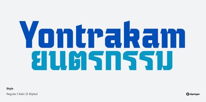 Yontrakam is a bold display font with a sharp and sleek appearance, exuding a futuristic and sci-fi vibe. Ideal for conveying special emphasis in diverse media, including posters, packaging, and more.
 - Burger Royale JNL by Jeff Levine,
$29.00Burger Royale JNL by Jeff Levine is a bold, sans serif font with a slight Deco feel, inspired by the logo of a former Florida chain of hamburger shops called Royal Castle. - Distance by Maulana Creative,
$14.00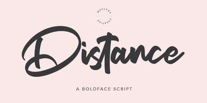 Give your designs an authentic handcrafted feel. "Distance Bold Script Font" is perfectly suited to signature, stationery, logo, typography quotes, magazine or book cover, website header, clothing, branding, packaging design and more.
 - Yanson by Younestype,
$99.00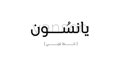 This Arabic typeface family was created by Younes Alaboudi. Yanson proudly incorporates a timeless geometric style with humanistic nuances. Featuring three weights from Light to Bold, Yanson supports OpenType features for Arabic.
 - Clarenwood JNL by Jeff Levine,
$29.00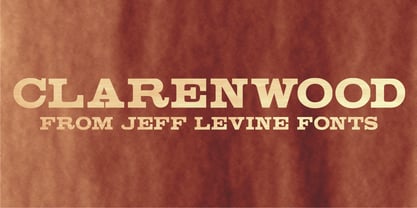 Based on some examples of a Clarendon-inspired wood type design, Clarenwood JNL is a bold and effective titling font which harkens back to old times and advertising on a grander scale.
 - Totally Rad by The Arborie,
$11.00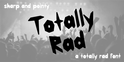 It's sharp and pointy! This font is anything but minimal, it has an edgy personality with asymmetrical qualities. This edgy font is perfect to use for a band or an edgy poster.
 - Lactosa by Nasir Udin,
$18.00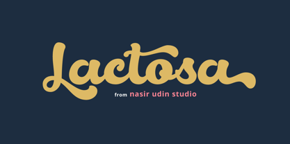 Lactosa is a sweet script font that is bold, full of energy, and curvaceous! The font comes with alternates for you to play with, and can amplify the uniqueness of your designs.
 - Meksa by Okaycat,
$29.95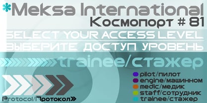 Meksa is sleek, minimal & very clean. This wide typeface is perfect for bold headers, impact text, or logo design. Meksa is multilingual, appropriate for international publications. Includes Cyrillic, West European diacritics & ligatures.
 - Lutfey by NamelaType,
$17.00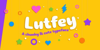 Lutfey is a chunky & cute typeface, visually featuring bold, firm and gentle characters. It’s has smooth lines on each side, especially on the outside, with subtle ink-trap details at every corner.
 - Bloop by Robert Petrick,
$19.95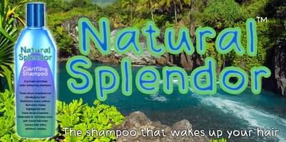 Bloop is a versatile bold new cartoon font that is great for the web, video, print headlines or product logos. It is a hot, contemporary, very readable design with language character function.
 - Keitana MF by Masterfont,
$59.00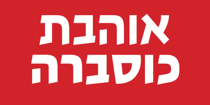 A practical font family with 2 weights for all your day by day headlines, signage etc. An extended sans serif typeface with rounded endings that provides unique bold appearance without losing legibility.
 - Realtime Gamer by Creaditive Design,
$12.00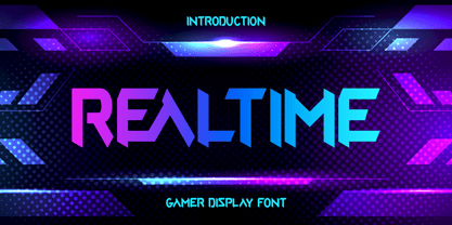 Realtime is a cool, thick lettered and robotic display font. This font is ideal for writing web designs, business cards, or pretty much anything else that requires a techno and bold touch.
 - Neo Strada by Differentialtype,
$10.00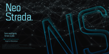 Neo Strada is a bold geometric sans serif font that comes in many weights and several alternates. It's perfect for documents, font logos, blogs, social media, marketing campaigns and many other projects!
 - Parkitecture JNL by Jeff Levine,
$29.00Parkitecture JNL is the latest font to embrace the angles and lines of the Art Deco era. Bold and solid in look and feel, it gives nostalgic headlines a "solid" retro appearance. - Striptease JNL by Jeff Levine,
$29.00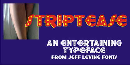 Striptease JNL is the bold, brash, "your-name-in-lights" companion to Showgirl JNL, and was inspired by a scene in an old television show depicting a burlesque house of the 1930s.
 - Gracioso by FadeLine Studio,
$14.00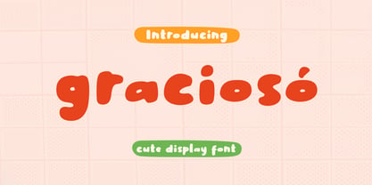 Introducing! Gracioso is a new cute and funny display font. This font adopts a bold, cute, firm, and trendy style. Very suitable to meet your various design needs that are trending now.
 - Catalog JNL by Jeff Levine,
$29.00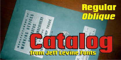 Catalog JNL is based on a set of vintage wood type. Its uniform, block-style appearance is perfect for projects where bold, readable titling will apply. Available in regular and oblique styles.
 - Mariosa by Letterara,
$12.00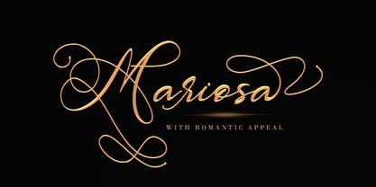 Mariosa is an elegant font with a romantic appeal; this font is for those who are in need of an elegant and appropriately modern calligraphy script. Get inspired by its bold swashes.
 - Grateful Everyday by Crumphand,
$12.00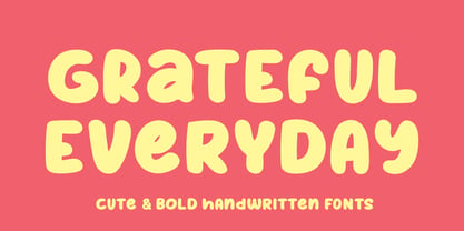 Hello, Introducing Bold and Cute Fonts Grateful Everyday. this font rounded good for your Graphic. Frendly use, Easy to Read. What's Character Included ? Uppercase Lowercase Symbols Numerals Multilingual Support Thank You, Regards.
 - Gostyk by Saxofont,
$18.00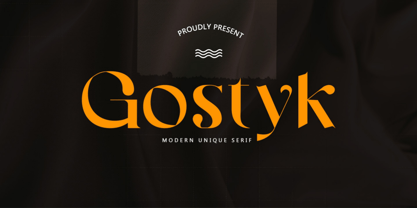 Gostyk is a bold and stylish font. Perfect for use in a variety of purposes, such as writing articles, magazines, branding projects or simply as stylish text to display on your screenshots.
 - Rima by K-Type,
$20.00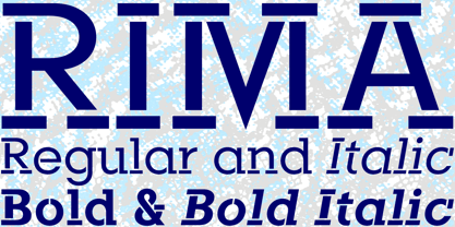 Rima is a stencil display face with imposing slab serifs, designed to suggest strength, confidence, expertise and efficiency. Regular and Bold weights are included along with two handy italics (optically corrected obliques).
 - Albeit Grotesk Caps by Cloud9 Type Dept,
$40.00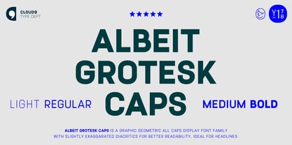 Albeit Grotesk Caps is a graphic geometric all caps display font family of four weights (Light, Regular, Medium and Bold) with slightly exaggarated diacritics for better readability making it ideal for headlines.
 - Rail Service JNL by Jeff Levine,
$29.00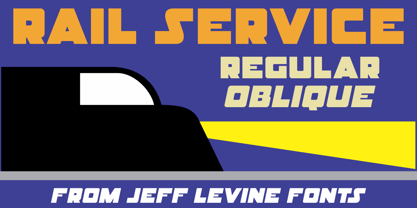 The extra bold, squared Art Deco sans hand lettering found on a 1940s travel poster for the Pennsylvania Railroad inspired Rail Service JNL, which is available in both regular and oblique versions.
 - Lights Of Athena by Epiclinez,
$18.00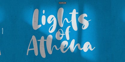 Lights Of Athena is a bold and smooth stylish script font. It's fun and casual, but demanding attention. Very suitable for headlines, titles, magazines, packaging, branding, apparel, adverts, logos, apps, and more.
 - Sensuous by Gerald Gallo,
$20.00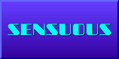 Sensuous is a bold sans serif font with characters that have a very high contrast between thick and thin elements. It is ideal for headlines, titles, branding and small blocks of text.
 - AZ Clouds by Artist of Design,
$20.00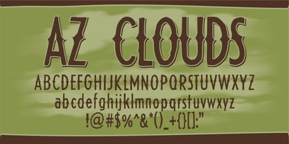 AZ Clouds was inspired from a need to develop a sans serif typeface with center accents for a t-shirt design. This font was designed for use as a fun bold headline.
 - Outrage by AVP,
$19.00Outrage is highly disfigured to the verge of illegibility. The base font is Fiendstar Bold Condensed and the distress pattern is derived from a series of semi-abstract paintings. The result screams. - Goudy Handtooled by Bitstream,
$29.99Goudy Handtooled was done in 1922 and is a shaded version of Goudy Bold. Some authorities credit the design to Charles A. Becker and others to Morris Fuller Benton and Wadsworth Packer. - Rounded Sans Wood JNL by Jeff Levine,
$29.00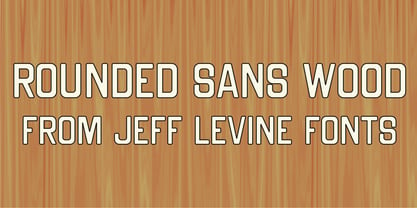 Examples of a wood type alphabet for letterpress are the basis for Rounded Sans Wood JNL. Clean and bold, the rounded ends give a softer, more informal look to any display copy.
 - Chyali by Din Studio,
$29.00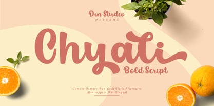 Chyali is a bold script. It especially made for branding packaging especially for food packaging. the design can elevate your project design. Featured : Many Alternates Many Swash Multilingual Support Numerals and Punctuation
 - Stitch It Up by Studio Indigo,
$17.00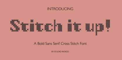 Stitch it up is a bold sans-serif cross-stitch font. It is intended for headings, advertisements and signs rather than continuous body text. It has multilingual support for all European languages.
 - Oblonga by Eurotypo,
$28.00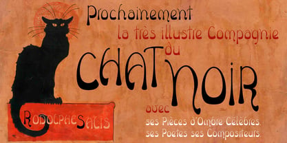 Oblonga shows thin, elegant lines. The continuity of the trace is only suggested through the curves of the letters, a soft effect of bonding that maintains the identity of each character. Oblonga is an Art-Déco font proposed in a modern key, a revival performed without aggression. More than three hundred glyphs (regular and Italic) that ensure legibility in Central-European and Slavic languages, enriched by some appropriate discretionary ligatures that enhance the charme of a time gone away.
 - FS Maja by Fontsmith,
$50.00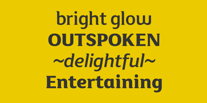 Youthful Fontsmith received a brief to develop a font that would form part of the broadcast identity for the UK’s first digital Freeview channel – E4. It needed to work seamlessly in text and display, both in print and on-screen, and please the eye of the target audience, 18-34-year-olds. So, young, fresh and informal. No problem. Except for one thing: the timing. Daughter As he worked on FS Maja, Jason Smith was occupied by another imminent deadline: the birth of his third child. The pressure was mounting, but rather than let it get to him, Jason embraced the challenge and made light of the tension, fashioning a bright, bubbly, entertaining type with a personality made for memorable headlines. Beautifully random FS Maja’s soft, rounded shapes and assured, fluent lines encompass lots of notable features that contribute to its warm, fun-loving personality, including: a very large x-height; a short, rounded serif to allow for close spacing and give texture to body text; a slight convexity, or bulge, in the stroke terminals; a calligraphic fluidity in the entry to the down-stroke of most lowercase letters; open, generous curves, especially in the “B”, “P” and “R”; and a “w” made of two “u”s.
 - Linotype Ergo Paneuropean by Linotype,
$103.99Linotype Ergo was designed by American Gary Munch, and was a winner in Linotype's Second International Digital Design Contest in 1997. Conceived as a blend of traditional and modern type concepts, it works as a legible text family as well as a lively display or headline font. The word ergo means consequently," but it also comes from the Greek word "ergon" for "work." Consequently, Munch sees this family as full of energy -- an ideal font for working hard to make a point, and able to get it across with friendly vigor. The strokes of the characters are carefully designed to accommodate the tendency of the eye to enlarge horizontals and perceive verticals as lighter. The lowercase forms have open, friendly counters and are enhanced by small quirks, such as the slightly leaning s and the wide t. The deep branching of curves from main strokes helps this humanist sans to be very readable at smaller sizes. Linotype Ergo has four normal-width weights, five condensed weights, and two compressed weights - all with companion Italics! The family also includes a clever "Sketch" font for use in headlines, bringing the total number of font styles to 23. Ergo is available with Greek and Cyrillic and as W2G fonts with Hebrew." - Denedo by Andinistas,
$19.95Just like the M.C. Escher impossible figures and optical illusions, "Denedo" is a font that is impossible to construct in three dimensions because it only exists as a drawing. This font is based on the "0, 1, 2, 3, 4, 5, 6, 7, 8, 9" characters of one of the alphabets published by Nedo Mion Ferrario in the "Letromaquia" exhibition that was shown in Caracas, Venezuela in the 70's. The reason why I chose to restore and complete this font is that unique and exceptional personality that each word acquires when it is written with this alphabet. Denedo is a typographic family in three styles: Denedo 1A, 1B and 1C. When mixing them in big sizes you will emphasize the balance and incongruity of its shapes, providing originality and a unique identity to every word. All of the 3 variations include a complete character set with the lower and upper case letters, numbers, accents, diacritic signs, punctuation and monetary signs. All the fonts included in this family are available in Open Type format and are perfectly compatible with Mac and PC. I want to express my sincere gratitude to all my friends at Typophile who supported and motivated me during the final stages in the development of this font. - Linotype Ergo W2G by Linotype,
$124.99Linotype Ergo was designed by American Gary Munch, and was a winner in Linotype's Second International Digital Design Contest in 1997. Conceived as a blend of traditional and modern type concepts, it works as a legible text family as well as a lively display or headline font. The word ergo means consequently," but it also comes from the Greek word "ergon" for "work." Consequently, Munch sees this family as full of energy -- an ideal font for working hard to make a point, and able to get it across with friendly vigor. The strokes of the characters are carefully designed to accommodate the tendency of the eye to enlarge horizontals and perceive verticals as lighter. The lowercase forms have open, friendly counters and are enhanced by small quirks, such as the slightly leaning s and the wide t. The deep branching of curves from main strokes helps this humanist sans to be very readable at smaller sizes. Linotype Ergo has four normal-width weights, five condensed weights, and two compressed weights - all with companion Italics! The family also includes a clever "Sketch" font for use in headlines, bringing the total number of font styles to 23. Ergo is available with Greek and Cyrillic and as W2G fonts with Hebrew." - Universo by PeGGO Fonts,
$12.00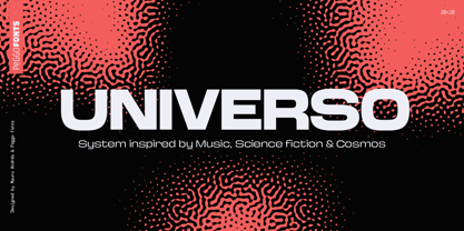 Universo and Universo Stencil by Mauro Andrés and Peggo Fonts is a display font family for “Caos Sagrado” specially designed for informative fanzine and magazines. Its name “Universo” comes from the quote “we have to talk about the horrible things of Universe” with the main idea of supporting and help to expose social problems. Inspired on Retro-Futuristic fonts and poster design and old scientific publications that is becoming a new design trend nowadays, and strongly influenced by the Italian type designer Aldo Novarese’s work, developed in the 50’s. "Universo CS" and "Universo CS Stencil" were produced between mid-September and October 2018 by Mauro Andrés under the creative direction of Victoria Rivas and those versions were publicly showed at “Impresionante” (a massive independent printing expo in Chile) with a printed specimen. That phase of the project was updated and completed in March 2019 and was lastly finished between November 2019 and April 7, 2020, developing it in six styles, under the co-production of Peggo Fonts. "Universo" and "Universo Stencil" are both suitable for headlines and short text lines, music and concert posters, books and magazines covers, branding, logotype and graphic design. All stylistic alternates are accessible via OpenType features or character map.
 - Metal Cry by Fabulous Rice,
$25.00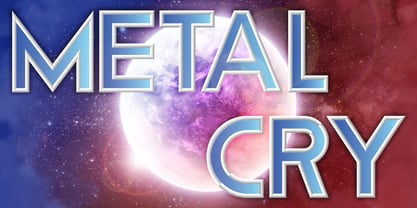 Metal Cry is a font family that was inspired by countless hours spent playing video games, watching old movies or reading comic books. And even more hours closely analysing the design of all these things. The art of creating beautiful letters has slowly declined with the rise of the digital age and its solid-colour, 2D fonts. And most of the time, the care given to typography in cultural products just isn't what it used to be anymore. This was the inspiration for Metal Cry, a family of 4 layerable fonts that can bring a feeling of depth to its letters, and offers endless possible combinations. Metal Cry Outlands is the basic shape of all the characters, it can be used as the bright side of the bevel. Metal Cry Front is the inline border font that can be used as the front side of the bevel. Metal Cry Shadow can be used as the dark side of the bevel. Metal Cry Depth can be used to flash out the inside shape of the letter. But of course, any font can be combined with any other font(s) to obtain various results. The planets in the above visuals are courtesy of 3D artist Thomas Veyrat / veyratom.com
 - Tag Banger by Okaycat,
$12.50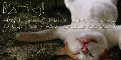 TagBanger WADE1 is the first in a short graffiti font series. This series will showcase the hand-styles of various mature street artists that Okaycat is working with. This first release highlights the style of one such graffiti writer, WADE1, who has an eclectic writing style after many years proliferating street art. Long-term graffiti artists develop their own style over their careers, spending as many endless hours honing their letter-forms as any full-time professional typographical artist. Style, individuality, and originality are everything. These attributes are key to the graffiti artist's tao. A writer who copies, or "bites" loses respect -- their work will be painted over or "crossed out" by all other writers. Okaycat's TagBanger series aims to demonstrate just how widely these individual styles can diverge, likely due, at least in part, to the social pressures of a community that ruthlessly punishes copycats. WADE1's tags were transformed into vector format from a generous sampling of their most recent scrawls. Our TagBanger series may not be composed of the most legible or beautiful fonts, but we imagine there are uses for these whenever highly unusual handwriting is needed. TagBanger WADE1 is extended, containing the full West European diacritics & a full set of ligatures, making it suitable for multilingual environments & publications.
 - Zenoa by Brenners Template,
$19.00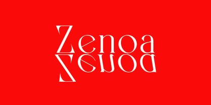 Zenoa Display Serif Font Family - They are sharp and sensitive, but connected-oriented. That's why they're designed by incorporating hook glyphs into an elegant serif style. Somewhat high contrast between vertical and horizontal, they reveal the strong individuality of each glyph, so you can create creative layouts. The meticulous design stands out so that readability and individuality can be expressed in harmony. And, these are the special excellences of this font family: Stylish Alternates and Ligatures where calligraphic subtlety is artistically connected. These OpenType features are decorative pleasures of using this font family more functionally. Please check first if the app you are using supports these features. They are easy to use in Adobe apps such as Photoshop and Illustrator. Alternates : A, B, C, D, E, F, G, H, J, K, L, M, N, P, Q, R, S, T, U, V, W, X, Y. Standard Ligatures : ff, fi, fl Discretionary ligatures : Am, Ba, Ca, Ch, De, En, Fr, Ge, Ha, In, Lo, Mi, No, Pa, Ro, Sa, Th, Va, Wo, Yo, an, bi, ck, de, ee, gn, ha,ie, lo, mo, no, oo, pr, ro, ss, st, te, um, ve, we, yo. Supported Languages: Western Europe, Central/Eastern Europe, Baltic, Turkish, Romanian