10,000 search results
(0.033 seconds)
- Povetarac Display by Tour De Force,
$25.00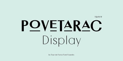 Povetarac Display font family is part of Povetarac Superfamily together with Povetarac Sans and Povetarac Didone. Available in 6 weights and one variable font file, Povetarac Display relays on lively uppercase proportions that took inspiration from vintage typefaces. It is well balanced, elegant and fully recognizable high contrasted sans serif family. One of its characteristics are straight and wide terminals. With sharp overhang, Povetarac Display works pretty well in all situations – from editorial use to branding, websites or just titles. Comes with 3 Stylistic Sets, SmallCaps and Fractions and extended Latin character map.
 - Taxon by Hoftype,
$49.00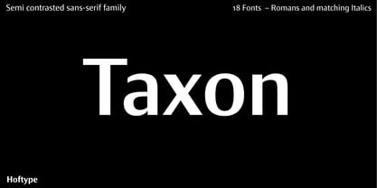 Taxon is a straightlined Sans with a clean, fresh and unsentimental look. Related to classical faces like Optima and Imago, it appears more contemporary and merges the austere linearity of the Grotesk with the elegance of the Antiqua. The Taxon family consists of 12 styles and is well suited for ambitious typography. It comes in OpenType format with extended language support. All weights contain ligatures, superior characters, proportional lining figures, tabular lining figures, proportional old style figures, lining old style figures, matching currency symbols, fraction- and scientific numerals, matching arrows and alternate characters.
 - Frederik by The Northern Block,
$26.95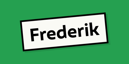 Frederik is a traditional humanist sans with a modern twist. Fresh and neutral in appearance but equally organic and friendly. Frederik features 10 styles ranging from Thin to Black, plus matching italics. Regular and Medium weights work exceptionally well for small body copy, while Light and Heavy styles work best for display purposes — making Frederik a highly versatile type family, suitable for a wide range of uses. Opentype features include inferiors, superiors, fractions, numero sign, circled numbers, stylistic ordinals, ligatures, numerous arrows including extended length, and support for all Latin and Cyrillic languages.
 - Sola by Khaito Gengo,
$25.00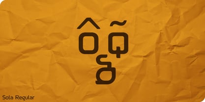 Sola is a simplistic, stylish, and modern san serif type font with the unique addition of rounded corners. When creating this font, Bank Gothic originally influenced me, however when I made the square shapes lower case the font didn't retain its sophistication, so it was designed narrower. The result is this warm and soft looking font that works for all types of design, from posters and fliers to logos and business cards. Sola also features standard ligature, stylistic alternates, titling characters with extended width, and a set of standard pictograms.
 - Dalek by K-Type,
$20.00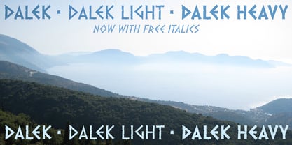 DALEK is a distressed, small caps typeface based on the lettering used in the Dalek Book of 1964 and in the Daleks strip in TV21 comic. The fonts have overtones of Greek, Phoenician and Runic alphabets. The updated Dalek fonts contain a full complement of Latin Extended-A characters, and also include Greek capitals and small caps. In addition to the original Regular font, Heavy and Light weights are available, and optically corrected obliques for each weight. Also check out Dalek Pinpoint, a clean and precise version of the Dalek typeface.
 - Klamp 105 by Talbot Type,
$19.50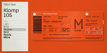 Talbot Type Klamp 105 is an elegant and streamlined, geometric sans-serif. A legible text font, its narrow proportions mean it’s economical with space; while at larger sizes it makes a confident, modern display face. Klamp 105 is available in a comprehensive family of seven weights, featuring an extended character set to include old style numerals, as well as accented characters for Central European languages. It is also available with some character variations as Klamp 205, most notably featuring a traditional, double-storey lower case a and g.
 - Nuber Next by The Northern Block,
$39.95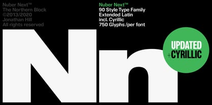 Nuber Next is a modern geometric sans influenced by the popular neo-grotesques of the 1950s including Helvetica and Univers. Carefully remastered from the original Nuber type family to improve letter shape, overall uniformity and introduce a flexible width system capable of handling a wider variety of typographic applications. Details include 750 characters per font, nine weights and five widths with matching italics. Opentype features include seven variations of numerals, fractions, case-sensitive forms, stylistic alternates, ligatures, extended monetary symbols and language support covering Cyrillic, Western, South and Central Europe.
 - Orbit Gate by pentagonistudio,
$19.00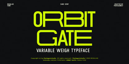 Orbit Gate Is Modern Display Sans Serif Typeface with Variable Style Condensed and Extended. SOFTWARE REQUIREMENTS : Fonts and alternate : No special software required they may be used in any basic program /website apps that allows standard fonts That's it folks! You can go ahead and get cracking :) Follow My Shop For Upcoming Updates Including Additional Glyphs And Language Support. And Please Message Me If You Want Your Language Included or If There Are Any Features or Glyph Requests, Feel Free to Send me A Message. Have a Good Day !
 - Mumford by fragTYPE,
$16.00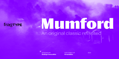 Mumford began as a revival of the early designs for sans serif fonts of the late 19th and early 20th centuries, but along the way it morphed into a reinterpretation of this style and it adaptation to more contemporary shapes. It's strong contrast, signature of the design, works along it 9 weight variables each with their corresponding oblique. Each variable includes extended language support (+ Cyrillic), fractions, tabular figures, ligatures and opentype features. Mumford was design with strong graphic display design in mind, perfectly suited for poster, magazine headers, titles and editorial design.
 - Deflexure by Ony Studio,
$14.00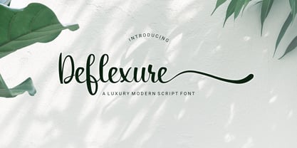 Features: Characters: Uppercase letters, Lowercase letters, numbers & extended punctuation Ligatures and Stylistic Alternates Non-English support for the international designer Deflexure is a luxury modern script font. This font is perfect for wedding event design, such as wedding invitations, wedding event organizer logo, and any design related to weddings. This font is also perfect for writing quotes, print-on-demand design like t-shirts and mugs. Each lowercase font also has alternates for each letter, so when you type lowercase for each font, the letters will have other style options.
 - Klamp 205 by Talbot Type,
$19.50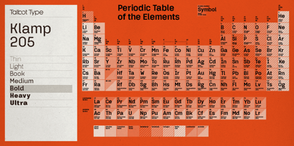 Talbot Type Klamp 205 is an elegant and streamlined, geometric sans-serif. A legible text font, its narrow proportions mean it’s economical with space; while at larger sizes it makes a confident, modern display face. Klamp 205 is available in a comprehensive family of seven weights, featuring an extended character set to include old style numerals, as well as accented characters for Central European languages. It is also available with some character variations as Klamp 105, most notably featuring a more modern, single-storey lower case a and g.
 - Hoyle by Mans Greback,
$49.00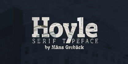 Hoyle is a dynamic high-quality serif typeface. Drawn and created by Måns Grebäck between 2019 and 2020, this classic design makes use of the fact that timelessness is the best manner to achieve modernity; the letters are of such composition that they will always be simultaneously contemporary and traditional. Hoyle is a family containing five weights: Thin, Light, Medium, Bold and Black. Each weight is also provided as Italic, resulting in 10 unique styles. The weights are harmonic and created to balance perfectly agaist each other. Try the included Variable Font! A format where you can set any weight manually, and any slant, resulting in more than 5000 variations. More info: https://www.mansgreback.com/variable-fonts This slab serif typeface is also filled with OpenType features such as ligatures, alternates, oldstyle, superscript, subscript, fractional and alternate numbers. It has a very extensive lingual support, covering European Latin, Vietnamese, Zulu and many more scripts. The font contains all characters you'll ever need, including all punctuation and numbers.
 - Satsuma by Hanoded,
$20.00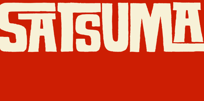 Satsuma. It used to be only a Japanese orange, but now it's a typeface as well. A rather unusual typeface. Satsuma is rough around the edges, squarish and playful. It is handmade and comes with over 400 interlocking ligatures. If that ain't fun, I don't know what is! Of course, Satsuma comes with extensive language support AND accented ligatures! Due to the complexity of this font, it only comes as TTF.
 - Ledbury by Greater Albion Typefounders,
$19.00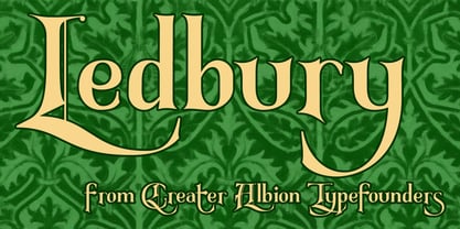 Ledbury is a calligraphic display face, inspired by hand lettered specimens and combining Roman and Blackletter elements. It is designed with an extensive range of ligatures and stylistic alternate forms to preserve that hand written look. Use Ledbury for posters and banners, whether you need an Elizabethan touch or a hint of the Victorian Gothic Revival. A typeface Mr Augustus Welby Northmore Pugin would be proud to employ!
 - Guilloche A by Wiescher Design,
$80.00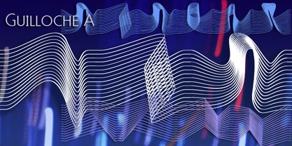 Guilloches were – in the old days – used to make the falsification of banknotes more difficult. The engraving of these intricate lines was done by a highly specialized mechanical machine, which was operated by an equally highly specialized engraving artist. Once the settings for a specific curve were changed back to zero it was very difficult, if not impossible to set them back to the old design. I have designed a useful set of Guilloches that join to form ribbons that create a kind of op-art 3d effect. Under the keys A-U and a-u you find joining pieces. Under the keys V-Z and v-z I placed start- and endpieces. 0-4 are different lenght straight extensions and 5-9 are not quite so straight extensions. All other keys are corner pieces that can be used as stand-alones or put in rows to make for superb decoration. With a little bit of experimentation and maybe colored overlays you can achieve super-phantastic designs. Your elegant type designer Gert Wiescher.
 - Crescendo by Canada Type,
$29.95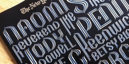 A year after the tremendous success of Memoriam in the "Lives They Lived" issue of the New York Times magazine at the end of 2008, Patrick Griffin and Nancy Harris Rouemy teamed up once more to tackle the same project for the 2009 issue. This time the magazine's design concept revolved around a typeface they created specifically for custom vertical malleability, and that can play just as well in single- or multi-color environments. The result was another iconic commemorative issue that shows exotic tri-line letters merging, swashing, extending and flourishing in stunning gold, silver and blue on black on the cover, and in black on white on the inside pages. Just like in the previous year, the issue won multiple publication design and typography awards. Crescendo is that typeface, finally issued for retail by public demand. Just turn your setting into outlines in your favorite vector program, grab single strands and extend away, and do your best alternating colours between strands. Crescendo comes with a limited punctuation set, but accented characters for Western Latin languages are included, and there many, many alternates and ligatures in there as well. This typeface is best used in large display sizes.
 - PT Root by ParaType,
$40.00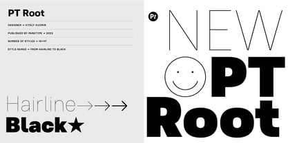 PT Root is a contemporary sans serif with strict, laconic forms. It’s a versatile typeface that provides a wide range of possibilities. Regular style works great in long texts (both on screen and in print), as well as in the interfaces. Medium and Demibold are good for signage, while the lightest and boldest styles look great in large sizes and are suitable for the brand identity. PT Root is a sans serif with 10 weights and a variable version. Its character set includes extended Latin and extended Cyrillic, three arrow variants, fractions, index numbers and letters. PT Root automatically lifts dashes and brackets with the case change. Its characters have stylistic variants, including the single-storey a, a strikethrough zero and some local alternates for Bulgarian and Serbian Cyrillic. PT Root can work in a project both independently and in pairs. Contemporary serif typefaces are the best text companions for it — try for example PT Serif, Yefimov Serif or Scientia. In case PT Root is the only text typeface in the project, then combine it with serious typefaces, such us technical (Din Condensed as an example) or pronouncedly contemporary typefaces, including postmodern ones, from Stapel or Spile to Helsa.
 - Banks and Miles by K-Type,
$20.00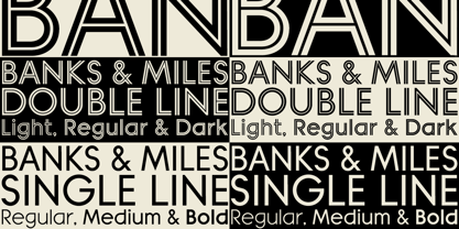 K-Type’s ‘Banks & Miles’ fonts are inspired by the geometric monoline lettering created for the British Post Office in 1970 by London design company Banks & Miles, a project initiated and supervised by partner John Miles, and which included ‘Double Line’ and ‘Single Line’ alphabets. The new digital typeface is a reworking and extension of both alphabets. Banks & Miles Double Line is provided in three weights – Light, Regular and Dark – variations achieved by adjusting the width of the inline. Banks & Miles Single Line develops the less used companion sans into a three weight family – Regular, Medium and Bold – each with an optically corrected oblique. Although the ‘Banks & Miles Double Line’ and ‘Banks & Miles Single Line’ fonts are based on the original Post Office letterforms, glyphs have been drawn from scratch and include numerous adjustments and impertinent alterations, such as narrowing the overly wide Z and shortening the leg of the K. Several disparities exist between the Post Office Double and Single Line styles, and K-Type has attempted to secure greater consistency between the two. For instance, a wide apex on the Double Line’s lowercase w is made pointed to match the uppercase W and the Single Line’s W/w. Also, the gently sloping hook of Single Line’s lowercase j is adopted for both families. The original Single Line’s R and k, which were incongruously simplified, are drawn in their more remarkable Double Line forms, and whilst the new Single Line fonts are modestly condensed where appropriate, rounded letters retain the essentially circular form of the Double Line. Many characters that were not part of the original project, such as @, ß, #, and currency symbols, have been designed afresh, and a full set of Latin Extended-A characters is included. The new fonts are a celebration of distinctive features like the delightful teardrop-shaped bowl of a,b,d,g,p and q, and a general level of elegance not always achieved by inline typefaces. The Post Office Double Line alphabet was used from the early 1970s, in different colours to denote the various parts of the Post Office business which included telecommunications, counter services and the Royal Mail. Even after the Post Office was split into separate businesses in the 1980s, Post Office Counters and Royal Mail continued use of the lettering, and a version can still be seen within the Royal Mail cruciform logo.
 - Dx Dynamix by Dirtyline Studio,
$35.00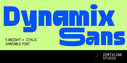 Dx Dynamix is a modern minimalist design typeface with geometric type and more feature alternative characters. there include some ligature. It is inspired by hype and urban design a font suited for lifestyle with trend design. Dx Dynamix comes with elegant style, strength, and contrasts, with features an extended Latin character set of 367 glyphs covering over 85 languages. It has been designed as a variable font to give lots of options and access to unique type looks, however, it also includes nine weights to give just as much access to creativity to those without access to variable supporting software. Its distinctive character and many variables make it a versatile, stylish workhorse, great for interfaces and design.
 - Mc Laren Pro by Stiggy & Sands,
$29.00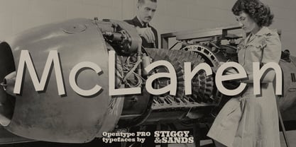 Our McLaren Pro was created to act as a generic go-to comic style lettering. Its simple and clean letterforms mixed with a mild bounce have an offbeat quality to it without going too far. It is cleanly legible for small bursts of copy to larger bodies of text, perfect for books for children, comics, and anything requiring a mildly playful yet clearly readable font. The SmallCaps and extensive figure sets give McLaren a profoundly diverse design voice, ranging from slightly serious to downright ludicrous. Opentype features include: - SmallCaps. - Full set of Inferiors and Superiors for limitless fractions. - Tabular, Proportional, and Oldstyle figure sets (along with SmallCaps versions of the figures). - Stylistic Alternates for Caps to SmallCaps conversion.
 - Linotype Devanagari by Monotype,
$103.99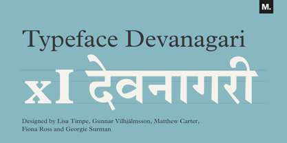 The new Linotype® Devanagari typeface is a traditional text face now available in five weights (from Light to Black) and suitable for a wide variety of print and digital uses. A compact design, Linotype Devanagari also provides economy of space where textual real estate is at a premium. In addition, its large character set enables the setting of Hindi, Marathi, Nepali and is suitable for Sanskrit passages. The design’s open counters ensure high levels of legibility at small sizes and at modest resolution. The history of Linotype Devanagari is quite extensive. Inspired by the late 19th and early 20th century Nirnaya Sagar designs, it was originally designed in 1977 by Mathew Carter for phototypesetting systems. It was then revised and expanded for digital typesetting by the Linotype letter-drawing studio headed by Georgie Surman under the art direction of Fiona Ross. This new, enhanced revival was designed by Lisa Timpi and Gunnar Vilhjálmsson with Fiona Ross as a consultant. This new Linotype Devanagari is part of a project to refresh the pivotal Linotype Bengali and Linotype Gujarati typefaces and make them available for the first time in the popular OpenType font format.
 - Aukim by AukimVisuel,
$20.00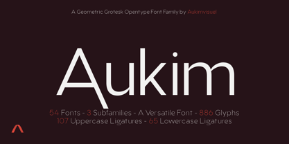 Aukim is an exceptional, unique and ligature-rich font that gives a new look to your texts. It is a more text-oriented font and thanks to its OpenType features, it becomes versatile. It is available in 3 sub-families (condensed, normal and extended) for a total of 54 fonts. There are 9 weights with their real italics. It has 886 glyphs, 107 uppercase and 65 lowercase ligatures per font. It also offers a wide range of languages, from Latin to Cyrillic, as well as powerful OpenType features such as meticulously and professionally maintained kerning, stylistic variations, swashes, highly distinctive ligatures, old-fashioned tabular figures, fractions, denominators, superscripts, unlimited subscripts, arrows and much more to satisfy the most demanding professionals. On the one hand, it has rounded curves with very open endings that make this font family noble, friendly and contemporary and on the other hand very useful for writing titles on any medium. Perfectly suitable for graphic design and any display use. It could easily work for web, signage, corporate design as well as editorial design. Aukim is a cool, wonderful, elegant, bold and fun display font. It can easily be paired with an incredibly wide range of projects, so add it to your creative ideas and notice how it makes them stand out!
 - Senlot Didone by insigne,
$35.00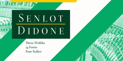 Senlot Didone enchants with this fresh and cutting-edge sequel. It’s a modern interpretation of Senlot that says glamor and seduction. The typeface adds to the original high contrast sans serif with it’s modern high contrast shape, and features a new beauty with the distinctive sinuosity of contrasting forms. Senlot Didone is the sleek, serifed, high contrast follow-up to Senlot, and it's low contrast sequel, Senlot Sans. A serif typeface suitable for text and display work joined in 2019. Senlot Didone includes a wide range of OpenType features, including titling capitals, superscripts and subscripts, and oldstyle figures. Senlot Didone is composed of 3 widths: Condensed, Normal, and Extended, with 9 weights and their italics for a total of 54 fonts with more than 800 glyphs. Senlot Didone is a great display typeface for logos, branding, packaging, and advertising. With its broad palate of options, the font covers over 72 Latin-based languages. Dress your text in any of nine separate styles from Thin to Bold. With Senlot Didone, there's no need to compromise on another font with fewer features. Simple, elegant, and versatile, Senlot Didone now makes perfect more possible. Take the show by storm with this high contrast serif. The seductive figure of Senlot Didone is here to entice your viewer.
 - Brahma Rounded by Tall Chai,
$15.00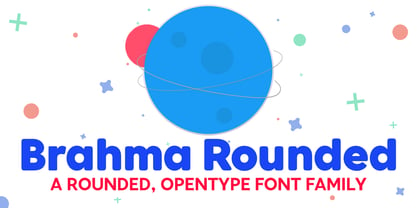 Brahma Rounded is a modern geometric rounded sans-serif font family with weights ranging from Thin (100) to Black (900). It is a sibling of the Brahma font family. Features: Available in 9 weights Over 550 glyphs supporting extended Latin Ideal for display texts: Titles, Logos and Headlines etc. Perfect for branding and rebranding Supports OpenTypes features like Ligatures and Stylistic Alternates Tabular Numerals included Symbols for 10 major currencies including Bitcoin provided in all weights Description: The name comes from Brahmā who is known as the god of creation. And manifesting the same spirit, the Brahma font family focuses on modern creativity. With its smooth and polished curves, Brahma Rounded provides friendly, casual vibes to all its characters. Every character effortlessly integrates with current design standards and interfaces. The fonts are professional yet have a hint of informal personality in them. This makes Brahma Rounded perfect for use in modern apps and websites. Brahma Rounded is built for the influencing, designing and marketing squads. It has a trendy geometric characteristic which is ideal for any branding and rebranding. Brahma has lot of OpenType features (like ligatures and tabular numerals) and the Extended Latin character set supports over a hundred languages. Start Creating!
 - Chamy by Rosario Nocera,
$12.00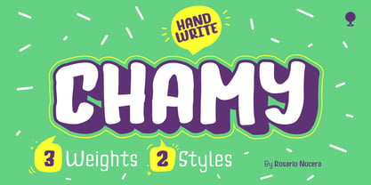 Chamy is a handwrite font family inspired by nature, sweets, comics and cartoons. It is available in three weighs from light to bold and two version: Solid and Sweet. Chamy is ideal for logo design, branding, titles, games, app and playful, cheerful and positive things.
 - Trio CT by CastleType,
$39.00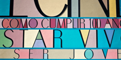 I was commissioned by Publish magazine to digitize Trio in 1990. Originally designed in a Light weight only, Trio is now available in Medium and Bold weights as well. Uppercase only, but each weight includes two alphabets, one more "deco," the other more "modern."
 - Literatura Pro by RMU,
$40.00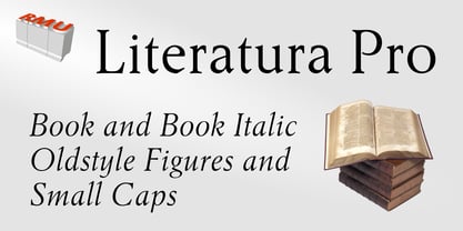 An elegant, well proportioned serif font family, especially intended for book production.
 - Shanks Antique 5 AOE Pro by Astigmatic,
$24.95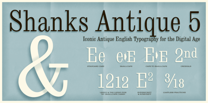 Shanks Antique 5 Pro is an iconic antique English typestyle rooted in tradition. It is the historical revival and elaboration of the “Antique No. 5” typeface created by Stevens, Shanks & Sons in 1865. What began as a basic character set of Capitals, lowercase, numerals, and a small handful of punctuation characters has been expanded to a full character set including unlimited fractionals, superiors & inferiors, ordinals, tabular & proportional figures, and an expanded language glyph set, all with a smallcaps and Caps to Smallcap set to match. Reviving history looks and feels good. Perfect for wedding invitations, historical ephemera recreations, and classically elegant text settings.
 - Ardenwood by Scriptorium,
$18.00Ardenwood is based on a wood-carved alphabet from the early 1500s. It features gothic characters with elaborate floral decorations. The lower case has the more basic versions of the letters while the upper case characters are more extensively decorated. - Churchward Ta Tiki by BluHead Studio,
$20.00Churchward Ta Tiki is a new font release by BluHead Studio, LLC from the exciting and unique typefaces of New Zealand designer Joseph Churchward. We will be releasing fonts from his extensive library in OpenType format on a regular basis. - Hefeweizen by David Thometz Design,
$24.95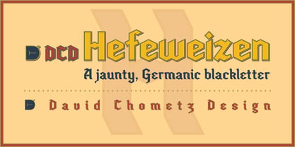 As seen on Typophile.com, DTD Hefeweizen is a contemporary take on the textura blackletter style. Comprised of straight lines and angles sloped at ratios of 1/2 or 2/1, Hefeweizen is a highly geometric design with extensive alternates and ligatures.
 - Cheat Sheet by Hanoded,
$15.00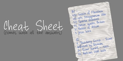 Cheat Sheet is a handwritten typeface that looks like, well, handwriting. It is loose, legible and useful and comes with extensive language support. It goes without saying that I have never used a cheat sheet when I was in school… (ahum)…
 - Lourino by Mans Greback,
$59.00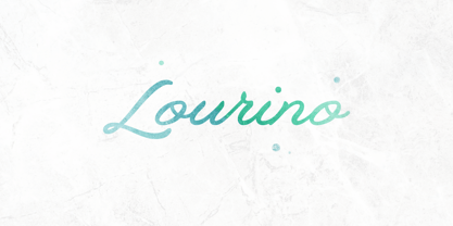 Lourino is a flowing script typeface, drawn by Måns Grebäck during 2018 It is a high-quality font with cute letter shapes and large, round capitals. The font has an extensive set of characters and supports all Latin based European languages.
 - Sumida Script by Hanoded,
$15.00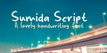 Sumida is a special ward in Tokyo AND the river running through the city. Sumida script is a nice, handwritten font, which was made using a sharpie pen. Sumida Script comes with double letter ligatures and an extensive language support.
 - Cerulean by Elemeno,
$25.00Cerulean echoes the elegant lines of an Old English typeface, but is pared down for versatility. The alternative characters, available in the swash version are intended to compliment the more legible regular style. - Enjoying Typeface by Putracetol,
$24.00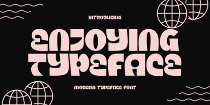 The Enjoying Typeface - Modern Display Font is a bold and contemporary font with a unique twist, offering two distinctive versions for added versatility. Its bold and playful characters make it an excellent choice for logos, quotes, posters, titles, headlines, magazines, business branding, product names, stickers, and invitation cards. With its thick, distinctive design, this font is sure to stand out and leave a lasting impression, making it quickly recognizable and perfect for a wide range of creative projects.
 - Kroine by Craft Supply Co,
$20.00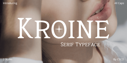 Meet Kroine – Versatile Serif Typeface Kroine redefines versatility. It’s a serif that suits any display size. Subtle Elegance in Low Contrast Its low contrast strokes offer modern simplicity. Also, Kroine delivers a clean reading experience. The delicate serifs enhance legibility, perfect for extended text. Designed for Flexibility Kroine thrives in both small and large displays. Furthermore, its uniform thickness ensures consistency. Thus, it becomes an ideal choice for diverse design needs.
 - Alphonse Mucha by K-Type,
$20.00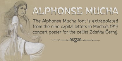 Alphonse Mucha is a decorative display font in the Art Nouveau style which originated over a century ago. The font is extrapolated from just nine capital letters in Mucha's 1913 concert poster for the cellist Zdeňka Černý. Letters and numerals are consistently top-heavy, imbuing text with a graceful uniformity and evenness of type color. A full repertoire of Latin Extended-A characters is contained within the font.
 - Pleasans by Gassstype,
$22.00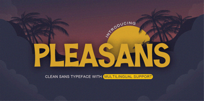 Hello Everyone, Introduce our new collection, Pleasans - Sans Serif Typeface ,Extended Display Sans Serif inspired by famous logos of Technology and brands that have very strong characteristics, very suitable for posters, packaging, branding, logotype and more. Pleasans font with strong and challenging nuances. very suitable for the title, typography, Poster, magazines, brochures, packaging,Websites and much more for your design needs, making your designs more modern and professional.
 - Suit Sans STD by Just in Type,
$15.00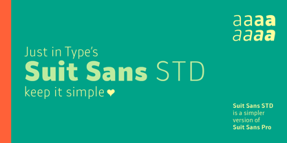 Suit Sans STD is a typeface designed for multi-purposes with 4 weights plus matching italics. The set of 554 glyphs embraces all European languages, and it's perfect for branding, interfaces and everything else you could create on large and small sizes. But if Suit Sans STD is not enough for you, take a look at Suit Sans Pro with extended weight range, character set and more cool features.