10,000 search results
(0.031 seconds)
- Altone by Eko Bimantara,
$29.00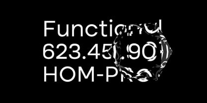 Altone was created in a pursue of regularity and conventional geometric sans serif typeface which tend to be easy to receive by it's reader, broad usage possibility, shown a simple, bold and strong personality. The letterforms are more likely associated with Grotesk rather than the original classical Bauhaus style, formed in moderate and proportional width, flat apex, closed aperture with straight cuts stroke ends. Consist of 9 weight from Thin to Heavy with each matching Obliques. Contain several OpenType features: Stylistic Alternates, Figures Variation (fraction, tabular lining, numerator, denominator), and also covered broad latin languages. Provided also variable fonts in two styles; Upright and Oblique
 - Wardshus Calligraphy by Mans Greback,
$59.00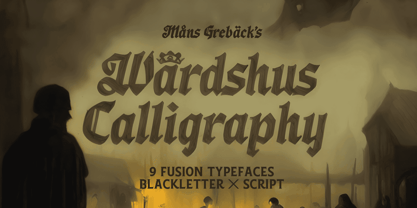 Wardshus Calligraphy is a unique blend of medieval gothic style and modern script, creating a distinctive and eye-catching blackletter font. The heavy, hand-drawn design brings an air of the Middle Ages to your projects, making it perfect for logos, posters, rock or hip-hop music album covers, and other display purposes that require a cool and striking touch. The beautiful cursive elements add a touch of elegance to the font, while the bold strokes and intricate details give it a strong presence. Wardshus Calligraphy is a testament to the rich artistic history of the past, reimagined for contemporary design projects. Use # after any letter to make a crown. Example: Que#en Use underscore _ anywhere to make a swash. Example: Kingdom_Heroes Use multiple underscores to make underlines of different lengths. Example: Knig___hters The Wardshus Calligraphy font family includes nine high-quality styles to suit various design needs: Regular: A well-balanced, classic blackletter script style. Regular Upright: Adds a more controlled, vertical look to the regular style. Regular Italic: Combines the balance of regular with a touch of expressiveness. Bold: A stronger, more assertive version of the script for impactful designs. Bold Upright: Merges the boldness of the bold style with the structure of upright. Bold Italic: A dynamic fusion of the bold style and the energy of italic. Black: The heaviest, most powerful iteration of the blackletter script. Black Upright: Combines the weight of the black style with the upright structure. Black Italic: Adds expressiveness and flair to the intense black style. Built with advanced OpenType functionality, Wardshus Calligraphy ensures top-notch quality and provides you with full control and customizability. It includes stylistic and contextual alternates, ligatures, and other features to make your designs truly unique. It has extensive lingual support, covering all Latin-based languages, from Northern Europe to South Africa, from America to South-East Asia. It contains all characters and symbols you'll ever need, including all punctuation and numbers.
 - Offense by Reserves,
$49.00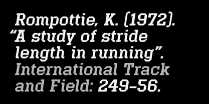 Offense is an unyielding rectangular slab-serif face designed with consistently balanced letterforms and a refined finish. It’s extremely angular geometric form commands attention in display settings, yet is also legible in short text blocks. Numerous alternate character sets allow room for customization, while the expanded ligatures push letter combinations to the limit. Stylistically, Offense’s almost crude, sharp-cornered construction is balanced by it’s sophisticated finish and attention to detail, often unrealized in similar faces of this genre. The upright weights are complimented by pairings of true italics, completely rebuilt, slightly narrower in width with modified letterforms, increasing their contrast and flow. Features include: Precision kerning Standard Ligatures set including 'f' ligatures (fi, fl, ff, fh, fj, ffl, ffi, ffj) Discretionary Ligatures set including (ft, rt, ae, oe, st, ft, ct, oc, oo, ry, AE, OE, AL, TH, HE, AK, AN, TT, HD, AM, AP, AR, NF, NE, NH, NL, NB, FL, ND, FE, AB, OB, OD, OF, OG, OH, OK, OL, OM, ON, OO, OP, OQ, OR, OU, AH, UE, UF, UB, UD, UH, UK, UL, UM, UN, UP, UR, UU, MP, XY, YX, KY, WY, VY, AF, FF, FI) Alternate characters (O, o, S, s, a, h circumflex, @, ®, ¶, $, &, _, and various ligature alternates) Case forms (shifts various punctuation marks up to a position that works better with all-capital sequences) Capital Spacing (globally adjusts inter-glyph spacing for all-capital text) Slashed zero Full set of numerators/denominators Automatic fraction feature (supports any fraction combination) Extended language support (Latin-1 and Latin Extended-A) *Requires an application with OpenType and/or Unicode support.
 - Murqas by holyline design,
$19.00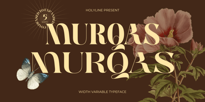 MURQAS by Holyline is a Retro serif and width variable typeface, have 5 style condensed to expanded . It's very unique, elegant, bold and have beautiful shapes from each character . MURQAS perfect for headline, custom logo, merchandise, packaging, wedding designs, invitations, watermark,social media posts, label, and anything for your creativity and MURQAS is perfect typeface if you want something new with your project. And you can play and choose the width axis, for make your project more awesome! Happy creating!
 - Biago by Letteralle,
$29.00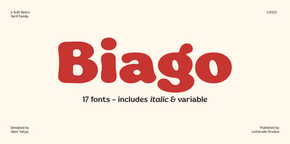 Typeface in 70s and 80s became the inspiration for Biago. soft and bold are the characteristics of Biago. The large and rounded legs make Biago unique and different from other serif fonts. Biago brings a warm, friendly, unique, and simple impression. Biago is intended for display purposes, such as large headlines, titles, logos, or anything that requires special characteristics and attention. Biago's five width, will give you the flexibility to express your interface and design. Italic and alternate versions are also included.
 - Winslow Title by Kimmy Design,
$25.00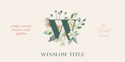 Winslow Title is a high contrast modern type family comes in two styles and a monolinear script family. The traditional proportions of Winslow Title are historical in nature and follow the design and style of Winslow Book as a high contrast variant. The Winslow Title Mod family is a contemporary take on the style, with tapering terminals and less pronounced finials. Each family includes both styles, to be accessed through the opentype panel as a stylistic alternate. If preferable, you can purchase the entire family collection to have easier access to both styles, but it's not necessary. The typeface family comprises of roman and italic styles in six weights from Thin to Black and two widths in the roman style: Regular and Narrow. The accompanying script family has a single weight but offers five tracking widths, from Narrow to Wide. The bundle is an elegant combination of styles perfect for titling and display design. The serif typeface is packed with features that make ideal titling styles. Not only do they include the Stylistic Alternates, but also Titling Alternates, Discretionary Ligatures, Small Capitals, Swashes and Contextual Ligatures. As noted previously, the typeface comes in two styles, Traditional and Modern. Each can be accessed either by the Stylistic Alternates or Stylistic Sets. Titling Alternates are alternates that expand the ball terminals to K, R, V, W, and Y (see Titling Alternates slide). Contextual Ligatures are for capital combinations with A that tighten the gap created by the extended serifs. It connects characters with a pairing serif (the lower right serif of the M with the lower right serif of the A) and bridges them together. This combination works for single and multiple A combinations. It is turned on automatically in the Opentype panel and shouldn’t need to be accessed individually. Alternatively, the Discretionary Ligatures feature combines diagonal or baseline stems with lifted small capitals, creating a unique combination of characters. Swashes is an extensive feature that offers up to five swash options per many of each character. These can be selected via the Glyphs panel or as character alternates in Adobe programs. The Script family has a feature set of it’s own, with initial and final swashes on lowercase letters, middle swashes for select characters, and a titling feature that joins words together by replacing the space with a line. Stylistic alternates create a bouncing baseline on connecting strokes. *Note: there is no great need to purchase both families as all styles can be accessed via Opentype features, but if customers prefer to purchase both styles, it can be done by selecting the Complete Typeface Family collection.
 - Kairos Sans by Monotype,
$50.99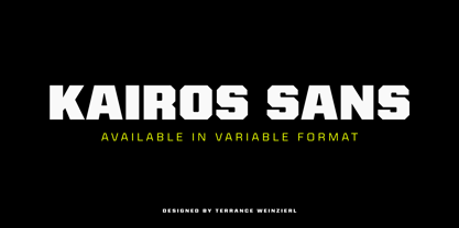 Kairos Sans, designed by Terrance Weinzierl, is an octagonal sans serif influenced by 19th Century Grecians, with the weights and widths of a contemporary palette. The bold simplicity radiates in headlines and sub-heads, with suitable performance in text. Of course, it pairs perfectly with the slab serif companion, Kairos . Kairos Sans is available in 48 styles; 8 weights in 3 widths, all with matching italics. Condensed, Regular and Extended widths range from Thin to Black. There are 4 Rough styles as well, bringing the whole family to a total of 52 styles. It comes in Latin, Greek and Cyrillic scripts. It also comes with some extras and OpenType features: Small capitals, proportional and tabular figures, superscript and subscript figures, support for fractions, ornaments, arrows and Stylistic Alternates. It often looks athletic, industrial, and stern. Kairos Sans is stout, but has energy.
 - Protura by MIX.Jpg,
$15.00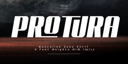 Protura Sans Serif Masculine - 9 Font Weights With Italics Introducing Protura Sans Serif Masculine, a versatile and powerful font family designed to make a bold statement in your creative projects. With nine distinct font weights and accompanying italics, Protura offers unmatched flexibility for all your design needs. Key Features: Nine Font Weights: Protura Sans Serif Masculine boasts an extensive range of weights, from Light to Ultra Bold. Whether you're crafting a subtle headline or a powerful logo, you'll find the perfect weight to convey your message. Italics Included: In addition to the standard weights, Protura also provides elegant italic versions for each weight. These italics add a touch of sophistication to your typography, making it ideal for editorial work and branding projects. Masculine Aesthetic: Protura's design exudes strength and masculinity, making it an excellent choice for projects aimed at a bold and assertive audience. Its clean lines and sharp edges give your text a contemporary and impactful look. Versatile Usage: This font family is highly adaptable, suitable for a wide range of design applications, including branding, packaging, editorial design, posters, websites, and more. It's a true workhorse font that performs well in various contexts. Legibility: Protura prioritizes legibility without compromising on style. Its well-crafted letterforms ensure that your text remains clear and readable, even at small sizes. OpenType Features: Take advantage of OpenType features such as ligatures and alternate characters to add subtle design nuances and improve overall visual appeal. Multilingual Support: Protura Sans Serif Masculine supports a multitude of languages, making it a globally accessible font choice for your projects. Applications: Branding: Create impactful logos and brand identities that leave a lasting impression. Editorial Design: Enhance the readability and visual appeal of magazines, newspapers, and books. Web Design: Craft modern and engaging websites that resonate with your target audience. Packaging: Design packaging that stands out on the shelf and communicates product quality. Posters and Flyers: Grab attention with bold and stylish promotional materials. Unleash the power of Protura Sans Serif Masculine to elevate your design projects with a masculine, contemporary, and highly versatile typographic solution. With its extensive weight range and italics, this font family empowers you to create impactful and visually stunning designs.
 - Adelle Sans by TypeTogether,
$45.00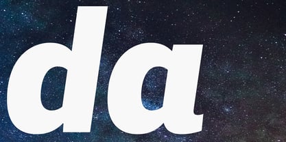 The Adelle Sans font family by José Scaglione and Veronika Burian provides a more clean and spirited take on the traditional grotesque sans. As is typical with TypeTogether typefaces, the most demanding editorial design problems were taken into consideration during its creation. The combination of lively character and unobtrusive appearance inherent to grotesque sans serifs make it an utterly versatile tool for every imaginable situation. Whether for global branding, screens, signage and advertising, or UI, the keyword behind Adelle Sans’s use is flexibility. To save space and keep legibility high, Adelle Sans is available in eight weights with matching italics and includes a condensed width of seven weights with their matching italics. Each of these 30 styles hits the perfect tone as a headline punch or subdued background hum, and the condensed widths are adept at setting short texts while retaining the expected personality. Rooted in the belief that broad language support is crucial to modern global type design, the Latin-matching variants are yet another push in TypeTogether’s ongoing multilingual efforts. The Latin script may have been first, but Adelle Sans has thus far been expanded into an exhaustive nine script family with extensive language support. Careful research and close collaboration with type experts yielded typographic consistency, legibility, and cultural awareness among all scripts, as well as filling the need for quality editorial typefaces in Arabic, Armenian, Chinese, Cyrillic, Devanagari, Latin Extended, Greek, and Thai, with more planned for the future. In addition to the 30 Latin styles, all other scripts have between seven and fourteen styles, each of which has been engineered to optically match the proportions of its counterparts. And each script comes bundled with the Latin script to ensure an harmonious fit amongst any two or more Adelle Sans families in the same block of text. The full Adelle Sans family delivers consistent, flexible, and personable results in multilingual documents, in apps, and multicultural branding worldwide. Its wide character set includes typographic niceties, small caps, several sets of figures, icons, and support for over 245 Latin-based languages. Be sure to check out the companions for Adelle Sans: Adelle, for a versatile and authoritative slab serif with no shortage of personality; and Adelle Mono, a two-width family flexible enough for developers and graphic designers alike.
 - Oxonia Roman by Greater Albion Typefounders,
$10.00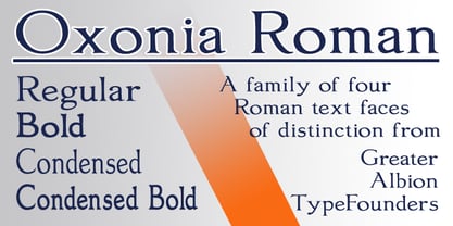 Oxonia Roman is a text family, offered in two weights and two widths, deriving it’s inspiration from classic Roman typefaces. It is intended for the setting of text legibly in quantity, and compliments our Anavio and Vectis faces particularly well.
 - Nsai by AukimVisuel,
$15.00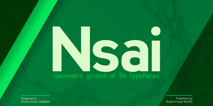 Nsai is a modern sans serif font family with a geometric twist, created in 2021 by a Congolese type designer, Audry Kitoko Makelele. It is available in two versions (normal and extended) making a total of 36 fonts. There are 9 weights with their true italics. Over 600 glyphs per font provide a wide range of language support, from Latin to Cyrillic, as well as powerful Opentype features such as professional kerning, stylistic variations, very special ligatures, old-fashioned tabular figures, Fractions, denominators, exponents, unlimited indices, arrows and more to satisfy the most demanding professionals. On the one hand, it features rounded curves with very open terminals that make this font family elegant, user-friendly and contemporary and on the other hand very useful for writing titles on any medium. Perfectly suited for graphic design and any display use. It could easily work for web, signage, corporate as well as editorial design. It’s a wonderful, bold and elegant font. This font is guaranteed to make your design stand out from the crowd and leave a lasting impression, as it has the potential to enhance any creation.
 - Chopper by Canada Type,
$24.95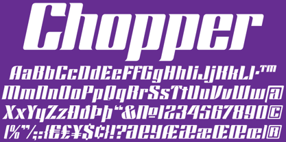 In 1972, VGC released two typefaces by designer friends Dick Jensen and Harry Villhardt. Jensen’s was called Serpentine, and Villhardt’s was called Venture. Even though both faces had the same elements and a somewhat similar construct, one of them became very popular and chased the other away from the spotlight. Serpentine went on to become the James Bond font, the Pepsi and every other soda pop font, the everything font, all the way through the glories of digital lala-land where it was hacked, imitated and overused by hundreds of designers. But the only advantage it really had over Venture was being a 4-style family, including the bold italic that made it all the rage, as opposed to Venture’s lone upright style. One must wonder how differently things would have played if a Venture Italic was around back then. Chopper is Canada Type’s revival of Venture, that underdog of 1972. This time around it comes with a roman, an italic, and corresponding biform styles to make it a much more attractive and refreshing alternative to Serpentine. Chopper comes in all popular formats, boasts extended language support, and contains a ton of alternate characters sprinkled throughout the character map.
 - Megafield by Great Studio,
$20.00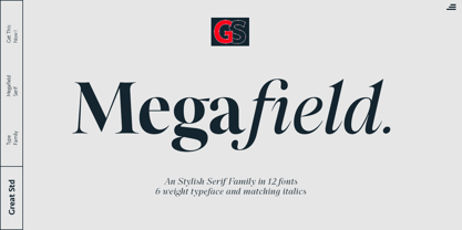 Megafield is a contemporary display serif typeface with sharp and dynamic strokes, strong contrast and delicate pointed serifs. giving traditional serif design elements a modern feel, it’s a graceful and confident typeface family with an extensive set of functional and experimental glyphs. Megafield family has 12 fonts, namely (6 weights and 6 Italics, ranging from Light to Extra Bold. These fonts are perfect for your design needs such as making nostalgic but still clean and elegant designs such as headlines, magazines, logos, packaging, editorials, and more. Features · All Uppercase and Lowercase · Number & Symbol · Supported Languages · Alternates and Ligatures · PUA Encoded Thank you, Great Studio
 - Sticks by Lindstrom Design,
$19.00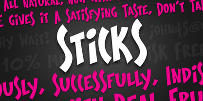 Sticks was originally designed as a custom logo for a sour gummy candy. It was then expanded to a full font, with numbers, symbols, foreign accents, and even a few ligatures. An all caps font, the capital letters are even more capital than the lower case capital letters. As a bold font, it's ideal for parties, flyers, greeting cards, posters, headlines, and snipes. It doesn't take itself too seriously, so it's well suited for comic, cartoony uses. The S is taller than the other letters and gives it it's unique quirky Stick-like personality. Use it with words and phrases that contain lots of S's!
 - Altair by Zetafonts,
$39.00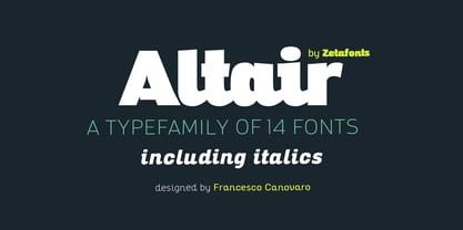 Altair is a sans serif type family derived from Zetafonts's Digitalino typeface. The original bold design by Francesco Canovaro has been expanded in a seven weights family, suitable for a wide range of design uses, from body copy to display text and ranging from a thin weight to the ultra one. Altair's main originality lies in the calligraphic roots of its design, that gives it a friendly, confident look that is perfect for corporate voices, new technology startups, news blogs and any other case where a solid design must be given an emotional context.
 - Retrofunk by Hendra Pratama,
$15.00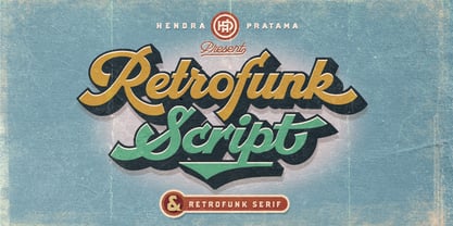 Retrofunk was inspired by the retro typography design in 70's. Script and Serif form a great combination for creating a logos, signboards or a simple word mark. Hundreds of Alternates with PUA Unicode are packed inside Retrofunk Script. Those alternate characters will help you to create a bold, strong, artistic and variate graphic design for flyers, posters, banner Ads, T-Shirts, book covers, titles or any retro or vintage typography. Tutorial: Watch how to access the alternate characters and pairing the basic script font with the extrude style here.
 - Vasarely by B2302,
$33.00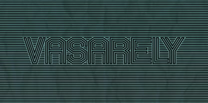 VASARELY has famous roots, its name is related to optical arts own Victor Vasarely. Dropping the field of Op-Art, you already know where we have been aiming at. The REGULAR and LIGHT cuts of VASARELY are quite ordinary, rectangular, but legible typefaces, but with the BOLD and EXTRABOLD versions you will be able to build diverse illusive type illustrations and layouts. Being build on a strict grid with same dimensions, the eye-affecting black-and-white contrast should trigger different optical effects. As an extra we build an EXTRUDED version as well. Have fun!
 - Ephemera Egyptian by Ephemera Fonts,
$20.00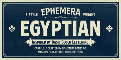 Egyptian ephemera is a typeface inspired from basic block lettering, widely used in art and craft of sign writing. 5 styles available from light to bold. and for the first time it is also available as variable fonts. One of the uniqueness of this font is the small spur on each stem, and the terminal, which intends to simulate an entry and end brush stroke. OpenType features support such as Smallcaps, Tabular Figure, Superscript, and 2 alternate of ampersands. This typeface was created for Display needs, such as headlines, signage, logotype, badges design, packaging, etc.
 - Rise by Greentrik6789,
$14.00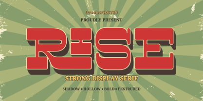 Are you looking for an eye-catching display font? This fonts will do it for you! Rise is a strong display font with reverse contrast so it grabs a lot of attention in the crowd. Rise will be very suitable for marketing design needs such as posters, flyers, advertisements, labels, book covers, film titles and various design needs with retro vintage style. Comes in Regular, hollow, shadow, extruded, and bold styles. Also come with several alternatives for lowercase characters that you can use to add aesthetics to your designs.
 - Lamna by Craft Supply Co,
$20.00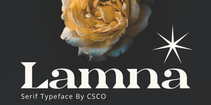 Introduction to Lamna – Wide Serif Font Lamna is a distinct wide serif font, characterized by its upright and bold appearance. Its design combines traditional elegance with modern simplicity, making it versatile for various applications. This font stands out due to its unique wedge-shaped serifs and strong structure. Design Features The key feature of Lamna is its wedge-shaped serifs. These serifs are not just decorative; they add a sense of stability and formality to the text. The wide structure of the font enhances readability, making it ideal for both print and digital media. Moreover, its upright stance contributes to its authoritative tone, suitable for titles and headings. Versatility and Usage Remarkably, Lamna adapts well to different contexts. Its clear, strong lines make it perfect for headlines and logos, where a commanding presence is needed. Additionally, it performs well in body text, offering a comfortable reading experience. Its versatility extends to various industries, including publishing, advertising, and digital design.
 - Marjac by Jeremia Adatte,
$29.00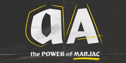 Marjac is an angular and upright script typeface that is directly inspired by handwriting. It is created after "Jacno", a typeface designed in 1948 by French type and graphic designer Marcel Jacno. This unique bold design later inspired other typeface designers to create brush script typefaces like Roger Excoffon’s "Choc". You will also notice it has a "unicase" feel, sharing some lowercase letters in the capital letters. It is recommended to use it for any packaging designs related to quality hand-made products, advertising, web, film title sequence design, posters, magazines and book jackets. Marjac is loaded with an extended character set, supporting Central, Western and Eastern European languages. It has plenty of cool OpenType features like a fun automatic brush underline feature or newly-designed secret alternate letters (like capital A). Kerning and spacing (+ than 25,000 kerning pairs) have been meticulously made-to-measure to this specific brush typeface. Beautiful hand-made arrows and other symbols were created to accompany letters.
 - Gloriz Vintage by Mans Greback,
$59.00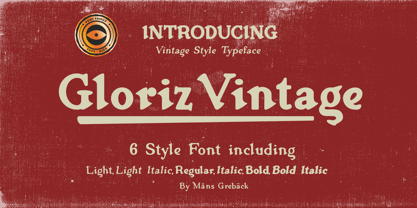 Gloriz Vintage is the bold and distinctive retro serif font that adds a touch of rustic charm to any project. Designed by Mans Greback in 2023, this font features rounded edges and a heavy, printed appearance that will give your work a vintage look. Perfect for headlines and logotypes, Gloriz Vintage is the perfect choice for designers looking to add a touch of personality to their work. Don’t miss out on this one-of-a-kind family! The Gloriz Vintage family consists of six high-quality fonts: The three weights Regular, Light and Bold, are each provided as both Upright and Italic styles. The font is built with advanced OpenType functionality and has a guaranteed top-notch quality, containing stylistic and contextual alternates, ligatures and more features; all to give you full control and customizability. It has extensive language support, covering all Latin-based languages, from Northern Europe to South Africa, from America to South-East Asia. It contains all characters and symbols you’ll ever need, including all punctuation and numbers.
 - Squid Junkie by Mans Greback,
$59.00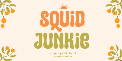 Squid Junkie is a bold and vibrant tribute to the funky, hippie-inspired designs of the past. With its playful, cartoonish aesthetic and playful use of line and color, this sans-serif font is the perfect choice for designers looking to inject a touch of retro fun and humor into their projects. With its versatile range of styles, including regular, light, and bold weights, each with its own italic counterpart, this font is designed to meet the needs of designers of all levels. But that's not all - Squid Junkie is also available as an outlined font, giving you even more options for making your designs stand out. The font is built with advanced OpenType functionality and has a guaranteed top-notch quality, containing stylistic and contextual alternates, ligatures and more features; all to give you full control and customizability. It has extensive lingual support, covering all Latin-based languages, from Northern Europe to South Africa, from America to South-East Asia. It contains all characters and symbols you'll ever need, including all punctuation and numbers.
 - BD Megatoya by Balibilly Design,
$25.00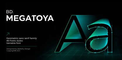 Overview of BD Megatoya Consists of 41 fonts, including nine upright, nine italics, nine extended, nine extended italics, all in nine weights from thin to black. 4 outline version in black weight. 1 variable with three axes (weight, width, slant). 1,470 glyphs in each font. Opentype features include small caps, stylistic alternates, ligatures, complete numeral figures, ordinal, case-sensitive forms. language support: Western European, Central European, and Southeastern European. About BD Megatoya Taking a geometric sans serif approach, we designed the letterform with details on round characters to pursue harmony and leave a slightly boxy feel to the extended style. The stylistic alternate is one of our concentrations to make them versatile yet still preserve consistency in stem and metrics to provide good readability in small text. Overall, the various treatments for each character will encourage each other to dynamic colours, flexible, and functional impressions in their application. Slicing edges The edge of the letter slice in 45 degrees will give the impression of a sparkle of light when you look at them for the first 2 seconds (our experience). This is what we did a few years ago when working on automotive branding. The word-mark logotype with slicing form gives an exclusive and different impression from its crowds. If you agree with us, does BD Megatoya deserve to be called a problem solver in branding projects? Jump over to .ss07, .ss08, .ss09, and .ss10 to find them! The Features BD Megatoya font family includes 41 great fonts in nine weights, an extended character set of over 1400 glyphs, multilingual support such as Southeastern Europe, Central Europe, Western Europe. Also advanced & useful open-type features: case-sensitive forms, small caps, standard and discretionary ligatures, stylistic alternates, ordinals, fractions, numerator, denominator, superscript, subscript, circled number, slashed zero, old-style figure, tabular and lining figure. Use BD Megatoya BD Megatoya is very suitable for branding projects and many designs purpose like advertising, posters, invitations, branding, logos, magazines, merchandise, presentations, etc. It's a FREE Get one weight from the BD Megayoya family for Free! Apply to your amazing projects and enlarge your creative tools by adding the complete BD Megatoya family to your font library.
 - Serapion by Storm Type Foundry,
$39.00Another variation on the Renaissance-Baroque Roman face, it extends the selection of text type faces. In comparison with Jannon, the contrast within the letters has been enhanced. The dynamic elements of the Renaissance Roman face have been strengthened in a way which is illustrated best in the letters "a", "b" and "s". These letters contain, in condensed form, the principle of this type face - in round shapes the dark stroke invariably has a round finial at one end and a sharp one at the other. Another typical feature is the lower-case "g"; the upper part of this letter consists of two geometrically exact circles, the inner of which, a negative one, is immersed down on the right, upright to the direction of the lower loop and the upright knob. The vertical strokes slightly splay out upwards. Some details of the upper-case letters may seem to be too daring, but they are less apparent in the text sizes. It has to be admitted that typographers tend to draw letters in exaggerated sizes, as a result of which they stick to details. Serapion Italic are italics inspired partly by the Renaissance Cancelleresca. This is obvious from the drop-shaped finials of its lower-case descenders. The type face is suitable for illustrated books, art posters and short texts. It has a rather ugly name - after St. Serapion. - Soapy by PintassilgoPrints,
$20.00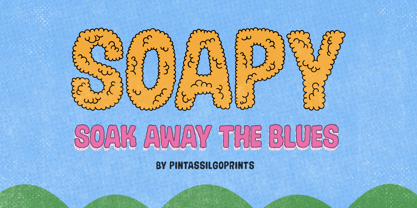 Soapy is a decorative font family, naturally scented and dermatologically tested. With extended language coverage, Soapy fonts are all-caps with 2 design options for each letter. There are also stylistic alternates with bouncy baselines – simply turn on the feature to instantly put your words to float. Or to dance, depending on your point of view. Stack styles for easily add colors to your compositions. Put a smile in your headline! Get Soapy!
 - Pop by Alias Collection,
$60.00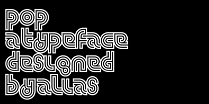 A decorative, maze-like multi-line typeface in two weights. Lower case is narrow, upper case is wide, the two can be mixed to give a variety of bold, dynamic effects.
 - Intellecta Monograms by Intellecta Design,
$20.90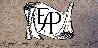 IntellectaMonograms is an extensive collection of ancient intrincate monograms, of all kinds, mainly Victorian style. To better understand the recherché combinations in these fonts, please take a look at the pdf brochures in the Gallery section.
 - Vivala Coffee House Icons by Johannes Hoffmann,
$19.00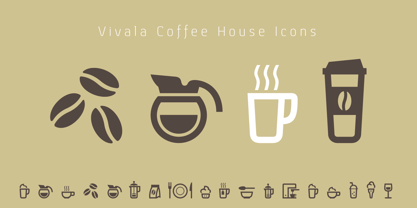 73 icons on the topic »coffee house.« The extensive kit includes the category’s coffee, drinks, food, coffee makers, roasted coffee and tea. The clear design is adapted to mobile interfaces and suitable for print, as well.
 - Jeyran by Michael Browers,
$25.00Jeyran is a handwriting font co-developed by Elnara Browers and Michael Browers. Based on Elnara Browers' handwriting, Jeyran is her first font design. Elnara's fluency in multiple languages facilitated the development of an extended character set that includes both Latin and Cyrillic. - Vivala Sans by Johannes Hoffmann,
$15.00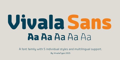 The character of Vivala Sans Round is modern and stylish with elegant squarish shapes. The family includes five weights. A large x-height is ideal for titles and body text. The extended character set supports languages like Western, Central European, and Eastern European.
 - Larque by Furiosum,
$20.00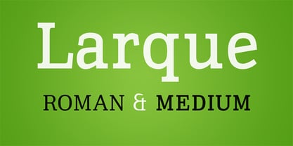 Larque is a slab serif text typeface. The tall x-height and the open counters makes the font very legible at small sizes. Larque includes extended latin characters, ligatures, oldstyle figures and Open Type features. It is available in roman and medium weight.
 - Matrice by Studio Sun,
$20.00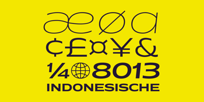 Matrice is a sans serif (Semi Extended) display font family in 8 weights plus matching natural italics. support 75+ Languanges (Latin Based) influenced by the grotesk typefaces developed in the early 20th century, perfect for branding (Identity), logotype, headline text, and caption.
 - Timenhor by Evertype,
$25.00Timenhor is a Latin-script font whose glyphs are based on the uncial letterforms of Coptic manuscripts. Timenhor is compliant with Unicode encoding and has an extended character set, supporting Celtic and Eastern European languages. It has both regular and italic styles. - Segmenta by Librito.de,
$15.00Segmenta, a sans serif typeface developed from the gridbased type of the Hamburg S-Bahn (metro). The type is originally used for diplaying informations about the trains. The typeface contains all accents and special letters for extended latin and the baltic languages. - ATC Duel by Avondale Type Co.,
$20.00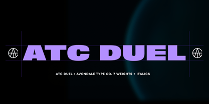 ATC Duel is a strong, extra heavy multi-width sans-serif display font with sharp edges and an extended horizontal span, inspired by the automotive industry. Font contains 500+ glyphs, full alphabet, ligatures, numberals, accents and punctuation. ATC Duel was released in 2016.
 - ST Titan by ShimanovTypes,
$20.00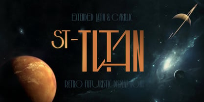 ST Titan is a retro futuristic display font with vintage vibes, inspirated by old sci-fi book's headers and posters. It's good for social media, headlines, large-format print, branding, posters, fashion designs and websites. Extended Latin and Cyrillic support. 30+ languages
 - Gaby Pro by RMU,
$35.00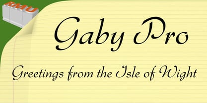 Inspired by the 1947 Weber font Gabriele, Gaby Pro is a freshly designed versatile and everyday cursive font that can be used for a wide range of printed products and for web design as well. The font was carefully extended for multilingual use.
 - Neue Plak by Monotype,
$57.99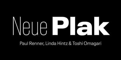 Originally designed in 1928, Plak is something of a lost gem in the type world. Despite being drawn by Futura creator Paul Renner, it never achieved the same popularity and spent decades lacking a much-needed digital revival. Monotype designers Linda Hintz and Toshi Omagari have taken its existing three weights and, after extensive research into the original wood type, extended them into the vast Neue Plak family. The typeface is available in 60 weights that stay true to Renner’s intentions, and offer the same blend of “quirky” details and “German stiffness” – as Hintz describes it. The design is an unusual mixture, bringing together a defiant outer appearance that’s counteracted by more playful details found in the lowercase r, and the large dots of the lowercase i. Other distinctive details include open or strikethrough counters, and a set of hairline widths that reduce Renner’s original design to its bare bones. Neue Plak’s display weights are crying out to be used in editorial, on packaging or in logos, while its text weight works well in both print and digital environments. Neue Plak Text Variables are font files which are featuring one axis and have a preset instance from Thin to Black
 - Gogh by Type Forward,
$32.00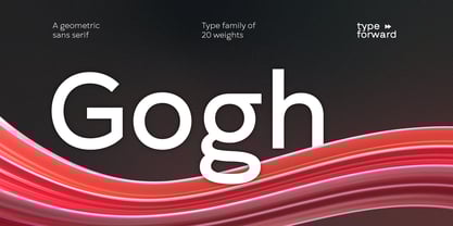 Gogh is a geometric sans serif with a modern look and traditional spirit. It blends evenly without overly distracting the reader, yet still keeps a rich and distinctive character. The generous x-height, easily distinguishable glyph forms, and open terminals help the eye perceive a block of text smoothly, making it clearly legible. Gogh thrives when used both on-screen and on print media. Gogh type family consists of 10 weights from Hairline to Black and their matching Italics. Gogh is also available as a fully functional variable font, which gives unlimited opportunity to explore typography without the restrictions of predefined weights. Gogh Variable is also the best option if used on the web as it has a much-reduced size compared to the original font family. Regardless of which Gogh family you choose, the typeface covers a broad spectrum of languages, as it includes Extended Latin and Cyrillic. And it also comes with an alternative stylistic set that will completely change the overall look of a paragraph, giving it a more contemporary and display appearance. In addition to that, Gogh type family is enriched with an extensive list of OpenType features for advanced typographic layout, including standard and discretionary ligatures, tabular and small figures, fractions, language localizations, case sensitive punctuation, and more.