10,000 search results
(0.046 seconds)
- Julie Molly by Letterhend,
$11.00 Julie Molly is a typeface with fun and playful looks. Available in 4 styles - regular, slanted, semi bold & semi bold slanted. This type of font perfectly made to be applied especially in storybook children or child theme which is need a standout font, and the other various formal forms such as invitations, labels, logos, magazines, books, greeting / wedding cards, packaging, fashion, make up, stationery, novels, labels or any type of advertising purpose. Features : numbers and punctuation multilingual ligatures PUA encoded We highly recommend using a program that supports OpenType features and Glyphs panels like many of Adobe apps and Corel Draw, so you can see and access all Glyph variations.
 - Longtype by Luxfont,
$18.00 Introducing original Longtype font family. Elongated in height and fully balanced in width. This font looks unusual and evokes a flight of imagination. Typeface in combination with the simplest graphic design techniques instantly turns into a modern object that attracts attention. Use it in short texts or headlines, add some color to enhance the effect. Fits well with modern minimal abstract design. Longtype is a stand-alone typeface that can be the centerpiece of a cover. And 3 types of thickness included in the family will give more freedom for creativity. Features: Elongated form 6 fonts in family: - Thin, Thin Italic - Regular, Italic - Bold, Bold Italic Kerning ld.luxfont@gmail.com
 - Legator by Putracetol,
$25.00 Legator - Super Bold Display Font. Legator a super bold, quirky display font with a fun and trendy characters. With a sporty style, it will be very suitable for your project, which is related to sport display. Such as story books, illustrations, comic books, t-shirts, posters, greeting cards, logos, branding, stickers, svg, crafting. The alternative characters were divided into several Open Type features such as Swash, Stylistic Sets, Stylistic Alternates, Contextual Alternates, and Ligature. The Open Type features can be accessed by using Open Type savvy programs such as Adobe Illustrator, Adobe InDesign, Adobe Photoshop Corel Draw X version, And Microsoft Word. Legator is also support multi language.
 - Musika by Lurinzu Studios,
$12.75 Musika" is a serene and elegant display typeface that is inspired by the vibe of soft jazz. Serene, elegant, soothing, somewhat sensual and at the same time feels like a warm hug. This typeface is made with the intention to be used in both titles and body text. The bold weight (even the light weight could also be used as a title card) holds really well as a title while the lighter weights (regular and light) can be used in body text. *This font includes letters, numbers, multi-language, and all essential marks needed. * Three (3) weights are currently available. (Light, Regular and Bold)
 - Tailor Craft by Putracetol,
$24.00 Tailor Craft - Bold Quirky Display Font. Tailor Craft a bold, quirky display font with a fun and trendy cute characters. With a childish style, it will be very suitable for your project, which is related to children. Such as story books, illustrations, comic books, t-shirts, posters, greeting cards, logos, branding, stickers, svg, crafting. The alternative characters were divided into several Open Type features such as Swash, Stylistic Sets, Stylistic Alternates, Contextual Alternates, and Ligature. The Open Type features can be accessed by using Open Type savvy programs such as Adobe Illustrator, Adobe InDesign, Adobe Photoshop Corel Draw X version, And Microsoft Word. This font is also support multi language.
 - Junior Schoolboy by Putracetol,
$16.00 Junior Schoolboy - Bold Fun Display Font. Junior Schoolboy a bold, quirky display font with a fun and trendy cute characters. With a childish style, it will be very suitable for your project, which is related to children. Such as story books, illustrations, comic books, t-shirts, posters, greeting cards, logos, branding, stickers, svg, crafting. The alternative characters were divided into several Open Type features such as Swash, Stylistic Sets, Stylistic Alternates, Contextual Alternates, and Ligature. The Open Type features can be accessed by using Open Type savvy programs such as Adobe Illustrator, Adobe InDesign, Adobe Photoshop Corel Draw X version, And Microsoft Word. This font is also support multi language.
 - Letraset Crillee by ITC,
$40.99Crillee is a family of our styles that was originally produced by Letraset. In 1980, Dick Jones designed Crillee Italic. Jones also designed the family's second style, Crillee Extra Bold Italic, in 1981. Peter O'Donnell designed Crillee Bold Italic in 1986. The fourth style, Crillee Italic Inline Shadow, was completed by Vince Whitlock. At the time of Crillee's development, Jones, O'Donnell, and Whitlock were all employees of the Letraset Type Studio. Crillee's slight lean to the right and geometric forms create a feeling of power and speed. Crillee should be spaced closely in word settings and is perfect for anything which should have a cool, modern appearance. - Bellona by Pista Mova,
$14.00 Bellona Introducing the new vintage bold script "Bellona". Inspired by retro typography from the 80s combined with a bold typography style. Comes with an open type feature with lots of alternates and finishes, it helps you create great fonts. Bellona best use for Logotype, headings, covers, posters, logos, quotes, product packaging, headers, merchandise, social media & greeting cards and more. This font also supports multiple languages. To access alternative glyphs, you will need a program that supports OpenType features such as Adobe Illustrator CS, Adobe Photoshop CC, Adobe Indesign and Corel Draw. Equipped with features: - Uppercase - Lowercase - Alternative - Numbers, Punctuation and Symbols - Ligature - Multilingual support. Happy Creative! Thank You!
 - Rockdale by Factory738,
$15.00 Rockdale is a bold and luxury serif font that created for brand or logo design purpose. It teases your eyes with its curves yet still able to maintain its modern and classy composure. The variety of weights provide a range of choices that will help you find the best typographic colour. The available stylistic Ligature and Alternate offer a perfect font for anything your creativity takes you. 5 Weights (Light, Regular, Semibold, Bold, Black) Basic Latin A-Z and a-z Numerals & Punctuation Stylistic Alternates & Ligatures Multilingual Support for ä ö ü Ä Ö Ü ... Free updates and feature additions Thanks for looking, and I hope you enjoy it.
 - Cairo by Viswell,
$19.00 CAIRO is a modern and sleek font that exudes simplicity and sophistication. This minimalist sans-serif font features clean, crisp lines with subtle contrasting strokes, adding just the right amount of edge to its overall design. The font's simple and unassuming style makes it a versatile choice for a wide range of design projects, from branding and advertising to editorial layouts and web design. The font comes in two styles: Regular and Oblique. The Regular style is perfect for headlines and titles, while the Oblique style adds a touch of elegance. The Oblique style is also ideal for creating emphasis and drawing attention to key elements within a design. CAIRO's design is inspired by the contemporary architecture. Its clean, minimalist look reflects the modern and forward-thinking nature of the city, making it a perfect choice for designers who want to create a bold, sophisticated look for their projects.
 - PT Serif Pro by ParaType,
$50.00PT Serif Pro is an universal type family designed for use together with PT Sans Pro family released earlier. PT Serif Pro coordinates with PT Sans Pro on metrics, proportions, weights and design. It consists of 38 styles: 6 weights (from light to black) with corresponding italics of normal proportions; 6 weights (from light to black) with corresponding italics of narrow proportions; 6 weights (from light to black) with corresponding italics of extended proportions; and 2 caption styles (regular and italic) are for texts of small point sizes. The letterforms are distinguished by large x-height, modest stroke contrast, robust wedge-like serifs, and triangular terminals. Due to these features the face can be qualified as matched to modern trends of type design and of enhanced legibility. Mentioned characteristics beside conventional use in business applications and printed stuff made the fonts quite useable for advertising and display typography. Each font next to standard Latin and Cyrillic character sets contain alphabet glyphs of title languages of the national republics of Russian Federation and support the most of the languages of neighboring countries. The fonts were developed and released by ParaType in 2011 with financial support from Federal Agency of Print and Mass Communications of Russian Federation. PT Serif family together with PT Sans won the bronze in Original Typeface category of ED-Awards 2011. Design – Alexandra Korolkova with assistance of Olga Umpeleva and supervision of Vladimir Yefimov - Salad by Zetafonts,
$39.00 The island of Fuerteventura is more known for its white sand beaches and windsurf-friendly constant winds than for its typographic marvels. Still, it's on the walls of a ballroom next to its white-sand beaches that Debora Manetti found the hand-painted letterforms that she took as inspiration for her typeface Sala de Fiestas. The resulting font was a condensed sans serif full of curious details and a jumpy latino vibe that many years after still keeps its freshness and vernacular charme. Francesco Canovaro took the original typeface as a starting point for a grand tour into sign-painter aesthetics, developing a reboot of the original into a new type family: Salad. While being faithful to the original proportions and feeling, Salad provides extreme versatility through its five-weights range, its extended charset and its set of Open Type features including stylistic sets, alternates, positional numerals, small capitals and case sensitive forms. While the roman family with its italic counterpart provide a good workhorse tool for informal branding, packaging and editorial projects, the interlocking and the inline weights add additional possibilities for display purposes. This is enriched by the inclusion in the typeface of a set hand-drawn decorative dingbats that further complement the sign painting vibe of the family. All Zetafonts expertise in handmade lettering, typographic design and water sports has been put to test to assure Salad is the best typographical alternative to a a trip to Canary Islands!
 - Decorya by Ahmad Jamaludin,
$15.00 Introducing DEKORYA – a brand new serif with all the nostalgic vibes! DECORYA typeface is a beautiful and inspiring mix of classic calligraphy and modern serif with 46 unique ligatures and special alternates. Comes in 3 versions: Condensed, Regular and Expanded DECORYA is made mainly for headlines, titles, and other short texts and is well-suited for advertising, vintage mood boards, branding, logotypes, packaging, titles, editorial design, modern logos, websites, social media quotes, wedding branding, modern and vintage design What's Included? Dekorya Main File 46+ Special Alternates and Ligatures Condensed, Regular and Expanded Instructions (Access special characters in all apps, even in Cricut Design) Accessible in Adobe Illustrator, Adobe Photoshop, Microsoft Word even Canva! PUA Encoded Characters. Fully accessible without additional design software Language Support: Danish, English, Estonian, Filipino, Finnish, French, Friulian, Galician, German, Gusii, Indonesian, Irish, Italian, Luxembourgish, Norwegian Bokmål, Norwegian Nynorsk, Nyankole, Oromo, Portuguese, Romansh, Rombo, Spanish, Swedish, Swiss-German, Uzbek (Latin) Thank you Dharmas Studio
 - Neue Frutiger Tamil by Linotype,
$99.00 Neue Frutiger Tamil was created by Pria Ravichandran and a team of designers and font engineers from the Monotype Studio, under the direction of Monotype type director Akira Kobayashi. The family is available in 5 weights from Light to Bold to support the Tamil script. The typographic forms of Neue Frutiger Tamil are familiar and friendly. The Tamil shows traces of elements that is reminiscent of the calligraphic influences found in the 20th-century designs. Reflecting the modern typographic needs of the Tamil script, this type family is in the upright style. These two factors ensure that the two scripts, Tamil, and Latin pair elegantly. The result, Neue Frutiger Tamil, is an eclectic contemporary type family that bridges the past and the present. Neue Frutiger Tamil embodies the same warmth and clarity as Adrian Frutiger's original design, but allows brands to maintain their visual identity, and communicate with a consistent tone of voice, regardless of the language. It is part of the Neue Frutiger World collection, offering linguistic versatility across environments – suited to branding and corporate identity, advertising, signage, wayfinding, print, and digital environments.
 - Camelin by Gian Studio,
$15.00 Introducing Camelin sant display is a complete typeface that is modern, simple and clean. As a typographic display it is useful for posters, logotypes, titles and short text in general. This font is easy to read and bold, easy to play. the embellished serif of the hat is slightly different from the usual hat to create an alternative glyph. We also designed an attractive uppercase set inside, to enhance your design. Enjoy!
 - North Queen by Typeskets,
$22.00 North Queen is a Variable font and Font Family with 8 weights, starting from thin to extra bold, this font belongs to the classic serif nuanced font, very suitable for making label designs, posters, headlines, and many more, you might be able to add this font in your font collection VARIABLE We hope you enjoy this font! please feel free to comment if you have any thoughts or feedback. Thanks for purchasing and happy creating!
 - Caster by Gian Studio,
$16.00 The newest Caster Serif is a complete serif typeface that is modern, simple and clean. As a typographic display it is useful for posters, logotypes, titles and short text in general. This font is easy to read and bold, easy to play. the embellished serif of the hat is slightly different from the usual hat to create an alternative glyph. We also designed an attractive uppercase set inside, to enhance your design. Enjoy!
 - Toner by Smartfont,
$20.00 If you like a bold and powerful all-caps sans-serif font to make your message stand out, Toner can be the choice to maximize your goals.иThis type family furthers the angular design by styling characters like O, R, P, etc. to be rectangular. To make it more attractive, Toner also provides opentypes features such as stylistic alternates and a stylistic set. Best for expressive headlines, posters, billboards and of course brand identities.
 - Figgins Standard by Shinntype,
$39.00 To meet the burgeoning demands of commerce, type founders in 1830s London introduced a plethora of new fonts which abandoned the traditional nib-informed model. Most radical were bold, capital-only designs with almost no stroke contrast, stripped bare of serifs. To all intents and purposes these minimal expressions of utility were identical to 20th century functionalism. Recontextualizing one of the original sans fonts, Shinn offers an alternative proposition to the myth of modernism.
 - Nautica Sottile by Resistenza,
$49.00 The Copperplate penmanship style has a distinctive flow and character. Many years of steady and patient practice allow calligraphers to achieve the flow, direction, sequencing, and speed required from the copperplate ductus, to achieve its distinctive, elegant, fluid aesthetic. Nautica is a monumental new script from Resistenza, which builds on the creator’s accomplished penmanship skills. The delicate strokes have high contrast and an extravagant personality. These letterforms invoke 18th-century sailors logbooks and the nostalgic correspondence those at sea sent home to their loved ones, with letters looping and rolling into one another like the waves these intrepid adventurers voyaged on. Nautica’s ornate feel is perfectly suited to romantic applications, and with three weights, one set of useful navigational icons and some nautical knots Nautica will allow you to create rich and cohesive graphics for those 'tying-the-knot' or in any display context which requires some sophistication. Nautica allows you to achieve the complexity and flow of copperplate calligraphy with OpenType features. Supreme swashes inspired by brush pen stroke, and exhaustive alternates, with over 900 glyphs and extensive language support, Nautica offers full professional typographic features, for a natural ‘written’ look. Check out also “Voguing” & “Nautica”
 - Watermint Script by Mans Greback,
$79.00 Watermint Script is a formal typeface that epitomizes the essence of elegance and sophistication. Envisioned for formal settings, its calligraphic strokes evoke a sense of classic beauty, making it an ideal choice for invitations or logotypes that demand a touch of class. Watermint Script is a harmonious blend of cute and lovely, wrapped in a feminine and romantic design. Its light and fresh appearance breathes life into each word, offering a clean and flawless presentation. The font's perfection lies in its attention to detail, with each character exuding a classy aura that enhances the overall visual experience. The font is built with advanced OpenType functionality and guaranteed top-notch quality, containing stylistic and contextual alternates, ligatures and more automatic and manual features; all to give you full control and customizability. It has extensive lingual support, covering all Latin-based languages, from North Europa to South Africa, from America to South-East Asia. It contains all characters and symbols you'll ever need, including all punctuation and numbers. Designed by Mans Greback, Watermint Script is a testament to his commitment to creating fonts that are not just tools of communication, but artworks that enrich the visual landscape.
 - Nippon Note by Hanoded,
$15.00 I just returned from a short holiday in Japan. I stayed in hostels and small guesthouses and noticed a peculiar thing they all had in common: they love little notes, telling you where to go, what to do, how to use the microwave oven and when to check out. These notes were sometimes printed, but more often they were handwritten. I found that the Japanese way of writing roman characters is a little, well, unusual. The letters are correct, but they have that typical ‘Japanese look’ - most notably the a and A the b, d and g, the p and P and the t and T. I can’t really tell you what makes them look different, maybe it’s the proportions, but I do know that a Nippon Note is highly recognisable. So, here is Nippon Note, a highly recognisable, handmade font. You don’t really have to be in Japan to use it, but it will give your designs that extra cachet. And don’t forget Nippon Note Kawaii - the cute doodle font which is free if you download the Nippon Note family! Comes with extensive language support, but unfortunately not Japanese…
 - Catalina by Kimmy Design,
$10.00 Earlier this year I visited a bakery in Newport Beach, CA and fell in love with the organic design and typography of the place. Hand-drawn menus, table cards, chalkboards, and wall quotes surrounded the charming spot. It inspired me to create a new font family based on the combination of hand drawn fonts. Included in this package are 5 font families, with 2 graphic ornament fonts. Each font family contains at least a light, medium and bold. Here is a breakdown of what's cookin' at Catalina's Bakery: Catalina Anacapa: Tall and skinny, this font comes in 3 weights for both sans and slab serif styles. It includes contextual alternatives (giving 3 versions of each letter), stylistic alternatives for select letters (A, K, P, Q, R, Y) and also includes Small Caps. Catalina Avalon: Based off Anacapa, this sub family has a high contrasting line weight. It comes in light, regular and bold as well as an inline alternative for both sans and slab serif styles. Avalon also includes opentype features such as contextual alternatives (giving 3 versions of each letter), stylistic alternatives for select letters (A, K, P, Q, R, Y) and small caps for each letter. Catalina Clemente: In a more standard width, Clemente is one of the two sub families that can be used for paragraph text as well as headlines. It's organically geometric in style and comes in ALL CAPS and lowercase, includes upright and custom italics, and has the opentype feature giving 3 versions of each letter. Catalina Script: A great compliment with the display sub-families, Catalina Script rounds out the package with a hand-drawn cursive flair. It includes contextual alternatives (giving 2 variations to each letter) as well as stylistic alternatives for many of the capital and lowercase letters. It has special ligatures for some letter combinations, and titling alternatives for all the capital letters. Catalina Typewriter: The second of the paragraph text sub-families, this typewriter inspired hand-drawn font family works great as either a display or paragraph text. It has contextual alternatives with 3 versions of each letter, and comes in both upright and custom italics versions. Catalina Extras! These two fonts go perfectly with the Catalina Family. They includes borders, frames, arrows, banners, flourishes and more. Catalina Flourish has all of it's options in a light and bold style, to use the light version type all lowercase letters, then to make something bold, used it's uppercase (or shift+) characters. For a breakdown of graphic/letter correlation, see the breakdown PDF. All of Catalina was drawn by the same hand, using the same ink and technique. While they contrast in their type styles, they work together perfectly to create one cohesive font family.
 - Typnic by Corradine Fonts,
$19.95 Everybody likes to have a picnic: some fresh fruits, cheese, ham, wine and so on. Like a “typographic picnic,” Typnic font system gathers many fonts with different flavors too, and you can enjoy them mixed or on their own. Typnic was drawn and calligraphed by hand and is made with eighteen typefaces, including three totally compatible yet different styles. It also has enhancement sets containing labels, dingbats, patterns and ornaments. The Headline style has six layered fonts that can be mixed in a wide variety of combinations to obtain powerful mastheads and headlines. It can be used to construct very nice advertising pieces. If you need to write informal texts, then use Typnic Script, which also comes in six variants and additionally has a complementary font with tails, double letters and ornamented ascenders. Finally, use Typnic Roman to add some secondary texts without losing the general appearance of your work. Typnic has a cool and natural feeling and could be used in all sorts of projects. Typnic is a very ambitious project and we will be working on it to further expand the whole system. Please check out our Typnic Headline Slab.
 - Graduate by Fontforecast,
$54.00 Graduate Script is a contemporary calligraphic script. With over 825 glyphs Graduate Script can be dressed up or down, to enliven its style. You can add curls to beginning and end of any lowercase letter, or even in between them. Alternates for both upper and lowercase, as well as ligatures for double letters are included too. OpenType features such as five numeral styles, fractions and both standard and discretionary ligatures, make Graduate Script a well equipped font. Graduate Ornaments has over 300 glyphs and expands the design possibilities of Graduate Script even further. It offers additional ornaments and curls to add to lowercase letters, frames, automated borders that can be accessed by the keyboard and a lot more fun glyphs to work with. On top of that there are catchwords in different styles. Not finding the catchword you’re looking for? Just create your own! A full set of capitals, including roman accented caps, currency, numerals and punctuation is part of Graduate Ornaments. Designed to fit the same frames that are being used for the different catchword-styles, so you can easily integrate custom text with the existing catchwords. A detailed user guide is available in the gallery section.
 - Astire Klarish by Dora Typefoundry,
$20.00 Introducing, Astire Klarish is a new retro serif with all clean and soft lines, tight curves, a combination of regular and italic versions adding to the appeal and trendy elegant look! This serif typeface that looks amazing in both large and small settings is perfect for your design needs yet still clean and elegant to apply to a variety of other formal forms such as invitations, labels, logos, magazines, books, greeting/wedding cards, packaging. , fashion, make up, stationery, novel, label or any kind of advertising purposes. WHAT YOU GET : Astire Klarish Regular (Open type) Astire Klarish Italic (Open type) Astire Klarish Bold (Open type) Astire Klarish Bold Italic (Open type) This type of family has become the work of true love, making it as easy and fun as possible. I really hope you enjoy it! Thank you.
 - As of my last update, there may not be a widely recognized or popular font specifically named "AB Exp". However, the naming convention suggests it could be a specialized or custom font, perhaps desig...
- News Nook by Mix Fonts,
$13.00 Introducing NEWS NOOK – a font family that captures the essence of newspaper headlines and front pages, with a rugged twist. This versatile sans-serif pairing is perfect for creating a modern, professional look that is both eye-catching and easy to read. With its unique ruggedness, it makes it stand out and suitable for outdoor designs. The font family includes two distinct styles: NEWS NOOK, a bold headline font, and NEWS NOOK MINI, a thin and stout sans-serif font. Together, they provide a range of options for creating headlines, subheadings, and body text that are sure to grab attention. The headline font is particularly great for creating bold and sturdy design elements. Inspired by the traditional newspaper style, NEWS NOOK brings a touch of nostalgia to any design project. But this font family is not just a replication of traditional newspaper style, it’s more of a modern take on publishing type with a handwritten spin. This makes it perfect for any print project, including magazines, newspapers, and more, creating a polished and professional look that is suitable for outdoor designs. NEWS NOOK (Regular) comes with the following glyphs: ABCDEFGHIJKLMNOPQRSTUVWXYZ abcdefghijklmnopqrstuvwxyz 0123456789 !@#$%^&*()`~♥❤✿•· ÷×+−±≈=≠≥≤[]:;’”,.|/?{}“”‘’-–—_ …‚„©®™‹›«»°¹²³ªº¡¿₱¢€£¥¶§№† ÁÀÂÄÃÅĂĀĄÆĆĈČĊÇÐĐÉÈÊËĖĒĘḞǴĜǦḠĠĤȞḦḢIÍÌÎÏĪĮĴḰǨŁḾṀŃÑŇ ÓÒÔÖÕŌŐØŒṔṖŔŘṘŚŜŠŞȘŤṪȚÚÙÛÜŨŮŬŪŰŲẂẀŴẄẆÝŶŸŹẐŽŻƵ áàâäãåăāąæćĉčċçðđéèêëėēęḟǵĝǧḡġĥȟḧḣıíìîïīįĵḱǩłḿṁńñň óòôöõōőøœṕṗŕřṙśŝšşșťṫțúùûüũůŭūűųẃẁŵẅẇýŷÿźẑžżƶ NEWS NOOK MINI comes with the following glyphs: ABCDEFGHIJKLMNOPQRSTUVWXYZ abcdefghijklmnopqrstuvwxyz 0123456789 !@#$%^&*()`~♥❤✿•· ÷×+−±≈=≠≥≤[]:;’”,.|/?{}“”‘’-–—_ …‚„©®™‹›«»°¹²³ªº¡¿₱¢€£¥¶§№† ÁÀÂÄÃÅĂĀĄÆĆĈČĊÇÐĐÉÈÊËĖĒĘḞǴĜǦḠĠĤȞḦḢIÍÌÎÏĪĮĴḰǨŁḾṀŃÑŇ ÓÒÔÖÕŌŐØŒṔṖŔŘṘŚŜŠŞȘŤṪȚÚÙÛÜŨŮŬŪŰŲẂẀŴẄẆÝŶŸŹẐŽŻƵ áàâäãåăāąæćĉčċçðđéèêëėēęḟǵĝǧḡġĥȟḧḣıíìîïīįĵḱǩłḿṁńñň óòôöõōőøœṕṗŕřṙśŝšşșťṫțúùûüũůŭūűųẃẁŵẅẇýŷÿźẑžżƶ
 - Darcy by Atlantic Fonts,
$26.00 Darcy is bold and exuberant. As an all-cap family (exception “i”), every letter has an artsy, handmade alternate. For the most joyful bounce, choose all lower or mix up the cases. For a more even baseline, go with all uppercase. Darcy Prints has gestural, organic motifs and patterns, including leaves, grasses, flowers and abstract shapes. Each playful letter has two options with different looks easily available in upper/lower places. Darcy Designs is a cheerful picture font adapted from 26 of the hand-drawings in Darcy Prints. Darcy family is based on hand-lettered cards the designer makes for friends. Darcy family lends itself to products that celebrate warmth, creativity, and a zest for humor and fun!
 - Timeout by DearType,
$35.00 Timeout is a fresh, casual script paired with a bold, impactful sans and lots of goodies. It is modern, stylish and it comes in two variations for easy use: - Timeout - long ascenders, descenders and caps - for more impact. - Timeout B - short ascenders, descenders and caps - for easy stacking. The combo between the script and the headline-style sans works perfectly for various applications such as logos, posters, fashion photos, ads, postcards, branding, T-shirts, web images, product packaging and basically for anything you need to look sexy, interesting and informal. The script has some sweet ligatures, stylistic alternates and swashes that will make your designs stand out and capture attention, especially paired with some of the goodies.
 - Fermo TRF by TipografiaRamis,
$20.00 Taking into consideration some complaints about lack of capital letters and deficiency of heavier weight styles, the Fermo typeface was redesigned to replace the existing font, dated 2002. New Fermo includes two subfamilies—Fermo TRF and Fermo-Uni TRF. Both fonts now consist of three weight styles—light, regular and bold—with significant contrast. During the updating process some minor glyph shape adjustments and changes have been made. Fermo TRF's main distinctions from the previous font are the new capital letters and additional weight (light) style. Fermo-Uni TRF is a unicase font with an additional lightweight style. Fermo is recommended for use as a display font. In large size settings negative tracking is recommended.
 - Kigali by Monotype,
$50.99Designed by Arthur Baker in 1994 for URW, Kigali is a wide-bodied display type with bold, uneven, pen-drawn strokes that taper dramatically downward. This unusual theme creates a unique, recognizable look. Furthering the effect, the Kigali typeface family contains additional decorative design fonts, one with a zigzag pattern filling the spacious strokes, and another with the letters in black squares for use as ornamental initials. The regular and italic versions include two alternate faces: one with long, tall ascenders and regular-length descenders, and one with shortened ascenders and descenders that allow it to fit where its companion might not. Use Kigali sparingly in display advertising, labels, flyers, and other incidental work. - M Gentle PRC by Monotype HK,
$523.99 The design concept of M Gentle is inspired by the aesthetics of ribbon gymnastics and the tenderness of orchids. The beauty of the two are combined in one typeface. Keeping the characters in right proportion and standard structure, its horizontal and vertical strokes (橫、豎) are generally straight. The linkage among dots (點), downstrokes and the ticks (剔) to the right represent a sense of movement and fill the typeface with liveliness and humanity. While M Gentle Light shows purity and softness, Medium and Bold fonts have their own personalities. They are all legible and suitable for a wide range of purposes, make the family a popular choice in the advertising industry.
 - M Gentle HK by Monotype HK,
$523.99 The design concept of M Gentle is inspired by the aesthetics of ribbon gymnastics and the tenderness of orchids. The beauty of the two are combined in one typeface. Keeping the characters in right proportion and standard structure, its horizontal and vertical strokes (橫、豎) are generally straight. The linkage among dots (點), downstrokes and the ticks (剔) to the right represent a sense of movement and fill the typeface with liveliness and humanity. While M Gentle Light shows purity and softness, Medium and Bold fonts have their own personalities. They are all legible and suitable for a wide range of purposes, make the family a popular choice in the advertising industry.
 - HS Gold by Hiba Studio,
$69.00 HS Gold is based on some modern lines of Naskh calligraphy which supports Arabic, Persian and Latin with a Sans Serif with subtle round on stems and corners. The typeface has been optimized for corporate identity work, editorial design and modern projects when a contemporary and simple look with a similarity between Arabic and Latin is requested. It features swash, ligatures and swash ligatures. Its proportions allow high impact on the tightly set lines of big and small text alike. This font consists of two weights (regular and bold) which can constitute a striking addition to the library of Arabic and Latin contemporary fonts models that meet the purposes of various designs for all tastes and projects.
 - Yusyad by Eyad Al-Samman,
$20.00 The typeface Yusyad is designed mainly for a very sentimental and emotional reason. Metaphorically, it is a modest artistic gift offered virtually from the designer to one of his beloved and cherished persons in this life, namely, his loyal and devoting wife. She represents one of the most essential motives for many artistic and non-artistic works that the designer achieved during his life. This was done through her tranquil personality, infinite patience, sincere support, and endless encouragement. The designer's partner (i.e., the significant other) lives with him along with their three children looking both always for a life full of peace, achievements, philanthropy, and of course love. The typeface's name Yusyad is a portmanteau word consists of two morphemes. It is a simple name-meshing for two different names. Those names represent the name of the designer's wife (Yusra) and the name of the designer (Eyad). Yusyad is like an epithet that ties the two partners' honest and eternal relationship until the last day of their lives. Technically, Yusyad is a sans-serif condensed and display typeface. It comprises seven fonts with dual styles and multiple weights. Specifically, it has two main styles, namely, the normal and the inline design. The normal style comes in five weights (i.e., thin, light, regular, bold, and black) whereas the inline style has two weights (i.e., regular and bold). The typeface is designed with more than 700 glyphs or characters. Its character set supports nearly most of the Central, Eastern, and Western European languages using Latin scripts including the Irish and the Vietnamese languages. The typeface is appropriate for any type of typographic and graphic designs in the web, print, and other media. It is also absolutely preferable to be used in the wide fields related to publication, press, services, and production industries. It can create a very impressive impact when used in movies' or TV-series titles, posters, products’ surfaces, logos, signage, novels, books, and magazines covers, medical packages, as well as the product and corporate branding. It has also both of lining and old-style numerals which makes it more suitable for any printing or designing purposes. To end, Yusyad's condensed appearance—especially the inline style—makes it very memorable, eye-catching, and striking for advertising, marketing, and promotional purposes.
 - Blastand by ZetDesign,
$15.00 blastand is a display font created by combining sharp edges and curves for a unique shape. This font also adopts a handwritten shape at the end of the letter to present a bold writing yet still creates a classy and friendly impression. This font is also created in italic style and has open types such as ligature, stylistic alternate, etc. to provide options for designers to create awesome work.
 - Jackal Nest GT by Gartype Studio,
$10.00 Inspired by thin, childly, unique and a bit bold handwriting style, we present to you Jackal Nest, a handwritten font with thin and childly characters that was comes with alternates and multilingual glyphs to help people around world with that unique accent with this font. Jackal Nest is very suitable like as text, cover book, posters, handwritten style, and more.That way easily change the glyphs to make more unique glyphs.
 - Romina by Rosario Nocera,
$22.99 Romina is a neoclassical font family with a hight contrast, developed for numerous uses, ranging from news to magazine and catalogs to corporate design and web. The Romina family consists of 7 weights from extra light to extra bold with matching italics. Romina provides advanced typographical support with features such as ligatures, small capitals and case sensitive forms but also some dingbat, special glypfhs and the others opentype features.
 - Bubbly by Gatype,
$16.00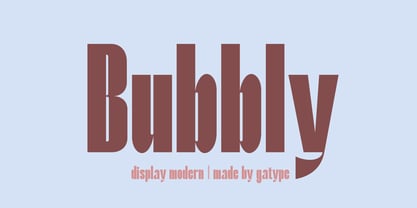 Stylish Bubbly Display with bold looking letters and Harmonious Impact to form a unique & elegant typography design. Perfect for branding projects, logos, wedding designs, social media posts, advertising, product packaging, product design, labels, photography, watermarks, invitations, stationery and any project. . uppercase and lowercase . multilingual symbol . number . punctuation . What will you get? Hope you enjoy our fonts and if you have any questions feel free to message & I'm happy to help