10,000 search results
(0.066 seconds)
- Nelson by Laura Worthington,
$25.00 Evocative of paint on weathered wood, Nelson’s engraved capital letters are as rustic and confident as the Old West. Combine the engraved face with bold and rough versions to create handsome wordmarks, or use Nelson to captivate customers of food packaging, restaurant menus, and roadside attractions. See what’s included! Engraved • Ornaments • Rugged • Bold *NOTE* Basic versions DO NOT include swashes, alternates or ornaments These fonts have been specially coded for access of all the swashes, alternates and ornaments without the need for professional design software! Info and instructions here: http://lauraworthingtontype.com/faqs/
 - Madden by Typogama,
$19.00 Madden is a bold, single weight typeface designed for use in titles, editorial design, branding or any other setting that requires capturing attention. With a bold, rugged stroke, inspired by the wide brush used in hand made protest signs, this typeface exploits Opentype features to randomly replace letters set in a line of text, thereby simulating the erratic and irregular letterforms that could be create by a manual writing. Madden is designed to give you an expressive and impactful typeface that will grab attention and shout your message.
 - Super Ultra Supra by Putracetol,
$24.00 Super Ultra Supra - Futuristic Font is a bold, rigid, and thick typeface that exudes a distinct sci-fi or futuristic vibe. Its ultra-modern appearance carries a powerful impact, making a bold statement in design. With three versatile font versions at your disposal, you can easily adapt this font to suit your specific design or thematic needs. Additionally, the inclusion of ligatures adds an extra layer of uniqueness and versatility to this font. Ideal for logos, branding, posters, titles, magazine layouts, sports-related designs, and any projects that demand a strong and modern font.
 - Morrello by Putracetol,
$28.00 Morrello is a bold retro decorative serif font with beautiful ligatures, tons of alternative glyphs and multilingual support. It's bold, groovy, clean and unique with vintage fell. Morrello is very versatile font that works great in large and small sizes. Helps to create layout design in 60s or 70s design projects. Come with open type feature with a lot of alternates, its help you to make great lettering. Morrello best uses for heading headlines, cover, poster, logos, quotes, product packaging, merchandise, social media & greeting cards and many more.
 - Selino by Reyrey Blue Std,
$16.00 Introducing, Selino Family Typeface. An elegant, classy with artistic touch family typeface. Selino Family Typeface is perfectly suitable for layout design for quotes or body copy, best used as a display for headings, logos, branding, magazines, product packaging, invitations. logotypes, and much more. Don't wait to add this luxury font family to your collection and start designing straight away. Features : · Font Family totals 4 fonts (Bold, Bold Italic, Regular, Regular Italic) · All Uppercase and Lowercase · Number & Symbol · Supported Languages · Alternates and Ligatures · PUA Encoded Hope you enjoy with our font!
 - Koran by Genesislab,
$10.00 Koran Sans is a clean family sans humasnist style that is absolutely perfect for editorial headlines. The complete font family of upright and italic letters is easy for you to use 18 styles in many projects. This font is complete with symbols and multilingual. This font style is bold, bold, and sleek, making it perfect for editorial, web, posters, t-shirts, and magazine covers. . etc Including: Uppercase Letters, Numbers, Punctuation & Symbols. Multilingual Support Koran sans exudes character but is still useful thanks to its restrained geometric styling and modern construction.
 - Berylium - Unknown license

- Unispace - Unknown license

- Engebrechtre - Unknown license

- Sangu by Nurrontype,
$15.00 Sangu is a high-contrast serif font that is perfect for adding an elegant and sophisticated touch to any project. With its unique glyphs and range of weights from thin to bold, Sangu is a versatile font that can be used for everything from headlines to body text. Whether you're designing a brand or a logo, Sangu's elegant and bold style will help your message stand out. What sets Sangu apart from other serif fonts is its unique glyphs that add a touch of personality to your text. If you're looking for a font that will elevate your design, Sangu is an excellent choice.
 - HOCUS FOCUS - Personal use only

- 1492_Quadrata_lim - Unknown license

- Microphone Check by IKIIKOWRK,
$19.00 Proudly present Microphone Check - Marker Type, created by ikiiko Microphone Check is inspired by the bold and expressive signature strokes of the 90s street hip hop movement. In that era, freestyle marking was a method of self-expression that was closely associated with the underground graffiti scene. This typeface perfectly encapsulates the vitality, attitude and resilience of life on the streets. Sharp lines with bold, bold bodies characterize this type of marker, allowing for substantial fills and bright colors to stand out on any surface. It gave them the opportunity to express their originality and creativity while leaving their mark on the urban environment. This type is very suitable for making a street wear brand, book cover, movie title, magazine layout, poster, quotes, or simply as a stylish text overlay to any background image. What's Included? Uppercase & Lowercase Numbers & Punctuation Alternates & Ligature Multilingual Support Works on PC & Mac
 - Early Quake by Ahmad Jamaludin,
$19.00 Say hello to EARLY QUAKE! Inspire some retro fun with bubbly swash and alternates, 70's inspired font complete with groovy bellbottoms! Early Quake comes in three versions - Regular, Outline, and Extrude version. With three different style fonts, you can easily create eye-catching designs without any extra effort This font is perfect for a retro 80s theme, and can be used for cover magazine, brochure, logo, headline or quotes, stand alone display, and short paragraphs or content. Each font in the family is dynamic and authoritative on its own, making it perfect for any display project. What you get? Early Quake Early Quake Outline Early Quake Extrude Alternates and Ligatures Instructions ( Access special characters, even in circuit design ) Letters, numbers, symbols, and punctuation No special software is required to use this typeface even work in Canva Multilingual Support Multilingual character supports : (Afrikaans, Albanian, Catalan, Croatian, Czech, Danish, Dutch, English, Estonian, Finnish, French, German, Hungarian, Icelandic, Italian, Lithuanian, Maltese, Norwegian, Polish, Portuguese, Slovenian, Spanish, Swedish, Turkish, Zulu) Give your design projects that fun, playful edge with EARLY QUAKE! Enjoy your day! Dharmas Studio
 - Monatomia by Ortho,
$24.99 Introducing Monatomia, a new display font by Omar Sacca a.k.a. ortho*. Monatomia is a font that is sure to make a statement in any design project. With stencil shapes designed to mimic the look of neon signs, Monatomia has a retro-futuristic twist that is truly unique. Featuring 191 glyphs in two styles, Monatomia is the perfect font for creating quick and effective logotypes or titles. Whether you're working on a poster, a website, or a packaging design, Monatomia will bring a fresh and eye-catching look to your work. So don't wait any longer! Add Monatomia to your design toolkit and start creating bold, neon-inspired designs that will grab attention and make an impact.
 - Jackalope LP by LetterPerfect,
$39.00 Jackalope is a new original script font from LetterPerfect Fonts. The design is a hybrid of pressure-pen calligraphy infused with whimsy and curlicue terminals. Letterforms are free-spirited and edges are rough, simulating spontaneous writing on rough paper. In addition to the full ANSI western character set, Jackalope includes a full set of small capitals, both lining and old-style numbers, and swash lowercase alternate characters that can be used as terminal letters at the ends of words for additional flourish. The genesis and realization of Jackalope was also a hybrid process. In 1996, LetterPerfect commissioned type designer Kathy Schinhofen to provide pen-written source material based on her commercial handwriting style and specifically on a logo she had designed for its "Viva la Fonts" line of script fonts. This work was digitized by LetterPerfect’s Garrett Boge and later fonticized by former Hallmark Cards type maven Myron McVay who unified the design and contributed additional characters. The design sat unfinished for over 12 years until Garrett Boge revived the project in 2010 filling out the extended character set. Jackalope is released in two versions: Jackalope LP Regular, which is the base font for continuous text setting; and Jackalope LP Expert, which includes swash variants, small capitals, and old-style numerals which can be swapped into text for extra flourish and effect.
 - LC Trinidad by Compañía Tipográfica de Chile,
$34.00 Lc Trinidad is the result of a series of wonderings regarding geometric Sans Serif typography design, in particular; Futura of Paul Renner. A “conversation” arose between me and the designer – actually there was no conversation, it is an euphemism for “I saw his designs, I draw them and discussed with myself some of his decisions – that ended up being the origin of this font firsts glyphs: A, H, N, O, R and S. I started with uppercase letters, and here is when Rudolf Koch with Kabel and his “Das schreibbuchlein” joined the conversation. This is how I could develop some alternative lowercase letters so as to illustrate this imaginary discussion. The result is a sans serif, geometric, modern typeface with classical Roman proportion in the uppercase letters; two stylistic sets for lowercase letters (setKoch and setRenner), rational, open and sharp ends. It is ideal to form titles, medium length texts, branding, exhibitions and animations. The family consists of 9 weight variants and their corresponding oblique versions and small caps. With more than 900 glyphs, it covers more than 190 Latin languages and together with its Opentype functions it creates a modern and versatile family. Besides, it has powerful OpenType features for each style, including stylistic sets, extended language support, ligatures, contextual alternates, lining figures, oldstyle figures, small caps numbers, arrows, fractions, superscripts, subscripts and many more.
 - Thicker by Zetafonts,
$39.00 Thicker is a type-family designed for Zetafonts by Francesco Canovaro with Andrea Tartarelli. A geometric sans typeface on steroids, it was first designed in the muscular Extrablack weight with the aesthetics of high-power dynamic typefaces used in sports communication, and then developed in the lighter weights where the shapes show some vintage-inspired proportions and the slightly squared look that nods to Novarese famous Eurostile, eponymous with retro-futurism. With these diverse influences the typeface allows for both impressive display use and effective logo design as well as more fine-tuned editorial use in body text - with a natural inclination for effective and powerful advertising. Sports typography usually uses italics to add dynamism and impact, and Thicker complies with this by offering a choice of three alternate italic forms with different slant, made even more customizable by the inclusion of variable font technology that allows fine tuning of the weight range as well as precise choice of typeface slant. In each of the 44 weights of the typeface family (as well as in the all-in-one variable type solution) Thicker offers a extended charset of over 900 latin, Cyrillic and Greek glyphs, covering over two hundred languages and including useful Open Type features (Alternate forms, Positional Numerals, Small Caps and Case Sensitive Forms) for flawless typesetting.
 - Nori by Positype,
$49.00 First, the important information…Nori is a hand-lettered typeface that contains over 1100 glyphs, 250 ligatures, 487 alternate characters, 125+ swash and titling alternates, lining and old style numerals. To make sure it is perfectly clear—Nori is the result of brush and ink on paper. The textures produced in each glyph are real and the imperfections are intentional and add to the sincerity of the letters. I say this to be as blunt as possible in order to avoid confusion and to frame what this typeface represents—calligraphic, handwritten letters captured digitally for their warmth and poetic variation for print and screen. Like my handwritten, calligraphic or brush-driven faces before it (the Baka series and the TDC2 2010 winning typeface, Fugu), Nori is a product of my analog and digital hand. To view the words and sentences formed by this typeface is to look at how my hands, yes hands, make letters. The fluidity, as well as the irregularity, is human, honest and intentional—to do so lets the brush I am holding breathe life into each letter. Once digital, any number of points and repetitive processes can’t mask its influences—and I like that. The brush, a simple instrument, my tool, my friend designed to emulate traditional Japanese sumi-e brushes... the Pilot Japan Kanji Fude brush pen. Each letter, each variation was written over and over again until I found the right combination. From there, each was scanned, digitized and optimized. Points were removed in order to ‘clean’ the glyphs up some but I did not want to compromise the integrity of the actual brush stroke. Once this base set of characters (about 350) were completed, the thoughtful manipulation of the glyphs, their gestures and forms were further expanded to solidify the embellishments used within the ligatures, alternates, swashes and additional features. This process was admittedly self-indulgent to an extent. I wanted the words created with this typeface to have the flexibility of variation and cohesiveness of movement that someone fluidly producing these letters by hand might have. I hope you enjoy this typeface as much as I did during the six months working on it. A specimen and style guide is included with the purchased of Nori.
 - Mancho by Ahmet Altun,
$-The Mancho Font was completely created by graphic tablet. This font family comes in two weights; regular and bold. They're all capital but lowercase and capital letters are different from each other. The name “Mancho” comes from Turkish Rock Music Singer "Barış Manço". The Mancho font can be a part of your stylish designs with its free and powerful outlook. - FebDrei by Ingrimayne Type,
$9.95 FebDei is neat, meticulous hand printing in two weights, plain and bold, each with italics. It has little contrast and appears as if it was written with a pencil or ball-point pen. Unlike many other hand-printing fonts, it has tiny serifs. FebDrei was created in the process of making the fonts AllSmiles and BringInTheFrowns and can be used with them.
 - Huggy by Typogama,
$19.00 Huggy is a display typeface designed by Michael Parson and inspired by the work of Heinrich Heinz. Full of Art Nouveau flair, this two weight typeface is bold forceful but full of subtle features that give the design a unique personality. With a narrow width and tall aspect, it is perfect for setting text in tight spaces like posters or other titling situations.
 - Mona by WildOnes,
$12.00 Mona hand lettered font is a hand drawn brush font. It has contrasting thin and bold lines. This is a decorative font, so it works best for short descriptions, logos, identities, packaging design. Also looks great on diferent invitations and posters. The typeface has two styles - regular and bouncy. Boucny is ideal for designs where you need just a little bit more playfulness.
 - Artvod by Tour De Force,
$25.00 The Artvod font family is a graduate project of Dusan Jelesijevic on the topic Museum of Digital Art. The whole project included a 15 minute interactive presentation through building of Artvod Museum, consisting of 15 posters and the font in two weights (Regular and Bold). The Artvod font family also appears in IndexBook's book Homage of Typography by Pedro Guitton.
 - Vanrott by Ergibi Studio,
$15.00 Vanrott is an old font with two styles: Regular and Destroyed. Both styles have a bold, prominent, old-fashioned but modern look! Vanrott is perfect for those of you who need fonts for titles, logos, clothing, invitations, branding, packaging, advertisements, and more. Vanrott includes uppercase and lowercase letters, punctuation, symbols, numbers, stylistic sets, alternate, ligatures as well as multi-lingual support.
 - Old Beck by Putracetol,
$24.00 Old Beck - Display Vintage Retro Serif Font. This bold typeface effortlessly combines the charm of vintage and retro aesthetics, creating a groovy yet classic vibe. With two distinct versions - clean and rough - Old Beck offers versatile options for your designs. The font's unique feature lies in its captivating groovy-shaped letter ends, adding an extra layer of character and style.
 - Elephunky NF by Nick's Fonts,
$10.00This hefty little number is an amalgam of two typefaces from the Flower Power era, Dave West’s Elephant Gothic and Wayne Stettler’s Neil Bold. It’s an extrabold, sassy headline face that will get your message across, loud and clear. Both versions include the complete Latin 1252, Central European 1250 and Turkish 1254 character sets, as well as localization for Moldovan and Romanian. - Merzalina by Agny Hasya Studio,
$9.00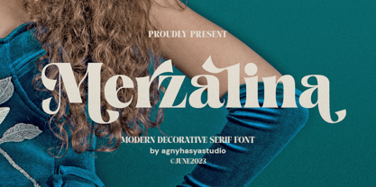 Merzalina is a Decorative Stylish Serif Display Font, Elegant, Classic yet Modern. Come in 2 (two) weights (regular & bold) including slants, and is created with Stylistic Alternates and Ligatures. Perfect for your design projects like logos, branding, advertising, product designs, stationery, photography, art quotes, wedding designs, fashion designs, and more. Featured with Uppercase and Lowercase, Numeral and Punctuation, Multilingual Support, and Opentype Features.
 - Koara by Rosario Nocera,
$14.99 Koara is a handmade font family inspired by nature. It's composed of two versions, (rough and wild) and available in the weights, light, regular and bold, with an alternative capital K, linear lowercase and capital numbers. It's recommended for large titrations, small paragraphs, typographic compositions and logotype, Koara shines on several backgrounds like leafs, jungle, nature images and even organic food.
 - Laurentian by Monotype,
$29.99 Maclean's is a weekly Canadian newsmagazine with a broad editorial mission. A typical issue covers everything from violence on the other side of the globe to the largest pumpkin grown in a local county. In 2001, Maclean's invited Rod McDonald to become part of the design team to renovate" the 96-year-old publication. The magazine wanted to offer its readers a typographic voice that was professional, clean, and easy to read. Above all, the typeface had to be able to speak about the hundreds of unrelated subjects addressed in each issue while remaining believable and uncontrived. A tall order, perhaps? Now add in that this would be the first text typeface ever commissioned by a Canadian magazine. McDonald, who some have called Canada's unofficial "typographer laureate," took on the challenge. McDonald used two historic models as the basis for Laurentian's design: the work of French type designer Claude Garamond, and that of the English printer and type founder, William Caslon. From Garamond Laurentian acquired its humanist axis, crisp serifs and terminals that mimic pen strokes. Caslon's letters are less humanistic, with a more marked contrast in stroke weight and serifs that appear constructed rather than drawn. These traits also made their mark on Laurentian. Using these two designs as a foundation, McDonald drew Laurentian with the narrow text columns and small type sizes of magazine composition in mind. He gave his letters strong vertical strokes and sturdy serifs, a robust x-height and a slightly compressed character width A tall order, per McDonald's genius is evident in the face's legibility, quiet liveliness and in the openness of the letters. The result is a typeface that not only met Maclean's demanding design brief, but also provides exceptional service in a wide variety of other applications. Laurentian is available in three weights of Regular, Semi Bold and Bold, with complementary italics for the Regular and Semi Bold, and a suite of titling caps."
 - NTF Fragma by Noble Type Foundry,
$20.00 A futurist headline typeface exploring the concept of sub-baseline interconnectivity and flow. Boasting over 450 glyphs, this typeface comes with an enormous amount of ligatures to achieve optimum flow between letterforms. Its sources of inspiration are endless (old science fiction, Arabic letterforms and 90s UK garage/rap album artwork featuring futurist custom type.) The typeface is best suited to headlines and larger type. Currently available in Bold with an Italic version coming in the not too distant future. Enjoy!
 - Arcas by Austin Stahl,
$13.00 Arcas is a display sans with no curves — straight lines only. Unlike many other typefaces with this characteristic, however, it’s built with some asymmetry, which helps it expand beyond the “sports” or “tech” feel that many of those fonts have. Instead, it’s a surprisingly warm and friendly family, ready to lend a unique personality to headlines, posters, and packaging. Supports a wide array of Latin-script languages. OpenType features include ordinals, arbitrary fractions, and case-sensitive punctuation. A set of catchwords is also included.
 - Freight Text Pro by Freight Collection,
$39.00 Fresh yet at the same time projecting a familiar feeling, Freight Text provides the stable foundation on which all other Freight serif families were built. As its name implies, it was designed to handle standard text sizes for large and small quantities of copy. Unique enough to catch the eyes but comfortable enough keep them from bleeding, Freight Text is a workhorse intended for magazines, newspapers, cookbooks, data-intensive technical documents and collateral. What more could you ask for from such a humble family?
 - Rockhard by Silverdav,
$18.00 Introducing the “ROCKHARD” font, a type of display font with a strong and modern shape, you can find a lot of uniqueness in it, this font is intended for designers who like strong but still elegant fonts with a unique shape that will add an elegant impression to the design you and different from others. This font is very suitable for design needs such as logos, branding, magazine covers, and others, please try it yourself. If you have any questions, don’t hesitate to contact us.
 - HoTom by Linotype,
$29.99Linotype Ho Tom is part of the Take Type Library, which features winners of Linotype’s International Digital Type Design Contest from 1994 to 1997. Designed by Thomas Hoffman, this font’s historical roots are easily traced to the slab serif style. Ho Tom was originally intended as a lettering system for a project in the center of the old East Berlin. This explains the stable, angular characters and the consistent rectangular base forms, which also makes Ho Tom a very legible font, suitable for longer texts. - Rigular Script by Gloow Studio,
$18.00 Rigular Script has inspirated from retro style and funky designs like signs and old poster. This font comes with an extra extrude to make the font look more retro/unique and save your time on making it. Font has an opentype features that allow you to modify it as you like as needed. Andala perfect for poster, logo, book covers, tshirt designs, packaging and more. Features : Uppercase Lowercase Number Punctuation Ligature Multilingual Language PUA encode Opentype Features Just enjoy with our product! Thank you
 - Dosky by takoliko,
$10.00 Dosky is a groovy, retro, bubble font. It have a big and bubbly anatomy. Inspired by 70s vibe and culture. The font is perfect to create a project that have a retro feeling but have a little bit modern and modest on it. Dosky support multilingual language also came with 6 font style : Reguler, Condensed, Expanded and Oblique styles. Dosky can be used as a fun or a formal kind of project. It can easily be matched to your projects, and good for communicating your brands.
 - Becka Brush by Sulthan Studio,
$14.00 Becka Brush is a bold and chunky lettered display font, created with the help of a brush pen. Add it to your most creative ideas and notice how it makes them come alive!
 - Volken by Phonnastudio,
$12.00 Volken is a heavy bold sans-serif font. This font is perfect for various projects, clean, and easy to read. what you get: · Alphabet · Number and Punctuation · Lettering format font · Include Multilingual support.
 - Lebbad Script by Lebbad Design,
$45.00 Lebbad Script is a bold decorative script font. It's ideal to give your headlines a sporty, retro feel. This original font design contains an alternate set of connecting lower case characters and ligatures.


