10,000 search results
(0.037 seconds)
- Spoodbrush by Dhan Studio,
$20.00 Spoodbrush is a new lowercase brushed textured font family designed to perfectly combine the different styles with one another and allow you to create beautiful designs with a personal touch. It also contains some ligatures and swashes and additionally a Spoodbrush Sans style. Perfect for branding, logos, product packaging, posters, invitations, greeting cards, news, blogs, and everything requesting personal charm. Fonts Included : Spoodbrush One Spoodbrush Two Spoodbrush Bold Spoodbrush Slant Spoodbrush Sans Spoodbrush Extra
 - Road Crew by Larin Type Co,
$16.00 Road Crew is a handwritten, monoline font that includes two styles, regular and bold, with which you can combine and create unique designs in an instant. Also included in this font are alternatives and touches that you can use to make your design more diverse and attractive. You can also use them to create a logo or use them for small businesses, t-shirts, book covers, stationery, marketing, blogs, magazines, and more.
 - Isometrica by Greater Albion Typefounders,
$15.00 Isometrica is the latest in Greater Albion's line of 'Banner' typefaces. Like all of the banner faces they lend themselves to the design of mastheads and logos. Isometrica is also a meeting of architectural drawing and typeface design, given bold two coloured concertina banners with letters appearing page by page. A range of decorative end pieces are also included. Bring your designs to life with lettering that stands up off the page!
 - Morthern by Graptail,
$19.00 Morthern is inspired by the work of charming lettering artists with a combination of Old Style Display Bold. Each letter is modified so that the distance, width and weight can give the beauty of the alternates given. A passionate curve gives a touch of beauty to this font. With both weights you have two different shapes in terms of uppercase letters that aim to distinguish between title of the letter and the paragraph.
 - Jack Knife by Mike Zuidgeest,
$14.00 The "Jack Knife" font is a unique, handcrafted font that perfectly captures the spirit of the medieval time period. With its spiky, pointy design, this font exudes strength, courage, and boldness – making it the perfect choice for anyone looking to add a touch of daring to their brand. The sharp, jagged edges of the "Jack Knife" font give it a rugged, rustic feel that is both timeless and modern. Its bold, thick strokes make it easy to read even from a distance, while the intricate details and delicate curves add a touch of elegance and sophistication. Whether you're looking to create a bold, daring logo for a whisky brand or add a touch of adventure to your design, the "Jack Knife" font is the perfect choice. Its unique design and versatile style make it suitable for a wide range of projects, from branding and packaging to advertising and social media. So if you're looking for a font that embodies the spirit of the medieval period and exudes strength, courage, and boldness, look no further than the "Jack Knife" font – the perfect choice for anyone who wants to make a bold statement with their design.
 - Neue Haas Grotesk Display by Linotype,
$33.99 The first weights of Neue Haas Grotesk were designed in 1957-1958 by Max Miedinger for the Haas’sche Schriftgiesserei in Switzerland, with art direction by the company’s principal, Eduard Hoffmann. Neue Haas Grotesk was to be the answer to the British and German grotesques that had become hugely popular thanks to the success of functionalist Swiss typography. The typeface was soon revised and released as Helvetica by Linotype AG. As Neue Haas Grotesk had to be adapted to work on Linotype’s hot metal linecasters, Linotype Helvetica was in some ways a radically transformed version of the original. For instance, the matrices for Regular and Bold had to be of equal widths, and therefore the Bold was redrawn at a considerably narrower proportion. During the transition from metal to phototypesetting, Helvetica underwent additional modifications. In the 1980s Neue Helvetica was produced as a rationalized, standardized version. For Christian Schwartz, the assignment to design a digital revival of Neue Haas Grotesk was an occasion to set history straight. “Much of the warm personality of Miedinger’s shapes was lost along the way. So rather than trying to rethink Helvetica or improve on current digital versions, this was more of a restoration project: bringing Miedinger’s original Neue Haas Grotesk back to life with as much fidelity to his original shapes and spacing as possible (albeit with the addition of kerning, an expensive luxury in handset type).” Schwartz’s revival was originally commissioned in 2004 by Mark Porter for the redesign of The Guardian, but not used. Schwartz completed the family in 2010 for Richard Turley at Bloomberg Businessweek. Its thinnest weight was designed by Berton Hasebe.
 - Paneuropa 1931 by ROHH,
$19.00 Paneuropa 1931™ is a faithful recreation of XX-century Polish classic, made by Idzikowski foundry in Warsaw, 1931. Original Paneuropa was a renowned and highly popular typeface in XX-century Poland, and was widely used in all kinds of design, editorial use and printed materials for decades. Paneuropa is a geometric, clean and versatile font family inspired by Paul Renner's famous Futura - it is a bit narrower, with different proportions and details in drawing, completely different figures and punctuation shapes than Futura. It is an interesting and refreshing alternative to Futura with its own distinct personality and a subtle authentic vintage flavour. Paneuropa 1931 contains separate styles for display and large sizes as well as styles for small text sizes - differing in spacing and the softness of letterforms. The family features an original Paneuropa Double font - a beautiful inline style for headlines and display use. The whole family is completed with added missing inbetween styles as well as italics. The original subfamily set is available for purchase and it contains solely the original Paneuropa styles (Thin, Regular, Bold, Text Regular, Text Italic, Double). Paneuropa 1931 characteristics: letter shapes and proportions are very faithful to the original, keeping its idiosycrasies and inconsistencies spacing and kerning are carefully adjusted in order to achieve the colour of the original fonts, keeping maximum possible consistency - a compromise between authentic vintage feel and legible consistent text colour (for hardcore users: just turn off the kerning) weights precisely matching the original (Thin, Regular, Bold, Text Regular, Text Italic, Double), inbetween weights were added (Light, Demi Bold, as well as missing italic styles) italic angle faithful to the original (8 degrees) softened corners help achieving the character of old imprecise printed display styles for big sizes are sharper and have tight spacing, text styles have softer shapes (recreating small print imperfect print) and broader spacing for use in paragraph text (spacing in both display and text styles matches the original as well) original style names in Polish for devices with Polish set as their primary language The family is very versatile. The Inline style as well as bold and thin weights are perfect for headlines and display use, other styles works wonderfully as paragraph text. Paneuropa 1931 consists of 18 fonts - 5 display weights with corresponding italics + 3 text weights with corresponding italics + 2 inline styles (for big and small print sizes). It has extended support for latin languages, as well as broad number of OpenType features, such as case sensitive forms, fractions, superscript and subscript, ordinals, currencies and symbols.
 - Ballade - Personal use only

- Carmencita by Underground,
$24.90 Carmencita is a typeface specially designed to give graphic products that hand-made feeling, slightly rustic with a handcrafted touch. It was created with a focus on signage, products and graphics that need to convey closeness, warmth and quality. It includes a set of ornaments that reinforces that gestural mark, and helps to customize logos, banners, posters and other design pieces. Its two versions, bold & regular (in addition to the alternate characters), can be combined to increase even more the amount of resources and possibilities of Carmencita.
 - Breaking Bread by Missy Meyer,
$12.00 This font came to be when I was creating a cake topper mockup (see the promo images) and didn't have a thick script font that I liked for it. So I got to work writing out some fun chunky cursive letters that could top a cake! The concept of breaking bread is an old one, often meaning two parties working together. In the Breaking Bread font, I've combined that heavy connecting script with a hand-lettered sans-serif uppercase set. It works in all lowercase, all uppercase, and title case with equal ease! I've also included a number of alternates and ligatures, so you can have a truly hand-written look when double-letter words show up, plus a few extra characters and swashes to add some pizzazz to your work. It's great for crafting a mug or t-shirt, creating a logo, or making product packaging! And all of those alternates are PUA-encoded, so they're easy to access in any character map. Breaking Bread also comes with over 300 extended Latin characters for language support, including but not limited to: Catalan, Czech, Danish, Esperanto, Estonian, Finnish, French, Gaelic, German, Icelandic, Irish, Italian, Latvian, Lithuanian, Norwegian, Polish, Portuguese, Romanian, Serbian (Latin), Slovak, Slovenian, Spanish, Swedish, Turkish, Welsh, and more!
 - Crucifix by Canada Type,
$39.95In June of 2004, Canada Type released Crucifix, a condensed three-tiers typeface that tried to bridge the gap between traditional blackletter forms and the traditional European gothics. The main goal of Crucifix was to have as many as 4 different variations on each letter form, so the original release consisted of three fonts: a main font with a standard character set, a small caps set, and a unicase variation. Now Canada Type presents the next generation of this typeface: Crucifix 2.0 and Crucifix Pro. This new version takes advantage of both Unicode and OpenType technologies to make Crucifix as versatile as ever. The PostScript Type 1 and the True Type version boast extended Latin character set support, including Western, Eastern and Central European, Turkish and Baltic, as well as two non-Latin scripts: Cryillic and Greek. The OpenType version, Crucifix Pro, goes even further by including all of above in one font, along with proper automation to accommodate on-the-fly ligatures, small caps, numerators, denominators, some fractions and a ton of stylistic and contextual alternates - all programmed to work with the latest OpenType-enabled programs. Unique, stark, and with more than 900 characters, Crucifix has that clinical sharpness and special dramatic wonder to make it perfect for mystery, gothic, and horror design settings. - Ashemore Softened by insigne,
$32.00 Following the success of the Ashemore family, it became clear that a rounded version of Ashemore would be a great addition to the product line that would allow designers even more design choices. Ashemore Softened’s rounder forms compliment the face well as the original font eschewed straight lines. The rounded terminators give the face a sense of friendliness that is unsurpassed. The distinct and flamboyant style of Art Nouveau and the Arts and Crafts style remain, but the blunted terminators give the face a more technological and contemporary look and feel. The Ashemore Softened family has a full range of six weights from thin to black and includes condensed and extended options for a total of 36 fonts. The typeface also includes some unique OpenType alternates that make the superfamily even more versatile. Ashemore Softened is equipped for complex professional typography, including alternates, small caps and many alternate characters. The face also has a number of numeral sets, including tabular figures, fractions, old-style, lining figures and superiors and inferiors. OpenType-capable applications such as Quark or the Adobe Suite can take full advantage of automatic ligatures and alternates. You can find these features demonstrated in the .pdf brochure. Ashemore Softened also includes the glyphs to support a wide range of languages, including Central, Eastern and Western European languages. In all, Ashemore Softened supports over 40 languages that use the extended Latin script, making the new addition a great choice for multi-lingual publications and packaging. The original Ashemore was designed by Jeremy Dooley with production assistance from Lucas Azevedo and Marcelo Magalhaes. Kerning assistance from iKern.
 - Swede-Trauma - Unknown license

- Invader by Yeahllow,
$20.00 Invader is a display font designed specifically for display, headline, logotype and similar applications. It is not intended for text use or for use at small sizes.
 - Trybuna by RMU,
$30.00 Inspired by Thannhaeuser's Liberta, completely fresh drawn and designed, Trybuna is a pronounced, freestyle serif font family, intended for body texts in print and for the web.
 - A La Nage - Personal use only

- Engebrechtre - Unknown license

- TypographerTextur - Unknown license

- SF Laundromatic - Unknown license

- SF Wasabi - Unknown license

- TypographerFraktur - Personal use only

- SF Retroesque - Unknown license

- SF Speedwaystar - Unknown license

- SF DecoTechno - Unknown license

- Skrawl by Haiku Monkey,
$10.00Skrawl will add some creepy boldness to your life. Just don't let it babysit your kids. - Fluro by Kazer Studio,
$5.00 Fluro typeface is Sans Serif hybrid, designed to look modern & minimal in any setting. It is offered in 5 weight styles - Light, Regular, Semibold, Bold + a bonus "Bold Outline" style.The Typeface also includes special characters, language supports and specialized Kerning. Designed by: KAZER STUDIO
 - Kirens Brush by limitype,
$18.00 Kirens is a brush font made in a modern, bold, classic and textured handwriting style, suitable for all your design needs that require display typeface to make your design appear bold and stylish. Kirens brush is equipped with: - Allcaps Font - Alternate - Numbers - Symbols - ligatures - Multilingual
 - Coil by Brownfox,
$44.99 Coil feels comfortable like a well-worn pair of shoes. It could easily pass for an assertive industrial European sans serif of the early 1960s with its slight reverse contrast, monotonous proportions, and squared-off curves, if not for its less predictable side. What appears initially as ellipses upon closer inspection turns out to be irregular shapes, closer to an inverted egg than an oval. The s looks topsy-turvy with its higher curve that is larger than the lower. Some terminal strokes overhang the bowl (as in the a), others open flat (as in the Q, the f, the j, and the t). The resulting effect shakes up this seemingly “retro” face just to make it new. Our midcentury recollections are slightly distorted and reinterpreted by this ironic typeface making it fresh while deceptively cozy and familiar. Coil’s high x-height and even texture make it readable even in small sizes despite its tight apertures. Available in four weights with their italics, with two sets of figures, fractions, and alternates for Extended Latin and Cyrillic scripts. Designed by Vyacheslav Kirilenko and Gayaneh Bagdasaryan, 2020-21.
 - Massif by Monotype,
$57.99 “Designers can’t help but be inspired by the things that surround them,” says Massif’s designer Steve Matteson. An avid mountain climber, Matteson found his inspiration for his text face family in the dramatic granite formations of North America’s Sierra Nevada Mountains. Most of Matteson’s type designs are custom projects designed with an end use or customer in mind. Massif, which had no customer or specific purpose, was probably his most personal typeface to date. “My goal was to embody, in Massif’s two-dimensional letterforms, the angular tension and smooth curvature characteristic of the rugged terrain of Yosemite National Park’s Half Dome, which was formed by eons of glacial and tectonic activity,” Matteson explains. The typeface’s striking design echoes the faults and fissures that define a massif formation, resulting in a rich texture when used for body text and revealing distinctive shapes and proportions at display sizes. The Massif family comes in six weights, from Light to ExtraBold, each with an italic companion. The OpenType Pro suite contains small caps, ligatures and old style figures, and offers a small set of decorative ornaments. Pro fonts also include an extended character set supporting most Central European and many Eastern European languages.
 - Cloud - Personal use only

- Lettering1 - Unknown license

- Covington SC Exp - Unknown license

- Covington SC Cond - Unknown license

- Dic Sans by CAST,
$70.00 DicSans is a square sans-serif typeface, inspired by Aldo Novarese’s Eurostile, it was meant as a sort of contemporary "open" Eurostile. It is a semi-custom font, designed and expanded according to costumers’ requests, since 2004 up to 2013. For this reason it has many glyph variants (up to three variants per lowercase glyphs and numbers, special smallcaps etc.) and wide language coverage.
 - Boughy by Craft Supply Co,
$17.00 Boughy – Font Family is a versatile display serif font family with 9 weights from ultra condensed to extra expanded. perfect for headings, titles, branding and much more. Boughy – Font Family contains everything you need to create stunning typography – from headline fonts to body text fonts – all in one place. Whether you’re starting out or you’ve been designing for years, Boughy has everything you need.
 - Paletone by Bale Type,
$15.00 Paletone is hand lettered sans in two style, Regular & Bold. With the organic and handmade feels, you can use this font for any project. This minimalist font also suitable for the project with earth tone color. Also good for quotes.
 - MAISY by Cultivated Mind,
$29.00 A chic and simple geometric hand font. Maisy comes with a set of icons and is perfect for fashion, marketing, books, websites, magazines, film and television. Maisy comes in two font styles (basic/wide) and four weights (light/regular/bold/black).
 - Spring Note by Letterhend,
$7.00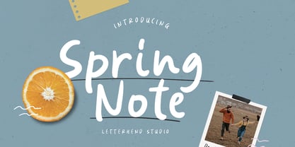 Spring Note is a playful yet usable font that you can use for any of your projects. Perfect for cute quote, branding, and anything. This font already support multi language. Also comes with two style, Regular and Bold! Happy Creating!
 - Almost Broken by Rillatype,
$17.00 Almost Broken is a modern display font with bold and strong personality but charmful. this font comes with two version, regular and slanted. Almost Broken is perfect for headlines, logotypes, magazine, advertising, etc. this font also comes with multilingual support.
 - CONFLICT DRIPS PERSONAL USE - Personal use only


