10,000 search results
(0.053 seconds)
- Antman by Lebbad Design,
$24.95 Antman is a bold serif font consisting of caps and smallcaps. Wide letterforms taper toward the bottom of each character to give this font a retro vintage feel.
 - La Barokah by Nirmana Visual,
$19.00 La Barokah , Contemporary of Bold Serif Typeface, La Barokah offers beautiful typographic harmony for a diversity of design projects, including logos & branding, social media posts, advertisements & product designs.
 - Agatized Informal by ULGA Type,
$26.00 Agatized Informal is a rough-edged stencil typeface with chunky letterforms and tight spacing. Designed primarily for display use, it’s ideal for posters, logos, advertising, book cover designs or small chunks of text such as pull-out quotes. The design is something of an enigma, a curious mish-mash of genres – imagine splicing Uncle Buck and Deadpool into a horror movie – it’s big, bold and funny although has a dark side. But what really makes this typeface a joy to drive is its boot full of alternative characters and ligatures. There is a saying: Use sparingly. Not on this street! Make your Glyphs palette burn rubber. Set your OpenType to full throttle: crank up your style and get those liga-tyres screeching. Agatized is a souped-up old campervan spinning doughnuts on the beach. The design started life as a piece of lettering for a book design that didn’t progress past the sketch stage. I liked the rough, dense character shapes, so during some down time I started drawing more characters and the lure of a new typeface pulled me in from there. Although this is a single-weight typeface it has a younger sibling, Agatized Formal, a neater, more dapper brother, smoother round the chops and smartly dressed – certainly no less fun though.
 - KING HOSHUN by Twinletter,
$17.00 Welcome King Hoshun, a display font with a superhero style ready to take your projects to a higher level. If you need a strong, bold, and action-packed theme like those in movies, games, or bold designs, King Hoshun is the right choice. With King Hoshun in attendance, your designs will be in the spotlight. Each letter is filled with strength and heroism that will make an unforgettable impact on the audience. The impressive and bold look of this font will make your message feel even more powerful and compelling. Not only does it look impressive, but King Hoshun also offers special features that enrich your creativity. With the available ligatures and alternative characters, you can explore unique and interesting typography combinations. Plus, this font supports multiple languages, so you can present a strong and inspiring message to a global audience. Join the power of King Hoshun and let your projects light up the world. With its bold superhero style and superior features, this font will give your designs an unforgettable impression. Don’t miss the chance to own King Hoshun and create amazing works that amaze and inspire. What’s Included : File font All glyphs Iso Latin 1 Alternate, Ligature Simple installations We highly recommend using a program that supports OpenType features and Glyphs panels like many Adobe apps and Corel Draw so that you can see and access all Glyph variations. PUA Encoded Characters – Fully accessible without additional design software. Fonts include Multilingual support
 - Yerk by That That Creative,
$15.00 Yerk is another modern Y2K inspired font. This retro font comes in 3 styles regular italic and slanted. Its bold weight, squared-off letters with slightly rounded corners make it perfect for adding big impact and a bit of personality to your design. It is perfect for logos, branding, magazines, Instagram, and whatever project you are looking for.
 - Sinami by Ably Creative,
$9.00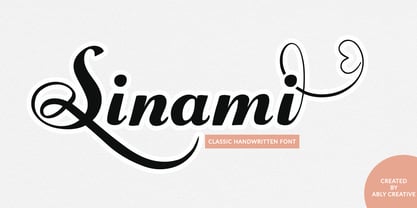 Sinami is a chic handwritten font. The authentic texture makes it a perfect choice. It has a bold classic calligraphy look making it perfect for branding and digital designs, logos, invitations, business cards, web, Instagram, social media, quotes, prints, wall decor, Branding projects, and more! Whats you get: Works on PC & Mac Simple installations Supports multilingual
 - Renovation by DearType,
$26.00 Renovation is a bold, brush-style typeface with an attitude. Modern, casual and rough, it is edgy and demands attention. Renovation is perfect for headlines, posters, cards, covers, magazines and websites. It is urban, industrial and chic. As a display typeface, it is ideal for businesses that seek to add a hand-crafted, artisanal feel to their image.
 - Brushfire by Sronstudio,
$23.00 “Brushfire” is a playful font with a handbrush texture, featuring rough edges and uneven strokes for a rustic and organic look. It adds a bold and edgy feel to any project and creates a sense of depth and dimension with its textured appearance. The font is both legible and expressive, making it perfect for a variety of design projects.
 - Siempre by 38-lineart,
$19.00 Introducing the Siempre Font. The Siempre font is a distinctive typeface created with the bold strokes of an ink pen. Its rough and raw aesthetics give it a unique and memorable character. This font exudes a powerful impression that makes it the perfect choice for brands, logos, and promotions, ensuring that people will always remember your message.
 - La Vieste by Reyrey Blue Std,
$18.00 La Vieste is a Bold, Elegant and Modern font with beautiful ligatures, tons of special alternative glyphs, ornament and multilingual support. It is suitable for branding, signature, wedding invitation, promotion, product packaging, and other needs. Fall in love with its incredibly versatile style and use it to create spectacular designs! Includes: Uppercase and Lowercase Ligatures PUA Encode Support
 - Fatigue by Typesthetic Studio,
$13.00 Heroic is a bold and playfull handwritten brush font. This font is very unique because sometimes it can look fierce like in modern street art graffiti if with capital letters, but sometimes it can look cute if it is included with the lowercase letters. As a result, this font can matches a wide pool of designs.
 - Kunstgewerbe NF by Nick's Fonts,
$10.00J. M. Bergling called the inspiration for this typeface “modern”—at least, it passed for modern in 1914. Its bold, sinuous forms and unusual decorative treatment suggest stained glass of a certain era, and so its name is German for “Arts and Crafts”. Both versions of the font include 1252 Latin, 1250 CE (with localization for Romanian and Moldovan). - Aeris by Linotype,
$29.99 Aeris™ typeface is a contemporary book face created by the American designer Tom Grace. It combines the proportions and rhythm of a sans serif font with the high contrasts and flexed strokes of script faces, while the open counters also ensure optimal legibility. Tom Grace focuses on providing subtle differentiations in his cuts and, as a consequence, this font family has its own individual structure: there are A and B variants of the basic forms regular, italic, bold and bold italic, and a display version for use in titles that also comes in A and B variants. It is advisable to use the A variant for larger font sizes, while the slightly more emphasized B variant can be recommended for smaller font sizes. Where the basic forms are to be mixed together in a work, it is important to use the corresponding A/B variants throughout as their designs have been carefully coordinated. Aeris is available in the OpenType Pro format and thus includes a wide range of different glyphs. The font family can be used in various environments, such as books, magazines, advertisements and promotional materials, but it is also the perfect choice for printed corporate documentation.
 - Habita Scenic by Mans Greback,
$59.00 Habita Scenic is the heavy and beautiful serif font that adds a touch of femininity and class to any project. Designed by Mans Greback in 2023, this font features high contrast and retro style, making it the perfect choice for designers looking to add a touch of cool to their work. With its beautiful swash letters, Habita Scenic is perfect for logos, headlines, and other creative projects. This font's classic and elegant design makes it an ideal choice for high-end brands and premium products. If you're looking for a font that exudes sophistication and timeless style, look no further than Habita Scenic. Use underscore _ anywhere to make a swash. Example: Love_Passion The Habita Scenic family consists of four high-quality fonts: Regular, Italic, Bold and Bold Italic The font is built with advanced OpenType functionality and has a guaranteed top-notch quality, containing stylistic and contextual alternates, ligatures and more features; all to give you full control and customizability. It has extensive lingual support, covering all Latin-based languages, from Northern Europe to South Africa, from America to South-East Asia. It contains all characters and symbols you'll ever need, including all punctuation and numbers.
 - Patihan by Jehoo Creative,
$19.00 Introducing Patihan, the font that will bring your designs to life! With sharp, strong, bold characters. Patihan font family is a combination of three different styles – Sans, Slab, and Serif – each with nine different weights: Thin, Extra Light, Light, Regular, Medium, Semibold, Bold, Extrabold, and Black. This font has beautiful Ligature and Stylistic Alternate settings, Patihan font is also equipped with the Smallcaps feature which gives more control over the typography, allowing you to create elegant and unique typography. Sans version of this typeface is versatile and easy to read, with a minimalist but impactful aesthetic. The Slab version is characterized by its solid, powerful strokes, while the Serif style has that extra classic flair with elegant curves and extreme contrast to its look. Patihan font is optimized for readability, making it a great choice for headlines, titles, and any long-form content. Ligature settings and discretionary styling add an extra layer of sophistication, making this font a great choice for magazines, branding and advertising. Overall, this font is a great choice for those looking to make a lasting impression. Its versatility, readability and unique features make it an excellent choice for any project.
 - P22 Barabajagal by IHOF,
$29.95 P22 Barabajagal is a unique take on the display fat face by way of doodling fun. Somewhat informed by the shapes of an early 1970s film type called Kap Antiqua Bold, this font’s aesthetic is the stuff of boundless energy and light humour, where an uncommon “peak” angle drawing perspective results in sturdy trunks, fat bottom curls, and active ascenders eager for mobility in space. This is the kind of font that makes you wonder whether it was drawn with rulers, protractors and compasses, or just by a mad doodler’s crazy-good free hand. Regardless, Barabajagal easily turns the geometry of modern forms into an exercise in sugar-loaded fun. It’s a very good tool to use in design geared at kids and young adults, such as food and toy packaging, books, animation, cartoons and games. Barabajagal comes with over 550 glyphs, lots of alternates, and a few ligatures and swash caps. It also contains extended support for Latin languages.
 - Mack Dutch by LetterStock,
$25.00 MackDutch MackDucth font pair was inspired by old magazine that i saw at barbershop. It was crafted by hand specially to add natural handmade feeling in its brand identity than i make it clean with pentool. We add some rough to make it retro feel, this font is bold so it can look strong if you use it for branding or even title for your retro poster design. Opentype features MackDucth font is a great retro rough font that will looks good in logotype, labels, t-shirt prints, product packaging, invitations, advertising and others. If you looking for retro rough font style, this font is a great choice for you to make your design awesome and flawless. This fonts works with folowing languages: Afrikaans, Albanian, Asu, Basque, Bemba, Bena, Chiga, Cornish, Danish, English, Estonian, Filipino, Finnish, French, Friulian, Galician, German, Gusii, Indonesian, Irish, Italian, Kabuverdianu, Kalenjin, Kinyarwanda, Low German, Luo, Luxembourgish, Luyia, Machame, Makhuwa-Meetto, Makonde, Malagasy, Malay, Manx, Morisyen, North Ndebele, Norwegian Bokmål, Norwegian Nynorsk, Nyankole, Oromo, Portuguese, Romansh, Rombo, Rundi, Rwa, Samburu, Sango, Sangu, Scottish Gaelic, Sena, Shambala, Shona, Soga, Somali, Spanish, Swahili, Swedish, Swiss German, Taita, Teso, Vunjo, Zulu Thank you for using this font. LS
 - Deportivo by 8AV,
$15.00 Welcome Deportivo - Spanish for sporty. Deportivo is a simple and powerful typeface based on the lettering on vintage sports equipment. I saw it as a brand on a pair of old skis and fell in love with it because it is so bold and it can be easily read while moving at high speed, making it perfect in a sports and dynamic environment. Due to its high legibility, it gets great results with sports teams, league names and t-shirt numbers and race indications. The high x-height gives the typeface a unique look and a strong tone of voice - that will echo in each arena and outside making it perfect also for headlines in newspapers and magazines and product names. Keep scoring!
 - London Boutique by Mans Greback,
$69.00 London Boutique is a bold and cute script font that combines rustic charm and fine art elegance. Its cursive strokes and handwriting style give it a personalized touch that is perfect for adding a decorative flair to your designs. Designed with a focus on independent shop usage, London Boutique features fine swashes that add a touch of sophistication to any project. Whether you're creating logos, branding, or social media posts, this font is versatile enough to handle it all. London Boutique comes in four styles: Regular, Italic, Bold, and Bold Italic. This range of styles provides flexibility and allows for dynamic and creative designs. Use underscore _ anywhere in a word to make a swash. Example: Luxure_Shops Use multiple underscores to make different swashes. Example: Angel___Stars Use # before or after any letter to make an initial or finishing swash. Example: #loveletter# The font is built with advanced OpenType functionality and has a guaranteed top-notch quality, containing stylistic and contextual alternates, ligatures and more features; all to give you full control and customizability. It has extensive lingual support, covering all Latin-based languages, from Northern Europe to South Africa, from America to South-East Asia. It contains all characters and symbols you'll ever need, including all punctuation and numbers.
 - Versatile EP by Borges Lettering,
$9.00 Versatile EP is a powerhouse of 9 fonts that make design and logo creation effortless. While other sans-serif fonts tend to be rigid and cold, Versatile stands out with it's warm and natural feel. It's generous x-height aids in its legibility and function, and the forms are classic yet modern allowing this font to live up to its name as a truly versatile workhorse for your next design or layout. Use it by itself, or in combination with Versatile 7 layer font package (Sold Separately.) https://www.myfonts.com/fonts/charlesborges/versatile-bold/ Versatile EP contains 3 body styles, and 6 shadow fonts including striped and solid in different weights. Versatile EP is not just for the Graphic Designer. It's well suited for the Sign Maker, Cricut and Silhouette users, and anyone else who uses a vinyl plotter. It weeds beautifully in cut vinyl. Its different layers allow the user to stack multi-colored vinyl to create one a kind signs and displays. Versatile EP is ideally suited for advertising and packaging, logo, branding and creative industries, poster and billboards, signage as well as web and screen design. What's included: 9 Fonts included in for one low price: 3 body fonts and 6 different shadows. 1,462 Glyphs (Characters) in each font for a total of 13,158 Glyphs per style pack. Over 200 Languages supported including Cyrillic, Bulgarian Cyrillic and Greek. A massive library of Alternate Characters: Latin, Extended Latin and Cyrillic Alternates including their Diacritic and Small Cap counterparts. Superscripts, Subscripts, Numerators, Denominators, and Scientific Inferiors. Small Caps in Latin, Extended Latin and Cyrillic include Numbers, Punctuation, Diacritics and Alternates. Extended currency symbols including Bitcoin. Fun assortment of speech bubbles. Unlimited fractions. PUA Encoded Versatile EP makes designing fun!
 - Big City Vibes by Roland Hüse Design,
$25.00 Big City Vibes is a display font designed for posters and texture or pattern like designs. The font is based on "Quixotic Sans Bold" and features its sliced and adjusted uppercase lettershapes. This font covers Eastern, Central and Western European accented characters and symbols, as well as Rovas Script (Old Hungarian). In place of the lowercase letters there are the uppercase letters shifted a little differently and set under "Contextual Alternate" OpenType feature, when you enable this feature and type all caps, it will alternating between the lowercase and uppercase for a mixed variety of the 2 versions of each letters that are cycling randomly.
 - Times New Roman Windows compatible by Monotype,In 1931, The Times of London commissioned a new text type design from Stanley Morison and the Monotype Corporation, after Morison had written an article criticizing The Times for being badly printed and typographically behind the times. The new design was supervised by Stanley Morison and drawn by Victor Lardent, an artist from the advertising department of The Times. Morison used an older typeface, Plantin, as the basis for his design, but made revisions for legibility and economy of space (always important concerns for newspapers). As the old type used by the newspaper had been called Times Old Roman," Morison's revision became "Times New Roman." The Times of London debuted the new typeface in October 1932, and after one year the design was released for commercial sale. The Times New Roman World Version is an extension of the original Times New Roman with several other scripts like with the Helvetica World fonts. It is part of the Windows Vista system. The following code pages are supported:1250 Latin 2: Eastern European 1251 Cyrillic 1253 Greek 1254 Turkish 1255 Hebrew 1256 Arabic Note: The Roman and Bold versions include the arabic scripts but they are not part in the corresponding italic versions. 1257 Windows Baltic 1258 Windows Vietnamese
- Neon Street by Ditatype,
$29.00 Neon Street is a captivating display font that takes inspiration from the dazzling glow of neon lights found on vibrant city streets. With its bold uppercase letterforms and neon-style inline elements, this typeface exudes energy and creates a visually stunning experience. Each letter is meticulously crafted with neon-inspired strokes that run through the center, adding a dynamic and luminous effect. This inline style brings a sense of urban excitement and nostalgia, evoking the vibrant atmosphere of neon-lit cityscapes. Inspired by the enchanting allure of neon signs, Neon Street infuses a sense of liveliness and modernity into each character. The font captures the captivating glow of neon lights, casting a radiant and vibrant hue that is both eye-catching and mesmerizing. This neon style adds a touch of urban energy, making the font truly stand out with its electrifying charm. The uppercase letter forms of Neon Street are bold and assertive, commanding attention with their distinctive design. Enjoy the various features available in this font. Features: Alternates Multilingual Supports PUA Encoded Numerals and Punctuations Neon Street is perfect for headlines, signage, logos, and any design that aims to make a bold statement with a touch of neon-inspired flair. This font will also inject your project with a vibrant and captivating element, whether you're creating posters, branding materials, digital artwork, or anything in between. Find out more ways to use this font by taking a look at the font preview. Thanks for purchasing our fonts. Hopefully, you have a great time using our font. Feel free to contact us anytime for further information or when you have trouble with the font. Thanks a lot and happy designing.
 - Romile by Nathatype,
$29.00 Looking for an elegant font? Romile is a elegant and bold serif font. It comes to be a single font all in uppercases. Thanks to the cursive and unique swirls at the end of some characters carries a sense of elegant looks. On the other hand, the weight of the font brings strength to any title or header you apply it to. Features: Stylistic Sets Ligatures Swashes Numerals and Punctuations PUA Encoded It can be used for many design projects, such as poster, logo, book cover, branding, heading, printed product, merchandise, quotes, social media campaign, etc. Get more inspiration about how to use it by seeing the font preview. Thank you for purchasing our fonts. Please don’t hesitate to contact us, if you have any further question or issues. We’re happy to help. Happy Designing.
 - Glaser Stencil by Linotype,
$40.99 The renowned American illustrator and graphic designer Milton Glaser designed Glaser Stencil in 1970. Glaser Stencil is a perfect summation of both Modernist proportion and New York-style solidity and self-assurance. An all capitals font, the shapes of the letters are reminiscent of popular sans serif faces of the time, such as Futura and ITC Avant Garde Gothic. Like everything New York-related, Glaser Stencil should be used big, in headlines and display applications, where it can play a bold, proud, and confident role.
 - Romantically by Abo Daniel,
$13.00 Romantically -the lovely natural signature font- It is classy, it is naturally, it is beauty signature fonts... - Fantastic 417 Ligature I was created 417 ligatures to keep this font looks naturally, al bl cl dl el fl gl hl il jl kl ll ml nl ol pl ql rl sl tl ul vl wl xl yl zl at bt ct dt et ft nt ot pt qt rt st tt ut yt all ell att ett itt ott utt alt elt ilt olt ult atl etl itl otl utl ftl attl ettl ittl ottl uttl ab bb cb eb ib jb mb nb ob sb ub abb ebb ibb obb ubb abl abh ebh ibh obh ubh abt ebt ibt obt ubt ah bh ch eh gh hh ih jh mh nh oh ph rh yh zh ahh ehh ihh ohh uhh ak ek ik kk ok rk sk uk yk zk akk cc dd ee ff mm nn oo pp ss zz am em im om um amm emm imm omm umm amb amh an en in on un ann inn anb anh ank enh inh anl enl ant ent ar er ir or ur arb arh erh irh orh urh ark arl erl url art ert fr urt ce co com ay eel iu ppl erfl Ar Br Cr Dr Er Fr Gr Hr Ir Jr Kr .............and more as you seen on presentation pictures. I am also created it for multilingual characters. àl ál âl ãl äl ål æl œl èl él êl ël ìl íl îl ïl ñl òl ól ôl õl öl ùl úl ûl ül àt át ât ãt ät åt æt ............and more as you seen on presentation pictures. - Swashes Swashes make it completed. You only need adding underscore 2x after lowercase from a to j . For example a__ - Multilingual Support Fonts include punctuations and multilingual support. Romantically is perfect for branding, photography, invitations, quotes, watermarks, advertisements, product designs, labels, and much more! I hope you really enjoy it.. Regards, Abo Daniel
 - Limes by Piñata,
$9.90 The idea of Limes emerged at the seashore last year in late summer. Getting ready in advance for a dark winter, we've decided to design a special fontfamily which would bring a bit of vitamins and summer sun into the rough everyday routine and help us survive the cold winter. Limes is both a dream of the sun while it’s gone and a refreshing breeze for the time when it finally gets warm! Limes is a completely handwritten fontfamily and consists of 23 typefaces. To create Limes Sans and Limes Slab families, we've used regular watercolor brushes, and to create monolinear Limes Script, as well as for Catchwords and Dingbats, we've used a felt-tip pen with circular section. Limes Sans and Limes Slabs fonts work perfectly together with Limes Script due to the general handwritten idea, as well as due to the widths contrast – despite its width, Limes Script mixes well with narrower opponents and adds a bit of human spontaneity into the general handwritten concept. The Limes collection includes: Limes Sans (Thin, Light, Regular, Bold, Black & italics), Limes Slab (Thin, Light, Regular, Bold, Black & italics), Limes Script, Catchwords and Dingbats. Limes Sans and Limes Slab widely support OT features: tnum, ordn, frac, case, numr, dnom, subs, sups, and Limes Script uses a large number of context alternatives.
 - Dizengof by Yinon Ezra,
$9.00 'Dizengof' is a Display Typeface, design to deliver a humanistic quality with a unique interpretation for the latin type. The Bold look of 'Dizengof' gives a magnetic visual impact, that is thanks to the strict attention of spaces within and between the letters. Can be used for logos, posters, on video, and of course - branding. The Bold look of 'Dizengof' gives a magnetic visual impact, that is thanks to the strict attention of spaces within and between the letters. Has 2 Stylistic sets.
 - Listian by Top Type,
$9.00 Hello, I'm back with my best product. This product is a serif font family because there are four style options, namely regular, italic, bold and bold italic. This font is also equipped with several alternates and ligatures so that you have the best choices for your work. This font can be used for wedding invitations, advertisements, web designs, quotes, banners, presentations and more. This font is PUA encoded which means you can access all the glyphs and ligatures with ease!
 - Qiduwy by Twinletter,
$15.00 Qiduwy is a futuristic and stylish font perfect for designing labels, retro, stamps, badges, Oktoberfest posters, packaging, titles, beer, logos, barbershops, whiskeys, tattoos, music, movies, or certificates. This font is perfect for a dark and mysterious look. Bold black lines make this font perfect for a classy and stylish look. The wide, bold typeface gives this font an upscale look. Sharp corners and edges add a touch of class. This is the perfect font for a dark and mysterious look.
 - Cyberank by Namara Creative Studio,
$20.00 Cyberank techno display typeface is a bold geometric with sharp angles typeface to unleash creativity and transform your designs! Strong and impactful characters with a futuristic look create a powerful visual impact that will leave a lasting impression on your audience. Features : Bold, Unique & Strong Techno Display Typeface Futuristic Character Design Alternates, Ligatures & Multilingual Support with PUA Encoded Note : To be able to access ligatures and the alternate letters, please make sure the software you are using can support opentype features.
 - Heroliga by Yahya Type,
$18.00 Heroliga is an elegant & modern sans serif font with special alternative letters and with multilingual support. Heroliga is perfect for logo design, magazine headers, product packaging, branding projects, clothing or simply as a stylish text overlay to any images or websites. WHAT’S INCLUDED? • Comes with regular, italic, bold and bold italic font styles. • Uppercase & lowercase letters. • Numbers, punctuation. • Ligature & Huge Stylistic alternate. • Multilingual support. Still got a question? Send me a message and I’ll be happy to answer! qura.yahya@gmail.com
 - Rigor Mortis by Comicraft,
$19.00 Here's a Collector's Item Classic for all our fiends! Sit up in your Caskets and we'll help you spin a Shocking, Suspense-filled Tale of Terror with a font Bad Bad Leroy "JG" Brown found in the Vault! Give us your grimy little dimes and come down into the Crypt with us. We call this rotten little font... RIGORMORTIS! AHAHAHHAHHHAHHHHAHA-HAH-haa... Features: Four weights (Regular, Italic, Bold & Bold Italic) with alternate uppercase characters. Includes Western and Central European international characters.
 - TF Nukes by Teenage Foundry,
$19.00 Introducing TF Nukes – the boldest display style font that will capture the attention of your audience and make your message stand out! This bold, strong font is perfect for headlines, titles, and any other text that needs to make a statement. A bold and striking font style will make your message impossible to ignore, while the bonus illustrations will add an extra layer of creativity to your design. Features: Uppercase, Lowercase, Numeral, Punctuation, Multilingual & Alternates. For any questions please contact me 🙂 Thanks!
 - Times Eighteen by Linotype,
$29.00In 1931, The Times of London commissioned a new text type design from Stanley Morison and the Monotype Corporation, after Morison had written an article criticizing The Times for being badly printed and typographically behind the times. The new design was supervised by Stanley Morison and drawn by Victor Lardent, an artist from the advertising department of The Times. Morison used an older typeface, Plantin, as the basis for his design, but made revisions for legibility and economy of space (always important concerns for newspapers). As the old type used by the newspaper had been called Times Old Roman," Morison's revision became "Times New Roman." The Times of London debuted the new typeface in October 1932, and after one year the design was released for commercial sale. The Linotype version, called simply "Times," was optimized for line-casting technology, though the differences in the basic design are subtle. The typeface was very successful for the Times of London, which used a higher grade of newsprint than most newspapers. The better, whiter paper enhanced the new typeface's high degree of contrast and sharp serifs, and created a sparkling, modern look. In 1972, Walter Tracy designed Times Europa for The Times of London. This was a sturdier version, and it was needed to hold up to the newest demands of newspaper printing: faster presses and cheaper paper. In the United States, the Times font family has enjoyed popularity as a magazine and book type since the 1940s. Times continues to be very popular around the world because of its versatility and readability. And because it is a standard font on most computers and digital printers, it has become universally familiar as the office workhorse. Times™, Times™ Europa, and Times New Roman™ are sure bets for proposals, annual reports, office correspondence, magazines, and newspapers. Linotype offers many versions of this font: Times™ is the universal version of Times, used formerly as the matrices for the Linotype hot metal line-casting machines. The basic four weights of roman, italic, bold and bold italic are standard fonts on most printers. There are also small caps, Old style Figures, phonetic characters, and Central European characters. Times™ Ten is the version specially designed for smaller text (12 point and below); its characters are wider and the hairlines are a little stronger. Times Ten has many weights for Latin typography, as well as several weights for Central European, Cyrillic, and Greek typesetting. Times™ Eighteen is the headline version, ideal for point sizes of 18 and larger. The characters are subtly condensed and the hairlines are finer. Times™ Europa is the Walter Tracy re-design of 1972, its sturdier characters and open counterspaces maintain readability in rougher printing conditions. Times New Roman™ is the historic font version first drawn by Victor Lardent and Stanley Morison for the Monotype hot metal caster." - Times Europa LT by Linotype,
$29.99In 1931, The Times of London commissioned a new text type design from Stanley Morison and the Monotype Corporation, after Morison had written an article criticizing The Times for being badly printed and typographically behind the times. The new design was supervised by Stanley Morison and drawn by Victor Lardent, an artist from the advertising department of The Times. Morison used an older typeface, Plantin, as the basis for his design, but made revisions for legibility and economy of space (always important concerns for newspapers). As the old type used by the newspaper had been called Times Old Roman," Morison's revision became "Times New Roman." The Times of London debuted the new typeface in October 1932, and after one year the design was released for commercial sale. The Linotype version, called simply "Times," was optimized for line-casting technology, though the differences in the basic design are subtle. The typeface was very successful for the Times of London, which used a higher grade of newsprint than most newspapers. The better, whiter paper enhanced the new typeface's high degree of contrast and sharp serifs, and created a sparkling, modern look. In 1972, Walter Tracy designed Times Europa for The Times of London. This was a sturdier version, and it was needed to hold up to the newest demands of newspaper printing: faster presses and cheaper paper. In the United States, the Times font family has enjoyed popularity as a magazine and book type since the 1940s. Times continues to be very popular around the world because of its versatility and readability. And because it is a standard font on most computers and digital printers, it has become universally familiar as the office workhorse. Times™, Times™ Europa, and Times New Roman™ are sure bets for proposals, annual reports, office correspondence, magazines, and newspapers. Linotype offers many versions of this font: Times™ is the universal version of Times, used formerly as the matrices for the Linotype hot metal line-casting machines. The basic four weights of roman, italic, bold and bold italic are standard fonts on most printers. There are also small caps, Old style Figures, phonetic characters, and Central European characters. Times™ Ten is the version specially designed for smaller text (12 point and below); its characters are wider and the hairlines are a little stronger. Times Ten has many weights for Latin typography, as well as several weights for Central European, Cyrillic, and Greek typesetting. Times™ Eighteen is the headline version, ideal for point sizes of 18 and larger. The characters are subtly condensed and the hairlines are finer. Times™ Europa is the Walter Tracy re-design of 1972, its sturdier characters and open counterspaces maintain readability in rougher printing conditions. Times New Roman™ is the historic font version first drawn by Victor Lardent and Stanley Morison for the Monotype hot metal caster." - Times Ten by Linotype,
$40.99In 1931, The Times of London commissioned a new text type design from Stanley Morison and the Monotype Corporation, after Morison had written an article criticizing The Times for being badly printed and typographically behind the times. The new design was supervised by Stanley Morison and drawn by Victor Lardent, an artist from the advertising department of The Times. Morison used an older typeface, Plantin, as the basis for his design, but made revisions for legibility and economy of space (always important concerns for newspapers). As the old type used by the newspaper had been called Times Old Roman," Morison's revision became "Times New Roman." The Times of London debuted the new typeface in October 1932, and after one year the design was released for commercial sale. The Linotype version, called simply "Times," was optimized for line-casting technology, though the differences in the basic design are subtle. The typeface was very successful for the Times of London, which used a higher grade of newsprint than most newspapers. The better, whiter paper enhanced the new typeface's high degree of contrast and sharp serifs, and created a sparkling, modern look. In 1972, Walter Tracy designed Times Europa for The Times of London. This was a sturdier version, and it was needed to hold up to the newest demands of newspaper printing: faster presses and cheaper paper. In the United States, the Times font family has enjoyed popularity as a magazine and book type since the 1940s. Times continues to be very popular around the world because of its versatility and readability. And because it is a standard font on most computers and digital printers, it has become universally familiar as the office workhorse. Times™, Times™ Europa, and Times New Roman™ are sure bets for proposals, annual reports, office correspondence, magazines, and newspapers. Linotype offers many versions of this font: Times™ is the universal version of Times, used formerly as the matrices for the Linotype hot metal line-casting machines. The basic four weights of roman, italic, bold and bold italic are standard fonts on most printers. There are also small caps, Old style Figures, phonetic characters, and Central European characters. Times™ Ten is the version specially designed for smaller text (12 point and below); its characters are wider and the hairlines are a little stronger. Times Ten has many weights for Latin typography, as well as several weights for Central European, Cyrillic, and Greek typesetting. Times™ Eighteen is the headline version, ideal for point sizes of 18 and larger. The characters are subtly condensed and the hairlines are finer. Times™ Europa is the Walter Tracy re-design of 1972, its sturdier characters and open counterspaces maintain readability in rougher printing conditions. Times New Roman™ is the historic font version first drawn by Victor Lardent and Stanley Morison for the Monotype hot metal caster." - Times Ten Paneuropean by Linotype,
$92.99In 1931, The Times of London commissioned a new text type design from Stanley Morison and the Monotype Corporation, after Morison had written an article criticizing The Times for being badly printed and typographically behind the times. The new design was supervised by Stanley Morison and drawn by Victor Lardent, an artist from the advertising department of The Times. Morison used an older typeface, Plantin, as the basis for his design, but made revisions for legibility and economy of space (always important concerns for newspapers). As the old type used by the newspaper had been called Times Old Roman," Morison's revision became "Times New Roman." The Times of London debuted the new typeface in October 1932, and after one year the design was released for commercial sale. The Linotype version, called simply "Times," was optimized for line-casting technology, though the differences in the basic design are subtle. The typeface was very successful for the Times of London, which used a higher grade of newsprint than most newspapers. The better, whiter paper enhanced the new typeface's high degree of contrast and sharp serifs, and created a sparkling, modern look. In 1972, Walter Tracy designed Times Europa for The Times of London. This was a sturdier version, and it was needed to hold up to the newest demands of newspaper printing: faster presses and cheaper paper. In the United States, the Times font family has enjoyed popularity as a magazine and book type since the 1940s. Times continues to be very popular around the world because of its versatility and readability. And because it is a standard font on most computers and digital printers, it has become universally familiar as the office workhorse. Times™, Times™ Europa, and Times New Roman™ are sure bets for proposals, annual reports, office correspondence, magazines, and newspapers. Linotype offers many versions of this font: Times™ is the universal version of Times, used formerly as the matrices for the Linotype hot metal line-casting machines. The basic four weights of roman, italic, bold and bold italic are standard fonts on most printers. There are also small caps, Old style Figures, phonetic characters, and Central European characters. Times™ Ten is the version specially designed for smaller text (12 point and below); its characters are wider and the hairlines are a little stronger. Times Ten has many weights for Latin typography, as well as several weights for Central European, Cyrillic, and Greek typesetting. Times™ Eighteen is the headline version, ideal for point sizes of 18 and larger. The characters are subtly condensed and the hairlines are finer. Times™ Europa is the Walter Tracy re-design of 1972, its sturdier characters and open counterspaces maintain readability in rougher printing conditions. Times New Roman™ is the historic font version first drawn by Victor Lardent and Stanley Morison for the Monotype hot metal caster." - Times by Linotype,
$40.99In 1931, The Times of London commissioned a new text type design from Stanley Morison and the Monotype Corporation, after Morison had written an article criticizing The Times for being badly printed and typographically behind the times. The new design was supervised by Stanley Morison and drawn by Victor Lardent, an artist from the advertising department of The Times. Morison used an older typeface, Plantin, as the basis for his design, but made revisions for legibility and economy of space (always important concerns for newspapers). As the old type used by the newspaper had been called Times Old Roman," Morison's revision became "Times New Roman." The Times of London debuted the new typeface in October 1932, and after one year the design was released for commercial sale. The Linotype version, called simply "Times," was optimized for line-casting technology, though the differences in the basic design are subtle. The typeface was very successful for the Times of London, which used a higher grade of newsprint than most newspapers. The better, whiter paper enhanced the new typeface's high degree of contrast and sharp serifs, and created a sparkling, modern look. In 1972, Walter Tracy designed Times Europa for The Times of London. This was a sturdier version, and it was needed to hold up to the newest demands of newspaper printing: faster presses and cheaper paper. In the United States, the Times font family has enjoyed popularity as a magazine and book type since the 1940s. Times continues to be very popular around the world because of its versatility and readability. And because it is a standard font on most computers and digital printers, it has become universally familiar as the office workhorse. Times™, Times™ Europa, and Times New Roman™ are sure bets for proposals, annual reports, office correspondence, magazines, and newspapers. Linotype offers many versions of this font: Times™ is the universal version of Times, used formerly as the matrices for the Linotype hot metal line-casting machines. The basic four weights of roman, italic, bold and bold italic are standard fonts on most printers. There are also small caps, Old style Figures, phonetic characters, and Central European characters. Times™ Ten is the version specially designed for smaller text (12 point and below); its characters are wider and the hairlines are a little stronger. Times Ten has many weights for Latin typography, as well as several weights for Central European, Cyrillic, and Greek typesetting. Times™ Eighteen is the headline version, ideal for point sizes of 18 and larger. The characters are subtly condensed and the hairlines are finer. Times™ Europa is the Walter Tracy re-design of 1972, its sturdier characters and open counterspaces maintain readability in rougher printing conditions. Times New Roman™ is the historic font version first drawn by Victor Lardent and Stanley Morison for the Monotype hot metal caster." - Odd Times by Gleb Guralnyk,
$15.00 Introducing medieval blackletter typeface "Odd times". It's inspired by old fracture calligraphy.