10,000 search results
(0.077 seconds)
- Doyen-D by Substance,
$12.00 A distorted, broken & cracked typeface. Doyen-D.ScreenRegular uses the same letter forms as the rest of the Doyen-D family, however the letters have gone through a halftone screen print process, resulting in even further distortion of the typeface.
 - Winter Monogram by Yoga Letter,
$20.00 "Winter Christmas Monogram" is a beautiful and unique Christmas monogram font. This font is equipped with monograms, uppercase, lowercase, numerals, punctuation, ligatures, and multilingual support. Very suitable for Christmas, Valentine's, winter, logos, banners, posters, prints, branding, stickers, and others.
 - Write by Aah Yes,
$12.00Write is a handwriting font, more like neat print than a flowing cursive script, which renders it highly readable and almost like a formal font, but still retaining the informality of handwriting. Also there are some "special effects" varieties. - Cribin by wearecolt,
$18.00 Introducing Cribin: Playful condensed serif inspired by 90s grunge & vintage aesthetics. Its condensed form, strong serifs & high contrast add attitude to logos, headlines, & more. Perfect for web, print, and branding. Embrace nostalgia, and elevate your design. Unleash Cribin's creativity!
 - Navue by Gholib Tammami,
$15.00 The Navue font is a typeface designed with an elegant and feminine style, making it suitable for enhancing the quality of your product branding. This font is well-suited for various purposes, including displays, printing, branding, and many others.
 - Typesetter Treasures JNL by Jeff Levine,
$29.00 Cartoon cuts, sales builders, catchwords, mortised cuts, decorative embellishments and stock art are what comprise the images found within Typesetter Treasures JNL. Redrawn from vintage sources, these nostalgic illustrations add warmth and charm to any print or web project.
 - Script Spot Initials JNL by Jeff Levine,
$29.00 Amidst the pages of the 1946 foreign-printed "100 Alphabets Publicitaires" ("100 Advertising Alphabets") was an example of a beautiful vertical script type design with a somewhat calligraphic look. This became the work model for Script Spot Initials JNL.
 - Amalestha by Yoga Letter,
$18.00 "Amalestha" is a beautiful and cute handwritten font. This font is equipped with uppercase, lowercase, numerals, punctuation, and multilingual support. Very suitable for weddings, invitations, engagements, certificates, stickers, banners, posters, prints, branding, logos, Christmas, Halloween, Valentine's, lovely, and others.
 - Midnight Sun by Hanoded,
$15.00 Midnight Sun, despite its rough look, was carefully painted. I used a very cheap brush with stuck-together bristles to get that ‘eroded’ look. Midnight Sun comes with double letter ligatures and some really cool stylistic alternates as well.
 - ALS Fuchsia by Art. Lebedev Studio,
$63.00 Fuchsia is a soft, romantic, and slightly eclectic script. The characters feature wide proportions, high contrast, and backward bends at joints—all ensuring the typeface truly shine in large sizes. Complex capitals look very nice next to lowercase letters.
 - Neon Bar by Zefrar,
$19.00 Neon Bar is very useful for any project related to Bar, Music, Panels, Signs and more. It has a unique style and inspired from Las Vegas Panels but the design is too modern and very fit with neon print.
 - Cleverda by Realtype,
$13.00 Cleverda Script is a beautiful hand painted script, organic, fun with dancing baseline and different ligatures. This fonts can be used for various purposes.such as headings, signature, logos, wedding invitation, t-shirt, letterhead, signage, labels, news, posters, badges etc.
 - Hardinge by Typefactory,
$14.00 Hardinge is born from an original and blackletter style font. It has a classic, vintage-style which is perfect for logos, branding materials, t-shirts, prints, business cards, and every other design which needs a unique and striking typeface.
 - KG Turning Tables by Kimberly Geswein,
$5.00 A neater version of my font Complete in Him, a hand-drawn marker font. Hand drawn with a brush marker, this font is neat but still has enough twists to make it fun. Perfect for painted or brushed looks.
 - Kingthings Spikeless - 100% free

- exotica - Unknown license

- A Charming Font Outline - Unknown license

- Christmas Card - Unknown license

- Hobgoblin by Hanoded,
$15.00 Hobgoblin is a cute and happy little font. It would be ideal for children's books, games and apps. Hobgoblin come with mischievous glyphs and a pot-o-gold worth of diacritics.
 - Galonia by Milan Pleva,
$18.00 Galonia is an elegant display typeface with flared serif. It has harmonic and classical look thanks to high contrast stroke. Includes ligatures, special alternative glyphs, old style figures and case sensitive glyphs. Features: Basic latin alphabet A-Z 77 Ligatures & Alternates 112 Accented characters Numbers, Punctuation, Currency, Symbols, Math symbols & Diacritics Old style figures Case sensitive glyphs Enjoy Galonia!
 - Chocolatier by Milan Pleva,
$18.00 Chocolatier is an all caps display serif typeface with soft edges. Includes ligatures, special alternative glyphs and old style figures. Chocolatier is ideal for headlines, headers, logos, labels, packaging, postcards, presentations, magazines, invitations, etc. Features: Basic latin alphabet A-Z 36 Ligatures & Alternates 56 Accented characters Numbers, Punctuation, Currency, Symbols, Math symbols & Diacritics Old style figures Enjoy Chocolatier!
 - Chalysta by BaronWNM,
$12.00 Introduces an old lettering style font. looks elegant, luxurious and classy. Chalysta is a form of handwriting with a sideways drag, which looks like it was handwritten in old scripts. Each lowercase has an alternate pull before the letter to make it look more natural. Very suitable for use in branding, wedding invitations, quotes, cards, etc.
 - Temeraire by TypeTogether,
$49.00 Quentin Schmerber’s Temeraire serif font family was not designed to be invisible. It is a typographic exploration meant to be seen — with its beauty, one could even say beheld. While some fonts aim to be as easily ignored as possible, Temeraire is offered as a gift to wide-eyed readers with its anything-but-boring character and its conspicuous inconsistency in styles. Most type families increase the weight of each character to expand the family. Instead, research into 17th century sources produced Temeraire’s wide range of letterforms, from the predictable to the odd and loosely related through time. Each style is designed to work alongside the others but are also standalone homages to specific parts of English lettering tradition: gravestone cutting, writing masters’ copperplates, Italiennes, and others. Temeraire’s Regular style is a contrast-loving Transitional Serif with vertical stress, making it great for period and classic works, ironic pieces, and modern throwbacks. The weight of the Bold squares off the ends of each glyph to give it stability, and the italic style rings true: flowing, contrasting, and purposefully inconsistent. Temeraire’s Display Black style is one salvaged from expressive gravestone artistry. The details most easily noticed are the ‘g’ with its descending bowl that has been pressed back up in the centre, and the additional serif on the ‘t’ crossbar that holds its neighbouring character at bay. (The ‘g’ and ‘Q’ have loopless alternates.) The final style is the Italienne, the horizontally stressed counterpoint to the family. By design its characters flow and bend in ways not in step with the rest of the family. All the weight has been pushed to either hemisphere within each glyph, resulting in a display style that demands space and peacefulness around it so its presence can impress. As with all TypeTogether families, Temeraire meets the current designer’s needs. Not only does its five styles shine in print work, it includes alternates for when the defaults are too boisterous and has been expertly crafted for screens. The Temeraire serif font family is resurrected from echoes in time and finds its family relation through impeccable taste.
 - Vendetta by Emigre,
$69.00 The famous roman type cut in Venice by Nicolas Jenson, and used in 1470 for his printing of the tract, De Evangelica Praeparatione, Eusebius, has usually been declared the seminal and definitive representative of a class of types known as Venetian Old Style. The Jenson type is thought to have been the primary model for types that immediately followed. Subsequent 15th-century Venetian Old Style types, cut by other punchcutters in Venice and elsewhere in Italy, are also worthy of study, but have been largely neglected by 20th-century type designers. There were many versions of Venetian Old Style types produced in the final quarter of the quattrocento. The exact number is unknown, but numerous printed examples survive, though the actual types, matrices, and punches are long gone. All these types are not, however, conspicuously Jensonian in character. Each shows a liberal amount of individuality, inconsistency, and eccentricity. My fascination with these historical types began in the 1970s and eventually led to the production of my first text typeface, Iowan Old Style (Bitstream, 1991). Sometime in the early 1990s, I started doodling letters for another Venetian typeface. The letters were pieced together from sections of circles and squares. The n, a standard lowercase control character in a text typeface, came first. Its most unusual feature was its head serif, a bisected quadrant of a circle. My aim was to see if its sharp beak would work with blunt, rectangular, foot serifs. Next, I wanted to see if I could construct a set of capital letters by following a similar design system. Rectangular serifs, or what we today call "slab serifs," were common in early roman printing types, particularly text types cut in Italy before 1500. Slab serifs are evident on both lowercase and uppercase characters in roman types of the Incunabula period, but they are seen mainly at the feet of the lowercase letters. The head serifs on lowercase letters of early roman types were usually angled. They were not arched, like mine. Oddly, there seems to be no actual historical precedent for my approach. Another characteristic of my arched serif is that the side opposite the arch is flat, not concave. Arched, concave serifs were used extensively in early italic types, a genre which first appeared more than a quarter century after roman types. Their forms followed humanistic cursive writing, common in Italy since before movable type was used there. Initially, italic characters were all lowercase, set with upright capitals (a practice I much admire and would like to see revived). Sloped italic capitals were not introduced until the middle of the sixteenth century, and they have very little to do with the evolution of humanist scripts. In contrast to the cursive writing on which italic types were based, formal book hands used by humanist scholars to transcribe classical texts served as a source of inspiration for the lowercase letters of the first roman types cut in Italy. While book hands were not as informal as cursive scripts, they still had features which could be said to be more calligraphic than geometric in detail. Over time, though, the copied vestiges of calligraphy virtually disappeared from roman fonts, and type became more rational. This profound change in the way type developed was also due in part to popular interest in the classical inscriptions of Roman antiquity. Imperial Roman letters, or majuscules, became models for the capital letters in nearly all early roman printing types. So it was, that the first letters in my typeface arose from pondering how shapes of lowercase letters and capital letters relate to one another in terms of classical ideals and geometric proportions, two pinnacles in a range of artistic notions which emerged during the Italian Renaissance. Indeed, such ideas are interesting to explore, but in the field of type design they often lead to dead ends. It is generally acknowledged, for instance, that pure geometry, as a strict approach to type design, has limitations. No roman alphabet, based solely on the circle and square, has ever been ideal for continuous reading. This much, I knew from the start. In the course of developing my typeface for text, innumerable compromises were made. Even though the finished letterforms retain a measure of geometric structure, they were modified again and again to improve their performance en masse. Each modification caused further deviation from my original scheme, and gave every font a slightly different direction. In the lower case letters especially, I made countless variations, and diverged significantly from my original plan. For example, not all the arcs remained radial, and they were designed to vary from font to font. Such variety added to the individuality of each style. The counters of many letters are described by intersecting arcs or angled facets, and the bowls are not round. In the capitals, angular bracketing was used practically everywhere stems and serifs meet, accentuating the terseness of the characters. As a result of all my tinkering, the entire family took on a kind of rich, familiar, coarseness - akin to roman types of the late 1400s. In his book, Printing Types D. B. Updike wrote: "Almost all Italian roman fonts in the last half of the fifteenth century had an air of "security" and generous ease extremely agreeable to the eye. Indeed, there is nothing better than fine Italian roman type in the whole history of typography." It does seem a shame that only in the 20th century have revivals of these beautiful types found acceptance in the English language. For four centuries (circa 1500 - circa 1900) Venetian Old Style faces were definitely not in favor in any living language. Recently, though, reinterpretations of early Italian printing types have been returning with a vengeance. The name Vendetta, which as an Italian sound I like, struck me as being a word that could be taken to signifiy a comeback of types designed in the Venetian style. In closing, I should add that a large measure of Vendetta's overall character comes from a synthesis of ideas, old and new. Hallmarks of roman type design from the Incunabula period are blended with contemporary concerns for the optimal display of letterforms on computer screens. Vendetta is thus not a historical revival. It is instead an indirect but personal digital homage to the roman types of punchcutters whose work was influenced by the example Jenson set in 1470. John Downer.
 - Traiectum by Hanoded,
$15.00 Traiectum is the old Roman name for the city of Utrecht (in The Netherlands). When I started working on this font, I wanted to give it a Latin name and Traiectum sounded good! Traiectum is a hand drawn font with a regal and messy look. It was based on Goudy Old Style, a classic old-style serif typeface created in 1915 by Frederic W. Goudy. Traiectum is a multilingual, all caps font and I am sure you’ll find lots of uses for it. The city it was named after, Utrecht, is actually very nice! You should visit one day!
 - Interboro JNL by Jeff Levine,
$29.00Interboro JNL is based on the serif lettering found on an old E-Z Letter lettering guide. - Rokach MF by Masterfont,
$59.00 Tradition and romance joined in the beautiful typeface, inspired by old hand drawn signs in Tel Aviv.
 - Balshan MF by Masterfont,
$59.00 Derived from old signage, this serif font is unique and readable in titles and text as well.
 - Tzoba MF by Masterfont,
$59.00 Inspired by old manuscript serif font, this low contrast font makes it high legible for long texts.
 - Shtetl MF by Masterfont,
$59.00 Inspired by traditional old Biblical type, this font has a rich and unique style, with modern touch.
 - Drugstore by Coffee Bin Fonts,
$20.00This font was inspired by lettering found on old tradecards and drugstore ads from the 19th century. - SwissCheese - Unknown license

- Alpha Flight - Unknown license

- Nemade by Lemonthe,
$16.00 Nemade is a modern and elegant display font. Its unique, clean, and flowing letterforms add a luxurious and striking impression to every design project. The perfect choice for logos, branding, posters, magazines, printing, advertising, packaging, headlines, titles, web design, etc.
 - Tropicollo by OzType.,
$16.00 Tropicollo is a handwritten mono weight cursive font. Its super clean and tidy design will turn any idea into a true standout end result! Works great applied to logos, prints, quotes, magazine headers, clothing, advertisements, product designs, labels, and much more!
 - Quintton by TypoBureau Studio,
$15.00 Quintton script is a casual clean brush stroke font, perfect for logo design, branding, invitations, t-shirts print, mock up, magazines, signage and so much more. With its handmade feel, Quintton is perfect for your upcoming projects so don't miss out.
 - Stange by Vultype Co,
$29.00 Stange is a font with a futuristic edge, geometric corners, perfect for technology theme. As with its Stange, Stange makes a strong impression in print, headlines, video, and social media – whether paired with a contrasting typeface or on its own.
 - PUJI by pororoca,
$25.00 PUJI is an experimental sans serif perfectly suited for graphic design and any display use. It could work for web, print, motion graphics etc. PUJI has the other version "PUJI narrow" which has different letter's width in "A","V","W".
 - Ft Thyson by Fateh.Lab,
$30.00 FT Thyson is a powerful and elegant display typeface. can be used to present your ideas in sports/fitness or editorials, Its weight is superior in posters, social media, headlines, titles, large format print - and wherever you want to be noticed.
 - Auther by Seniors Studio,
$21.00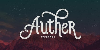 Auther is a modern design with a vintage feel. A monoline display font that combines classic & modern styles. Includes OpenType features with Stylistic Alternates and ligatures. Auther is suited for various print and digital designs, including logos, stationery, posters and more.


