3,431 search results
(0.01 seconds)
- Komet Pro by Jan Fromm,
$65.00 Komet is a sturdy typeface with a calm and upright feel. Although it derives inspiration from classical English sans-serifs, it’s not too closely related to that model. Komet, instead, feels rather more lively and contemporary. Its compact spacing, low stroke contrast and heavy dots and accents give it an almost monolinear quality. The diagonals are slightly curved and the counters of the round letters such as b, o and q are generously wide. The muted, understated middle weights are built for extended body copy, while Komet’s thin and dark weights look brisk and assertive and make for subtly expressive headlines. Komet is an ideal choice for editorial design, branding and corporate design. The Komet Pro family comes in eight weights with matching italics, from Thin to Black. Each font contains around 850 glyphs, including a rich repertoire of OpenType features. Small caps, ligatures, ten different figure sets with matching currency symbols, stylistic alternates and arrows make Komet Pro a comprehensive toolkit for ambitious typography.
 - Komet by Jan Fromm,
$45.00 Komet is a sturdy typeface with a calm and upright feel. Although it derives inspiration from classical English sans-serifs, it’s not too closely related to that model. Komet, instead, feels rather more lively and contemporary. Its compact spacing, low stroke contrast and heavy dots and accents give it an almost monolinear quality. The diagonals are slightly curved and the counters of the round letters such as b, o and q are generously wide. The muted, understated middle weights are built for extended body copy, while Komet’s thin and dark weights look brisk and assertive and make for subtly expressive headlines. Komet is an ideal choice for editorial design, branding and corporate design. The Komet family comes in eight weights with matching italics, from Thin to Black. The glyph set of each font contains around 520 glyphs and provides good everyday support for most Latin-based languages. For a wider range of advanced OpenType features, Komet Pro is also available.
 - ITC CuppaJoe by ITC,
$29.99 Nick Curtis's love affair with typography began when he was barely past adolescence, in a neighborhood alley of East Dallas. On a routine patrol for tossed treasures, he came across a type specimen catalog: a big, fat green binder displaying hundreds of fonts! He was hooked. Curtis's career has taken him from production art to graphic design to art direction, but type has always remained his graphic passion, especially the provocative designs produced from the late 19th through the early 20th centuries. Curtis's inspiration for ITC CuppaJoe comes from Art Deco lettering, but not from the typical sources. Depending upon your age or your interest in early twentieth-century package design ITC CuppaJoe might look familiar. Its foundation is the label art for Bokar, A&P's premium coffee during the 1930s. Curtis built on the gently sweeping curves and bold angular strokes of the original coffee-can lettering to create a distinctive typeface that commands attention. Rich, full-bodied, satisfying - now that's a ITC CuppaJoe!
 - Clarence by Protimient,
$35.00Clarence is a modern, original typeface that has been designed to have a warm and slightly antiquated feel. It is slightly too idiosyncratic for great lengths of continuous text but does work very well at both small and display sizes. The serif structure takes some inspiration from architectural buttresses (a structure built against a wall to provide support or reinforcement). The serifs only protrude a small way from the body of the letter, which serves to ground the letter and, because the serifs bracket (the curve) joins the vertical at a relatively great distance from the tip of the serif, it remains subtle. The italic variant draws on the roman but has a more pronounced and curvier serif structure, analogous to the cursive element expected of an italic. This serif structure is present throughout the italic, even extending into the uppercase, making it more of a true italic than the commonplace sloped roman. - COMANDO X by RASDesign,
$50.00Comando X is special font, built to create different characters using case-sensitive different characters. - Drexler by Device,
$29.00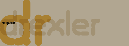 Drexler is a logically constructed molecular font built via nanotechnology and mathematically derived geometric permutations.
 - Tesca by Nicolas Massi,
$25.00 Tesca is a condensed modern grotesque typeface. Tesca is great for uses such as headlines or text body. Features Latin and non-latin glyphs. Three styles: Flaca, Normal & Gorda. (Uppercase & Lowercase). OpenType features include ligatures and basic fractions.
 - Rosenberg Textile MF by Masterfont,
$59.00 A practical font family with 4 weights for all your day by day design needs: headlines, body text, signage etc. High legibility at small sizes. An extended sans serif typeface that provides unique softness appearance without losing legibility.
 - Construct by Breitenlauf,
$20.00 Construct is a technically based headline font that can also be used as body text. The font has some new ligatures that are automatically applied. Construct particularly suitable for headlines which should have a urban and technical character.
 - Albion Sharp Italic by Greater Albion Typefounders,
$16.00 Albion Sharp Italic is an elegant sharply cut italic display face. Its classical elegance is ideal for setting headings alongside conventional body text faces, and an ideal way to imbue such settings with a little life and energy.
 - Chockablock by Elemeno,
$15.00Chockablock is an homage to Charles Schulz's lettering in the comic strip Peanuts. It's not an exact match for Schulz's work, but the inspiration is obvious, as is the designer's love and respect for Sparky's body of work. - Fajowy by Edyta Demurat,
$22.00 Fajowy is a hand drawn typeface. The family is available in 12 weights. Fajowy has only upper characters with up to three alternate glyphs. Build in OpenType Contextual Alternates feature will automatically set alternate glyphs depending on frequency of appearance of the same character.
 - Assai by Type Matters,
$23.90 A very heavy headline only typeface which should be typeset at rather large type sizes due to its fine counters. It’s the ideal typeface for building a brick-wall out of letters. Surprise is in the details, so play it loud and big! It’s fun.
 - Fajny by Edyta Demurat,
$22.00 Fajny is a hand drawn typeface. The family is available in 12 weights. Fajny has upper and lowercase characters with up to three alternate glyphs. Build in OpenType Contextual Alternates feature will automatically set alternate glyphs depending on frequency of appearance of the same character.
 - Empyrean by Greater Albion Typefounders,
$16.00 Empyrean is a display Roman typeface which sets out to be deliberately different. Its letterforms explore white space and the art of leaving things out. Empyrean is a futuristic Roman design which builds in respect for typographic tradition with an exploration of design possibilities.
 - News Ticker JNL by Jeff Levine,
$29.00 News Ticker JNL was inspired by some 1930s film footage of the famous electronic message sign that surrounded the New York Times building in Times Square. A blank panel is located on both the regular and broken vertical bars for use in spacing between words.
 - Beblock by Garisman Studio,
$20.00 Introducing Beblock - Display Typeface Beblock combines attractive curves with a fresh urban edge and build with all caps letters; delivering a stylish script which is guaranteed to add an eye-catching appeal to your logo designs, brand imagery, quotes, product packaging, merchandise & social media posts
 - Jazayeri Kufic Shoushtar by Arabetics,
$79.00 The Jazayeri Kufic Shoushtar font is a beautiful typographic implementation of the decorative Kufic calligraphy inscribed on the walls of the historic Grand Mosque of Shoushtar in southwestern Iran. This mosque contains many other inscriptions added over time for documentary purposes but its four monumental Kufic inscriptions which are revived in this font are the most essential ones to understand its design and meaning. Built in the ninth century CE, this mosque is one of the earliest hypostyle mosques in Iran. It was built in “the city of scholars” when its residents included two great Sufis, Sahl Ibn Abdullah Tostari and Mansur Hallaj. The designer and producer of the font is Seyed Mohammad Vahid Mousavi Jazayeri, a well-known Iranian master calligrapher, designer, scholar, and author. Mousavi Jazayeri has taken a personal interest in the Kufic script and devoted years to independent research, visiting archaeological locations, historic buildings and cemeteries, mosques, libraries and museums to study the script through direct contact. He has developed a systematic research methodology and published his findings in several books. His professional interest in script and calligraphy stimulated his discovery of the historic method for cutting the Kufic pen, which has had a direct impact on his own work, as seen in several well-received exhibitions and workshops. The historical research and achievements of Mousavi Jazayeri brought together the first international group dedicated to the study and revival of the historic Kufic script operation through kuficpedia.com.
 - Quiny by Nestype,
$17.00 Quiny is built with bold and curvy characters, Perfect if you need fun for your projects.
 - Ephemera Sickles by Ephemera Fonts,
$35.00 A debut from the most anticipated vintage digital typefoundry by Gilang Purnama and Ilham Herry, who stucked their mind, body and soul back into the first era of 18th century. They build this intense visual-time machine that no one capable before. Started by the visual branding of the Ephemera Fonts, they bring every letters of it to the another level of journey. They called it Ephemera Sickles. Ephemera Sickles is a ornamented letterhead style typeface-inspired by the era of victorian (1800-1900) and this style was commonly used by engrossers at the turn of the century to embellish official documents, such as diplomas and other certificates. Carefully crafted for every single letters with the soul of Sickels Lettering, Spencerian, and some research from the Penmanship Journal book. The style is named after Charles Sickels, who headed the art department of Electro-Light Engraving Co. in New York City during the early 20th century. There’s no doubt that such a very strong presence typeface like Ephemera Sickles will bring a powerful identity to your visual project. Will be a perfect joint for a logo, visual branding, poster, beer label, packaging, classic bar decor, vintage hotel, et cetera.
 - Shpinoza MF by Masterfont,
$59.00 A practical font family with 5 weights for all your day by day design needs: headlines, body text, signage etc. High legibility at small sizes. An extended sans serif typeface with rounded endings that provides unique softness appearance without losing legibility.
 - Hujan by Ezzazebra,
$15.00 A sans-serif font that I created when long raining in my city. The shape is clean with a dynamic semi-bold stroke. It's suitable for a minimalistic, "less is more" design and useful for display and larger body text.
 - American Writer by Typadelic,
$19.00American Writer is suitable for many types of designs. It is meant to be used for body text and is very readable at small text sizes. It looks similar to the type you would see on blueprints or an architect's drawings. - Darbuka MF by Masterfont,
$59.00 A practical font family with 4 weights for all your day by day design needs: headlines, body text, signage etc. High legibility at small sizes. An extended sans serif typeface with rounded endings that provides unique softness appearance without losing legibility.
 - Meteor Condensed MF by Masterfont,
$59.00 A practical font family with 8 weights for all your day by day design needs: headlines, body text, signage etc. High legibility at small sizes. An extended serif typeface with elegant endings that provide unique softness appearance without losing legibility.
 - MBF Danomo by Moonbandit,
$16.00 Danomo is a modern take on the extra bold typeface design. With extra big and wide body and extra small counter makes this font unique and grabs attention. Best usage on logo, poster, display, headline, t-shirt design and many more.
 - TAN Angleton by TANTypeCo.,
$17.00 TAN ANGLETON is an elegant combination of serif and serif-italic. They are classy and the perfect match if you needs something modestly stylish. Its high legibility makes it versatile to be used as a display type or body copy.
 - Daikon by Pepper Type,
$30.00 Daikon is a semi-closed geometric grotesque featuring rich language support including Cyrillic, various OpenType features and multiple sets of figures. This family’s clean and legible feel makes it useable as both display and body type in any font size.
 - County Clerk JNL by Jeff Levine,
$29.00 County Clerk JNL was modeled after the vintage Hamilton wood type design Gothic Special, and is available in both regular and oblique versions. An early grotesk font, this condensed sans serif lends itself well to short headlines and brief body copy.
 - Paviljoen by Hanoded,
$15.00 Paviljoen (meaning Pavilion or Gazebo in Dutch) is an Art Deco typeface which was modeled on cast-iron lettering on some monumental buildings in Amsterdam. I only had a few glyphs to work with, so I designed the remaining ones myself. Paviljoen comes with extensive language support.
 - KT Nirma by Kotivoro Lab,
$14.00 KT Nirma Sans Nirma is a typeface with 9 Weight Sans Serif from thin to Black, inspired by Founders Grotesk, This project start from April 2022 and start from the stretch until shaped the solid character to represent the Dynamic Sans Serif. Nirma has total 462 glyph and 218 Support language. Nirma support Latin Basic, Latin-1 Supplement, Latin Extended A-B, Spacing Modifier Letters, and Combining Diacritical Marks. The Solid Character has multi function Display Sans & Body text based on Display Grotesk. Especially in te Thin to Regular is more legible for body text and the black one good for Display Sans, with dinamyc shape and more wide.
 - Supernova Std by Martina Flor,
$79.00 Supernova is a new family that combines the spontaneity of a script typeface with the versatility of multiple weights and cuts. The development of script typefaces has largely been limited to variations in shape and proportion (and with the advent of OpenType technology, the addition of alternate letterforms). Their application has continued to be primarily linked to their emotional attributes, while roman types predominate in body texts. Supernova takes a step in a different direction and was conceived as a script typeface family comprised of several weights and cuts, including a versatile, eye-catching display version and a highly legible body-text version with five weights.
 - Perfect Dream by Sealoung,
$17.00 Introducing Perfect Dream – a new serif with all the nostalgic vibes! A classy eighties magazine-inspired serif - with a complementary italic version :) Comes in two normal and condensed versions, mix them together to create an interesting effect. Perfect Dream is a beautiful nostalgic upper and lower case typography that looks amazing in both large and small settings as display and body text. I love combining regular and italics, either all in one word (as in the Missfits sample) or in body text! Don't forget to use all caps as well in your blending and matching - this adds contrast and impact to your type design.
 - Comical by Scholtz Fonts,
$12.00 Comical is an offshoot of Scholtz Fonts 2007 Comic SCF. The font has been reworked and updated, and is presented in three weights, Black, Regular & Lite. Comical is legible and infinitely versatile: Black works wonderfully for display purposes, posters, headlines, branding, signage, ads and comic covers. Regular is great for body text or subheadings, for hang tags and branding, for greeting cards, magazines and comics. Lite works best as a body font in children's books and comics, and in combination with the bolder options. The family is vigorous, lively, casual and, above all, fun! Comical supports extensive languages such as Western European, Central and Eastern European languages.
 - Musika by Lurinzu Studios,
$12.75 Musika" is a serene and elegant display typeface that is inspired by the vibe of soft jazz. Serene, elegant, soothing, somewhat sensual and at the same time feels like a warm hug. This typeface is made with the intention to be used in both titles and body text. The bold weight (even the light weight could also be used as a title card) holds really well as a title while the lighter weights (regular and light) can be used in body text. *This font includes letters, numbers, multi-language, and all essential marks needed. * Three (3) weights are currently available. (Light, Regular and Bold)
 - Abigral by Arterfak Project,
$18.00 Abigral is a minimalist sans serif font, created with geometric shapes and fancy double-strokes letterforms. Abigral is designed in normal letterspacing that looks versatile to be used as a display, logotype, or body-text. This font is compliment with the beauty alternates characters and stylish ligatures that make your design more conceptual. This font is flexible for many styles of graphic design. You can use Abigral for minimalist themes, feminine, masculine, or luxurious. Perfect for logo, headline, magazine, body text, quotes, and more. Here's what you'll get : Uppercase Lowercase Numbers & punctuation Accented characters Stylistic set 01-04 Ligatures Thank you for your support and happy designing!
 - Binario Soft by Tarallo Design,
$14.99 Binario Soft is a friendly typeface with rounded edges, offering a warm and soft impression. It comes in three weights with matching obliques. Drawn with subtle references to Art Deco, this type is ideal for a clean, warm, and modern look in branding, posters, magazines, and screen-based projects. The light weight is good for short body text. The regular weight exudes confidence, making it suitable for both body and heading text. For impactful headlines, the bold weight is excellent. The clear weight distinction make it easy to create organized text. Binario Soft is a gently rounded version of Binario, which is also available on this vendor’s website.
 - Sans Beam by Stawix,
$35.00 After releasing Amsi in 2015, this year Sans Beam is now ready to launch with the design that support many different usability from Headline to Body text, and specifically designed to be compatible with other font families of Stawix Foundry. This typeface has been designed under the simple idea of ‘Choose. Play. Repeat.’ on the limited space of typographic layout, in which most of the time faces the problem of choosing appropriate font weight that would serve the right intention. This typeface is designed to erase those problems, preventing impossibility in designer’s layout in both Body Text and Headline, which comes in 15 different weights.
 - Bolda Display by The Infamous Foundry,
$29.00 Bolda Display is a a-z lowercase display font in two styles; regular and outline. Lowercase is regular and uppercase is outline. Inspired by the 1970’s tennis, dart and ping pong fashion. Perfect for headlines, logos and everything above the body.
 - Flannel Shirt BB by Blambot,
$6.00 Flannel Shirt BB is a body copy font that's warmer and cozier than most-- perfect for curling up with a laptop on a blustery New England "Nor'Easter". Flannel Shirt BB comes with four wintery weights, and has a hefty compliment of special characters.