10,000 search results
(0.272 seconds)
- Sedoya by Twinletter,
$13.00 Introducing “SEDOYA Font” – Where Handwriting Meets Elegance. SEDOYA Font is the epitome of graceful handwriting. With its exquisite handwriting theme, this font adds a touch of sophistication to your creative projects, making it the ideal choice for those seeking refined and elegant script. Whether you’re designing invitations, branding materials, or anything in between, SEDOYA Font effortlessly captures attention and infuses your designs with timeless charm. Crafted with meticulous detail, SEDOYA Font exudes the elegance and allure of handwritten script, forging an immediate connection with your audience. Its versatility knows no bounds, making it suitable for a wide array of applications, from wedding invitations to luxury branding. SEDOYA Font elevates both legibility and style with its flowing strokes and refined lines, lending a natural and enchanting appearance to your text. It also offers multilingual support, ensuring it resonates with a global audience. – PUA Encoded Characters – Fully accessible without additional design software.
 - Dupincel by Plau,
$30.00 A typeface for telling stories. After seven years through which Rodrigo Saiani worked on Dupincel, Plau’s team still had months of dedication until found a good way of summing up this typeface. All this effort was rewarded, though, when we came up with a motif that gave Dupincel the grandiosity it deserves. Telling stories is this typeface’s gift because it has the emotion for it, resources for it and the breadth for it. Like all that wasn’t enough, it has the scale for it: optical sizes Small, Medium and Large make Dupincel optimized for stories of every length. From short stories displayed big or long stories on small letters. We don’t want to dictate the types of stories either, anything goes. But if ornaments make a good fit with that story, we will be even more thrilled. In the end, Dupincel makes us want to find new stories to tell.
 - Okaytext by Okaycat,
$24.50The inspiration for the Okaytext family came from seeing so many fun, highly individualized special-use fonts. Alongside this massive selection, the choice of simple, plain & readable typefaces is relatively spartan. As a newly established foundry, we feel it a "must" to contribute our very best work to this important but oft-neglected genre of fonts. So the construction of the Okaytext family began. We feel that a rounded, sans serif font should be easily read, and very clean looking. It does not need to tire the eyes with any needless twists or silly quirks. So is Okaytext, it exists simply to be read, and hopes that it is a pleasant read. Okaytext is perhaps our most versatile font yet, its ultra-simplicity makes it adaptable to the demands of almost any typeset environment. Okaytext is extended, containing the complete West European diacritics & ligatures, making it suitable for multilingual environments & publications. - Rocky Mountain Spotted Fever - Unknown license

- Zebbadee - Unknown license

- Toybox - Unknown license

- Splinky - Unknown license

- Mandalay - Unknown license

- Pot roaster - Unknown license

- Neue Swift by Linotype,
$50.99 The original Swift (1985) proved its worth in corporate identities, magazines and newspapers and occasionally in books. It is a versatile type and can be used in a wide range of circumstances. It is a striking type, with large serifs, large counters and letters that produce a particularly strong horizontal impression. This means that words and lines in Neue Swift are easily distinguished, even where there are large spaces between words, as can occur in newsprint. Neue Swift's large, robust counters were designed to improve legibility particularly in newspapers. It was designed in the early eighties, when papers were less well printed than they are today, and its special features help it survive on grey, rough paper printed on fast rotary presses. Today it is used more often outside newspapers than in them. Neue Swift (2009) is the newest version of the Swift concept. It has been improved by technical and aesthetic enhancements, and has been expanded into a family of twelve variants. Featured in: Best Fonts for Logos, Best Fonts for Websites, Best Fonts for PowerPoints
 - Bauhaus Bugler Soft by Breauhare,
$35.00 Take Bauhaus Bugler, dip it in chocolate, and what do you get? Bauhaus Bugler Soft, of course! Or dip it in butter! You can achieve all sorts of yummy, appealing images with the softness of Bauhaus Bugler Soft, whether it be food, cosmetics, fabric softener, or any number of other fluffy things! Unlike its fellow Bugler fonts, Bauhaus Bugler Soft’s design never appeared in Harry Warren’s 6th grade class newsletter, The Broadwater Bugler, but its design came about during that same period in 1975. Because of this, it has been officially designated an honorary Bugler font! Its theme of broad curves that leap over and under conjure visions of fashion and high-end department stores with their dress boxes and shopping bags, plus hair products, cosmetics, couture, and other stylish personal merchandise of the highest caliber. Bauhaus Bugler Soft also has an art deco flavor, especially when all capitals are used. It comes with two alternate versions of the upper and lower Y to give users more freedom of choice. Put Bauhaus Bugler Soft in your “haus” today! Digitized by John Bomparte.
 - Shackle One by Christoph Reichelt,
$18.00 Shackle One is a geometric Sans Serif with a twist. As a modern classic that does not wear out visually it is suitable, for example, for luxury items, leather goods, watches and jewelry, high-class sports, documentation of historical technology or graphics in the field of art and design. It works excellently for huge headlines, but can also show particular strengths in continuous text – its gray value is almost flawlessly uniform. All line connections and terminations are perpendicular, which means that slopes or curves have a light bend at their ends, similar to the lordosis of the cervical spine. This makes the font look upright and straight and at the same time agile and dynamic, like an athlete with good posture – a typeface that is powerful and confident without appearing steely or violent. Shackle One is a classic but casual looking font with sophisticated details. It has a classy appearance without being pretentious. It can appear stern and serious as well as playful and humorous. Its strong character also makes it an excellent corporate font for certain branches. You will love it.
 - Huckleberry by Canada Type,
$24.95Huckleberry is a revival and expansion of a 1973 typeface called Mark Twain, which was G. Jaeger's reaction to the popularity of VGC's Eightball (also digitized and expanded as Orotund by Canada Type) from across the ocean. Jaeger's reaction was typical German efficacy, with majuscules that surpass their inspiration in art and humour, and minuscules that could have been just the thing if one wanted to make the Eightball lowercase friendlier. Back in its day, this font reached its own heights of popularity in Western Europe, but in the Americas it was less known because art nouveau faces were being made by the hundreds in the 1970s. Round, happy and bouncy, Huckleberry comes as a timely response to public demand for big and cheerful letters. Huckleberry is also very effect-friendly. Stretch it a bit, drop-shadow it, warp it, and it will still keep its cheer and communicate the message with a smile. Huckleberry comes in all popular formats, and contains plenty of alternates sprinkled throughout the character set. - Allaya by Pen Culture,
$19.00 Proudly present "allaya calligraphy font" Allaya is a gorgeous calligraphy font that exudes elegance, style, and a hint of modernity. Its flowing lines and graceful curves are inspired by traditional calligraphy, yet it has been designed with a contemporary touch that gives it a fresh and modern feel. One of the standout features of Allaya is its stunning ligatures, which create a seamless flow of letters and add a touch of sophistication to any project. The two swash options provide even more versatility and allow you to add a flourish to the beginning or end of a word or phrase. Allaya is perfect for a wide range of design projects, including wedding invitations, logos, branding, packaging, social media graphics, and more. Its versatility makes it suitable for both feminine and masculine designs, and its elegant and timeless style will elevate any project. I really hope you enjoy it – please do let me know what you think, comments & likes are always hugely welcomed and appreciated. More importantly, please don’t hesitate to drop me a message if you have any issues or queries. Thank you
 - ATF Headline Gothic by ATF Collection,
$59.00 ATF Headline Gothic cries out to be used in headlines, and that is exactly how it was used after it was first created by American Type Founders in 1936 with newspapers in mind. It would be hard to imagine a better typeface for a shocking, front-page headline in a scene from an old black-and-white movie. With its all-caps character set, and its big, bold, condensed design, ATF Headline Gothic is the epitome of its name. “Extra! Extra!” The style of ATF Headline Gothic recalls the bold, condensed gothic display faces of the 19th century, but with more refinement in its details than many large types of the time (typically wood type). Its most recognizable trait is the restrained, high-waisted M, with short diagonal strokes that end with their point well above the baseline; this avoids the sometimes cramped look of a bold condensed M with a deep “V” in the middle, common in many similar headline faces. The digital ATF Headline Gothic comes in a single weight, all caps, like its predecessor, but offers two styles: one crisply drawn, and a “Round” version with softer corners, to suggest a more “printed” feel, reminiscent of wood type. Of course, in either style it includes a full modern character set, including symbols such as the Euro, Ruble, and Rupee, that didn’t exist in 1936.
 - Cutie Sugary by Jafar07,
$14.00 Cutie Sugary is a delightful font that exudes charm and sophistication. With its graceful serifs and refined letterforms, it adds an air of elegance to any design. The carefully crafted swashes on select letters provide a whimsical and playful element, making it perfect for creating eye-catching headlines, invitations, and branding materials. Designed with love and attention to detail, Cutie Sugary captures the essence of timeless beauty. Its classic style, combined with the hand-drawn sketch medium, adds a touch of warmth and authenticity to your projects. Whether you're designing wedding stationery, crafting unique greeting cards, or creating stunning logos, this font will add a delightful and personalized touch. The friendly and simple nature of Cutie Sugary makes it incredibly versatile. It effortlessly blends into a variety of design styles, from modern to vintage, ensuring its adaptability for different projects. Its legibility and balanced letterforms make it equally suitable for both small and large-scale designs, guaranteeing a seamless reading experience for your audience. As you bring your creative ideas to life, Cutie Sugary will be your trusty companion. Its charming aesthetics will help your creations stand out on marketplaces like Etsy, Creative Market, and MyFonts. With Cutie Sugary, you can add a sprinkle of sweetness and elegance to your designs, captivating the hearts of your customers
 - Techari by Letterjuice,
$35.00 Techarí comes from a commission in which the brief consisted of the creation of a typeface family to be used for the design of the third disc of the band called Ojos de Brujo based in Barcelona. This disc was called Techarí, which means “free” in Caló, the language of the Spanish gypsies. The starting point of the design was the music of this band, the meaning of the disc 's name, and three words given by the band as key concepts: ethnic, baroque and graffiti. Techarí is a mixture of lots of influences, which give it its unique personality. From its technical viewpoint designing Techarí was a challenge, on the one hand it had to have lots of personality, and on the other it had to work in text at 9 or 10 pt size. Its goal is precisely that, while keeping a strong personality it works in text size. The typeface also contains a Stencil version for use in display sizes which keeps Techarí's innovative spirit. The way it has been “cut" is unconventional, it has been carefully done to keep the freshness of the typeface by taking advantage of the letterforms' flow. Techarí extra complements the typeface by taking a classical typographic form, the ornament, and making it a contemporary graphic tool, vindicating this wonderful typographic element.
 - Rush by Canada Type,
$24.95Follow us to the future. It is in your face. It is fashionable. It is friendly. It is fly, far-out, funkadelic, fun. But first of all, the future is fast and full. Named after the most famous Canadian rock group of all, Rush is a typeface that wants your full attention. It is square like a bodybuilder's jaw, round like a football player's muscles, and tight like an abdomen after a thousand sit-ups. It gives you plenty of attitude. It commands your respect and lets you know that if you've been thinking of giving up on macho in this brave new world, think again. It tells you that everything has an underlying engine, that every engine hums clockwise, that adrenaline is the name of the game, and if you don't like it, get your sensitive self back to your silly scripts. Rush comes in two fully interchangeable variations: Rush One and Rush Two. While Rush Two is the somewhat predictable, determined pedal-to-the-metal contemporary brute, Rush One is sharper, smarter and more sophisticated in the way it affects a design. While Rush Two's message is a straight-forward one of strength and speed belonging in an overall design, Rush One calls attention to itself first then turns on the wonder about everything surrounding it. Expertly mixing shapes from both fonts in the same word or line can achieve just that perfect form a design needs for its message. Such flexibility and distinction in character design and degree of message relay makes Rush the perfect font package for any design that has anything to do with speed, strength, and proud pursuit of adrenaline. - Maree by Ashton,
$5.00 If you want to write something sincere and genuine but not too formal then this is the font for you. It is based on real handwriting, not some artificial calligraphy made to be either too haphazard or spiky or have loads of elegant flourishes but an ordinary person's writing, and designed to look as natural and as close to the original lettering as possible. Like any person's writing it is individual and distinctive, but so easy going on the eye those differences sit comfortably with you. It is friendly and open with easy to read glyphs both as lowercase and uppercase. The letters are relatively wide with clearly shaped distinct outlines. This font may be ideal for projects where you expect a wide readership with different reading abilities from young to old. When you are using this font a slightly bigger point size usually gives a better result so for a standard letter or similar you should size up to 15 points or more. Maree has been individually crafted to the smallest detail. To create a realistic handwriting font that looks relatively simple but works in a wide variety of languages requires a complexity and attention to detail most fonts will never require. This font in any ordinary business environment would never have been made, the effort required to make it too great, the length of time too long. There have been no shortcuts in this font, no automatic scanning or tracing, no automatic generation, no class kerning. Not only is each glyph individual but the width of letters, the height, the accents and the positions of the accents are all different. Even the line weight of the letters is designed to have natural variation but yet similar enough that the font appears as though it were written effortlessly in the same pen. And in order to keep the spacing consistent even though the letters have different widths, heights, lengths of descenders and so on, there are a vast number of kerning pairs, letter to letter, number to number, letter to number... All kerning has been individually assessed with an eye to proportionality taking in character shape, size and weight. For instance if you write a telephone number the numbers all sit close together but if you write a number before a letter such as in a UK post code or before a unit of measurement an extra little bit of space has been added which makes the number more distinct and therefore readable. That space is so natural to the eye that you don’t even know it is there. However even in the spacing allowance has been made for the fact it can’t be too perfect because when you write by hand the spacing is inconsistent. There have to be some letters which are too close or far apart otherwise the font would look artificial. For similar reasons if you are going to print out this font for a letter, etc, check the print version before you make any letter spacing changes because with the zoom functions in modern applications that uneven spacing and lettering can seem more pronounced than it actually is. When this font is printed out you will find it is surprisingly neat. This font is what it is, simple clear handwriting. You will not go wow. But if you want something unique and different and looks good on the page you won’t be disappointed. This font is not a work of art but it is a work of love. This font has a soul. How many fonts can you say that about?
 - Gil MF by Masterfont,
$59.00 This geometric typeface makes it very useful for headlines, signs and short texts. The variety of 8 weights makes it ideal for signage and captions.
 - Cathedral by Solotype,
$19.95This font was designed as an experiment in simplfying the Blackletter. We never showed it in the Solotype catalog, so it didn't get much use. - ALT Deville by ALT,
$- DEVILE is a gothic medieval font; its something new for me I never tried to create a font like this before so check it out –
 - Boa by Alien,
$30.00 Boa bold is a basic display font made for print. It was created for an Artbook about reptiles. It needed to be round and clear.
 - Compendium by Sudtipos,
$99.00 Compendium is a sequel to my Burgues font from 2007. Actually it is more like a prequel to Burgues. Before Louis Madarasz awed the American Southeast with his disciplined corners and wild hairlines, Platt Rogers Spencer, up in Ohio, had laid down a style all his own, a style that would eventually become the groundwork for the veering calligraphic method that was later defined and developed by Madarasz. After I wrote the above paragraph, I was so surprised by it, particularly by the first two sentences, that I stopped and had to think about it for a week. Why a sequel/prequel? Am I subconsciously joining the ranks of typeface-as-brand designers? Are the tools I build finally taking control of me? Am I having to resort to “milking it” now? Not exactly. Even though the current trend of extending older popular typefaces can play tricks with a type designer’s mind, and maybe even send him into strange directions of planning, my purpose is not the extension of something popular. My purpose is presenting a more comprehensive picture as I keep coming to terms with my obsession with 19th century American penmanship. Those who already know my work probably have an idea about how obsessive I can be about presenting a complete and detailed image of the past through today’s eyes. So it is not hard to understand my need to expand on the Burgues concept in order to reach a fuller picture of how American calligraphy evolved in the 19th century. Burgues was really all about Madarasz, so much so that it bypasses the genius of those who came before him. Compendium seeks to put Madarasz’s work in a better chronological perspective, to show the rounds that led to the sharps, so to speak. And it is nearly criminal to ignore Spencer’s work, simply because it had a much wider influence on the scope of calligraphy in general. While Madarasz’s work managed to survive only through a handful of his students, Spencer’s work was disseminated throughout America by his children after he died in 1867. The Spencer sons were taught by their father and were great calligraphers themselves. They would pass the elegant Spencerian method on to thousands of American penmen and sign painters. Though Compendium has a naturally more normalized, Spencerian flow, its elegance, expressiveness, movement and precision are no less adventurous than Burgues. Nearing 700 glyphs, its character set contains plenty of variation in each letter, and many ornaments for letter beginnings, endings, and some that can even serve to envelope entire words with swashy calligraphic wonder. Those who love to explore typefaces in detail will be rewarded, thanks to OpenType. I am so in love with the technology now that it’s becoming harder for me to let go of a typeface and call it finished. You probably have noticed by now that my fascination with old calligraphy has not excluded my being influenced by modern design trends. This booklet is an example of this fusion of influences. I am living 150 years after the Spencers, so different contextualization and usage perspectives are inevitable. Here the photography of Gonzalo Aguilar join the digital branchings of Compendium to form visuals that dance and wave like the arms of humanity have been doing since time eternal. I hope you like Compendium and find it useful. I'm all Spencered out for now, but at one point, for history’s sake, I will make this a trilogy. When the hairline-and-swash bug visits me again, you will be the first to know. The PDF specimen was designed with the wonderful photography of Gonzalo Aguilar from Mexico. Please download it here http://new.myfonts.com/artwork?id=47049&subdir=original
 - Semilla by Sudtipos,
$79.00 I spend a lot of time following two obsessions: packaging and hand lettering. Alongside a few other minor obsessions, those two have been my major ones for so many years now, I've finally reached the point where I can actually claim them as “obsessions” without getting a dramatic reaction from the little voice in the back of my head. When you spend so much time researching and studying a subject, you become very focused, directionally and objectively. But of course some of the research material you run into turns out to be tangential to whatever your focus happens to be at the time, so you absorb what you can from it, then shelf it — like the celebrity bobblehead that amused you for a while, but is now an almost invisible ornament eating dust and feathers somewhere in your environment. And just like the bobblehead may fall off the shelf one day to remind you of its existence, some of my lettering research material unveiled itself in my head one day for no particular reason. Hand lettering is now mostly perceived as an American art. Someone with my historical knowledge about lettering may be snooty enough to go as far as pointing out the British origins of almost everything American, including lettering — but for the most part, the contemporary perspective associates great lettering with America. The same perspective also associates blackletter, gothics and sans serifs with Germany. So you can imagine my simultaneous surprise and impatience when, in my research for one of my American lettering-based fonts, I ran into a German lettering book from 1953, by an artist called Bentele. It was no use for me because it didn't propel my focus at that particular time, but a few months ago I was marveling at what we take for granted — the sky is blue, blackletter is German, lettering is American — and found myself flipping through the pages of that book again. The lettering in that book is upbeat and casual sign making stuff, but it has a slightly strange and youthful experimentation at its heart. I suppose I find it strange because it deviates a lot from the American stuff I'm used to working with for so long now. To make a long story short, what’s inside that German book served as the semilla, which is Spanish for seed, for the typeface you see all over these pages. With Semilla, my normal routine went out the window. My life for a while was all Bezier all the time. No special analog or digital brushes or pens were used in drawing these forms. They're the product of a true Bezier process, all starting with a point creating a curve to another point, which draws a curve to another point, and so on. It’s a very time-consuming process, but at the end I am satisfied that it can get to pretty much the same results easier and more traditional methods accomplish. And as usual with my fonts, the OpenType is plenty and a lot of fun. Experimenting with substitution and automation is still a great pleasure for me. It is the OpenType that always saves me from the seemingly endless work hours every type designer must inevitably have to face at one point in his career. The artful photos used in this booklet are by French photographer and designer Stéphane Giner. He is very deserving of your patronage, so please keep an eye out for his marvelous work. I hope you like Semilla and enjoy using it. I have a feeling that it marks a transition to a more curious and flexible period in my career, but only time will tell.
 - Withrose by Sakha Design,
$14.00 Withrose is a romantic and elegant handwritten font. Its distinct and well rounded letters make this font a masterpiece. Fall in love with its incredibly versatile style and use it to create spectacular designs! Withrose is PUA encoded which means you can access all of the glyphs and swashes with ease!
 - Amarylli Blossom by Balpirick,
$15.00 Amarylli Blossom is a sweet, soft hand-lettered handwritten font. The playful rounded characters make it the perfect font for creating stunning designs. Fall in love with its authentic feel and use it to create gorgeous wedding invitations, beautiful stationary art, eye-catching social media posts, and cute greeting cards.
 - Fox Bowling by Fox7,
$12.00 Fox Bowling is a bold and playful display font that adds a captivating and energetic touch to your designs. Its main feature is its vibrant and expressive design, allowing you to create attention-grabbing headlines, t-shirt typography, banners, product labels, and more. With its versatility and eye-catching presence.
 - Autopilot by Juncreative,
$19.00 Autopilot is an elegant and flowing handwritten font. It is PUA encoded which means you can access all of the glyphs and swashes with ease! It maintains its classy calligraphic influences while feeling contemporary and fresh. Fall in love with this font and bring your projects to the highest levels!
 - Stringlabs by Stringlabs Creative Studio,
$25.00 StringLabs is a cute and modern script font. It maintains its classy calligraphic influences while feeling contemporary and fresh. This font is PUA encoded which means you can access all of the amazing glyphs and swashes with ease! It also features a wealth of special features including alternate glyphs and ligatures.
 - Lord Mayor by Solotype,
$19.95We know very little about this font. A printer in Lisbon had it, but said it came from England. Nicolette Gray shows it in her Nineteenth Century Ornamented Type Faces as Lord Mayor from the British Typefoundry. We never got the complete font, but drawing the missing letters was not difficult. - Fox Juice by Fox7,
$12.00 Fox Juice font is a bold, playful Display font that adds a captivating and energetic touch to your designs. Its main feature is its vibrant and expressive design, allowing you to create attention-grabbing headlines, t-shirt typography, banners, product labels, and more with its versatility and eye-catching presence.
 - Fantastique by Hanoded,
$15.00 Fantastique is a bit of a sloppy 3D font: the outline is wobbly and the glyphs are uneven. Because of its imperfectness, it is ideal to create posters, advertisements and the like, because sloppy as it may be, Fantastique will catch your eye! C'est Fantastique! Comes with extensive language support.
 - Febyetska by CBRTEXT Studio,
$15.00 Febyetska is an elegant new signature style font. The thick and thin parts of each glyph give the impression of beauty and make it classy. With a new style, we want to help your project or brand become fresher and make it elegant and pleasant for all who see it.
 - Letrinth by Ingrimayne Type,
$9.95 Letrinth is a bold, informal sans-serif face. Its lower case is unusual in design; some of the characters are scaled versions of the upper-case letters. It was developed from a special alphabet I used to construct a maze and its name (LETters for a labyRINTH) reflects that origin.
 - Camsia by BonjourType,
$12.00 Camsia is a distinct and flowing handwritten font. It is PUA encoded which means you can access all of the glyphs and swashes with ease! It maintains its classy calligraphic influences while feeling contemporary and fresh. Fall in love with this font and bring your projects to the highest levels!
 - SK Anatolia by Salih Kizilkaya,
$3.50 SK Anatolia is a mono decorative font designed inspired by the cultural structure of Anatolia. It was designed by Salih Kızılkaya in 2021. It offers full support for the Latin alphabet and meets all the typographic elements you will need. It contains 12 individual fonts and 4236 glyphs in total.
 - Blusbow by Rvandtype,
$15.00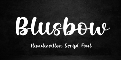 Blusbow is a handwritten Script font. It has an elegant and playful look that can be used for logos, branding, invitations, stationery, wedding designs, social media posts, and so much more. Its authentic look will add a personal and realistic feel to your designs. Thank You, i hope you enjoy it.
 - Maldive by Muksal Creatives,
$12.00 Maldive is a unique, simple, clean and well appointed display serif. It is perfect for gorgeous logos, titles, web layouts, fashion magazine and branding. It looks very nice and classy in an all-caps with a wide-set spacing, and also very beautiful on its own in capital and lowercase letters.
 - Christmas Neighborhood by Mvmet,
$15.00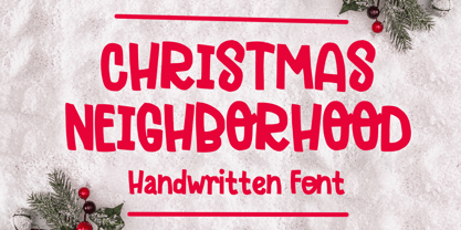 Christmas Neighborhood is your perfect stylish Christmas font. You can use it for anything ranging from t-shirts, kids’ book designs, and greeting cards to stickers and posters, or anything that needs a casual touch. Fall in love with its incredibly versatile style, and use it to create lovely designs!


