10,000 search results
(0.046 seconds)
- Baskerville LT by Linotype,
$40.99 John Baskerville (1706-1775) was an accomplished writing master and printer from Birmingham, England. He was the designer of several types, punchcut by John Handy, which are the basis for the fonts that bear the name Baskerville today. The excellent quality of his printing influenced such famous printers as Didot in France and Bodoni in Italy. Though he was known internationally as an innovator of technique and style, his high standards for paper and ink quality made it difficult for him to compete with local commercial printers. However, his fellow Englishmen imitated his types, and in 1768, Isaac Moore punchcut a version of Baskerville's letterforms for the Fry Foundry. Baskerville produced a masterpiece folio Bible for Cambridge University, and today, his types are considered to be fine representations of eighteenth century rationalism and neoclassicism. Legible and eminently dignified, Baskerville makes an excellent text typeface; and its sharp, high-contrast forms make it suitable for elegant advertising pieces as well. The Linotype portfolio offers many versions of this design: ITC New Baskerville® was designed by John Quaranda in 1978. Baskerville Cyrillic was designed by the Linotype Design Studio. Baskerville Greek was designed by Matthew Carter in 1978. Baskerville™ Classico was designed by Franko Luin in 1995."
 - Monotype Baskerville by Monotype,
$29.99 John Baskerville (1706-1775) was an accomplished writing master and printer from Birmingham, England. He was the designer of several types, punchcut by John Handy, which are the basis for the fonts that bear the name Baskerville today. The excellent quality of his printing influenced such famous printers as Didot in France and Bodoni in Italy. Though he was known internationally as an innovator of technique and style, his high standards for paper and ink quality made it difficult for him to compete with local commercial printers. However, his fellow Englishmen imitated his types, and in 1768, Isaac Moore punchcut a version of Baskerville's letterforms for the Fry Foundry. Baskerville produced a masterpiece folio Bible for Cambridge University, and today, his types are considered to be fine representations of eighteenth century rationalism and neoclassicism. Legible and eminently dignified, Baskerville makes an excellent text typeface; and its sharp, high-contrast forms make it suitable for elegant advertising pieces as well. The Linotype portfolio offers many versions of this design: ITC New Baskerville® was designed by John Quaranda in 1978. Baskerville Cyrillic was designed by the Linotype Design Studio. Baskerville Greek was designed by Matthew Carter in 1978. Baskerville™ Classico was designed by Franko Luin in 1995."
 - Schotis Display by Huy!Fonts,
$35.00 If you need a typeface suitable for the most elegant and hard work, you will fall in love with Schotis family, your true Scotch Roman style workhorse. Schotis Text is designed for perfect reading on running texts, leaving the setting of big sizes for Schotis Display. Each optical size family has seven weights plus matching italics, with 1100 glyphs per font. With a very extended character set for Latin based languages including Vietnamese, Schotis shows all its potential with OpenType-savvy applications. Every font includes small caps, ligatures, old-style, lining, proportional and tabular figures, superscript, subscript, numerators, denominators, and fractions. Schotis family is based in Scotch Roman style but designed from scratch, with a more contemporary and not nostalgic look. The Scotch Romans were one of the most used letters during the 19th and early 20th century, but they don’t have their own place in the main typographical classifications. They appeared at the beginning of the 19th century with Pica No. 2 in the catalog of William Miller (1813) and assumed the British route towards high contrast and vertical axis modern Romans. In opposition to the continental route of Fournier, Didot, and Bodoni, the English way opted for a wider, more legible letter also resistant to bad printing conditions.
 - Baskerville LT Cyrilic by Linotype,
$29.99John Baskerville (1706-1775) was an accomplished writing master and printer from Birmingham, England. He was the designer of several types, punchcut by John Handy, which are the basis for the fonts that bear the name Baskerville today. The excellent quality of his printing influenced such famous printers as Didot in France and Bodoni in Italy. Though he was known internationally as an innovator of technique and style, his high standards for paper and ink quality made it difficult for him to compete with local commercial printers. However, his fellow Englishmen imitated his types, and in 1768, Isaac Moore punchcut a version of Baskerville's letterforms for the Fry Foundry. Baskerville produced a masterpiece folio Bible for Cambridge University, and today, his types are considered to be fine representations of eighteenth century rationalism and neoclassicism. Legible and eminently dignified, Baskerville makes an excellent text typeface; and its sharp, high-contrast forms make it suitable for elegant advertising pieces as well. The Linotype portfolio offers many versions of this design: ITC New Baskerville® was designed by John Quaranda in 1978. Baskerville Cyrillic was designed by the Linotype Design Studio. Baskerville Greek was designed by Matthew Carter in 1978. Baskerville™ Classico was designed by Franko Luin in 1995." - Bridone by Tipo Pèpel,
$22.00 Introducing the innovative and original Josep Patau’s new recipe, salsa and wild-type master. 1. In a font, combine a bit of slightly outdated British slab types from the late Victorian period. If you find Vincent Figgins’s variety, do not discard. You'll find plenty to choose from in his specimens, some of then with unexpected vitality an enviably condition, despite it’s age. As aging wine, they had improve their quality with time. Cut Didones into thin slices and add. 2. In a blender, whisk the strength of these Slab serif with highly contrasted strokes from Bodoni or Didot’s neoclassical types. Adjust the mix to get a sweeter or spicier taste, but do not forget to emphasize the contrast to avoid the dressing off. 3. On the page, set the wide variety of weights as your menu demands. If you want to feed fill the stomach of the hungriest holders, use Bridone Titling as main course. If you are serving a traditional menu, starter, main and dessert, then simmer a combination of weights and sizes according to your space. It will not disappoint, much less your guests . 4. Spread thoroughly the page, serve and enjoy . If you like natural, switch to Bridona, your pages will thank you.
 - Megalithic by IC Fonts,
$20.00 3D Chiseled Rock type font based on the ideas of Ancient Megalithic Structure and Stone Masonry. This Font comes in a Solid Bolder type or Outlined Type for that Chiseled Ice Block Look. Based on Hulkbusters by Dan Zadorozny.
 - Woodout by Justyna Sokolowska,
$15.00 Wooden font block. Taken from the typesetting department at the Academy of Fine Arts in Warsaw. All the letters were printed on paper, scanned and polished on the computer. It’s very detailed font, which are suitable for large prints.
 - JT Marnie by JAM Type Design,
$14.00 The design is influenced by the geometric style sans serif faces which were popular during the 1920s and 30s. The JT Marnie font family is well suited for headlines and small blocks of text, particularly in advertising and packaging.
 - Yusyad by Eyad Al-Samman,
$20.00 The typeface Yusyad is designed mainly for a very sentimental and emotional reason. Metaphorically, it is a modest artistic gift offered virtually from the designer to one of his beloved and cherished persons in this life, namely, his loyal and devoting wife. She represents one of the most essential motives for many artistic and non-artistic works that the designer achieved during his life. This was done through her tranquil personality, infinite patience, sincere support, and endless encouragement. The designer's partner (i.e., the significant other) lives with him along with their three children looking both always for a life full of peace, achievements, philanthropy, and of course love. The typeface's name Yusyad is a portmanteau word consists of two morphemes. It is a simple name-meshing for two different names. Those names represent the name of the designer's wife (Yusra) and the name of the designer (Eyad). Yusyad is like an epithet that ties the two partners' honest and eternal relationship until the last day of their lives. Technically, Yusyad is a sans-serif condensed and display typeface. It comprises seven fonts with dual styles and multiple weights. Specifically, it has two main styles, namely, the normal and the inline design. The normal style comes in five weights (i.e., thin, light, regular, bold, and black) whereas the inline style has two weights (i.e., regular and bold). The typeface is designed with more than 700 glyphs or characters. Its character set supports nearly most of the Central, Eastern, and Western European languages using Latin scripts including the Irish and the Vietnamese languages. The typeface is appropriate for any type of typographic and graphic designs in the web, print, and other media. It is also absolutely preferable to be used in the wide fields related to publication, press, services, and production industries. It can create a very impressive impact when used in movies' or TV-series titles, posters, products’ surfaces, logos, signage, novels, books, and magazines covers, medical packages, as well as the product and corporate branding. It has also both of lining and old-style numerals which makes it more suitable for any printing or designing purposes. To end, Yusyad's condensed appearance—especially the inline style—makes it very memorable, eye-catching, and striking for advertising, marketing, and promotional purposes.
 - Flaminia by Andinistas,
$39.95 Flaminia is a typeface family of 4 members designed by Carlos Fabián Camargo G. The central idea started as Dingbats and titles labeled with fine-tipped brushes and flat tip for graphic design related restaurant menus, instructions, packaging, food containers and labels. Thus began the process of drawings and letters integrated by shapes and counterblocks that seem inaccurate yet but at the same time clean and attractive. For this reason each variable suggests fresh brushstrokes that combine ideas from Roman and italic calligraphy. Flaminia members work separately or together by solving needs in different scenarios. This will enhance its properties in order to control and diagram titles, subtitles and short paragraphs with an effusive and manuscript character. Flaminia is useful for generating a flavor of "hand lettered by skilled artists lettering." In conclusion, Flaminia Regular and Italic are used to write short paragraphs. His ascending and downs are lower that the X height. Its width is imperceptibly condensed to save horizontal space. Its smooth lines and finishes simulating a crescent moon have been made with fine-tipped brush. The contrast between thick and thin has medium intensity. Its complement is an ideal italic to emphasize words and phrases. Its conceptual characteristics are similar with foundation's handwriting, except for his companion who takes ideas from the ornamental italic calligraphy. Flaminia Black is compact and ideal for ranking information such as words and titles. Its personality is based on ornamental penmanship italics mixed with humanistic ideas outlined with contrast-type, flat-tipped brush thickness. Its overall width is slightly condensed, rising and falling are short compared to an exaggerated X height. Its smooth lines and terminations as in a crescent moon simulate the path of a broad brush. Its amount of contrast between strokes have average intensity. In brief, push to the limit parameters such as the type and amount of contrast, size, backward, forward, overall width, etc. And finally, Flaminia Dingbats offers three sets of different illustrations, a total of almost 90 drawings useful in communications related to: Food, Clothes and Sketchy. Each carefully wrought through research, testing, analytical design, visual strategy and high-definition of Bezier paths, optimizing time and work to their users. And in conclusion, I have plans to continue expanding the family with more complete versions in the future.
 - Clio by LeType,
$75.00 Clio, Clio XS and Clio Condensed —each available separately— is a big family of 72 fonts. They were designed by Gabriel de Souza in 2012. They are simple and stylish and they have the ideal appearance to your work. Furthermore, features such as italics, obliques, great language support and flexibility. They can be applied in many different forms but their primary use is indicated to display use and luxurious trade mark creation and also available for Clio Icons.
 - Scansky by Satori TF,
$20.80 Scansky is a carefully crafted contemporary modern sans serif typeface. It comes with 28 fonts, regular and condensed sub-families, and matching italics. Scansky was designed to give a distinct, corporative look to your artwork, suited for signage, web, and corporate print material. It is equipped with an extended character set to support Central, Eastern and Western European languages. And the good news is that the SemiBold weights are free of charge so you can try it. :)
 - Brumery by Letterhend,
$14.00 Brumery Condensed is a sleek condensedfont. Perfect to be applied to the other various formal forms such as invitations, labels, logos, magazines, books, greeting / wedding cards, packaging, fashion, make up, stationery, novels, labels or any type of advertising purpose. Features : numbers and punctuation multilingual PUA encoded We highly recommend using a program that supports OpenType features and Glyphs panels like many of Adobe apps and Corel Draw, so you can see and access all Glyph variations.
 - Montana by Resistenza,
$39.00 Montana is an elegantly playful handwritten font family with separate fonts for icons and illustrations included. This font is based on tight, condensed Grotesk typefaces, combining geometry and legibility with the originality of handwritten strokes. The result is a fresh font family perfect for headlines, typographic posters, t-shirts, food packaging and other print works. Its optimized legibility, simple structure and low contrast was made to perform excellently with e-books and mobile apps in mind.
 - Delator by FedeBiagioli TypeFoundry,
$30.00 Delator font is a display typeface, inverted contrast, and condensed. Inspired by the personal experience of the designer who, with resilience and daily struggle, managed to get ahead. Its name is linked to the song of an Argentine rock artist called "Corazón delator", this means that it is a typeface that does not go unnoticed, it attracts attention for its shapes and its way of being and above all, when it is present, it automatically "gives itself away".
 - Palio by Eurotypo,
$34.00 Palio is a family of fonts derived from the classic Didone, its capitals are slightly condensed and the lower case definitively abandon the reminiscent of the baroque endings strokes, which are still endure in many typefaces. It is an elegant font especially the slant version that actually is a truly italic. This version very readable and is enriched with a series of alternative variables and swashes that make it more expressive for certain projects that need some flowering.
 - Charles Wright by K-Type,
$20.00 Charles Wright is a full typeface in the style used for British vehicle license plates. The standard Bold weight is based on the condensed bold ‘2001’ style with an uppercase which conforms to UK registration plate specifications for character heights of 79mm and widths of 50mm. The 9 font family also includes previously unavailable Medium and Regular weights, Obliques , and a newly designed lowercase. For platemakers, the wider '1935' and lighter 'Motorcycle' fonts are also included.
 - Arlego by Maulana Creative,
$14.00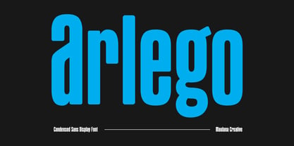 Arlego is a modern condensed sans serif Display font. Bold stroke, fun character with a bit of ligatures and alternates. To give you an extra creative work. Arlego font support multilingual more than 100+ language. This font is good for logo design, Social media, Movie Titles, Books Titles, a short text even a long text letter and good for your secondary text font with script or serif. Make a stunning work with Arlego font. Cheers, Maulana Creative
 - Tact Slab New by Pesic,
$29.00 Tact Slab New is geometrically a slab serif font, with 3 weights, condensed looks glyphs, with an alternative glyph set to improve its use in different graphic contexts. Tact Slab New is compatible with the sans serif font Tact New. It is suitable for use in the fields of science, art, architecture, urban planning, techniques, electronics, advertising, posters, corporate designs, futuristic themes, sport, film, computers, phones, video games, publishing... Contains all the Latin and Cyrillic glyphs.
 - Bemore Serif by Asenbayu,
$15.00 Bemore Serif is a decorative serif font that has a distinctive serif shape. This font has sleek and tall condensed letter proportions so it can give an attractive and elegant impression. You can use this font in both modern and vintage designs. This font is suitable for attractive packaging label designs, unique desired logos, trendy poster designs, fashion and many more. Bemore Serif font features: standard glyphs, stylistic alternates, stylistic ligatures, symbol, punctuation and multiple languages supported.
 - MC Roater by Maulana Creative,
$18.00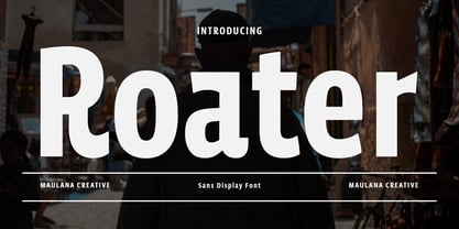 Roater is a Condensed Decorative Display Sans font. Regular stroke, fun character with a bit of ligatures and alternates. To give you an extra creative work. Roater font support multilingual more than 100+ language. This font is good for logo design, Social media, Movie Titles, Books Titles, a short text even a long text letter and good for your secondary text font with script or serif. Make a stunning work with Roater font. Cheers, Maulana Creative
 - Mynalos by Maulana Creative,
$11.00 Mynalos is a condensed sans serif font. With bold tall sharp edge stroke, fun character with a bit of ligatures and alternates. To give you an extra creative work. Mynalos font support multilingual more than 100+ language. This font is good for logo design, Social media, Movie Titles, Books Titles, a short text even a long text letter and good for your secondary text font with sans or serif. Make a stunning work with Mynalos font. Cheers, Maulana Creative
 - Fonzie by Jehoo Creative,
$- Fonzie redefining versatility. With four charming styles seamlessly blended together, it offers the perfect balance between tradition and innovation. Fonzie's basic style embodies timeless elegance with a Space-saving Condensed form with a modern twist. The SS01 explores futuristic aesthetics with a geometric style, or embraces the sophistication and form of the Extended with the SS02 features, and for the SS03 it is added for those of you who like the extreme extended style that is now a trend.
 - Hide Seek by Maulana Creative,
$12.00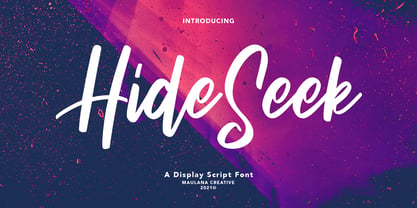 Hide Seek is a Script Display font. With bold stroke, condensed and fun character with a bit of ligatures. To give you an extra creative work. Hide Seek font support multilingual more than 100+ language. This font is good for logo design, Social media, Movie Titles, Books Titles, a short text even a long text letter and good for your secondary text font with sans or serif. Make a stunning work with Hide Seek font. Cheers, MaulanaCreative
 - Sysmatic by Maulana Creative,
$15.00 Sysmatic is a suer condensed display sans font. With medium low contrast stroke, fun character with a bit of ligatures and alternates. To give you an extra creative work. Sysmatic font support multilingual more than 100+ language. This font is good for logo design, Social media, Movie Titles, Books Titles, a short text even a long text letter and good for your secondary text font with sans or serif. Make a stunning work with Sysmatic font. Cheers, Maulana Creative
 - Konnekta by Maulana Creative,
$15.00 Konnekta is a condensed decorative display font. With bold consist stroke, fun character with a bit of ligatures and alternates. To give you an extra creative work. Konnekta font support multilingual more than 100+ language. This font is good for logo design, Social media, Movie Titles, Books Titles, a short text even a long text letter and good for your secondary text font with sans or serif. Make a stunning work with Konnekta font. Cheers, Maulana Creative
 - Isra by Linotype,
$187.99Isra, designed by Almamoun Ahmed in 2005, is a modern Kufi and a winner in Linotype’s first Arabic Typeface Design Competition. The highly geometric and condensed form make it ideal for magazine headlines, advertising, and general display usage, while the large body height and clear forms make it suitable for short text settings. The font includes a matching Latin design and support for Arabic, Persian, and Urdu. It also includes proportional and tabular numerals for the supported languages. - Anthem Park by Maulana Creative,
$14.00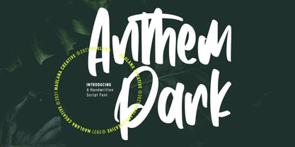 Anthem Park is a handwritten script font. With medium felt tip stroke, Condensed and fun character with a bit of ligatures. To give you an extra creative work. Anthem Park font support multilingual more than 100+ language. This font is good for logo design, Social media, Movie Titles, Books Titles, a short text even a long text letter and good for your secondary text font with sans or serif. Make a stunning work with Anthem Park font. Cheers, MaulanaCreative
 - Styxes by Maulana Creative,
$13.00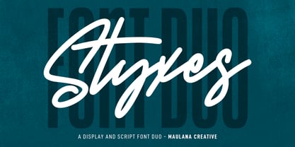 Styxes is an expressive signature script and sans font duo. With clean and condensed stroke, fun character with a bit of ligatures and alternates. To give you an extra creative work. Styxes font support multilingual more than 100+ language. This font is good for logo design, Social media, Movie Titles, Books Titles, a short text even a long text letter and good for your secondary text font. Make a stunning work with Styxes font. Cheers, MaulanaCreative
 - Demos Next by Linotype,
$50.99 The Demos® Next typeface family is a complete renewal and expansion to Dutch type designer Gerard Unger’s classic from 1975. This enhanced typeface design introduces subtle changes to character shapes, proportions and spacing to improve legibility and readability in print and on screen. The new expanded family now has 6 weights of regular and condensed designs, each with a complementary italic for a total of 24 typefaces, and provides a welcome set of OpenType® typographic features.
 - Foundry Form Serif by The Foundry,
$90.00 Foundry Form Serif was drawn concurrently as a sans and a serif, with matching capital and x-height proportions for harmonious use. The Foundry Form Serif design has a strong horizontal emphasis, slightly condensed proportions for economic use of space, and open counters ensuring legibility at small sizes. Both families function independently. Foundry Form Serif includes a true italic; the angularity and sharp serifs help to retain maximum clarity, with the contrasting stroke widths adding refinement.
 - Gigenham by Maulana Creative,
$14.00 Gigenham is a Retro-ish condensed sans font. Bold stroke, fun character with a bit of ligatures and alternates. To give you an extra creative work. Gigenham font support multilingual more than 100+ language. This font is good for logo design, Social media, Movie Titles, Books Titles, a short text even a long text letter and good for your secondary text font with script or serif. Make a stunning work with Gigenham font. Cheers, Maulana Creative
 - Arghfunks by Maulana Creative,
$14.00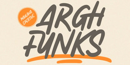 Arghfunks is a fancy handwritten display font. With condensed bold stroke, fun character with a bit of ligatures and alternates. To give you an extra creative work. Arghfunks font support multilingual more than 100+ language. This font is good for logo design, Social media, Movie Titles, Books Titles, a short text even a long text letter and good for your secondary text font with signature or script. Make a stunning work with Arghfunks font. Cheers, Maulana Creative
 - UUeirdie by Ingrimayne Type,
$7.95UUeirdie is weird. The Condensed-Light style was derived from the star-serifed font Asterx by replacing the star serifs with a rounded flare serif. Widening that style resulted in UUeirdie-Regular and the bold was then constructed to complement it. The warped version was a result of play with a font distortion program. Although the glyphs have sharp corners, they do not have straight lines. The UUeirdie faces are rough, irregular, and maybe a bit creepy. - Aseel by MAKYN,
$40.00 Aseel is a contemporary and legible typeface. It is intended to work well in the context of information and signage design. It also works well as a body text typeface as it is characterized by open counter forms and a large x-height. It is based on the Naskh calligraphic structure and has a medium stroke contrast. The letters are condensed to fit more information per line and it exists in three weights, regular, medium and bold.
 - WyomingSpaghetti by Ingrimayne Type,
$12.95 Typefaces with very thin verticals and fat, square serifs were popular in the 19th century for display. Hollywood helped associate this style with the Old West, but reference books identify some of it as Italian style. WyomingSpaghetti, part of an extended family of typefaces, has a name which combines these two associations. Most typefaces of this type are very condensed, but this one is not. The letter o is nearly circular, which is rather unusual in this style.
 - Kuzanyan by ParaType,
$30.00 The hand composition typeface was created at Polygraphmash type design bureau in 1959 by a well-known Soviet book and type designer Pavel Kuzanyan (1901-1992). It was reproduced in the 1960s for slugcasting and machine display composition. Sharp contrast, strong weight, slightly condensed Modern Serif with calligraphic elements. The typeface is useful in text and display composition, in scientific, fiction and art books. The revised and completed digital version was designed at ParaType in 2002 by Lyubov Kuznetsova.
 - MC Ertige by Maulana Creative,
$16.00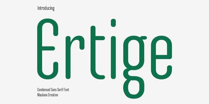 Ertige is a condensed sans serif Display font. Regular stroke, fun character with a bit of ligatures and alternates. To give you an extra creative work. Ertige font support multilingual more than 100+ language. This font is good for logo design, Social media, Movie Titles, Books Titles, a short text even a long text letter and good for your secondary text font with script or serif. Make a stunning work with Ertige font. Cheers, Maulana Creative
 - Agency FB by Font Bureau,
$40.00 ATF Agency Gothic was designed by Morris Fuller Benton in 1932 as a lone titling typeface. In 1990, David Berlow saw potential in the squared forms of the narrow, monotone capitals. He designed a lowercase and added a bold to produce Font Bureau Agency, an immediately popular hit. Sensing its potential to be than just a useful condensed face, Font Bureau developed Agency into a major series offering five weights in five widths; FB 1990-95
 - MC Aglesko by Maulana Creative,
$14.00 Aglesko is a modern condensed sans display font. Bold stroke, fun character with a bit of ligatures and alternates. To give you an extra creative work. Aglesko font support multilingual more than 100+ language. This font is good for logo design, Social media, Movie Titles, Books Titles, a short text even a long text letter and good for your secondary text font with script or serif. Make a stunning work with Aglesko font. Cheers, Maulana Creative