10,000 search results
(0.043 seconds)
- Maus - Personal use only

- Rabiosa - Personal use only

- DuerersMinuskeln - 100% free

- Reprise Script - Unknown license

- Digital Kauno - Unknown license

- Gear - Unknown license

- Wolf's Bane - Unknown license

- AB UltraChic - 100% free

- Oaxaqueña Tall - Personal use only

- Fairgrid Urban by Ditatype,
$29.00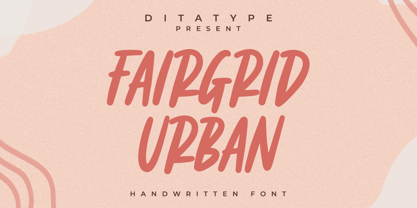
- Mister Sally by Din Studio,
$29.00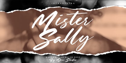
- Atlas - Unknown license

- Western Sans JNL by Jeff Levine,
$29.00
- Doppel Mittel Lapidar Azure by Intellecta Design,
$20.90
- Otago by Hanoded,
$15.00
- Canniza by Prominent and Affluent,
$30.00
- Alamanda by ErlosDesign,
$19.00
- Revelry Deco JNL by Jeff Levine,
$29.00
- Capetown Signature by MJB Letters,
$15.00
- Angkasa Script by Struggle Studio,
$16.00
- Sodbuster NF by Nick's Fonts,
$10.00
- Rodenberg by Zealab Fonts Division,
$18.00
- HV Christo by Harmonais Visual,
$12.00
- Atol by Type & Roll,
$30.00
- Rache Rache by Daylight Fonts,
$50.00
- Hellya by Arkrist Letter,
$14.00
- Blackheat by Almarkha Type,
$19.00
- Tape Font by Vladimir & vladimir,
$-
- Autovia by Santi Rey,
$25.99
- Marteau by Little Giant,
$28.00
- LTC Spire by Lanston Type Co.,
$24.95
- Art Exhibit JNL by Jeff Levine,
$29.00
- Serid by Samuel Vicente Types,
$22.00
- Schoolyard Blues JNL by Jeff Levine,
$29.00
- Marcovaldo by Zetafonts,
$51.00
- Allerton by Jeff Levine,
$29.00
- Dante Alighieri by RMU,
$35.00
- Sansational by Type Innovations,
$39.00
- Bandiera Del Legno NF by Nick's Fonts,
$10.00
- Wood Sans Narrow JNL by Jeff Levine,
$29.00


