10,000 search results
(0.072 seconds)
- Anamelia Script by Strong,
$20.00 Anamelia Srcipt is calligraphy font with a classic style and a touch of elegance, inspired by the handwriting of ancient manuscripts. Carefully designed to work together in harmony that makes it very suitable for wedding media, book covers, greeting cards, logos, branding, business cards and certificates, even for any design work that requires a classic, formal or luxurious. Try Anamelia Srcipt, enjoy the richness of OpenType features and let her fun and elegant excitement make you happy and enhance your creativity! You can use this font very easily. multilingual support and ligatures Your download will include format files. If you do not have programs that support OpenType features like Adobe Illustrator and CorelDraw X Versions, you can access all alternative flying machines using Font Book (Mac) or Character Map (Windows): Do not forget to see, buy, like and share my other great products:https://My Fonts.net/strong Thank you for purchases.!
 - As of my last update in April 2023, I can provide a general analysis of a font named "Magnificent Serif" by Imagex, based on common attributes of serif typefaces created by this foundry and the typic...
- Retro Boldy by Nirmana Visual,
$24.00 Retro Boldy, a Bold, classy, contemporary of script font, inspired by 90s Era. Retro Boldy offers beautiful typographic harmony for a diversity of design projects, including logos & branding, social media posts, advertisements & product designs.
 - Great holiday by Amarlettering,
$15.00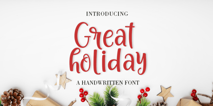 Great Holiday is a beautiful and refined script font. It has a classy, elegant and modern look that can be used for logos, branding, invitations, stationery, wedding designs, social media posts, and much more!
 - Hello Sister by Haffastudio,
$12.00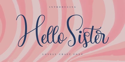 Hello Sister is a beautiful and refined script font. It has a classy, elegant and modern look that can be used for logos, branding, invitations, stationery, wedding designs, social media posts, and much more!
 - Black Wednesday by Lemon Studio Type,
$20.00 Black Wednesday is a bold serif typeface in modern and classy style. OpenType features include more Alternative character sets. Black Wednesday is ideal for headlines, headers, logos, labels, packaging, postcards, presentations, magazines, invitations, etc.
 - Satero Serif by Linotype,
$29.99 Satero was designed by Prof. Werner Schneider in 2007. Never before have we had so much written material to consume; this is the age of mass-communication. Unfortunately, the decision of which typeface to use is too often made lightly. The typeface is one of the most elementary means of language, and it can play a major role in a text's legibility and the amount of time the reader needs for it. The Satero Type System offers a high degree of legibility due to its dynamic and forms. The individual characters have been based on classical concepts. They are clearly made, and leave all unnecessary elements behind. The type works to create an environment of extreme legibility. Essential parts of the a, c, e, s, and r are to be found at the x-height line, which is the most important area of a line of text in determining legibility. The Satero Type System includes two members whose basic forms are the same. The Sans Serif members are more horizontally differentiated than common grotesques, which aides their legibility. The Serif design employs asymmetrical serifs, avoiding elephant feet" altogether. Their dynamic is progressive. The condensed nature of the seriffed counterparts is optimal for newspaper and magazine applications, where space is at a premium and paper must be saved. All fonts in the Satero Type System include a number of alternate glyphs, as well as ligatures and proportional lining figures; all weights except the Heavy and Heavy Italic fonts are also equipped with small caps, small cap figures, and oldstyle figures as OpenType features. "
 - ATF Alternate Gothic by ATF Collection,
$59.00 ATF Alternate Gothic is a new, significant digital expansion of Morris Fuller Benton’s classic 1903 type design. Originally available in one bold weight, the metal typeface came in three slightly different widths for flexibility in copy-fitting layouts. ATF Alternate Gothic has impact at any size. Its letterforms are instantly familiar: Benton’s original metal type family was used throughout the 20th century in newspapers, magazines, and advertising, providing “strong and effective display” in a compact space. Monotype issued its own metal version for machine typesetting, and Alternate Gothic likely served as inspiration for Linotype’s ubiquitous Trade Gothic® Bold and Bold Condensed. ATF Alternate Gothic expands on the characteristics that perhaps made Trade Gothic so popular, providing a wider range of weights and widths to address the needs of today’s designers and technologies. The space-saving clarity of ATF Alternate Gothic brings readability to the world of advertising typefaces. With its finely graded range of ten weights, with four widths of each weight (40 fonts total), this extensive type family can be used to pack a lot into a narrow space, and the range makes it easy to create variations of an advertisement or announcement for different formats and media. The tall x-height and narrow proportions, combined with a relatively low waist and springy, tension-filled forms, make ATF Alternate Gothic strong and effective in display. All ten weights have been carefully spaced for readability, caps and lowercase work well together, while attention-grabbing all-caps settings are clear and never crowded, no matter how narrow.
 - Span by Jamie Clarke Type,
$25.00 Span is a modern chiseled style family that flaunts its engraved heritage with sweeping serifs and sculptural forms. Bridging the contemporary and traditional, Span appears exuberant yet dignified. Designed primarily for luxurious headlines and titles, Span’s strong vertical stress is softened by elegant organic curves while its compact height accentuates the deep serifs. The family offers five weights, each with three widths and italics. The condensed styles provide an invaluable advantage when designing within narrow spaces. Span’s italics strike a balance between true italics and oblique letterforms to create a change in rhythm while preserving its chiselled style. A variety of additional features enhance Span's typographic capabilities including restrained swashes and flourishes are available in both roman and italic styles. Span also introduces an additional set of capitals for exceptional typographic control over uppercase settings. ‘Mid Caps’ sit midway between full-height capitals and lowercase letters and extend Span's title setting options to All Capitals, Capitals with Mid Caps and Capitals with Small Caps. Choose Span and take full control over your title settings and produce classic typography with statuesque poise. Overview: 30 styles comprised of 5 weights, 3 widths and accompanying italics Additional features include alternate characters, swashes, Small Caps and Mid Caps 987 glyphs per style See the Specimen Supported Languages: Albanian, Asturian, Basque, Breton, Bosnian, Catalan, Croatian, Czech, Danish, Dutch, English, Estonian, Faroese, Finnish, Filipino, French, Galician, German, Hungarian, Icelandic, Indonesian, Irish, Italian, Kurdish, Latin, Latvian, Lithuanian, Malay, Maltese, Moldavian, Norwegian, Occitan, Polish, Portuguese, Romanian, Samoan, Serbian (Latin), Slovak, Slovenian, Spanish, Swahili, Swedish, Tagalog, Turkish, Walloon, Welsh, Wolof, Zulu
 - Agilita by Linotype,
$29.99 Created by German designer Jürgen Weltin, Linotype’s Agilita is a contemporary humanist sans serif family with a wide variety of weights, including both ultra thin hairline options and heavier, dark type. Agilita has rather classical proportions; its clear ascenders and descenders lend more distinct word shapes. Weltin’s design has a dynamic, yet strong and very functional appearance with a fine but clear emphasis on the horizontals. This traditional approach makes it a versatile typeface for large-scale text setting, but it can also be used in complex information design projects, and orientation systems, for example. Hence it was developed carefully into a wide range type family system consisting of 32 styles. This even covers the requirements for display and headline setting. Corresponding condensed weights are suitable where horizontal space is scarce, as in narrow columns and tables, for example. The Agilta Hairline and Agilta Ultra Thin styles were especially made for display use. These fonts should be set at a minimum size of 20 pt for printed project, and about 40 pt on output to laser printers, depending on the paper used. Agilita’s character sets include special symbols and signs that may be used in dictionaries; like arrows for lemmata and signs for cross references, idioms or colloquial language. There are two sets of arrows available in each weight for use in orientation systems. Each font in the Agilta family is built according to Linotype’s Extended European character set guidelines. These offer support for more than 48 Latin-based languages used in Western, Central, and Eastern Europe, including Baltics and Turkey.
 - Satero Sans by Linotype,
$29.99 Satero was designed by Prof. Werner Schneider in 2007. Never before have we had so much written material to consume; this is the age of mass-communication. Unfortunately, the decision of which typeface to use is too often made lightly. The typeface is one of the most elementary means of language, and it can play a major role in a text's legibility and the amount of time the reader needs for it. The Satero Type System offers a high degree of legibility due to its dynamic and forms. The individual characters have been based on classical concepts. They are clearly made, and leave all unnecessary elements behind. The type works to create an environment of extreme legibility. Essential parts of the a, c, e, s, and r are to be found at the x-height line, which is the most important area of a line of text in determining legibility. The Satero Type System includes two members whose basic forms are the same. The Sans Serif members are more horizontally differentiated than common grotesques, which aides their legibility. The Serif design employs asymmetrical serifs, avoiding elephant feet" altogether. Their dynamic is progressive. The condensed nature of the seriffed counterparts is optimal for newspaper and magazine applications, where space is at a premium and paper must be saved. All fonts in the Satero Type System include a number of alternate glyphs, as well as ligatures and proportional lining figures; all weights except the Heavy and Heavy Italic fonts are also equipped with small caps, small cap figures, and oldstyle figures as OpenType features. "
 - DIN Next by Monotype,
$56.99 DIN has always been the typeface you root for—the one you wanted to use but just couldn’t bring yourself to because it was limited in its range of weights and widths, rendering it less useful than it could be. The century-old design has proven to be timeless, but modern use cases demanded an update, which resulted in DIN Next—a versatile sans serif family that will never go out of style. This classic design turned modern must-have includes seven weights that range from light to black, each of which has a complementary italic and condensed counterpart. The family also included four rounded designs, stretching the original concept’s range and core usability. DIN Next also boasts a suite of small capitals, old style figures, subscript, superscript and several alternate characters. A quintessential 20th-century design, its predecessor DIN was based on geometric shapes and was intended for use on traffic signs and technical documentation. Akira Kobayashi’s update made slight changes to the design, rounding the formerly squared-off corner angles to humanize the family. Rooted in over 100-years of history, it’s safe to say that there will always be a demand for the DIN design, and thanks to DIN Next, now it’s as usable as it is desired. Wondering what will pair with it perfectly? Check out Agmena™, Bembo® Book, Cardamon™, Joanna® Nova, FF Quadraat® and Quitador™. Featured in: Best Fonts for Logos, Best Fonts for Websites, Best Fonts for Tattoos
 - Renault MN - Unknown license

- Astronauts In Trouble by Comicraft,
$49.00 AiT/Planet Lar publisher and writer, Larry Young loves The Space Program. Next time you see him at a comic convention just ask him about any one of the Moon Landings and you'll see.
 - Alaturka by Bülent Yüksel,
$19.00 ABOUT FAMILY: What makes "Alaturka" elegant, friendly and contemporary is its very rounded curves with very open terminals. "Alaturka" has been designed with a higher "x-height" than other fonts in its class to make tiny readability more obvious in any use situation. It will be ideal for use in small sizes such as business cards or mobile applications. This typeface is also equipped with powerful OpenType features to satisfy the most demanding professionals. It has solid features like case sensitivity, small, true capitals, full ligatures, tabular figures for tables, old-style figures to elegantly insert numbers into your sentences, and more alternative characters to give personality to your projects. FEATURE SUMMARY: - 2 style: 1From 1923 To 2023 - 8 weights: Thin, Extra Light, Light, Regular, Medium, Bold, Extra Bold, and Black. - 3widths: Normal, Narrow, and Condensed. - Matching italics (12º) for all weights and widths. - Matching small caps for all weights and widths. - Lining and old-style figures (proportional and tabular). - Some alternate characters - Unlimited fractions. - Automatic ordinals (1st, 2nd, 3rd, etc.). - Extended language support: Most Latin-based scripts - Extended currency support. You can enjoy using it.
 - ITC Ellipse Neo by Typorium,
$30.00 The Typorium presents a new optimized and enriched version of ITC Ellipse which first appeared in 1996 in the International Typeface Corporation typeface library. ITC Ellipse Neo design has been lightly modified. Three weights have been added (light, Medium, Extra Bold, including Italics) to the original Regular and Bold styles. ITC Ellipse Neo is both modern and classic. Modern in the unusual shape based on the geometric ellipse form. And classic in the structure of some letters like the lower cases c, e, g, o, s. These letters alone could come from a traditional typeface, but they fit perfectly with the atypical rest of the alphabet giving it a present-day and traditional mix. Furthermore, the ellipse shape fits naturally in the italic styles, giving the font an organic and fluid feeling. ITC Ellipse Neo offers OpenType features such as alternate characters for upper and lower case, and an extended accented character set to support many languages. Five weights have been created for each style to offer a wide range of graphic possibilities in a tidy digital footprint. Designer: Jean-Renaud Cuaz Publisher: Typorium MyFonts debut: December 15, 2020 Le Typorium présente une nouvelle version optimisée et enrichie d'ITC Ellipse qui est apparue pour la première fois en 1996 dans la bibliothèque de caractères de l'International Typeface Corporation. Le design de ITC Ellipse Neo a été légèrement modifié. Trois graisses ont été ajoutées (léger, moyen, extra gras, y compris les italiques) aux styles originaux Regular et Bold. ITC Ellipse Neo est à la fois moderne et classique. Moderne dans le dessin inhabituel basé sur la forme géométrique de l’ellipse. Et classique dans la structure de certaines lettres comme les minuscules c, e, g, o, s. Ces lettres pourraient provenir d'une police de caractères traditionnelle, mais elles s'intègrent parfaitement avec le reste de l'alphabet plus insolite en lui donnant un mélange de modernité et de tradition. De plus, la forme de l'ellipse s'intègre naturellement dans les styles italiques, donnant à la police une sensation organique et fluide. ITC Ellipse Neo offre des fonctionnalités OpenType telles que des caractères alternatifs pour les capitales et les bas de casse, et un jeu de caractères accentués étendu pour prendre en charge de nombreuses langues. Cinq graisses ont été créés pour chaque style afin d'offrir un large éventail de possibilités graphiques pour une empreinte numérique rigoureuse.
 - The 5 Fingered Goth SWTrial font by Astigmatic One Eye stands out as a unique and captivating typeface that carries an unmistakable gothic charm. Crafted by the intriguingly named Astigmatic One Eye ...
- Quickat by deFharo,
$18.00 Quickat is a handwritten font, thick, condensed calligraphic style has several sets of terminal ornaments for decoration of phrases and titles. This font is drawn by hand with a pen following proportions based on the numbers of Perrin applied completely to the capital letter H and from this letter all the proportions of the rest of the alphabet are calculated according to mathematical formulas that I have been perfecting and putting into practice in my last fonts, is ideal for designing greeting cards or weddings, posters, flashy headlines or small texts.
 - Balinese Culture by Graphicxell,
$19.00 Balinese Culture Condensed Sans Font Typeface inspired by the famous minimalist logo perfect for the purposes of designing templates, brochures, videos, advertising branding, logos, invitation, layout design, elegant crafting, beauty design and other What's Included : Standard glyphs International Accent Works on PC & Mac Simple installations Accessible in the Adobe Illustrator, Adobe Photoshop, Corel Draw. PUA Encoded Characters - Fully accessible without additional design software. Fonts include multilingual support Image used : All photographs/pictures/vector used in the preview are not included, they are intended for illustration purpose only. Thank You
 - Neumatic Gothic by Arkitype,
$20.00 Nuematic Gothic is a condensed sans-serif family. It has a tall Cap Height and an x-height to balance it. Neumatic Gothic is versatile in use as a Headline font or as a text font. Neumatic Gothic has loads of options to play around with, included in the glyph set is small caps a stylistic uppercase superscript, stylistic alternates and circled numbers to name some. The typeface was designed with the graphic designer in mind to make beautiful typographic pieces with more ease with all the options you have in Neumatic Gothic.
 - Braleno by Letterhend,
$19.00 Introducing, Braleno - a condensed brush typeface. This type of font perfectly made to be applied especially in headlines which is need a standout font, and the other various formal forms such as invitations, labels, logos, magazines, books, greeting / wedding cards, packaging, fashion, make up, stationery, novels, labels or any type of advertising purpose. Features : numbers and punctuation multilingual PUA encoded We highly recommend using a program that supports OpenType features and Glyphs panels like many of Adobe apps and Corel Draw, so you can see and access all Glyph variations.
 - Maison Neue by Milieu Grotesque,
$99.00 Maison Neue is the completely reworked version of our original Maison typeface family. While the earlier version was constructed using rigid elements, Maison Neue has been meticulously redrawn to be less formulaic and have a stronger focus on optical criteria to create a distinct grotesque paying greater attention to harmony, rhythm and flow. In 2017, Maison Neue was further developed and expanded into a super family of 40 styles. This includes the subtly condensed original version, an extended counterpart, a mono-spaced alignment—all featuring additional weights within each family.
 - Ardone by Hackberry Font Foundry,
$24.95Ardone is a well-modulated humanist serif font family with Garalde roots. A distant ancestor is Minister (a German font designed by Fahrenwaldt in 1929) through my first font, Diaconia Old Style. This first style, book, is slightly condensed and very elegant with thin bracketed serifs. There are many OpenType features with over 600 characters: Caps, lower case, small caps, ligatures, discretionary ligatures, swashes, small cap figures, old style figures, numerators, denominators, accent characters (including CE), ordinal numbers (1st-infinity: lining and oldstyle), and so on. Ardone is designed for text use in body copy. - Dinastri by Mantra Naga Studio,
$20.00 Dinastri is a condensed sans serif font that has a modern edge with bold characteristics. At 385 glyphs, this font is perfect for modern logos, contemporary web designs, or printed headlines. 385 Glyphs 5 Opentype features 7 Ligatures and 11 Stylistic alternates Multilingual support for 89 languages We highly recommend using a program that supports the OpenType feature and the Glyphs panel like many Adobe and Corel Draw applications, so that you can view and access all variations of Glyphs. Thanks for your support of our product and using it in your project.
 - Aircrew by Vanarchiv,
$28.00 Aircrew is a neutral, humanist sans-serif family optimized for signage applications in display sizes. Its large x-height enhances readability and its letterforms help distinguish characters from each other, increasing legibility. Aircrew has vertical terminals, low contrast, and short ascenders and descenders. The weight variations between uppercase and lowercase characters provide the perfect balance and its slightly condensed proportions allow more words to fit in less space. There are two different versions of Aircrew, positive and negative. This avoids optical effects that cause uneven thickness and unsteady readability in either light or dark backgrounds.
 - Congress by Monotype,
$29.99Congress from Adrian Williams was shown for the first time at the Association Typographique International Congress, which proved to be so popular in 1980 at Kiel; designed to present a style equally appealling in European languages. Many characters are more condensed than is usual, while others have had certain elements exagerated, bringing notice to new elements of certain letters. The concept being to bring an equality of importance to the whole, producing a collection of International characters working together in harmony on the page -- a common aim that Europeans wish of any Congress. - Dear Sans by Stiggy & Sands,
$24.00 The Dear Sans Collection is comprised of four widths ranging from Condensed, Regular, Expanded, and Wide; each of which are comprised of a three font family of weights: Book, Regular & Bold. Cleanly readable, with just a slight hint of silliness, the Dear Sans Collection brings adds the perfect level of lightheartedness to your designs. The Dear Sans Collection comes with: - Approx. 367 Character Glyph Set per font - including standard & punctuation, international language support, and basic “fi fl” ligatures per font. - 3 Weights per family including: Book, Regular, and Bold. - Loads of Personality for your designs.
 - Sortland by Tour De Force,
$30.00 Sortland is single weight font inspired with vintage serif typography. By it’s design, Sortland is condensed, contrasted and typeface with tall x-height. It radiates with distinctive charm and warmness as soft lines and rounded corners make friendly impression on words made with Sortland. Sortland recommends itself for package design, posters, outdoor and indoor graphics, logo and websites either for headlines or paragraphs. In terms of markets, it’s ideal for beverage, food and cosmetics, but also for movies, magazines and books. Comes with Small Caps and standard Ligatures.
 - Song Composer JNL by Jeff Levine,
$29.00 The sheet music for the 1939 tune "Chico's Love Song (Ma-La-Ja Fa-La Pas-Ka Lah-Ta) [Cuban Double Talk]" may have had an odd title, but the main portion of it was hand lettered in an interesting style. Condensed letters with rounded corners complemented by sharp lines and angles give the characters an almost futuristic look, despite the fact that they were designed during the Art Deco era. This became the basis for Song Composer JNL, which is available in both regular and oblique versions.
 - Pinguino by Sudtipos,
$49.00 Angel Koziupa's familiar brush goes upright and narrow with Pinguino. Koziupa's approach to condensed brush fonts makes use of the same elements that have always distinguished his calligraphy from any other. With Pinguino, however, we see him softening his corners and adding a distinctly feminine touch to his exotic brush. Pinguino would feel at home on sobering coffee packaging just as it would on a bouncy mixed-fruit juice bottle. Try Pinguino for your next packaging project, and tell your client an Angel told you to use it.
 - LeakorLeach by Ingrimayne Type,
$9.95 An early drawing tablet was largely responsible for the LeakorLeach typefaces. They resemble hand lettering using cake icing or done with an ink pen that leaves lots of ink blobs or ink blots. The family has two widths, plain and condensed, and in addition to each having an oblique style, each also has a leftward-inclined style. There may not be many uses for a leftward-inclined typeface, but for those needing one, the LeakorLeach family offers two. The LeakorLeach typefaces are unlike any other faces from IngrimayneType.
 - Trade Gothic by Linotype,
$42.99 The first cuts of Trade Gothic were designed by Jackson Burke in 1948. He continued to work on further weights and styles until 1960 while he was director of type development for Mergenthaler-Linotype in the USA. Trade Gothic does not display as much unifying family structure as other popular sans serif font families, but this dissonance adds a bit of earthy naturalism to its appeal. Trade Gothic is often seen in advertising and multimedia in combination with roman text fonts, and the condensed versions are popular in the newspaper industry for headlines.
 - Belle Sans by Park Street Studio,
$25.00 Belle Sans is a clean, straightforward sans serif typeface family, and a very large family at that! It has seven widths, from Ultra Condensed to Extra Wide, and seven weights, ranging from Light to Black, all with Oblique companions. Belle Sans offers up great legibility for on-screen usage, and the breadth of width and weight make it very usable for text applications as well. The heavier weights, especially the Black, are exceptional for creating visual impact! Each font supports Western and Central European languages, ligatures, tabular figures, unlimited fractions, superiors & inferiors, and ordinals.
 - Evie Sans by KTStudio,
$23.99 Evie Sans was developed in 2020 by Katy Thompson as a typeface to be used for her customisable planner / diary company PLANNER.STUDIO. The fonts have geometric proportions and subtle Art Deco influences in several of the uppercase characters, including a lowered crossbar on the H, lowered middle arm on the F and deepened bowl on the P. The family includes 6 weights in regular, italic and condensed variations, each with 216 glyphs. Evie Sans is perfect for modern branding and logo design, editorial design, web design, packaging and other projects.
 - Aftermath by Bosstypestudio,
$15.00 AFTERMATH?? has been designed to come in four different widths; Normal, Italic, Narrow and Condensed, additional to add weight to support various uses ranging from Thin, Light, Regular, Medium, Bold, Extrabold, and Black. AFTERMATH It comes in 40 weights with various features that support designer creativity from the Font Menu and extended language support. AFTERMATH will suit many projects: fashion, magazines, logos, branding, photography, invitations, wedding invitations, quotes, blog headers, posters, advertisements, postcards, books, websites, etc. If you have any questions, you can contact us by email: bosstypestudio@gmail.com| Thank you!
 - Dx Grove by Dirtyline Studio,
$20.00 introducing Dx Grove, a vintage-inspired font that seamlessly blends nostalgia with elegance, making it the perfect choice for your design projects. This timeless serif font comes in 4 Style regular and Condensed including the italic too. offering you versatility and style for your graphic design, branding, and packaging projects. Capture the essence of the past with Dx Grove free-spirited vintage charm, bringing a touch of yesteryear to your creations. Ideal for wedding invitations, branding, or projects that need nostalgic 90’s font aesthetics, this hand-drawn typeface is bold and versatile.
 - Working by Graphicxell,
$19.00 Working Condensed Sans Font Typeface inspired by the famous minimalist logo perfect for the purposes of designing templates, brochures, videos, advertising branding, logos, invitation, layout design, elegant crafting, beauty design and other What's Included : Standard glyphs International Accent Works on PC & Mac Simple installations Accessible in the Adobe Illustrator, Adobe Photoshop, Corel Draw. PUA Encoded Characters - Fully accessible without additional design software. Fonts include multilingual support Image used : All photographs/pictures/vector used in the preview are not included, they are intended for illustration purpose only. Thank You
 - Vacantonia by Invasi Studio,
$14.00 Vacantonia is a brush display font pairing with regular and condensed fonts. With its all-caps style, Vacantonia is perfect for creating aesthetic quotes, logos, posters, and anything that needs a bold and impactful look. Its vintage retro style adds a touch of nostalgia and adventure vibes to any project. In addition to its striking style, Vacantonia also features Latin Multilingual Support, alternate characters, and ligatures, making it even more versatile for any project. Its brush style gives it a unique and handcrafted feel, making it perfect for creating a personalized and customized look.
 - Phoenica Std Mono by preussTYPE,
$29.00 Phoenica Std Mono expands the already large family of my very successful Phoenica. The motivation to develop a new mono-Phoenica family was that I was not satisfied with monospaced fonts in programming code, or simply in e-mail correspondence. The Mono Phoenica solves the problem of a typical monospaced font, a rigid, fixed width. The design gradations from Condensed monospaced to monospaced from 390em to 600em-square incurred a total of 21 fonts. Packages contain the fonts in CFF-OpenType and TrueType format, so you can use these beautiful fonts on all operating systems.
 - Borden by La Boîte Graphique,
$25.00 Borden is a rounded hand-printed caps font ideal for your graphic project. Usage recommendations : Title, short text, children’s book, poster, book cover, brochure, label, magazine. "The friendly hand-drawn charms of the Borden family […] Designed by Ewen Prigent, the Borden family is a hand rendered, all-caps design ideal for all sorts of playful settings. With its narrow condensed letterforms and rough rendering, this family is a good fit when space is limited in your design but you don’t want to compromise its friendly tone." www.fonts.com - newsletter - march 2014
