10,000 search results
(0.047 seconds)
- Newcomen by insigne,
$24.99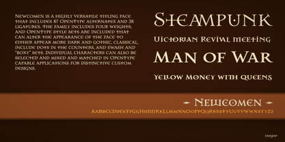 Newcomen is a highly versatile titling face that includes 87 OpenType alternates and 38 ligatures. Newcomen titling, in its default form, evokes the Victorian era and is named for the British inventor of a steam engine for pumping water. Newcomen's flexibility is remarkable; the family includes four weights, and OpenType style sets are included that can alter the appearance of the face to either appear more dark and gothic, classical, include dots in the counters, and swash and "boxy" sets. Individual characters can also be selected and mixed and matched in OpenType capable applications for distinctive custom designs. A few design ideas are to use the gothic alternates for Halloween, the dots for a steampunk appearance, or the traditional alternates for a unique classical look.
 - Rabusta Greatness by Bungletter,
$12.00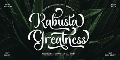 Rabusta Greatness is an elegant calligraphy font that comes with a very beautiful character change, a kind of classic decorative script with a modern touch, designed with high detail to present an elegant style, which has 4 types of fonts. Rabusta Greatness is attractive because the typeface is pleasing to the eye, clean, feminine, sensual, glamorous, simple and very easy to read, thanks to its many extravagant letter relationships. I also offer a number of decent stylistic alternatives for some of the letters. Classic style is very suitable to be applied in various formal forms such as invitations, labels, restaurant menus, logos, fashion, make up, stationery, novels, magazines, books, greeting/wedding cards, packaging, labels or all kinds of advertising purposes. . . . . . Thanks & Happy Designing!
 - Beach Holiday by Gian Studio,
$12.00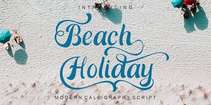 Beace Holiday is an elegant calligraphy luxury font that comes with a very beautiful character change, a kind of classic decorative script with a modern touch, designed with high detail to present an elegant style. Beace Holiday is attractive because the typeface is pleasing to the eye, clean, feminine, sensual, glamorous, simple and very easy to read, thanks to its many extravagant letter relationships. I also offer a decent number of stylistic alternatives for some of the letters. Classic style is very suitable to be applied in various formal forms such as invitations, labels, restaurant menus, logos, fashion, make up, stationery, novels, magazines, books, greeting/wedding cards, packaging, labels or all kinds of advertising purposes. and much more. .. Thanks & Happy Designing!
 - Skyward by Carmel Type Co.,
$19.00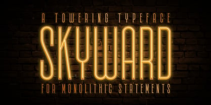 Robust, towering, and geometrically refined, Skyward is a surefire classic cocktail of equal parts utility and elegance. This typeface carries a set of over 300 glyphs across 8 distinct faces. With Deco-era sensibilities and a touch of modern refinement + an all new alternative set of characters, Skyward is exceedingly effective in a diverse spectrum of situations. Skyward is the perfect selection for modern, chic, luxury products and packaging as well as bold ad campaigns, window signage, magazine headlines or the classic branding project. Skyward works best as display text. 12 styles Sans-Serif, Serif, and Rounded styles Select Stylistic alternates Upper & lowercase Numerals & punctuation 330+ glyphs per style Supports 75+ Latin based languages OTF files Designed by Jason Carne
 - Breve Text by DSType,
$50.00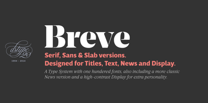 Breve was designed for use in editorial projects. Simple but with enough personality to stand by is own, in a quest for a more forceful and contemporary appearance. All the fonts in Breve superfamily, share the same exact structure, both in terms of anatomy and functionality. The Text versions provide a softer and warm feel to the typographic palette and is intended for use in much longer passages of text, while the Title versions are distinguished by non-descending letterforms, making the titles and headlines much more uniform and interesting. The News version is more classic, with ball terminals and classic proportions, while the Display is, somehow, the set of fonts we had to design: extra-black, ultra-contrasted, proud-display fonts.
 - Breve Sans Text by DSType,
$50.00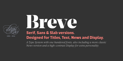 Breve was designed for use in editorial projects. Simple but with enough personality to stand by is own, in a quest for a more forceful and contemporary appearance. All the fonts in Breve superfamily, share the same exact structure, both in terms of anatomy and functionality. The Text versions provide a softer and warm feel to the typographic palette and is intended for use in much longer passages of text, while the Title versions are distinguished by non-descending letterforms, making the titles and headlines much more uniform and interesting. The News version is more classic, with ball terminals and classic proportions, while the Display is, somehow, the set of fonts we had to design: extra-black, ultra-contrasted, proud-display fonts.
 - Breve Slab Text by DSType,
$50.00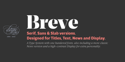 Breve was designed for use in editorial projects. Simple but with enough personality to stand by is own, in a quest for a more forceful and contemporary appearance. All the fonts in Breve superfamily, share the same exact structure, both in terms of anatomy and functionality. The Text versions provide a softer and warm feel to the typographic palette and is intended for use in much longer passages of text, while the Title versions are distinguished by non-descending letterforms, making the titles and headlines much more uniform and interesting. The News version is more classic, with ball terminals and classic proportions, while the Display is, somehow, the set of fonts we had to design: extra-black, ultra-contrasted, proud-display fonts.
 - Vintage Reclame by Putracetol,
$32.00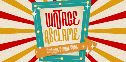 Vintage Reclame is a vintage script font. As the name suggests, this font is inspired by classic billboards/boards. Besides that, I also combine it with a script style and it's a little irregular in its shape / bouncy style. I strengthen the vintage/retro impression with the character ligatures, there are 140 ligatures in this font. But if you want to use this font with a neater impression, you can disable this ligature feature. This font is perfect for projects with vintage/retro and classic themes. But this font is also suitable for logos, branding, greeting cards, invitation cards, advertisements, titles, healines, book titles, stickers, packaging, quotes, posters, t-shirts/apparel, billboards and others. This font is also support multi language.
 - Shàngó Sans by CastleType,
$59.00 Taking the concept of a monoline version of Shàngó — as exemplified in Shàngó Gothic — to its extreme, resulted in the latest addition to the popular Shàngó family of typefaces: Shango Sans. This is a minimalist face, still maintaining the elegant classic letterforms of Professor F.H. Ernst Schneidler's original design, but without obvious contrast in the stroke widths, and of course, without serifs. An extensive set of ligatures and alternate letterforms, along with powerful OpenType features, give Shàngó Sans a great deal of versatility. This elegant, modern typeface supports dozens of languages that use the Latin alphabet as well as modern (monotonic) Greek and most languages that use the Cyrillic alphabet. Shàngó Sans is a member of the extended Shàngó family (Classic, Chiseled, Sans, Gothic).
 - The British Telegraph by Vintage Voyage Design Supply,
$14.00 The British Telegraph font family was inspired by classic headers of Britain newspapers from the middle of XX century. Classic look with three width – Light, Regular and Bold. Great for headers, signs or logos. Also, working well for text blocks. - The British Telegraph Light: Use it for text blocks, or for gently light header typographic. Try to make more wide tracking with capitals, it looks good. - The British Telegraph Regular: Great for simple message, quotes, subheaders (If the header is Bold) or advert slogans. - The British Telegraph Bold: Is a killing title buddy. Massive, strong, bold and in the same time – very gentle. Perfectly for main words, headers, signs or logo's. The British Telegraph has full glyph set with standard and discretionary ligatures (Open Type Features).
 - 58 Rodeo by Baseline Fonts,
$24.00Introducing 58 Rodeo: A Classic Redefined 58 Rodeo is based on several different woodtypes used primarily as display faces in the late 1800s/early 1900s. The difference with this version of a classic woodtype is the balance and legibility. 58 Rodeo has been redrawn to emphasize line and character uniformity. The goal is to create a eurostyle, square look in a western font designed for modern applications with wild west sensibility. Additional characters provide whimsy and flair to round out any layout on the fly. Stars and other sorts are included in this reinterpreted design. Egyptienne-style fonts possess a universal appeal and are spectacular for adding interest and legibility in a variety of applications. The extended character set includes the Euro, placed on the currency key. - Baby Madina by IM Studio,
$12.00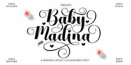 Baby madina is an elegant calligraphy font that comes with a very beautiful character change, a kind of classic decorative script with a modern touch, designed with high details to present an elegant style, which has 5 types of fonts. Baby madina is attractive because the typeface is pleasing to the eye, clean, feminine, sensual, glamorous, simple and very easy to read, thanks to its many luxurious letter relationships. I also offer a decent number of stylistic alternatives for some of the letters. Classic style is very suitable to be applied in various formal forms such as invitations, labels, restaurant menus, logos, fashion, make up, stationery, novels, magazines, books, greeting/wedding cards, packaging, labels or all kinds of advertising purposes and many others. .. Thanks & Happy Designing!
 - Breve Sans Title by DSType,
$50.00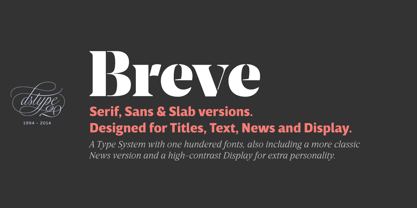 Breve was designed for use in editorial projects. Simple but with enough personality to stand by is own, in a quest for a more forceful and contemporary appearance. All the fonts in Breve superfamily, share the same exact structure, both in terms of anatomy and functionality. The Text versions provide a softer and warm feel to the typographic palette and is intended for use in much longer passages of text, while the Title versions are distinguished by non-descending letterforms, making the titles and headlines much more uniform and interesting. The News version is more classic, with ball terminals and classic proportions, while the Display is, somehow, the set of fonts we had to design: extra-black, ultra-contrasted, proud-display fonts.
 - Hello Bakista Script by madjack.font,
$20.00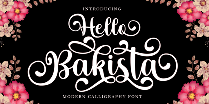 Hello Bakista Script is a modern calligraphy font featuring a varied baseline, smooth lines, a classic and elegant touch. Can be used for various purposes such as headings, signatures, logos, wedding invitations, t-shirts, letterheads, signage, labels, news, posters, badges etc. I created this Hello Bakista Font inspired by classic calligraphy concepts and made it into a modern style, and I also added some really interesting binders and alternatives when we applied them. I also tried to execute in a different way so that it resulted in this Bela Yasmine Script font. To enable the OpenType Stylistic alternative, you need a program that supports OpenType features such as Adobe Illustrator CS, Adobe Indesign & CorelDraw X6-X7, Microsoft Word 2010 or a later version. Thank you,
 - Didot Headline by Canada Type,
$24.95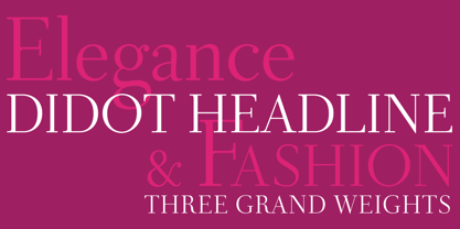 In spite of its name, this font family embodies the ultimate classic modern advertising typeface, rather than concern itself with revivalism or Didone authenticity. Naturally the spirit of the original Didot faces still exists in this family, but over twelve years of work on it have made it more fitting to the luxurious expression of our day and age, rather than nineteenth century Europe. Upscale and stylish, Didot Headline is an essential tool for any designer involved in magazines, books, tasteful music, or overall luxury packaging that requires clean and large classic typography with an unmistakable modern spin. We recommend the use of Didot Headline between 12 and 48 points. For larger display use, check out its sister family, Didot Display.
 - Salistya by Kartiny Type,
$12.00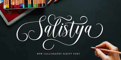 Salistya is an Elegant script font that comes with very beautiful character changes, a classic copper decorative script type with a modern touch, designed with high detail to present an elegant style. Salistya file Salistya script is interesting because the typeface is pleasing to the eye, clean, feminine, sensual, glamorous, simple and very easy to read, because of the many luxurious letter connections. I also offer a number of decent stylistic alternatives for some of the letters. Classic style is very suitable to be applied in various formal forms such as invitations, labels, restaurant menus, logos, fashion, make up, stationery, novels, magazines, books, greeting cards/weddings, packaging, labels or all kinds of advertisements. If you need help or have questions, let me know. I'm happy to help.
 - Samithan by Kartiny Type,
$12.00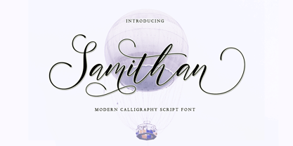 Samithan Script is an Elegant script font that comes with very beautiful character changes, a classic copper decorative script type with a modern touch, designed with high detail to present an elegant style. Samithan file Samithan is interesting because the typeface is pleasing to the eye, clean, feminine, sensual, glamorous, simple and very easy to read, because of the many luxurious letter connections. I also offer a number of decent stylistic alternatives for some of the letters. Classic style is very suitable to be applied in various formal forms such as invitations, labels, restaurant menus, logos, fashion, make up, stationery, novels, magazines, books, greeting cards/weddings, packaging, labels or all kinds of advertisements. If you need help or have questions, let me know. I'm happy to help.
 - Melindan by Bungletter,
$10.00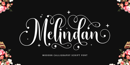 Melindan is a modern script font that features a classic and elegant touch. Melindan is attractive because it is sleek, clean, feminine, sensual, glamorous, simple and very easy to read, thanks to its many beautiful letter connections. I also offer a number of decent stylistic alternatives for some of the letters. Classic style is very suitable to be applied in various formal forms such as invitations, labels, restaurant menus, logos, fashion, make up, stationery, novels, magazines, books, greeting/wedding cards, packaging, labels or all kinds of advertising purposes. . . . . . . . . Files include: -4 Type Font Contains full set: -Uppercase -Lowercase -Alternative -Style -Ligatures -Punctuation -Number -Multilingual support. need help or have questions let me know. I'm happy to help. Thanks & Congratulations on the Design!
 - Sina by Hoftype,
$-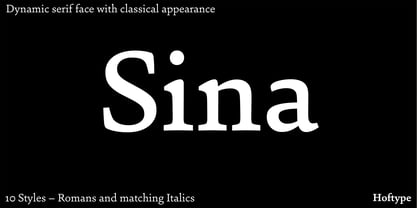 Sina is a strong, sturdy and self-confident serif accented face. Distinct ascenders and descenders in classical proportions ensure pleasant reading. Robust but assertively warm, it recalls and references the virtues of early classical printing types but presents a distinctly contemporary look. With its even text flow it works very well for long texts. It is also great for headlines and in larger styles. An extended, fine-tuned range of weights renders it suitable for almost every application. Sina comes in 12 styles and in OpenType format. All styles contain standard and discretionary ligatures, small caps, proportional lining figures, tabular lining figures, proportional old style figures, lining old style figures, matching currency symbols, fractions, and scientific numerals. Sina supports West European, Central and East European languages.
 - Kevin Keyla by Bosstypestudio,
$13.00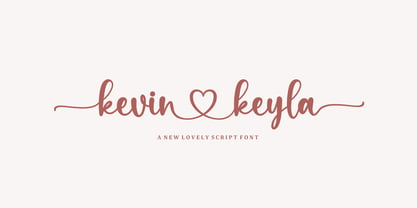 Kevin Keyla is an cute calligraphy luxury font that comes with a very beautiful character change, a kind of classic decorative script with a modern touch, designed with high detail to present an elegant style. Kevin Keyla is attractive because the typeface is pleasing to the eye, clean, feminine, sensual, glamorous, simple and very easy to read, thanks to its many extravagant letter relationships. I also offer a decent number of stylistic alternatives for some of the letters. Classic style is very suitable to be applied in various formal forms such as invitations, labels, restaurant menus, logos, fashion, make up, stationery, novels, magazines, books, greeting/wedding cards, packaging, labels or all kinds of advertising purposes. and much more. .. Thanks & Happy Designing!
 - Rumble King by Putracetol,
$20.00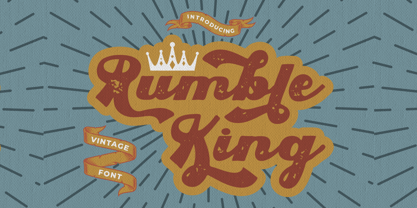 Rumble King is a vintage script font. As the name suggests, Rumble King is inspired by classic poster or vintage magazine. Besides that, I also combine it with a script style and it’s a little irregular in its shape style. I strengthen the vintage/retro impression with the character ligatures, there are 140 ligatures in Rumble King. But if you want to use Rumble King Font with a neater impression, you can disable this ligature feature. Rumble King is perfect for projects with vintage/retro and classic themes. But Rumble King is also suitable for logos, branding, greeting cards, invitation cards, advertisements, titles, healines, book titles, stickers, packaging, quotes, posters, t-shirts/apparel, billboards and others. Rumble King is also support multi language.
 - Native Stories by Prioritype,
$19.00 Native Stories - Classic Serif Font. A serif font with a stylish, classic feel is ready to work with your design projects. There are two styles, namely Regular and Italic. Perfect for applying to poster designs, branding, magazines, merchandise, logos and more. Features: Uppercase, Lowercase, Numeral, Punctuation & Multilingual. Multilingual contained: Afrikaans, Albanian, Asu, Basque, Bemba, Bena, Breton, Catalan, Chiga, Cornish, Danish, Dutch, English, Estonian, Filipino, Finnish, French, Friulian, Galician, German, Gusii, Indonesian, Irish, Italian, Kabuverdianu, Kalenjin, Kinyarwanda, Luo, Luxembourgish, Luyia, Machame, Makhuwa-Meetto, Makonde, Malagasy, Manx, Morisyen, North Ndebele, Norwegian Bokmål, Norwegian Nynorsk, Nyankole, Oromo, Portuguese, Quechua, Romansh, Rombo, Rundi, Rwa, Samburu, Sango, Sangu, Scottish Gaelic, Sena, Shambala, Shona, Soga, Somali, Spanish, Swahili, Swedish, Swiss German, Taita, Teso, Uzbek (Latin), Volapük, Vunjo, Zulu. Thanks!
 - Bestop Glistening by Bungletter,
$12.00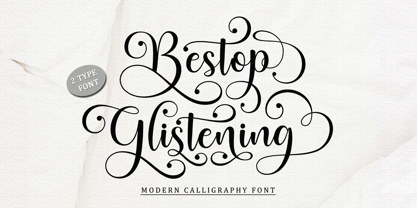 Bestop Glistening is a modern script font that features a classic and elegant touch. Bestop Glistening is attractive because it is sleek, clean, feminine, sensual, glamorous, simple and very easy to read, thanks to its many beautiful letter connections. I also offer a number of decent stylistic alternatives for some of the letters. Classic style is very suitable to be applied in various formal forms such as invitations, labels, restaurant menus, logos, fashion, make up, stationery, novels, magazines, books, greeting/wedding cards, packaging, labels or all kinds of advertising purposes. . . . . . Contains full set: -Has 2 font models, Regular and Bold -Uppercase -Lowercase -Alternative -Ligatures -Punctuation -Number -Multilingual support. need help or have questions let me know. I'm happy to help. Thanks & Congratulations on the Design!
 - Winden by Latinotype,
$26.00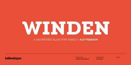 Winden is a geometric slab serif typeface based on the bestselling font Isidora https://www.myfonts.com/fonts/latinotype/isidora/ and inspired by early 20th century famous classic slab-serif typefaces. Characteristic features such as trapezoid shape serifs give Winden a modern, contemporary touch and the rounded edges of the Alt version make it look unique and special. This font consists of two subfamilies: Winden —classic, simple and functional— and Winden Alt (playful and contemporary), ideal for display use. Each version comes in 7 weights, ranging from Thin to Black, and includes matching italics— 28 fonts in all. Winden is the perfect choice for headlines, logos, branding, packaging, publications and websites. The full set contains 615 characters that support over 200 Latin-based languages.
 - Desirable Brust Texture by Alcode,
$20.00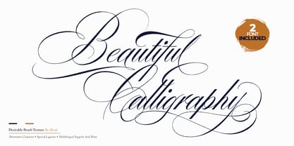 Desirable Brush Texture is a brush version of desirable solid released in 2019. With a classic style and an elegant touch, inspired by Italian women's handwriting and ancient manuscripts. These two fonts are carefully designed to work together in harmony making them perfect for wedding media, book covers, greeting cards, logos, branding, business cards and certificates, even for any design work that requires classic, formal or extravagant. Try Desirable Brush Texture, enjoy the richness of the features and let her fun and elegant excitement make you happy and enhance your creativity! You can use this font very easily. Multilingual Support And Special Ligatures If you are interested in the solid version, visit the link - https://www.myfonts.com/fonts/alcode/desirable-calligraphy/
 - Breve Display by DSType,
$50.00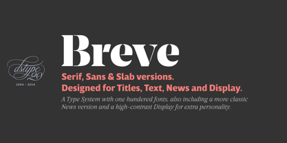 Breve was designed for use in editorial projects. Simple but with enough personality to stand by is own, in a quest for a more forceful and contemporary appearance. All the fonts in Breve superfamily, share the same exact structure, both in terms of anatomy and functionality. The Text versions provide a softer and warm feel to the typographic palette and is intended for use in much longer passages of text, while the Title versions are distinguished by non-descending letterforms, making the titles and headlines much more uniform and interesting. The News version is more classic, with ball terminals and classic proportions, while the Display is, somehow, the set of fonts we had to design: extra-black, ultra-contrasted, proud-display fonts.
 - Dahgean by Bungletter,
$10.00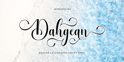 Dahgean is a modern script font that features a classic and Unique touch. Dahgean is attractive because it is sleek, clean, feminine, sensual, glamorous, simple and very easy to read, thanks to its many beautiful letter relationships. I also offer a decent number of stylistic alternatives for some of the letters. Classic style is very suitable to be applied in various formal forms such as invitations, labels, restaurant menus, logos, fashion, make up, stationery, novels, magazines, books, greeting/wedding cards, packaging, labels or all kinds of advertising purposes. . . . . . . . . . Contains full set: -4 Type Font -Uppercase -Lowercase -Alternative -Style -Ligatures -Punctuation -Number -Multilingual support. need help or have questions let me know. I'm happy to help. Thanks & Congratulations on the Design!
 - Didot Display by Canada Type,
$24.95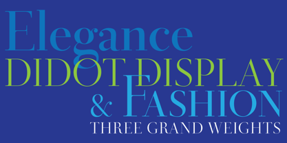 In spite of its name, this font family embodies the ultimate classic modern advertising typeface, rather than concern itself with revivalism or Didone authenticity. Naturally the spirit of the original Didot faces still exists in this family, but over twelve years of work on it have made it more fitting to the luxurious expression of our day and age, rather than nineteenth century Europe. Upscale and stylish, Didot Display is an essential tool for any designer involved in magazines, books, tasteful music, or overall luxury packaging that requires clean and large classic typography with an unmistakable modern spin. We recommend the use of Didot Display at 48 points and over. For 12-48 pt. use, check out its sister family, Didot Headline.
 - Breve Slab Title by DSType,
$50.00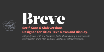 Breve was designed for use in editorial projects. Simple but with enough personality to stand by is own, in a quest for a more forceful and contemporary appearance. All the fonts in Breve superfamily, share the same exact structure, both in terms of anatomy and functionality. The Text versions provide a softer and warm feel to the typographic palette and is intended for use in much longer passages of text, while the Title versions are distinguished by non-descending letterforms, making the titles and headlines much more uniform and interesting. The News version is more classic, with ball terminals and classic proportions, while the Display is, somehow, the set of fonts we had to design: extra-black, ultra-contrasted, proud-display fonts.
 - Camy by Scholtz Fonts,
$9.50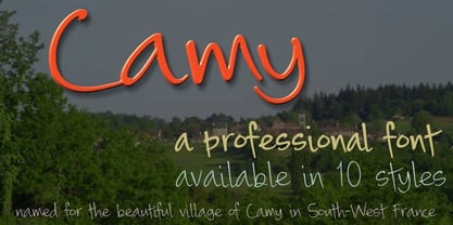 I wanted to create a "handwriting" font which could be used professionally. I have often needed such a font with a variety of weights and styles for a particular project and have had to resort to mixing fonts, creating a rather messy, amateur job. Camy is named for a little village in South West France where I did much of the initial work on this font. Camy is ideal for contemporary display work, comes in ten styles, and has a contemporary appeal with its casual, easy to read letters. Camy was designed as a total professional package for designers looking for a handwritten font suitable for all kinds of contemporary display work: the idea being that once you have the Camy Professional Pack you don't have to waste time searching for other handwritten fonts. The Family: LIGHT -- NARROW - light weight, condensed width, delicate line -- MEDIUM - light weight, delicate line -- WIDE - light weight, expanded width, delicate line NORMAL WEIGHT -- NARROW - of medium weight and condensed width - perfect for limited space -- MEDIUM - of medium weight -- WIDE - of medium weight and expanded width BLACK - for best readability -- NARROW - condensed width for bolder statements in small areas without losing legibility -- MEDIUM - for bolder statements -- WIDE - expanded width for bolder statements FAT -- WIDE - for maximum impact Use a combination of styles for product branding, book covers, invitations, greeting cards. The Camy combination works well for both headings and body text. Camy contains over 250 characters - (upper and lower case characters, punctuation, numerals, symbols and accented characters are present). It has all the accented characters used in the major European languages.
 - Eastman by Zetafonts,
$39.00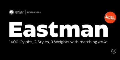 Discover the complete Eastman type family: Eastman Grotesque and Eastman Condensed! Designed in 2020 for Zetafonts by Francesco Canovaro and Andrea Tartarelli with help from Solenn Bordeau and Cosimo Lorenzo Pancini, the original Eastman typeface family was conceived as a geometric sans workhorse family developed for maximum versatility both in display and text use. The original wide weight range has been complemented with three more additional widths, to give you maximum control over the appearance of text in your page. While Eastman Compressed and Eastman Condensed behave as space-saving condensed families, Eastman Grotesque adapts the family design style to humanist proportions. All share a solid monolinear design and a tall x-height that makes body text set in Eastman extremely readable on paper and on the screen. Influenced by Bauhaus ideals and contemporary minimalism, but with a nod to the pragmatic nature 19th century grotesques, Eastman has been developed as a highly reliable tool for design problem solving, and given all the features a graphic designer needs - from a wide language coverage (thanks to over one thousand and two hundred latin, cyrillic and greek characters) to a complete set of open type features (including small capitals, positional numbers, case sensitive forms). The most impressive feature of all Eastman fonts remains the huge choice of alternate characters and stylistic sets that allows you to fine-tune your editorial and branding design by choosing unique, logo-ready variant letter shapes. Don’t want to lose too much time with the glyphs palette? Use the Eastman Alternate weights, thought for display use and presenting a selection of some of the more eye catching & unusual letter shapes available for the family.
 - Scriptuale by Linotype,
$29.00The Scriptuale family, which contains eight styles, is a contemporary upright calligraphic face. Designed by German designer Renate Weise in 2003, this family of typefaces speaks to the present, while at the same time reflecting on a lyrical past. The letterforms of the Scriptuale family are romanticized, they reference German calligraphic styles from the 19th and early 20th Centuries. For instance the design of Scriptuale's uppercase strays from the canon of classical proportion into romantic idealism. While the C and O are drawn according to the ancient quadratic proportions - almost twice as wide, optically, as the E or the L - the letter A is wider than would be expected, and the D narrower. These subtle differences introduce a different rhythm into text set in Scriptuale than Italic styles of calligraphy may offer. Scriptuale's Gs merit special notice: both the upper and lower case G lunge slightly forward, further enhancing the dynamic quality of the text. Also unique in Scriptuale's design is the lowercase width: the letterforms appear slightly condensed; they have large x-heights to compensate for this. In a delightful twist, the number 2's beak has been closed by drawing it full-circle, back into the stem: this references a style of letter design that was practiced, among other places, by artists from the old Klingspor foundry in Offenbach Germany. Typefaces constructed there easily captured the zeitgeist of the romantic period, but are less calligraphic than Scriptuale (e.g., Rudolf Koch's Koch Antiqua). A semi-serif face (like Prof. Hermann Zapf's Optima or Otl Aicher's Rotis Semi), some of Scriptuale's letters have serifs (D), and some do not (A). And although both the B and the E normally have the same "structure" on their left side, Weise has drawn them differently in Scriptuale. These strengthen the calligraphic-like quality of the family. Traces of the pen are easy to see in Scriptuale's design; it is a thoroughly calligraphic face. The eight typefaces in the Scriptuale family include Light, Regular, Semi Bold, and Bold weights. Each weight has a companion italic. Scriptuale is similar to one other contemporary calligraphic family in the Linotype portfolio, Anasdair , from British designer - Ankle by VType,
$8.00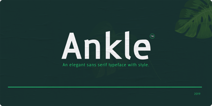 An elegant sans serif typeface with style. Fashionable, classy but still modern! Designed and shared by Vikers | RerdSystems. Perfect for logos, posters and more.
 - Oh Beloved by Nissa Nana,
$19.00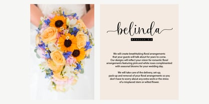 Oh Beloved is a beautiful script font with a classy, elegant, and modern look. It will add a personal touch to any design project!
 - Nolita by Sakha Design,
$12.00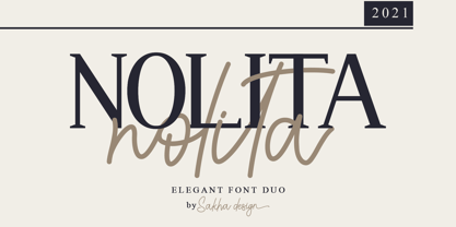 Introducing the Nolita Font Duo, a classy pair of script and serif fonts. Nolita offers beautiful typographic harmony for a diversity of design projects.
 - Valfieris by insigne,
$21.99A classy and elegant serif from DooleyType. Valfieris includes a number of advanced OpenType features, including alternates, ligatures, small caps and old style figures. - Mr Moustache by FaceType,
$19.00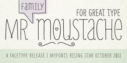 Handmade Mr Moustache™ is designed for Great Type. · Extra thin letters, condensed and with a handwritten touch, Mr Moustache gives a warm and friendly feeling to your layout. Mix upper- and lowercase letters according to your own liking. Furthermore, choose between a hand-drawn Unicase and an almost Unicase appearance. Use Mr Moustache Display for headlines and anything BIG. Use Mr Moustache Text for small type sizes or large volumes of text. · Mr Moustache is accompanied by frames, ornaments and dingbats in regular and solid, that can be layered for multicolored effects, providing endless design-possibilities. Please download MrMoustacheAccessories.pdf to get a complete overview. If you prefer the document in Indesign, please send an email to office@buerofliegenpilz.at · Mr Moustache offers OpenType features, including contextual alternates and stylistic sets. The font family works best with frame-based layout programs that support full OpenType functionality. · For Mr Moustache Frames please note: The glyph preview in your design application may be a bit confusing due to the size of the "letters". Please download the MrMoustacheAccessories.pdf which shows all possible frame parts. Here you can easily copy and paste all the parts you need. · View other fonts from Georg Herold-Wildfellner: Sofa Serif | Sofa Sans | Mila Script Pro | Pinto | Supernett | Mr Moustache | Aeronaut | Ivory | Weingut · Language Report for MrMoustache / 175 languages supported: Abenaki, Afaan Oromo, Afar, Afrikaans, Albanian, Alsatian, Amis, Anuta, Aragonese, Aranese, Aromanian, Arrernte, Arvanitic, Asturian, Aymara, Basque, Bikol, Bislama, Bosnian, Breton, Cape Verdean, Catalan, Cebuano, Chamorro, Chavacano, Chickasaw, Cimbrian, Cofan, Corsican, Croatian, Czech, Danish, Dawan, Delaware, Dholuo, Drehu, Dutch, English, Estonian, Faroese, Fijian, Filipino, Finnish, Folkspraak, French, Frisian, Friulian, Galician, Genoese, German, Gooniyandi, Greenlandic, Guadeloupean, Gwichin, Haitian Creole, Han, Hiligaynon, Hopi, Hungarian, Icelandic, Ido, Ilocano, Indonesian, Interglossa, Interlingua, Irish, Istroromanian, Italian, Jamaican, Javanese, Jerriais, Kala Lagaw Ya, Kapampangan, Kaqchikel, Karelian, Kashubian, Kikongo, Kinyarwanda, Kiribati, Kirundi, Klingon, Ladin, Latin, Latino Sine, Lojban, Lombard, Low Saxon, Luxembourgish, Makhuwa, Malay, Manx, Marquesan, Meglenoromanian, Meriam Mir, Mohawk, Moldovan, Montagnais, Montenegrin, Murrinhpatha, Nagamese Creole, Ndebele, Neapolitan, Ngiyambaa, Norwegian, Novial, Occidental, Occitan, Oshiwambo, Ossetian, Palauan, Papiamento, Piedmontese, Polish, Portuguese, Potawatomi, Qeqchi, Quechua, Rarotongan, Romanian, Romansh, Rotokas, Sami Lule, Sami Southern, Samoan, Sango, Saramaccan, Sardinian, Scottish Gaelic, Serbian, Seri, Seychellois, Shawnee, Shona, Sicilian, Silesian, Slovak, Slovenian, Slovio, Somali, Sorbian Lower, Sorbian Upper, Sotho Northern, Sotho Southern, Spanish, Sranan, Sundanese, Swahili, Swazi, Swedish, Tagalog, Tetum, Tok Pisin, Tokelauan, Tshiluba, Tsonga, Tswana, Tumbuka, Tzotzil, Uzbek, Venetian, Vepsian, Volapuk, Voro, Walloon, Waraywaray, Warlpiri, Wayuu, Wikmungkan, Wiradjuri, Xhosa, Yapese, Yindjibarndi, Zapotec, Zulu, Zuni
 - Ranelte by insigne,
$-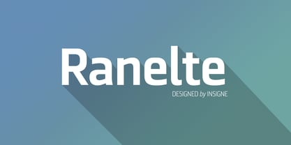 The beauty of a classic is that it never really goes out of style. The pure, simple elements which define its greatness only strengthen and solidify with time and exposure--elements like those that inspired Ranelte, the new sans serif from insigne design. While it pays homage to the enduring DIN series of the early-20th century, the new Ranelte is far from outdated. The classic style happily connects with its more modern side, incorporating a more pronounced curve than many of its contemporaries do. This accentuated curve helps pad the type against being cold or overly technical, especially with its inherent semi-modular form and geographic feel. In short, you end up with a good vibe at the intersection of high-tech and friendly. A versatile typeface, Ranelte is designed for headline use as well as print and web copy. Within this family’s three widths and eight weights (along with italics), the letter proportions remain easily readable through their tendency toward equalisation, while still avoiding strict monospacing. The typeface also features sophisticated typographical help in the form of OpenType features. Included in the set are case-sensitive types, fractions, super- and subscript characters, and stylistic alternates. It comes using a comprehensive array of old style and lining figures. All features comprehensively cover the Latin-based languages. Thinking about it again, a classic may never go out of style, but that doesn’t mean you can’t improve on it. A little adjustment can have a beauty all its own. So discover the tuning of Ranelte, and enjoy all the new things you can do with a classic.
 - Geopa by Baqoos,
$15.00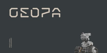 Geopa is a fractional conversant tech sans apt for headline, editorial, branding, packaging, printed materials and typographic applications. 200+ glyphs with ligatures and fractions.
 - KG I And Love And You by Kimberly Geswein,
$5.00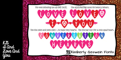 Conversation hearts! Use ALL CAPS for even lettering. For bouncy letters, alternate uPpEr and LoWeR cases to make the letters bounce up and down.