10,000 search results
(0.187 seconds)
- Jacob Riley by Magpie Paper Works,
$32.00 Jacob Riley is based on antique 18th century printers’ specimens and has been hand-illustrated with calligraphy nibs dipped in walnut ink. A goodly fellow, Jacob delights in uses varied and sundry including personal correspondence, rustic decor, graphic display and even amongst the pages of children’s books.
 - Carlotte by Rezastudio,
$9.00 Carlotte is a romantic and beautifully flowing handwritten font. It is suitable for logos, business cards, weddings, t-shirt designs, books, magazines, quotes, fashion, watermarks, invitations, signatures, packaging. This font is PUA encoded, which means you can access all of the glyphs and swashes with ease!
 - Pretty Letters by Supfonts,
$14.00 Pretty Letters will be perfect for wedding lettering, beautiful frame for your home, book covers, greeting cards, logos, marketing, magazines or anything that requires cute handwritten lettering :) What's inside: Multilingual support Cricut support If you have any questions, please contact me directly or in instagram @superdizigner
 - Abstract Style by Putracetol,
$24.00 Abstract Style is a abstract display font. This font has abstract and irregular shapes, sharp corners and messy shapes that characterize it. Abstract Style would be perfect for Logo, title, logotype, cover, headline, apparel, comic, cover books, cards, posters, or anything that requires a abstract creativity!
 - Bataler by Eldertype Studio,
$13.00 Introducing Bataler Vintage Font with elegent and professional style, perfect for adding some romance and charm to your designs. This script functions most strongly as a display or headline font. suitable for logo, logotype, branding,wedding, fashion, label, book cover, t-shirt, instagram post, and other
 - Streamlined Stencil JNL by Jeff Levine,
$29.00 Streamlined Stencil JNL is based on a photo of an Art Deco era shipping stencil saying "With Care" which was heavily influenced by the Futura Black style of lettering. The image was seen in the Steven Heller-Louise Fili book "Stencil Type" (published by Thames and Hudson).
 - Panoramic by Supfonts,
$9.00 Panoramic will be perfect for wedding lettering, beautiful frame for your home, book covers, greeting cards, logos, marketing, magazines or anything that requires cute handwritten lettering :) What's inside: Panoramic Script Multilingual support Cricut support If you have any questions, please contact me directly or in instagram @superdizigner
 - Ludema by JAM Type Design,
$18.00 Ludema is a very informal and adventurous typeface designed by JAM Type and inspired by the many children’s books and the video games of our youth. Perfectly adaptable to be used in such designs as well on shop floors, Ludema is simply a bit of fun.
 - Ramadhan Mubarok by Silverdav,
$18.00 Ramadhan Mubarok is a font with an Islamic theme, this font is suitable for your Islamic design needs, This font is perfect for products, clothing, t-shirts, food products, beverage products, book covers, magazines, posters, flyers, and other designs. If you have any questions please contact us
 - Shabon Dama by Abdulrhman Saeed,
$19.99 Shabon Dama is a cheerful fun Arabic typeface, it bridges the gap between formal and fun, thus keeping it readable. It fits well with video games rated for everyone, kids comics and books, and cheerful marketing. Featuring three weights: Light, Regular, and Bold. ARABIC CHARACTERS ONLY.
 - Show Card Elite JNL by Jeff Levine,
$29.00 One example in the 1919 instructional book “One Hundred Alphabets for the Show Card Writer” was for an elegant sans serif with a subtle Art Nouveau style to the letter forms. This is now available digitally as Show Card Elite JNL in both regular and oblique versions.
 - Oraden Naloch by madeDeduk,
$14.00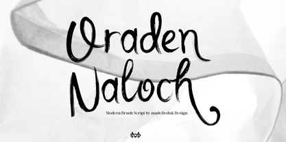 Oraden Naloch is a modern handwritten Brush. This font perfect for poster design, book covers, merchandise, fashion campaigns, newsletters, branding, advertising, magazines, greeting cards, album covers, and quote designs and more. Feature Uppercase & Lowercase Number & Symbol International Glyphs Multilingual support Alternative Ligature Hope you enjoy it.
 - Mifelin by Nathatype,
$29.00 Mifelin is a well-defined serif font. Serifs are small ornaments that appear at the ends of the lines of letters, giving them a neater, more structured appearance. The well-defined serifs in this font create an elegant and professional impression. This serif font has a balanced and harmonious proportion of height and width. The proportions ensure that each letter looks proportional and easy to read. The line of letters in this font has a smoothness and clarity that distinguishes each character. Sharp, clear lines give off a professional and organized impression. This clarity also helps strengthen the legibility of the font in a variety of design settings. This serif font with an elegant look has a classic style that remains relevant in modern designs. Despite having strong roots in traditional typographic design, this font is able to adapt to more contemporary design contexts and give it a touch of elegance and class. Even though it has a touch of elegance, this serif font still prioritizes good readability. Each letter is carefully designed to ensure that the text remains easy to read and understand for the reader. Prominent readability is the hallmark of this font. Enjoy the various features available in this font. Features: Stylistic Sets Ligatures Multilingual Supports PUA Encoded Numerals and Punctuations Mifelin is suitable for any designs that require a formal and official impression. This font is can be used in the design of books, magazines, reports, formal invitations, brand identities, and other design projects that require elegance and professionalism. Find out more ways to use this font by taking a look at the font preview. Thanks for purchasing our fonts. Hopefully, you have a great time using our font. Feel free to contact us anytime for further information or when you have trouble with the font. Thanks a lot and happy designing.
 - Megalito Slab ExtCond - Personal use only

- Guaruja Grotesk by Tipogra Fio,
$- Guaruja Grotesk is the first Tipogra Fio family for headlines & body copy. The grotesque form factor is much inspired in the Modernism movement from the mid of 20th Century but the Italic weight is a great cursive contrast aside the Roman ones so you can make very brutalist layouts or craft humanist projects, without losing the communication between all the family. Do not be afraid to type words with uppercase I and lowercase L because this last one has its own personality so do others glyphs like Italic lowercase G, Y and K and the straight corners in the Roman uppercase A, K, V, W, X, Y and Z. The same curves and corners are transferred to the numbers, symbols and so on. If your text is in a latin alphabet even though has lots of diacritcs, Guaruja may get it done! If you’re making a mathematical equation, it also can make it. If there’s a signaling project with lots of destinations, trust the arrows to help with together with the whole family.
 - Between by Monotype,
$40.99 Akira Kobayashi’s Between™ typeface comes in three main states. While different from each other, they all offer human-centered design to ensure that copy set in them is affable and approachable. An added benefit is the ability to transition “between” font designs, choosing different styles – or even individual characters – to create hierarchy, contrast or emphasis. Kobayashi designed the Between typeface in response to the current popularity of rounded, humanist sans serif designs over the cool grotesques of the 20th century. Between 1 melds industrial and humanist sans ethics. Between 2 represents a sans version of Kobayashi’s Cosmiqua® typeface, striking a balance between crisp and legible, organic and friendly. Between 3 is a freestyle sans with an uplifting sprightly mien. Between has 48 styles; each has eight weights of roman with its own italic counterpart. The family offers a large set of alternative glyphs and OpenType® features. A full interactive type specimen can be viewed here: http://www.monotype.com/fonts/between/ Featured in: Best Fonts for Logos
 - Glerosion by IbraCreative,
$17.00 Glerosion – A Retro Cartoon Sans Serif Font Glerosion, a retro cartoon sans-serif font, exudes a playful and nostalgic charm that effortlessly transports viewers to a bygone era. With its whimsical and rounded letterforms, Glerosion captures the essence of classic cartoon aesthetics, reminiscent of beloved animated shows from the mid-20th century. The font strikes a harmonious balance between a timeless simplicity and a distinct vintage flair, making it a versatile choice for a range of creative projects that seek to evoke a sense of lightheartedness and retro appeal. Glerosion’s characters possess a delightful quirkiness, embodying the spirit of yesteryear while maintaining a modern edge that lends itself well to a variety of design applications, from branding to editorial design and beyond. Glerosion is perfect for branding projects, logo, wedding designs, social media posts, advertisements, product packaging, product designs, label, photography, watermark, invitation, stationery, game, fashion and any projects. Fonts include multilingual support for; Afrikaans, Albanian, Czech, Danish, Dutch, English, Estonian, Finnish, French, German, Hungarian, Italian, Latvian, Lithuanian, Norwegian, Polish, Portuguese, Slovak, Slovenian, Spanish, Swedish.
 - Futura Headline EF Pro by Elsner+Flake,
$103.00 The design of Futura seems to be timeless. This typeface family which had been developed in 1926 by Paul Renner for the Bauer Type Foundry in the style of constructivism and as part of the Bauhaus movement, experienced, however, in the course of the past 90 years, repeated time-appropriate revivals which guaranteed its on-going popularity. The version of the Futura EF Pro contains the original character constructions which Dennis Megaw described as the “first designs of Futura” in 1938 in “20th century sans serif types, Typography no. 7” (See: Dr. Christopher Burke: Paul Renner, Princeton Architectural Press, New York 1998). What makes it exceptional is the extension into three weights: “Text”, “Headline” and “Index” which came about as part of a degree dissertation at the Hochschule für Bildende Künste (HFBK) in Hamburg. In this context, the accompanying documentation “Die Kritik der reinen Futura” (“The Critique of the Pure Futura”) by Katharina Strauer was published by the Materialverlag, Hamburg, in 2003. Some copies are still available at Elsner+Flake.
 - Fenomen Sans by Signature Type Foundry,
$38.00 Geometrical drawing of Fenomen Sans typeface goes back to the roots of the Bauhaus aesthetics and the entire architectural and design avant-garde of the 20th century. It is still a symbol of functional rationality, clean aesthetics in relation to shape, and of progressive thinking. Its popularity is timeless and permanent. The set contains eight basic alphabets of a square pattern, eight semicondensed, eight condensed and eight extremely condensed alphabets, all in Latin and Cyrillic alphabets. Every font of the family has four types of numerals, small caps and variant letters. The typesetting can fluently use all fonts simultaneously. The typeface originated between the years 2011–2014 and was subjected to a series of tests for the fluent legibility of narrow fonts even in extreme conditions. Narrow fonts provide this set with the maximum use also for newspaper typesetting. The typeface has an elegant, delicate design in thin fonts and sufficient legibility in bold. Mutual contrast produces creative tension. Font name acronyms described: SCN = SemiCondensed CN = Condensed XCN = ExtraCondensed
 - Corsica by AVP,
$19.00 Corsica is an all-purpose geometric sans-serif typeface of visually uniform stroke thickness. The design seeks to be reminiscent of classic 20th Century grotesques with a crisp modern appearance and opentype features that are now expected. Coverage includes most Roman languages, Greek and basic Cyrillic. Each font contains a standard set of features including fractions, small capitals etc. The family contains six weights, two widths and three lowercase size options, together with an italic variant for each. The are three standard 4-font families for each size variant and a further three corresponding families for Condensed versions. The versatility provided by this extensive family has many useful applications. In particular, the choice of small, medium and large lowercase letter sizes (SX, MX, LX) allows designers to select an appropriate style for suitable impact and legibility in different situations such as headlines, captions, signage, web menus etc. Although each of the three size options will work equally well in most situations, the middle size (Corsica MX) would generally be the preferred choice for lengthy texts.
 - Futura Text EF Pro by Elsner+Flake,
$103.00 The design of Futura seems to be timeless. This typeface family which had been developed in 1926 by Paul Renner for the Bauer Type Foundry in the style of constructivism and as part of the Bauhaus movement, experienced, however, in the course of the past 90 years, repeated time-appropriate revivals which guaranteed its on-going popularity. The version of the Futura EF Pro contains the original character constructions which Dennis Megaw described as the “first designs of Futura” in 1938 in “20th century sans serif types, Typography no. 7” (See: Dr. Christopher Burke: Paul Renner, Princeton Architectural Press, New York 1998). What makes it exceptional is the extension into three weights: “Text”, “Headline” and “Index” which came about as part of a degree dissertation at the Hochschule für Bildende Künste (HFBK) in Hamburg. In this context, the accompanying documentation “Die Kritik der reinen Futura” (“The Critique of the Pure Futura”) by Katharina Strauer was published by the Materialverlag, Hamburg, in 2003. Some copies are still available at Elsner+Flake.
 - Caminito by JVB Fonts,
$15.00 This fontface is inspired on Argentinean classic and traditional art craft named as Fileteado Porteño. Caminito is available in 10 layered styles for compose with multi combinations and a extra of ornaments. Highly recommended to be used for colorized titles and display texts. Fileteado Porteño is a type of artistic drawing, with stylized lines and flowered, climbing plants, typically used in Buenos Aires, Argentina. It is used to adorn all kind of beloved objects: signs, taxis, lorries and even the old colectivos, Buenos Aires’s buses. Filetes (the lines in fileteado style) are usually full of colored ornaments and symmetries completed with poetic phrases, sayings and aphorisms, both humorous or roguish, emotional or philosophical. They have been part of the culture of the Porteños (inhabitants of Buenos Aires) since the beginnings of the 20th century. One of the most highlighted and recognized artists nowadays is Alfredo Genovese, who does a great job of teaching and claim this art and craft. The name Caminito reminds the emblematic and iconic Buenos Aires neighborhood immortalized by Carlos Gardel in music, in the tango.
 - Futura PT by ParaType,
$30.00 Futura is a classic geometric sans serif, one of the crucial typefaces of the 20th century. It remains relevant today and is widely used in logos, headings, web and print. Futura was designed by Paul Renner for Bauersche Gießerei (Bauer) in 1927. The typeface is based on simple geometric forms and is close in the aesthetics to 1920s-30s constructivism and the Bauhaus. Futura PT is the most complete Cyrillic version of Futura. It’s a type system of 25 styles: 16 regular and 9 narrow, from Thin to Extrabold. Futura PT has linear and old style figures, subscripts and fractions. The typeface supports more than 100 languages: Western and Central European Latin and the Cyrillic-extended. The Cyrillic version of Futura was designed by Vladimir Yefimov in 1991–1995. He partially redesigned the typeface in 2007, making it a wholesome consistent system, and Isabella Chaeva added new styles. The typeface was released under the name Futura PT. Isabella Chaeva returned to work on Futura in 2022. The typeface has three new styles, old style figures and extended Cyrillic support.
 - Wolverton by Greater Albion Typefounders,
$10.00 The extensive Wolverton family was inspired by a turn of the 20th century luggage label designed by the London and North Western railway. The Wolverton family combines period flair and charm with respect for the modern need for legibility and purposefulness. The family has at its heart four Body text faces (regular, italic, bold and bold italic). These are complimented by three display text faces, offering upper and lower case letter forms, all offered in regular, oblique, bold and bold oblique forms. Four all-capital based display design are also included if offered in the same four style, making an extensive and flexible family suitable for a wide range of uses; everything from setting large amounts of text to large scale signage and poster work. Wolverton offers a unique blend of charm an modern flexibility, why not give it a try today? All faces include lining and old style numerals and are extensively kerned. Individual faces are all economically priced and substantial discounts offered for the purchase of larger sets of typefaces.
 - Ongunkan Sweden Dalecarlian Run by Runic World Tamgacı,
$50.00 The Dalecarlian runes, or dalrunes, was a late version of the runic script that was in use in the Swedish province of Dalarna until the 20th century.The province has consequently been called the "last stronghold of the Germanic script. When Carl Linnaeus visited Älvdalen in Dalarna in 1734, he made the following note in his diary: The peasants in the community here, apart from using rune staves, still today write their names and ownership marks with runic letters, as is seen on walls, corner stones, bowls, etc. Which one does not know to be still continued anywhere else in Sweden. The Dalecarlian runes were derived from the medieval runes, but the runic letters were combined with Latin ones, and Latin letters would progressively replace the runes. At the end of the 16th century, the Dalecarlian runic inventory was almost exclusively runic, but during the following centuries more and more individual runes were replaced with Latin characters. In its last stage almost every rune had been replaced with a Latin letter, or with special versions that were influenced by Latin characters.
 - Bernhardt Standard by Linotype,
$40.99Bernhardt Standard, which was designed in 2003 by Julius de Goede, is a flowing Bastarde script. Bastarde is one of the sub-categories of Blackletter typefaces. The term Blackletter refers to typefaces that have evolved out of Northern Europe’s medieval manuscript tradition. Often called gothic, or Old English, these letters are identifiable by the traces of the wide-nibbed pen stroke within their forms. Of all of the various sorts of Blackletter styles, Bastarde scripts are the most flowing, or Italic. The first Bastarde typefaces, cut in the late 1400s, were based on French handwriting styles, especially those styles popular in Burgundy. The flowing nature of Bernhardt Standard makes it similar to some other sorts of Blackletter typefaces as well. Bernhardt Standard, because of its handwritten roots, is also similar to Kurrent, a style of handwriting that was popular in Germany prior the 20th Century. Bernhardt Standard is a very calligraphic face, suitable for formal applications. This typeface would be an excellent choice for certificates or awards. The old style figures in the font allow for nice short settings of text as well. - Thesis Typewriter by Ana's Fonts,
$15.00 Thesis typewriter is a typewriter font collection that includes 3 typewriter fonts, sampled from three different thesis and reports from the 60s and 70s. Thesis Typewriter Weary has a textured look, while Thesis Typewriter and Thesis Typewriter Bold are smooth and include math symbols and Greek letters that will look great in digital collages. This collection is perfect for authentic vintage designs and digital collages, but will also look great in modern logo design, in branding and packaging.
 - Abiah by Creativetacos,
$15.00 Abiah Sans Serif Typeface is a minimal sans serif font, which contains 5 weights and It features unique and modern sans serif look and feel. Perfect for gorgeous logos, titles, web layouts and branding. It looks gorgeous in all caps with a wide-set spacing if you want to try a classy look, or beautiful on its own in capital and lowercase letters for something completely timeless. Included Features: Font Weight: Regular, Thin, Light, Bold and Distorted
 - Volcano by Match & Kerosene,
$40.00 Volcano is titling family of four is broken down into a gothic and island style. The island style features a "toothed" look that gives it a very unique look that can be used for a variation of project styles: Jungle, Island, Cruise, Vacation, Tiki, Retro, and Comicbook. The gothic style features a more industrial look and was inspired by gaspipe lettering styles. Each style features a different inline font file that can be layered over to produce striking headlines.
 - Side Note Variable by Jamie Clarke Type,
$199.00 Hello! I’m SideNote Variable. I specialize in: Annotations Headings Friendly dialogue Social media marketing Looking both smart & casual I’m perfect for descriptions and explanatory text. Use me to deliver tricky information in a helpful, reassuring manner. I look friendly and relaxed but professional enough to make you look awesome. I add personality to otherwise dry information making it fun and easier to understand. I come with all sorts of useful features, like emoji, arrows, and underlines.
 - Devil Kalligraphy by Lián Types,
$17.00Devil Kalligraphy was performed by Argentina Lián Types in 2007. The shapes of each caracter have a strong personality. It was based on antique writings. Devil Kalligraphy was inspirated in calligraphy styles. Gothic and Uncial themselves. A mix with lots of personal qualities. Devil Kalligraphy has ligatures which look evil. Ascendents and descendents were designed to look that way too. Kerning was designed taking into account the way calligraphers used (and still use) to write: Pattern looking. - Nonchalant by PizzaDude.dk,
$20.00 Nonchalant was inspired by an old Peter Sellers poster from the around 1970 (the year that I was born!) I wanted to keep the funky look of the 70's but update with a more modern 21st century look. That's how Nonchalant ended up looking like a hybrid between funk, grafitti and sans serif! Use Nonchalant for your posters, commercials, postcards, invitations, shout-outs or whatever needs something funky! Comes with an extensive amount of international letters!
 - Auzhera by Floves Type,
$39.99 Looking to take your design game to the next level? Look no further than Auzhera Brush Font! Handmade from a real analog fude brush pen, this stunning handwritten font boasts a unique brushed texture that adds a natural, hand-written feel to any project. From bold headlines to understated designs, Auzhera Brush Font’s versatility is unmatched. Crafted with meticulous attention to detail, this font is perfect for creatives looking to add a touch of personality to their work.
 - Black Forest by Haksen,
$12.00 Black Forest is a beautiful high fashion font duo that makes for gorgeous logos, posters, wedding invitations, blog posts, social media, and more!I love using them together with layer masks in Photoshop, so it looks like the script is running through the lines of the sans. The sans looks stunning. Black Forest Script includes ligatures to make everything look totally hand-done, and alternates for each letter. What Includes: Black Forest Script OTF Black Forest Sans OTF Thanks
 - Mega by BA Graphics,
$45.00A bold engraver type style with a Wall Street look. - Amfost by PizzaDude.dk,
$20.00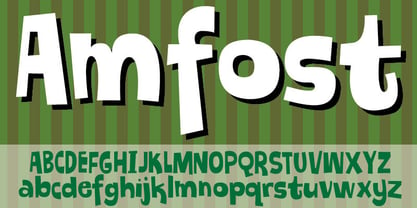 A comic font with that casual and funky pizzadude-look!
 - Serendipity by BA Graphics,
$45.00An arts and craft design with that trendy retro look. - KG Attack Of The Robots by Kimberly Geswein,
$5.00 This squared font is designed to look robotic in style.
 - Donut by Vladvertising,
$20.00 Yummy dönut ya? Does this type make me look fat?
 - Taxi MF by Masterfont,
$59.00 A tender serif font with a round and soft look.
