10,000 search results
(0.547 seconds)
- Maiers Nr. 8 Pro by Ingo,
$27.00 A handwritten ”font for technicians“ from ca. 1900. Very geometrical, rigid forms borrowed from the typical characteristics of Jugendstil / Art Nouveau. This script is found in an old magazine which was issued sometime in the years shortly before WWI. The original copy, produced by means of a galvanized plate, is just 7 centimeters wide. It served as the model for technical professions in which, at that time, the captions of drawings were still done by hand. ingoFonts has not only digitized this beautiful typeface, we have also extended it to a whole family. In »Maier’s Alte Nr. 8« special attention was given to ensure the ”uneven“ edges, typical of handwritten script, remained effectively noticeable even in the digitized form. As a result, this ”technical“ font retains a handmade touch, while »Maier’s Neue Nr. 8« is the clean version with exact contours. The Art Nouveau forms, which are characteristic for the period of origin around the turn of the century around 1900, look especially pretty. The high degree of abstraction also seems strange in Maier's No. 8, especially when the age of the original is known. It is generally assumed that it was not until the Bauhaus in the late 1920s that such "modern" typefaces were created. Maier's No. 8 is a generation older! So many of today's supposedly "ultramodern" typefaces look quite old in comparison. In addition to the original two weights, Light and Bold, the Maiers Neue Nr. 8 got a regular and a extra-bold weight. Furthermore, the Neue is also available in italics. Although this is only a slanted version, unlike common practice, it is inclined to the left. Maier’s Nr. 8 Pro is suitable for all European languages. It includes ”Latin Extended-A,“ for Central and Eastern Europe incl. Turkish, and even Cyrillic and Greek, too. The font includes several stylistic alternates as well as a number of ligatures.
 - Magnific by Din Studio,
$29.00 Calling all of you to be the part of this perfection. Exactly, Magnific strike the perfect balance between function and design. Magnific is a bold display serif font that expresses powerful yet welcoming vibe. It's modern, simple, easy to read, and works equally as well in header and body text-what’s not to love! Beside that, this font has more fascinating features that helps you maximize your design. Features: Ligatures Stylistic Sets Multilingual Supports PUA Encoded Numerals and Punctuation It works perfectly for for many design projects, such as poster, logo, book cover, branding, heading, printed product, merchandise, quotes, social media campaign, etc. Learn more about how to use it by seeing the font preview. Thank you for purchasing our fonts. Please don’t hesitate to contact us, if you have any further question or issues. We’re happy to help. Happy Designing.
 - Luzern by Gumpita Rahayu,
$- Inspired by the most common grotesque heights and boxed sans serif typefaces, Luzern Typefaces was built with low-mid contrast sans serif and was designed in quite tall caps height and lower x-height which represents the flavor of the dynamic typefaces and is subtle for the display typefaces. The typefaces comes with five weights, from light to extra bold, plus matching italics in each weights. And Luzern Typefaces is loaded with OpenType features such as some stylistic alternates in uppercase, case-sensitive forms, fractions, and another numerals features such as super and subscript characters, tabular figures, numerator-denominator, etc. It’s highly usable for display text titles such as editorial magazine headline, websites heading, poster, advertising, logo, also it works well for medium body text. It comes with more 400+ glyph support including more latin european diacritics language.
 - Scrapt Script by Brainware Graphic,
$12.00 ScraptScript is a classic casual script typeface inspired by signpainter and autotechno typography, developed with a little bit bold and contrast on horizontal stroke. Comes with a lot of opentype features, ScraptScript also supports multilingual covering Latin based language (Latin Extended-A & Latin Extended Additional), including Celtic, Sami, Maltese, Turkish, England, USA, Germany, France, Italy, Poland & etc. ScraptScript would be nice on logo design, posters, etc. with any design characteristic.
 - Ollie by Eclectotype,
$40.00 Meet Ollie, a casual signage script whose friendly, bouncy exterior belies a heart of sophisticated OpenType programming. This font is designed to make the most of OpenType savvy applications, and as such is recommended for professional design use. Or to put it another way: Make sure that contextual alternates and ligatures are always turned on! Ollie includes about 900 glyphs, many of which are automagical substitutions to keep the text flowing smoothly, and to pseudo-randomly pick different glyphs to avoid repetition. With contextual alternates turned on (as they should be by default), most lowercase letters will alternate between at least two different forms. The powerful OpenType programming makes the font itself ‘look back’ (up to eight characters) on previously used letters; typing “banana” will give you three different a’s and two different n’s (the last a is a special ‘end form’ character). The calt feature controls many other ‘special effects’ which all add together to give a smooth-flowing, hand-lettered look. These effects include start and end forms (and indeed, ‘loner’ forms) of many letters, which are automatically substituted in at beginnings or ends of words, or when the previous or next letter doesn't connect. Another special feature tests to see if there is room for the crossbar of t (or tt ligature) to extend further over the previous or next letter, or both, as is often the case. The last main effect of the calt feature is to substitute certain letters typed before any ‘e’ character, to make for a more natural connection (see the pe combination in ‘Eclectotype’ in the first poster). Ligatures should be on by default, for a much nicer looking tt combination, and a few others besides. The swash feature should be used sparingly (one glyph at a time, really) to apply a more extravagant look to g,j and y in the lower case, and quite a few of the upper case too. Oldstyle figures are included, as well as the lining defaults. Now to delve into the stylistic alternates... These are all included in the salt feature, or for uses of applications that support them, separated into stylistic sets thus: ss01 - (with swash feature on) L and G swashes get even swashier. ss02 - standard s changes to a connected script s form. ss03 - r takes on a script form. ss04 - z also gets a scriptier look. [the previous three sets also change any versions of s, r or z with diacritics] ss05 - a useful underline function. When enabled, typing two or more underscores will extend a cool underline under the previous letters. More underscores = longer underline. ss06 - the Polish script lslash changes to its more standard form. ss07 - E, S and B change to a more top-heavy alternate form. ss08 - An alternate form for A characters. ss09 - Alterative rounder forms of M and N. ss10 - An alternate ampersand. That about wraps up the features. Now all that’s left is for you to license the font and get experimenting!
 - Pistol Twelve JNL by Jeff Levine,
$29.00Pistol Twelve JNL is a novelty version of Jeff Levine's Twelve Oaks JNL wood type font, with the addition of random bullet holes in the upper case characters. The font design was suggested by fellow type designer Ray Larabie. Pistol Twelve JNL is a two-fold pun. Initially, this conveys the obvious fact that the design is a variation of Twelve Oaks JNL with bullet holes... but the name is also a play on an old, old joke. One person asks the other: "Would you care to join the Pistol Club? You drink 'til twelve and..." Well, you get the picture! - KT Quantum by Kotivoro Lab,
$11.00 KT Quantum is a Display Serif Typeface with 8 weight from Thin to Extrablack. Quantum adapted from 1911 old style serif typeface, Our mindset is to bring this historical typeface to this era, which is we have to redrawing that from the scratch and refining the shape to build the strong characteristic and make it ours. KT Quantum have total 434 glyphs and 203 language support. Quantum support latin basic, latin-1 supplement, latin extended A-B, Spacing modifier letters, and combining diacritical marks. This typeface have a bold characteristic with masculine and feminine effect in the same time, that's make this typeface suitable for your Headline and sub-headline, we don't recommended to use it as body text in small size, because it has a very large contrast and reduce the legibility and readability Whats Include: Webfont is available if you purchase the webfont option and we will send the file direct to download it. Enjoy & Happy Creating We're Here Tapinkco@gmail.com
 - Monarcha by Isaco Type,
$45.00 Monarcha is a serifed type family, with a strong influence of the baroque style, for extended texts. Its roman versions are slightly skewed, in the sense of reading, and its italics have unusual calligraphic features. Moreover, the contrast between thick and thin strokes is relatively smaller than in conventional serif fonts. These characteristics, coupled with its rounded shapes, give Monarcha a delicious fluidity and texture. Monarcha innovates and brings an exclusive OpenType feature to convert Arabic to Roman numerals up to 3999. It also has several other professional features - small caps, fractions, old style-, lining-, tabular numbers, scientific superior/inferior figures, stylistic sets and more than 40 different ligatures (standard + discretionary). The family consists of 8 styles, 4 weights - Book, Regular, SemiBold and Bold - plus their respective italic versions. The fonts are available in OpenType PS format and have extended character set to support CE, Baltic, Turkish as well as Western European languages.
 - Travelling by Ake,
$12.00 Travelling is a captivating display font designed to ignite wanderlust. Perfect for book covers, logos, and lettering, its bold and expressive design adds an enchanting touch to your creative projects. Embark on a typographic journey with "Travelling" and let your designs explore new horizons.
 - James Paul by Fajardo,
$9.00James Paul is a versatile display font based on the designer's handwriting. The letterforms are legible even at small sizes. When set bigger, this bold script reveals hairline ink trails that add rhythm to its lively forms. James Paul contains alternate glyphs and ligatures. - Super Ground by Genetype,
$16.00 Introducing Super Ground Typeface : Expand Your Design Horizons A wide sans serif font designed to amplify your design impact. Its spacious letterforms provide a canvas for bold ideas, from captivating headlines to eye-catching logos. Embrace the power of width and redefine your designs
 - Fun Trace by FunFont,
$17.00 FunTrace is font prepared to make it easier to teach children to recognize letters, numbers and practice writing. Designed to consist of 6 sub-families of fonts (Regular, Bold, Dashes, Directions, Outlines, and Guide Lines) supports the child's learning process in a fun way.
 - Wonder Stark by Letterhend,
$14.00 Wonder Stark, a script typeface that has strong and bold characteristic. This font is perfect to use in logotypes, badges, sign boards, posters, headline texts, apparel, wedding invitations, and more. It has many OpenType features like ligature, stylistic alternate, contextual alternate, swash, and support multilingual.
 - Auckland Script by Sarid Ezra,
$15.00 Auckland Script is a bold script that contains Uppercase, Lowercase, Numerals, Accents, Punctuation, 5 sets of alternates, Ligatures, Swashes, and also Underline. You can use it to make logos for branding, as well as for apparel design, and quotes. This font also already PUA Encoded.
 - Angela by Sealoung,
$25.00 Angela is a modern, bold and highly detailed serif font. This font is PUA encoded which means you can access all of the amazing glyphs and ligatures with ease! Add it confidently to your favorite creations and let yourself be amazed by the outcome generated.
 - Takidos by Prioritype,
$15.00 A bold and unique font is here to accompany your project, it can be applied to t-shirts, logos, video covers, book covers, food labels, and much more. See some of the previews above for an illustration. Features: -Uppercase -Lowercase -Numeral -Punctuation -Multilingual -Alternate Thanks.
 - Suntea by Atlantic Fonts,
$26.00 Flavored with a cool set of discretionary ligatures, and infused with delicate sweetness, Suntea is quirky and refreshing! Suntea Caps keeps it bold with all-caps and alternates for each character. Hand drawn and delicious, let Suntea quench your thirst for a friendly font.
 - Auliya Rahmah by Nandatype Studio,
$12.00 Auliya Rahmah is a bold serif font, and is trendy, contemporary in style. This font is PUA coded which means you can access all the glyphs and swashes easily! Fall in love with her incredibly versatile style and use it to create spectacular designs!
 - The Meez by TipografiaRamis,
$19.00 The Meez is a geometric, extremely extended sans-serif typeface strictly intended for use as a display font. The family consists of three styles: Light, Regular and Bold. In each weight, all letterforms retain the same width, which make it ideal for titling use.
 - Horror Metal by Letterara,
$14.00 Horror Metal is a brush font with a bold weight font that’s perfect for any horror or metal designs! As its name suggests, Horror Metal is not a font for the faint-hearted. In fact, using this metal-style display font requires courage and bravery.
 - Alterous Text by ZetDesign,
$15.00 Alterous is made for a bold impression on each of your works. This font can be used for title and text display so it is suitable for all types of designs, whether posters, flyers, banners, t-shirts, screen printing, magazines, newspapers, logos, and others.
 - SK Kalender by Salih Kizilkaya,
$9.99 SK Kalender is a sans serif and mono weighted font. It was designed by Salih Kızılkaya in 2020. The name of the font comes from the word “kalender”, which means humble, unpretentious and simple living. SK Kalender has three different versions, regular, medium and bold.
 - Fort Courage JNL by Jeff Levine,
$29.00 Fort Courage JNL is a bold slab serif wood type in the French Clarendon genre, taking its name as a tongue-in-cheek reference to the cavalry fort populated by a number of post-Civil War misfits in the 1960s television comedy "F Troop".
 - Chamy by Rosario Nocera,
$12.00 Chamy is a handwrite font family inspired by nature, sweets, comics and cartoons. It is available in three weighs from light to bold and two version: Solid and Sweet. Chamy is ideal for logo design, branding, titles, games, app and playful, cheerful and positive things.
 - Good Father by Andrey Font Design,
$9.00 Good Father is a cool, bold and modern display font. This font is PUA encoded which means you can access all of the amazing glyphs and ligatures with ease! Add it confidently to your favorite creations and let yourself be amazed by the outcome generated.
 - FF Motive by FontFont,
$29.99 German type designer Stefan Hägerling created this display FontFont in 1995. The family contains 3 weights: Light, Regular, and Bold and is ideally suited for music and nightlife. FF Motive provides advanced typographical support with features such as ligatures. It comes with proportional oldstyle figures.
 - Syaquita by Areatype,
$13.00 Syaquita Bold Display is a very versatile font.perfect for magazine images, to branding, poster design, and more. Thanks so much for looking, I really hope you enjoy it and please don't hesitate to drop me a message if you have any issues or queries :)
 - Alterous Display by ZetDesign,
$15.00 Alterous is made for a bold impression on each of your works. This font can be used for title and text display so it is suitable for all types of designs, whether posters, flyers, banners, t-shirts, screen printing, magazines, newspapers, logos, and others.
 - Revelio by ArimaType,
$14.00 Revelio is a cool, bold, retro-styled display font. This font is PUA encoded which means you can access all of the beautiful glyphs and swashes with ease! Add it confidently to your favorite creations and let yourself be amazed by the outcome generated.
 - Lino Stamp by Letters&Numbers,
$23.00 Lino Stamp is a geometrical, sans-serif typeface inspired by Futura Bold Condensed. To produce it, letters were carved into linoleum, inked and impressed on paper – giving a worn and distressed finish. Lino Stamp works particularly well for headings, short paragraphs and scrapbook-style designs.
 - Paint Hand by Letters&Numbers,
$18.00 Paint Hand is based on type drawn with an open acrylic paint tube. This bold vernacular typeface with rugged rounded edges will work well for headers and captions. Paint Hand is extended, containing West European diacritics making it suitable for multilingual environments and publications.
 - FT Graphitum by Foxys Forest Foundry,
$9.00 This is a powerful graphic rough sans-serif typeface with four different styles. Two linear, one with an aged texture and one basic, for your experiments. It makes a bold impression, feels like a strong simple typeface. Looks great in short inscriptions, headlines, posters.
 - Rockel by Din Studio,
$29.00 Rockel is a bold and authentic display font. It suitable for your any project that needs the outer space touch. And the font also suitable for branding project, t-shirt print and many more. Featured : Accents (Multilingual characters) PUA encoded Numerals and Punctuation (OpenType Standard)
 - Rupture by Letterhend,
$16.00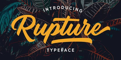 Rupture is a bold and modern script that will fulfil your design needs for casual themes such as logotype, quotes, watermarks, and more. This has many OpenType features like ligatures, stylistic alternates, contextual alternates, swash, and support for multi-language. It also already PUA Encoded.
 - Flashie by Gerald Gallo,
$20.00 Flashie is an all caps, very bold contemporary sans serif font. Under the lowercase keys are alternate characters for A, C, E, F, K, L, M, N, R, S, U, W, X, Y. It is ideal for headlines, titles, branding and small blocks of text.
 - Nervous by Trustha,
$15.00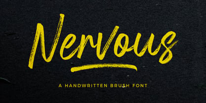 Nervous is a handwritten brush font with a bold twist. Nervous perfect for branding, logo, poster design, book covers, invitations, packaging, headers, greeting cards, apparel designs, fashion campaigns, newsletters, album covers, quote and many more. It will add an authentic spark to any creative project!
 - Aniara by Gustav & Brun,
$18.00 Aniara is a playful, happy and intergalactic font. Arriving in three different weights, Light, Regular and Bold. + the antagonist; the dark version without the space/counter. Aniara comes with laser shrinked upper case letters. It attacks with a alternative upper and lower case glyph. PoFF!!
 - Mercearia Antique by PintassilgoPrints,
$12.00 Mercearia is a bold typestyle font, based on a 1944 Brazilian book about alphabets and letterings styles. Combining squarish letterforms and soft edges with a handcrafted feel, Mercearia is best suited for display sizes and works like a charm from 18pt and up. Try it!
 - Scout Athletic Typeface by Hipfonts,
$18.00 Scout is a sharp, clean, and bold athletic font. It is a very versatile display typeface perfect for sports branding, emblems, jerseys, posters, apparel design, magazine headlines, labels and so much more. Scout is fully-kerned and ready to be used right out the box.
 - Blacker Spirit by Letterara,
$26.00 Blacker Spirit, a captivating blackletter typeface, combines bold elegance with distinctive character forms, ideal for elevating diverse design projects like product packaging, branding, and more. Its PUA encoding ensures effortless access to all the unique glyphs and swashes, promising remarkable results for your creative ventures.