10,000 search results
(0.043 seconds)
- Sweet Affogato by Stefani Letter,
$12.00 Sweet Affogato is a fun and cute display font. It has a playful style and great readability. It’s perfect for Christmas cards, branding, stationery, blog design, custom art, custom stamps, custom embossers, book, apparel, packaging, headline, or much more! It will add a unique feel and looks stunning to any design project! This font is PUA encoded which means you can access all of the cute glyphs with ease! It also features a wealth of including ligatures.
 - Christmas Holiday by Stefani Letter,
$12.00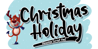 Christmas Holiday is a fun and cute display font. It has a playful style and great readability. It’s perfect for Christmas cards, branding, stationery, blog design, custom art, custom stamps, custom embossers, book, apparel, packaging, headline, or much more! It will add a unique feel and looks stunning to any design project! This font is PUA encoded which means you can access all of the cute glyphs with ease! It also features a wealth of including ligatures.
 - Endurant by Baps Patil,
$15.00 Endurant is a font inspired by futuristic conceptual arts from the late-20th century. The question it answers is, "What if someone in the late 20th century were to imagine a futuristic font?" Endurant is a brave, all-caps display font. Because of what it's inspired by, it is suitable for futuristic and retro-modern designs in the modern-day world. It can be used for graphic design, poster design, web and mobile UI design—and many other applications.
 - Latino Gothic by Latinotype,
$39.00 “Latino Gothic” is the result of two years of hard work by the Latinotype design team under the artistic direction of Alfonso García. We are really proud to present a superfamily with the magnitude and characteristics of "Latino Gothic". A very complete typographic font made up of no less than 90 styles. "Latino Gothic" offers a new interpretation of the original design totally focused on the needs of visual communication of the 21st century. «Latino Gothic» is designed to respond to the most varied communication needs thanks to its 5 widths and 9 weights, with their respective italics. 90 different styles make it the most versatile and complete gothic family on the market!
 - Campeche Variable by Latinotype,
$199.00 Campeche variable is an expressive yet functional typeface family. Seeking to express its beauty, it twists the conventions of classic typography when necessary. Campeche finds its inspiration in the grotesque typefaces of the late 19th century coupled with a typical Latin American playful sense that gives it a modern freshness. The initial form arises from the idea of expanding Seriguela, evolving along the way, becoming its own system with a unique personality. Campeche is designed according to today's visual requirements. Taking advantage of variable technology in 3 axes: width, weight and display. Campeche Variable is a typeface that provides versatility for almost any use. It can be used for packaging, editorial, branding... etc. The mixture of its possibilities can generate complex graphic parts or systems with different levels of hierarchy, without losing unity.
 - Kisba Nova by Identity Letters,
$29.00 Kisba Nova – A character actor that turns heads. Spiky serifs, soft ball terminals. All eyes on Kisba Nova: enter a typeface designed to arouse attention. Kisba Nova is that one guest who joins a party, and a murmur goes through the crowd. Kisba Nova is pure charisma. Opposites attract: Kisba Nova combines sharp wedge serifs and spiky spurs with round and soft ball terminals. Infuse this with a neoclassical stroke contrast and you get a thrilling typeface driven by visual extremes. Sure: Kisba Nova is a diva. But it’s a pro, after all. That’s why it comes in two optical sizes: Headline and Text. This makes sure it looks gorgeous in any situation. The Kisba Nova Headline subfamily is flaunts the trademark flamboyant looks and extravagant letters like f and k. They bring you all of the excitement of the showbiz in large applications—use it for sizes of 24 Pt. and more. The extraordinarily designed, thin and monolinear diacritics, punctuation marks, and symbols of Kisba Nova Headline add to this modern and elegant character. Kisba Nova Headline consists of seven weights from Thin to Black, offering plenty of possibilities to set headlines and titles. With about 600 characters per weight, it contains enough functionality for the demands of a skilled typographer. OpenType features, such as a large set of ligatures, extended language support, case-sensitive forms, different sets of figures, and arrows, enable sensational designs both in web & print layouts. The Kisba Nova Text subfamily comes with decreased contrast, more generous letter proportions, and wider spacing. Instead of employing flashy thin and monolinear diacritics, punctuation marks, and symbols, Kisba Nova Text aims for a more even texture on the page. It retains the true, elegant Kisba DNA while allowing you to set legible copy in sizes between 9 and 18 Pt. Nothing will distract your reader–Kisba Nova Text aims to please. Kisba Nova Text consists of seven weights from Thin to Black, offering plenty of possibilities to set body copy and subheadlines. With about 600 characters per weight, it contains enough functionality for the demands of a skilled typographer. OpenType features, such as a large set of ligatures, extended language support, case-sensitive forms, different sets of figures, and arrows, enable sensational designs both in web & print layouts. Kisba Nova celebrates the dual nature of softness and sharpness in a single typeface. It’s a character actor that turns heads.
 - Risotto Script by Estudio Calderon,
$69.00 Risotto Script is a sexy font designed by Felipe Calderón, it represents the texture, sound, smell and flavor of food that come in those interesting packages with different concepts. This font makes you want to eat it because it is designed with a unique texture like a lot of vegetables, it has flourishes that suggest herbs and country roots. Calligraphy with folded pen and food packaging were two of the inspirations to develop this project that will work well wherever it is applied. Risotto Script Pro has 672 glyphs that have the purpose of covering a lot of writing options with different results, by applying OpenType programming as: - Standard ligatures - Stylistics alternatives - Contextual alternates - Discretionary ligatures - Swashes - Terminal forms - Stylistic Set 1, 2, 3 and 4 - Initials (it includes leaves in some endings) NOTE: The X height is generous, in order to design signs to 8 and low size. You`d better get the “extras” for a more complete experience. Most of the Standard ligatures include Stylistics alternatives with detailed endings Multiple language options.
 - Hinnual by Jipatype,
$27.00 Hinnual เป็นฟอนต์ที่ผสมผสานระหว่างรูปทรงสี่เหลี่ยมและทรงกลมเพื่อสร้างสไตล์ที่ไม่เหมือนใคร ชื่อมาจากคำไทย 2 คำ คือ Hin แปลว่า หิน และ Nual แปลว่า อ่อน ผสมผสานองค์ประกอบที่แข็งและอ่อนนี้สะท้อนให้เห็นในแบบอักษร ซึ่งมีเส้นที่สะอาดตาและเส้นคมซึ่งถูกทำให้อ่อนลงด้วยมุมโค้งมน ฟอนต์มีให้เลือกถึง 18 แบบ มีตัวเลือกหลากหลายให้คุณได้เลือกใช้ Hinnual เหมาะอย่างยิ่งสำหรับใช้ในพาดหัวและพาดหัวย่อย ซึ่งลักษณะที่โดดเด่นสามารถช่วยดึงดูดความสนใจของผู้อ่านได้ เส้นสายที่สะอาดตาและสไตล์ที่เป็นเอกลักษณ์ยังทำให้เป็นตัวเลือกที่ยอดเยี่ยมสำหรับแบรนด์ โลโก้ และงานออกแบบอื่นๆ ที่ต้องการภาพลักษณ์ที่น่าจดจำ โดยรวมแล้ว Hinnual เป็นฟอนต์อเนกประสงค์และสะดุดตาที่ผสมผสานองค์ประกอบทั้งความแข็งแกร่งและความนุ่มนวล การออกแบบที่เป็นเอกลักษณ์ทำให้เป็นตัวเลือกที่ยอดเยี่ยมสำหรับนักออกแบบที่ต้องการสร้างผลงานที่น่าจดจำ Hinnual is a font that combines the square and rounded shapes to create a unique visual style. Its name comes from two Thai words - Hin, which means stone, and Nual, which means soft. This juxtaposition of hard and soft elements is reflected in the font's design, which features clean, sharp lines softened by rounded corners. The font comes in 18 styles, providing a range of options for designers to choose from. Hinnual is particularly well-suited for use in headlines and sub-headlines, where its bold and distinctive appearance can help to grab the reader's attention. Its clean lines and unique style also make it a great choice for branding projects, logos, and other design elements that require a memorable. Overall, Hinnual is a versatile and eye-catching font that combines elements of both strength and softness. Its unique design make it an excellent choice for designers looking to create impactful visual content.
 - Anehik by Twinletter,
$15.00 Introducing our newest font Anehik. Halloween fonts are perfect for making Halloween parties fun and full of fun. It’s also the perfect addition to your next various designs, making it easy to make something you can use to make people smile at night. Of course with this font your various design projects will be perfect and amazing, get a beautiful title and start using our font for your special project.
 - Morgana by Krismagraph,
$17.00 Hello, Start good day for new font! present to you, Morgana! A unique modern & classic ligature font that is a mix of old and new. It's soft curves mixed with high contrast glyphs lend it self to both feminine and masculine qualities. Equipped with epic ligature, great in layout design for quotes or body copy, and will be unique to the use of the logo design. And also multilingual support.
 - Annexxus by Kustomtype,
$25.00 Kustomtype's 'Annexxus' font is a serrif font family with a regular & oblique version. It contains all upper & lower cases. The 'Annexxus' family is coordinated into letterforms, metrics, and weights to work better together. Why still looking for old school types for your posters, text, design, artwork, headtext, editoral design, magazines, etc.? Dress up your graphic work with 'Annexxus! A good font does not have to be perfect to be wonderful!
 - Katherine by ParaType,
$30.00Script font developed for ParaType in 2007 by Gennady Fridman based on informal handwriting. The handwriting belongs to a woman of middle class that have found her place in the life and does not pretend to get more. It produces a feeling of reliability and promptness. The font can be used for advertising of house goods and in other printed materials where it's important to show informality and personal attitude. - Serca by Adam Ladd,
$25.00 Serca is a structured geometric sans serif font family with normal and condensed proportions. It is professional and precise, open and legible. The modern, clean design lends itself to being a workhorse for a variety of applications—branding, advertising, websites, mobile apps, logos, magazines, etc.—able to be used in both small body text and large headlines alike. The vast range of weights gives plenty of options to choose from.
 - Al American Legend by Aluyeah Studio,
$125.00 Hello Aluyeaholics! So we tried playing with the script, we hope you like it. American Legend is inspired by vintage handwriting. Comes with 220+ stunning alternates and ligatures. Super easy to use alternates and ligatures. Super Easy to Use alternates - You can easily call alternates using special combination like a.2 a.3 b.5 e.r a.r l.l etc. To get results like the preview just type Ame.rican Leg.9end
 - Taurunum Ferrum by Kostic,
$40.00 Taurunum Ferrum is a version of Taurunum family, made to feel like it’s been cast in iron or cut out of steel plates. It is meant to be used in a bold display setting where raw and strong look is a priority. The Iron style has an medieval (blackletter) flavour, while Steel has more of a contemporary look. Taurunum Ferrum has a character set to support Western and Central European languages.
 - PF Das Grotesk Pro by Parachute,
$79.00 Das Grotesk was inspired by earlier nineteenth-century grotesques, but it is much more related to American gothic designs such as those by M.F. Benton. Due to their pure geometric structure, most grotesque typefaces tend to have a rather monotonous and lifeless appearance, thus failing to express the ideals of the modern creed. Das Grotesk on the other hand is a lively design with several distinguishable characteristics which attract attention when set at large sizes, whilst they become subtle and blend evenly at small sizes, fostering a neutral identity. This is a very legible and space-saving typeface with a narrow structure. It was designed with slanted curved ends and sheared terminals applied on several straight strokes. It has two-storey ‘a’ and ‘g’ but includes single-storey alternates. The family consists of 14 weights ranging from Extra Thin to Black (including true-italics). It provides simultaneous support for Latin, Cyrillic and Greek and is loaded with several advanced typographic features such as small caps. Download its complehensive PDF Specimen Manual for further details.
 - Manzello by Tour De Force,
$35.00 To start with one personal fact: I really like to listen Rahsaan Roland Kirk. He was a multi-instrumentalist, real grandmaster and unique jazz virtuoso. The way he improvised and walked through variety of different music influences are admiring. One of things he liked is to modify instruments, so he modified soprano saxophone and got an instrument called manzello. When I was looking for good name for this typeface, it came on my mind that Manzello could be the perfect one. It has the symbolic background from the instrument and theoretically in my head, it's imagined as typeface that rely on stable classic examples, but graphically designed and modified to match modern standards. Manzello contains a dose of characteristics of display typefaces with terminals that aren't perfectly rounded, high contrast between stems and good balanced Italics with elements of fine calligraphy. It's a small font family, something what I was always looking for to have as first text solution in my web and graphic projects.
 - Roves by Andrew Footit,
$12.00 Roves is a font family dedicated to exploration, adventure and the early merchants of history. The word rove means “a journey, especially one with no specific destination; an act of wandering”. the family consists of three Stencil versions each with a Regular and Bold weight as well as two Sans versions each also with a regular and bold weight, this is a total of 10 different options to work with. When combined these two fonts create great looking typography that compliment each other but each also strong enough to be used on their own. The Roves family is a display font with a great rust vintage feel to it which gives the user an authenticity when working with typographic projects. Roves has been created with the designer in mind, to create with and explore the different options with in the family.
 - Mixa by Fontfabric,
$29.00 Neo-grotesque Sans Serif mixed with the classical handwritten Script in slanted geometric shapes - that’s the way Mixa was born. Those two faces of the new font family makes it as much as unique and recognizable. When you’re using the Capitals only nobody will suspect that there is script hidden in the lowercase. That’s why all eight weights can be combined perfectly with wide list of classical Sans Serif, Slab Serif and Serif typefaces. The font offers wide range of ligatures to ensure smooth readability and beautiful letter combinations. The decorative swashes in some of the Capitals presented as a stylistic sets give unique touch in any design. Mixa has it’s own style and personality, but without lacking of legibility.
 - FS Truman by Fontsmith,
$80.00 Beyond broadcast Like Truman Burbank, the star of The Truman Show, FS Truman was born for TV. You’ll know it from Sky One’s on-screen trails and announcements, but it’s just as at home in other media. Its starting point was the skeleton of a highly legible, space-saving, corporate font with some of FS Dillon’s geometric discipline built in. Its distinctive tone of voice and “ownability” are in its boxy but friendly shapes, and characters with hybrid features. FS Truman’s weights and widths were honed to work at TV screen resolutions. A face for TV it may have been, but this is a font that works on every level, on screen, in print, in headlines, in listings, in longer text, in tight corners and open spaces. The space-saver Compact, condensed but crystal clear, FS Truman comes into its own where a lot needs to be said in not a lot of space. Its letter spacing allows the type room to breathe, even at small sizes, while its fulsome x-height and diminutive descenders pave the way for tighter leading. A natural for headlines and titles over three or four lines. “Hybrid” features With every font, Fontsmith look for crafty new ways to imbue letterforms with a consistent character. The idea with FS Truman was to introduce “hybrid” features. In open letters such as “c” and “s”, for example, the top terminals have straight, vertical cuts while their lower terminals have a more angular, cursive finish. Boxy, spacious forms with unusual curves and angles create not just highly legible and efficient letters but strongly distinctive ones, too.
 - Rethink by Viktor Nübel Type Design,
$35.00 The robust and contemporary sans-serif typeface Rethink, comes with strong characteristics. The typeface is made for work in text as well as in display. It features nine weights in two styles, including Small Caps, a set of contemporary OpenType functions, multiple figure sets and a rich language support. Rethinks main characteristics are the non-straight stroke endings and a slope that might come in an unexpected direction. It brings a bit of movement to the baseline and some attraction to the shapes in bigger sizes. These details are designed to ‘disappear’ in smaller sizes and to not disturb a reading process. Rethink was designed with the idea to help spreading bold ideas ond strong opinions, to support the work of activists in contemporary movements, to design statements with impact and meaningfulness.
 - Gorda by Zeptonn,
$10.00 Oh yeah! Gorda is a huge, bold and all-caps typeface. It's rounded style makes sure it's nice and friendly, even though it can be used in (very) large sizes. With Gorda you can produce a powerful and contemporary style. The smaller stroke width of the symbols and punctuation marks makes sure legibility is not an issue, as is often the case with fat type. Gorda is suitable for all sorts of uses, especially posters, headlines, artwork and logos. Use it to draw attention, in a quirky and distinctive way. Gorda has been designed and developed by Zeptonn.
 - Janice by Canada Type,
$24.95 Janice is a revival and expansion of a 1960s Mecanorma film type called Putty Bold. It’s thick, flowing, happy and oozes psychedelia. Unlike many art nouveau/hippy faces of the era, this font comes with a lowercase that expands its functionality to quite a few applications, like design aimed at kids and young adults. It’s also one of those fonts that feel right at home being warped, scaled and manually squeezed for packaging and poster design. Janice comes with over 400 glyphs. It contains a few stylistic alternates and support for the majority of Latin languages.
 - Suco De Laranja by Hanoded,
$20.00 I like orange juice. Come on, who doesn't? Orange juice is the drink of heroes; it's the elixir of life; it's the gods' own ambrosia. Suco De Laranja means orange juice in Portuguese and I named this font thus, just because I love the stuff! Suco De Laranja is a very narrow, very gentle typeface with a rough edge. It comes in a variety of languages and guess what? I have added Cyrillic as well. Just to be complete. So there you have it: a font named after a juice. Take a sip and enjoy! На здоровье!
 - Fiesta De Los Muertos by Mvmet,
$10.00 Fiesta De Los Muertos is a fun and festive display font! Not only can be used for Halloween theme needs, you can use it too for other things for daily needs. Use it on t-shirts and clothing, book designs, greeting cards, stickers, posters, banners, or anything that needs a fun touch. Try it to create fabulous designs and feel the fun and cool vibes with it!
 - Notorious by W Type Foundry,
$15.00 Notorious is a brush script typeface with features that come from gestural calligraphy plus a touch of personality, therefore, it delivers wider freedom in both rhythm and composition of words. As a result, this typeface is highly suitable to convey expression in a most natural way. Notorious is composed by two styles; the first one is black and the other one textured. Both generate a more natural look when it comes to writing. Every weight includes alternative characters, ligatures, numbers, final forms, swashes, extras and catchwords giving you more options in terms of fostering your creativity. If you are looking to create expressive and gestural messages Notorious is your ideal choice.
 - Colophon by Roy Cole,
$34.00 During development of Colophon 30, the base font of the typeface family, two requirements emerged; namely that it should demonstrate good legibility and robustness when used for text composition, and where individual characters become more apparent, as in much larger sizes, these should appear well formed. Colophon 60 and 90 progressively increase in x-height to allow the counters to retain openness. The italics lean towards informality, this being apparent in the descender tails. On account of its neutrality there are few instances where the use of Colophon would be inappropriate; a quality that can also be attributed to Roy Cole's other typeface families: Lina, Zeta and Coleface.
 - Mode by Daggertypo,
$24.00 Mode is a typographic experiment exploring how same sans serif form adapts to different circumstances and what are the possibilities in variations of Thin / Black, Contrast / Negative contrast. Two main groups are Mode 0 (with rounded shapes) and Mode 1 (with angular shapes). Each of them varies from Thin to Black in six cuts, in the same manner it varies from contrast shapes to negative contrast. Mode comes in total of 72 cuts regular and italic, it speaks majority of Latin based languages and is equipped with smcp, c2sc, Old style and all caps numerals. Mode is made by DAGGERtypo during a period of 2019/2020
 - HS Hadeel Serif by Hiba Studio,
$50.00 HS Hadeel Serif is a versatile display typeface designed for use in titles and graphic projects that support Arabic, Persian and English. It draws inspiration from the modern kufi style and features a unique blend of sharp and curved lines that lend a beautiful and geometric structure to each character. Based on the original HS Hadeel typeface, HS Hadeel Serif includes a serif on some of its characters to provide a more traditional look. Two weights are available for this typeface: Regular and Bold. HS Hadeel Serif represents a valuable addition to Arabic typography, offering designers a visually striking and flexible option for their projects.
 - Rockness by MlkWsn,
$19.00 Rockness is a brush script that is written casually and quickly. Letters are made with brushes on paper. Then scanned and carefully drawn into vector format. That is why Rockness has charming, authentic and relaxed characteristics. It has 2 styles, regular and slant variations, with a more natural look to your text. You can activate Ligature and Alternates in the OpenType panel to make these two styles. It also has many alternatives and underlines that make your text and design more interesting. Rockness perfect for homeware designs, branding projects, logo design, quotes, product packaging - or simply as a stylish text overlay to any background image
 - Melina BT by Bitstream,
$50.99Melina Plain and Melina Fancy are characterized by graceful lines, strong contrast and nostalgic overtones. These typefaces are patterned after two members of a type family named Greco, released by Fundición Tipográfica Richard Gans of Madrid, Spain, in the 1920s. Melina Plain is a refined version of Greco Bold, and Melina Fancy is based on Greco Adornado, with the notable addition of a lowercase, which was not a part of the original design. Melina is based on two typefaces (ca. 1920) from the Fundición Tipográfica Richard Gans in Madrid, Spain. Nick Curtis first found Greco Adornado in a type specimen at the Library of Congress. It was a cap only design. He made a cut of the original (Melina Fancy) and created his own lowercase, and many other characters to support contemporary character sets. Later he came across Greco Bold, which had a lowercase, but he chose not to use it and instead, adapted his Melina Fancy to create Melina Plain. - Isidora Soft by Latinotype,
$26.00 Isidora Soft is a new version of Isidora —a 2016 MyFonts Bestseller. Its rounded, soft terminals give it a friendly and expressive look, and its modern and contemporary style, small x-height and classic proportions make it an excellent choice for headlines, logotypes, branding, books, magazines, motion graphics, and use on web and Tv. Isidora Soft consists of two 7-weight versions: one regular and one alternative which is more expressive and playful compared to its counterpart. Both versions include matching italics, resulting in a total of 28 styles. Isidora Soft contains a set of 452 characters that support over 200 Latin-based languages.
 - Allister Rough by Ksenia Belobrova,
$29.00 Allister Rough is a handmade font family based on Oldstyle English and Transitional fonts, modern typography and lettering. It’s a kit of joyful fonts that can be used for cards, posters, books, t-shirts, etc. Allister Rough has three font Styles and Extras. “Decor 1” is an expressive font which has three sets for each letter. “Decor 2” has two sets and “Caps” has Capital letters and Small Capitals. So you can choose what you need or combine Styles to create different typography compositions. All contextual alternates are built into the ‘Liga’ feature and duplicated into the ‘Calt’ feature. So when you work with the fonts, please make sure that ‘Liga’ or ‘Calt’ is turned on. Font family also supports OpenType features like Titling, Oldstyle Figures, Fractions, Ordinals. Please take a look at the User Guide in the Gallery.
 - WildWords Lower by Comicraft,
$49.00 WILD WORDS! WILD WORDS! Buh-Buh-Buh-DUH-DUH! WILD WORDS! Wild Words never lose it! Wild Words never chose this way… Wild Words never close their eyes… Wild Words always sh-- I'm sorry? WILD WORDS is NOT a song by Duran Duran? Really? But I got myself the Simon Le Bon ’80s haircut and my MAD MAX outfit and everything… It’s a font from Comicraft? Now available in lower case? Well that’s good too, right? Comicraft fonts are created BY comic book letterers FOR lettering comic books. Accept no substitutes! See the family related to WildWords Lower: Wild Words
 - Mukadua by Letterhend,
$10.00 Mukadua consists of two fonts: serif and script. Mukadua means "two-face", and so it can be used in a happy and fun concept, but still looks great in dark, horror, or scary concepts! The main font is a serif font type with unique bouncing baseline, includes upper and lowercase characters, punctuation, numerals, and multilingual support. It also has OpenType features like stylistic alternates and ligatures.
 - Bountiful Signature by Arendxstudio,
$17.00 Bountiful Signature is a high energy signature-style script font guaranteed to make a big impression. Digitally hand-drawn, it's super-clean smooth flow and high-intensity pen strokes make an unmistakeable impact in logo/branding projects, large header text and product packaging. Features: 1.Uppercase & Lowercase 2.Numer & Punctuation 3.Multilingual support 4.Ligatures 5.Alternates There it is! I really hope you enjoy it - comments & likes are always welcome and accepted. More importantly, don't hesitate to send a message if you have a problem or question. Now just read this, go there and make it happen :)
 - Medina Gothic by Design is Culture,
$39.00 Medina Gothic is a three-weight sans serif inspired by Latin American moderne. It was designed in response to the 2002, Altos de Chavon design conference in The Dominican Republic, which celebrated utilitarian driven gestures in graphic design. "There’s a rigor to Medina Gothic that takes care of all sorts of tenets of a hard-working, highly legible, objective font. But at the same time, it’s human. All the curved terminals and open counter forms make for a sort of kindness. For all the discipline, it doesn’t sacrifice its friendliness." – William Morrisey, Professor of Typography, Parsons The New School for Design.
 - Hiroshima Gyoshi by 38-lineart,
$14.00 Hiroshima Gyoshi is a handwritten font inspired by ancient Japanese calligraphy. The thick and random strokes look very prominent and play with negative space. You will feel the rhythm in irregularity. it is a bold handwritten font, carefully handcrafted to become a true favorite. Its casual charm makes it appear wonderfully down-to-earth, readable and, ultimately, incredibly versatile. This fantastic font is best suited for headlines of all sizes, as well as for blocks of text that have both maximum and minimum variations. Whether it’s for web, print, moving images or anything else – Hiroshima Gyoshi will look spectacular
 - IM FELL French Canon - Unknown license

- Basquiat Irregular by Cuda Wianki,
$29.00 Basquiat Irregular is a font inspired by graffitti and children's writing. Contains 3 alternative characters for each letter, multilanguage support including cyryllic. It's perfect for creating artistic publications, writing quotes and many other designs. The family also has two fonts with frames, lines and ornaments. Its apperance is rough, hand painted and casual. Perfect for music and street art designs. Frames and lines are created by typing uppercase letters for starting or ending frame or creating an arrow and lowercase letters for typing lines.
