10,000 search results
(0.047 seconds)
- Satisfactory by Fauzistudio,
$12.00 Satisfactory Craft retro vintage typeface. It can be used to create almost all types of design projects. Just use your imagination and some graphic design set, your project will become more alive and look great. Implementing alternative Contextual features makes it easier for all people to use. Hope you enjoy. Intuisi Creative
 - Flash ND by Neufville Digital,
$29.60 Flash was designed in 1953 by the designer Enric Crous-Vidal, as part of the graphic trend “Grafía latina”. It is a three-dimensional typography, which seeks optical and relief effects, similar to those of wood engraving. It gives a handcrafted look to any printed piece. Flash is a Trademarks of BauerTypes SL
 - Kidszones by Krakenbox Studio,
$15.00 Kidszones is a cute and fun display and decorative font. Its cool, playful & childish look makes it a fantastic choice for fashion, signature, album covers logos, branding, magazines, social media posts, advertisement, and many more. Use this display font to add that special cool touch to any design idea you can think of!
 - Arabhella by Krakenbox Studio,
$15.00 Arabhella is a cute and fun display and decorative font. Its cool, playful & childish look makes it a fantastic choice for fashion, signature, album covers logos, branding, magazines, social media posts, advertisement, and many more. Use this display font to add that special cool touch to any design idea you can think of!
 - Merry Script by Letterara,
$14.00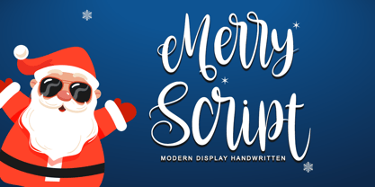 Merry script font that is simple and unique looking. Its beautiful charm makes it appear wonderfully down-to-earth, readable, and, ultimately, incredibly versatile. This will add a fun and friendly touch to any of your projects! This font is PUA encoded which means you can access all glyphs and sweeps easily.
 - Stellie by Olivetype,
$18.00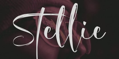 Stellie is a stylish script font with unique textures. Embrace this eye-catching script font to create something truly unique. With its versatility, you can use it on anything from logos, web design, and social media posts to branding material and more. Give your designs the wow factor with Stellie Script Font!
 - Expletive Script by Barnbrook Fonts,
$50.00 Expletive Script is a modular font based on a circular form. Its characters can sit above or below the baseline to create unusual display typography and complex repeating patterns. Expletive Script has a playful spirit and simple geometry that makes it suitable for a variety of uses from fine detailing to expressive headlines.
 - Endymion by Greater Albion Typefounders,
$10.00 Endymion is a Tuscan display face that speaks of traditional fairgrounds and circuses, or 19th century poster design and even of the wild west. Its name derives from its ogee curves, which have been likened to the bluebell (Endymion) flower. Bring a sense of lively fun to your next design with Endymion.
 - Anglina Farmhouse by Letterara,
$14.00 A simple Anglina Farmhouse font looks unique and classy. Its beautiful charm makes it look absolutely stunning, easy to read, and, ultimately, incredibly versatile. This will add a fun and friendly touch to any of your projects. This font is PUA encoded which means you can access all the glyphs and sweeps easily.
 - Floreste by Krakenbox Studio,
$9.00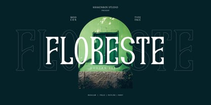 Floreste is a modern display font. Its elegant, classy, and modern look makes it a fantastic choice for fashion, apparel projects, signature, album covers logos, branding, magazines, social media posts, advertisement, and many more. Use this display font to add that special cool touch to any design idea you can think of!
 - Bonaro by Sabrcreative,
$20.00 Introducing the Bonaro Vintage Retro Serif All Caps Font, a versatile collection that brings timeless elegance and a touch of nostalgia to your design projects. With its 10 distinct styles, this font offers a treasure trove of possibilities, making it an essential asset for designers seeking to infuse their work with vintage charm.
 - Andralis ND by Neufville Digital,
$45.25 Andralis was designed by Ruben Fontana in tribute to the designer Juan Andralis. Its handcrafted, strong and robust appearance, maintains at the same time a friendly and human tone. It was specifically designed to perform well in long texts, also offering excellent results in headlines. Andralis is a Trademark of BauerTypes SL
 - Nemorosa by Octotypo,
$28.00 Nemorosa is a versatile font family. Its design has a retro sweet sixties feeling with a geometric touch. It comes in six weights and italics and a selection of alternates to mix-and-match and bring a different perspective to your texts and logos design. Perfectly suited for publishing and display use.
 - Christmas Script by Letterara,
$16.00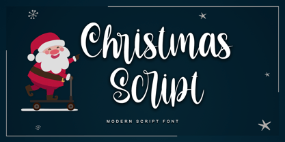 Christmas script font that is simple and unique looking. Its beautiful charm makes it appear wonderfully down-to-earth, readable, and, ultimately, incredibly versatile. This will add a fun and friendly touch to any of your projects! This font is PUA encoded which means you can access all glyphs and sweeps easily.
 - Northgate by Stringlabs Creative Studio,
$25.00 Northgate delivers an incredibly bold and unique font experience. This script will make a great addition to any crafter’s toolbox. Northgate Path is a flowing and elegant handwritten font, created with the help of a brush pen. Get inspired by its unique and beautiful style and add it to your favorite designs!
 - Sabeth by Craft Supply Co,
$20.00 Sabeth - Elegant Typeface perfectly captures its essence, combining opulence, elegance, and timeless allure. It creates a captivating statement of refined luxury. This typeface is ideal for greeting card, packaging, brand identity, poster, or any purpose to make your design project look eye catching and trendy. Feel free to play with this typeface!
 - 210 Jamak by Design210, Korean Fonts,
$300.00 It is a font designed in a balanced manner by optimizing the width and spacing of letters to make use of readability. Serif was treated as a curve to emphasize a soft and comfortable feeling. The serifs of the letters gave a distinct impression and gave it a natural look by adding inclination.
 - Glimpse by MJType,
$19.00 The Glimpse Font Family, with its reverse contrast approach, provides a fresh take on display fonts. It allows designers to play with visual hierarchy in an innovative way, using the variable weights to enhance different textual elements. Despite their distinctive weights, each font in the family maintains a cohesive look and feel.
 - Counter Service JNL by Jeff Levine,
$29.00 The hand lettered name “Chickland” from a 1958 restaurant menu cover was actually a throwback to the Art Deco style with its condensed thick and thin sans serif design. With just a few available letters to work with, it has been turned into Counter Service JNL; available in both regular and oblique versions.
 - Backstreet by Letterara,
$12.00 Backstreet is a purely handwritten typeface with its own unique characteristics. It has an elegant, feminine style with good readability. Perfect for Valentine day, neon design, signatures, invitations, titles, and much more! To stay up to date for my latest job, follow me and let’s be friends because there will be many promos.
 - HU Masking Tape by Heummdesign,
$15.00 Masking tape, also known as painter's tape, is a type of pressure-sensitive tape made of a thin and easy-to-tear paper, and an easily released pressure-sensitive adhesive. It is available in a variety of widths. It is used mainly in painting, to mask off areas that should not be painted.
 - Mandilla by Create Big Supply,
$15.00 Introducing Mandilla, a captivating bold calligraphy font that showcases natural brush strokes and exudes elegance in every character. With its distinctive style and versatility, Mandilla is the perfect choice for a wide range of design projects, from logos and labels to magazines, books, packaging, and more. The bold and dynamic nature of Mandilla makes it ideal for creating impactful and eye-catching designs. Its smooth and fluid brush strokes lend a sense of authenticity and craftsmanship to your typography, adding a touch of sophistication to your visual compositions. Mandilla features a harmonious combination of uppercase and lowercase letters, offering flexibility and creativity in your design work. The font also includes numbers and punctuation, ensuring seamless integration of numerical and textual elements in your projects. With multilingual support, Mandilla allows you to communicate your message effectively in various languages, making it accessible to a global audience. The font incorporates ligatures and alternate characters, enabling you to add subtle variations and artistic flourishes to your text. Mandilla is designed with PUA (Private Use Area) Encoding, granting you easy access to special characters and alternate glyphs. This feature enhances your design process, empowering you to create unique and visually captivating compositions.
 - Louisa by Julia Hanft,
$30.00 Louisa is a monospaced font-family designed and optimized specifically for small font sizes. But even as headline font it looks good. It has a very good distinguishability of letter forms and legibility even in longer text paragraphs. The character of Louisa is a combination of strong elements and warm, friendly forms. The font family is not only designed for coding and tabular layout, but can be used in different fields of communication design. Therefore it provides two stylistic sets with different letter forms: one with the look of serious modern typewriter font, the second with more soft letter forms and elements of a real italic. Additionally it consists oldstyle numbers (and of course tabular numbers) and a set arrows. The font is available in four styles: regular, italic, bold and bold italic.
 - Itacolomi by Eller Type,
$35.00 Itacolomi is a font family conceived for editorial purposes. Based on historical models, it is well placed in the present time, turning classic proportions into contemporary letter shapes. It is robust and clean in small sizes, keeping the consistency in both print and digital environments. Itacolomi is a result of an extensive investigation into Scottish style types produced in Brazil around 1820. A possible connection between Brazil and Scotland. In short, it preserves the qualities of the famous 19th-century Scotch Roman types while adding a personal approach with unique features from the early Brazilian models. It has six weights, romans plus respective italics, which makes twelve fonts with an extensive character set that supports over two hundred languages and includes small caps, ligatures, old-style and tabular numerals.
 - Ramadhan Night by Nathatype,
$29.00 Introducing Ramadhan Night, a captivating display font that effortlessly captures the essence of Arabic letters. Ramadhan Night pays homage to the flowing beauty of Arabic script, where each letter gracefully connects to the next. It brings the charm of this age-old tradition to your designs. This font maintains low contrast between strokes and curves, ensuring clarity and easy reading in various contexts. Ramadhan Night is highly versatile, making it suitable for various designs. It fits in headlines, logos, posters, flyers, branding materials, print media, editorial layouts, and many more designs. Find out more ways to use this font by taking a look at the font preview.
 - Rundgotisch by HiH,
$10.00 One of my favorites. Rundgotisch is a easy to read for eyes that are accustomed to roman letterforms, yet keeps in touch with its blackletter roots. It was released around 1900 by Schelter & Giesecke of Leipzig, Germany. Can be used to set short text passages and pairs easily with many different decorative initials of the period. A very useful typeface. Don't leave home without it. According to Bringhurst, Schelter & Giesecke was formed in 1819 by Johann Gottfied Schelter and Christian Friedrich Giesecke. This old German printing house was sucked up by state-owned Typoart in 1946, after Marshall Zhukov and the Red Army had established Soviet dominion over East Germany.
 - URW Form by URW Type Foundry,
$35.99 URW Form by Volker Schnebel is the quintessence of a modern sans. Originally inspired by the timeless classic Futura, URW Form is a mix of classic and modern geometric typefaces, yet still incorporates the fundamental rules of design and looks and functions like a contemporary sans. In addition to its strong identity, URW Form has all the quality characteristics we come to expect from a Schnebel typeface. Available in 80 styles and four widths, there is also a much sought-after semi-condensed extension to broaden its creative spectrum. Weights range from the filigree Thin to the forceful Poster, making it a truly versatile sans serif typeface.
 - Royce by Jehoo Creative,
$18.00 Royce is a cute and minimalist designed font family with rounded edges on each character to make a fun and modern impression on your designs. It is very easy to combine this font with other types because it comes with 10 complete weights ranging from thin to extrablack, with a modern impression Royce has many useful features for example Alternate which is more formal in feel and Discretionary Ligature which is very eye-catching so it is ready to be used for various kinds design types such as displays, titles, body text, magazines, cover art, social media, logos, web Ui, clothing, posters, and others. Royce also has multilingual support.
 - Chronosfer by Anomali Creative,
$19.99 The concept of this font are Inspired by stories of space travel, interstellar war. social life in the galaxy. So we chose the name Chronosfer, which was said to be similar to Chromosphere. The chromosphere is the second most outer layer of the Sun. Several thousand kilometres thick, it resides above the photosphere and beneath the corona. Due to its low density, it is relatively transparent, resulting in the photosphere being regarded as the visual surface of the Sun. What Featured on this font? Glyphs count is 281 glyphs each style. Have some alternate characters International Language Support Best to use on Hi-Tech Style design Space or cosmos theme design
 - Ravenstonedale by Hanoded,
$15.00 Ravenstonedale is a village in Cumbria, England. There’s not much to see in this quaint village, but the landscape surrounding it is beautiful. This font was sort of based on a number of handwritten letters by English author D.H. Lawrence. It is not a true reflection of the man’s handwriting, though, as I had to design a lot of missing glyphs myself; it was merely an inspiration. Ravenstonedale comes in a slightly slanted ‘regular’ version and a more slanted ‘Italic’ version. In order to stay true to the handwritten nature of this script, I have added a lot of ligatures, plus all the diacritics you could hope for.
 - Astro by Just My Type,
$20.00 When Sputnik launched in 1957, the world was launched into the Space Age, baby! It was rockets and soda shops, souped-up jalopies and Fairlane convertibles with radios blaring. Rock and Roll. American Bandstand and the Race to Space. Astro aims to call back those exciting days with a look that might have graced the sign of your local drive-in or donut shop. The uppercase characters look like they could fly, suggesting spacecraft, UFOs. Use it for Retro future events or business branding. It also seems to work exceptionally well, strangely, with French, Icelandic, Japanese and African names and anything to do with fish.
 - Chamberton by Maculinc,
$16.00 Chamberton is a font script that I made for your needs and is easy to read so it is comfortable to wear, you can use it as a logo, badge, badge, packaging, title, poster, t-shirt / clothing, greeting cards, business cards, and wedding invitations and many again. Flowing characters are ideal for making interesting messages according to your taste. mix and mix with many alternative characters to fit your project. It will be more interesting if you add swash. Alternative characters in this font are divided into several OpenType features such as Stylistic Alternate, Ligature and Ligature Alternates. Mail support: maculinc@gmail.com Thank you! Maculinc
 - Troutbeck by Hanoded,
$15.00 I used to live in the English Lake District - in a town called Ambleside to be precise. It was a nice time in my life, as living in the Lake District gave me the opportunity to go out every day and enjoy the beautiful nature! Troutbeck is a small, old fashioned village on the narrow and hilly road from Windermere to Penrith. If you ever make it there, you will discover that the area is a walhalla for hikers! Troutbeck font is a pleasing, handmade all caps font. It would look great on product packaging or book covers, or maybe postcards reading ‘Greetings from the Lake District’.
 - Distopia by Unio Creative Solutions,
$5.00 Distopia is a contemporary type system which focus on clarity and legibility, developed in two weights with true matching italics. Distopia includes, as previously said, two contrasting versions: Light and Regular with corresponding true italics. This font family combines modernist shapes with slight grotesque touches. Each variant was designed with an attentive optical evaluation; curves, details and spaces were specifically tweaked to better suit the requirements of a highly-legible typeface. The end result is a family with full multilingual capabilities and a coverage of several languages based on the Latin alphabet; Distopia aims to become your next typographic companion. Specifications: - Files included: Distopia Light, Distopia Regular with corresponding true italics - Multi-language support (Central, Eastern, Western European languages) - OpenType features Thanks for viewing, Unio.
 - FS Me Paneuropean by Fontsmith,
$90.00Mencap When most of us go about everyday tasks, we take for granted the reading that’s involved, on instructions, labels and so on. For people with learning disabilities, reading is made much harder by certain fonts. FS Me is designed specifically to improve legibility for people with learning disabilities. The font was researched and developed with – and endorsed by – Mencap, the UK’s leading charity and voice for those with learning disabilities. Mencap receive a donation for each font license purchased. Every letter of FS Me was tested for its appeal and readability with a range of learning disability groups across the UK. Inclusive Fontsmith were determined to design a font that was accessible to those with learning disabilities without standing out as such – one that was inclusive of all readers. It should comply with accessibility guidelines and work best at 12pt, but still have a character of its own that was warm and approachable. “So much accessible design is done separately to the main body of brand work,” says Jason Smith. “We wanted to make a typeface that covered both brand tone and neutrality, and that could be used legitimately as a brand font as well as in accessible design.” Me, you, everyone FS Me is about design that doesn’t patronise. People with learning disabilities are often treated as inferior by childlike design. FS Me is designed for adults, not children – a beautifully-designed font for everyone. Its features include very subtle distinguishing elements of each letter to aid the reading and comprehension of texts, and tails, ascenders and descenders that have been extended for extra clarity. What the people said... Here is a sample of comments from the extensive research groups that helped to shape the letterforms of FS Me: “I want something round, clear and friendly.” “We like movement in the letters but don’t want anything childish.” “The ‘b’ and ‘d’ need to be different as they can be confused.” “I prefer the handwriting-style ‘a’.” “It’s important to have an accessible ‘a’ and ‘g’. Teachers sometimes complain that learners cannot read or understand the inaccessible ‘a’ and ‘g’.” - FS Me by Fontsmith,
$80.00 Mencap When most of us go about everyday tasks, we take for granted the reading that’s involved, on instructions, labels and so on. For people with learning disabilities, reading is made much harder by certain fonts. FS Me is designed specifically to improve legibility for people with learning disabilities. The font was researched and developed with – and endorsed by – Mencap, the UK’s leading charity and voice for those with learning disabilities. Mencap receive a donation for each font license purchased. Every letter of FS Me was tested for its appeal and readability with a range of learning disability groups across the UK. Inclusive Fontsmith were determined to design a font that was accessible to those with learning disabilities without standing out as such – one that was inclusive of all readers. It should comply with accessibility guidelines and work best at 12pt, but still have a character of its own that was warm and approachable. “So much accessible design is done separately to the main body of brand work,” says Jason Smith. “We wanted to make a typeface that covered both brand tone and neutrality, and that could be used legitimately as a brand font as well as in accessible design.” Me, you, everyone FS Me is about design that doesn’t patronise. People with learning disabilities are often treated as inferior by childlike design. FS Me is designed for adults, not children – a beautifully-designed font for everyone. Its features include very subtle distinguishing elements of each letter to aid the reading and comprehension of texts, and tails, ascenders and descenders that have been extended for extra clarity. What the people said... Here is a sample of comments from the extensive research groups that helped to shape the letterforms of FS Me: “I want something round, clear and friendly.” “We like movement in the letters but don’t want anything childish.” “The ‘b’ and ‘d’ need to be different as they can be confused.” “I prefer the handwriting-style ‘a’.” “It’s important to have an accessible ‘a’ and ‘g’. Teachers sometimes complain that learners cannot read or understand the inaccessible ‘a’ and ‘g’.”
 - Quire Sans by Monotype,
$155.99 My goal was to make a design that might fit in anywhere,” says Jim Ford about his Quire Sans™ typeface. “I wanted it to be highly functional and sexy at the same time.” With one foot comfortably in the realm of oldstyle design and traditional book typography, and the other in evolving electronic media, the Quire Sans family does, indeed, fit in just about anywhere. As for sexy, someone once quotably wrote, “A great figure or physique is nice, but it's self-confidence that makes someone really sexy.” Yes, Quire Sans is sexy, performing confidently in virtually any setting. 2014-06-26 00:00:00.000 57.9900 F43063-S193385 42831 Neue Frutiger World Monotype https://www.myfonts.com/collections/neue-frutiger-world-font-monotype-imaging https://cdn.myfonts.net/cdn-cgi/image/width=417,height=208,fit=contain,format=auto/images/pim/10000/279026_ed8c8093fe1ac59ebe9e3ee1d9262c8e.png Neue Frutiger World is designed for global use with an impressive range of 10 weights, from Ultra Light to Extra Black, with matching italics. It embodies the same warmth and clarity as Adrian Frutiger’s original design, but allows brands to maintain their visual identity, and communicate with a consistent tone of voice, regardless of the language. Neue Frutiger World supports more than 150 languages and scripts including Latin, Greek, Cyrillic, Georgian, Armenian, Hebrew, Arabic, Thai and Vietnamese. “Before Neue Frutiger World it was not an easy task for western brands to find families in Arabic, Hebrew, Thai and Vietnamese which match with their Latin,” says Monotype type director Akira Kobayashi, who led the Neue Frutiger World project. “They may find a type with closer expression, but there was no guarantee if the bold version in the non-Latin family matches the bold in their Latin. Neue Frutiger World offers a better solution.” In addition to Neue Frutiger World’s linguistic versatility, it works hard across environments – suited to branding and corporate identity, advertising, signage, wayfinding, print, and digital environments. The Neue Frutiger World fonts can be paired with Monotype’s CJK fonts: M XiangHe Hei (Chinese), Tazugane Gothic (Japanese), Tazugane Info (Japanese), and Seol Sans (Korean). These were all designed to address brands’ needs to expand into Asian cultures and solve for global typographic challenges.
 - Maus by Sentinel Type,
$10.00A heavy duty block-shadow font derived from Sentinel Sten Type, Maus' inflexible, near-featureless block-like shapes give the impression of great mass and solidity. Maus is an example of minimalism in type design, using a minimum of sculpting to elicit the essence of familiar Latin forms. Two sets of complimentary letters allow designers to pick and choose combinations for letter fit, for their symmetric values, or to create a particular look or feel to suit the subject. Obviously Maus has great potential for signage, posters and billboards, and screen-printed garments. - Mejicana by Page Studio Graphics,
$29.00The PIXymbols™Mejicana fonts are designed to create both single color, and two-color titles. The fonts are designed for use in creating menus for Mexican restaurants, notices of festive occasions with a Mexican theme, promotion of Mexican folk crafts, and of travel to Mexico. Each font package includes both TrueType and PostScript versions, and is available in either PC/Win or Macintosh format. In order to avoid serious problems, be sure not to install the same fonts in both TrueType and PostScript on the same computer. - Yekuana by Neo Type Foundry,
$28.50 Yekuana is a typeface whose design is based primarily on the study of certain geometric ethnic ancestral Venezuelan signs, visually rich and originally used in the enrichment of various utilitarian objects with high symbolic and cultural content. Yekuana is a family of two weights, stylistic alternates, fractions, ordinals and ligatures. Its use is recommended for titles or short phrases and elements of oversized visual communication.