10,000 search results
(0.043 seconds)
- Flaminia by Andinistas,
$39.95 Flaminia is a typeface family of 4 members designed by Carlos Fabián Camargo G. The central idea started as Dingbats and titles labeled with fine-tipped brushes and flat tip for graphic design related restaurant menus, instructions, packaging, food containers and labels. Thus began the process of drawings and letters integrated by shapes and counterblocks that seem inaccurate yet but at the same time clean and attractive. For this reason each variable suggests fresh brushstrokes that combine ideas from Roman and italic calligraphy. Flaminia members work separately or together by solving needs in different scenarios. This will enhance its properties in order to control and diagram titles, subtitles and short paragraphs with an effusive and manuscript character. Flaminia is useful for generating a flavor of "hand lettered by skilled artists lettering." In conclusion, Flaminia Regular and Italic are used to write short paragraphs. His ascending and downs are lower that the X height. Its width is imperceptibly condensed to save horizontal space. Its smooth lines and finishes simulating a crescent moon have been made with fine-tipped brush. The contrast between thick and thin has medium intensity. Its complement is an ideal italic to emphasize words and phrases. Its conceptual characteristics are similar with foundation's handwriting, except for his companion who takes ideas from the ornamental italic calligraphy. Flaminia Black is compact and ideal for ranking information such as words and titles. Its personality is based on ornamental penmanship italics mixed with humanistic ideas outlined with contrast-type, flat-tipped brush thickness. Its overall width is slightly condensed, rising and falling are short compared to an exaggerated X height. Its smooth lines and terminations as in a crescent moon simulate the path of a broad brush. Its amount of contrast between strokes have average intensity. In brief, push to the limit parameters such as the type and amount of contrast, size, backward, forward, overall width, etc. And finally, Flaminia Dingbats offers three sets of different illustrations, a total of almost 90 drawings useful in communications related to: Food, Clothes and Sketchy. Each carefully wrought through research, testing, analytical design, visual strategy and high-definition of Bezier paths, optimizing time and work to their users. And in conclusion, I have plans to continue expanding the family with more complete versions in the future.
 - Wildflower by Calamar,
$15.00 Introducing my new handwriting font - Wildflower. It's perfect for creating quotes, logos, or just adding a handmade touch to any project.
 - Tiramisu by Zang-O-Fonts,
$25.00This font has nothing to do with the delicious coffee-flavoured Italian dessert treat. Instead, it's a future-inspired display face. - Uncencored Halloween by Ably Creative,
$12.00 Uncensored Halloween is a cute font for Helloween. Expertly designed to become a true favorite, this font has the potential to take your every creative idea to the highest level! Add it to any of your Halloween-related designs and see how to make it come alive, add this font to your creative ideas and see how to make it so scary. An uncensored Halloween font, eye-catching, cute horror-style font for you to use in your future projects. With this unique font, you're sure to make your designs stand out!
 - Spleeny by Galapagos,
$39.00A gentle breeze on a warm summer's day. A cozy gathering of friends and family around a crackling fire. The sweet aroma of freshly baked cinnamon bread. A slow walk in the autumn woods, light sparkling down through the multi-colored leaves. Billowing white clouds against a stark azur sky, leisurely floating past the tops of palm trees. What do these idyllic scenes all have in common? A: Most people can never find the time to enjoy any of them. B: These are just some of the things you would never try to describe using a crankish font like Spleeny Decaf GD. Just as ITC Fontoon was designed to be used with the many critters that populate the "Toonie" series of fonts, Spleeny Decaf GD was created by Steve Zafarana for use in the balloned dialogue portions of a new panel cartoon feature currently under development. Spleeny Decaf GD is the first completed font in a family that ranges from the jittery san serif Spleeny Espresso GD to the sedate and serifed Spleeny Asleep GD. Each font in the series appears a little more relaxed and staid than its predecessor. None of them however, will find themselves being used for the text of any legal documents. Spleeny Decaf GD is the perfect font to use when the weight of the message is leaning towards the light and jocular side of things. So remember, if your documents are starting to put you on edge, it may be time to switch to decaf. Spleeny Decaf GD that is. - Gelion by Halbfett,
$30.00 Gelion is a large family of geometric sans serif fonts. It ships both as two Variable Fonts or as 16 traditional fonts. Those static fonts span eight different weights, ranging from Extralight to Black. Each has an upright and an italic font on offer. The italics are carefully crafted, with an 8° slope. Gelion is inspired by 20th-century geometric sans serifs and classic neo-grotesque designs from the late 19th century and the middle of the 20th century. Its forms remain true to the gracefully geometric look of its classic predecessors, which will surely tick off any client’s long list of branding requirements. Letters in all of Gelion’s weights are drawn with virtually monolinear strokes. Its lowercase letters have a tall x-height. Yet, that still leaves enough room for the fonts’ diacritical marks. Gelion’s default “a” and “g” each have single-storey forms by default. The dots on the ‘i’, ‘j’, and diacritics are round, as are the punctuation marks. Gelion is an excellent choice for both corporate design and editorial design projects, thanks to its range of weights and its legibility in text. The fonts include a lot of ligatures, some monochromatic emoji, a set of arrows, lovely Roman Numerals, and more. Thanks to Gelion’s stylistic alternates, if a project comes up where you do not need a geometric vibe, you can activate Stylistic Set 1. That will replace many of the fonts’ letters with more humanistic-sans alternates, giving your text the feeling of a whole other type design with just one click. Last but not least, the descending “f” available in Gelion’s italics is a nice typographic trait.
 - Tank by Typodermic,
$11.95 Are you tired of flimsy typefaces that can’t stand up to the rigors of modern design warfare? Then it’s time to enlist in the Tank army! Tank is a typeface that means business. With its heavy letterforms and industrial appearance, it commands attention and demands respect. The tight spacing and lack of negative space give it a robust precision that other typefaces can only dream of. It’s the perfect weapon for delivering a knockout blow with bold color blocks or as a photo cut-out effect. And don’t let the name fool you—this typeface may be called Tank, but it’s far from slow or clunky. It comes in a large Regular style that will leave your competitors in the dust, an ironically titled Light version that still packs a punch, and a pair of oblique styles that add a dynamic twist to your designs. So what are you waiting for? Show the world that you mean business with the heavy headline artillery of Tank. Most Latin-based European, and some Cyrillic-based writing systems are supported, including the following languages. A Afaan Oromo, Afar, Afrikaans, Albanian, Alsatian, Aromanian, Aymara, Bashkir (Latin), Basque, Belarusian (Latin), Bemba, Bikol, Bosnian, Breton, Bulgarian, Cape Verdean, Creole, Catalan, Cebuano, Chamorro, Chavacano, Chichewa, Crimean Tatar (Latin), Croatian, Czech, Danish, Dawan, Dholuo, Dutch, English, Estonian, Faroese, Fijian, Filipino, Finnish, French, Frisian, Friulian, Gagauz (Latin), Galician, Ganda, Genoese, German, Greenlandic, Guadeloupean Creole, Haitian Creole, Hawaiian, Hiligaynon, Hungarian, Icelandic, Ilocano, Indonesian, Irish, Italian, Jamaican, Kaqchikel, Karakalpak (Latin), Kashubian, Kikongo, Kinyarwanda, Kirundi, Komi-Permyak, Kurdish (Latin), Latvian, Lithuanian, Lombard, Low Saxon, Luxembourgish, Maasai, Macedonian, Makhuwa, Malay, Maltese, Māori, Moldovan, Montenegrin, Ndebele, Neapolitan, Norwegian, Novial, Occitan, Ossetian, Ossetian (Latin), Papiamento, Piedmontese, Polish, Portuguese, Quechua, Rarotongan, Romanian, Romansh, Russian, Sami, Sango, Saramaccan, Sardinian, Scottish Gaelic, Serbian, Serbian (Latin), Shona, Sicilian, Silesian, Slovak, Slovenian, Somali, Sorbian, Sotho, Spanish, Swahili, Swazi, Swedish, Tagalog, Tahitian, Tetum, Tongan, Tshiluba, Tsonga, Tswana, Tumbuka, Turkish, Turkmen (Latin), Tuvaluan, Uzbek (Latin), Venetian, Vepsian, Võro, Walloon, Waray-Waray, Wayuu, Welsh, Wolof, Xhosa, Yapese, Zapotec Zulu and Zuni.
 - Berling Nova by Linotype,
$29.99Swedish designer Karl-Erik Forsberg created the original Berling typeface in 1951. Owned by Verbum in Sweden, Berling was completely redesigned and released in 2004, under the name Berling Nova. Forsberg (1914–1995) is considered one of Sweden’s most masterful graphic designers, and his original Berling has come to be seen as possibly the most definitive Swedish typeface. But a redesign was necessary in order to secure that the spirit of Berling would survive in the digital age. Linotype, the distributor of the original Berling™ , provided its collection of source materials to the designers working on Berling Nova. Additionally, Akira Kobayashi — Linotype’s Type Director — lent them his advice as their project advanced. Berling Nova is available in two optical sizes: Text and Display. The original Berling was a classic Renaissance roman face, with fine terminals and sharp, beak-like serifs. If one looks at Berling’s old lead type proofs in the smaller type sizes, it is clear that these had a fuller and more readable form than in later digital versions. So, in order to help return the new Berling Nova to its original splendor, both the base forms and the serifs were softened and inflated. In the text version, the x-height has been increased a bit (by 4%), the diagonal axis is less apparent, and special glyph ranges, such as those for small caps and old style figures, have been included in the font’s character sets. The display version still has the unmistakable “Berling” character that displays Forsberg’s mastery. Berling Nova is well suited for longer text passages in books, publications, and magazines. This typeface fulfils all the demands that one can make on a legible newspaper typeface. Access to both text and display versions are important to the demanding typographer. This is the first time since the typeface was digitalized that it is possible to use it in order to create truly beautiful and functional typography in all type sizes. - Malden Sans by Monotype,
$49.00 Malden Sans is a mischievous grotesque sans serif with charming details that gives designers a solid typographic voice. It was created by Michele Patanè with regular and condensed widths, as a utilitarian typeface family for print and digital environments. It was originally designed as part of a type system for cinema magazines, and embodies the devil-may care attitude of the silver screen. Designer Michele Patanè looked back to an earlier era of typography to create the typeface, embracing unusual details, rather than ironing them out. “There is a very naive way of using typography in the 30s and 40s, something not as clean as how it’s used in the late 50s and 60s when everything passed through a rationalisation of the typographic palette,” he explains. “In film magazines you can still see a bit of roughness, and I like that.” This is a design that’s desperate to be used in editorial environments, and has been created to stand up to lower quality paper. It would be equally at home on posters, packaging, and even in digital environments where designers are looking for something more expressive than another geometric sans serif. Malden Sans includes a Normal and Condensed range, with 7 weights in the normal and 6 in the Condensed, both including italics.
 - Schorel by insigne,
$29.00 Schorel commands the room and sets the audience at ease. This new Scotch Roman typeface from insigne is a confident personality with a tasteful amount of contrast. Cool, sharp, balanced, and contemporary, Schorel not only delivers well in longer texts, but can use its mass to meet the needs of subheadlines, callouts, and other similar projects. Scotch typefaces initially come from Scottish foundries, popular in the United States in the late 18th century. This beautiful genre of type grew in popularity through the Victorian era and most of the 20th century to make regular appearance in books, magazines, newspapers, and advertisements. Schorel itself, with its moderate contrast and organic design, features short ascenders and descenders and calligraphic italics. The design features a few ball terminals, but mostly touts its bracket serifs, which come to a sharp point. The typeface, ideal for medium to large sizes, is useful for both headlines and text, carefully created for both print and screen. This OpenType font supports most Latin-based languages. Schorel has nine weights and a true italic, and many special features such as small caps, fractions, old-style figures, and numerous extras complete each font. It’s every bit a delight to your reader’s eye.
 - Artifex Regina by Adorae Types,
$29.00 Created for designs that require a handcrafted and handwritten look with a majestic touch. Artifex Regina is a blend of fantasy, wizardry, and charming delight. What's even better? IT'S VARIABLE! Designed to be a fun variable font, it allows Artifex Regina to be used as an animated typography adding a hint of magic through styles & transitions. Need a brighter inline? Need a softer shade? We got you! As an extra feature, you might want to try and play with its sliders and navigate throughout its 2 axes plus a swirly style handler to get a fully customized style! FEATURES: · Alternates: With an easy access at hand and through various stylistic sets that may contain many or a few alternates, leaving the choice to the designer for the right combination of sets and alternate characters. This includes a set of swirly ends available for static fonts as well as an axis for the variable font. · Contextual alternates: a few characters that provide some variety when used together. · Ligatures: Common used connectors with a playful twist. · Swashes: Accesible through OpenType Swashes feature there's a set of initial, final and middle swashes with passionate, elegant, and expressive strokes. Also, through stylistic sets, there's a set of monoline swashes for a cleaner look or limited spaces.
 - Webdings Windows compatible by Microsoft Corporation,Webdings™ is a symbol font designed in 1997 as a response to the need of Web designers for a fast and easy method of incorporating graphics in their pages. Webdings contains a wide variety of Web-related images of the kind found in common use across the Web, as well as some more unusual drawings. User Interface icons suitable for creating page navigation elements are also included. Webdings is ideal for enriching the appearance of a Web page. Because it is a font, it can be installed on the user's system, (or embedded in the document itself) is fully scaleable and quick to render. It's a perfect way of including graphics on your site without making users wait for lots of graphic files to download. Each Webding has been fine-tuned to ensure high quality and clarity on the screen, regardless of the complexity of the individual symbol. Character Set: Picture/Symbol This version of Webdings is the licensable equivalent to the font versions coming preinstalled with Microsoft Windows® since version 8. It is identical regarding font name, language coverage and other font behaviour and is perfect for document exchange with machines that are not running the Windows® operating system.
- Twenty Night by Aminmario Studio,
$20.00 Twenty Night is a modern handwriting font. Its charm makes it appear wonderfully, readable, and, ultimately, incredibly versatile. This font will look outstanding in any context, whether it’s being used on busy backgrounds or as a standalone headline! Comes in Regular and Italic styles. Thank you for your purchase! Hope you enjoy with our font
 - Emerge BF by Bomparte's Fonts,
$40.00 Emerge BF was inspired by Admiral, c.1900, from the Keystone Type Foundry. Its relatively condensed proportions allow for a close fit in a distinctive, yet highly legible form. It's a great choice for headlines and text settings (where it shows a beautifully crisp, typographic color) on book covers, magazine advertisements, posters and so forth.
 - Bitstream Vera Sans - Unknown license

- Regent Pro by Storm Type Foundry,
$39.00 This modernized rustic Baroque Roman face paraphrases freely its model from the first half of the 18th century. The shape of the letters has been cleared from all unevenness and softness, but has retained its lively expression. It is deliberately rather cooler than the reverently digitized Baroque Roman type faces, since it was necessary to adjust it with regard to the visual experience of the contemporary reader. In addition, it has bold designs and aligning figures, which also considerably extends the range of its application. It is an entirely reliable text type face for the most demanding extensive works. Thanks to its calm expression and excellent legibility it is widely used when printing series of professional literature.
 - Ausion by Andfonts,
$14.00 Ausion is a minimal and neat sans serif font. It can easily be matched to an incredibly large set of projects, so add it to your creative ideas and notice how it makes them stand out! Caps only fonts.
 - Misquote Note by Bogstav,
$15.00 Here's my all-purpose handwritten font. Actually, it's my own handwriting - in speed mode! Well, speed mode but still concentrating on creating letters that are legible! :) Misquote Note is an all-purpose text font. Suitable for anything that needs a hasty yet legible look. That could be recipes, invitations, postcards, posters, chore lists, diaries etc.
 - Boocr by OneSevenPointFive,
$20.00 Boocr, a display family crafted for company logos, game/book/movie titles, landing pages, branding, posters, banners, packaging, etc. Designed with powerful open-type features - 11 stylist sets, ligatures, numerators-denominators, fractions and so on. Whether it's for dominating, subtle or even playful headlines, Boocr is amazingly suitable for all. Give feedback - https://bit.ly/3FlmhDS
 - Aphrosine by ParaType,
$30.00 Aphrosine is a font based on pointed pen script. A huge lot of alternatives and smart OpenType features allow it to look almost indistinguishable from real live handwriting. Aphrosine is something between handwriting and calligraphy: it took too much effort for being “just handwriting” but lacks seriousness and regularity comparing to true calligraphic fonts. That’s why it was called after a peculiar character from a children’s book: a witch who was very fond of dressing, makeup and writing letters. Aphrosine has three faces. But unlike most other type families, the glyphs from one face do not match exactly the glyphs from another one. The faces are based on writing with different nibs but by the same hand. The type is designed by Alexandra Korolkova and Alexander Lubovenko and released by ParaType in 2015.
 - Divert by Little Fonts,
$15.00 Based on the outline of each character, Divert works by re-directing each outline as a single meandering stroke that moves back and forth to create a quirky yet clean typeface. The typeface contains an uppercase character set plus two lowercase character sets (one standard and one alternate) and two sets of numerals. Plus all punctuation and basic latin European accents. See glyphs for full character set.
 - Mansheen by Dora Typefoundry,
$10.00 Mansheen is a simple and sweet display font. Authentic beautiful & delightful touches make it the perfect partner to present funny and childish feelings in any design. It's perfect for children's books, funny greeting cards, meal package designs, logos and many others, where simple abstract cartoons or graphics are used. But clearly, its use can be more extensive. I did a few design examples, so you can see how it works. WHAT YOU GET - Uppercase and lowercase letters are full - Numbers, Punctuation, Multilingual Accents - Alternates glyphs I highly recommend using a program that supports OpenType features and Glyphs panels such as Adobe Illustrator, Adobe Photoshop CC, Adobe InDesign, or CorelDraw, so you can see and access all Glyph variations. We really hope you enjoy and are interested in our offer. If you want to upgrade or need a license or ask questions, you can send me a message and you can immediately start your service doratypefoundry@gmail.com. Thank You
 - Epillox by Formatype Foundry,
$20.00 PDF Epillox is a modern, contemporary, geometric typeface, with a strong personality and more unique with maximum emotional. It is inspired by modern contemporary display sans typefaces. We spent a lot of time, especially in the italic, to draw with high-quality compensation for all circles and strokes to become fresher and cleaner from the geometric point of view. As an OpenType family it includes 51 alternate characters and ligatures, plus extra characters. The most interesting is about Stylistic set (ss02) have a more powerful characters the combination of original and wide characters. Epillox also supports other OpenType such as: Ligatures, Discretionary Ligatures, ordinal numbers, case sensitive, fraction, supscript, superscript, ss01, ss02, ss03, ss04, ss05, ss08 Epillox contains 695 characters supports over — 200 Latin-based languages. Other Essential sets are composed of alternative glyphs. its great in headline, titles and short paragraphs (Poster, Signage, Logo, Branding, cover and etc) A Variable Font is also included in the family.
 - Bleach by Ronny Studio,
$19.00 Bleach is a luxurious and beautiful serif font. It looks lovely on a variety of designs requiring a personalized style, such as wedding invitations, thank you cards, weddings, greeting cards, logos and so on. Calfine is PUA encoded which means you can access all glyphs and swashes with ease! It is suitable for branding, invitations and business cards, christmas cards, branding, logos, product packaging, invitations, t-shirts, poster labels etc. 2 Style Font : - Regular - Italic Bleach Features : - Uppercase - Lowercase - Numbers & Punctuation - Ligature - Alternative - Multilingual Support - Simple installation All of features and special characters of this font are included in one file. So it is easy to accessed by using program or software that support the opentype like Adobe Illustrator, Adobe Photosop, and Adobe Indesign). This font also very easy to use because compatible for all software even for non-opentype supported. Please comment us if you have any questions Thank you and have a nice day. thank you
 - Binomic by DearType,
$19.00 Binomic is a sort of monospaced font family. "Sort of" because it was not designed with the sole purpose of being used as a coding font, but rather as a nice alternative to monospaced fonts in graphic design projects. It's a friendly mix between your average fixed-width font and a more geometric, wider sans, thus more of a display font than a text one. The Binomic family has both upright and slanted versions, each in four convenient weights. The family is equipped with 480+ glyphs, has Latin Extended and Cyrillic support (both Russian and Bulgarian), oldstyle figures, as well as a set of cute technical characters, alternates and symbols. The Binomic family is clean, amiable and really versatile, so it will fit most design applications - from greeting cards, menus, merchandise, book covers and packaging materials to websites and apps. It is legible and modern, kind of sleek but without any pretensions.
 - VLNL Boulangerie by VetteLetters,
$35.00 VLNL Boulangerie was originally an incomplete set of early 20th century wood type letters, that Donald Roos found in a dust covered carton box stashed away somewhere at the Royal Academy in The Hague. Charmed by the letter forms Donald decided to print them on paper with a printing press. Next he digitised the prints as they came out, including small imperfections and damages. The missing characters were composed and added digitally to complete the alphabet. (See if you can spot those!?) We think VLNL Boulangerie is a little French in appearance (hence the name), it's joyful, warm, a little crunchy and round-ish. It defenitely has that ‘je-ne-sais-quoi’ that seperates it from most wood type grotesques. It can be perfect for lettering on a storefront window of – let's say a bread shop or a lunchroom. Or a logo for a downtown hipster café. VLNL Boulangerie hardly has any limitations actually.
 - Floki by LetterMaker,
$39.90 Floki is a contemporary condensed sans serif with sixteen styles ranging from extralight to extrabold and accompanying italics. The amount of styles, condensed proportions and large character set make Floki suitable for various uses such as infographics, packaging, branding, advertising and editorial design. Floki’s aesthetics are distinctly modern and they have a hint of softness which comes from sublty curving the diagonal strokes in letters such as A and V. This feature really shines when you set text in tightly set caps as big as possible. Stylistically Floki leans more to the humanist sans serif but it has a flavour of geometry in its shapes as well. The result of this combination of features is a highly usable typeface with a clear voice of it's own. All styles feature small caps and multiple sets on numerals including lining figures, old style figures, tabular figures, small cap figures, numerators, denominators, superiors, inferiors and fractions. Floki has latin extended character set making it well suited for multilingual typography.
 - Beatrix Antiqua by Zetafonts,
$39.00 Beatrix Antiqua is a humanist sans-serif typeface designed by Francesco Canovaro. Beatrix Antiqua is part of the Beatrix Family that takes its inspiration from the classic Roman monumental capital model: its capitals are directly derived from the stone carvings in Florence Santa Croce Cathedral - where the serifs are often removed while keeping the variable width strokes. So, even if it’s basically a sans-serif, Beatrix keeps a subtle swelling at the terminals suggesting a glyphic serif - in the same vein as Herman Zapf classic Optima typeface. In the lowercase design, Beatrix references early humanist typefaces, keeping small calligraphic details (as the prolongation of the e nose) that are especially visible in the italics. While Beatrix Antiqua, the companion typeface to Florentia , slightly exaggerates its antique stylistical features, Florentia tries to mix those influence with a more robust & digital age ready design, featuring bigger X-height and an extended character set that covers over forty languages using the latin alphabet, as well as Greek and Russian Cyrillic.
 - MCM Hellenic Wide by Victory Type,
$15.99 Victory Type Studios is pleased to announce the release of MCM Hellenic Wide, the first typeface from the upcoming Mid-Century Modern Collection--a set of vintage American typefaces rescued from the dustbin of history and rendered for digital use. You've seen it before. But it’s been a while... MCM Hellenic Wide is an extended slab-serif typeface that was painted on railroad cars and stamped on posters; it was found in textbooks and once proudly graced letterheads. MCM Hellenic Wide lacks frills and flourishes. Its trademark single-thickness alphabet features broad and squared-off serifs. Now that retro is en vogue, do yourself a favor and download MCM Hellenic Wide today. This digital revival of a once pervasive unappreciated typeface was rendered from scans of primary source material. MCM Hellenic Wide will add a bit of classy Americana to your next design. MCM Hellenic Wide is available for Mac and PC, in TrueType, OpenType and PostScript formats. Includes kerning.
 - Nagamaki by LePunktNoir,
$14.00 Multilingual, semi-connected display brush script, Nagamaki is perfect for logos, food packaging, menus, labels, apparel, advertising, cards, branding and more. Nagamaki comes with a set of lowercase swash alternates, ligatures and ending terminals. Inspired by my writing created with Pentel Touch Brush Pen and polished into clean forms, it’s stroke endings on letters like l or t reminded me of Japanese Katana swords. After researching the swords I named the font Nagamaki, which is a type of Katana sword with an extra long handle. It works well in smaller sizes and for more text but it shines in medium to large point sizes. You can access all the OpenType features through Adobe, Affinity and other similar software. With a couple of defining features like double story lowercase g and alternate lowercase r it makes a perfect choice for giving a little character to your designs while keeping everything nice and neat.
 - American Favorite Script by Great Studio,
$20.00 American Favorite is a luxury font. which comes with a combination of modern and elegant fonts, namely serif and signature style. You can combine it to make beautiful typography. This hand display style makes it perfect for use in all your design projects be it logos, labels, packaging designs, blog titles, posters, wedding designs, social media posts, Instagram designs, card invitations, art quotes, home decor, book / cover titles , etc. Already matched up and ready to be used together for your next design! Here’s what’s included : -American Favorite Script Regular / Bold -Thin and realistic signature fonts containing 52 automatic ligatures, lowercase letters, uppercase letters, all punctuation & numbers American Favorite Serif -An all-caps Serif font containing uppercase, all punctuation & numerals. Language Support • Supports the following languages; English, French, Italian, Spanish, Portuguese, German, Swedish, Norwegian, Danish, Dutch, Finnish, Indonesian, Malay, Hungarian, Polish, Croatian, Turkish, Romanian, Czech, Latvian, Lithuanian, Slovak, Slovenian. I hope you enjoy this font. Thank you for your purchase!
 - Embossanova by Emboss,
$29.00 Embossanova was initially sketched to be a monospaced typeface but quickly took on a life of its own. It developed serifs and numerous arcs and stroke weights. I wanted it to retain a pre computer/unmathematical feel so there is a slight variation on curved characters and their relationship to the X height.
 - Grinchan by Mvmet,
$12.00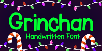 Grinchan is a fun to use Halloween and Christmas font. You can use it for anything ranging from t-shirts, kids’ book designs, and greeting cards to stickers and posters, or anything that needs a casual touch. Fall in love with its incredibly versatile style, and use it to create lovely designs!
 - Lemah Teles by Letterafandi Studio,
$14.00 Lemah Teles is a display font. It is a tough-looking font with a strong brush touch, ready to rock every design you want to create. It is perfect for logos, quotes, posters, clothing, and so much more! Add it to any of your creative projects, and be amazed by the generated outcome!
 - 1523 Holbein by GLC,
$28.00 This typeface is an attempt to offer as a font the well known marvelous Hans Holbein “Death Alphabet”, first published in 1523. We have tried to preserve as much as possible the spirit and appearance of the original Initials set — incredibly fine and enriched with detailed figures — trying at the same time to create a font not too complex to be usable. Neverteless, the font files are large, and when used, the decorated initials may appear on screen more slowly than ordinary characters. (Minimum size recommended : 96 pts) We are offering here two complete standard sets (no accented characters) : Initials and capitals. We have reconstructed the missing letters : J and U, Eth, Lslash, Thorn and Oslash. The font may be used with all our Humane and Garalde fonts, like 1543 Humane Jenson or 1592 GLC Garamond and others from the GLC foundry catalog.
 - Understory by Hanoded,
$15.00 Lately I feel reluctant to watch the news: The Amazon Forest is burning, Australian forests are burning, palm oil controversy… It really brings tears to my eyes to see all this destruction around me. It is like people hate nature with a vengeance - I cannot explain it otherwise. I made this font to take my mind off things. It was loosely based on Futura, a font I really like. Understory was completely made by hand. It comes with some cute upper case swashes and a whole bunch of diacritics. The good thing is: no trees were cut down or burned to make this font; in fact, I donated a nice amount of $ to help save the rainforests!
 - Dx Dynamix by Dirtyline Studio,
$35.00 Dx Dynamix is a modern minimalist design typeface with geometric type and more feature alternative characters. there include some ligature. It is inspired by hype and urban design a font suited for lifestyle with trend design. Dx Dynamix comes with elegant style, strength, and contrasts, with features an extended Latin character set of 367 glyphs covering over 85 languages. It has been designed as a variable font to give lots of options and access to unique type looks, however, it also includes nine weights to give just as much access to creativity to those without access to variable supporting software. Its distinctive character and many variables make it a versatile, stylish workhorse, great for interfaces and design.
 - Distance Rider by B1 Industries,
$4.50 This font is useful for all sorts of things (Sites, Gaming, Signage, Electronics, Logos, etc.) I wanted to create a Type Face like this, so I did, making sure to check for errors…
 - KS Foo by Kreuk Type Foundry,
$12.00 KS Foo is Display typeface with countless possibilities. Sub-culture inspired display with sharp & striking form display. From Gigs posters to skateboard to clothing industries. Ideally suited for headline, logo, branding, posters etc.
 - Hadesz PRO by JOEBOB graphics,
$28.00 Hadesz is a lusty and playful font with a rough, brushy texture. It comes with an abundance of opentype features, which make for the handwritten authenticity one looks for in a handwriting font. Hadesz comes in two versions: Basic (without ligatures) and PRO (the complete set).
