10,000 search results
(0.042 seconds)
- Sheridan Gothic SG by Spiece Graphics,
$39.00 Sheridan Gothic, also known as Grant Antique, is a quaint design produced in the late nineteenth century. Its proportions are in keeping with extra condensed faces of the times. Its uppercase letters are quite narrow. Its lowercase letters are equally narrow and tall. This pleasant and enduring design contains a touch of novelty, too. Swelled terminal flourishes on such characters as C, J, S, c, e, r, and s help add interest and warmth to what is basically a friendly old soul. Sheridan Gothic is now available in the OpenType Std format. Some new stylistic alternates have been added to this OpenType version. Advanced features work in current versions of Adobe Creative Suite InDesign, Creative Suite Illustrator, and Quark XPress. Check for OpenType advanced feature support in other applications as it gradually becomes available with upgrades.
 - Khakoy by Twinletter,
$13.00 Introducing “Khakoy Font” – Unleash Playful Creativity! Dive into a world of limitless imagination with Khakoy Font, your ultimate tool for injecting a playful spirit into your designs. Khakoy Font is the embodiment of joy and whimsy in typography. Crafted to spark delight, it’s your go-to choice for projects that demand a dash of fun and a pinch of mischief. With its lively and distinct characters, Khakoy Font invites you to explore the playful side of design. It’s a font that ensures your message is conveyed with a contagious sense of playfulness, captivating your audience instantly. Designed to ignite creativity, Khakoy Font adds a touch of amusement to your projects. From cheerful posters to charming children’s books, this font is your partner in crafting designs that leave a lasting, joyful impression. Let your designs break free from the ordinary and embrace the vibrant spirit of Khakoy Font. Elevate your creative game, infuse humor and light-heartedness into your work, and watch your designs come alive with this delightful typeface. Discover the magic of Khakoy Font today! – PUA Encoded Characters – Fully accessible without additional design software.
 - Clarence by Protimient,
$35.00Clarence is a modern, original typeface that has been designed to have a warm and slightly antiquated feel. It is slightly too idiosyncratic for great lengths of continuous text but does work very well at both small and display sizes. The serif structure takes some inspiration from architectural buttresses (a structure built against a wall to provide support or reinforcement). The serifs only protrude a small way from the body of the letter, which serves to ground the letter and, because the serifs bracket (the curve) joins the vertical at a relatively great distance from the tip of the serif, it remains subtle. The italic variant draws on the roman but has a more pronounced and curvier serif structure, analogous to the cursive element expected of an italic. This serif structure is present throughout the italic, even extending into the uppercase, making it more of a true italic than the commonplace sloped roman. - ABC Zoo English by Intellecta Design,
$21.90 ABC Zoo is a collection of two typefaces where the alphabet letters are combined to create a design of animal using the letters in the name of each animal.
 - Fury by Canada Type,
$24.95 Get your goggles on. You're on your way to the Metaverse, where no subject is off limits, everyone has an avatar, and reality is subjective. The world can be turned off or on at your very whim. Never mind the markets, resource counters, national inflations, caviar-loaded barons, environmental surprise, or who will nuke whom first. In 2D it's all peace and understanding. This is the great escape, shell, shield, your real fury against furious reality. One fist in the air is the start of a revolution. Two fists are the end of a victory. You are in between. Be smooth. Stay sharp. Walk the line.
 - Moho Sport Pro by John Moore Type Foundry,
$36.00 As an ingredient of the large family of display typefaces "Moho", John Moore Type Foundry presents another variation of fonts consisting of two components: a main font Moho Sport based on a thick outline overlapping and Moho Sport Top, a counterblocks as shape or inside filler. Both typographic forms, Open Type, empty and filled complement one another to create interesting layering headlines for announcements, posters, marks or logo design, labels etc. This combination of both typefaces can still gain more interest if the forms are colored using graphic patterns, drawings or photographs. A nonoverlapping version is also available in Moho Sport Fat and your partner Moho Sport Fattop.
 - Solomon by Fontfabric,
$40.00 The new Solomon type family includes 12 very unique design styles. These twelve designs are divided into two main style groups—text family and display (or decorative) family. The Solomon text pack is characterized by excellent legibility, well-finished geometric designs, optimized kerning etc. Solomon is most suitable for headlines of all sizes, as well as for text blocks that come in both maximum and minimum variations. The Solomon deco pack is created using ornamental work with organic forms at the heart of the design base. The use and combination of both groups - deco and text family, is highly recommended in order to attain maximum desired effects.
 - Old Labels JNL by Jeff Levine,
$29.00 Old Labels JNL was inspired by the red and white gummed labels that were used for shipping parcels long before self-adhesive materials and desktop publishing rendered the older labels obsolete. The fifty-two glyphs include a generous supply of phrases such as ‘Air Mail’, ‘Do Not Bend’, ‘Rush’, etc. along with a number of blank label backgrounds and decorative frames. NOTE: Commercial replication of the images within this font for any resale purposes (including, but not limited to labels, t-shirts, stock designs, et al) requires a separate license which may be obtained by contacting the designer via the email address found within the End User License Agreement.
 - Black Boundy by FoxType,
$25.00 BlackBoundy Display is a Unique Modern Elegant Typeface with Web-fonts. It's a very versatile font that works great in large and small sizes. BlackBoundy Font would perfect for branding, logos, headlines, Captions. or simply as a stylish text overlay to any background image. Strong capitals and a smooth, open lowercase are effective in a variety of applications. It's shown a clean, minimalist, warmth, quirky, yet still purposed to be versatile and easy to read.
 - Futura Round by URW Type Foundry,
$39.99 Futura is THE prototype of a geometric or constructed linear sans serif and the font most commonly font of its kind used to date. Futura, very much influenced by the Bauhaus movement in Germany, was designed in 1927 by Paul Renner. Although being around for almost 90 years, Futura seems eternally young and fresh which also explains its continuous popularity with designers and typographers. Futura simply means efficiency and functionality documented by both its many usages as corporate type (e.g. Volkswagen, formerly IKEA, Vuitton, Shell, formerly HP, SMA and many more) as well as in various famous film projects (e.g. Kubrick, Anderson etc.). Futura’s iconic status was probably established when it walked on the moon with the Apollo 11 crew in 1969. It was used for the lettering of the plaque that was left up there. Now, URW has expanded its range of Futura styles by Futura Round with 14 additional styles.
 - Brother Scribble by Mvmet,
$18.00 Brother Scribble is a bold scribbly handwritten font. You can use it for anything ranging from t-shirts, book designs, and greeting cards to stickers and posters, packaging designs or anything that needs a casual touch, it will be your perfect font to pick. Fall in love with its incredibly versatile style, and use it to create lovely designs!
 - Sketchier by Mvmet,
$12.00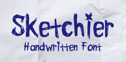 Sketchier is a sketchy handwritten font. You can use it for anything ranging from t-shirts, book designs, and greeting cards to stickers and posters, packaging designs or anything that needs a casual touch, it will be your perfect font to pick. Fall in love with its incredibly versatile style, and use it to create lovely designs!
 - Graphite Love by Mvmet,
$16.00 Graphite Love is a chalky handwritten font that you can use it for anything ranging from t-shirts, book designs, packaging, and greeting cards to stickers and posters, or anything that needs a casual touch, it will be your perfect font to pick. Fall in love with its incredibly versatile style, and use it to create lovely designs!
 - Sauceguy by Mvmet,
$12.00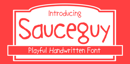 Sauceguy is playful handmade font. You can use it for anything ranging from t-shirts, book designs, and greeting cards to stickers and posters, packaging designs or anything that needs a casual touch, it will be your perfect font to pick. Fall in love with its incredibly versatile style, and use it to create lovely designs!
 - ASTRALYS by Cerri Antonio,
$37.00 Astralys is a linear decorative font, works very well as a type of identity logo, poster and 3d works. It continues the tradition of precedent Xova but with a hard linear impact. Its interesting to note that with it its possible to play with straight corners to create endless couplings geometric styles and beyond. Caps only fonts.
 - Quick Marker by Mvmet,
$12.00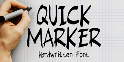 Quick Marker is a quick handwritten skinny font that you can use it for anything ranging from t-shirts, book designs, packaging, and greeting cards to stickers and posters, or anything that needs a casual touch, it will be your perfect font to pick. Fall in love with its incredibly versatile style, and use it to create lovely designs!
 - Springbok by Seemly Fonts,
$12.00 Springbok is a striking display font. It can easily be matched to an incredibly large set of projects, so add it to your creative ideas and notice how it makes them stand out!
 - Intentness by Seemly Fonts,
$12.00 Intentness is an incomparable display font. It can easily be matched to an incredibly large set of projects, so add it to your creative ideas and notice how it makes them stand out!
 - Fourth Reign by Mans Greback,
$39.00 Fourth Reign is a royal medieval typeface. With diamonds, borders and ornaments, this decorative typeface brings us to glorious worlds in the golden times of epic knight sagas. Fourth Reign is the typeface of queens and kings. Use it for a Middle Ages game, a fantasy headline, or as a logotype for anything of historical theme. To make heraldic symbols, copy these icons: 🐉 🐎 👑 🗡 🦁 🦅 🦌 + ♖ × ✝ ⚓ * ⚔ † ‡ Alternatively write %A %B %C ... etc to create the heraldry. (Download required.) Dragon, Horse, Crown, Sword, Eagle, Deer, Cross, Anchor are some of the logos. Use [ ] for side borders. Example: [Magic⚔Thrones] The Fourth Reign family consists of four styles: The regular Plain style, and the beautiful Borders, Diamonds and Combo styles. The font is built with advanced OpenType functionality and has a guaranteed top-notch quality, containing stylistic and contextual alternates, ligatures and more features; all to give you full control and customizability. It has extensive lingual support, covering Greek and Cyrillic, as well as all Latin-based languages, from North Europe to South Africa, from America to South-East Asia. It contains all characters and symbols you'll ever need, including all punctuation and numbers.
 - Le Monde Sans Std by Typofonderie,
$59.00 Humanist sans in 8 styles Designed by Jean François Porchez, Le Monde Sans is a sanserif based on Le Monde Journal — a practice that become commonplace from early nineties. Designed originally in 1994 for the Le Monde newspapers, it was expended over the years to the large family we know today. Le Monde Sans features a “traditional g” in addition to the usual 1994’s g. Le Monde Sans is offered in numerous weights — in roman, italic to meet all kinds of situations. It will help designers to select the best weights depending their needs, from glossy paper printing to high resolution screen. Superfamily The design of Le Monde Sans continues the basic common structure found in the members of the Le Monde family: its proportions, a relatively narrow width, a fairly oblique axis, etc. The typographer can, at all times, switch between Sans & Journal or Courrier without any disruption in the composition. The verticals metrics and proportions of Le Monde Sans are calibrated to match perfectly others Typofonderie families. This family was designed in 1994 as bespoke typeface family for the French newspaper Le Monde. The family is not used any more by this newspaper from November 2005. Type Directors Club .44 1998 European Design Awards 1998
 - FS Rosa by Monotype,
$52.99 FS Rosa is a free-spirited and optimistic serif typeface – reminiscent of those used on fanzines, film sequences and book covers of the 1970s, such as Cooper and Windsor, it has a laid-back nature with a touch of rebellion. It also reminds of type used in colourful protest graphics by nun-turned-designer Corita Kent, and its personality is akin with brands like Whole Foods - positive rather than preachy. While unconventional, it’s sensible enough to work perfectly for socially conscious brands, magazines, websites and campaigns that want a fairer and more responsible world. Hand-drawn digitally, FS Rosa is warm and open-minded – its irregular letterforms are rounded, with soft terminals, a large x-height and wide apertures. But it is also quirky and eclectic, with irregular shapes – its short ascenders and descenders have slanted serifs, its uppercase forms have unusually low crossbars and the letters are filled with oddities and surprises. The typeface looks to stand out against a sea of homogenous, geometric sans serifs, and celebrates beauty through imperfection. It comes in five weights of Thin, Light, Regular, Bold and Black. The heavier weights make an impact and are great for loud, headline statements. The Regular weight is functional, balanced and robust for text, and the lighter weights have an elegance and contemporary beauty. FS Rosa is eclectic yet with its soft roundness, also positive and progressive. Its name, inspired by the phrase “rose-tinted glasses”, reflects its optimism.
 - Bong God by Loaded Fonts,
$7.50Following rules, perhaps too closely. The first full font created by Ray Mullin who strongly believes a font need not be pretty to be valid. Each capital shares similar angles, as does each lowercase, making for a typeface only a mother could love. The rounded style was the true inspiration for the original, but logically it had to come second. Based entirely around Bong God but losing the harsh edges to become a usable futuristic type. Legible, but not readable, recommended in small doses. - 1756 Dutch by GLC,
$42.00 This family is inspired from the set of two styles, Roman normal and Italic, and the ornaments used by an unknown printer working around East Switzerland, circa 1750's. It is a Dutch style font, slightly bolder than usual Fournier's or Caslon's Roman fonts, with some emphasized serifs and finals parts and special letters as capital "U" for example. A set of initials, fleurons, ornaments and frame elements is joined to the family as a supplement. The two styles, Normal and Italic, are containing standard ligatures, a few alternative characters and titlings (who are more preferable than enlarged capitals). They are "small eye" or "Small x-eight" fonts. The standard characters set is completed with accented or specific characters for Western (Including Celtic) and Central Europe, Baltic, Eastern Europe and Turkish.
 - ARB-187 Moderne Caps AUG-47 by The Fontry,
$25.00 Beginning in January, 1932, Becker, at the request of then-editor E. Thomas Kelly, supplied SIGNS of the Times magazine’s new Art and Design section with an alphabet a month, a project predicted to last only two years. Misjudging the popularity of the “series”, it instead ran for 27 years, ending finally two months before Becker’s death in 1959, for a grand total of 320 alphabets, a nearly perfect, uninterrupted run. In late 1941, almost ten years after the first alphabet was published, 100 of those alphabets were compiled and published in bookform under the title, “100 Alphabets”, by Alf R. Becker. And so, as published in August, 1937, The Fontry presents the truly "modern" version of Becker’s 187th alphabet, Moderne Caps, complete with OpenType features and Central European language support.
 - Rainbow Night by Nathatype,
$29.00You may want your designs to look sharp, professional, and interesting without exaggerations, but how would you do it amid the abundance of font options available to choose? Rainbow Night is a perfect answer to your design needs. Rainbow Night is an elegant, prominent display serif font to attract everyone who sees it. A serif font is a font with hooks and tiny scratches attached to the letters’ edges. The huge serif size adjacent to each other in such a font makes the letters look heavier. Moreover, this font is deliberately created in thick lines and strong contrasts as the characters of a display font to produce strong visual displays. Generally, such a display serif font can show elegant, classy nuances to assign a strong identity to the brand, to stand the desired messages out, and to get the messages easily recognized by readers. You can apply this font for various text sizes due to its great legibility. In addition, you can make use of the available features here as well. Features: Stylistic Sets Ligatures Multilingual Supports PUA Encoded Numerals and Punctuations Rainbow Night fits best for various design projects, such as brandings, posters, banners, headings, magazine covers, quotes, printed products, merchandise, social media, etc. Find out more ways to use this font by taking a look at the font preview. Thanks for purchasing our fonts. Hopefully, you have a great time using our font. Feel free to contact us anytime for further information or when you have trouble with the font. Thanks a lot and happy designing. - Bazinga by Tipo Pèpel,
$22.00 Bazinga is a fun and uncomplicated typeface, thanks to the rectilinear counterforms that accompany it, it is ideal to use in our most cheerful works, where fun, humor or childish naivety, is the essence of what is to be transmitted. It also has a set of decorative initials to personalize our beloved words, and a set of dingbats to decorate our works.
 - Prostir Sans by Kobuzan,
$25.00 Prostir Sans is a powerful typeface of the humanistic sans serif. He strives to be a "workhorse" that does almost any job without unnecessary problems, while remaining expressive enough. Has large x-heights and small ink traps. The typeface looks emotional and feels free, combining smooth curves and contrasting connections. It consists of 2 conditional parts — Basic and Display, which differ in the thickness of diacritical symbols and additional elements. This contrast adds unusual rhythm and liveliness. It has 7 grades in weight and and supports variable, adjustable on two axes, which allows you to fine-tune the desired style with sliders. Features: – Total glyph set: 753 glyphs; – 14 styles (7 weights x 2 widths); – Support 210+ languages; – Latin Extended; – Cyrillic Basic + Bulgarian letters; OpenType features: – Proportional, oldstyle, circled, tabular numerals, superiors, fractions; – Punctuations and symbols; – Arrows; – Stylistic sets; – Ligatures; – Case-sensitive forms.
 - Hollander by Linotype,
$29.99Hollander is a refined, yet sturdy text typeface designed by Gerard Unger. The name stems from the font’s similarity to the types attributed to van Dijk and Voskens, two Dutch punchcutters from the seventeenth century. Like those earlier Dutch types, Hollander has generous proportions, a tall x-height, and high contrast between thick and thin strokes. It was designed to work in the early arenas of digital technology, when letters were generated as coarse pixels with a cathode ray tube in the typesetters of the 1970s, and then as finer pixels with a laser beam in the machines of the 1980s. Hollander has a well-drawn stability that maintains legibility even on inferior quality paper. When used as a display face, Hollander is an excellent companion to one of Unger’s most successful text faces, Swift. - Irrlicht by Aarhaus,
$30.00 Irrlicht is based on C. H. Kleukens’ 1923 typeface Judith Type . Whilst Dunkle Irrlicht is a fairly faithful rendition and extension of Kleukens’ typeface, the Licht style was initially added as a stand-alone stencil version; yet, the two styles work perfectly together – for different nuances, for emphasis or simply stacked/layered. Irrlicht is equipped with upper- and lowercase ligatures, contextual and stylistic alternates, fractions, superior and inferior figures, extended language support and a few extra goodies. Additional information – How Irrlicht came to life Christian Heinrich Kleukens cut his Judith Type in 1923, at the peak of German expressionism, exclusively for publications with the Ernst-Ludwig-Press, such as a limited series of biblical prints – the first being the Book of Judith , hence the original’s name. I stumbled upon this typeface a couple of years ago in a nice little 1930 booklet of the Gutenberg-Gesellschaft and was struck by its forceful darkness on paper and its seemingly simple, crude letterforms. The lack of a long-ſ in the final version of Judith Type – quite unusual for a German typeface of that time – adds to this feel of crudeness and spontaneity*. Judith Type seemed to me like a semi-blackletter cousin of Rudolf Koch’s typeface Neuland (cast in the same year). Besides its apparent affinity with expressionism, it reflects a lot of that deeply spiritual craftsmanship of the era – much like Neuland. A few months later, when I was working on a stencil project and looking for a typeface that could be cut into thin wooden plates easily, I remembered those dark, sharp letters that seemed to be lacking any curves at all. After enlarging a few letters and tracing them by hand, the whole set was redrawn digitally, using only straight lines. As for spacing, the goal was to keep the letters tight but to avoid touching characters – without ironing out all the original’s tension and rhythm. Deliberate kerning, subtle contextual alternates and ligatures help to deal with critical glyph combinations. Two additional versions were developed: a stencil version with open counters and, in reference to a popular style of the 1920s and inspired by dry, cracked wood, an inline version. These two additional styles were later merged into one font – Lichte** Irrlicht was born. — AARHAUS * Consequently, the original typeface’s German eszett is simply a ligature of the “round s” and standard z . In some of his publications, Kleukens dispenses with using eszett altogether and sets double s instead. Irrlicht , however, does feature a more common eszett (ß); the original, among other more faithful letter forms, can be accessed via the stylistic sets feature ** licht – literally bright – being the German term for inline typefaces – not to be confused with leicht ( light )
 - Handmade Beautiful by Rhd Studio,
$12.00 Handmade Beautiful consists of two fonts designed to complement each other perfectly. Together or apart, these fonts are ideal for adding a stylish, cheerful touch to your crafts. Handmade Beautiful is a PUA code which means you can access all the glyphs easily!
 - VLNL Duct by VetteLetters,
$35.00 Duct tape is one of the most versatile adhesive materials known today. From fixing the bumper of your car that keeps falling off, to creating a sturdy wallet. From alternative wrapping to sticking a friend to the wall, Duct tape is there. And it will stay there. It will stick to anything and hold for a very darn long time too! The cloth-backed tape was invented some time during World War II, and also proved itself useful as a base material for lettering. VLNL Duct was originally designed by DBXL as a logo for temporary Amsterdam restaurant BAUT. DBXL imagined an owner taping the name on the window of his shop using Duct tape. The font was used for all communication of the restaurant. Duct is a sturdy, rough all-caps typeface that will stick to anything.
 - Pseudographia by The Ampersand Forest,
$35.00 Pseudographia is a lighthearted, loving pastiche of “Greek-Style” type inspired by J.M. Bergling’s 1917 “Society Greek” lettering. Happily living in the world of kitschy cross-cultural fonts of the kind found on restaurant awnings around the US, Pseudos is blithely unconcerned with legibility. Instead, it embraces its own benign exoticism and revels in its own chicanery! Pseudographia’s standard letterforms are angular Roman forms. Its Stylistic Set One contains a simplified Small Caps version of the kind commonly seen at Mediterranean eateries. Its Stylistic Set Two contains a full set of outlined Ornamental caps. Opa! Part of The Ampersand Forest's Sondheim Series.
 - Crayond by Dora Typefoundry,
$15.00 - Elegan / Bergaya / Modern - Introducing a beautiful and classy Crayond modern san serif typeface with lots of alternative styles to choose from, planting it firmly in a modern design. It is a careful collaboration between beauty and function. The beautiful modern Crayond sans serif is available in 3 regular and Italic weights including Light, Regular, and Bold. The style of the font family stems from the classic Didone, but makes steps to simplify and modernize some letterforms and make Didone feel more contemporary. If you want to get that classic Haute Couture look - Crayond Sans is a great choice. It is the perfect choice for fashion logos, headlines, short text, magazines, because its simplicity looks great in big typography, branding, identity, website design, album art, covers, posters, advertisements, etc. This purchase includes: Crayond - San serif typeface containing upper and lowercase characters, numbers 0-9, as well as a series of punctuation marks and symbols as well as an alternative style. If you have trouble finding a certain character, you can access it via the glyph panel. You can see all the characters available in the screenshot above, and you can try the font below. Please let me know if you have any questions, leave a comment!
 - Freaky by Shakira Studio,
$17.00 Start good day for new font! present to you, Freaky! Freaky is a unique display serif font with two versions, regular and outline. Specially designed to create a striking and eccentric look in a variety of design projects. Freaky is a great choice for design projects that require a unique and striking visual identity. From bold branding to creative t-shirt designs, this font will add an unforgettable visual touch to any design medium you use. What did you get? Unique letterforms Works on PC & Mac Simple Installations Accessible in the Adobe Illustrator, Adobe Photoshop, Microsoft Word even work on Canva! PUA Encoded Characters Fully accessible without additional design software. I really hope you'll get pleasure using Freaky font and it will be perfect addition to your font collection! If you have some questions, please write me a letter! Shakira Studio
 - Favourite by Fidan Fonts,
$18.60 Favourite is a hand-lettered font. Mix it up with uppercase and lowercase and you'll get a different vibes from it. It's works perfectly for headlines, pull quotes, wordmark logos, posters and many more. Latin-based Language Support (You can check your language typing characters in text box below). Happy creating!
 - Brainoise by Ronny Studio,
$19.00 Punk-looking fonts usually embody the rebellious and edgy spirit of the punk subculture. It is characterized by its bold, jagged, and distorted letterforms, which often feature exaggerated or irregular shapes. This font is perfect for your design needs such as: for posters, magazines, covers, brands, logotypes, band logos, etc
 - Danilla by Arendxstudio,
$12.00 Danilla Signature Modern script is very suitable for your design project because it is very elegant and you you can apply it on business cards, posters, branding names, logos, your products and others. It's a handwritten font. This font includes all upper and lower case standard characters, punctuation, numerals and ligatures.
 - Romatine Signature by Aminmario Studio,
$20.00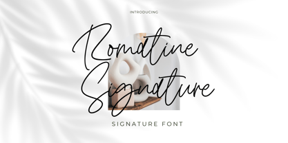 Romatine Signature Font Romatine Signature is a stylish signature font. Its modern charm makes it appear wonderfully, readable, and, ultimately, incredibly versatile. This font will look outstanding in any context, whether it’s being used on busy backgrounds or as a standalone headline! Thank you for the purchase. Happy creating design :)
 - Talaga Lakes by Aminmario Studio,
$20.00 Talaga Lakes Font Talaga Lakes is a casual script font. Its modern charm makes it appear wonderfully, readable, and, ultimately, incredibly versatile. This font will look outstanding in any context, whether it’s being used on busy backgrounds or as a standalone headline! Thank you for the purchase. Happy creating design :)
 - Albertus Nova by Monotype,
$50.99 Albertus® Nova is a faithful digital revival of Berthold Wolpe’s earlier design of Albertus and is one of the five designs in The Wolpe Collection of typefaces. This new design enlarges the typeface set from its previous two weights into a robust set of five ranging from thin to black, all with extended language support including Cyrillic and Greek. Berthold Wolpe began working on Albertus in 1932, at the encouragement of Stanley Morison. Morison saw an example of Wolpe’s engraved lettering and liked it so much that he commissioned a typeface based on the design. Since then, the original Albertus typeface has been used on book covers, in branding, on signs and in video games.