10,000 search results
(0.059 seconds)
- Dexa Pro Variable by Artegra,
$79.00 Dexa Pro is now available on variable version. The family was designed by Ceyhun Birinci in 2020 with an inspiration to create a contemporary super family with inspiration from classic sans serif families. It's a workhorse family consisting of condensed, narrow, normal and expanded widths. Each width has a wide weight range from thin to black, along with their true italic counterparts. With more than 770 glyphs per font, It offers a ton of language support from all the Latin languages to Cyrillic.
 - Haileyna by Romie Creative,
$15.00 Haileyna script typeface. Contains a complete set of lowercase, uppercase, alternative, ligatures, punctuation, numbers and multilingual support. Work in sync with Haileyna to create awesome calligraphic creations. You can use it for a variety of purposes: logos, wedding invitations, titles, signatures, t-shirts, letterheads, signage, labels, posters, etc. How to access all alternative characters, using the Windows Character Map with Photoshop: https://www.youtube.com/watch?v=Go9vacoYmBw How to access all alternative characters using Adobe Illustrator: https://www.youtube.com/watch?v=XzwjMkbB-wQ thank you
 - Thillends by Wacaksara co,
$16.00 Thillends is a fancy handlettering typeface with a clear style, good mood, and dramatic movement. It allows you to create beautiful hand-made typography in an instant. It’s suitable for headlines, logotype, editorial design, branding, letterhead, poster, apparel design, product packaging, label or anything that need handlettering style. Thillends comes with many variations on each character, including uppercase, lowercase, numerals & punctuation, stylistic styles, ligatures, discretionary ligatures, and titling. You will also discover extras swash added to give that finishing touch to your texts.
 - Budgeta Script by Letterfreshstudio,
$14.00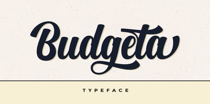 Budgeta is a modern script typeface. It contains a complete set of lowercase, uppercase, alternative, ligatures, punctuation, numbers, and multilingual support. Works in harmony with other fonts to make calligraphy creations. Budgeta is suitable for various purposes: logos, wedding invitations, titles, signatures, t-shirts, letterheads, signboards, labels, posters etc. How to access all alternative characters, using Windows Character Map with Photoshop: https://www.youtube.com/watch?v=Go9vacoYmBw How to access all alternative characters using Adobe Illustrator: https://www.youtube.com/watch?v=XzwjMkbB-wQ
 - TE Nastaaliq by Tharwat Emara,
$59.00 TE Nastaaliq Font It is one of the Persian calligraphy or ta'liq line that appeared in Persia in the seventh century AH (thirteenth century AD), as it was extracted from the lines of naskh, patch and thuluth. It is a beautiful font whose letters are distinguished by precision and extension. It is also characterized by its ease, clarity and lack of complexity. It does not tolerate diacritics, despite its difference with the line of the patch, as it is one of the best fonts in the world and the best without a competitor and admires many Arab calligraphers, and no cultural or literary exhibition is devoid of a painting written in Persian script. It is one of the most beautiful lines that has a special character that distinguishes it from others, as it is characterized by gracefulness in its letters, so it appears as if it descends in one direction, and its beauty is increased by the soft and rounded lines in it, because it is more flexible in drawing and more flexible, especially if it is drawn with precision, elegance and good distribution, and the calligrapher may baptize In his use of decoration to reach strength in expression by taking advantage of arches and circles, in addition to the grace of painting, the artist may link the letters of one word and the two words to reach the composition of a frame or curved and wrapped lines in which he shows his genius in imagination and creativity.
 - Killegar by Tony Fahy Font Foundry,
$20.00 The Killegar family is inspired by one of the great houses of Ireland...Killegar—which is on the grand Estate of Killegar. I lived there for many years. It is a quiet and peaceful place surrounded by lakes and trees and is inspirational in so many ways. All of my creative talents were boosted by this amazing two hundred year old building with all of it's secrets and heritage. Time stood still in Killegar....except for me and my modern day computers, cell phones and fax machines. This twist of fate, with me living both a rural and hi-tech life, living in an environment of the early 18th century, with the friendliest local people on the Earth, played it's part in the origin of the Killegar family of fonts. Tony Fahy
 - Above the Beyond by My Creative Land,
$27.00 Above the Beyond is a font family that contains a high contrast Contemporary Garamond Serif and a Casual Signature Brush script. The serif comes in two styles - Regular and Italic - the italic angle is similar to the one used in the Script font. The main difference between traditional Garamond and Above the Beyond Garamond is that the ascenders are significantly shorter which makes the serif fonts more suitable for branding design and helps to reduce the distance between lines without scarifying the legibility. The Italic style has many stardard ligatures as well as calligraphic ones. Above the Beyond Script is full of OpenType enhancements such as ligatures and alternates - everything that is needed to create an organic handwritten look. It is fully unicode mapped and can be used in any software - either using OpenType panel of the application in use or your OS default Font management software - Character Map or FontBook - by copy-pasting the glyphs you need. The font family is perfect for all kind of designs: quotes, t-shirt, branding, social media, magazines, cards, packaging etc.
 - Quotes by Sudtipos,
$49.00 «Quotes» is the second typeface calligraphed by Yani Arabena, designed along with Guille Vizzari and Ale Paul, for Sudtipos. Being thrilled by the use of the pointed brush, spontaneous messages, gesture and freshness to represent inspirational phrases and quotes written by hand, «Quotes» comes in two handwriting styles: Script and Caps. «Quotes Script» and «Quotes Caps» are thought together and complement each other filling with rhythm and infinite sensations to the spoken words. A more free and spontaneous version –Script–, joined by an uppercase system –Caps–, that offers a huge amount of alternate glyphs, ligatures and connectors, to enrich different messages brought to life with this type family. «Quotes Script» counts on a great variety of alternate signs in its lowercase as well as its uppercase letters. It hands a combination of ligatures and capital alternates that allows to shape the beginnings and endings of words and phrases intended to be inspiring and to inspire others that read them. «Quotes» also stands for the fashion universe, Gourmet, Natural, the D.I.Y. passionates, and for all those who seek for the Handcrafted spirit and agrees that it adds an added value to its products and in their communication possibilities. Nowadays, new trends in the calligraphic and drawn letters fields, have lead to the use of the brush pen as a daily practice, bringing to life phrases that motivates people to share their thoughts. «Quotes» is a typeface that invites to write, share and influence others to make their own. Sometimes a feeling can’t be explained, but «Quotes» is a font that can.
 - Mirey by Nathatype,
$29.00 If you want your designs to be prominent, you will need a unique, prominent, yet professional, legible font. However, it may be hard and take some time to find the right one due to a lot of options available causing difficulty to figure out the suitable one you desire. With Mirey, you can easily create a unique identity for your design. Mirey is a display serif font in thick weights with small lines on the letters’ edges to look formal and classic. In addition, it expresses unique, artistic touches from its combinations with display font characters. This display font has thick lines and strong contrasts, so that it is perfect to attract attention and to show strong impressions. Due to its high legibility level, this font is applicable for a variety of text sizes. In addition, you can enjoy the available features here. Features: Multilingual Supports PUA Encoded Numerals and Punctuations Mirey fits best for various design projects, such as brandings, posters, banners, headings, magazine covers, quotes, invitations, name cards, printed products, merchandise, social media, etc. Find out more ways to use this font by taking a look at the font preview. Thanks for purchasing our fonts. Hopefully, you have a great time using our font. Feel free to contact us anytime for further information or when you have trouble with the font. Thanks a lot and happy designing.
 - MVB Calliope by MVB,
$39.00Gayle Sato, longtime friend of MVB Fonts, has amazing handwriting. It’s a natural, simple hand, with perfect rhythm. Devoid of flourishes, it doesn’t try to be beautiful. It’s just genuine, quick, and clean — the handwriting we all wish we had. The digitization by Mark van Bronkhorst captures these qualities. Retaining the roughness of a felt pen, MVB Calliope is a handwriting typeface that feels much more authentic than most, highly legible but still raw. The Regular was released in 2005, with the other weights shortly thereafter. - Jacko Frosta by Siwox Studios,
$11.00 JACK FROST is an authentic handmade style font with stunning characters. Real written with a brush and high quality water-based ink. Ideal for name tag, handwritten quotes, product packaging, merchandise, social media, greeting cards, etc. It contains a full set of lower & uppercase letters, a large range of punctuation, numerals. Full accessible in the Adobe Illustrator Glyphs panel, or under Stylistic Alternates in the Adobe Photoshop OpenType menu. Corel, Ms. Word, Ms. Powerpoint, etc. No special software is required to access any of the standard letters.
 - Mencken Std by Typofonderie,
$59.00 An American Scotch remixed in 27 fonts Mencken has twenty seven styles, divided into three widths, three optical sizes, romans and italics. Generally, optical size typeface families belong to a same common construction. It falls into the same category of type classification, while presenting different x-heights or contrasts. Mencken is unique because it is designed according to different axis and optical sizes. Firstly, Mencken Text is a low-contrast transitional typeface, designed on an oblique axis, asserting horizontal with featuring open counters. Its capitals follow Didots to better harmonize the rest of the family. On the other side of the spectrum, Mencken Head (and narrow variations) is designed on a vertical axis, high contrast, in a contemporary Didot style. The Mencken is therefore a typeface answering to different sorts of uses, whose design is different according to its uses: from oblique axis in small size to vertical axis in large sizes. Vertical proportions (x-height, capitals height, etc.) were calibrated to be compatible with many Typofonderie typeface families. Lucie Lacava and I followed the idea launched by Matthew Carter few years ago for some of his typefaces intended for publications. From Baltimore Sun’s project to Typofonderie’s Mencken It is a bespoke typeface for American newspaper The Baltimore Sun started at the end of 2004 which marks the beginning of this project. The story started with a simple email exchange with Lucie Lacava then in charge of redesigning the American East Coast newspaper. As usual, she was looking for new typeface options in order to distinguish the redesign that she had started. At the time of its implementation, a survey of the newspaper’s readers has revealed that its previous typeface, drawn in the mid-1990s, was unsatisfactory. The Mencken was well received, some reader responses was particularly enjoyable: “It’s easier to read with the new type even though the type is designed by a French.” Why it is called Mencken? The name Mencken is a tribute to H. L. Mencken’s journalistic contributions to The Sun. According to the London Daily Mail, Mencken ventured beyond the typewriter into the world of typography. Because he felt Americans did not recognize irony when they read it, he proposed the creation of a special typeface to be called Ironics, with the text slanting in the opposite direction from italic types, to indicate the author’s humour. Affirming his irreverence, the Mencken typeface does not offer these typographic gadgets. Henry Louis Mencken (1880 — 1956) was an American journalist, satirist, cultural critic and scholar of American English. Known as the “Sage of Baltimore”, he is regarded as one of the most influential American writers and prose stylists of the first half of the twentieth century. He commented widely on the social scene, literature, music, prominent politicians and contemporary movements. Creative Review Type Annual 2006 Tokyo TDC 2018
 - Johnny by Canada Type,
$24.95 Johnny is the latest addition to the long line of popular psychedelic/hippy/funky art nouveau fonts representing the retro side of the Canada Type library. It is the digitization of a popular 1969 Phil Martin typeface that was known by two different names: Harem and Margit. The film type version had plenty of irregularities and quirks that made it seem like it was done in a hurry. In this digital version the errors have been corrected and the character set expanded to include international characters with built-in alternates, to be on par with what today's layout artists expect from a high quality font. This font saw a lot of use on record sleeves and music posters throughout the pre-disco part of the 1970s, which makes it a veteran of both the psychedelic and funk periods. This makes it the sharper, sturdier art nouveau contemporary personality of Canada Type's Tomato font. This font contains a very expanded character set that includes full support for Central, Eastern and Western European languages, as well as Baltic, Turkish, Esperanto, Greek, Cyrillic and Vietnamese.
 - LFT Arnoldo by TypeTogether,
$39.00 LFT Arnoldo began as an all-caps book cover typeface created during the rebranding of Oscar Mondadori, the most important Italian publisher, with over 4,500 titles from ancient classics to contemporary works, and spanning academic essays to children’s and self-help books. For such a diverse catalogue, it was necessary to find a coherent and flexible paradigm which took into account genre and readership differences and ensured harmony among its works. The main idea was to create a typeface suitable for the branding element and which could be used for each title of the immense catalogue. So what makes LFT Arnoldo a companion to the centuries? Starting with the design of the capital letters, it is first a rational typeface with contemporary proportions. But rationality without style wasn’t enough, so its glyphic nature carries an engraved feeling to resemble letters when chisel is put to stone. Once these two traits were settled, the entire character set was developed as a flared humanist sans in order to complete the family and extend its usage, from titles and display settings to texts. LFT Arnoldo sets titles with dignified authority to appear digitally carved and more arresting than the usual sans or flared sans designs of the past. It is calm and dependable in paragraph use and a captivating vehicle of aesthetic expression in title and display use. At once rugged and syncopated, the slight hourglass stems and incised details make each letter come alive and engrave each paragraph upon our emotions. LFT Arnoldo intends to be a resilient type family for centuries to come. Its seven roman weights have italic counterparts and the entire family is loaded with OpenType features: alternates, ligatures, small caps, oldstyle and lining numerals, and science and math capabilities. In the battle of charisma, where the right voice must project intelligence, influence, and refinement, LFT Arnoldo is the victor.
 - Baline by Xelo,
$12.00 Baline is a modern and dynamic sans-serif typeface that is perfect for branding, marketing materials, and personal projects. With 20 font styles ranging from heavy to light, and variable weights, Baline is a versatile typeface that can adapt to any design project. Its sleek and clean design makes it easy to read, while its contemporary style gives your text a unique and sophisticated look. Baline is perfect for anyone looking to make a statement with their typography. Whether you're a designer, marketer, or just someone who appreciates beautiful typefaces, Baline is the perfect font for you. Try it out today and see how it can elevate your designs to the next level. Versatility: With 20 font styles ranging from heavy to light and variable weights, Baline is a versatile typeface that can adapt to any design project. This makes it a great investment for designers who need a font that can work across multiple mediums and projects. Modern and dynamic: Baline's sleek and clean design makes it easy to read, while its contemporary style gives your text a unique and sophisticated look. This makes it perfect for branding, marketing materials, and personal projects that need a modern and dynamic touch. Professional quality: Baline is a professionally designed font that has been created to the highest standards of typography. This means that you can be confident that your designs will look polished and professional, whether they are used for print or digital projects. Multilingual support: Baline supports multiple languages, making it a great choice for designers who need a font that can handle multilingual projects. Easy to use: Baline is easy to use and install, so you can start using it right away without any hassle. It also comes with a complete set of characters and symbols, so you can use it for a wide range of design projects. Great value: With its range of font styles and professional quality, Baline offers great value for money. It's a smart investment for any designer who wants to elevate their typography game without breaking the bank. Baline font is a great choice for anyone looking for a versatile, modern, and professional-quality typeface that can handle a wide range of design projects.
 - Fruity Snack by Hanoded,
$15.00 We have been in lockdown for a long time now. The schools were also closed, meaning my kids had to stay at home. This week the schools reopened (not a day too soon!), which means my kids can play with their friends again and learn something too! My wife and I pack their lunchboxes every day and always add some fruit for snack time. That fruity snack inspired me to create this rather messy font! Fruity Snack is a handmade display font. It looks wobbly, comes with awkward angles and rough bits. It also comes with extensive language support (including Vietnamese) and 2 sets of alternates for the lower case letters.
 - Walnut Cream by Nathatype,
$29.00 Want to live up the hype of your brand? It's all here. The cute elegant Walnut Cream is a beautiful combination of the handcrafted script font and the uppercase display font to beautify your designs. The font features a set of lower and uppercases, numerals, punctuations, multilingual supports, stylistic sets, ligatures and swashes. It is best to apply for various purposes, such as branding, logotypes, promotions, quotes, and more. See the previews above to get some inspiration on how to use them. Happy designing! Thank you for purchasing from Natha Studio. For further details and queries, feel free to contact us.
 - Rosvard by Bombastype,
$35.00 Rosvard is our new old fashioned typeface. Inspired by vintage signages and brewery emblems. You could feel the vintage vibe on our preview images. Although you could use it to modern design as well. Since our last font just single font. We decide to make another layered font like we did in the past. This one in particular contains Stripe, Outline, Regular, Extrude and Shadow. You could combined all of them of just use two or three of them as you like. We also give you the separate ornaments we used for the preview image as an icon/dingbat font. You could mix and match each part to make your own badge / emblem. Because we believe you could do it.
 - Big Welly by Inclusive Fonts,
$19.95 Big Welly …in the United Kingdom we have a very British phrase which is ‘Give it some Welly (Wellie)’ this is often shouted to a person as encouragement or criticism, it asks for more effort to be put into whatever he or she is doing. The saying comes from an informal name for Wellington Boots; Wellies - named after The Duke of Wellington. Hence, ‘Big Welly’ the font, this font is bold and big on the one hand and handwritten on the other. These two attributes make this font ideal as a poster font or t-shirt font for instance to make your message really stand out. So, if you need a bit of added oomph in your design – look no further than ‘Big Welly’.
 - Zoelander by Locomotype,
$15.00 Zoelander is an experimental geometric font. The distinctive feature of this font is having an irregular x-height. This will look unusual, but if you are looking for something unique and looks different, Zoelander can be an alternative to making an attractive typography. Zoelander comes in two versions, Zoelander Regular and Zoelander TF. Each has a bold and rounded style. Zoelander Regular is a sans serif font with irregular x-height but if you want the same x-height size, the stylistic alternates feature allows you to do it. While Zoelander TF is the development of a regular version where each letter is connected in a line at the baseline. Some of the other opentype features make it easier for you to explore more interesting typographic designs.
 - Shell Shock by Characters Font Foundry,
$17.50 Shell Shock was inspired by stencil typefaces used on military tanks and ammunition boxes. It can be enhanced with a separate set of bombs and warning signs for the typographer in power. Shell Shock Cloak is the ultimate add-on for Shell Shock. This 3-layered 'Cloaking Device' enhances the existing Shell Shock. Put the 3 Cloak layers on top of Shell Shock and suddenly it's camouflaged and you will hardly be able to find it. Use only one extra Cloak layer to give Shell Shock that cool distorted look, like those damaged warsigns on military vehicles. If you only use the Cloak layers you can create background patterns and structures. Try using different color combinations and you'll be surprised by the possibilities of Shell Shock Cloak. It's preferably seen on clothing, skateboards, party flyers, posters or other daring design.
 - Wonder Brush by Canada Type,
$29.95 Wonder Brush is a display typographer's guilty pleasure. It's one of very few fonts ever made that can take intense abuse and still look natural. Partly based on a 1969 Friedrich Poppl design called Poppl Stretto, but considerably fused with ideas found in interwar magazine ad lettering and signage, Wonder Brush caters to the idea that most graphic designers would rather use design elements they can enjoy. When you spend your days being "challenged" and "creatively tested" and "communicating the message," you can definitely use a little bit of playtime. And this font gives you just that, playtime on the job. Wonder Brush appears to be a straightforward narrow upright brush script. But it really is made of malleable rubber. Take it into a program like Adobe Illustrator, set something, stretch or squeeze, shear or warp, slant or transform… just play with it like they used to do in the 70s and 80s. You will soon discover that this font really is a big old top hat, and it's up to you and your mischief to pull rabbits or geese out of it. A single font that allows you to emphasize content or manage space mechanically without affecting the integrity of the type setting. And if your playtime includes fiddling with OpenType features, you're in for a bonus treat: Wonder Brush comes with over 800 characters, including a lot of alternates and extended language support. So tweak away until your eyes cry with joy. The only rules are the ones you set, and even those are meant to be broken.
 - Elizabeth ND by Neufville Digital,
$45.25 Elizabeth ND is known for being the first typeface designed by a woman: Elizabeth Friedlander. It was engraved in 1938 by the Bauersche Gießerei. It has two styles: roman and italic. Its grace, delicacy and beauty allow many compositional possibilities, making it an ideal choice for use as a display and headline typeface. Elizabeth is a Trademark of BauerTypes SL
 - Brother 1816 by TipoType,
$24.00 This year we commemorate the 200th anniversary of the first sans-serif typeface. and what better way to celebrate, than to design our own sans-serif! Brother 1816 is a very flexible, multifaceted and solid typeface, mixing Geometric shapes with Humanistic strokes at the same time. You can choose between a pure geometric or humanistic style, or even mix the +20 alternate characters to create the feeling that you need for your projects. Its humanistic nature makes it easy to read, legible in small sizes; perfect for branding, editorial and signage. Its geometric nature works for bigger applications in need of more personality, like branding, headlines, posters, etc... This makes Brother an excellent tool for an incredible wide range of uses. It has a total of 32 fonts, which are divided into 2 groups: normal (16 weights) & printed (16 weights). Each weight has +460 characters, +20 alternates, angular and straight edges, swashes, fractions, ordinals and much more.... Brother has also been specially designed for web (using hinting instructions), making it work in small and large sizes on different types of screen resolutions.
 - Rodeo Rebels by Putracetol,
$24.00 Rodeo Rebels is a display typeface with a retro, cowboy, and western theme. It's perfect for designs that require a bold and masculine touch, such as branding, packaging, posters, and headlines. The font was inspired by vintage rodeo posters and the American Old West, where bold, slab-serif typography was a common sight. To make the most out of Rodeo Rebels, consider using it in designs that require a rugged and tough aesthetic, such as clothing and apparel, whiskey and beer packaging, and Western-themed events. Pairing it with other vintage-inspired elements, such as distressed textures and illustrations, can also help create a cohesive look and feel. With its bold and rugged aesthetic, Rodeo Rebels is a font that demands attention. It's perfect for projects that require a vintage and masculine vibe, and its features make it a versatile choice for a wide range of designs. Give your projects a touch of the American Old West with Rodeo Rebels, and let its bold and rugged style do the talking.
 - Born Spirit by Dora Typefoundry,
$17.00 Introducing the Born Spirit font, it is a display typeface that demands attention with a bold vintage look. Sharp hooks and strong lines create a sense of toughness. It's great to tap into designers or product owners who need solutions to make their designs look more uniquely elegant. Features: Uppercase, numbers, punctuations; Multilingual support. PUA Encoded We highly recommend using a program that supports OpenType features and Glyphs panels like Adobe apps and Corel Draw, so you can see and access all Glyph variations. This type of family has become the work of true love, making it as easy and fun as possible.I really hope you enjoy it! Thank you Enjoy the font and go get creative :)
 - Kaleko 205 Text by Talbot Type,
$19.50 Kaleko 205 Text is the text specific variation of stablemate, Kaleko 205 . With a shallower x-height and longer ascenders and descenders, its more traditional proportions make it more economical with space and better suited to continuous text. It's a well-balanced, versatile, modern sans, highly legible as a text font and with a clean, elegant look as a display font at larger sizes. The Kaleko 205 Text family comprises of four weights and includes old style non-aligning (lower case) numbers, both proportional and tabular as well as accented characters for Central European languages. It is closely related to Kaleko 105 Text , which offers variations in some characters, most notably a single storey lower case a and g.
 - Burdigala Sans by Asgeir Pedersen,
$19.99 Burdigala is a clean-cut, modern yet classic typeface inspired by Didones and Aicher’s Rotis family. Burdigala Sans is especially well suited for on-screen usage such as in apps and pdf documents. It is also ideal for larger amounts of (printed) texts in brochures, magazines and books. It is slighty narrow in order to conserve space, but spacious enough to faciliate reading and overall clarity. Check out its sibling, the Burdigala Semi Serif version. The expanded versions, being wider and more open, works equally well in media intended both for print and on-screen reading, e.g. in Pdf-documents etc. Burdigala is the ancient Roman name of the city of Bordeaux France.
 - Kamerik 205 Text by Talbot Type,
$19.50 Kamerik 205 Text is the text specific variation of stablemate, Kamerik 205. With a shallower x-height and longer ascenders and descenders, its more traditional proportions make it more economical with space and better suited to continuous text. It's a well-balanced, versatile, modern sans, highly legible as a text font and with a clean, elegant look as a display font at larger sizes. The Kamerik 205 Text family comprises of four weights and includes old style non-aligning (lower case) numbers, both proportional and tabular as well as accented characters for Central European languages. It is closely related to Kamerik 105 Text, which offers variations in some characters, most notably a single storey lower case a and g.
 - Plinc Banjo by House Industries,
$33.00 When it comes to poster design, the line between wild west and psychedelic can be surprisingly fine. Dave West combined both typographic genres to create his refreshing Banjo. Developed in the late 1960s for Photo-Lettering, Inc., this curvaceous high-contrast sort-of serif might have been born on the nineteenth-century frontier, but it was raised in the counterculture of the mid-twentieth century. Use it wherever the conventional and uncommon collide. Vectorized by Mitja Miklavčič in 2017. Like all good subversives, House Industries hides in plain sight while amplifying the look, feel and style of the world’s most interesting brands, products and people. Based in Delaware, visually influencing the world.
 - Blingtastic Script by Seniors Studio,
$17.00 Blingtastic Script is a modern & clean calligraphy script. Its characters dance along the baseline while it still has an elegant touch. It can be used for various purposes such as logos, wedding invitations, headings, t-shirt, letterheads, signage, labels, news, posters, badges etc. OpenType features include stylistic alternates, ligatures and extensive language support. To enable the OpenType Stylistic alternates, you need a program that supports OpenType features such as Adobe Illustrator CS, Adobe Indesign & CorelDraw X6-X7, Microsoft Word 2010 or later versions. There are additional ways to access alternates/swashes, using Character Map (Windows), Nexus Font (Windows), Font Book (Mac) or a software program such as PopChar (for Windows and Mac).
 - Granite Falls by Pen Culture,
$17.00 Introducing Granite Falls, a captivating modern font that effortlessly blends elegance with contemporary style. With its sleek lines and refined letterforms, this font brings a touch of sophistication to any project. The carefully crafted characters maintain a perfect balance between simplicity and uniqueness, making it ideal for a wide range of design applications. Whether it's branding, logos, headlines, or social media graphics, Granite Falls adds a modern and trendy flair. What will you get: Granite Falls SVG file I really hope you enjoy it – please do let me know what you think, comments & likes are always hugely welcomed and appreciated. More importantly, please don’t hesitate to drop me a message if you have any issues or queries. Thank you
 - Quintet by Lauren Ashpole,
$15.00 Quintet is a narrow, stylized sans serif font made up of thin, looping lines. This font tries to walk the line between retro and modern and to incorporate some hand drawn imperfections without being too obvious about it. I kicked off designing without any particular inspiration in mind but, as time went on, started associating it in my head with an old-timey, swingy jazz aesthetic. So hopefully it captures the spirit of the Jeeves and Wooster throwback theme song and opening credits, the music of Stéphane Grappelli and Django Reinhardt (who the name is a nod to), and countless album covers from that era.
 - Redcurrant by Hanoded,
$15.00 My family and I recently moved to a ‘fixer upper’ farm from the 1930’s. It came with a slightly run down barn, 4000 square metres of land and a LOT of redcurrant bushes. I can’t really say that I am overly fond of them. I find them a bit too tart. As a kid, I used to smother them in sugar, but I can’t do that any longer, since I am a responsible dad… ;-) Redcurrant is a slightly wonky, slightly crazy handmade font. It can be used for book covers or post cards, but feel free to use it for whatever. Comes with cute little swashes as well.
 - Alkaria by Konstantine Studio,
$10.00 Please welcome, Alkaria. Fun and casual vintage retro decorative font. The definition of real versatility and flexibility. You can rock on both vibes, retro and modern by using a single font. Yes, just like your favourite day-to-day sneakers. Wide variety of Stylistic Alternates and Ligatures in every single letter to elevate your design game to the next level. And it comes in 3d Shadow version too. Cut the process more because it should be easy. Perfectly fit for the visual project such as logo, branding, poster, food and beverages, social media content, website, UI/UX design, youtube thumbnail, CV, mood board, wedding, you name it.
 - Golden Sand by Fidan Fonts,
$19.80 Inspired by the retro cars/motorcycles, desert and wild west the Golden Sand script stays classy and elegant. It's a handwritten font which includes full set of uppercase and lowercase basic characters, multilingual symbols, numerals, punctuation and ligatures. It's works perfectly for handwritten quotes, greeting cards, posters, branding, book cover designs, packaging, wedding stationery, album covers, social media posts and many more. Latin-based Language Support. If you want to type with stylistic ligatures make sure you have them turned on (use a capable software like Photoshop, Illustrator, InDesign, Word, Pages etc). Note: If you don't use this font with these programs stylistic ligatures won't work. Happy creating!
 - Pickled Limes by Missy Meyer,
$15.00 It all started with the letter S. I drew it, I liked it, I based a font around it! This is Pickled Limes, a tall and narrow single-case font. It's built clean from the ground up, for ultra-sharp lines and corners, as well as super-smooth curves. The slightly flared ends and quirky character mix make this font a ton of fun to use on its own, but it will also pair well with tons of hand-written styles! I've branched out on this one; in addition to over 300 Extended Latin characters, I've also included Unicode's 256 Cyrillic and 121 Greek characters for even more language support. Add in the 90+ alternates, ligatures, and catchwords, and Pickled Limes clocks in at just over 1000 characters. I hope you enjoy using my tasty Pickled Limes for your branding project, logo, crafting work, or design project. Happy fonting, MyFonts fans! :)
 - KoreanJeju by Beewest Studio,
$10.00 Korean Jeju Font, is a cool and modern display font and a great companion for your Korean-themed designs. It’s perfect for movie posters, greeting cards, social media content, youtube videos, even logo design, etc.
 - Blame by Haksen,
$15.00 Blame is a strong font family and sophisticated sans also serif Each font in the family can stand on its own, dynamic and authoritative in their own right. Bison includes ten all-caps fonts: a weight (clean and rough version), two outlines, four italics. - Blame Sans Clean and Rough Regular - Blame Serif Clean and Rough Regular - Blame Sans Clean and Rough Italic - Blame Serif Clean and Rough Italic - Blame Sans Outline Regular and Italic - Blame Serif Outline Regular and Italic FEATURES : a weight / Italics / Outlines / Numbers & Punctuation / Extensive Language Support USE Blame works great in any branding, logos, magazines, films. The different weights give you full range to explore a whole host of applications, while the outlined fonts give a real modern feel to any project. Thanks for having a peek at Blame. I hope you enjoy it and feel free to take it for a spin below! As always, if you have any questions just send me a message! I’m glad to help :) Haksen
 - Balcony by Shaily Patel,
$10.00 Balcony is a decorative display typeface inspired by the patterns of metal safety grills. Its highly geometric features may be used to identify it as Art Deco. It is a monospaced type family with all characters confined in a square frame. The main idea of Balcony is to create a grill-like pattern when letterforms are placed together. This creates an illusionary experience for the reader. The best way to use this typeface is without leading, as shown in the visuals. Balcony also comes with two stylistic sets. The first stylistic set contains most characters with more decorative elements and the second one includes Dingbats. These Dingbats are motifs with simple geometric patterns that may be used for any kind of ornamentation. The diacritics letterforms are geometrically squeezed within the square frame to include the accents. This experimental typeface comes with about 650 characters and four weights (Thin, Light, Regular and Bold). The font family supports Western and Central European languages.