10,000 search results
(0.24 seconds)
- Bariso Cawfu by Maulana Creative,
$14.00 Bariso Cawfu bold display font. Heavy stroke, fun character with a bit of ligatures. To give you an extra creative work. Bariso Cawfu bold display font support multilingual more than 100+ language. This font is good for logo design, Social media, Movie Titles, Books Titles, a short text even a long text letter and good for your secondary text font with script or serif. Make a stunning work with Bariso Cawfu bold display font.
 - Archipad Pro by Bejeletter,
$14.00 Archipad Pro is a geometric sans and slab font family, The combination of modern geometric elements make it clean and readable with the form and matching oblique. Archipad Pro Consist of 9 weight sans and 9 weight of slab, makes more free choice in writing with 36 font styles. 9 Weights Sans and Slab (Thin, Extralight, Light, Regular, Medium, Semi Bold, Bold, Extra Bold and Black) Oblique font is available Latin Pro
 - Augillion by Sarid Ezra,
$17.00 Introducing, new bold serif, Augillion - a soft bold serif with ligatures and alternates! Augillion is a modern and bold serif with a bunch of ligatures and alternates that will make your presentation or logo even more stunning and stand out! Augillion also support Multi Language. and already PUA Encoded! Including a special character "✦", just type A+ to access it! Features Uppercase & Lowercase Number & Symbol Multi language Ligatures Alternates for each characters PUA Encoded
 - Expressway Free - 100% free

- Yacqui by Jonahfonts,
$45.00 In designing a font that had a Mayan or Aztec quality to it without the usual "Mariachi" look, I decided to make it single weight with some open ends and offbeat rounded serifs to give it a more serious feel which will lend itself to other non ethnic uses. I have added a few discretionary ligatures, which also contain old-style numerals, titling caps and small caps. Usage recommendations: Captions, packaging, cards, posters, ads, book jackets, manuals, and menus.
 - Bariyet by Ironbird Creative,
$22.00 The Bariyet is an organic hand drawn script. This script typeface gives a feel of vintage, classic, old, handmade looked like.This typefaces is perfect for people looking for vintage aesthetic. Suitable for any graphic designs such as branding materials, t-shirt, print, business cards, logo, poster, t-shirt, photography, quotes .etc We hope you enjoy the font, please feel free to comment if you have any thoughts or feedback. Thanks for purchasing and have fun! Regards, Ironbird Creative
 - Morge Knight by TypeClassHeroes,
$14.00 Morge Knight is a retro font come with curly and rounded old 80's retro style serif. You can explore and combine creating rhythm for comfortable reading. Vintage and refined use this font for any branding, product packaging, invitation, quotes, headline, label, poster, logo etc. Feature Uppercase & Lowercase Number & Symbol International Glyphs Multilingual support Alternative Ligature Feel free to drop us a message any time and follow my shop for upcoming updates Hope you enjoy it.
 - Cordon by Garisman Studio,
$20.00 Cordon is a textured font that gives a feel of vintage, classic, old and handmade. Already PUA Encoded, this font is perfect for people looking for vintage aesthetic and suitable for any graphic designs such as branding materials, t-shirts, print, business cards, logos, posters, photography, quotes, and more. Cordon has support for 23 languages: Afrikaans, Albanian, Catalan, Croatian, Czech, Danish, Dutch, English, Estonian, Finnish, French, German, Hungarian, Icelandic, Italian, Norwegian, Polish, Portuguese, Slovak, Slovenian, Spanish, Swedish and Zulu.
 - Ecriture by Garisman Studio,
$10.00 Ecriture Hand drawn Font was born from original and hand-drawn style font. This font gives a feel of classic, old, handmade look. Already PUA Encoded, and I think this font is perfect for people looking for an aesthetic or hand-drawn logo. Suitable for graphic designs such as branding materials, t-shirt, print, business cards, logos, posters, t-shirt, photography, quotes and more. What Advantages? Simple installation Multilingual Support with Accents PUA Encode Support for MAC and PC
 - Organa by TypeFaith Fonts,
$5.00 Now that we're done with the hipster stuff, the handwritten and the brush fonts, it is time for something new: Organa, a stylish geometric font family. Create a new feel for your designs. Organa is a unique and creative font that can be used for logo design and branding, posters flyers and book covers. Organa will help you to shake off the old feel and to create something new. It comes in three styles that are easy to combine.
 - Merisk by Imoodev,
$20.00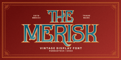 Merisk is old fonts with visual elegance, smooth curves, and beautiful ligatures clear, making your work look true and attractive. A very versatile font that works in both large and small sizes. This font is suitable for a wide variety of projects such as invitations, logos, branding, magazine, photography, card, product packaging, mugs, quotes, poster, labels, signatures, and more. Font which is perfect for all business sectors including personal projects, studio, corporate, creative agency, industrial, company, etc.
 - Romantico by Kustomtype,
$25.00 Kustomtype's "Romantico" font is a sans serif font family with a regular & oblique version. It contains all upper & lower cases. The "Romantico" family is coordinated into letterforms, metrics, and weights to work better together. Why still looking for old school types for your posters, advertising, text, design, artwork, headtext, editoral design, magazines, etc.? "The true genius shudders at incompleteness - imperfection - and usually prefers silence to saying the something which is not everything that should be said." Edgar Allan Poe
 - Delpina by Vultype Co,
$29.00 Delpina is inspired by the vintage old American which has two styles, Clean and Rough also come with a lot alternative characters. Made carefully to create the perfect texture and suitable for each of your projects also great for Logotype, Branding Design, Logo Design, Digital Lettering Arts, T-Shirt/Apparel, Poster, Magazine, Signs, Advertising Design, and any vintage design needs. Software for use this font: Adobe Illustrator, Adobe Photoshop, Adobe Indesign, Word, Corel draw, inkscape). Cheers ! Chandra - Vultype Co
 - Kroist by Just Font You,
$16.00 Kroist was born from the rebellious mindset to break the rules of perfection of typographic hierarchy. Pushing to the very edge of possibilities to craft something different yet remarkable in the industry. Combining the reference of classic band posters, old records, and a spirit to be loud in sending the message. Kroist will be your perfect choice for your logo, branding, music project, cover artwork, merchandise, apparel, clothing, fashion, movie title, serial project, and many more.
 - Bronzier by Arterfak Project,
$13.00 Bronzier is a strong serif display family with 8 different styles. Bronzier was designed with a strong and sharp serif which gives it a more manly look. Sporty, vintage and modern taste at the same time which mean you can use this font family for many design styles. Inspired by old-school typography and modern style. Create a perfect design with Bronzier! Because Bronzier is suitable for logos, logotypes, apparel, jersey, tags, labels, posters, stickers, branding and more.
 - Cursed Stone by Ditatype,
$29.00 Cursed Stone is a spine-chilling display font that will transport your designs to a realm of dark enchantment. Designed in large letters and with a bold weight, this typeface demands attention and exudes an aura of haunting mystery. Each letter is meticulously crafted with eerie stone texture details, adding an ominous and cursed touch to the font. The large size of the letters enhances the font's imposing presence, making it impossible to ignore. The stone texture details in each letter of this font bring an authentic and sinister feel, as if the font was chiseled from the depths of an ancient cursed monument. These haunting details add an element of mystique and darkness, immersing the viewer into a world of malevolent enchantment. The combination of bold weight and stone texture gives Cursed Stone a rugged and formidable look, evoking images of cursed relics and forbidden ruins. The letters appear to hold secrets from the past, carrying a haunting energy that captures the imagination. For the best legibility you can use this font in the bigger text sizes. Enjoy the available features here. Features: Alternates Multilingual Supports PUA Encoded Numerals and Punctuations Cursed Stone fits in headlines, logos, movie posters, flyers, invitations, branding materials, print media, editorial layouts, headers, and any horror-themed project. Find out more ways to use this font by taking a look at the font preview. Thanks for purchasing our fonts. Hopefully, you have a great time using our font. Feel free to contact us anytime for further information or when you have trouble with the font. Thanks a lot and happy designing.
 - Hilmar by Graptail,
$15.00 Hilmar Sans is a neo-grotrsque typeface family in 7 weights, support most European Languages and features. The typeface is versatile to blend in your design- with 7 weight, ranging from thin, extra light, light, regular, medium, semi bold, bold variable type. Perfect anywhere you need a right finas touches for branding, publishing, titles, book, magazine , and use on UI/UX design.The typeface is versatile to blend in your design- with 7 weight, ranging from thin, extra light, light, regular, medium, semi bold, bold variable type. Perfect anywhere you need a right finas touches for branding, publishing, titles, book, magazine , and use on UI/UX design.
 - Rover Pro by Fontforecast,
$24.00 Rover Pro is a hand painted font family that comes in 5 styles: Regular, Bold, Bold Shadow, Bold Rough and Extra. It was designed with retail in mind, but is also perfectly suited for other uses. The flat brush that was used to hand paint all 424 glyphs creates a nonchalant stroke that adds a personal touch and plenty of pizzaz to your design. Combine Rover Pro Bold Shadow with the Bold and Rough styles for more variety and beautiful designs. For extra fun Rover Pro Extra adds another 85 glyphs to play around with. All in all Rover Pro is a smashing painted font family for virtually every project. Rover Pro is PUA encoded. This means that all Rover Pro's characters are fully accessible via Character Map or Font Book (that come with your PC or Mac).
 - Magoat by Fikryal,
$25.00 Magoat – Modern Clean Bold Font is the perfect choice to infuse a contemporary and bold touch into your graphic design projects. With its distinctive All Caps style, Magoat has the ability to capture attention with clarity and courage. Each character is designed with precision, showcasing the cleanliness and modernity that define this font. With its bold shapes, Magoat is well-suited for titles, logos, and other design elements that require a strong and clear presence. Despite its bold appearance, the clarity of each letter is maintained, ensuring that your message is conveyed with precision and readability. With Magoat, your design projects will gain a fresh, contemporary, and professional touch, bringing a clean and bold look to various visual platforms. If you have any questions please don’t hesitate to contact me Follow my Instagram: @fkryall Thank you
 - Morta by Michael Rafailyk,
$15.00 Morta is a handwritten unicase typeface with a slight calligraphic influence. Its design, like a centuries-old cold dark stones, has carved edges and polished corners, and represented by two styles: more legible “Brute” for general use, and more contrast “Grace” for large text size. Scripts: Latin, Greek, Cyrillic Languages: 480+ Hinting: Manual PostScript
 - Quare Zombie by Struggle Studio,
$10.00 Quare Zombie is an old typeface, comes in a clean and elegant style. There are 5 files in this font such as: Regular and Engraving with tattoo additions and Monoline Fonts. Quare Zombie is great for all types of looks from branding, emblems, advertisements, t-shirts, etc. Notes: (Quare Zombie Extras Tattoos are sold separately)
 - Statos - Personal use only

- Morvien by Alit Design,
$19.00 Introducing Morvien Typeface - a bold and dynamic display font that brings a unique edge to your creative projects. With its distinctive torn shapes and powerful design, Morvien Typeface is the perfect choice for film titles, game interfaces, comic book lettering, superhero themes, and music posters. This font is not just a typeface; it's an artistic statement that adds a touch of drama and excitement to your visual creations. Torn Shapes Design: Morvien Typeface stands out with its edgy and torn shapes, giving your text a rebellious and energetic vibe. Each character is carefully crafted to convey a sense of dynamism and movement. Display Style: Morvien Typeface is designed specifically for display purposes, ensuring that your headlines and titles command attention. The bold and impactful strokes make it ideal for creating a strong visual impact. Ligatures and Alternatives: Morvien Typeface includes a rich set of ligatures and alternative characters, providing you with creative flexibility. Experiment with different combinations to customize your text and make it uniquely yours. 633 Characters: Morvien Typeface boasts an extensive character set with 633 characters, offering a wide range of options for your design needs. Whether you're working on a detailed project or a quick creative piece, Morvien Typeface has you covered. Multilingual Support: Morvien Typeface is crafted with global compatibility in mind, supporting multiple languages. Now you can express your creativity in various linguistic contexts without compromising on style. Versatile Usage: Morvien Typeface is well-suited for a variety of creative projects, including film titles, game interfaces, comic book lettering, superhero-themed designs, and music posters. Its versatility makes it a go-to choice for projects that demand a bold and expressive typographic style. Elevate your design projects with Morvien Typeface and let your text speak with intensity. Embrace the torn shapes, explore ligatures, and make a lasting impression with this powerful and versatile display font. Your creativity knows no bounds with Morvien!
 - Binder by Grype,
$16.00 Our Binder Family is a revival and expansion of Binder-Style, a typeface designed by Joseph Binder and released by D. Stempel AG in 1959. It originally was a single weight. In later film type adaptations, a bold style, and an outline with drop shadow style were made available. However, this typeface never really had a true sense of family or larger language compatible character set. The original Binder-style typeface found revived popularity with its super condensed style when it appeared on the movie poster for "Silence of the Lambs". It was always a disappointment to me how this typestyle had never gained more traction in use. And so, many years later, we decided to revive the original typestyle, and expand it with a range of weights and obliques to pair with those weights. We've moved most of the unusual lowercase forms to a Stylistic Alternates feature, along with unicast alternates for the Capitals. The family includes a full standard character set with expansive international support of latin based languages, and 4 weights jumping from Thin to Bold, along with 4 accompanying obliques. This family is ready for you to eat it up with a nice glass of Chianti. Here's what's included with the Binder Family: 538 glyphs per style - including Capitals, Lowercase, Numerals, Punctuation and an extensive character set that covers multilingual support of latin based languages. 4 weights: Thin, Light, Regular, & Bold. Accompanying Obliques with each weight/width style. TTF formatted fonts have been hinted for optimal performance. Here's why the Binder Family is for you: You're in need of a stylish condensed font with a variety of weights and obliques for your designs You're a fan of the typographic works of Joseph Binder, but wish there was more to them You love the style of Agency and Bank Gothic, but want something uber-narrow You are desperate to recreate the movie poster from Silence of the Lambs You just like to collect quality fonts to add to your design arsenal
 - Skjald by Monotype,
$29.99Skjald is a decorative typeface for use on posters and in books where an elaborate face enhances the mood. The Skjald font is an excellent choice for book covers and posters. - Neuliner by CozyFonts,
$20.00 The Neuliner Family is sleek, condensed, extremely legible & flexible available in 7 styles. The inspiration stems from the classic, slender Art Deco era. Designed with a repeated vertical theme Neuliner is consistent from style to style with variations in weight and character. With over 350 glyphs and applying in over 80 languages with Numerals, Dingbats & Euro accents this family is complete. At the time of its first release Neuliner is available in Medium, Bold, Italic, Outline, Drop, Rough, & Rounded. Other styles are in the works. As displayed in the posters, Neuliner works well, in any style, for headlines, by-lines, logos, titles, posters, signage, billboards, ads, main & end titles, monograms, numbering systems, wedding invites and stationary, etc. The Bold style works congruously with the Outline & Drop styles, for either 'trapped' or 'offset' effects. This family also has its roots and influence in Mid Century influenced architecture and design yet lends its style to contemporary and modern design in the 2020s. The Drop & Rough versions are unique styles that render well in Adobe Illustrator & Adobe Photoshop for use in a myriad of colors and effects. The rough-edged style resembles a stitched and weathered effect, while the drop version plays prominently as headlines in either bright or muted color combinations. The versatile, ever-classic outline style gives any image or photographs an impression of elegance and transparency without sacrificing legibility. Neuliner Rounded embosses and engraves either blindly or foil added with a lasting impression. Neuliner Family from Cozyfonts Foundry.
 - Wrenn Initials - Unknown license

- Zebron by Fontron,
$35.00A bold, decorative, striped font for display and headlines. - Gothic Leavenworth by Wooden Type Fonts,
$20.00 Gothic Leavenworth, a display type, very bold, sans serif.
 - Triron by Fontron,
$35.00A bold, decorative, striped font for display and headlines. - Adriane Text by Typefolio,
$49.00 Adriane Text was designed between 2006 and 2007 with additional production completed by Silas Dilworth for this 2008 release [v1.002]. Focusing on text composition and unique typographic characteristics, details within the characters provide both personality and excellent legibility at small sizes. With a medium contrast, a predominantly vertical axis, and a generous x-height, it can be classified as a transitional typeface. This package of advanced OpenType fonts consists of the style-linked quartet of Regular and Bold weights accompanied by corresponding Italics, each of which include small caps and full support for Extended Latin character sets - now including Central European diacritics. Old style and lining figures are provided in both proportional and tabular spacing, and an extensive set of ligatures, ornaments, dingbats, and alternate ampersands are available across the family. The Italics possess a fluidity that contrasts with the staid posture of the Roman styles. The degree of inclination for the uppercase and lowercase characters are slightly different, offering an enhanced visual rhythm in the text settings.
 - Times New Roman PS Cyrillic by Monotype,
$67.99In 1931, The Times of London commissioned a new text type design from Stanley Morison and the Monotype Corporation, after Morison had written an article criticizing The Times for being badly printed and typographically behind the times. The new design was supervised by Stanley Morison and drawn by Victor Lardent, an artist from the advertising department of The Times. Morison used an older typeface, Plantin, as the basis for his design, but made revisions for legibility and economy of space (always important concerns for newspapers). As the old type used by the newspaper had been called Times Old Roman," Morison's revision became "Times New Roman." The Times of London debuted the new typeface in October 1932, and after one year the design was released for commercial sale. The Linotype version, called simply "Times," was optimized for line-casting technology, though the differences in the basic design are subtle. The typeface was very successful for the Times of London, which used a higher grade of newsprint than most newspapers. The better, whiter paper enhanced the new typeface's high degree of contrast and sharp serifs, and created a sparkling, modern look. In 1972, Walter Tracy designed Times Europa for The Times of London. This was a sturdier version, and it was needed to hold up to the newest demands of newspaper printing: faster presses and cheaper paper. In the United States, the Times font family has enjoyed popularity as a magazine and book type since the 1940s. Times continues to be very popular around the world because of its versatility and readability. And because it is a standard font on most computers and digital printers, it has become universally familiar as the office workhorse. Times?, Times? Europa, and Times New Roman? are sure bets for proposals, annual reports, office correspondence, magazines, and newspapers. Linotype offers many versions of this font: Times? is the universal version of Times, used formerly as the matrices for the Linotype hot metal line-casting machines. The basic four weights of roman, italic, bold and bold italic are standard fonts on most printers. There are also small caps, Old style Figures, phonetic characters, and Central European characters. Times? Ten is the version specially designed for smaller text (12 point and below); its characters are wider and the hairlines are a little stronger. Times Ten has many weights for Latin typography, as well as several weights for Central European, Cyrillic, and Greek typesetting. Times? Eighteen is the headline version, ideal for point sizes of 18 and larger. The characters are subtly condensed and the hairlines are finer." - Times New Roman Seven by Monotype,
$67.99In 1931, The Times of London commissioned a new text type design from Stanley Morison and the Monotype Corporation, after Morison had written an article criticizing The Times for being badly printed and typographically behind the times. The new design was supervised by Stanley Morison and drawn by Victor Lardent, an artist from the advertising department of The Times. Morison used an older typeface, Plantin, as the basis for his design, but made revisions for legibility and economy of space (always important concerns for newspapers). As the old type used by the newspaper had been called Times Old Roman," Morison's revision became "Times New Roman." The Times of London debuted the new typeface in October 1932, and after one year the design was released for commercial sale. The Linotype version, called simply "Times," was optimized for line-casting technology, though the differences in the basic design are subtle. The typeface was very successful for the Times of London, which used a higher grade of newsprint than most newspapers. The better, whiter paper enhanced the new typeface's high degree of contrast and sharp serifs, and created a sparkling, modern look. In 1972, Walter Tracy designed Times Europa for The Times of London. This was a sturdier version, and it was needed to hold up to the newest demands of newspaper printing: faster presses and cheaper paper. In the United States, the Times font family has enjoyed popularity as a magazine and book type since the 1940s. Times continues to be very popular around the world because of its versatility and readability. And because it is a standard font on most computers and digital printers, it has become universally familiar as the office workhorse. Times?, Times? Europa, and Times New Roman? are sure bets for proposals, annual reports, office correspondence, magazines, and newspapers. Linotype offers many versions of this font: Times? is the universal version of Times, used formerly as the matrices for the Linotype hot metal line-casting machines. The basic four weights of roman, italic, bold and bold italic are standard fonts on most printers. There are also small caps, Old style Figures, phonetic characters, and Central European characters. Times? Ten is the version specially designed for smaller text (12 point and below); its characters are wider and the hairlines are a little stronger. Times Ten has many weights for Latin typography, as well as several weights for Central European, Cyrillic, and Greek typesetting. Times? Eighteen is the headline version, ideal for point sizes of 18 and larger. The characters are subtly condensed and the hairlines are finer." - Times New Roman WGL by Monotype,
$67.99 In 1931, The Times of London commissioned a new text type design from Stanley Morison and the Monotype Corporation, after Morison had written an article criticizing The Times for being badly printed and typographically behind the times. The new design was supervised by Stanley Morison and drawn by Victor Lardent, an artist from the advertising department of The Times. Morison used an older typeface, Plantin, as the basis for his design, but made revisions for legibility and economy of space (always important concerns for newspapers). As the old type used by the newspaper had been called Times Old Roman," Morison's revision became "Times New Roman." The Times of London debuted the new typeface in October 1932, and after one year the design was released for commercial sale. The Linotype version, called simply "Times," was optimized for line-casting technology, though the differences in the basic design are subtle. The typeface was very successful for the Times of London, which used a higher grade of newsprint than most newspapers. The better, whiter paper enhanced the new typeface's high degree of contrast and sharp serifs, and created a sparkling, modern look. In 1972, Walter Tracy designed Times Europa for The Times of London. This was a sturdier version, and it was needed to hold up to the newest demands of newspaper printing: faster presses and cheaper paper. In the United States, the Times font family has enjoyed popularity as a magazine and book type since the 1940s. Times continues to be very popular around the world because of its versatility and readability. And because it is a standard font on most computers and digital printers, it has become universally familiar as the office workhorse. Times?, Times? Europa, and Times New Roman? are sure bets for proposals, annual reports, office correspondence, magazines, and newspapers. Linotype offers many versions of this font: Times? is the universal version of Times, used formerly as the matrices for the Linotype hot metal line-casting machines. The basic four weights of roman, italic, bold and bold italic are standard fonts on most printers. There are also small caps, Old style Figures, phonetic characters, and Central European characters. Times? Ten is the version specially designed for smaller text (12 point and below); its characters are wider and the hairlines are a little stronger. Times Ten has many weights for Latin typography, as well as several weights for Central European, Cyrillic, and Greek typesetting. Times? Eighteen is the headline version, ideal for point sizes of 18 and larger. The characters are subtly condensed and the hairlines are finer."
 - Times New Roman by Monotype,
$67.99 In 1931, The Times of London commissioned a new text type design from Stanley Morison and the Monotype Corporation, after Morison had written an article criticizing The Times for being badly printed and typographically behind the times. The new design was supervised by Stanley Morison and drawn by Victor Lardent, an artist from the advertising department of The Times. Morison used an older typeface, Plantin, as the basis for his design, but made revisions for legibility and economy of space (always important concerns for newspapers). As the old type used by the newspaper had been called Times Old Roman," Morison's revision became "Times New Roman." The Times of London debuted the new typeface in October 1932, and after one year the design was released for commercial sale. The Linotype version, called simply "Times," was optimized for line-casting technology, though the differences in the basic design are subtle. The typeface was very successful for the Times of London, which used a higher grade of newsprint than most newspapers. The better, whiter paper enhanced the new typeface's high degree of contrast and sharp serifs, and created a sparkling, modern look. In 1972, Walter Tracy designed Times Europa for The Times of London. This was a sturdier version, and it was needed to hold up to the newest demands of newspaper printing: faster presses and cheaper paper. In the United States, the Times font family has enjoyed popularity as a magazine and book type since the 1940s. Times continues to be very popular around the world because of its versatility and readability. And because it is a standard font on most computers and digital printers, it has become universally familiar as the office workhorse. Times?, Times? Europa, and Times New Roman? are sure bets for proposals, annual reports, office correspondence, magazines, and newspapers. Linotype offers many versions of this font: Times? is the universal version of Times, used formerly as the matrices for the Linotype hot metal line-casting machines. The basic four weights of roman, italic, bold and bold italic are standard fonts on most printers. There are also small caps, Old style Figures, phonetic characters, and Central European characters. Times? Ten is the version specially designed for smaller text (12 point and below); its characters are wider and the hairlines are a little stronger. Times Ten has many weights for Latin typography, as well as several weights for Central European, Cyrillic, and Greek typesetting. Times? Eighteen is the headline version, ideal for point sizes of 18 and larger. The characters are subtly condensed and the hairlines are finer."
 - Times New Roman Small Text by Monotype,
$67.99In 1931, The Times of London commissioned a new text type design from Stanley Morison and the Monotype Corporation, after Morison had written an article criticizing The Times for being badly printed and typographically behind the times. The new design was supervised by Stanley Morison and drawn by Victor Lardent, an artist from the advertising department of The Times. Morison used an older typeface, Plantin, as the basis for his design, but made revisions for legibility and economy of space (always important concerns for newspapers). As the old type used by the newspaper had been called Times Old Roman," Morison's revision became "Times New Roman." The Times of London debuted the new typeface in October 1932, and after one year the design was released for commercial sale. The Linotype version, called simply "Times," was optimized for line-casting technology, though the differences in the basic design are subtle. The typeface was very successful for the Times of London, which used a higher grade of newsprint than most newspapers. The better, whiter paper enhanced the new typeface's high degree of contrast and sharp serifs, and created a sparkling, modern look. In 1972, Walter Tracy designed Times Europa for The Times of London. This was a sturdier version, and it was needed to hold up to the newest demands of newspaper printing: faster presses and cheaper paper. In the United States, the Times font family has enjoyed popularity as a magazine and book type since the 1940s. Times continues to be very popular around the world because of its versatility and readability. And because it is a standard font on most computers and digital printers, it has become universally familiar as the office workhorse. Times?, Times? Europa, and Times New Roman? are sure bets for proposals, annual reports, office correspondence, magazines, and newspapers. Linotype offers many versions of this font: Times? is the universal version of Times, used formerly as the matrices for the Linotype hot metal line-casting machines. The basic four weights of roman, italic, bold and bold italic are standard fonts on most printers. There are also small caps, Old style Figures, phonetic characters, and Central European characters. Times? Ten is the version specially designed for smaller text (12 point and below); its characters are wider and the hairlines are a little stronger. Times Ten has many weights for Latin typography, as well as several weights for Central European, Cyrillic, and Greek typesetting. Times? Eighteen is the headline version, ideal for point sizes of 18 and larger. The characters are subtly condensed and the hairlines are finer." - Times New Roman PS Greek by Monotype,
$67.99In 1931, The Times of London commissioned a new text type design from Stanley Morison and the Monotype Corporation, after Morison had written an article criticizing The Times for being badly printed and typographically behind the times. The new design was supervised by Stanley Morison and drawn by Victor Lardent, an artist from the advertising department of The Times. Morison used an older typeface, Plantin, as the basis for his design, but made revisions for legibility and economy of space (always important concerns for newspapers). As the old type used by the newspaper had been called Times Old Roman," Morison's revision became "Times New Roman." The Times of London debuted the new typeface in October 1932, and after one year the design was released for commercial sale. The Linotype version, called simply "Times," was optimized for line-casting technology, though the differences in the basic design are subtle. The typeface was very successful for the Times of London, which used a higher grade of newsprint than most newspapers. The better, whiter paper enhanced the new typeface's high degree of contrast and sharp serifs, and created a sparkling, modern look. In 1972, Walter Tracy designed Times Europa for The Times of London. This was a sturdier version, and it was needed to hold up to the newest demands of newspaper printing: faster presses and cheaper paper. In the United States, the Times font family has enjoyed popularity as a magazine and book type since the 1940s. Times continues to be very popular around the world because of its versatility and readability. And because it is a standard font on most computers and digital printers, it has become universally familiar as the office workhorse. Times?, Times? Europa, and Times New Roman? are sure bets for proposals, annual reports, office correspondence, magazines, and newspapers. Linotype offers many versions of this font: Times? is the universal version of Times, used formerly as the matrices for the Linotype hot metal line-casting machines. The basic four weights of roman, italic, bold and bold italic are standard fonts on most printers. There are also small caps, Old style Figures, phonetic characters, and Central European characters. Times? Ten is the version specially designed for smaller text (12 point and below); its characters are wider and the hairlines are a little stronger. Times Ten has many weights for Latin typography, as well as several weights for Central European, Cyrillic, and Greek typesetting. Times? Eighteen is the headline version, ideal for point sizes of 18 and larger. The characters are subtly condensed and the hairlines are finer." - Times New Roman PS by Monotype,
$67.99In 1931, The Times of London commissioned a new text type design from Stanley Morison and the Monotype Corporation, after Morison had written an article criticizing The Times for being badly printed and typographically behind the times. The new design was supervised by Stanley Morison and drawn by Victor Lardent, an artist from the advertising department of The Times. Morison used an older typeface, Plantin, as the basis for his design, but made revisions for legibility and economy of space (always important concerns for newspapers). As the old type used by the newspaper had been called Times Old Roman," Morison's revision became "Times New Roman." The Times of London debuted the new typeface in October 1932, and after one year the design was released for commercial sale. The Linotype version, called simply "Times," was optimized for line-casting technology, though the differences in the basic design are subtle. The typeface was very successful for the Times of London, which used a higher grade of newsprint than most newspapers. The better, whiter paper enhanced the new typeface's high degree of contrast and sharp serifs, and created a sparkling, modern look. In 1972, Walter Tracy designed Times Europa for The Times of London. This was a sturdier version, and it was needed to hold up to the newest demands of newspaper printing: faster presses and cheaper paper. In the United States, the Times font family has enjoyed popularity as a magazine and book type since the 1940s. Times continues to be very popular around the world because of its versatility and readability. And because it is a standard font on most computers and digital printers, it has become universally familiar as the office workhorse. Times?, Times? Europa, and Times New Roman? are sure bets for proposals, annual reports, office correspondence, magazines, and newspapers. Linotype offers many versions of this font: Times? is the universal version of Times, used formerly as the matrices for the Linotype hot metal line-casting machines. The basic four weights of roman, italic, bold and bold italic are standard fonts on most printers. There are also small caps, Old style Figures, phonetic characters, and Central European characters. Times? Ten is the version specially designed for smaller text (12 point and below); its characters are wider and the hairlines are a little stronger. Times Ten has many weights for Latin typography, as well as several weights for Central European, Cyrillic, and Greek typesetting. Times? Eighteen is the headline version, ideal for point sizes of 18 and larger. The characters are subtly condensed and the hairlines are finer." - Obey Obey Obey by Comicraft,
$19.00 YOU WILL OBEY ALL OUR COMMANDS! YOU WILL OBEY INSTANTLY! YOU WILL OBEY WITHOUT QUESTION! OBEY! OBEY! OBEY! OBEY! OBEY! OBEY! YOU WILL BUY THIS FONT OR YOU WILL BE EXTERMINATED! Features Four fonts (Regular, Italic, Bold & Bold Italic) with alternate uppercase characters.
 - TBS Gartek by TypoBureau Studio,
$19.00 Meet the new Strong and Bold typeface from TBS. TBS GARTEK is a Display typeface It has a single weight ultra bold It come with multilingual glyphs. Good amount at Large Point sizes with combine with any suit typefaces, Headline, Logo font.


