10,000 search results
(0.132 seconds)
- Baguede by Craft Supply Co,
$15.00 Introducing Baguede, a post modern grotesque typeface with Fancy and catchy touch to maintain a sophisticated feel for the purpose of display. You want to make a greeting card or a package design, or even a brand identity, craft design, any DIY project, book title, poster, pop vintage design, retro design or any purpose to make your art / design project look pretty and trendy? Feel free to play with this typeface!
 - Gerallydine by Stefani Letter,
$12.00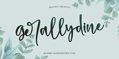 Gerallydine is a beautiful handwritten font that will effortlessly add a perfect look to any craft! Your imagination and this font will make a perfect combination. Get inspired by its unique charm and create amazing greeting cards, Weddings, books, logos, stationery, and much more! This font is PUA encoded which means you can access all of the cute glyphs with ease! It also features a wealth of including ligatures.
 - Highbary Sunfest by Letterena Studios,
$17.00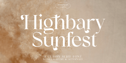 Highbary Sunfest is a classic serif font with a unique style and modern look. It is perfect for elegant and luxury logos, book or movie title design, fashion brands, magazines, clothes, lettering, quotes, and much more. Add it to any of your creative projects, and you will be amazed by the results. This font is PUA encoded, which means you can access all of the glyphs and swashes with ease!
 - Rotterdam Bridge by Stefani Letter,
$12.00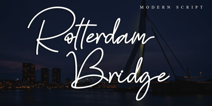 Rotterdam Bridge is a beautiful monoline script font that will effortlessly add a perfect look to any craft! Your imagination and this font will make a perfect combination. Get inspired by its unique charm and create amazing greeting cards, Weddings, books, logos, stationery, and much more! This font is PUA encoded which means you can access all of the cute glyphs with ease! It also features a wealth of including ligatures.
 - Wackets by Letterhend,
$19.00 Wackets is a standout script with a touch of vintage look and feel. This type of font perfectly made to be applied especially in logo, headline, signage and the other various formal forms such as invitations, labels, logos, magazines, books, greeting / wedding cards, packaging, fashion, make up, stationery, novels, labels or any type of advertising purpose. Features : uppercase & lowercase numbers and punctuation multilingual alternates / swashes and ligatures PUA encoded
 - Tisk by Gittype,
$20.00 Tisk is a superb blackletter font. The Blackletter typeface (also sometimes referred to as Gothic, Fraktur or Old English) was used in the Guthenburg Bible, one of the first books printed in Europe. This style of typeface is recognizable by its dramatic thin and thick strokes, and in some fonts, the elaborate swirls on the serifs. Use this font for any crafting project that requires a personalized look!
 - Adverse Stencil JNL by Jeff Levine,
$29.00If you're old enough to remember having a lettering stencil in school, then you might have tried to save all of the waste paper punched out of the letters and numbers; hoping to do something with them later on. Jeff Levine took his Tramp Steamer JNL stencil font and gave it the look of those waste paper pieces - lined up to form erratic characters with a personality all their own. - HS Novano by Helipad Space,
$18.00 Introducing, HS Novano! A Modern San Serif with the clean touch. It looks modern and clean that can be used for all your project needs.This font can be used at any time and on any project. So, HS Novano Font can't wait to give its touch to all your design projects such as magazine, book, poster design, personal branding, promotional materials, logotype, product packaging, etc. Thank You HS
 - Neosim by Smartfont,
$20.00 A striking modern display font in three styles. Neosim is for any kind of design work. Every single letters have been carefully crafted to make your text looks beautiful. Created with creativity, passion and imagination. PERFECT FOR Titles, greeting cards (Christmas, Birthday, Helloween, other holidays), logos, posters, phrases, cover album, gift shops, books, comics, presentation, Pinterest or Instagram, other. Have fun with Neosim and expand your creativity in all areas.
 - Hailen Font Duo by Fateh.Lab,
$8.00 Hailen is a font that is very suitable to be combined with current fashion themes and a number of illustrations to give them a more beautiful look. These two beautiful fonts will be perfect to combine in your design and are suitable for t-shirts, prints, magazine or book cover, business cards, material branding, poster quotes, Clothing, wedding invitations, blog posts, social media, digital letters, and many more!
 - Motteka by Arterfak Project,
$17.00 Introducing Motteka, a playful display font inspired by children's books and handwritten font. This font designed with a bouncy layout of the letters that give a very playful look, childish, and funny impression. Complete with some OpenType features. Motteka is a great choice for display, poster, flyer, headline, craft, educational/storybook, kids theme, fantasy, family, and more! Fonts featured: Uppercase Smallcaps Numbers Symbol & punctuations Ligatures Stylistic alternates Multilingual PUA Encoded
 - Acardia by Letteralle,
$23.00 I'd like to introduce you Acardia! a stunnig signature font. Font with natural flow and feminine style. Each letter is deliberately imperfect to make it look more natural and charming. Acardia comes with multilingual support, long range ligature, and ending swash from a-z. Acardia is perfect for many design needs such as merch, T-shirts, titles, book covers, social media posts, websites, events, and many more. Enjoy the font, Thanks!
 - Simple by Winnie Tan,
$69.00 Simple - The Bilingual Font. The process of Simple began with the usual alphabets followed by a series of icons and soon it was an avalanche of Chinese characters. The pool of proposed Chinese characters were loosely determined by the needs of a lunar calender. In a nutshell, Simple is a single-weight, minimal, grid-based Sans-serif display. Prudent with details and sturdy in form, the geometrically-driven structure marks the foundation of a cross-cultural assortment of Latin alphabets, Chinese characters and thematic icons. After months of extensive typesetting, Simple is also realized to be well-catered for use in graphical information design in games and tournaments, logotypes, advertisements and headlines. http://www.behance.net/gallery/Simple/847905
 - Rallocate by Nathatype,
$29.00 Need help with your design? Expect nothing but brilliance for your design. It's a perfect way to maximize your productivity and enjoy the comfort of designing process at its best. Meet Rallocate, a wonderful script font that looks like signature, with beautifully contrasting thick and thin strokes. Each letter looks neat and carries some elegance. This font will look equally good in the header or smaller text. In addition, it has more fascinating features to create your amazing design. Features: Stylistic Sets Ligatures Multilingual Supports Numerals and Punctuations PUA Encoded It is perfect to be used for many design projects, such as poster, logo, book cover, branding, heading, printed product, merchandise, quotes, social media campaign, etc. Learn more about how to use it by seeing the font preview. Thank you for purchasing our fonts. Please don’t hesitate to contact us, if you have any further question or issues. We’re happy to help. Happy Designing.
 - Proper by Scholtz Fonts,
$17.00Proper was based on handwritten characters (of my own) that I scanned and then digitally touched up. I kept the digital editing to a minimum so as to preserve the freshness of the original. I did, however, want to convey a sense of propriety and regularity and so my original handwriting was done with quite a lot of control. I kept the size of the lower case characters quite large and this makes the font very readable, even at quite small point sizes. Proper may be used when you need clean, legible text, with a natural look, e.g.: -- magazines aimed at the natural health market -- "natural look" fashion pages -- "natural look" decor pages -- natural food products -- natural beauty products -- children's books -- packaging for children's toys, games etc. -- educational material -- comics Proper contains a full character set with all upper and lower case characters, numerals, symbols, accented characters and it has been carefully spaced and kerned. - Beethink by Gassstype,
$25.00 Bee Think This is a Rough Brush Typeface that is written casually and quickly. comes in two mode Standart this font are made with brushes on Procreate. Then crafted carefully drawn into vector format. That is why Bee Think has Rough and strong characteristic more natural look to your text with a more modern look to your text. You can activate Ligature OpenType panel to make these two styles. Bee Think is perfect for homeware designs,branding projects, Logo design, Quotes product packaging, especially with horror and scary themes Bee Think a natural Hand Drawn feel. This handmade font will make your design has a beautiful natural touch for each details. It is perfect for any design project as Invitation,logo, book cover, craft or any design purposes,photos, photography overlays, signs, window art, scrapbooking, tags and so much more! That is has charming, authentic and relaxed characteristic more natural look to your text.
 - Garalda by TypeTogether,
$49.00 Type designer Xavier Dupré’s Garalda is a charming 21st century family that renews a legacy of finesse. As paragraphs on a page, Garalda’s overall impression is of a workaday personality, committed to the main purpose of the job: easy long-form reading. But setting it in display sizes proves something different: This reinvented Garamond is anything but basic. The Garalda story begins with the serendipitous finding of a book typeset in a rare Garalde, called Tory-Garamond, with which Dupré was not immediately familiar. This Garamond was used in bibliophile books in the decades surrounding 1920, but after that it became déclassé for an unknown reason. Dupré found the italic styles especially charming and discovered the family was probably the mythical Ollière Garamond cut from 1914. He obtained low resolution scans of the typeface and used them, rather than high resolution scans, as the basis for his new type family. This allowed Dupré the mental freedom to experiment and remix as he saw fit, culminating in a contemporary family with heritage. As seen in the simplistic rectangular serifs, Garalda is a humanist slab serif, but with a mix of angles and curves to give the classic shapes a fresh, unorthodox feeling. While almost invisible in paragraph text, these produce a graphic effect in display work. The set of ligatures in the roman and italics lend themselves to unique display use, such as creating lovely logotypes. In the italics, some swashes inspired by different historic Garamonds are included, sometimes breaking their curves to be more captivating. Just look at how the italic ‘*-s’ ligatures create ‘s’ with a cursive formation rather than merely a flowing slant. And how the roman ‘g’ link swings as wide as a trainer’s whip. These are all balanced by squared serifs in the roman to keep an overall mechanised regularity. The Garalda family comes in eight styles, includes some of the original arrows and ornaments, and speaks multiple languages for all typesetting needs, from pamphlets to fine book printing. The complete Garalda family, along with our entire catalogue, has been optimised for today’s varied screen uses.
 - Gridlite PE Variable by Rosetta,
$290.00 The two great technical constraints a type designer can tackle are low resolution, which limits detail and dictates proportions between negative and positive shapes, and uniform width, which restricts each letter to a fixed horizontal space. Wrestle with both at once, and each letter becomes a black-and-white chessboard that challenges every design decision. Sometimes battling these constraints gets in the way of a good idea, but other times, tinkering with fewer options can make the job irresistibly easy and lead straight to a grid addiction. Gridlite, an experiment with a modular negative space, is the side effect of such an addiction. It’s simplified, monospaced, and variable: foreground and background alike are ready to be animated, typed, scaled up, scaled down, rounded, or otherwise deformed. Gridlite is primarily a variable font with axes that control the size of the elements, their shape, and the background (one for the rectangular field and one for the compact envelope around the letters). The fonts cover Cyrillic, Greek, and Latin scripts. Small caps are included, for no apparent reason ... and there is a monospaced elephant, too.
 - Ronnia by TypeTogether,
$45.00 One of the most remarkable characteristic of this humanistic sans serif is its versatility. Ronnia’s personality performs admirably in headlines, but is diffident enough for continuous text and small text alike. The heavier weights deliver very cohesive shapes, and they have been successfully used for branding and newspaper headlines. Its ten styles grant the designer a broad range of coherent color and texture variations in text blocks, necessary tools to solve complex information and editorial design problems. Ronnia has been mainly engineered for newspaper and magazine applications manifested in its properties: economic in use, highly legible, and approaching the reader with some friendliness and charm. Ronnia features about 800 characters per weight, including small caps, fractions, old style and lining numbers, scientific superior/inferior figures, and a set of symbols and arrows. It supports over 40 languages that use the Latin extended alphabet. Ronnia Basic is a reduced version of Ronnia. It is still an OT-font but without any particular features except of a set of ligatures, class-kerning and language support including CE and Baltic.
 - Mamirolle by The Ampersand Forest,
$20.00 Sometimes a sans serif just needs a sister. Meet Mamirolle! A geometric wedge-serif companion to Mimolette! (OR is Mimolette the sans serif companion to Mamirolle.... hmmmmm....) Mamirolle, like her sister, is great for text and display alike—she's super-readable AND super-legible, and her different weights lend themselves to creating clear contrast in your textual hierarchy! And she's got some nifty features, too! Mamirolle has a two-story a and g in the upright versions, but if you want a one-story a and g, just turn on Stylistic Set 01! Her italic is a true italic, not just an oblique. Want more playful cursive alternatives in the italic? Activate Stylistic Set 02, and you've got them in the A, E, K, Q, R, and k. She's got true small caps in all styles! She's got true fractions in all styles, as well as oldstyle (small cap) and lining numerals, in both tabular and proportional widths. Best of all, perhaps, Mamirolle was made with love, as always, by yer pals in the Ampersand Forest.
 - Media Blackout by KC Fonts,
$14.00 Media Blackout is a handmade font with rugged good looks. The Media Blackout Family consists of three fonts: Normal, Italic & Marker. Media Blackout Marker takes the handcrafted look one step further by adding heavy hand etched lines for a truly unique look. For an even more handmade look, switch between uppercase and lowercase for a change of etching.
 - Ladylove by Creaditive Design,
$14.00 Ladylove is a beautiful handwritten font. It has an elegant style and it will add a sophisticated look to your designs. It will perfect for wedding invitations, bussiness card, logos, and quotes. Featuring a light weight it looks fantastically elegant. With lowercase Swashes can make your design looks beautiful, also Ligatures make your design more smooth and looks natural.
 - DS Rada_Double - Unknown license

- Brandan by Andfonts,
$69.00 If you're looking for the perfect font to make your logo stand out, then look no further than Brandan font. This modern and cool font is sure to give your logo, text, or any other design element a unique and eye-catching look. Whether you're looking for a font for a logo, lettering, website, or something else entirely, Brandan font has got you covered. Plus, it looks great on both light and dark backgrounds, so you know your design is going to look nice no matter where it's seen. Check out Brandan font today and give your design a professional edge!
 - Dream Script by Lián Types,
$49.00 One of my dreams as a type-designer was making a good looking chancery cursive. Full of life, like some of the best calligraphers around the world do on their artworks. With Julian Waters, John Stevens and Denis Brown (just to name a few of them) (1) chancery, or italic script, was transformed into a new, exciting and very fresh style of calligraphy mainly at the end of 20th Century. Dream Script may be that dream named above made true. I have been practicing chancery in the way I learnt from those calligraphers for many years now. Making a font out of my ink-sketches was a tough work, since they were closer of -being art- than of -being type-. However, this font rescues many aspects of handmade calligraphy: You have to look at it really close to notice it is actually a font, and that was one of my goals. The secret of a good looking chancery is on its subtle details: pen angle is constantly changing, even on the strokes which seem straight. Capitals and swashes have to be done a little faster than lowercase letters. The rhythm has to be even, in spite of its playful look. The fact that makes Dream look alive is that it has many alternates per glyph. This makes each word look unique like it happens in calligraphy: you will find alternates for the beginning/ending of a word/phrase, some for the middle of it, some interchangeable. Also, to accompany the script, you will find Dream Caps, which was inspired in the eternally beautiful trajan capitals. Place them like I did on the posters and you will have great results for sure. The font works great in small, middle and big sizes and can be a great selection for magazines, wedding invitations, perfumes, and posters. Close your eyes, and Dream with me... TECHNICAL Dream Script Pro is the most complete style, it contains all the alternates and ligatures (OT programmed, better if you use Adobe applications) If you plan to use the font for text, be sure to activate the less decorative capitals, which are placed in the “salt” group of alternates. Dream Script Standard has less glyphs than the Pro one, it contains just some ligatures for a better legibility. (OT programmed, better if you use Adobe applications) NOTES (1) Not only are they great artists, but also good people, who are always willing to share with their students all what they know. I would also like to thank Ricardo Rousselot, whose work inspired me this time to make “The Dream Script” exlibris; and to Alisara Tareekes, a very talented friend which international calligraphy conferences gave me: She kindly helped me with some tips to make this font better.
 - Lorenzo by Canada Type,
$24.95 The lifetime of Lorenzo de Medici (1449-1492) coincides with the rise of metal type as it displaced broad pen calligraphy for the production of books. This revolution marked the end of formal Western calligraphy, as the industry employed metalworkers who designed type according to geometric measurement while calligraphers were forced to become secretaries who practiced handwriting systems. Renaissance Florence should have witnessed the marriage of calligraphy and typography, just as all the other arts and sciences flourished as classical learning was applied to technical advances; but the metalworkers and geometricians measured, dissected and recast the calligraphic letters by crude indirect methods, and in the end took all the life out of them. Here they languished until digital type has made it possible to render the precise motion of the broad pen stroke into type. Lorenzo is a confluence of many strains from the Middle Ages, brought together within the classical harmony of the capitals. It attempts to bypass metal type, using calligraphic means to achieve the precision of type while retaining the life of the stroke: a classical font that would be familiar to Lorenzo himself as well as to the modern eye. The Lorenzo family comes in four weights, ranging from light to bold. Two sets of italics, one with swashed caps and ascenders, complement each weight. The family boasts extensive language support and an offering of over fifty calligraphic ornaments/flourishes included within the character set.
 - Ulga Grid by ULGA Type,
$19.00 Update November 2022: ULGA Grid now features an oblique variant. It’s also been expanded into a family of different but related designs with the addition of ULGA Grid Solid and ULGA Grid Rounded typeface families. All variants and new designs are monospaced, sharing the same width as the original ULGA Grid font and matching character sets. The character set has also been enlarged and now supports Western Europe, Vietnamese, Central/Eastern Europe, Baltic, Turkish and Romanian. ULGA Grid is a modular, monospaced typeface reminiscent of the old Letraset LCD & Quartz typefaces from the 1970/80s with lots of alternative characters and ornaments to bring a fresh twist to the genre. The idea’s seed germinated while I was going through a phase of binge watching my favourite 1980/90s sci-fi movies (classics such as Terminator, Total Recall and RoboCop). However, perception and reality don’t always align. Thirty years later, when compared to today’s technology, some visual elements look kind of outdated, almost Retro Futuristic. The initial design process started out in Adobe Illustrator when I constructed letters from a few geometric shapes within a square block. Just playing around with different shapes was so engrossing that it wasn’t long before there were enough characters for a basic typeface. The project grew again as I experimented with designs within the shapes and set paragraphs of text in patterns, resulting in over a hundred alternative characters and ornaments, some of which double up as border designs. This typeface may be square but it’s anything but boring. What it lacks in legibility ULGA Grid makes up for in style and the end result is a surprisingly versatile typeface that you'll have fun using for a wide range of display purposes including CD covers, posters, packaging, advertising, brochures and film titles. Ironically, the fixed grid structure frees the characters to create patterns of text not possible with variable widths.
 - ITC New Rennie Mackintosh by ITC,
$50.99 Looking to add a little Arts & Crafts flavor to your next project? Perhaps you just need a distinctive, new sans serif design? And one with a large international character set. In either case, ITC New Rennie Mackintosh™ may be the typeface for you. Its narrow proportions saves space, and the design shines at large sizes. While it can be an excellent typeface for Art Nouveau flavored labels, name tags and chapter call-outs, this is a suite of fonts that you can also turn to for a bevy of print and on screen uses. Games and apps, as well as print headlines and menus all benefit from ITC New Rennie Mackintosh’s vintage vibe. Based on Phill Grimshaw’s original 1996 design, Monotype Studio designers reimagined the iconic family, added lowercase characters, a new weight structure of light, regular and a more robust bold design; each with an italic counterpart. In addition, a large international character set that include support for many Western and Eastern European languages – including Cyrillic and Greek – give the family a deep typographic bench. An added benefit: the new designs can also be combined with Grimshaw’s original ornament and initial character fonts.
 - Arsena by Apostrof,
$50.00 The font Arsena was designed for a contest on the creation of modern Ukrainian business font "Arsenal" and awarded the 3rd prize. A little squared figure which is enlightened from the middle, unobvious, but the existing modular grid, simplified, but not a primitive design of letters, mathematically defined optimum inclination angle, counterbalanced ratio of thickness, an optimum spacing and a manual kerning - all of this is for the best reproduction in any conditions as well as for the maximum clarity and readability. Asymmetric slab serifs make the font Ukrainian and at the same time have a modern and dynamic look. Besides its highlighting function, Italics also have an independent assignment. The Italics are made under calligraphic traditions in a modern style of mono-thickness (but optically compensated) and in particular, in combination with alternative initials of the same style and it is relevant to use it in a private letter, or in the design of the official greetings, etc. It is also promoted by four typographic ornamental motives. Due to the above-mentioned qualities this font can be used successfully for a wide range of tasks - from business to mass media, publishing, advertising and accidental.
 - Ramadan Letter by Nathatype,
$29.00 Ramadan Letter is a striking display font that draws its inspiration from the intricate beauty of Arabic calligraphy. Ramadan Letter is more than just a font; it's a symbol of heritage and visual artistry. It's the perfect choice for projects that require a touch of cultural sophistication and a bold presence. The characters in Ramadan Letter are meticulously designed with a substantial weight that exudes a sense of boldness and presence. The elegant line ornaments add intricate details, enhancing the font's beauty and cultural significance. The low contrast between letters ensures legibility and a harmonious visual flow. In addition, you can also enjoy the features here. Features: Stylistic Sets Multilingual Supports PUA Encoded Numerals and Punctuations Ramadan Letter fits in headlines, logos, posters, flyers, branding materials, print media, editorial layouts, and many more designs. Find out more ways to use this font by taking a look at the font preview. Thanks for purchasing our fonts. Hopefully, you have a great time using our font. Feel free to contact us anytime for further information or when you have trouble with the font. Thanks a lot and happy designing
 - Roses Queen by Nathatype,
$29.00 Roses Queen is an exquisite serif font made in uppercases that reigns with elegance and beauty. What sets Roses Queen apart is the meticulous addition of ornate details, transforming each letter into a regal work of art and bestowing a sense of opulence to the overall appearance. The characters in Roses Queen boast a commanding size, evoking a sense of authority and grace. The stability of the letter size ensures a harmonious visual flow, contributing to the font's overall sense of refinement. The real magic, however, lies in the intricately designed ornaments that adorn each letter, adding a touch of sophistication and enchantment. In addition, enjoy the features here. Features: Alternates Multilingual Supports PUA Encoded Numerals and Punctuations Roses Queen fits in headlines, logos, posters, flyers, branding materials, greeting cards, print media, editorial layouts, and many more designs. Find out more ways to use this font by taking a look at the font preview. Thanks for purchasing our fonts. Hopefully, you have a great time using our font. Feel free to contact us anytime for further information or when you have trouble with the font. Thanks a lot and happy designing.
 - RMU Initials by RMU,
$20.00 Four fonts entirely of decorative initials of which the uppercase basic letters of RMU Initials One are occupied by Walthari initials, the lowercase ones by Eckmann initials, both released first by Rudhard’sche Gießerei, Offenbach, Germany, about 1900. RMU Initials Two consists of Jubilaeumsinitialen in the uppercases and Augsburger Initialen in the lowercases. RMU Initials Three comes with floral ornaments, whereby the lowercase initials can be colorized by yourself due to non-joining elements. RMU Initials Four consists of hand drawn initials by Rudolf Koch and letters of a former Klingspor font called Queen.
 - Quickat by deFharo,
$18.00 Quickat is a handwritten font, thick, condensed calligraphic style has several sets of terminal ornaments for decoration of phrases and titles. This font is drawn by hand with a pen following proportions based on the numbers of Perrin applied completely to the capital letter H and from this letter all the proportions of the rest of the alphabet are calculated according to mathematical formulas that I have been perfecting and putting into practice in my last fonts, is ideal for designing greeting cards or weddings, posters, flashy headlines or small texts.
 - Aluvemskrew by Ilhamtaro,
$99.00 ALUVEMSKREW is a fairly simple Blackletter font, not too many strokes or ornaments. The font is clean enough so that it has better legibility than other Blackletters. Even so, this font still has a vintage style so it is suitable for creating classic or retro designs, such as for liquor branding, studio tattoos or classic motorcycles. To enable the OpenType Stylistic alternates, you need a program that supports OpenType features such as Adobe Illustrator CS, Adobe Indesign & CorelDraw X6-X7. Guides to access all alternates glyphs : http://adobe.ly/1m1fn4Y Cheers!
 - Tre Giorni by Eurotypo,
$60.00 Tre Giorni, is a variant of the "Due Giorni" font with the possibility of combining between the two. This useful writing font is very expressive, fresh, agile and organic. It comes in two styles: Solid and outline (just a little shine) Each font contains 571 glyphs with many OpenType features: standard and discretionary ligatures, stylistic alternates, decorative characters, old-style figures, small caps, titles, case sensitives, and ornaments. Specially designed for creating eye-catching headlines, logos, packaging, greeting cards, advertisements and websites. It also has good readability for longer texts.
 - Pain de Mie by PintassilgoPrints,
$24.00 Pain de Mie is a soft font, friendly and sweet, kinda creamy, kinda bubbly. It's an all caps font with 2 different glyphs for each letter: easily access these through the keyboard upper or lower cases keys. Make them cycle with OpenType Contextual Alternates. There's also a handful of drawings to add an extra charm here and there. Reach these via OpenType Ornaments or pick your choices through a glyphs palette. Like a fresh loaf of bread, Pain de Mie goes well in so many ways. Give it a try!
 - Fette Deutsche Schrift by Lamatas un Slazdi,
$35.00 Fette Deutsche Schrift also known as Koch-Fraktur or Kochschrift was created by Rudolf Koch for Klingspor foundry between 1908 and 1910. The basis of this font is a publication in the magazine “Das Plakat” of September 1921. The font contains swash capitals to use as dropcaps, contextual alternates, glyphs for line endings, ligatures, discretional ligatures for use in German, ornaments and other OpenType features. It supports all the European languages using Latin alphabets (including slashed S and slashed long s used in Latvian old orthography till 1930s).
 - Oliva by Viktor Nübel Type Design,
$25.00 Oliva & Oliva Italic are two strong and funky display fonts. Influences came from typefaces like Futura Black by Paul Renner and Motter Ombra by Othmar Motter, but also Stilla by François Boltana and Allegro by Hans Bohn lay on the desk. All these ingredients were mixed to a new and contemporary type experience and packed in proper OpenType files Oliva & Oliva Italic are OpenType Pro, featuring full Western, Central European, Baltic, Turkish and also Cyrillic language support. They contain ligatures, superior numerals, and a stylish set of decorative ornaments and arrows.
 - Fourth by J Foundry,
$25.00 Fourth is a contemporary roundhand script with a classic feel. It draws inspiration from classic Americana – baseball scripts, sign painting and branding. The family consists of seven weights with ornament extras for good variety in layout and logo development. The forms are rational and refined for consistency and legibility. Contextual alternates are included for smooth initial and ending forms. Stylistic alternates are available for the commonly substituted forms; s, r, l, f, k, and z. Fourth also features Swash capitals, swash lowercase, underlines and catchwords for custom styling.
 - Linotext by Linotype,
$29.99Linotext was designed by Morris Fuller Benton in 1901 and first appeared with the name Wedding Text with American Type Founders in Jersey City, where its metal forms were cut by hand. The font was so popular that its forms soon began appearing with other font foundries under different names, Elite Kanzlei with D. Stempel AG, Comtesse with C.F. Rühl, etc. Its ornamental forms are not considered very legible by today’s standards and Linotext should therefore be used for headlines and short texts in point sizes 12 or larger.
