10,000 search results
(0.045 seconds)
- Redob by Product Type,
$18.00 The Redob Racing Font is a strong-looking font that gives your project a bold and sporty personality. This font was designed with attention to detail to make your design project stand out from the rest. A bold, masculine font that’s perfect for creating that “in your project” look. Comes in 6 different styles: Regular, Round & Italic, each with a slightly different feel.
 - Brave Dark by Olivetype,
$18.00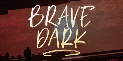 Brave Dark is a creatively hand-drawn brush font. Its unique style is characterized by strong strokes and beautiful, spontaneous-looking lettering. This font will allow you to create an attractive, urban look for your design project. So what’s included : Basic Latin Uppercase and Lowercase Numbers, symbols, and punctuations Multilingual Support. Simple Installations Works on PC & Mac Thank You and Happy Designing!
 - Terexmal Sunday by limitype,
$10.00 Terexmal sunday is a decorative typeface with an urban and modern style with unique and wild characteristics but still looks neat, suitable to make your design look more unique, modern and attractive. This typeface is also suitable for youth sports design themes such as skateboarding, bicycles, motorcycles, climbing, surfing, etc. Terexmal sunday is equipped with uppercase, lowercase, numbers, symbols and some multilingual
 - Growing Garden by Wyarecreatype,
$7.00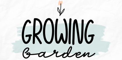 Growing Garden is an elegant and natural trio handwritten font. This original look will appeal to a wide range of crafty ideas. It looks stunning on wedding invitations, thank you cards, quotes, greeting cards, logos, business cards and every other design which needs a handwritten touch. Includes: Uppercase and lowercase For every questions or help, Please contact me. Happy Creating! Thanks!
 - Akira Jimbo by Mevstory Studio,
$15.00 Akira Jimbo Vintage Font will gives a feel of vintage, classic, old, handmade looked like by Muhammad Afif Ersya. It contains uppercase, lowercase, punctuation and symbols. Freudian is is perfect for people looking for vintage aesthetic or hand drawn logo. Suitable for any graphic designs such as branding materials, t-shirt, print, business cards, logo, poster, t-shirt, photography, quotes, etc.
 - Jacklyen by Rometheme,
$25.00 Jacklyen is a modern hand-drawn typeface. It has a elegant, classy look, catchy, readable and cool. This font is perfect for giving your branding projects, font for fashion, apparel projects, and goth vibe, but also works great for other projects like posters, packaging, advertising, headlines, social media, branding, signage and anything where you want that urban look and feel.
 - Rage Italic by ITC,
$40.99 Rage Italic is the work of American designer Ron Zwingelberg. It was one of the first casual brush style scripts with a rough, textured edge. The initial-like capitals complement a lowercase alphabet which links together to create the look of true handwriting. Rage Italic font is ideal for work that should have the spontaneous look of pen writing on parchment.
 - Born Ready by Nicky Laatz,
$20.00 Get ready to make a statement with “Born Ready” - A dry marker handwritten font with textured lines and multiple personalities. Born Ready comes in various styles — Regular, Slanted and Upright — each with its own unique personality to suit the look you need. A handy set of alternate lowercase letters and ligatures allows you to get the perfect look you need for your design.
 - Amundsen by Juraj Chrastina,
$39.00 Amundsen is an all-caps stencil-like face with a unique look due to several originally shaped glyphs and overlapping letters. The font is equipped with automatic discretionary ligatures and it comes with a fine-tuned kerning. As the ligatures combine light letters, the overall look remains balanced even with wider display oriented spacing. Amundsen supports West as well as Central European languages.
 - Valkyrie by Brave Lion Fonts,
$9.49 Valkyrie was designed following the idea to have realy strong letters taking a lot of room. This results in a heavy appearance and gives Valkyrie its special look. It is possible to give it an even more uniform look by using the alternate characters. What can a strong font be used for? Valkyrie hopes to break rules. Use its power.
 - Stoopid Markers by Gassstype,
$28.00 Here comes a New font, Stoopid Markers is a Bold Market Typeface that is written casually and quickly. these strong Letters are made with Market Typeface on Procreate. Then crafted carefully drawn into a vector format. That is why Stoopid Markers has a charming, authentic, and relaxed characteristic more natural look to your text with a more natural look to your text.
 - Bhuron by Twinletter,
$15.00 Introducing the Bhuron Blackletter Font. fonts that can give you the option to mix and match for a unique and attractive look. This font can be used in a variety of projects to create a vintage and elegant style. Use it to enhance visual projects, titles, or banners, packaging with a bold classic look that exudes style, elegance, and strong personality.
 - Murbia by PizzaDude.dk,
$20.00Murbia was written with a glimmer-pen which has left the letters with a grungy look. What's even better is that the font comes with loads of ligatures for both double letters/numbers and the most common letter combinations...just to make the font look more like real scribbled handwriting! You will need to use OpenType supporting applications to use the autoligatures. - Azsion by Okaycat,
$24.50 From Okaycat is the Azsion font, hand-lettered with loving hand in a distinctive style. This font is artistically textured with great detail, yet highly legible with a soft pleasant look. Azsion matches well with Okaycat font, Azsitra. Illustrated pen & ink, artistic typography for that hand drawing look. Azsion is extended, containing West European diacritics & ligatures, making it suitable for multilingual environments & publications.
 - Anerome by Azzam Ridhamalik,
$10.00 Introducing Anerome, a vintage display typeface contains a set of 3 style fonts with an authentic vintage look. Anerome comes packed with over 300 glyphs containing stylistic alternates and discretionary ligature characters. This font is perfect for people are looking for vintage aesthetic or logotype. Suitable for any graphic designs such as branding materials, print, business cards, logo, poster, t-shirt, quotes .etc.
 - Linotype Markin by Linotype,
$29.99 Markin is named after the writing utensil with which it looks like it was drawn, the marker. Its even strokes display characteristics similar to those of a sans serif typeface, but the stroke endings with their typical handwritten look give Markin a personal touch. Extremely versatile, it is the perfect choice for any work where individuality and spontaneity are the emphasis.
 - Rocksider by Balpirick,
$15.00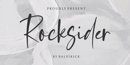 Rocksider is a Modern Handwritten Font. Rocksider is a stylish, cool and casual looking handwritten font. It has a classy, elegant and modern look that can be used for logos, branding, invitations, stationery, wedding designs, social media posts, and much more! Rocksider also multilingual support. Enjoy the font, feel free to comment or feedback, send me PM or email. Thank you!
 - Wounds by Dawnland,
$29.00 Horror/Metal/Punk upper case only font with varied double letters (open type feature). Open type Latin Pro with alternate upper case using the lower case, and varied double letters for an even more genuine handwritten look. (Open type feature.) Ink on paper, carefully and meticulously touched up digitally so that all letters will look good printed in bigger sizes.
 - Missy Voya by Creativemedialab,
$20.00 Introducing Missy Voya. The unique and fashionable font with tons of alternative characters and ligatures. This Versatile family consists of 8 weights, multilingual support, numbers, and currency symbols. The straight lines combined with a slight curve make Missy Voya look minimalist and elegant. Try uppercase for a simple look. Missy Voya is perfect for website header, logo, Instagram story, or fashion-related branding.
 - Detori by Joe Hewitt Design,
$12.99 Detori makes its appearance offering you a clean and unpretentious typeface. It embraces a dreamy quality owing to its slightly wider apertures, creating a more informal look for your writing. Available in 9 weights (all with matching obliques), Detori has you covered for all uses, including modern-looking discrete thin and light weights to Bold and Black where extra emphasis is required.
 - Progelud by Beary,
$13.00 Hello guys Proudly presents our font Progelud. Progelud is mazing sans-serif look attractive and natural! Every single letters have been carefully crafted to make your text looks beautiful. It has beautiful and well-balanced characters and as a result, it matches a wide pool of designs. Progelud is PUA encoded, which means you can access all of the glyphs!
 - Pirate Bay by Vozzy,
$5.00 A vintage look label font named "Pirate Bay".Typeface includes five styles plus aged version, for sample look at 4th preview. This font will good viewed on any retro design like poster, t-shirt, label, logo etc. For using effects layers: - Type your text in Regular. - Copy that and paste at the same position. - Change the style to Effects, Shadow or Texture.
 - Chili Chips by Epiclinez,
$18.00 Chili Chips is a playful handwritten font. Looks great on a children's craft, teaching material, quotes, or any other design that needs a splash of cuteness! This font is supporting 66 languages, from English to Zulu. It is also PUA encoded and has open-type features such as ligatures to help you create that authentic handwritten look. Thanks, hope you enjoy our fonts.
 - Picto Handwriting by SoftMaker,
$15.99 Digitized handwriting fonts are a perfect way to give documents the “very special touch”. Invitations look simply better when handwritten than when printed in bland Arial or Times New Roman. Short handwritten notes look authentic and appealing. There are numerous occasions where handwritten text makes a better impression. “Picto Handwriting” comes with beautiful handwritten pictograms that let you quickly spruce up your designs.
 - Response by PizzaDude.dk,
$20.00 Response is 100% handmade with a worn look to it. Comes with 5 different versions of each letter, and by using the contextual alternates they automatically cycles as you type! Response is good if you need a response regarding your next project - that being an invitation, packaging or something that needs a worn handmade look! Besides that, Response is full of international characters!
 - Fino by TypeTogether,
$35.00 Tall, stately, and refined, with a showy contrast between thick and thin, a certain kind of titling Didone has become synonymous with fashion. Ermin Međedović’s latest type system amplifies the most theatrical aspects of this genre while bringing an uncommon flexibility of style and variation to any type palette — particularly those required for editorial design. Fino is a Rational (or Modern) display serif with sharp details. Its fairly Title proportions produce a regular beat of bold stems at frequent intervals. One can add an unexpected twist to this plot line by introducing the alternate ‘C, D, G, O, and Q’ (found in the uppercase); these replace the standard, Title oval shapes with big, full, show-stopping round ones. Other alternate forms, along with a grand ensemble cast of ligatures, lets the director continually flip the script. This stage is set in three acts: Fino, Fino, and Fino Stencil. Each of these offer six weights and italics, and each actor is comfortable speaking any Latin-based language, from standard Hollywood English to the many accents of Eastern Europe. Finally, every style comes in two optical sizes, with Title having the finest hairlines for the biggest parts. This lets you put Fino to work in a variety of productions, from short texts (24pt–48pt settings) to epic titles. The complete Fino family, along with our entire catalogue, has been optimised for today’s varied screen uses. All these talents let Fino perform a range of roles far broader than your typical Bodoni or Didot.
 - Really No 2 W2G by Linotype,
$124.99Really No. 2 is a redesign and update of Linotype Really, a typeface that Gary Munch first designed in 1999. The new Really No. 2 offers seven weights (Light to Extra Bold), each with an Italic companion. Additionally, Really No. 2 offers significantly expanded language support possibilities. Customers may choose the Really No. 2 W1G fonts, which support a character set that will cover Greek and Cyrillic in addition to virtually all European languages. These are true pan-European fonts, capable of setting texts that will travel between Ireland and Russia, and from Norway to Turkey. Customers who do not require this level of language support may choose from the Really No. 2 Pro fonts (just the Latin script), the Really No. 2 Greek Pro fonts (which include both Latin and Greek), or the Really No. 2 Cyrillic Pro fonts (Latin and Cyrillic). Each weight in the Really No. 2 family includes small capitals and optional oldstyle figures, as well as several other OpenType features. Really No. 2's vertical measurements are slightly different than the old Linotype Really's; customers should not mix fonts from the two families together. As to the design of Really No. 2's letters, like Linotype Really, the characters' moderate-to-strong contrast of its strokes recalls the Transitional and Modern styles of Baskerville and Bodoni. A subtly oblique axis recalls the old-style faces of Caslon. Finally, sturdy serifs complete the typeface's realist sensibility: a clear, readable, no-nonsense text face, whose clean details offer the designer a high-impact selection. - Really No 2 Paneuropean by Linotype,
$103.99Really No. 2 is a redesign and update of Linotype Really, a typeface that Gary Munch first designed in 1999. The new Really No. 2 offers seven weights (Light to Extra Bold), each with an Italic companion. Additionally, Really No. 2 offers significantly expanded language support possibilities. Customers may choose the Really No. 2 W1G fonts, which support a character set that will cover Greek and Cyrillic in addition to virtually all European languages. These are true pan-European fonts, capable of setting texts that will travel between Ireland and Russia, and from Norway to Turkey. Customers who do not require this level of language support may choose from the Really No. 2 Pro fonts (just the Latin script), the Really No. 2 Greek Pro fonts (which include both Latin and Greek), or the Really No. 2 Cyrillic Pro fonts (Latin and Cyrillic). Each weight in the Really No. 2 family includes small capitals and optional oldstyle figures, as well as several other OpenType features. Really No. 2's vertical measurements are slightly different than the old Linotype Really's; customers should not mix fonts from the two families together. As to the design of Really No. 2's letters, like Linotype Really, the characters' moderate-to-strong contrast of its strokes recalls the Transitional and Modern styles of Baskerville and Bodoni. A subtly oblique axis recalls the old-style faces of Caslon. Finally, sturdy serifs complete the typeface's realist sensibility: a clear, readable, no-nonsense text face, whose clean details offer the designer a high-impact selection. - Tenez by Plau,
$30.00 Big News! Tenez has been selected for the Tipos Latinos Biennial 2016 and Typographica’s Favorite Typefaces of 2015! Tenez is a Grand Slam display didone typeface from Plau. We designed it for a branding project, further developing the resulting logotype into a typeface we felt could solve many designers’ needs. Its origins are rooted in pointed nib calligraphy which can be seen in contemporary Didot and Bodoni inspired typefaces. But Tenez’s shapes are organic (these modern typefaces were originally cut by hand after all) – in fact that was the challenge we set from the start: to make a typeface as organic in construction as possible. This echoes some of late 19th century typefaces and advertising, yet we thought of it for contemporary uses. One of the several unique features of Tenez is its unusual Thin weight, in which the contrast between thin strokes and the black area left by the serifs makes for a typewriter-like personality. The italics provide a perfect counterpoint to the roman weights. Tenez was unapologetically conceived as a display typeface meant to be used large as in magazine openings, drop caps or everywhere there’s a need for elegant impact. The family includes support for almost all Latin languages available, figure sets for almost every conceivable occasion (tables, text, you name it), alternates for the quirky beautiful R (sometimes simpler is better, but not always!) and Q (with a nice big tail for that article opener). Tenez pairs really well with our no-frills sans-serif Motiva Sans and our cute vertical connected script Primot.
 - Fino Sans by TypeTogether,
$35.00 Tall, stately, and refined, with a showy contrast between thick and thin, a certain kind of titling Didone has become synonymous with fashion. Ermin Međedović’s latest type system amplifies the most theatrical aspects of this genre while bringing an uncommon flexibility of style and variation to any type palette — particularly those required for editorial design. Fino Sans is a Rational (or Modern) display serif with sharp details. Its fairly Title proportions produce a regular beat of bold stems at frequent intervals. One can add an unexpected twist to this plot line by introducing the alternate ‘C, D, G, O, and Q’ (found in the uppercase); these replace the standard, Title oval shapes with big, full, show-stopping round ones. Other alternate forms, along with a grand ensemble cast of ligatures, lets the director continually flip the script. This stage is set in three acts: Fino Sans, Fino Sans, and Fino Sans Stencil. Each of these offer six weights and italics, and each actor is comfortable speaking any Latin-based language, from standard Hollywood English to the many accents of Eastern Europe. Finally, every style comes in two optical sizes, with Title having the finest hairlines for the biggest parts. This lets you put Fino Sans to work in a variety of productions, from short texts (24pt–48pt settings) to epic titles. The complete Fino Sans family, along with our entire catalogue, has been optimised for today’s varied screen uses. All these talents let Fino Sans perform a range of roles far broader than your typical Bodoni or Didot.
 - Fino Stencil by TypeTogether,
$35.00 Tall, stately, and refined, with a showy contrast between thick and thin, a certain kind of titling Didone has become synonymous with fashion. Ermin Međedović’s latest type system amplifies the most theatrical aspects of this genre while bringing an uncommon flexibility of style and variation to any type palette — particularly those required for editorial design. Fino Stencil is a Rational (or Modern) display serif with sharp details. Its fairly Title proportions produce a regular beat of bold stems at frequent intervals. One can add an unexpected twist to this plot line by introducing the alternate ‘C, D, G, O, and Q’ (found in the uppercase); these replace the standard, Title oval shapes with big, full, show-stopping round ones. Other alternate forms, along with a grand ensemble cast of ligatures, lets the director continually flip the script. This stage is set in three acts: Fino Stencil, Fino Stencil, and Fino Stencil Stencil. Each of these offer six weights and italics, and each actor is comfortable speaking any Latin-based language, from standard Hollywood English to the many accents of Eastern Europe. Finally, every style comes in two optical sizes, with Title having the finest hairlines for the biggest parts. This lets you put Fino Stencil to work in a variety of productions, from short texts (24pt–48pt settings) to epic titles. The complete Fino Stencil family, along with our entire catalogue, has been optimized for today’s varied screen uses. All these talents let Fino Stencil perform a range of roles far broader than your typical Bodoni or Didot.
 - Really No 2 by Linotype,
$29.99 Really No. 2 is a redesign and update of Linotype Really, a typeface that Gary Munch first designed in 1999. The new Really No. 2 offers seven weights (Light to Extra Bold), each with an Italic companion. Additionally, Really No. 2 offers significantly expanded language support possibilities. Customers may choose the Really No. 2 W1G fonts, which support a character set that will cover Greek and Cyrillic in addition to virtually all European languages. These are true pan-European fonts, capable of setting texts that will travel between Ireland and Russia, and from Norway to Turkey. Customers who do not require this level of language support may choose from the Really No. 2 Pro fonts (just the Latin script), the Really No. 2 Greek Pro fonts (which include both Latin and Greek), or the Really No. 2 Cyrillic Pro fonts (Latin and Cyrillic). Each weight in the Really No. 2 family includes small capitals and optional oldstyle figures, as well as several other OpenType features. Really No. 2's vertical measurements are slightly different than the old Linotype Really's; customers should not mix fonts from the two families together. As to the design of Really No. 2's letters, like Linotype Really, the characters' moderate-to-strong contrast of its strokes recalls the Transitional and Modern styles of Baskerville and Bodoni. A subtly oblique axis recalls the old-style faces of Caslon. Finally, sturdy serifs complete the typeface's realist sensibility: a clear, readable, no-nonsense text face, whose clean details offer the designer a high-impact selection.
 - Moliere by Eurotypo,
$44.00 The life of Molière is a story of struggle, hard work, domestic unhappiness, death and burial in obscurity and almost in shame. Molière left behind a body of work that not only changed the face of French classical comedy, but has also come to influence the work of other dramatists from around the world. Despite his own preference for tragedy, which he had tried to further with the Illustre Théâtre, Molière became famous for his farces, which were generally in one act and performed after the tragedy. Both the comic and the serious drama were powerfully affected by the work of Molière, not only in his own age and country but everywhere and up to the present time. Didot is a name given to a group of typefaces named after the famous French printing and type producing family. The classification is known as modern, or Didone. The typeface we know today was based on a collection of related types developed in the period 1784–1811. Firmin Didot cut the letters, and cast them as type in Paris. Along with Giambattista Bodoni of Italy, Firmin Didot is credited with establishing the use of the "Modern" classification of typefaces. The types that Didot used are characterized by extreme contrast in thick strokes and thin strokes, by the use of hairline serifs and by the vertical stress of the letters. As in the extreme contrasts of the literature of Molière, in Didione's typefaces, thick and thin strokes, straight and curved, are the most relevant characteristic for an era marked by the changes.
 - Pistol Shot by Linotype,
$29.99At first glance, Pistol Shot looks like it was originally drawn as a large, geometric slab serif font - a slab serif font that underwent an unfortunate accident, and had many of its extremities shot off! However, there is more to Pistol Shot's appearance than looking as if it had survived a showdown. Pistol Shot also looks vaguely like a pixel font viewed through a blurry filter. It also looks like it could have been cross-stitched into a craft project. Whatever its appearance, Pistol Shot Light and Pistol Shot Normal are perfect headline fonts for a wide variety of display applications. You might even want to try cross-stitching its letters into fabric yourself! Both weights of the Pistol Shot family were designed by the French design team of Roselyne and Michel Besnard in 2002, and are included in the Take Type 5 collection from Linotype GmbH." - Glaw by Flavortype,
$15.00 Meets Glaw, A new carefully crafted Fonts from Ilham Herry to bring a new heavy look of Psychedelic Theme. The Ideas of this fonts are from 70s, Psychedelic, Funk, Hippie, Party, Music and Etc. Even though it’s a specific theme for this fonts. It doesn’t ruled out the possibility of creating a new style or themes. Glaw Created with a 3 Weight on the traditional OTF, Condensed, Regular and Expanded. Not Just that, If your software are support for Variable Fonts like Adobe Illustrator or Photoshop, The Weight are going to 100 Weight!. Glaw Best used for a Large Text such as Headline, Poster, Branding, Logos, Concert, Branding and Any other use that needs a Heavy looks for the Title. Our creation on the display to give you a reference what it looks like on your project. It shows that how Glaw will look on your design style.
 - Largest by 50Fox,
$29.00 Are you looking to make your headlines more eye-catching? If so, then this Largest Display Typeface is perfect for you! This typeface style stands out from the crowd, making it ideal for grabbing attention. Whether you're looking to make a statement on a poster, logo, card, website, social media or even just overlay text, this Largest Fonts is a great choice. With its bold and heavy look, it will give your headlines the added pop they need. https://youtu.be/5x84ygKnLjg7 You can easily customize the typeface with ligature and alternative characters. And if you're worried about legibility, don't be - the large typeface is designed to be easy to read from a distance. It's the perfect way to make your headlines stand out and show off your creativity. So don't be afraid to go big and make your headlines more attention-grabbing with our Largest Fonts! Thank you for looking.
 - Rosamund Cyrillic by Ira Dvilyuk,
$17.00 Rosamund Cyrillic Script Font is an inky brush script with heavy downstrokes, and skinny loops, and upstrokes. It was made with my favorite brush pen and retains a playful handwritten look for all your designs and will be perfect for use in your projects, be it logos, signatures, labels, packaging design, or blog headlines. Also, it will look great in mugs, cards, gorgeous typographic designs, stationery, and much more. Rosamund Cyrillic Script contains a full set of uppercase letters and 2 full sets of lowercase letters, (standard and alternative), and 17 ligatures. Use alternate lowercase and double-letter ligatures to create a perfect hand-painted look in your creations. The Cyrillic part of the font includes a full set of gorgeous uppercase and lowercase letters, ligatures, numerals, a large range of punctuation. Rosamund Symbols is a font with over 50 unique, hand-drawn doodles and illustrations that can help to make your design awesome. A different symbol is assigned to every uppercase and lowercase standard character so you do not need graphics software just simply type the letter you need. Multilingual Support for 32 languages: Afrikaans, Albanian, Basque, Bosnian, Catalan, Danish, Dutch, English, Estonian, Faroese, Filipino, Finnish, French, Galician, Indonesian, Irish, Italian, Malay, Norwegian Bokmål, Portuguese, Slovenian, Spanish, Swahili, Swedish, Turkish, Welsh, Zulu And Cyrillic glyphs support for Russian, Belorussian, Bulgarian, Ukrainian, and Kazakh languages. Works perfectly on the Canva platform. For Cricut & Silhouette recommended. Thanks!
 - Jetworld by Nelson Borhek Press,
$12.00 Jetworld is the space-age typeface with the retro-forward look. Jetworld’s tapered and weighted parabolic-arch curves interplay with its rigid, straight verticals and horizontals to create an unexpected but pleasing motion and a rhythm that is constantly changing. Jetworld is an OpenType font that speaks of clean space-age design, midcentury optimism, and the promise of new frontiers. Jetworld gives a midcentury-modern or retro-futuristic look to book covers, magazine layouts, posters, and album covers. But Jetworld is adaptable, too. With hints of ancient cuneiform writings mixed with the look of markings on an alien spaceship, Jetworld spans eons. And Jetworld’s large character set includes multi-lingual support and many other special characters. That means Jetworld can be used for more than just headlines and more than just English. Jetworld combines a distinctive personality with surprising readability. Jetworld is unusual in that it is not descended from handwriting or calligraphy. Instead, Jetworld was inspired by midcentury modern architecture and consumer goods. Think of the parabolic arches seen in midcentury masterpieces like the Theme Building at Los Angeles International Airport, the TWA terminal at JFK Airport in New York, and even the cartoon architecture of “The Jetsons” television show. Think of boomerang-patterned Formica countertops and tabletops, or arch-shaped “hairpin” legs on midcentury furniture. Jetworld’s character shapes were inspired by all of these. Jetworld—direct from the world of the future to you.
 - Technical SCRIPTURE by MMC-TypEngine,
$19.00 ‘Technical Scripture’ 2015-2021 A manuscript look, Pixel labyrinthine Display Type System… Plus, an Optical “Layered Game”, Retro Futuristic Sci-Fi Digital interface evolving placeholder… Now with 3D Styles! It was designed as a pair to its brother font ‘Technical Signature’ a Small Caps Font, both inspired by antique Greek, mosaics zig-zag ornaments “ancient times computer” intentionally as a Romanic variation with same metrics... Searching for Technical Solutions, it resulted in many combined styles by matching the primary ones so there’s plenty variations for multi-purpose texting like layered typesetting or simply monochromatic designs… Plus got accurate streaming resolution, therefore some sub-families like Stamp and Texture implicates greater points for minimum size as Regular and Light is appropriated to Small Optical Text reductions. *The New 3’s Upgraded Edition Improvements consisted of Correct ‘Font Info’ (verified data-debugging) rescaled glyphs, quick design review, better style linking with correspondent renamed fonts, addition of automatic OT features encoding, 3D Styles and Italics. Ps. This actual Typeface was quickly re-edited for technical reasons and hasn’t yet reached the intended design, it will soon receive a more tangible redesign upgrade, mainly in lowercases to enhance cursive style. Due to other priorities. Tip: Give preference to THE LYSERGIC UPPERCASES! Multilanguage Support: Western & Eastern European, Baltic, Turkish, Greek, and Cyrillic. This Type is pleasant to Technician Compositions, Such as Briefs layouts manuscript, Old Engineering & Crafts Logos or Support Text, Op-Art Posters, Stamps, Labels, movies and Cartoons Ludic Scripts, sites and of course Video Games! Try ‘Technical Scripture’ & Have some Power to the Pixel! Padang!
 - Merengue Script by Sudtipos,
$59.00 Merengue Script is the second typeface designed by Panco, once again together with Ale Paul, who supervised the whole development. In this opportunity, the process of shape research and the systematization of signs led him to dive into new waters. The objective was to generate a system of signs in which the construction of such was not directly bound to traditional calligraphy, nor to texts typography. Instead, the point was to create signs inspired in “Brush pen” calligraphy but with their main features drawn or literally illustrated. The result was a font with personality, authenticity and uncommon formal aspects that make Merengue Script an interesting, highly attractive and rather unusual font. From the very beginning, the search was based on creating a font with weight and good presence in big formats, but, at the same time, efficient for brief texts of small formats. The aim was to make it usable mainly in candy, sweets and chocolate packaging. The predominance of round shapes, harmonious modulations and funny and friendly-looking visual rhythms spark a special effect in the usage of Merengue Script. Texts are enhanced with an interesting visual charm, capable of transforming a very simple text into a virtual illustration that semantically reinforces the messages in a simple way, without putting legibility at risk. With a basic set of stylistic alternatives full of frills and flounces for initials, ornamental and final letters, plus a set of disconnected signs, Merengue Script offers a wide and versatile range of options for graphic designers in the process of packaging design.