10,000 search results
(0.078 seconds)
- Steletto Neue by Jonahfonts,
$42.00 Condensed Gothic. Great for tight-fitting headlines and other condensed titling situations such as headlines, ads, invitations, captions, packaging, bulletins, posters, and greeting cards.
 - ALT Ayame by ALT,
$- Ayame is a display font which looks great on posters, logos, and titles. Ayame is a 6-weight family with a heavy retro look.
 - Constância Script by Pedro Teixeira,
$20.00 Constância Script, classic and elegant calligraphy. This unique, stylish and legible script is handy for logo, poster, headlines, invitations, cards and all display needs.
 - Subytro by Subtitude,
$39.00 Subytro! Use this font for sweet bold titles. It adds personality and an handmade feeling. Old Style font based on posters of the fifties.
 - Witches Crow by Forberas Club,
$16.00 Witches Crow is a Halloween Treat by our team. It's perfectly matches for any invitation type, and children theme, cartoon, poster, display, and comics.
 - Manbokun by ahweproject,
$10.00 Introducing Manbokun – a typeface that has a unique letterform inspired by Japanese kanji typography. Suitable for headlines, titles, logos, logotypes, posters, brochures, and more!
 - Cornerstone Flair by Jonahfonts,
$35.00 Condensed Gothic, great for tight-fitting headlines and other condensed titling situations. Applications include Headlines, ads, invitations, captions, packaging, bulletins, posters, and greeting cards.
 - Steletto Oldstyle by Jonahfonts,
$42.00 Condensed Gothic. Great for tight-fitting headlines and other condensed titling situations such as headlines, ads, invitations, captions, packaging, bulletins, posters, and greeting cards.
 - Swing Bill by Monotype,
$29.99The Swing Bill font was designed as a display face for sport material or pop music posters, but has also been seen on TV. - Chit Chat by Jonahfonts,
$29.95 A brush font that keeps its legibility without sacrificing its free-spirit. Usage recommendations: Captions, packaging, cards, posters, ads, book jackets, manuals, and menus.
 - Ruman by Juraj Chrastina,
$29.00 Ruman is a display typeface suitable for logotypes and posters. It’s a very simple origami font and short words look almost like abstract pictures.
 - Rany by Haiku Monkey,
$10.00Rany is a fun, legible handwriting font with a childlike twist. Great for posters, packaging, logos, or anywhere a fun font is called for. - Cornerstone by Jonahfonts,
$35.00 Condensed Gothic, great for tight-fitting headlines and other condensed titling situations. Applications include Headlines, ads, invitations, captions, packaging, bulletins, posters, and greeting cards.
 - Solander by Patria Ari,
$15.00 Solander is as sharp display typeface inspired from middle east movies. With small caps, this font suit for movie posters, cinema, fantasy movies, etc.
 - Kids Scratch by Struggle Studio,
$12.00 Kids Csrattch is a font made with children's handwriting.great for cafe websites, restaurant menus, children's books, art exhibition posters and anything else you fancy.
 - Avney Gad MF by Masterfont,
$59.00 Geometric forms make this elegant font family a great companion for invitations signs, indoor and outdoor. Useful when you design book jackets, posters etc.
 - Antique Tuscan No 9 by HiH,
$8.00 Antique Tuscan No.9 was one of the earlier wood-type designs by William Hamilton Page. It was first shown among the specimens produced in 1859, shortly after Page entered into a new partnership with Samuel Mowry, owner of the Mowry Axle Company. The new company was named Page and Company and was located at the Mowry facility in the Greenville section of Norwich, Connecticut. Antique Tuscan No.9 is an extra-condensed version of the tuscan style that had been released in moveable type by Vincent Figgins of London in 1817 and had become so popular for advertising in the intervening years. Because of the extreme compression in the design, we might be tempted to describe it as "Triple-X," but that might be misleading. The analogy would, of course, be to clothing sizes, not movie ratings. Because of the compression, this typeface reads best when set extra-extra-extra large. For printing, we recommend 36 points or larger. For the screen, we suggest at least 72 points. An unusual and distinctive design, it is best used with discretion. If I were doing a term paper for school or submitting an article to a magazine for publication, I might use it for the title page, to grab someone’s attention. I would certainly not use it for the main body of text - not if I expected anyone to read what I wrote. If you wonder why we make this recommendation, take the Ten-Point challenge. Print this paragraph using Antique Tuscan No.9 and set the font size at 10 points. If you are young and blessed with good eyesight, you will probably be able to read it - with effort. So, here is the challenge: hand it to your Grandmother and ask HER to read it.
 - Cheesy Bread by Putracetol,
$24.00 Introducing Cheesy Bread, a super playful bold font. This font is perfect for your projects related to kids, which is playful and fun. This font also has 2 versions, clean and rough. Cheesy Bread also perfect for branding design, posters, apparel, logotype, header, quote, invitation, greeting card, cover, poster, fashion design and any more. Come with lot of ligatures character, its help you to make great lettering. This font is also support multi language.
 - Cutie Cat by Goodigital13,
$20.00 You can use it as a logo, badge, insignia, packaging, headline, poster, etc signature, stationery, logo, typography quotes, magazine or book cover, website header, flyer, clothing, branding, packaging design and more. suitable for logo, branding, greeting card, poster and any design that you create. perfect for many different project such as logos & branding, invitation, stationery, wedding designs, social media posts, advertisements, product packaging, product designs, label, photography, watermark, special events or anything.
 - Roadstore by Almarkha Type,
$35.00 Introducing our latest display typeface called Roadstore unique Fonts with vintage taste can make your logotype become more interesting. Best Vintage font with special alternative glyphs, and multilingual support. inspired by the decorative arts and architecture movement. Roadstore fonts is perfect for your project and allows you to create designs, headlines, posters, logos, badges, t-shirts and many more that are beautiful. It is also best used for posts, logos, posters, certificates, labels and more.
 - Futurik by Grontype,
$15.00 Futurik is a futuristic look font, designed all Caps with different size. Comes with an unique alternatives for every letter, to create some custom design by single font. This Font is perfect for movie title poster, logo header, magazine header, or such even an invitational poster, or any other project. It includes multilingual language support. Features : Futurik All Character set Numeral and Punctuation Alternates and Ligatures Multilingual Thankyou For downloading The font Regards, Grontype
 - Dizzy Fence by Putracetol,
$22.00 Introducing Dizzy Fence, a quirky and blocky display font. This font is perfect for your projects related to kids, which is playful and fun. This font also has 2 versions, clean and rough. Dizzy Fence also perfect for branding design, posters, apparel, logotype, header, quote, invitation, greeting card, cover, poster, fashion design and any more. Come with lot of ligatures character, its help you to make great lettering. This font is also support multi language.
 - PAG Novembris by Prop-a-ganda,
$19.99Prop-a-ganda offers retro-flavored fonts inspired by lettering on retro propaganda posters, retro advertising posters, retro packages all the world over. This is perfect font for your retrospective project. PAG Novembris is narrow and serif font with art deco look. “A”, “G”, “H” and “M” have different letter form in uppercase and lowercase, and they give decorative accents on your typography. PAG Novembris is perfect font for your retrospective project. - Akon by Ahmet Altun,
$19.00 Akon Font Family comes in 2 weights; Regular and Bold. It is completely hand-drawn. The Akon Font Family has a few ornaments and stylistic alternates, ligatures, small capitals, Scientific Inferiors and so. This font family would fit in your mobile application designs magnificently and is a great choise for poster design. With this font family, you can create eye-pleasing and nice works such as posters, printings, t-shirts, adds, magazines etc.
 - Hleba Soli Ziamli Voli by Koval TF,
$39.99 Hleba Soli Ziamli Voli typeface is a graphic discovery on title type that combines traditional poster shapes with Humanist notes from Renaissance. Hleba Soli Ziamli Voli is named after Belarus poem by Yanka Kupala and inherits some original glyph designs from Renaissance printings by Francisk Skoryna. Hleba Soli Ziamli Voli due to wide variety of weights is great for titles and posters. Cyrillic and Latin support makes the type sutable for multilingual communications.
 - Lavah Pro Arabic by Protype,
$50.00 Lavah Pro is the upgrade from old version of Lava Arabic 1.0. It's Arabic condensed/narrow with grunge and rough style for vintage style posters, brands or ads maybe for food ads or movie poster. Lavah Pro is supported by OpenType Features with many Stylistic Alternates and Discretionary Ligatures and It's support Arabic, Persian, Urdu and Latin. Designed and Created by Ibrahim Hamdi Copyright © 2019 by Protype Foundry. All rights reserved.
 - MRK Reginda by Marka Design,
$16.00 MRK Reginda is a psychedelic-inspired sans font. It's trendy, stylish, and playful. Thin and curve lines mix with smooth thick curves creating unique glyphs that are perfect for interesting wordmarks and typographic posters. The stylish and extraordinary font is containing ligatures, all punctuations, and supports multi-languages. This font is suitable for various purposes such as street style designs, t-shirts, posters, logos, labels, packaging, branding, editorial design, UI designs, and any modern purposes.
 - WBP Sight by Studio Jasper Nijssen,
$15.00 This font is inspired by posters opticians use to test a person’s eyesight. Those letters are always blurred or distorted when they're beheld. That’s awful for any creation. So why not rig the game from the start and blur the whole font?! WBP Sight is most defiantly a display font, so play to it’s strengths. Use it in headings, on banners or on posters. Especially on those to test a person’s eyesight…
 - Rundeck by Edignwn Type,
$12.00 The Rundeck perfectly represents crafted stuff of serif display. This project was inspired by a beautiful retro music poster. The product includes 4 styles (regular, smooth, rough and texture). This matches applies in some designs such as the logotype, poster, label, badge, packaging, branding, and more custom design. Rundeck includes : 4 style typefaces (regular, smooth, rough and texture) Uppercase, lowercase, numeral, punctuation and symbol Multilingual PUA Encoded Thank you for your support and choosing us.
 - Pokland by Inumocca,
$12.00 POKLAND Modern Family Font, Come with 3 Style, Reguler One, Stencil Two and Stencil Three, Modern Futuristic, Minimalist and unique Glyphs Construction. Inspiration from Synthwave, Mecha, Modern Technology, Sci-fi Movie Poster, science and Space Theme. Really great font to covering your Project, like Lettering, Website Interface, Magazine, Branding, Poster, wedding invitations, Quotes Lettering, Logos, and more your project design. - Unique glyphs - Multilingual Characters - UPPERCASE - Lowercase - Numeric - Symbol - Punctuation Character - Stylistic Alternates inumocca type Studio
 - Fledermaus by Hanoded,
$15.00 Fledermaus (meaning 'Bat' in German) was a cabaret theater from Vienna. The original Jugendstil decor was designed by Josef Hoffman and several posters, advertising performances, were designed by other members of the Vienna Workshop. Fledermaus font was based on a 1907 poster by Bertold Löffler. Since only a few glyphs were available, I designed the missing ones myself. The lower case consists of small caps and the font comes with extensive language support.
 - Brunei Darussalam by HafisHidayat,
$23.00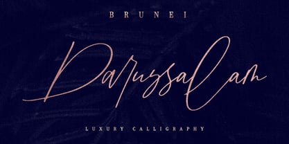 Introducing Brunei Darussalam, a fashionable and luxury handwriting font, which looks like a signature. This font is intentionally made with unique ligatures and alternates. Brunei Darussalam is perfectly suited for branding, logos, business cards, posters, invitations, greeting cards, news, product packaging, blog posters and more. This font is also equipped with unique and interesting ligatures, by using this ligature you can give a real handlettered style. Multi-Language support: ŠÀÁÂÃÄÅÆÇÈÉÊËÌÍÎÏŸŽÐÑÒÓÔÕÖØÙÚÛÜÝßàáâãäåæçèéêëìíîïñòóôõöøùúûüýÿŒœšž Thank you for your purchase!
 - Grifa Slab by deFharo,
$14.00 Grifa Slab is a chunky typeface with thick rounded slab serifs in 4 styles with true italics, ideal for very legible titles and with a hard and smooth aspect at the same time. You can use this font in editorial design for headlines, also for advertising and the design of posters, signs or posters, in all cases readability is guaranteed. The typography has a set of 525 characters (Latin Extended-A) and OpenType functions.
 - Fabitha Script by stiplinestudios,
$11.00 Proudly Present .. Fabitha Script Fabitha Script goes with Modern and Natural Calligraphy, ready to give your design project with Fresh and Fabulous Style. This font have an 177 Standard Glyph + 109 Glyph Alternate in Open Type Standard Format. Suitable for various purpose such as digital lettering, headings, logos, wedding invitation, t-shirt, letterhead, signage, lable, news, posters, badges, branding materials, t-shirt, print, business cards, quotes, logo, poster, and suitable for any graphic design project.
 - Horror Vibes by Gassstype,
$25.00 Introducing of our new product the name is Horror Vibes - Handmade horror Font and Multilanguage support.Introducing of designs look modern, unique and fun. It’s perfect for labels, quotes, posters, DIY projects, branding, packaging, greeting cards, websites, photos, photography overlays, signs, window art, scrapbooking, tags and so much more!our new product that inspired by Street Tagging, graffiti style with a fun theme very good for graffity poster, flyer, childrenbook, cartoon, comic etc
 - Laythis by Gatype,
$14.00 Laythis - Modern Signature Font. It comes with an elegant and modern style that is perfect for making any design stand out! This font is perfect for branding, wedding invitations, magazines, mugs, business cards, quotes, posters and more. Here's what's included: Laythis. OTF Help Files Laythis Type Features: Uppercase - Lowercase Numbers & Punctuation Encoded PUAs Perfect for Headlines, Logotypes, Signs, Posters, Letterheads, T-Shirts and more. Hope you enjoy with our Fonts Thank you
 - Magrit by Creativemedialab,
$20.00 Magrit is a bold serif display font, It has many alternates character with nice curve that you can arrange to create a nice logo lettering, or use it as a display face on a poster and add a few alterations to it to make a beautiful eye catching words. Magrit font is best for branding, logo lettering, headlines, product packaging, tshirt design, wedding theme, poster, book cover, wedding invitation, Christmas and many more
 - Delamoore by Almarkha Type,
$27.00 Introducing our latest display typeface called Delamoore Classic Display Serif with vintage taste can make your logotype become more interesting. Best Vintage font with special Ligatures, and multilingual support. inspired by the decorative arts and architecture movement. Delamoore fonts is perfect for your project and allows you to create designs, headlines, posters, logos, badges, t-shirts and many more that are beautiful. It is also best used for posts, logos, posters, certificates, labels and more.
 - Fino by TypeTogether,
$35.00 Tall, stately, and refined, with a showy contrast between thick and thin, a certain kind of titling Didone has become synonymous with fashion. Ermin Međedović’s latest type system amplifies the most theatrical aspects of this genre while bringing an uncommon flexibility of style and variation to any type palette — particularly those required for editorial design. Fino is a Rational (or Modern) display serif with sharp details. Its fairly Title proportions produce a regular beat of bold stems at frequent intervals. One can add an unexpected twist to this plot line by introducing the alternate ‘C, D, G, O, and Q’ (found in the uppercase); these replace the standard, Title oval shapes with big, full, show-stopping round ones. Other alternate forms, along with a grand ensemble cast of ligatures, lets the director continually flip the script. This stage is set in three acts: Fino, Fino, and Fino Stencil. Each of these offer six weights and italics, and each actor is comfortable speaking any Latin-based language, from standard Hollywood English to the many accents of Eastern Europe. Finally, every style comes in two optical sizes, with Title having the finest hairlines for the biggest parts. This lets you put Fino to work in a variety of productions, from short texts (24pt–48pt settings) to epic titles. The complete Fino family, along with our entire catalogue, has been optimised for today’s varied screen uses. All these talents let Fino perform a range of roles far broader than your typical Bodoni or Didot.
 - Really No 2 W2G by Linotype,
$124.99Really No. 2 is a redesign and update of Linotype Really, a typeface that Gary Munch first designed in 1999. The new Really No. 2 offers seven weights (Light to Extra Bold), each with an Italic companion. Additionally, Really No. 2 offers significantly expanded language support possibilities. Customers may choose the Really No. 2 W1G fonts, which support a character set that will cover Greek and Cyrillic in addition to virtually all European languages. These are true pan-European fonts, capable of setting texts that will travel between Ireland and Russia, and from Norway to Turkey. Customers who do not require this level of language support may choose from the Really No. 2 Pro fonts (just the Latin script), the Really No. 2 Greek Pro fonts (which include both Latin and Greek), or the Really No. 2 Cyrillic Pro fonts (Latin and Cyrillic). Each weight in the Really No. 2 family includes small capitals and optional oldstyle figures, as well as several other OpenType features. Really No. 2's vertical measurements are slightly different than the old Linotype Really's; customers should not mix fonts from the two families together. As to the design of Really No. 2's letters, like Linotype Really, the characters' moderate-to-strong contrast of its strokes recalls the Transitional and Modern styles of Baskerville and Bodoni. A subtly oblique axis recalls the old-style faces of Caslon. Finally, sturdy serifs complete the typeface's realist sensibility: a clear, readable, no-nonsense text face, whose clean details offer the designer a high-impact selection.