1,856 search results
(0.024 seconds)
- Picador Sans by Picador,
$29.00 Picador Sans is a modern sans serif typeface. Intriguingly condensed. Distinctively eye-catching. Interestingly well-developed. This family covers latin script – every weight has more than 1200 glyphs. The whole family consist of 10 weights and italics, small caps, superscript and subscript letters, oldstyle, tabular figures, ligatures and fractions. Picador Sans is a perfect match for the elegance of serif Praho Pro.
 - Nouvelle by Mina Arko,
$45.00Nouvelle is an elegant sans serif family of six fonts (light, regular, semibold and italics). This modular typeface works just as well as display typeface as it does in body text. Because of the high x-hight it stays readable in very small sizes. It has 1884 characters: oldstyle numerals, ligatures and extra characters that support almost all European languages. - Hupp Fraktur by RMU,
$25.00 Otto Hupp's blackletter font, released by Klingspor in 1911, took its inspiration from the then dominating Art Nouveau designs. Some of its capitals express this with their lovely swash forms, and make this fraktur font less stiff. Hupp Fraktur contains a bunch of usefull ligarures, and by typing 'N', 'o' and period you get an oldstyle numbersign by activating the Ordinals feature.
 - Fluidum by Monotype,
$29.99 Aldo Novarese designed the Fluidum typeface in 1951. As its name implies, the design is very fluid. This high contrast script face curls and twists across the line. It is sort of a cross between Giambattista Bodoni's cursive letters, and Aldo Novarese's later, heavier designs, like Microgramma, Eurostile, and Sprint. Fludium should be set in very large pint sizes. It is perfect for invitations, greeting cards, and fine logos.
 - Caldina by Artegra,
$29.00 Caldina is a delicious font family that adds a great taste to any given project. From light to bold, it comes with 10 fonts with matching true italics. Each font contains 659 glyphs which offers a great amount of language support including the Greek, Russian and other languages using the Cyrillic alphabet. Each glyph has been designed to perfection and kerned with countless amount of kerning pairs. When it comes to Opentype features it has oldstyle figures, tabular lining, tabular oldstyle, ligatures, subscript and superscript, fractions and language localizations (such as the Polish kreska). It’s great for display purposes but also its high legibility makes it a great text font as well. Although not limited to, it’s perfect for food, beverage and coffee brands as well as the cos- metic brands. Let it be branding, advertising, packaging or posters, Caldina is there to add that special flavor that you’re looking for.
 - 1776 Independence by GLC,
$38.00 1776 Independence was designed inspired mainly from the Caslon typeface used by John Dunlap in the night of 1776 July 4th in Philadelphia to print the first 200 sheets of the Congress' Declaration of Independence establishing the United States of America. I just added accented letters and a few others, with respect for the original design. A render sheet,enclosed with font file, help to identify them on keyboard. It can be used as web-site titles, posters and fliers, editing ancient texts, menus or greeting cards as a very decorative font... This font supports as easily enlargement or small size, remaining clear and easy to read from 8 or 9 points to 72 and over. It gives a smart look especially to prints.
 - Chaparral by Adobe,
$35.00Chaparral is the work of type designer Carol Twombly and combines the legibility of slab serif designs popularized in the 19th century with the grace of 16th century roman book lettering. The result is a versatile, hybrid slab-serif design. Unlike ""geometric"" slab serif designs, Chaparral has varying letter proportions that give it an accessible and friendly appearance in all weights from light to bold. And because it is a multiple master typeface with an optical axis (ranging from 7 to 72 points), Chaparral is clear and legible in smaller text settings while remaining subtle and lively at display sizes. Chaparral�s highly functional design is surprisingly beautiful, the perfect choice for correspondence, as well as book, poster and newsletter design. - Farmer's Marker by Citrus Branding,
$3.99 Farmer's Marker is an ode to the hobby-farmer and their honest and hardworking (but not too serious) lifestyle. The font reflects a vision of a farmer who quickly scrawls down her produce (72 Eggs + 20L of Milk + 2kg Honey) before she heads off to the market to do her best to sell what she has farmed. It is a casual, freehand, marker script that doesn't take itself too seriously. It is hand drawn by me, then meticulously perfected in Illustrator while leaving in just enough small imperfections that the font retains it's humanistic, hand-drawn and personal feel. The font will lend itself perfectly to rustic restaurant menu's, organic branding and packaging, social media content, child-centric design, travel posters, humanitarian organisations and much more.
 - Senlot Serif by insigne,
$29.00 Senlot Serif is a follow-up to the technical yet elegant sans serif Senlot . In this serif edition, the original’s calligraphic tension shines through, with a moderate amount of contrast. Moreover, you can use Senlot Serif to set large amounts of text or for titling. It has a special calligraphic tension, and lends itself to luxury and design work of high quality. There’s a full set of small capitals and titling capitals and a real italic. Including thin to heavy, there are nine weights and three widths. Also included are a full set of OpenType features, super and subscript, old style numbers, and expanded Latin with support for more than 72 languages. For your next luxury campaign, the new rich text is Senlot Serif.
 - P22 Garamouche by P22 Type Foundry,
$24.95 Think of Garamouche as Garamond's drunken cousin. This font replicates a long lost document ravaged by time and the elements (with a little sloppy printing for good measure.) Unlike the fake bolding option found in software programs, Garamouche Bold is a variant with more appropriate thick and thin features. The "dancing along the baseline" that has made Garamouche a favorite, is also a feature in Garamouche Bold, but the letters align and tilt in on their own terms. Using the two Garamouche fonts together can produce much more expressive results than just hitting "bold". P22 Garamouche Ornaments is a set of 72 ornamental embellishments designed to complement the Garamouche fonts but can be used with almost any layout that calls for historical decoration.
 - TDL Ruha Hairline by Tipos Das Letras,
$15.00 Ruha Harline is a modern and mechanical serif typeface and is the result of stencil's RUHA development. Being the first typeface of the family, it sets the basic concepts for further development, on each version to come. The design approach, results from a rigid geometrical connection with the Roman du Roi, since the letterforms are imposed by the constraints of the RUHA ruler. The main typographic proportions are connected with the modern typefaces, like Didot or Bodoni. Maintaining the same structure with different typographical and stylistic properties, the stencil allows to explore a modern typeface, with vertical stress, high contrast between the thick and thin strokes and hairline serifs.
 - Pyke by The Northern Block,
$39.95 Pyke is a versatile serif typeface inspired by the Didone style of Giambattista Bodoni. After a detailed legibility study, Sofie Beier produced the typeface in three optical sizes; Micro, Text, and Display. The work goes beyond historic revival creating the complexities and subtleties of this classic style fit for users in the modern era. Details include six weights with true italics, specific sizes; Micro for small point sizes of 8 or less, Text for 9–14 points, and Display for larger print sizes, over 530 characters per style with 14 opentype features, and language support for Western, South, and Central Europe. Check out Karlo which is a great pair for Pyke.
 - Fournier by Monotype,
$29.99 Fournier was made by Monotype in 1924. The design is based on types cut by Pierre Simon Fournier circa 1742, some of the most influential designs of the eighteenth century. Fournier's types were among the earliest of the transitional" style of typeface and were a stepping stone to the more severe "modern" style made popular by Bodoni later in the century. They had more vertical emphasis than the old style types, greater contrast between thick and thin strokes and little or no bracketing on the serifs. Fournier has a light, clean look on the page, provides good economy in text and retains an even colour.
 - Salient by Device,
$39.00 Elegant, classic yet contemporary. Salient is a updated interpretation of the Didot school of type design, typified by Giambattista Bodoni in Italy and the “modern” French styles of high-contrast fonts cut by Fermin Didot in Paris the early 19th century. Salient is not a historical revival but a contemporary reworking, using fewer pen-derived forms especially in the lower case. This gives it a cleaner edge. Instead of ball serifs, it uses lightly flicked stroke terminals. It is suitable for both text and headline, and the wide range of weights make it a versatile choice for books, magazines, reports, posers, packaging and corporate identities.
 - Red Tape by Wiescher Design,
$39.50 Red Tape is three fonts that were designed by sticking letters together with red tape. It makes for a wonderful makeshift set of fonts. And I really enjoyed sticking those letters together. Of course I did it on screen using bits and pieces of scanned red tape. Just use it as you like, I won't give you any red tape in how to use the fonts. »Red Tape« is since February 2012 on permanent display in the »German National Library« – next to the likes of »Bodoni«, »Garamond« and »Helvetica« – being part of the exhibition about type through the ages. Your (now a little famous) unproblematic type designer, Gert.
 - Pondicherry by Hanoded,
$15.00 Pondicherry is a nice city in the South-East of India. It has changed colonial hands over time, but after the last colonial power (the French) left in 1954, it reunited with India. I have always liked the name Pondicherry. It evokes something happy and exotic and I guess I had the same feeling when I developed this font. Pondicherry font is an outlined affair with an uneven baseline and an overall 'happy' feel. It is an all caps font, but upper and lower case differ and you can use them together. Pondicherry comes with a treasure chest full of diacritics.
 - Grave Ornamental by Intellecta Design,
$25.95Grave is a Intellecta's best seller, a classic font design remastered, distressed and antique, merging the bodonian style with tendrils and victorian ornaments. Ideal to use in in display purposes for a stylized type design. Its family of fonts has too Grave Ornaments , a dingbat/decorative display font featuring many different styles of flourishes and ornaments, great for a vintage antique feel. Completes the collection Grave Plus , where six different fonts has different styles of victorian fleurons and ornaments merging with a bodonian shaded typeface in great style. A beautiful and big family, available single or in pack with an attractive price. - Grave Plus by Intellecta Design,
$29.90 Grave is a Intellecta's best seller, a classic font design remastered, distressed and antique, merging the bodonian style with tendrils and victorian ornaments. Ideal to use in in display purposes for a stylized type design. Its family of fonts has too Grave Ornaments, a dingbat/decorative display font featuring many different styles of flourishes and ornaments, great for a vintage antique feel. Completes the collection Grave Plus, where six different fonts has different styles of victorian fleurons and ornaments merging with a bodonian shaded typeface in great style. A beautiful and big family, available single or in pack with an attractive price.
 - Grave Ornaments by Intellecta Design,
$19.90 Grave is a Intellecta's best seller, a classic font design remastered, distressed and antique, merging the bodonian style with tendrils and victorian ornaments. Ideal to use in in display purposes for a stylized type design. Its family of fonts has too Grave Ornaments, a dingbat/decorative display font featuring many different styles of flourishes and ornaments, great for a vintage antique feel. Completes the collection Grave Plus, where six different fonts has different styles of victorian fleurons and ornaments merging with a bodonian shaded typeface in great style. A beautiful and big family, available single or in pack with an attractive price.
 - PL Brazilia by Monotype,
$29.99PL Brazilia from Albert Boton is an elegant extended sans serif face in two weights. Usable in headlines on books, journals and posters. - Mymoon by Tour De Force,
$25.00 Mymoon is geometric modern sans serif family that comes in 22 weights. Aimed for universal use, in any size and in any media. It has slight retro characteristics and mostly neutral overall impression. With wide range of thickness, from Thin to Heavy, all weights are well synchronized to match ideally. Contains extended Latin character set with OT features such as OldStyle and Tabelar numerals and fractions.
 - Board Deluxe by Katatrad,
$29.00Display block letters inspired by train station LED board. Board Deluxe is a humanist version of previously release Board based on bitmap diamond cells pixel font. Original Board (released by T.26) provided rounded corners diamond shape cells deliver surprisingly nice texture when use in extra large size. Board Deluxe gives you solid headline letters that spell out the midpoint between Digital and OldStyle. - Calm Gray by WR Foundry,
$20.00 The Calm Gray typeface is a book font with good readability. It is relatively bright, has a gentle rhythm and neutral expression. Calm Gray is a lightweight font, and thanks to its small caps and oldstyle figures, it allows to create a pleasant, unaccented text grayness. The Thin and ExtraBold weights are suitable for headlines and highlights in text while maintaining the uniform character of the design.
 - FF Atlanta by FontFont,
$41.99 Slovakian type designer Peter Bil'ak created this display FontFont in 1995. The family contains 3 weights: Extra Light, Regular, and Extra Bold and is ideally suited for festive occasions, logo, branding and creative industries, music and nightlife as well as sports. FF Atlanta provides advanced typographical support with features such as ligatures and case-sensitive forms. It comes with proportional oldstyle and proportional lining figures.
 - P22 Foxtrot Pro by IHOF,
$39.95 The design of P22 Foxtrot is inspired by the lively ballroom dance of the same name. Foxtrot is a transitional antiqua with rounded serifs that features ligatures, small caps, oldstyle numerals and full Central European support for those with applications that support OpenType features. The companion, Foxtrot Sans, is a sans serif version with a little more jazzy expression. Both fonts are great for text and display.
 - Bling by Hackberry Font Foundry,
$24.95 My second font for 2009, Bling is a hoot. This vaguely Deco, sparkly sans is for those heads that need bling. This is the first font released in a long time without my complete feature set. It has lining and oldstyle figures, many wild ligatures, the x-height is too high to make a small caps set worth the effort. It's just for fun. Enjoy!
 - FF Clair by FontFont,
$41.99 German type designer Ingrid Liche created this script FontFont in 1995. The family has 5 weights, ranging from Light to Black and is ideally suited for advertising and packaging, editorial and publishing as well as logo, branding and creative industries. FF Clair provides advanced typographical support with features such as ligatures, alternate characters, and case-sensitive forms. It comes with proportional oldstyle and proportional lining figures.
 - FF Dora by FontFont,
$68.99 The family has 5 weights, including a Display style, and is ideally suited for book and magazine design as well as small text. FF Dora provides advanced typographical support with features such as ligatures, small capitals, alternate characters, case-sensitive forms, fractions, and super- and subscript characters. It comes with a complete range of figure set options – oldstyle and lining figures, each in tabular and proportional widths.
 - Autorich Sans by Typia Nesia,
$20.00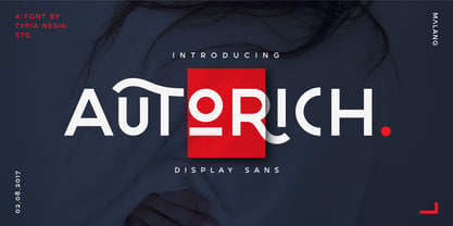 Autorich Sans is a display sans font, comes with 2 set of upper case (allcaps), 58 ligatures and some alternate. Great for brand identity, poster design, website / display, editorial, and more. **FEATURES :** * Basic A-Z * Numbers * Symbols * Stylistic Alternates * Standard Ligatures * Discretionary Ligatures * Oldstyle Figures * PUA Encode * Multilingual support Thank you for your purchase! and hope you're having fun with Autorich Sans ! Happy creating! Typia Nesia Studio
 - FF Scribble by FontFont,
$41.99 German type designer Ole Schäfer created this display FontFont in 1995. The family has 6 weights, ranging from Regular to Bold and is ideally suited for film and tv, editorial and publishing as well as poster and billboards. FF Scribble provides advanced typographical support with features such as ligatures, small capitals, and case-sensitive forms. It comes with proportional oldstyle and proportional lining figures.
 - Miranda Pro by Tim Rolands,
$29.00 An elegant display face influenced by Aldine oldstyle letterforms, Miranda Pro brings the early successful Tim Rolands font Miranda into the OpenType era. Miranda Pro now includes numerous extended ligatures, alternate forms, small capitals and support for a wider range of languages. Use it as a companion display for classic text fonts or on its own as a refined but stylish messenger for all sorts of projects.
 - Rustika by Linotype,
$40.99Rustika is a rather rough Oldstyle typeface. The roughness is seen in larger points only. In smaller points it is not easy to see that I tried to imitate characters cut with a chisel. The characters themselves follow otherwise totally the classic models. The name, in this spelling taken from Esperanto, refers to the rustic nature of the characters. Rustika was released in 1995. - Quebra by Vanarchiv,
$55.00 Quebra is an extend display sans-serif font family with four widths (Extra Condensed, Condensed, Normal and Expanded) and ten weights, italics versions are available. The main strokes contain small breaks simulating modulated variations on the letterforms, these details are more present on large body sizes. All font versions contain Latin and Cyrillic encoding characters and also ligatures, case-sensitive forms, fractions, oldstyle and finally tabular figures.
 - FF Letterine by FontFont,
$41.99 Italian type designer Alessio Leonardi created this display FontFont in 1995. The family has 7 weights, ranging from Regular to Black and is ideally suited for festive occasions, film and tv, music and nightlife as well as poster and billboards. FF Letterine provides advanced typographical support with features such as ligatures, alternate characters, and case-sensitive forms. It comes with proportional oldstyle and proportional lining figures.
 - Legal by Linotype,
$29.99The Legal typeface family grew out a sans serif project that Hellmut G. Bomm began in the 1970s (his HGB Grotesk). This refined, industrial type family is well suited for short amounts of text, headlines, corporate identity and logo design. In small sizes, the typeface works like many other sans serifs, but with better differentiation between characters. The Legal family includes oldstyle figures and true italics. - Leibniz Fraktur by RMU,
$25.00 In the middle of 18th century Leibniz Fraktur appeared in German print shops. This blackletter font with its great x-height preserved the then fashioned trunk in many of its uppercase letters. It was a cast font of Genzsch & Heyse, Hamburg. Leibniz Fraktur contains a bunch of useful ligatures, and by typing 'N', 'o' and period plus activating the Ordinals feature you get an oldstyle number-sign.
 - Cambalache by JVB Fonts,
$35.00 The idea for Cambalache was conceived back in 2008 and was to create a geometrical font based on tangential modules into structure. The serif would be arranged, looking to approach to the lettering shapes. The creative concept has a feel from the mid-30s of last century, reaching a taste of retro and vintage style. Includes oldstyle numbers, slashed zero, standard and discretional ligatures.
 - Kis FB by Font Bureau,
$40.00 Transylvanian punchcutter Nicholas Kis cut a leading figure in 18th century Amsterdam. Series of his matrices survived at the Ehrhardt typefoundry. From these Chauncey Griffith at Mergenthaler cut the Janson series in 1936. Morison at Monotype followed with Ehrhardt. David Berlow takes full advantage of current techniques to produce these splendid and adventurous display series to complement one of the great oldstyle texts; FB 2007
 - Kepler by Adobe,
$29.00Named after the German Renaissance astronomer, Kepler is a contemporary type family designed by Robert Slimbach in the tradition of classic modern 18th century typefaces. Modern typefaces are known for their cool intellectual quality, but Slimbach's Kepler multiple master captures the modern style in a humanistic manner. It is elegant and refined with a hint of Oldstyle proportion and calligraphic detailing that lends it warmth and energy. - Sigma by Wiescher Design,
$30.00 »SIGMA« is the name for the Greek voiceless »S«. It is also called the »Lunar Sigma«, in Hellenistic times the letter was simplified to »C«. I thought SIGMA was a nice name for my new, very readable and friendly Sans typeface. »SIGMA« has that classical Sans beauty with friendly touches that make it unique. You will love this font. It is a great everyday workhorse with seven weights from Thin to Bold and all the necessary weights in between. Great for body copy and headlines! With 875 Glyphs it is a truly European font designed for all Central European and Latin using countries. »SIGMA« has a set of Cyrillic that is – besides Russia – also good for Serbia, Macedonia and Ukraine. It has oldstyle- and lining-, tabular- and tabular-oldstyle-figures, many ligatures. »SIGMA« comes in Normal and Oblique, I made it Oblique instead of Italic which would have been too playful for this friendly font. Enjoy!