2,410 search results
(0.007 seconds)
- Shmulik Hasamba MF by Masterfont,
$59.00 - Rosh Gadol MF by Masterfont,
$59.00 - Sheva Brachot MF by Masterfont,
$59.00
- Kaffe Shachor MF by Masterfont,
$59.00 - Compact Hebrew MF by Masterfont,
$59.00
- Zanav Kashiach MF by Masterfont,
$59.00 - Haim Arukeem MF by Masterfont,
$59.00 - Fifty Five MF by Masterfont,
$59.00
- Pirkey Avot MF by Masterfont,
$59.00
- Elef Layla MF by Masterfont,
$59.00
- Ketamine One MF by Masterfont,
$59.00
- Prat Proza MF by Masterfont,
$59.00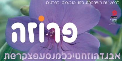
- Rosenberg Promo MF by Masterfont,
$59.00 - Frank Ruhl1924 MF by Masterfont,
$59.00
- Shuli Curly MF by Masterfont,
$59.00 - Victor Habaz MF by Masterfont,
$59.00
- Mana Hama MF by Masterfont,
$59.00
- Shmulik Yael MF by Masterfont,
$59.00
- Ein Karem MF by Masterfont,
$59.00 - Mechaot Poster MF by Masterfont,
$59.00 - Avney Gad MF by Masterfont,
$59.00
- Rosenberg Text MF by Masterfont,
$59.00 - Frank Ruhl MF by Masterfont,
$59.00
- Oron Koteret MF by Masterfont,
$59.00
- Prat Parpar MF by Masterfont,
$59.00
- MoDi Khilari 1 - Unknown license

- Fd Boldie Slab by Fortunes Co,
$9.00
- Pete-Boy <> Hand of Pete-Boy - Unknown license

- Scooter Boy Free - Unknown license

- Astron Boy Video - Unknown license

- Astron Boy Wonder - Unknown license

- BB Petie Boy - Unknown license

- Prissy Frat Boy - Unknown license

- BN Moog Boy - Unknown license

- Olho de Boi - Personal use only

- Boys on mopeds by PizzaDude.dk,
$20.00
- LHF Bell Boy by Letterhead Fonts,
$33.00
- Wrong Boys Graffiti by Sipanji21,
$16.00
- Little Boy Blue by Hanoded,
$15.00
- Geisha Boy AOE by Astigmatic,
$19.95


