2,396 search results
(0.104 seconds)
- Losta Frida by Creativemedialab,
$20.00 This family contains 5 weights and ornaments to create an artistic touch to your projects. Has tons of alternates and ligatures. Best for branding, Webdesign project, Clothing brand, logo design, valentine's greetings, packaging, and much more. Comes with a variable format as well as multilingual support, numbers, and currency symbols. Check out Pretty Boy which is a great pair for Losta Frida.
 - Ye-As-Ta by Grummedia,
$20.00Ye-As-Ta is a unique interpretation of traditional brush drawn oriental calligraphy. A caps only font, the characters type English style left to right but appear laid on their side. When the text box is rotated 90 degrees clockwise the text reads top right to bottom left, oriental style. A fun typeface, though reading can require a little practice! - Big Gorilla by Aminmario Studio,
$20.00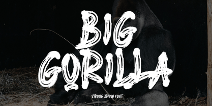 INTRODUCING This is a supercharged font, with natural brush, quick strokes and sharp details. Contains ALL CAPS, numbers, some punctuation and ligature. Perfect for challenging jobs, titles, movie,logos, apparel, t-shirts, hoodies, quotes, product packaging, or anything that needs a typographic turbo-boost and a typographic unique style. Thanks for checking out this font. I hope you enjoy it! AminMario
 - Cool Crayon by Hanoded,
$15.00 Cool Crayon is a nice typeface I created with the black crayola from my 3 year old son's crayola box. It was broken (because he tends to throw them around), but I managed to get the glyphs onto a sheet of paper. Cool Crayon is similar to Crayon Crumble, but is rounder and thicker. Cool Crayon comes with extensive language support.
 - Strangelove by FaceType,
$12.00 Strangelove is inspired by the title sequence of Stanley Kubrick’s movie Dr. Strangelove. The original titles were designed by Pablo Ferro, who is one of the most acclaimed film title designers, especially famous for his hand-drawn lettering. With the Bombs also come illustrations referring to scenes from the film. Looking for a serif version? Have a look at Strangelove NextSlab!
 - Cristal Ttris by Johannes Krenner,
$7.00 This Font is inspired by the Nintendo game: Tetris® It has 2 styles: BOLD and THIN. They both have simulated greyscale and can be used out of the box like you see them on the pictures. It comes with more than 450 glyphs per style. More than capable of supporting all european languages, small caps and different numeral figures.
 - Athletic Pro by Mandarin,
$29.00 Athletic Pro is an updated and revised version of Athletic Condensed. Added weight styles and a brand new designed Cyrillic alphabet. Practical and timeless, this display font does an excellent job on laying headlines and bold messages. With the variable font file you will have further personalisation and broader range of styles, it also contains the standard weights and styles.
 - Conjur by chrismetcalfe,
$30.00This work is inspired by creatures that I have drawn for my six year old boy. The monsters can be found at chrismetcalfe.com. I wanted to take their hair/fur and translate the fun attitude to type. To be honest I think this font is used best as display type. However the fun attitude lends to many usages without structure. - Acceptable JNL by Jeff Levine,
$29.00 Acceptable JNL is a typeface modeled from hand lettering on a piece of 1940s sheet music, and has a distinctly casual, yet Art Deco flair. It's name can also be mischievous, for when you're asked "which font should I use for the job" you can answer "the Acceptable font". This may well start a dialogue reminiscent of Abbott and Costello's "Who's On First?"
 - ALS Pobeda by Art. Lebedev Studio,
$20.00 Pobeda is a bright jobbing typeface inspired by the Moscow Victory Day Parade commemorating the 70th anniversary of the end of the Second World War. At the heart of the typeface is the recognizable rapid silhouette of the famous MiG-29. This cool typeface looks great on souvenir objects, in print and on the web, adding some technical flair to any material.
 - Toddler JNL by Jeff Levine,
$29.00The fun, lighthearted appeal of Toddler JNL will bring out the inner child in you. Perfect for any layout or project that has to do with newborns, toddlers, preschool, playtime or anything related to little ones. There's a fairly complete character set - and two different width blank boxes on the brace keys - which can be used as spaces between words. - Srostky by Nikita Kanarev,
$25.00 The Srostky font is willful and stubborn. It is rude, but it is as natural as a country boy. The characters of this font were inspired by an image of the Russian countryside. The letters look as if they were felled with an ax. It is named after the village in Altai region. This font is suitable for short sayings and titles.
 - Adequate by K-Type,
$20.00 ADEQUATE is a basic geometric sans serif typeface comprising 6 weights plus a free italic with each. The family has modern, workaday letterforms with a tall x-height for clarity and legibility. Adequate does the job; it doesn't claim to be beautiful and lacks the fashionable mannerisms of many contemporary faces, but there is something timeless, perhaps elegant, about its mathematical simplicity.
 - Bravissima Script by Sudtipos,
$59.00 Bravissima is the dynamic and spirited embodiment of the 1970s, when food was food and the wild brush ruled. It tells you to eat, and to do it right now. Another perfect blend of traditional Koziupa calligraphy and Paul tech, spiced up with OpenType features like the meal of your dreams. A personal favorite for food packaging design, especially hot stuff. Bon appetit.
 - Okay Cotton by Okaycat,
$29.95 Okay Cotton is soft & gentle -- specially made for situations where a pointy hard-edged font just isn't up to the job. This font is extra-soft but stays true to form -- delivering your message with clarity. The small details make Okay Cotton friendly & inviting. Okay Cotton is extended, containing West European diacritics & ligatures, making it suitable for multilingual environments & publications.
 - Squat by BA Graphics,
$45.00 Squat may be vertically challenged but hey, even the vertically challenged need love too! And you know what? Squat is worth much more than Diddley Squat! It gets the tough jobs done in half the vertical space with its sturdy, low profile. Randy Newman may not care for it, but Squat shows that short fonts got plenty of reason to live! So there.
 - Barrage by RagamKata,
$14.00 Barrage Display Font Barrage presents a modern take on typeface design, merging cheerful boldness with artistic touches. Each letter is meticulously shaped, striking a balance between confidence and elegance. The box-like lines provide a sturdy foundation, while the subtle curves add a delightful creative flair. With its lively boldness and delicate lines, Barrage conveys courage and a positive personality.
 - Zayna by Fidan Fonts,
$17.90 Zayna is an uppercase sans serif font. The font works perfectly for headlines, posters, pull quotes, wordmark logos and many more. It includes full set of uppercase basic characters, multilingual symbols, numerals, punctuation (check the previews in order to see them all). Latin-based Language Support (You can check your language typing characters in text box below). 2 styles: plain, oblique. Happy creating!
 - Arum Sans by Australian Type Foundry,
$40.00 A humanist sans-serif family which displays subtle influences of the edged writing tool. Inspired by modern faces such as Chaparral and Enigma, Arum Sans is versatile enough to be used for high-end text setting as well as display purposes. A full international glyph set, extended for European use, allows Arum Sans to play on the field with the big boys.
 - "Child's Play" isn't just a font; it's a joyride back to the days of yore, when the toughest decision of the day was choosing between crayons or markers. This font mimics the erratic yet sincere hand...
- Long Underwear by Comicraft,
$29.00 Boy, they're everywhere. One of your neighbors is probably one of them, Freaking super-heroes (TM, ©, ®, SM blah blah blah) are more ubiquitous in cities these days than Simon Cowell is on talent shows. Notice how that guy on the subway -- the one with the boy scout haircut? -- see how he keeps his shirt buttoned all the way up? He's not sweating either... that's 'cause he's probably from some dead planet that exploded twenty years ago. His REAL parents wrapped him in blankets and, when he turned 18, his Ma on Earth turned those same blankets into Long Underwear for her foster son. He's probably wearing his long underwear right now. That's why he's smiling at you through his horn rimmed glasses. He thinks you don't know. Thinks he's special. Thinks he's a super-hero (TM, ©, ®, SM blah blah blah). Ain't that Super?
 - Verse Serif by Hubert Jocham Type,
$39.00 In 2006 the art director of Emotion, a women’s psychology magazine, asked me to design a copy typeface for them. Before I actually got the job I started to work on a serif. I wanted it to be feminine but still clear and modern. On one hand there are the floral round elements and on the other hand the angular serifs. In the composition I wanted the two extremes to work together. All the other elements had to be harmonized. The proportions needed to match the magazine’s requirements. The ascenders and descenders are short enough to work in narrow columns but long enough to work in small sizes. As you can imagine, the emotion-job never happened. Verse is now a serif and a san-serif with 7 weights with italics and smallcaps. In copy you should not get heavier than Heavy. Extrabold and Ultrabold work best in display.
 - Space Rocks by Wing's Art Studio,
$10.00 Space Rocks! A Retro Sci-Fi Font Inspired by 1950s Television Serials “Oh boy, oh boy, oh boy! The next episode of Space Rocks is on tonight! What’s it about? Well, it’s all to do with this family of astronauts who crash land on Mars and how they survive all sorts of alien creatures and killer storms! The science is really real too! Who needs school!!!” And so goes the story of one young fan whose imagination is captured by the latest offering in a golden-age of TV science-fiction. A brand of 1950s programming that offered a light-hearted and optimistic view of the future full of exploration, discovery and hazardous adventure! Sometimes even a cautionary tale to live on in your nightmares! With Space Rocks I want to capture this vibe with an all-caps design inspired the opening titles of these shows, fully hand-drawn with a range of discretionary ligatures that add a comic (not atomic!) touch. The package includes Regular and Outlined (all hand-drawn) versions with a complete set of alternatives to help maintain the analogue look. This font also includes unique uppercase and lowercase characters, along with numerals, punctuation, language support, underlines and symbols. It’s perfect for movie and television titles, album covers, posters or any design that needs a dramatic, spacey and fun look. Check out the visuals to see it in action.
 - Batoswash by T4 Foundry,
$21.00Avantgarde fonts Batory and Batoswash are monoline sansserifs designed by Bo Berndal. The futuristic Batory (think Bladerunner and Total Recall) and the spicier relative Batoswash come in three versions: Narrow, Middle and Wide. The font family is available in Truetype and Postscript for Mac and PC. Bo Berndal, born 1924, has been designing typefaces over 56 years, for Monotype, Linotype and other foundries. "Batory is a monoline reaction to my many calligraphic fonts", says Bo Berndal. "That is also the reason I did several widths instead of weights. Batory has short stems and high x-height. Batoswash is a Batory gone wild!" The successful Batory has already been used for logotypes, vignettes in magazines and as headline type. - Batory by T4 Foundry,
$21.00Avantgarde fonts Batory and Batoswash are monoline sansserifs designed by Bo Berndal. The futuristic Batory (think Bladerunner and Total Recall) and the spicier relative Batoswash come in three versions: Narrow, Middle and Wide. The font family is available in Truetype and Postscript for Mac and PC. Bo Berndal, born 1924, has been designing typefaces over 56 years, for Monotype, Linotype and other foundries. “Batory is a monoline reaction to my many calligraphic fonts”, says Bo Berndal. "That is also the reason I did several widths instead of weights. Batory has short stems and high x-height. Batoswash is a Batory gone wild!" The successful Batory has already been used for logotypes, vignettes in magazines and as headline type. - Armature Neue Sans by fontBoy,
$15.00 Armature Neue Sans is an extension of the original Armature Neue family released in 2010. Like Armature Neue, Armature Neue Sans consists of six weights with accompanying italics. Armature is one result of my interest in typefaces that are constructed, rather than drawn. Although it is basically a monoline design, there are subtle details throughout that compensate for a monoline’s evenness. As with all fontBoy fonts, there are dingbats hidden away in the dark recesses of the keyboard. When I first started designing this face in 1992, I called it Dino - I thought I would name all my fonts after famous pets, so the dingbats for Armature are dinosaurs. To access the alternate characters (closed counter B and R, and others) use Stylistic Set 1 or the glyphs palette in your OpenType-enabled application. Designed by Bob Aufuldish with editing and production by Psy/Ops.
 - Sleepy Time by Hanoded,
$15.00 Sleepy time… Ah, if only your kids would go to bed, close their eyes and drift off to sleep. This font was created when my son had some problems falling asleep: he'd cry, he wanted to sleep in a different bed, he wanted a different animal friend (he has Tij - a tiger, Meh - a sheep, Rafi - a giraffe, Moo - a cow, Woofy - a dog, Kikker - a frog). Sleepy Time font is an all caps typeface with uneven letters and a very different upper and lower case. It comes with all languages, including Cyrillic!
 - Hello Walter by Fonts of Chaos,
$14.00 Hello Walter is a nice and clean typography I made for my little boy Walter. The story behind is I want to create a bold font with less holes and funny shapes. More naive but still serious with a lot of glyphs easy to use in many language cyrilic included. Perfect for web and print, for making logos or children book and app. Have lot of fun.
 - Calendar Blocks JNL by Jeff Levine,
$29.00Calendar Blocks JNL was inspired by old-fashioned wood type used to assemble calendar pages in the days of letterpress printing. The A-Z keystrokes contain the dates 1-26. The lower case a-z keystrokes have the remaining dates 27-31, along with the split dates 23/30 and 24/31 and blank boxes. The days of the week are located on the 1-7 keys. - Depot New by moretype,
$35.00 Original released in 2006 Depot has now been updated to Depot New. While staying true to its original robust charm Depot New has been reexamined from the ground up with improved outlines, spacing, kerning and opentype features. Depot New also boasts two new weights with Thin and Thin Italic added to its arsenal, making it the perfect choice for the most demanding of jobs.
 - Toot Sweet Bistro NF by Nick's Fonts,
$10.00A 1928 poster for a café by German artist Karl Bauer informed the creation of this charming and expansive typeface. This font hops, bops, flip-flops and never stops, and is named after a fictitious café which offers cool jazz and fast service. Both versions contain the complete Unicode 1252 (Latin) and Unicode 1250 (Central European) character sets, with localization for Romanian and Moldovan. - FDI Reklameschrift by FDI,
$25.00 FDI Reklameschrift is a carefully crafted digitization and extension of “Reklameschrift Bombe”, originally released in 1908 at the type foundry Ludwig & Mayer. FDI Reklameschrift covers Western, Eastern and Central European Latin and comes in two versions: Version A is as close as possible to the original design, containing some blackletter-style letterforms. Version B replaces these letterforms to improve legibility and allow a modern use.
 - Grand Heist by Palmer Type Company,
$30.00 Grand Heist is a bold and unique display typeface, fully equipped with basic and Western European Latin characters, numbers, punctuation, some symbols and special characters. Now we don't condone robbing banks here, but if you do, we can't deny that you'll have way more street credibility if you have this font in your handy fontbook. Just sayin'. Aa-Zz Numbers Multi-language support Symbols Special Characters
 - Round Rock NF by Nick's Fonts,
$10.00Woodtype wizard Rob Roy Kelly identified the inspiration for this typeface in his 100 Wood Type Alphabets simply as "No. 154". Funky, chunky, round and robust, it’s clearly a barrel of fun. Named after a small town in Central Texas, which just happens to be the home of Dell Computer. Both versions of the font include 1252 Latin, 1250 CE (with localization for Romanian and Moldovan). - Dorchester Script MT by Monotype,
$29.99Dorchester Script font, released in 1939 by Monotype, was widely accepted by high society for calling cards, announcements, and invitations. Dorchester Script is nearly upright with lowercase letters that have loops and generous ascenders and descenders and capitals with delicate, curly flourishes. Besides the usual job work, such as letterhead and business cards, Dorchester Script font can be used sparingly for serious display work. - Dive Gear Stencil JNL by Jeff Levine,
$29.00 Some vintage 1960s-era packaging for dive gear (masks, swim fins, etc.) manufactured by the Voit division of AMF had various merchandise boxes hand-lettered [with some variation of design] in an interesting sans stencil. These packages formed the inspiration of Dive Gear Stencil JNL. Thanks once again to Gene Gable, whom on many occasions has provided Jeff Levine material for type design inspiration.
 - Be Bowtiful by One Line Design,
$19.99 Wrap it up by adding a little sweetness to your words. This is an addition to the Be Me font family, to give it a little flair and charm. Doll up announcements, posters and so much more. Letter alternates available so the placement of the bow is perfect for your word/s. Includes: Basic Latin Latin- 1 Supplement Latin extended-A Latin extended-B
 - Galanthia by Calamar,
$20.00 Galanthia Script is a beautiful font for those who are needing of elegance and stylish for their designs and particularly well suited for wedding invitations, cards and feminine branding. Galanthia Script includes Upper and Lowercase Basic Characters, Numbers and Punctuation. Galanthia Script is also available for Western European, Central European and South Eastern European Languages. You can check your language typing characters in text box above.
 - Dapplegrim by Hanoded,
$15.00 Dapplegrim is a Norwegian fairytale collected by Peter Christen Asbjørnsen and Jørgen Moe in their book ‘Norske Folkeeventyr’. The story is about a boy who inherits a big horse (called Dapplegrim, or Grimsborken in Norwegian) and sets off to rescue the king’s daughter from a nasty troll. Dapplegrim is a handmade fairytale font. Use it for your book covers, product packaging and fairytale collections!
 - Fundevogel by Hanoded,
$15.00 Fundevogel is a Brothers Grimm fairytale about a boy who was found in a tree. The story, of course, has all the obligatory characters in it: a fair maiden, a wicked cook, an old forester and lots and lots of shapeshifting. And, yes, a happy end! Fundevogel font is a handmade fairytale font. It comes with extensive language support and all the cuteness you could wish for.