2,252 search results
(0.016 seconds)
- Summit by Jonahfonts,
$35.00 Summit rehashes both Circuitry Fonts, combining them into one font. To further modernize Summit, I have included all the characters required for full character set. Regular with Small Caps. Summit includes all punctuations, numerals, diacritics and special characters. The oringinal Circuitry Font was inspired by the printing on electronic circuit boards, it was interesting that most all printed font-strokes were either 90 or 45 degrees. I have kept most if not all of these angles while simultaneously giving it a contemporary feel.
 - MFC Billow Monogram by Monogram Fonts Co.,
$299.00 The inspiration source for MFC Billow Monogram is a beautiful letterset from the "Manuel de Broderies No. 179" by N. Alexandre & Cie. from the late 1800's. We've drawn out some flourishes and ornamental glyphs based on the original design in order to offer more versatility with this monogram. Experiment with the flourishes in different combinations. You may be surprised at what you can create! Download and view the MFC Billow Monogram Guidebook if you would like to learn a little more.
 - Rose Avenue by Set Sail Studios,
$26.00 Introducing Rose Avenue, an extra bold serif font with soft, charming rounded edges and curves. Rose Avenue brings chunky retro typography to the modern era, and includes 70 additional special characters with additional flair and flourishes - providing you with a variety of captivating custom text arrangements. Whether it's a fancy retro-inspired logo, or engaging bold header text - Rose Avenue is able to deliver. Accessing Alternate Characters • Many letters of this font have multiple alternate versions (see final image). In order to access each one, simply make sure 'Standard Ligatures' are enabled, and follow your letter with a number. For example, typing 'A1, A2, A3, A4, A5' will generate the 5 alternate versions shown for capital A. Accessing Ligatures • There are 10 lowercase ligatures (double letters) included. In order to access these, simply make sure 'Standard Ligatures' are enabled, and the ligatures will automatically generate as you type. All special characters can also be accessed via a Glyphs panel. Language Support • Rose Avenue supports the following languages; English, French, Italian, Spanish, Portuguese, German, Swedish, Norwegian, Danish, Dutch, Finnish, Indonesian, Malay, Hungarian, Polish, Croatian, Turkish, Romanian, Czech, Latvian, Lithuanian, Slovak, Slovenian
 - Homework by DAAZ,
$9.00 Homework font was specially conceived/designed for teaching cursive writing. This resource allows tutors and parents to create worksheets for individual or class teaching. Associated with the dashed version of the font, students can learn and exercise their handwriting abilities. All capital letters, excluding I, F, T and P, link to any following small letter: the sequence of the previous letter stroke always follows the angle of the initial stroke of the subsequent letter. This, in the real world, means that words built with the font can be handwritten without having to lift the pen from the paper (except to cross t and f and dot i and j) or interrupt the writing flow. All the letters are base aligned and all small letters have the same ‘x’ height in order to fit a ruled worksheet. Homework font letter stroke widths are uniform in order to emulate regular pens. Homework font also mimics genuine handwriting, making it useful for online stores gift cards, thank you cards and all applications where a real world feel is desired. The Homework font also performs well on long texts.
 - Ozana Pro by Mostardesign,
$99.00 Ozana Pro is a bracketed serif font family adapted to the professional requirements of graphic designers, web designers and mobile app developers. Comprised of 24 styles including 12 styles designed especially for headlines and 12 styles for text and long paragraph design, Ozana Pro is a very versatile family of fonts that can be used in many projects such as editorial design, branding or corporate identity creation, design of posters or logos, the creation of websites or the development of mobile applications. This serif font family, with a resolutely modern aspect, also hides a unique typographic design since it has 2 distinct styles (Roman and Display) which have 2 different optical sizes in order to graphically differentiate the appearance of titles, subtitles and long paragraphs. With this design of glyphs differentiated by the optical size according to the styles, the titles have a very graphic aspect while the long texts have a more classic design in order to keep an optimal readability in all cases. Ozana Pro is also equipped with powerful OpenType features such as case sensitivity, true small caps, ligatures, tabular figures, old styles figures, numbers circled. Ozana Pro is also available as a variable font family.
 - Wicked Hearts by Set Sail Studios,
$26.00 Wicked Hearts Is a chunky Serif font with an edge - it's a cool modern take on a retro classic, and it's ready to make a lasting impression on your merchandise, quote designs, header text, logos & branding, advertisements and much more. It's packed with plenty of alternates and ligatures to really bring it to life, and give you a wide range of customisation options. FAQs; Accessing Alternate Characters • Many letters of this font have multiple alternate versions (see image). In order to access each one, simply make sure 'Standard Ligatures' are enabled, and follow your letter with a number. For example, typing 'A1, A2, A3, A4' will generate the 4 alternate versions for capital A. Accessing Ligatures • There are 12 lowercase ligatures (double letters) included. In order to access these, simply make sure 'Standard Ligatures' are enabled, and the ligatures will automatically generate as you type. Standard Ligatures are supported by most desktop graphics & text software (not just the fancy ones!), including Photoshop, Illustrator, InDesign, Word, Pages & Keynote. Language Support • Wicked Hearts supports the following languages; English, French, Italian, Spanish, Portuguese, German, Swedish, Norwegian, Danish, Dutch, Finnish, Indonesian, Malay, Hungarian, Polish, Croatian, Turkish, Romanian, Czech, Latvian, Lithuanian, Slovak, Slovenian
 - Guess by DearType,
$59.00 Guess is a versatile, connecting script, designed to convey elegance and style. It is slender, feminine and friendly, let alone sexy. Guess will work perfectly for fashion, e-commerce brands, trend blogs, or any business that wants to appear classy and chic. The font is ideal for high-end logotypes and magazine headlines, but let’s not forget greeting cards, invitations, posters, ads and the various web usages. When it comes to the glyph set, well, Guess Pro has quite a lot of that (2500+ glyphs) - think multiple languages and tons of swashes and stylistic alternates to unleash your creativity. For all pragmatists out there, there is also a basic version of the font with an extended latin glyph set (no swashes, contextual alternates or stylistic sets). Last, but not least, Guess comes with a neat geometric sans in capital letters, which makes a great addition to the script, and a set of beautiful ornaments and borders that complete the whole look with a bang.
 - Nikola by Untype,
$29.00 Nikola is a text typeface that offers a wide range of possibilities. While its regular and medium weights were specially optimized for maximum performance, balanced for excellent legibility and carefully crafted to spread a scent of tradition on long text settings; its extreme weights, on the other hand, were designed with a more display use in mind, and thanks to the flexibility place at disposal by its many alternates, swashes, decorative cartouches, borders and ornaments, can deliver a vintage, reliable, dynamic, fancy and even playful inflection to the text. Nikola includes a large set of over 1400 glyphs, support for more than 200 latin script languages and 1.21 gigawatts of the finest type design generated by classic proportions, the elegance and formality of the early XX century and a glimpse of expressionism on terminals and serifs. Nikola was named after Nikola Tesla as a tribute to the pioneers of the electric age.
 - Frigga by Sudtipos,
$49.00 Frigga is a typeface that settles its roots in the Baroque Dutch tradition of text typefaces and northern european type forms. Carefully crafted for an optimum balance between its solid historic structure and a refreshing repertoire of organic forms, where blossoms its contemporary spirit and natural beauty. In the page, spread on long text settings a feeling of comfort and closeness, while in headlines and display use, it reveals itself more exuberant and plentiful of details. Is beautiful, timeless, lush, elegant and smooth like nordic mead. Fully equipped to realize your wildest editorial dreams, Frigga came in 20 styles, with more than a 1000 glyphs per style, alternates, ornaments and borders, old style and tabular figures, small caps and plenty of OpenType features to fulfill any type of editorial need. Named after the nordic goddess Frigga (also called Frejya), taking as a reference the romantic mythos of its cultural representation, the solemn presence and her warm, gentle embrace.
 - Wolfsblood by Monotype,
$29.99 Wolfsblood is a new display face by Jim Ford, adapted from hand-lettered logos spawned by punk rock bands like The Misfits and Bad Brains. The style can be traced back further to Hollywood and the explosion of low-budget exploitation, horror and sci-fi films, which also had an influence in punk rock. Wolfsblood captures this bizarre dark-spirited lettering which has become a staple in the designer‘s work for bands and posters. The Wolfsblood font has an expanded character set with borders, dingbats (yes, Bats!), and contextual ligatures programmed to give the typeface a random appearance by default. As with some of Jim‘s other typographic experiments, Wolfsblood encourages the designer to play with upper and lowercase, and mixed-case settings, to replicate the decisions that a lettering artist might make. Wolfsblood is great for logos, posters, headlines and short bits of text, and will add a fun, aggressive energy to your dark and other-worldly creations.
 - Ahra by Magpie Paper Works,
$58.00 Ahra from Magpie Paper Works is an upright, hand-lettered script full of fun calligraphy. This Opentype font was created with a pointed pen & ink, and features a host of special features. Within Ahra are three sets of capital letters, ranging from simple to quirky to traditional, as well as single-word characters for common titles (Mr., Miss, Dr., etc.) prepositions (to, the, for, etc.) and envelope addressing (blvd., st., etc.). You'll also find simple & automatic end-of-word swashes, old-style numerals and special double-letter ligatures for a true hand-drawn look. Ahra Hand features decorative word art, all lovingly drawn in a swirling traditional calligraphy style. There are 88 unique greetings, prompts, and phrases, plus an ornate set of numerals 0-9. Ahra Swash includes over fifty unique hand-inked flourishes, borders, corners, swashes and curls. Mix and match for a truly custom look! All were designed to coordniate with the Ahra alphabet, but can be used to enhance other faux-calligraphy fonts.
 - Bourton by Kimmy Design,
$10.00 Bourton is the sans-serif cousin to Burford. In addition to a new look, it boasts more layering options, stylistic alternatives, graphic extras and even comes with its own script font! For a hand-drawn look, check out Bourton Hand Okay… so here’s everything you get with Bourton! Bourton Layering Fonts • 6 Base Layer Fonts (Base, Inline, Marquee, Stripes A, Stripes B, Stripes C) • 6 Top Layer Fonts (Base Drop, Dots, Line Light, Outline Light, Outline Medium, Outline Bold) • 6 Extrude Fonts (Extrude, Outline, Shade A, Shade B, Shade C, Shadow) • 5 Drop Shadow Fonts + 5 solo styles (Drop Shadow, Drop Extrude, Drop Line, Drop Stripes A, Drop Stripes B) • 2 Line Fonts for secondary text (Line Medium, Line Bold) Bourton Script • Light • Bold Bourton Extras Ornaments, banners, frames, borders, flags and line break (OTF, EPS, AI with User Guide for OTS) Flourishes (OTF, EPS, AI with User Guide for OTS). Happy Creating!
 - Spry Roman by Stephen Rapp,
$49.00 Handmade, expressive, lively, organic— …words typically used to describe a script font or a casual sans. Spry Roman opens up new possibilities. It’s origin is handwritten letters created using a pointed nib on slightly toothy paper. While based on a Roman form, the letters are designed to break out of the mold and dance along the baseline. Spry Roman Pro is a fully featured opentype font. Among the 964 glyphs are loads of alternate characters and swash letters; a full set of small caps; simple fractions; case sensitive punctuation; and a variety of ornaments, border elements, and flourishes. It also includes a full dose of language support for not only main characters, but also for alternates and small caps. Ligatures have been kept to a minimum to allow users the option of tracking text. **Please note that the Pro version has all the glyphs of the others combined. The smaller versions are for those who don't have opentype savvy apps like Adobe Illustrator.
 - Integra by Sudtipos,
$39.00 Semi-serif? Semi-sans? Emerging from the hazy border that divides Sans from Serif, Integra aims to integrate both styles in a cool, elegant, contemporary fashion. With its sleek anatomy, flared terminals and almost non-existent straight lines, Integra was inspired by the stressed, modulated, unserifed letterforms incised in the early 15th-century ledger tombs at Santa Croce church in Florence, and the neoclassical grotto inscriptions at Stourhead in England that dates from the mid 18th-century. Integra, however, gives a contemporary, even futuristic twist to these references by featuring original, audacious shapes on key letters like L, E and X; as well as with the modern, generous proportions of its lowercase; infusing it all with a flowing, luminous, Latin American feel. Integra comes in several weights and italic styles, for text composition and display usage. Its rounded counterforms and arch-like shapes lend texts a spacious, neat, architectural quality, perfect for sophisticated content.
 - Infusion by Andinistas,
$39.00 Infusion is a type family designed by CFCG & Fabio Godoy for andinistas.net. The creative process of Infusion evolved throughout a myriad of experiments supported by my font gluten This is why its expressivity comes from the addition and subtraction of its parts by mixing and combining, resulting in a great variety and new versatility of uppercase, lowercase, multiple and different numbers to be applied at the beginning, middle or end of the word. Infusion is used to write sentences in craft contexts that require organic graphic design, with meticulous imperfect look. Infusion offers typographic solutions out of the limits, or out of borders that divide the mechanics of the drawn by hand. Infusion has 6 decorative and legible fonts to write casual messages with organic, friendly and natural personality. Infusion “Script, Mix, Roman, Shadow, Extras, Dingbats” contain unconventional visually appealing ideas to work independently or in group in the design of logos, packaging, presentations, headlines or editorials.
 - Monterey Pop by K-Type,
$20.00 Monterey Pop oozes 1960s freedom and optimism, and is based on Tom Wilkes’s poster lettering for the Monterey International Pop Festival in June 1967, the event which heralded the legendary Summer of Love. The fonts include a newly-designed lowercase and a full complement of Latin Extended-A characters. In addition to the normal font, Outline and Thinline versions with matching spacing and kerning are supplied for use separately or overlapped with the regular font for bicolor effects. The Outline font is best for darker lines, and the Thinline font is designed for white and tinted outlines which can tend to halo and appear slightly bolder.
 - Comical by Scholtz Fonts,
$12.00 Comical is an offshoot of Scholtz Fonts 2007 Comic SCF. The font has been reworked and updated, and is presented in three weights, Black, Regular & Lite. Comical is legible and infinitely versatile: Black works wonderfully for display purposes, posters, headlines, branding, signage, ads and comic covers. Regular is great for body text or subheadings, for hang tags and branding, for greeting cards, magazines and comics. Lite works best as a body font in children's books and comics, and in combination with the bolder options. The family is vigorous, lively, casual and, above all, fun! Comical supports extensive languages such as Western European, Central and Eastern European languages.
 - Shad by Ingo,
$27.00 The Shad is the almost illegible cousin of the >> Chiq. As the name suggests - it consists of the shadows of the letters. And the bolder the font style, the stronger it is. The “Light” only has a thin shadow, while the “Black” casts a very deep, broad shadow. Shad only consists of the letter shadows, the corresponding letter remains transparent, i.e. without filling. The “metrics”, i.e. the spacing and character widths, correspond to those of Chiq, so that both fonts can be placed congruently on top of each other. When you combine and play with the two fonts, very attractive effects quickly emerge. Shad brings a bit of 3D into typography.
 - Veotec by Hashtag Type,
$29.00 Veotec is a classic humanist sans that skilfully works for both screen and print due to its steep and precise angles enabling more negative space. Not only does this methodical approach improve legibility and readability at small sizes, it allows the bolder weights to feel harmonised and consistent without the compromise of this legibility. Angles are refined and considered with a balance between sharp and round curves adding a unique feature to this font. This also gives a modern and appealing feel at large sizes. Details include 6 well constructed weights, manually edited kerning, which is more open for on-screen devices, ligatures and alternatives.
 - Plywood by Canada Type,
$24.95 Plywood is based on a long lost American film classic: Franklin Typefounders's Barker Flare from the early 1970s. Plywood is a surprisingly effective mix between the rigid confidence of nineteenth century wood types and the smooth feminine curves of twentieth century art nouveau ideas. With many variations on almost every letter in the alphabet, it's a versatile typeface that can make itself timelessly at home in multiple design environments, with motifs ranging from the strong and western to the crafty and artsy. Plywood's very expanded character set comes in all popular font formats, including a Pro version that takes advantage of OpenType's many character alternating features in supporting programs.
 - PF Monumenta Pro by Parachute,
$69.00 Royal, majestic, elegant. These letters are based on Roman and Greek characters carved on stone. They come in 3 different styles. Normal and Shaded are designed to have serifs with a finer thinning. On the other hand, Metallic is bolder and simulates in the most realistic way three-dimensional metallic lettering. There are some alternate characters placed at lowercase positions as well as a few stylistic alternates which are accessed through the OpenType features. Pay attention to letters like Greek Omega (lowercase position) and Greek Xi (lowercase position) as well as B, R, K (lowercase position). Monumenta Pro was recently upgraded to support Latin, Greek and Cyrillic.
 - Scatio by Wahyu and Sani Co.,
$16.00 Scatio is squarish with vertical terminal cut, a multi-purpose sans serif which can be use for many kind of graphic design projects. The Light, Regular and Medium weight have good legibility for text, the bolder and lighter weights can be used for headlines, display, posters, and more. Each members of the Scatio family contains 400+ glyphs which covers Western and Eastern Latin based languages. Each font is also equipped with some useful OpenType Features, such as: Fraction (frac) Numerator (numr) Denominator(dnom) Standard Ligatures (liga) Localized Forms (locl) Ordinals (ordn) Proportional and Tabular Lining (pnum & tnum) Superscript and Subscript (sups & subs) Scientific Inferior (sinf)
 - Biblia Serif Display by Hackberry Font Foundry,
$12.95 What I needed in my projects was a solid oldstyle serif typeface with impact for heads. I had an old engraving font, which I’d never really finished. It happened to be built on the Minister/Diaconia base drawings I used to create Biblia Serif, so I took a shot at it. It’s wide enough to minimize the large solid ink shapes of many of the bolder display headline faces. It’s not readable, but it’s very legible. This is exactly what I needed for headlines, callouts, and special subheads. It uses the same vertical metrics of the Biblia Serif book Production Group It helps keep fiction designs comfortable
 - Pueblito by Corradine Fonts,
$15.00 Pueblito is a hand drawn font with a rustic and antique appearance. Was inspired from old books and newspapers but express a very own personality and not necessary represent a specific classic style. The family consists of twelve fonts in six weights plus a set of ornaments in order to compose all kind of texts. Using Pueblito in your projects, you can obtain an original aged flavor and just by adding a subtle texture effect will help you to obtain the desired vintage look.
 - Electric Newspaper JNL by Jeff Levine,
$29.00 Around 1931, the Los Angeles Times (in partnership with the Richfield Oil Company) installed on its building a moving message board similar to the one at the New York Times in New York City which they dubbed an “electric newspaper”. The style of characters used on this electronic sign were the basis for the namesake font Electric Newspaper JNL, which is available in both regular and oblique versions. A blank space to place between words is available on both the solid bar and broken bar keystrokes.
 - Ongunkan Old Hungarian Runic by Runic World Tamgacı,
$50.00 It was used in parts of Transylvania until the 1850s, although it was banned by Istvan, the first Christian king of the Hungarians (Szekel), in line with an order to "destroy all pre-Christian inscriptions". Hungarian runic script was usually written on wood-stone pieces in the bustrofedon style. In this method, the writing was written consecutively from right to left and from left to right. This article is available in Bosnian, Carpathian and Glozel editions. Whenever possible, I will present the fonts in these versions.
 - Noyh Geometric by Typesketchbook,
$55.00 Noyh Geometric is altered modified from the form of the original “Noyh(2015)” typeface. We added sharp corners in apex, including the structure of typeface. Import to be more Corporate, the font family has flat terminals that harmonize with sharp corners. With all of these features , “Noyh Geometric” is a prominent, eye-catching and unique typeface. It comes with 9 weights and italic type in order to suit for a multifunctional usage, especially for cooperative work, such as website, magazine, editorial, publishing , as well as packaging.
 - Monadic by TEKNIKE,
$45.00 Monadic is a modern singular monospace display font. The typeface is made from groups of single basic triangular geometric units. Monadic is inspired by structured and organic geometry. The name is derived from the Ancient Greek μοναδικός (monadikós, “single”), from μονάς (monás, “a unit”); it is the adjective of monad, an elementary individual substance which reflects the order of the world and from which material properties are derived. Monadic is great for display work, logos, structures, architecture, technology, biology, sports, monograms, quotes, headings and posters.
 - Genilla by Fatamorkidd,
$11.00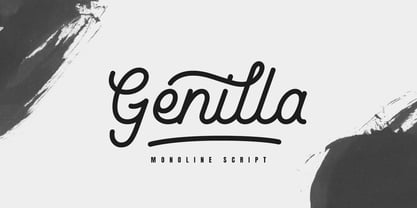 Genilla monoline script. It is perfect for branding, logo, invitation, stationery, wedding designs, social media post, handwritten quotes, product packaging etc. Comes with full set of gorgeous uppercase and lowercase letters, numerals, a large range of punctuation, ligatures and also swash. In order to use the beautiful swashes, you need a program that supports OpenType features such as Adobe Illustrator CS, Adobe Photoshop CC, Adobe Indesign and Corel Draw. but if your software doesn't have Glyphs panel, you can install additional swashes font files.
 - Dylan Condensed by Wiescher Design,
$29.00 Dylan is a Sans typeface in the best American tradition. In order to keep corners open and to make the font more readable in small sizes it has deep cuts where curves join straights. I designed 8 finely tuned weights with fitting italic sets. The fonts includes full smallcaps, language support for most European languages plus Turkish, many fractions, nominator and denominators, Greek mathematical signs and many currency symbols. It is a versatile font that is well suited for many occasions, even for signage.
 - Vitrines by PintassilgoPrints,
$24.90 Vitrines is a digital and extended version of a charming alphabet featured in a 1913 book devoted to window signs and show cards. This version was carefully developed to preserve the original hand lettered look and feel. It includes a bold weight and a set of pattern tiles to adorn your compositions. A note about the pattern font: in order to create even patterns, be sure to set the line spacing the same size as the font and set no spaces before or after paragraphs.
 - Avion by Fenotype,
$25.00 Despite what some might say, you can’t just always go for that most ubiquitous font in the world, can you? Avion font family channels those cool modernist vibes yet brings something new to the table. With a slightly more rectangular approach and some clever detailing, Avion has a distinct look of its own, yet provokes a calming familiarity of neutrality and objectiveness. As goes without saying, it’s also equipped with a sensible amount of features that make it a true, versatile workhorse. Get on board.
 - Shmulkas by Fontsoon,
$9.00 Nu?! Vhat else vould you font?! Introduction to the first kosher vant...er...font! Yes, our Board certified rabbis made all the proper blessings so you can use this font guilt free. Just kidding, what's Jewish without a schmear of guilt. This font borrows its style from the 2nd. Avenue Deli all the way down to Guss Pickles on Essex street. If pastrami on white bread with ketchup is for you, this font is NOT. Its strictly pastrami on rye with mustard and slaw on the side.
 - Tilson by Marc Lohner,
$28.00 Meet Tilson, a versatile workhorse family for both texts and headlines based on a geometric and straight-lined design. It will give your apps, websites, logos, posters and so much more a techy and masculine look and feel. However, some friendly rounded details, such as the i-dot, add a rather pleasant personality to this family. With more than 200 languages covered, many opentype features on board, obliques, and weights ranging from Thin to Black, Tilson is a truly versatile companion for your next design project.
 - Tendencies by HIRO.std,
$22.00 Tendencies – Graffiti Font This font describes culture, hip-hop, gravity, style, spray, road, travel, is easy to use and will bring good harmony when the letters are connected with alternate styles and paired with each other Tendencies has more than 489 Glyphs FEATURES - Ligatures - Stylistic Alternates - Uppercase - Lowercase - Numbering and Punctuations - Multilingual Support - Works on PC or Mac - Simple Installation USE Tendencies works great in any branding, board, logos, apparel, produk pagaking, magazines, label, films, stationary, poster, etc. and any projects that need street art taste.
 - Dylan by Wiescher Design,
$29.00 »Dylan« is a Sans typeface in the best American tradition. In order to keep corners open and to make the font more readable in small sizes it has deep cuts where curves join straights. I designed 7 finely tuned weights with fitting italic sets. The fonts includes full smallcaps, language support for most European languages plus Turkish, many fractions, nominator and denominators, Greek mathematical signs and many currency symbols. It is a versatile font that is well suited for many occasions, even for signage.
 - Butan by Butan,
$30.00 Butan was originally designed as a typographic project for the Specialization in Typography Design at the University of Buenos Aires, during the years 2013 and 2014. The project was conceived as a “wayfinding” font, that would be functional for bilingual signage systems. The main guideline for its design was to create a font that could be readable from great distances and it could be potentially used in signage systems. Therefore the neutral aesthetics and clean shapes were very relevant in order to create this particular font.
 - Alota by Burntilldead,
$14.00 Say hi to “Alota” retro typeface. Inspired by 70’s design styles, a good decade where we saw many calm colors with groovy, bold, 3D and round shape. This font is very easy to use with hundreds of stylistic alternate (ss01-ss12) & powered with opentype feature. The font really bring a good statement for your logo design and can be the image of a design. Alota is very unique and easy to apply to any media; t-shirts, posters, sign boards, and social media needs.
 - Spiralis by Lorenzo Vecchiotti,
$17.00 Spiralis is a font that wants to maximize the spiral by including at least one in each letter of the alphabet. It is a font that lends itself to being used for headlines or otherwise in large sizes in order to be best appreciated. It is based on the golden spiral, Archimedes' spiral, the golden rectangle and the square from which the construction grids are derived. 2 styles 179 glyphs for each style 6 ligatures Italian, english, french, spanish, german, danish https://www.behance.net/gallery/147197043/Spiralis
 - SomaSkript by ArtyType,
$29.00 SomaSkript is a natural extension to the basic Somatype font design, adding more variety to the family, all of which have similar features. Basically, by widening the uprights and maintaining the thin cross-bars it takes on more of a script-like quality, hence the name. Slanting the letters reinforces the script illusion and consequently brings a broader application to the font’s original format. When designing the Somatype alphabet originally, I always envisaged maximizing on its potential by creating an incised version. This variation not only emphasizes the implied script qualities within the name but brings out the softer, feminine side of the typeface. This evolutionary process creates a different looking font altogether and in turn the slanted version emphasizes the elegant quality even more so.