10,000 search results
(0.045 seconds)
- Casemark Stencil JNL by Jeff Levine,
$29.00 Casemark Stencil JNL is a bold sans serif design modeled after an image of a hand made antique shipping stencil used by the Bridgeport Brass Company of Bridgeport, Connecticut. The type design is available in both regular and oblique versions.
 - Cover Art JNL by Jeff Levine,
$29.00 Cover Art JNL was inspired by the hand-lettered sans serif title of an Art Deco era Portuguese magazine called Ilustraçáo. The mix of conventional and non-conventional letter forms made it a perfect candidate to turn into a digital font.
 - Black Grotesk by ParaType,
$30.00 Designed at ParaType in 1997 by Tagir Safayev. Based on Gasetny Chorny (“Newspaper Black”), of Ossip Lehmann foundry, St.-Petersburg, 1874, and Kompakte Grotesk of Haas. An old-fashioned German sans serif “Grotesque”. For use in advertising and display typography.
 - Maghony by Sronstudio,
$18.00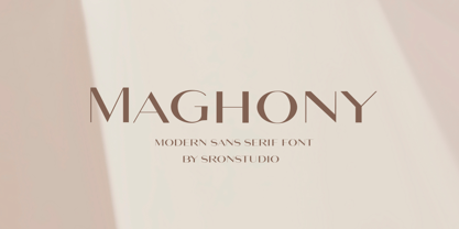 Maghony - Modern Sans Serif Font branding, invitation, stationery, wedding designs, social media posts, advertisements, product packaging, product designs, label, photography, watermark, special events, and more. Features: Uppercase and lowercase letters Multilingual symbols, numerals, and punctuation Follow Instagram: @sronstudio Thank You!
 - Machi by MendozaVergara,
$14.00 Machi is a font, clean, mystic and contemporary geometric sans for titling. The uppercase is simple and clean, but in the lowercase have ornamental characters. It is perfect for headlines, apparel, fashion, album artwork, posters and logos. Photos by Claudio Sepulveda.
 - Tekanan by San Studio,
$10.00 Tekanan Typeface is an experiment and designed by Zainul Faozi. Tekanan Typeface looks futuristic and it's a great choice to use on your designs, such as a shop sign, poster, cover, headline, and more. Designer: Zainul Faozi Publisher: San Studio
 - Shopping Basket JNL by Jeff Levine,
$29.00 The cover of the vintage sheet music for "This Little Piggie Went to Market" (from the 1934 film "Eight Girls in a Boat") features a hand-lettered sans serif with intermittent chamfered angles. This became the model for Shopping Basket JNL.
 - Autobahn Std by AVP,
$18.00 Autobahn is a robust masculine sans of near monoline thickness and angular characteristics. Autobahn Std has a full Latin 1 character set but no CE, Cyrillic or Opentype features. For the extended character set and Opentype features, see Autobahn Pro.
 - Liet Display by Stanley fonts,
$9.99 Casual and Elegant. Liet Display© is an upright italic that plays with formality by subtly exploring the spaces between serif, sans-serif and italic styles. I recommend Liet Display© for post-apocalyptic packaging, branding, and editorial design. Dominic
 - Several Mono by Mårten Nettelbladt,
$- Several Mono is a monospaced 5×5 dot matrix typeface in the vein of ASCII Art, based on http://en.wikipedia.org/wiki/Bitstream_Vera. When Several Mono is set seven times larger than Vera Sans Mono, the two fonts will align perfectly.
 - Nautikka by Sea Types,
$25.00 Nautikka was designed from the waves of the sea is a sans serif, elegant and functional for editorial design, visual identities or digital applications. With 685 glyphs, 5 weights and variations in italics is a versatile font with great legibility.
 - Antartida Rounded Essential by Los Andes,
$18.00 Antartida Rounded Essential is a sans serif with rounded terminals. Its simple, kind of neutral feeling is functional, clean and minimal; its rounded terminals make it friendly and warm. It is a family of 4 fonts: 2 weights and their italics.
 - Rebar by Method & Craft,
$10.00 Consisting of 6 weights & 12 styles, Rebar is a geometric sans with harmonious curves and slightly angled framing which gives the typeface a foundation of balance and strength. Includes numbers, punctuation, some ligatures and diacritics for compatibility with many foreign languages.
 - Plaza by ITC,
$29.99Plaza is the work of British designer Alan Meeks, an Art Deco sans serif style. It includes many alternative characters which offer endless possibilities. Plaza is ideal for work in which a feel of the 1920s or 30s is desired. - Cut Block by Adam Ladd,
$20.00 A hand-drawn typeface that depicts the idea of cutting away pieces of wood. It has a rough, yet modern appearance as it is largely based off the popular Gill Sans (with some modifications). Leaving a graphic and textured look.
 - Bindweed by Solotype,
$19.95From an old wood type owned by a San Francisco printer. Wood types were customarily given somewhat generic names (Antique Tuscan) or, more frequently, numbers to identify them. Our clients liked colorful, easily-remembered names better, and so did we. - Heldustry by URW Type Foundry,
$35.99 Heldustry is a sans serif design with letterforms partway between Helvetica and Eurostile. The Heldustry font family has a large x-height and wide characters, making it ideal for situations where there is not much copy but pages must be filled.
 - Office Work JNL by Jeff Levine,
$29.00 The 1965 film “Mirage” had its titles and credits hand lettered in a simple, thin sans serif with rounded corners and an overall square design. This is now available digitally as Office Work JNL, in both regular and oblique versions.
 - Zinc by K-Type,
$20.00 Zinc is a clean, distinctive family which is essentially a monoline sans serif but with horizontal and diagonal nubs that add a subtle script quality to display type and an easy-to-read rhythm to the flow of ordinary text.
 - HeiT ASC Traditional Chinese by Ascender,
$523.99The HeiT ASC Font family contains 3 Traditional Chinese fonts with Big 5 support. HeiT ASC Font Family features a sans serif style with consistent strokes. HeiT ASC Bold Font Family character Set: Latin-1, Traditional Chinese (code page 950). - Xahosch by Ingrimayne Type,
$9.95 Xahosch uses a calligraphic pen to form a set of letters in which circular elements are based on a bottom-heavy egg shape. A pen-drawn san-serif face, it is available in three weights, each with an italic style.
 - Mylon by Nasir Udin,
$19.00 Mylon is an elegant display sans-serif family with high contrast. It has 14 styles with 7 weights plus matching italics. Mylon works well with headlines or short paragraphs. It has extended latin character set that supports 200+ latin-based languages.
 - Navine by OneSevenPointFive,
$15.00 Navine is a rectangular sans serif typeface with 3 widths, each with 9 uprights, and the corresponding italics. Navine is crafted with powerful OpenType features, alternate glyphs, kerning pairs, superiors, inferiors, and much more. Navine blends beautifully into your creative designs.
 - Alive by Tasty Type,
$11.00 A fun trendy font with a monoline calligraphy style. This is a display sans-serif font that we recommend using in the following types of work; magazines (titles and layouts), logos and branding, invitations, quotes, blog headers, posters and advertising.
 - Shinn by Red Rooster Collection,
$45.00 Designed by Nick Shinn. Digitally engineered by Steve Jackaman. Humanist sans serif with a calligraphic cut and tall ascenders. Light, Medium and Extra Bold designed by Nick in 1985 for Typsettra; Steve added the Book and Bold weights, and the Italics.
 - Fireclay by Ergibi Studio,
$19.00 This font is perfect for logotype, apparel, branding, packaging, advertising and more. This typeface comes in uppercase, lowercase, punctuations, symbols & numerals, stylistic alternate, ending swashes. Also having multilingual support. Fireclay is perfect for logos & branding, photography, invitations, watermarks, advertisements, product designs, stationery, wedding designs, labels, product packaging, special events or anything that requires branding content. Ending the Swash and alternate makes it complete. It comes with several different lengths.It's easy to access swash Kind regards Ergibi Studio
 - Adenium by Inumocca,
$17.00 Adenium Typeface inspired by the Shape of the Adenium Tree, Vintage Display typeface , Classic Taste with some Curly and Curved its Great flexible typeface. unique Stylictic Set and Beautiful Ligature, Really playful typeface to covering your Project, like Lettering, Website Interface, Bookcover or Book Content, Magazine cover, Branding, Poster, wedding invitations, Quotes Lettering, Logos, and more your project design. - Unique glyphs - Multilingual Characters - UPPERCASE - Lowercase - Numeric - Symbol - Punctuation Character - Ligature - SS01, SS02, SS03, SS04 inumoccatype Studio
 - HU Flatwhite KR by Heummdesign,
$25.00 This is a headline typeface for titles with a retro sensibility. The concave first projection of the vowel and the dot shape further add to the retro feel. It is characterized by the dot shape seen in the initial consonants and the thin ending strokes of 'ㄱ', 'ㅅ', and 'ㅈ' to create a flowing curve. Although it is a full module, the inner space created by the large contrast of strokes gives a cool feeling. This font contains KOREAN
 - Immortal Paradise by Abo Daniel,
$19.00 introducing IMMORTAL PARADISE - a Simple Handwritten Font - IMMORTAL PARADISE is a natural hand brush script font. Described by an elegant touch, perfect for your favorite projects. Fall in love with its simple and timeless style and use it to create spectacular designs. It is great for quotes, cards, banners, books, branding, packaging, cutting, silhouette, social media content, and anything of your project. Features: - Uppercase - Lowercase - Number & punctuations - Multilingual - PUA encoded I hope you love it. regards, Abo Daniel Studio
 - Draw by Andinistas,
$37.00 Draw is a type family designed by Carlos Fabian Camargo G. Draw emphasizes the abundance of useful features to design messages with artistic purposes, spontaneous and vernacular, usually dressed in imaginative ideals to compose words, apparently drawn freehand. Draw is intended to be used in the context of graphic design as vogue, restaurants, weddings, art, clothing or imaginative supports where crafts and romance predominates. Draw contains professional typographic OpenType strategies to grant special character content: ligatures, swash and more.
 - Gready PERSONAL USE ONLY - Personal use only

- Ekorre PERSONAL USE ONLY Black - Personal use only

- Patched Medium - Personal use only

- Letric PERSONAL USE ONLY - Personal use only

- Gevher by Hurufatfont,
$23.00 Gevher is a grotesque based font family that the product of a meticulous work that spread over 2 years. It differs from other grotesque fonts with its very soft angular turns to the rounded forms and its daring ink traps. The rigid and stable structure is balanced by deep ink traps and unusual opposite angle at the joints. Thus it has a more humanistic expression. It has 3 widths: Condensed, Narrow and Normal. It consists of 8 main weights and their compatible italics, totally has 48 styles. Therefore, it provides a wide range of usage practices. It offers creative "contextual alternates" for the best reading experience. Ideal for every editorial design, packaging, corporate identity, brand, application, web and desktop usages.
 - Protest by Society of Fonts,
$29.00 Protest is inspired by protest posters and the power of the people! Each glyph is written by hand with a Sharpie® Magnum marker on big sheets of paper. It is designed to fit more into the poster and still be legible for the media from a block away. It's bold, slightly condensed, and neatly drawn with love and conviction, with the warm imperfection that comes from being hand drawn. Protest consists of over 1,430 glyphs. This includes 300 alphanumeric glyphs with 3 contextual alternates each, 20 stylistic alternate glyphs, and 20 protest themed dingbats. Contextual alternates will rotate through automatically when OpenType features are enabled, giving it more human irregularity. Protest supports 219 latin-based languages, using Underware’s Latin Plus glyph set.
 - Beebzz Rounded by Popskraft,
$19.00 Everybody loves black colour, strict stylish and elegant shapes. We strive to be perfect. Right? But... Do not you think that we have lost something? Maybe child's spontaneity? The Beebzz Rounded font brings you back to those perfect times, when there was no need to be serious, when the whole world was not so serious. Beebzz Rounded is an original font family designed for headlines, titles and subtitles. It has his own unique style in expressive, perfectly condensed forms, inspired by child calligraphy and strong geometric typefaces. Beebzz Rounded is a font family that is ideal for display, text, print, branding, signage, and also for user interfaces, mobile devices, especially web design creation, with a set of optimal characters for your design in any layout.
 - Soft Press by Canada Type,
$24.95 This is the rounded, softer version of Canada Type's popular Press Gothic. Originally done in 2011 for a global publisher, this font has already seen plenty of magazine and book cover action, perhaps even more than the sharp condensed face that spawned it. And like Press Gothic, Soft Press comes with small caps and biform/unicase forms, in addition to the main upper/lowercase set. The extended language support covers a wide range, including Greek and Cyrillic, Turkish, Baltic, Central and Eastern European languages, Celtic/Welsh and Esperanto. The Pro version combines all three TrueType fonts into one OpenType-programmed font, taking advantage of class-based kerning, the small caps feature, and the stylistic alternates feature for the biform shapes.
 - Dutch Mediaeval Book by Canada Type,
$29.95This is the elaborately expanded version of what is arguably the most classic and popular of all historic Dutch faces: Sjoerd Hendrik de Roos's Hollandse Mediaeval from 1912. Over the decades, many pressmen and typography connoisseurs have gushed loving prose about this typeface. An extended family of two weights, corresponding italics, small caps, four condensed fonts, four book fonts, a set of initials and some very Dutch ornaments, Dutch Mediaeval is a versatile workhorse that flows comfortably and artistically, with the elegance of the main weights nicely complemented by the sturdiness of the bolds. Very few text faces are this clean and inviting while being crafty as well. The Dutch Mediaeval family comes with quite a few OpenType features and extended Latin language support. - Mondo News by Untype,
$30.00 Mondo News is a typeface designed to fulfill digital and paper publication editorial needs, its cared equilibrium between slightly condensed proportions and generous «x» height, offers optimum performance without compromising legibility. The modulation of thick and thin strokes in the middle weights is balanced for extensive text reading, while on the heavy weights becomes more dramatic making them ideal for strong headlines. Equipped with 760+ glyphs, support for more than 200 languages, smallcaps, alternates, ligatures, dingbats and plenty of OpenType features, Mondo News modern interpretation of tradition performs excellent both on screen and on paper, satisfy the most demanding editorial needs and will nourish your pages with a convincing and reliable atmosphere. Mondo News is part of the Untype Mondo family typographic system.


