10,000 search results
(0.024 seconds)
- Muller by Fontfabric,
$47.00 Muller Specimen: http://bit.ly/mullers Muller Narrow Specimen: http://bit.ly/mullerns The very first sketches of Muller were made about four years ago. In the process they changed to the point where they had nothing in common with the original idea. As it is with most work we do, when we seek perfection, changes are inevitable. It was specifically designed with a wider structure for better appearance in small sizes and the extra attention to the detail was needed for the big sizes. We managed to find the right balance for the perfect universal font family. The family consists of 20 weights, ranging from Thin to Heavy with matching Italics. This font family is suited for everything, ranging from advertising, packaging, editorial and branding, to web and screen projects. Muller comes with a complete range of figure options, including proportional and old style figures, each in its tabular version. It also includes advanced typographic features such as ligatures, fractions, alternate characters, case-sensitive forms, superscripts and subscripts.
 - Electric Hermes AOE - Unknown license

- Juslia Sophia by Bosstypestudio,
$14.00 Juslia Sophia is an cute calligraphy luxury font that comes with a very beautiful character change, a kind of classic decorative script with a modern touch, designed with high detail to present an elegant style.
 - Bubol by Hipopotam Studio,
$19.00 Typeface designed for award winning website www.bubole.pl. To be able to change fills and stroke color separately we created 3 fonts. Each glyph has an alternative version so it can give a more handmade impression.
 - Sign Man JNL by Jeff Levine,
$29.00Sign Man JNL is a reworking of Sign Shop JNL, with a lighter font weight and a number of changed characters (including extended horizontal crossbars on the B,E,F,H,K,P and R). - LoganFive by The Northern Block,
$16.70 A modern digital typeface inspired by the 1976 sci-fi film Logan's Run . The grid structure is re-worked from the out-of-use typeface OptiStabile Xtra Light with various new changes, refinements and additions.
 - Cline by Typomancer,
$20.00 Cline, a family of slab and sans typefaces that seamlessly harmonize with each other. All styles have the same width, so changing font weight will not affect your typesetting. Suitable for both text and headlines.
 - Echowarp by Luxfont,
$18.00 Introducing Echowarp is an unusual COLORED font family. Main idea of this font is that a colored echo spreads and fades from minimalistic letters to the sides. Distorted letters give the effect of temporary refraction. The originality of this family is primarily suitable for a bold design. And if you add a random distortion in a graphics program to the finished heading written in this font, the inscription will turn into an absolutely unique and inimitable one. Futuristic set has 23 fonts in the family! Do not limit your imagination, because the font opens up a huge space for creative experiments. Check the quality before purchasing and try the FREE DEMO version of the font to make sure your software supports color fonts. Features: Free Demo font to check it works Letters with color echo & distortion 23 OTF SVG color fonts in the family Gradient and hologram fonts Kerning IMPORTANT: - OTF SVG fonts contain vector letters with gradients and transparency. - Multicolor OTF version of this font will show up only in apps that are compatible with color fonts, like Adobe Photoshop CC 2017.0.1 and above, Illustrator CC 2018. Learn more about color fonts & their support in third-party apps on www.colorfonts.wtf - Don't worry about what you can't see the preview of the font in the tab "Individual Styles" - all fonts are working and have passed technical inspection, but not displayed, they just because the website MyFonts is not yet able to show a preview of colored fonts. Then if you have software with support colored fonts - you can be sure that after installing fonts into the system you will be able to use them like every other classic font. Question/answer: How to install a font? The procedure for installing the font in the system has not changed. Install the font as you would install the classic OTF | TTF fonts. How can I change the font color to my color? Adobe Illustrator: Convert text to outline and easily change color to your taste as if you were repainting a simple vector shape. Adobe Photoshop: You can easily repaint text layer with Layer effects and color overlay. ld.luxfont@gmail.com
 - Palmer Lake by Jen Wagner Co.,
$13.00 Features: Palmer Lake Print: Uppercase letters, numbers, & extended punctuation Palmer Lake Script: Lowercase letters, numbers, & extended punctuation Non-English support for the international designer Same stroke thickness with each font, so you don't need to make any time-consuming adjustments to get it looking right! Palmer Lake Print (uppercase font) letters are the same height as the Script lowercase letters, so making quotes is super easy! This is such a fun new duo, perfect for creating quotes, logos, or just adding a hand-written touch to any project! While other fonts usually take some size adjusting to look just right, Palmer Lake duo has the same stroke thickness for both fonts, so you can set each font to the same size and you're done! Plus, the uppercase letters of the Print font are the same height as the lowercase letters of the Script font (see the samples), so lining them up with one another is a breeze! Each font also has alternates for each letter, so when you type uppercase or lowercase for each font, the letters will change slightly. For example, tying in all caps with the Script font will connect each letter, whereas typing all lowercase will disconnect each letter. Test it out for yourself in the box above!
 - Tintoretto by profonts,
$41.99 Tinteretto is a very beautiful, decorative Art-d�co font which is ideal for ad design about fine arts events and the world of arts and crafts as well as in restaurants, bars and for food packaging. Tintoretto harmonizes well with serif and sans serif fonts created at the beginning of the last century. It contains character sets for West and Central European as well as for Romania and Turkey. When Unger started his work on Tintoretto, he had the splendid idea of adding a Fill version to the original 3D characters. Combining both fonts make it even stronger and more beautiful. How to combine both fonts in order to achieve a color fill effect: Type your word or phrase and do not make any changes to the spacing or kerning. Duplicate or copy the original and change it to the Fill version (font change). Apply a color to the copy and position it exactly behind the original. See and love the result.
 - Eterea LC by Corradine Fonts,
$60.00 Eterea LC (Lower Case) is based in Eterea using the same Capitals but changing the lower case set. You can use this version of Eterea to give a more readable and soft aspect to your work.
 - TD Alpha Pro by Tribox Design,
$9.00 Alpha is an intuitive, clean and modern sans serif typeface crafted to depict change, the new normal, and unbridled opportunities. It has excellent legibility and is ideal for usage in displays, headlines, labels, and website design.
 - Thousands by Dharma Type,
$19.99 This slab serif has an incredible type system. By using power of OpenType alternates, typographic flexibility going up and up as its name indicates. Serifs transform, change to small caps and ligatures give you rich typography.
 - Amethyst Zucchini - Unknown license

- Escritura by Vanarchiv,
$30.00 The handwriting typeface Escritura was created for editorial purposes and the letter forms are influenced by chancery handwriting from the Italian Renaissance. The asymmetrical shapes of the undulating serifs cause the characters to have a large aperture. Originally designed for display sizes, the typeface also comes in a text version for small sizes. With taller vertical proportions, the text version has slightly longer serifs and increased white space between the characters to optimize legibility in small sizes. Ascenders and descenders and serifs are shorter in the display version, which has more economical letter spacing resulting in a visually compact text image. The stress in the letter strokes create changing widths according to their direction, improving the calligraphic rhythm in the characters. The oblique crossbar as well as other typographic details lend the typeface that typical Renaissance atmosphere.
 - All Ages by KC Fonts,
$19.00 All Ages is a true punk rock font. It has the same look and feel that you see wrapped around a light post telling you where the next show of your favorite band will be. All Ages will work with any of your headline, in your face, stylized design needs and it looks great BIG or small! For a customized look to your works, switch between uppercase and lowercase for a change of grunge to the letters, italics are also available. You can also use All Ages in layers if your background is a little too busy by using All Ages Letters on top of the All Ages Ripped Paper, you can even use All Ages Letters on it’s own for an alternate look. Each font includes a character set large enough to support you international punkers with multilingual characters.
 - Notice2Std - 100% free

- Squickt by Wiescher Design,
$39.50 Squickt was the first script I designed. The name is an atrocity, I don't remember what was on my mind, when I decided on that name, but after 25 years it is to late to change, so I have to stick with it. I have recently gone over the script and changed a little stroke here, a curve there and I added Small-Caps. The font is very useful for all kinds of signs, that have to look spontaneous. You can even condense or extend it without me going berserk; Squickt is very robust. Your scribe Gert Wiescher
 - Fou Pro by URW Type Foundry,
$49.99 The Fou typeface family was designed as an alternative to Trade Gothic condensed bold. During the design process of a normally wide font variant a system developed that responds to white space and changing proportions. Thus, round transitions become rectangular and vice versa, space is made and space is taken away. This system and the associated changes are continued on a model with semi-serifs. Fou can also be used as an alternative to Din or the wider Q-Type, but in comparison offers more room for emphasis with its italics, expert sets and numerous special characters.
 - Seminar SRF by Stella Roberts Fonts,
$25.00 When Ray Larabie donated some font work files to the Stella Roberts font project, he suggested that whenever possible the design get reworked to reflect some update and change. Jeff Levine overhauled the original design and made numerous changes to end up with Seminar SRF and its oblique version. A friendly, clean sanserif with a nod to the classic Optima, this text face can easily fit into word copy or hold its own in headlines. The net profits from my font sales help defer medical expenses for my siblings, who both suffer with Cystic Fibrosis and diabetes. Thank you.
 - Fou Serif CN by URW Type Foundry,
$49.99 The "Fou" typeface family was designed as an alternative to "Trade Gothic condensed bold". During the design process of a normally wide font variant a system developed that responds to white space and changing proportions. Thus, round transitions become rectangular and vice versa, space is made and space is taken away. This system and the associated changes are continued on a model with semi-serifs. "Fou" can also be used as an alternative to Din or the wider Q-Type, but in comparison offers more room for emphasis with its italics and condensed styles, expert sets and numerous special characters.
 - Ribbonetter by Ingrimayne Type,
$5.00 Ribbonetter is an experimental font playing with the calt or contextual alternatives feature of OpenType. This feature alternates letters in ovals with letters in hourglass shapes to create a banner. The letters in the ovals will be determined by the start of the line, whether it starts by typing an upper-case or lower-case letter. Using layers, background color can be added (dot accent and ring characters) or the outline color can be changed (sterling and yen characters). The font may also be useful with the contextual alternatives turned off. Different amounts of character spacing may give interesting results. With default character spacing, ovals with will overlap. If you are typing numbers and want the start to be an oval, switch on OpenType style set 2. In at least one word processor (Pages 5 for Macintosh) the carriage return adds the shape assigned to the space character. If you encounter this, try adding a nonbreaking space (option-space on the Macintosh) before the carriage return.
 - Kake by Eclectotype,
$30.00 Kake’s upper case letters are inspired by a hand-painted sign outside a temple in Ubud, Bali. The rest of the font is made to fit the style. The hand-made aesthetic is increased by the implementation of contextual alternates, which automatically swap glyphs to alternate forms to avoid the monotony of repeating letters. The amount of variations for each glyph is dependent on letter frequency in English; there are more a’s and e’s than q’s and j’s. Even with only two variations of some glyphs, the programming makes sure that no two matching glyphs are ever next to eachother, and for the most part they will rarely be even two letters apart. This all makes for type that looks like it isn't type. The glyphs bounce and subtly change weight with willful abandon. Some of the letters on that original sign are somewhat quirky. If you're not a fan you can engage stylistic alternates or stylistic sets to change the C, G, S, Y, c, s and y glyphs to a less idiosyncratic form. These variations still have variations themselves, so with contextual alternates on, they will look as random as all the rest. Case sensitive forms and automatic fractions are included, as are 98 ornaments, ranging from the useful to the (let’s just say) esoteric. These can be accessed from the glyph palette. I know you've probably never realized you need an anchor, a fuel pump, skull and crossbones and chess symbols in the same font before, but that doesn't mean you don't! Kake is full on display typography. It’s legible for small blocks of copy but don't go setting essays in it. Unless you really want to... in which case, go for it.
 - Barbieri by Re-Type,
$45.00 Barbieri is a casual sans type family, based on a German lettering style from the 1960s. The original hand-drawn alphabet was used in a rather peculiar edition of Der Barbier von Bagdad, an opera composed by Peter Cornelius. Our efforts to identify the cover designer have been, so far, unsuccessful. As fans of informal typography and popular lettering styles, we thought these few thin letters deserved a re-incarnation as a complete type family. Andrés Torresi and Marta Sánchez Marco were in charge of the production work. Now Barbieri has 6 weights suitable for packaging, posters, and music covers. It resembles a certain 'Americana' spirit, though with a Germanic twist.
 - Conflict by Typomancer,
$20.00 ‘Conflict’ is one of Typomancer’s early typefaces; it was released when the foundry started. After a few years, we decide to give it some major changes, including more weights, more glyphs, brand new outline, and revamped kerning.
 - Charm by Typomancer,
$20.00 ‘Charm’ is one of Typomancer’s early typefaces; it was released when the foundry started. After a few years, we decide to give it some major changes, including more weights, more glyphs, brand new outline, and revamped kerning.
 - Peter Sellers by Type-Ø-Tones,
$40.00 Peter Sellers is a revival display font. We wanted to pay homage to the fifties graphic design with this stylish typeface. Use the “Base” style alone or overlap it with “Volume” and change it to another colour.
 - Septhia by IM Studio,
$12.00 Septhia is an elegant calligraphy luxury font that comes with a very beautiful character change, a kind of classic decorative script with a modern touch, designed with high detail to present an elegant style, which has 6 types of fonts. Septhia is attractive because the typeface is pleasing to the eye, clean, feminine, sensual, glamorous, simple and very easy to read, thanks to its many extravagant letter relationships. I also offer a decent number of stylistic alternatives for some of the letters. Classic style is very suitable to be applied in various formal forms such as invitations, labels, restaurant menus, logos, fashion, make up, stationery, novels, magazines, books, greeting/wedding cards, packaging, labels or all kinds of advertising purposes. and much more. .. Thanks & Happy Designing!
 - Cassandra Plus by Wiescher Design,
$49.50 Cassandra Plus is my revised version of Cassandra, it can now be used all over Europe except Greece and Russia. I changed the weights a bit to make them more distinct. The Font has two widths of letters, wide Capitals on the (shift) uppercase-keys and narrow ones on the (no shift) lowercase-keys. You can match them as you like, but you should avoid having the same letter in one word in two different widths. But if yoyu are really daring you can use one narrow S and a wide one, it might still look good. It will almost always look good! Cassandra is my “bow” to Adolphe Mouron Cassandre. Yours sincerely mixing things up for you again Gert Wiescher
 - Rabusta Greatness by Bungletter,
$12.00 Rabusta Greatness is an elegant calligraphy font that comes with a very beautiful character change, a kind of classic decorative script with a modern touch, designed with high detail to present an elegant style, which has 4 types of fonts. Rabusta Greatness is attractive because the typeface is pleasing to the eye, clean, feminine, sensual, glamorous, simple and very easy to read, thanks to its many extravagant letter relationships. I also offer a number of decent stylistic alternatives for some of the letters. Classic style is very suitable to be applied in various formal forms such as invitations, labels, restaurant menus, logos, fashion, make up, stationery, novels, magazines, books, greeting/wedding cards, packaging, labels or all kinds of advertising purposes. . . . . . Thanks & Happy Designing!
 - Beach Holiday by Gian Studio,
$12.00 Beace Holiday is an elegant calligraphy luxury font that comes with a very beautiful character change, a kind of classic decorative script with a modern touch, designed with high detail to present an elegant style. Beace Holiday is attractive because the typeface is pleasing to the eye, clean, feminine, sensual, glamorous, simple and very easy to read, thanks to its many extravagant letter relationships. I also offer a decent number of stylistic alternatives for some of the letters. Classic style is very suitable to be applied in various formal forms such as invitations, labels, restaurant menus, logos, fashion, make up, stationery, novels, magazines, books, greeting/wedding cards, packaging, labels or all kinds of advertising purposes. and much more. .. Thanks & Happy Designing!
 - Baby Madina by IM Studio,
$12.00 Baby madina is an elegant calligraphy font that comes with a very beautiful character change, a kind of classic decorative script with a modern touch, designed with high details to present an elegant style, which has 5 types of fonts. Baby madina is attractive because the typeface is pleasing to the eye, clean, feminine, sensual, glamorous, simple and very easy to read, thanks to its many luxurious letter relationships. I also offer a decent number of stylistic alternatives for some of the letters. Classic style is very suitable to be applied in various formal forms such as invitations, labels, restaurant menus, logos, fashion, make up, stationery, novels, magazines, books, greeting/wedding cards, packaging, labels or all kinds of advertising purposes and many others. .. Thanks & Happy Designing!
 - Rodeo Clown by FontMesa,
$25.00 Rodeo Clown is a revival of an old classic font that you may have known under the name of Carnival. The Rodeo Clown family includes Fill fonts that you may layer behind the letters to add color or set to white so any background image doesn't show through the letters. The half fill should be layered on top to change the color of the top inlay design. The fill font for Rodeo Clown may also work as a stand alone black weight. In our sales images you'll see a sample of the fill font being used, we've intentionally offset the fill font to give it a misaligned printed look which was common to see with fill fonts in the 1800's
 - Salistya by Kartiny Type,
$12.00 Salistya is an Elegant script font that comes with very beautiful character changes, a classic copper decorative script type with a modern touch, designed with high detail to present an elegant style. Salistya file Salistya script is interesting because the typeface is pleasing to the eye, clean, feminine, sensual, glamorous, simple and very easy to read, because of the many luxurious letter connections. I also offer a number of decent stylistic alternatives for some of the letters. Classic style is very suitable to be applied in various formal forms such as invitations, labels, restaurant menus, logos, fashion, make up, stationery, novels, magazines, books, greeting cards/weddings, packaging, labels or all kinds of advertisements. If you need help or have questions, let me know. I'm happy to help.
 - Samithan by Kartiny Type,
$12.00 Samithan Script is an Elegant script font that comes with very beautiful character changes, a classic copper decorative script type with a modern touch, designed with high detail to present an elegant style. Samithan file Samithan is interesting because the typeface is pleasing to the eye, clean, feminine, sensual, glamorous, simple and very easy to read, because of the many luxurious letter connections. I also offer a number of decent stylistic alternatives for some of the letters. Classic style is very suitable to be applied in various formal forms such as invitations, labels, restaurant menus, logos, fashion, make up, stationery, novels, magazines, books, greeting cards/weddings, packaging, labels or all kinds of advertisements. If you need help or have questions, let me know. I'm happy to help.
 - Kevin Keyla by Bosstypestudio,
$13.00 Kevin Keyla is an cute calligraphy luxury font that comes with a very beautiful character change, a kind of classic decorative script with a modern touch, designed with high detail to present an elegant style. Kevin Keyla is attractive because the typeface is pleasing to the eye, clean, feminine, sensual, glamorous, simple and very easy to read, thanks to its many extravagant letter relationships. I also offer a decent number of stylistic alternatives for some of the letters. Classic style is very suitable to be applied in various formal forms such as invitations, labels, restaurant menus, logos, fashion, make up, stationery, novels, magazines, books, greeting/wedding cards, packaging, labels or all kinds of advertising purposes. and much more. .. Thanks & Happy Designing!
 - Signage JNL by Jeff Levine,
$29.00 Signage JNL shows the heavy influence of the perennial favorite Futura Black with a couple of minor changes here and there. The design was inspired by a set of British brass stencils for sale in an online auction.
 - Monogramma by Wiescher Design,
$10.40 Monogramma is a set of 676 beautiful and unique Monograms plus some doubles. There is one monogram for each possible letter-combination! For easy use I packed the monograms in 13 packets. One for two starting letter each. So if for example you look for the monogram "GW", you must choose the packet "Monogramma-GH" -- the G-combinations under the uppercase letters. You now have to type a capital "W" and Bingo you have the combination GW! Some letter-combinations have doubles, just check the numbers 0 to 9 if there is anything to be found. If you buy the whole set of monograms you get the basic font free of charge! Your long-distance (this was a lot of work) font-designer Gert Wiescher
 - Vanigar Display by Tony Type Studio,
$15.00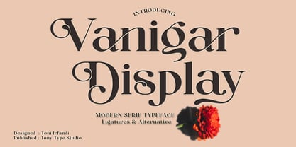 Vanigar Display is a serif font that comes with a very beautiful change character that will bring a touch of luxury and style to your projects. Vanigar Display is perfect for editorial design, branding, headings, logos, magazines and more.
 - Instructor by Chank,
$59.00Introduced as the Chank Font of the Month for May 1998, Instructor was drawn Roger Lootine and fontified by Chank. Roger was an instructor at Art Instruction School. You know the "Draw Tippy the Turtle" ads? That's where Roger used to teach. He also draws a cool comic called Residue. "Roger's got the best handwriting I've ever seen, and you can download it today!" says Chank. "How lucky are you? Way lucky!" Now available in OpenType format for your Personal or Commercial Use.


