10,000 search results
(0.012 seconds)
- Mucura by Corradine Fonts,
$19.95 Based in Manuel Corradine's handwriting, Mucura is a very spontaneous font. It could be used in almost any informal project.
 - Zape by Corradine Fonts,
$14.95 Based in Manuel Corradine's handwriting, Zape is a very spontaneous font. It could be used in almost any informal project.
 - Czaristane by Typotheticals,
$5.00 A rather light humorous font that can be used for many purposes. Updated in 2022 to add further bold versions
 - Blikfang by Bogstav,
$17.00 All caps font that just want to be your friend, and maybe the font you use for your next project! :)
 - Splasher by GRIN3 (Nowak),
$18.00 Splasher is a set of 94 unique ink, paint and coffee splatters that can be quickly used in your design.
 - Irrlicht by Aarhaus,
$30.00 Irrlicht is based on C. H. Kleukens’ 1923 typeface Judith Type . Whilst Dunkle Irrlicht is a fairly faithful rendition and extension of Kleukens’ typeface, the Licht style was initially added as a stand-alone stencil version; yet, the two styles work perfectly together – for different nuances, for emphasis or simply stacked/layered. Irrlicht is equipped with upper- and lowercase ligatures, contextual and stylistic alternates, fractions, superior and inferior figures, extended language support and a few extra goodies. Additional information – How Irrlicht came to life Christian Heinrich Kleukens cut his Judith Type in 1923, at the peak of German expressionism, exclusively for publications with the Ernst-Ludwig-Press, such as a limited series of biblical prints – the first being the Book of Judith , hence the original’s name. I stumbled upon this typeface a couple of years ago in a nice little 1930 booklet of the Gutenberg-Gesellschaft and was struck by its forceful darkness on paper and its seemingly simple, crude letterforms. The lack of a long-ſ in the final version of Judith Type – quite unusual for a German typeface of that time – adds to this feel of crudeness and spontaneity*. Judith Type seemed to me like a semi-blackletter cousin of Rudolf Koch’s typeface Neuland (cast in the same year). Besides its apparent affinity with expressionism, it reflects a lot of that deeply spiritual craftsmanship of the era – much like Neuland. A few months later, when I was working on a stencil project and looking for a typeface that could be cut into thin wooden plates easily, I remembered those dark, sharp letters that seemed to be lacking any curves at all. After enlarging a few letters and tracing them by hand, the whole set was redrawn digitally, using only straight lines. As for spacing, the goal was to keep the letters tight but to avoid touching characters – without ironing out all the original’s tension and rhythm. Deliberate kerning, subtle contextual alternates and ligatures help to deal with critical glyph combinations. Two additional versions were developed: a stencil version with open counters and, in reference to a popular style of the 1920s and inspired by dry, cracked wood, an inline version. These two additional styles were later merged into one font – Lichte** Irrlicht was born. — AARHAUS * Consequently, the original typeface’s German eszett is simply a ligature of the “round s” and standard z . In some of his publications, Kleukens dispenses with using eszett altogether and sets double s instead. Irrlicht , however, does feature a more common eszett (ß); the original, among other more faithful letter forms, can be accessed via the stylistic sets feature ** licht – literally bright – being the German term for inline typefaces – not to be confused with leicht ( light )
 - Sackem PB by Pink Broccoli,
$14.00 There’s just nothing quite like a heavyweight geometric typestyle with tiny counters, you just love it like the Bee Gees. Sackem started as a digitization of a singular film typeface called Benman Jumbo by Lettergraphics. From there, this mechanical typeface was expanded into a giant family of playful widths and obliques: from the condensed “Slim” style to the original “Jumbo” style.
 - Fan Script by Sudtipos,
$99.00 A friend of mine says that sports are the ultimate popular drug. One of his favorite things to say is, “The sun’s always shining on a game somewhere.” It’s hard to argue with that. But that perspective is now the privilege of a society where technology is so high and mighty that it all but shapes such perspectives. These days I can, if I so choose, subscribe to nothing but sports on over a hundred TV channels and a thousand browser bookmarks. But it wasn't always like that. When I was growing up, long before the super-commercialization of the sport, I and other kids spent more than every spare minute of our time memorizing the names and positions of players, collecting team shirts and paraphernalia, making up game scenarios, and just being our generation’s entirely devoted fans. Argentina is one of the nations most obsessed with sports, especially "fútbol" (or soccer to North Americans). The running American joke was that we're all born with a football. When the national team is playing a game, stores actually close their doors, and Buenos Aires looks like a ghost town. Even on the local level, River Plate, my favorite team where I grew up, didn't normally have to worry about empty seats in its home stadium, even though attendance is charged at a high premium. There are things our senses absorb when we are children, yet we don't notice them until much later on in life. A sport’s collage of aesthetics is one of those things. When I was a kid I loved the teams and players that I loved, but I never really stopped to think what solidified them in my memory and made them instantly recognizable to me. Now, thirty-some years later, and after having had the fortune to experience many cultures other than my own, I can safely deduce that a sport’s aesthetic depends on the local or national culture as much as it depends on the sport itself. And the way all that gets molded in a single team’s identity becomes so intricate it is difficult to see where each part comes from to shape the whole. Although “futbol” is still in my blood as an Argentinean, I'm old enough to afford a little cynicism about how extremely corporate most popular sports are. Of course, nothing can now take away the joy I got from football in my childhood and early teens. But over the past few years I've been trying to perceive the sport itself in a global context, even alongside other popular sports in different areas of the world. Being a type designer, I naturally focus in my comparisons on the alphabets used in designing different sports experiences. And from that I've come to a few conclusions about my own taste in sports aesthetic, some of which surprised me. I think I like the baseball and basketball aesthetic better than football, hockey, volleyball, tennis, golf, cricket, rugby, and other sports. This of course is a biased opinion. I'm a lettering guy, and hand lettering is seen much more in baseball and basketball. But there’s a bit more to it than that. Even though all sports can be reduced to a bare-bones series of purposes and goals to reach, the rules and arrangements of baseball and basketball, in spite of their obvious tempo differences, are more suited for overall artistic motion than other sports. So when an application of swashed handlettering is used as part of a team’s identity in baseball or basketball, it becomes a natural fit. The swashes can almost be visual representation of a basketball curving in the air on its way to the hoop, or a baseball on its way out of the park. This expression is invariably backed by and connected to bold, sleak lettering, representing the driving force and precision (arms, bat) behind the artistic motion. It’s a simple and natural connective analysis to a designer, but the normal naked eye still marvels inexplicably at the beauty of such logos and wordmarks. That analytical simplicity was the divining rod behind Fan Script. My own ambitious brief was to build a readable yet very artistic sports script that can be a perfect fit for baseball or basketball identities, but which can also be implemented for other sports. The result turned out to be quite beautiful to my eyes, and I hope you find it satisfactory in your own work. Sports scripts like this one are rooted in showcard lettering models from the late 19th and early 20th century, like Detroit’s lettering teacher C. Strong’s — the same models that continue to influence book designers and sign painters for more than a century now. So as you can see, American turn-of-the-century calligraphy and its long-term influences still remain a subject of fascination to me. This fascination has been the engine of most of my work, and it shows clearly in Fan Script. Fan Script is a lively heavy brush face suitable for sports identities. It includes a variety of swashes of different shapes, both connective and non-connective, and contains a whole range of letter alternates. Users of this font will find a lot of casual freedom in playing with different combinations - a freedom backed by a solid technological undercurrent, where OpenType features provide immediate and logical solutions to problems common to this kind of script. One final thing bears mentioning: After the font design and production were completed, it was surprisingly delightful for me to notice, in the testing stage, that my background as a packaging designer seems to have left a mark on the way the font works overall. The modern improvements I applied to the letter forms have managed to induce a somewhat retro packaging appearance to the totality of the typeface. So I expect Fan Script will be just as useful in packaging as it would be in sports identity, logotype and merchandizing. Ale Paul
 - Automoto by Device,
$39.00 Automoto is built from a limited number of curved and straight segments that have been flipped and rotated. It has an extensive set of two- and three-letter ligatures that form a triple ribbon resembling a model car racetrack. For clarity, some character combinations were excluded as they proved to be ambiguous in context. The upper- and lowercase characters can be freely intermixed according to taste.
 - Captain Tall Ship by Alphabet Agency,
$20.00 Captain Tall Ship is the clean version of Captain Tall Shipwreck. The font can be used in many project themes, from birthday party invitations to beer labels. The font could be potentially used is a number of design themes including bars, pubs, pirate, navy, seafarer, alcohol products, western/cowboy, card game/gambling, biker gang, tattoos, emblems and crests, old military & hunting to name a few.
 - Monotype Clarendon by Monotype,
$40.99The first Clarendon was introduced in 1845 by R. Besley & Co, The Fan Street Foundry, as a general purpose bold for use in conjunction with other faces in works such as dictionaries. In some respects, Clarendon can be regarded as a refined version of the Egyptian style and as such can be used for text settings, although headline and display work is more usual. - Caballero Script by T4 Foundry,
$21.00 Caballero Script is a calligraphic font from from Swedish type designer Bo Berndal and the T4 font foundry. Caballero is inspired by Spanish handwriting from 15th and 16th century, minus the extremely long ascenders. If it would be music or a dance, it would be a Flamenco – there is fire as well as discipline. It is an OpenType creation, for both PC and Mac.
 - Côté by Studio Bayley,
$4.00 A modern geometric sans serif that comes in 2 weights with 3 styles for each; Solid, Outline and Stripes. Côté was originally designed as a purely striped typeface but evolved to more weights to create a fun and playful typeface that can be layered and scaled. The solid weight allows for title or body copy while the stripes should be used as large as possible!
 - Amadeus by Classic Font Company,
$14.95Amadeus was inspired by an alphabet reputed to be used in the Papal Chancery in the 16th century. It has highly decorated capitals and to be used at its best requires a large point size. The lower-case characters have been deliberately made simple to contrast with the ornate capitals. Included within the font are many extra characters plus a complete set of framed numerals. - PR Sprucewood 01 by PR Fonts,
$5.00 This font is a collection of sketched spruce trees. Some are filled outlines, some are bare trunks and branches, and some are rough squiggles. Each can be used individually to suggest a tree, and the different shapes can be layered in different colors, to suggest texture, or snow cover. There is also a glyph of a mountain range, for a horizon behind your forest.
 - Carved Initials by Gerald Gallo,
$20.00 Carved Initials, under the character set, are initials that appear to have the background carved away so the initial appears protruding. Under the shift + character set the initials appear to be carved into the background so the initial appears to be recessed. There are two sets of initials, protruding and recessed, a through z and 0 through 9 for a total of 72 characters.
 - Norden Retro Round by Asgeir Pedersen,
$14.99 Norden Retro Round is based on Norden Round, but Retro comes with an added perspective, giving it a "retro-futuristic" look. It has a lower x-height than its parent, due to it being slightly tilted. Norden Retro Round can be used in any setting, but given its lively style, it will excel as a display font; in headings, titlings, logos and so on.
 - Sugar Free by PizzaDude.dk,
$17.00 Don't be afraid to taste something sugar free - most times you will be surprised how good it tastes! My Sugar Free font may not look as very much at first glance - but play around with the Regular and Italic versions (and notice the 4 different versions of each letter, that automatically cycles as you type!) and you will see how lively the font is!
 - Prossimo by Studio Sun,
$16.00 This font is strongly inspired by the Futurism (Futurismo) movement in the early 20th century; with its simple shapes and strong structure, this font can be used to give a contemporary look to any design. Available in 3 styles (Display, Stencil, Text), this font is great for logos, headlines, posters, and UI/UX design. It can be used in various design applications such as print or web.
 - Keong by Grontype,
$12.00 Keong is a creative and attractive font, made using handwriting techniques, Unique and elegant. The writing can be used for various projects, such as flyer Project, or it can be used to print on clothes. just put it on top of your creative idea and make your project happen. Features : alternative and ligature character multilingual support unique style Thankyou for getting this font Regard. Grontype
 - Return Pass JNL by Jeff Levine,
$29.00 Return Pass JNL is the solid version of Forward Passed JNL and can be used as a standalone font or in combination with Return Pass Fill JNL (the inline version with the main letters stripped away) for a dual color design. In some applications the inline fill may appear to create a cast shadow effect, so it may be necessary to manually adjust any overlaid copy.
 - Restoe Bumi by HansCo,
$15.00 Restoe Bumi is a Luxury Handwriten that is luxurious in a casual and distinctive style that is perfect for your branding design, and will also be very beautiful in your wedding invitations and business cards and especially for your brand name logotype. This one should make your designs instantly professional and amazingly! Be a perfect professional in a minute and start creating with this font today! Enjoy
 - Halima Sofira by HansCo,
$15.00 Halima Sofira is a Luxury Handwriten that is luxurious in a casual and distinctive style that is perfect for your branding design, and will also be very beautiful in your wedding invitations and business cards and especially for your brand name logotype. This one should make your designs instantly professional and amazingly! Be a perfect professional in a minute and start creating with this font today! Enjoy
 - Okay A by Okaycat,
$24.95 Okay-A lets you make 3D letters that look to be fastened down with screws. Inspired by the angular futuristic shapes of Japanese Katakana letters, this angular font is bold and square. Okay-A lets you easily make multicolour logos or signs as the styles can be overlaid. It features extended characters, containing West European diacritics & ligatures, making it suitable for international environments & publications.
 - Iyannu by Thirdin,
$20.00 Iyannu has no meaning in its self. This font is made to be very quiet and simple yet to be unique. Iyannu is created by Japanese designer and it is designed so called "Retro Future" like cyberpunk in Tokyo. When font is made strictly with mathematic sometimes it looks unbalanced. So this font is mixing mathematics method and optical illusion of view to maintain the clear balance.
 - AT Borsnery by Amera Type,
$15.00 Borsnery is a decorative font that can be a great choice for your visual needs. With a modern vintage style, it can be more ideally used for posters, signage, and other visual branding needs And now we provide a different work than before, the first time for our fonts combined with well and carefully crafted illustrations. If you like and want this, please visit ameratype.com
 - Monotype New Clarendon by Monotype,
$29.99The first Clarendon was introduced in 1845 by R. Besley & Co, The Fan Street Foundry, as a general purpose bold for use in conjunction with other faces in works such as dictionaries. In some respects, Clarendon can be regarded as a refined version of the Egyptian style and as such can be used for text settings, although headline and display work is more usual. - RM Almanack by Ray Meadows,
$19.00 Based on William Caslon’s design (c1720) which was itself based on Dutch Baroque typefaces. The old saying “when in doubt, use Caslon.” can now be updated ... “use RM Almanack instead!” Includes: Western European, Central European, Baltic & Turkish sets Due to the modular nature of this design there may be a slight lack of smoothness to the curves at very large point sizes (around 100 pt and above).
 - Merry Melody by Comicraft,
$19.00 Sufferin' Succotash, was that five minutes already?! Seemed to us like that lunatic cartoon went by faster than a roadrunner being pursued by a wily coyote or a hare brained bunny dodging short sighted hunters during wabbit season. Adorn your favorite duck, pig, cat, tweeting bird or skunk with the warming strains of our merry melody font or it'll be all over for all you folks.
 - Ubik by Présence Typo,
$36.00Ubiquity: the possibility to be in several places at the same time; this could be the definition of a typeface like Ubik. Its applications are numerous and various: books, magazines, posters but also architecture and signs. Ubik is a grotesk sans serif with a “nordic taste”: shapes pure and somewhat square. The nonexistent contrast between thin and thick strokes gives it a discreet rustic look. - Cortair by Letterhend,
$15.00 Cortair is an organic font duo with natural vibes! Contain two fonts, Sans and Serif with Rough and Stamp Style. You can use this font for every project. Suitable for branding logo, hand lettering, or apparel design. We hope you enjoy the font, please feel free to comment if you have any thoughts or feedback. Or simply send me a PM or email me at letterhend@gmail.com
 - Kinderz by MaxnorType,
$15.00 Kinderz is a fun display font with lots of styles and multilingual support. The design has a relaxed feel and is intended for purposes related to kids and teenagers, but can also be used for all modern informal themed designs. It can be used for various purposes, especially those related to kids and teenagers, such as for logo design, branding, posters, banners, stationery, and so on.
 - Konstarica by Ilhamtaro,
$27.00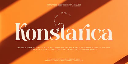 KONSTARICA is a serif font with some unique ligatures. It is suitable for branding and can be used for fonts on social media. In addition, it will also be suitable for headline fonts. To enable the OpenType Stylistic alternates, you need a program that supports OpenType features such as Adobe Illustrator CS, Adobe Indesign & CorelDraw X6-X7. Guides to access all alternates glyphs : http://adobe.ly/1m1fn4Y Cheers!
 - Wooles by Mightyfire,
$15.00 Something bold, rounded, bubbly and cute is here! Yes, we have Wooles. As you can see, Wooles is a font with playful and fun style. The look of the font is cute yet firm. It suits perfectly for comic book, cartoon movie, school, children book, birthday card and another fun creative arts! We hope and be honored if Wooles can be the part of your happy moment. :)
 - Buttery Signature by Fontysia,
$13.00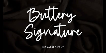 Buttery Signature is a unique and elegant monoline font, this font was created by being inspired by a signature by someone, then developed into a work that can be used by many people. It comes with an elegant and unique style which is perfect to make any design stand out! This font is perfect for branding, wedding invites, magazines, mugs, business cards, quotes, posters, and more.
 - Fairytales Script by Dhan Studio,
$25.00 Fairytales Script is a beautiful handmade typeface, organic and dancing baseline with different swashes that can be applied to the beginning and ends of all lowercase. For the separate swashes font, type lowercase a-z for the beginning swashes and end swashes. This fonts can be used for various purposes.such as headings, signature, logos, wedding invitation, t-shirt, letterhead, signage, lable, news, posters, badges etc.
 - Ayesha by Rotterlab Studio,
$15.00 Ayesha is beautiful and lovely script font with many alternative styles, ligatures, swash and multilingual glyphs. Ayesha can be used for wide ranges of application, such as wedding design, logo, poster, name card, invitations, social media posts, and others. Files include: Ayesha Script.OTF + PUA-Encoded + Can be used in any software, like Adobe Photoshop, Illustrator, even Microsoft Word, PowerPoint and others + Multilingual glyphs. Thank You
 - Komunidad Hebrew Script by Jonahfonts,
$42.00 Komunidad is the Hebrew version of ”Quintana Light”. Suitable for logos and packaging statements. Invoking the OpenType / CONTEXTUAL variant produces the word terminals for all lower-case letterforms as well as diacritic letters. Final Hebrew Glyphs are also added. This can be done individually for each letter as well. Komunidad also contain alternative Swashes and TabOldstyle numerals. (OpenType-Variants may only be accessible via OpenType-aware applications.)
 - Arventa Sans Pro by preussTYPE,
$59.00 Arventa was designed to be highly legible and flexible. Arventa offers a high quality alternative to contemporary humanist sans serifs and is a flexible family for editorials and corporate branding. Arventa comes in seven weights (ExtraLight, Light, Regular, Medium, Bold, Black and UltraBlack). I wanted to create a very refined family that could be used for display or body copy, for print or digital.
 - Reloaded by Almarkha Type,
$25.00 Reloaded - Military Serif Font, first conceptualize was inspired by the classic vintage military stencil design . I wanted a typeface that could be a solid base for any military inspired project Reloaded Fonts can be used for wallpaper, pattern fills, web page background, surface textures. Perfect for making army posters , scrapbooking,invitation cards, stationary, gift wrap, packaging, buttons, pendants, holiday gifts, print on fabrics and so much more.