9,094 search results
(0.015 seconds)
- Epokha by ITC,
$29.99 Epokha is the work of Colin Brignall, an unusal slab serif typeface influenced by the poster styles of the early 20th century. Its robust geometric construction commands attention in a fresh, contemporary way. Epokha is made even more flexible by a number of alternative letter forms and should be set tightly for maximum effect.
 - Montag by insigne,
$24.99 Montag is an extended, rounded sans-serif. In many ways it can be seen as a more conservative, extended version of Chennai . As with Chennai, it includes simplified versions of many characters for titling or when a more futuristic appearance is called for. Montag also has a non-rounded companion, Dienstag , also from insigne.
 - TOCinRings by Ingrimayne Type,
$14.95 TOCinRings has letters in circles. The letters are from a typewriter font called TiredOfCourier. The typeface contains characters that can add color to letters. There are two ways to do this. One uses layers and the other a combination of characters, some with zero width. This pdf file explains the how this can be done.
 - Ring Quad by Ochakov,
$9.00 Ring Quad is brave and confident from thin to black. A cleaner, geometrical and professional aesthetic. Ring Quad is a modern & minimalist font. It’s perfect for branding, logos, quotes, posters, name card, stationary, and every other design that needs a striking typeface. Now, Ring font family prepared for any insane adventure life throws our way!
 - EuroMachina BT by Bitstream,
$50.99The boss of extended typefaces, Brian Bonislawsky, has belted out this ultra wide design, EuroMachina, that looks like an odd meld of OCR-A, Microgramma and Bank Gothic. And if that wasn't enough, Brian then felt the need to distort it in various ways, creating Broken, Eroded and OverGreased. A little something for everyone. - Evening Edition JNL by Jeff Levine,
$29.00Evening Edition JNL pays tribute to the ever-decreasing line of daily newspapers in this country by emulating the "wood type" look of the headlines. Way before the Internet took over as a popular information source, it was the morning, afternoon or evening edition of a paper that presented the big story of the day. - Rimshot NF by Nick's Fonts,
$10.00A rather droll unicase typeface, discovered in a 1970s chapbook of suggested lettering for Soviet propaganda posters, inspired this bouncy beauty. Way more fun than a barrel of Volga Boatmen. The PC Postscript, Truetype and Opentype versions contain the complete Latin language character set (Unicode 1252) plus Central European (Unicode 1250) languages as well. - Gangrena by Stolat Studio,
$19.00 Gangrena is a display font family, based on a old lettersets and style of UK punk posters from 80’s. It is characterized by a huge amount of automatic alternates, cycling in a random way trough the text. Each letter has three versions. To complement the font Gangrena has a set of six different brushes.
 - Systema by Gspr one,
$4.00 "Systema" is an innovative typeface that combines modularity and pixelated style in a surprising way. Its letters continuously transform, taking on shapes ranging from soft circles to sharp squares, with occasional flashes that add a touch of vitality. This versatility makes it the perfect choice for design projects looking for a dynamic and unique aesthetic.
 - Termit by Ditatype,
$29.00 Termit is a striking display font designed with a game theme, featuring large letters with a fairly thick weight and a rectangular shape with sharp corners. This font shows large letters that demand attention and create a bold statement. The rectangular shape with sharp corners in Termit adds a sense of structure and stability to the font. The clean lines and defined angles create a visually bold and impactful appearance. This unique feature evokes a sense of strength and resilience, reflecting the competitive and strategic nature of the gaming world. Each character shares the same height and width, creating a cohesive and pleasing visual experience. With its low-contrast design, it offers a subtle and understated look. The minimal variation in stroke width adds a sense of uniformity and simplicity to the font, allowing the overall design to take center stage. This feature ensures that the focus remains on the content while still maintaining a strong visual impact. Enjoy the available features here. Features: Stylistic Sets Multilingual Supports PUA Encoded Numerals and Punctuations Termit fits in headlines, logos, posters, titles, branding materials, print media, editorial layouts, website headers, and any other game-themed projects. Find out more ways to use this font by taking a look at the font preview. Thanks for purchasing our fonts. Hopefully, you have a great time using our font. Feel free to contact us anytime for further information or when you have trouble with the font. Thanks a lot and happy designing.
 - Chilopod by Typodermic,
$11.95 Are you looking for a font that will transport you back to the golden age of video games? Look no further than Chilopod—the worm script typeface inspired by the classic arcade game, Centipede. With its bold, connected letters, Chilopod will bring a touch of retro gaming nostalgia to any project. But it’s not just a pretty face—this font also features OpenType ligatures, which allow common letter combinations to flow seamlessly into continuous lines. It’s the perfect blend of form and function. So whether you’re designing a poster for your next gaming tournament or just want to add some playful flair to your branding, Chilopod is the font for you. Try it out today and get ready to level up your design game! Most Latin-based European writing systems are supported, including the following languages. Afaan Oromo, Afar, Afrikaans, Albanian, Alsatian, Aromanian, Aymara, Bashkir (Latin), Basque, Belarusian (Latin), Bemba, Bikol, Bosnian, Breton, Cape Verdean, Creole, Catalan, Cebuano, Chamorro, Chavacano, Chichewa, Crimean Tatar (Latin), Croatian, Czech, Danish, Dawan, Dholuo, Dutch, English, Estonian, Faroese, Fijian, Filipino, Finnish, French, Frisian, Friulian, Gagauz (Latin), Galician, Ganda, Genoese, German, Greenlandic, Guadeloupean Creole, Haitian Creole, Hawaiian, Hiligaynon, Hungarian, Icelandic, Ilocano, Indonesian, Irish, Italian, Jamaican, Kaqchikel, Karakalpak (Latin), Kashubian, Kikongo, Kinyarwanda, Kirundi, Kurdish (Latin), Latvian, Lithuanian, Lombard, Low Saxon, Luxembourgish, Maasai, Makhuwa, Malay, Maltese, Māori, Moldovan, Montenegrin, Ndebele, Neapolitan, Norwegian, Novial, Occitan, Ossetian (Latin), Papiamento, Piedmontese, Polish, Portuguese, Quechua, Rarotongan, Romanian, Romansh, Sami, Sango, Saramaccan, Sardinian, Scottish Gaelic, Serbian (Latin), Shona, Sicilian, Silesian, Slovak, Slovenian, Somali, Sorbian, Sotho, Spanish, Swahili, Swazi, Swedish, Tagalog, Tahitian, Tetum, Tongan, Tshiluba, Tsonga, Tswana, Tumbuka, Turkish, Turkmen (Latin), Tuvaluan, Uzbek (Latin), Venetian, Vepsian, Võro, Walloon, Waray-Waray, Wayuu, Welsh, Wolof, Xhosa, Yapese, Zapotec Zulu and Zuni.
 - Gegor by Balibilly Design,
$17.00 Say Hello to Gegor, an experimental serif display font. Gegor is freedom of our hand when creating the letterform without many references. We try to let the pen tool flow and dancing according to our imagination. The characters of this typeface are adopted from the letter "r". She was born and influence each other. The simple shape on the shoulder are slightly pointy at a thick weight and curves at a thin weight have a big influence on other letters. The unique form of letter "r" takes us to further development to get achieve a distinct harmony as a display typefaces. If you look at the teaser images and get an idea, we are in line. Gegor consists of 14 families from thin to black, and 1 outline style in black weight equipped with discretionary ligatures, case-sensitive forms, ordinals, small capital, and fractions. Consists of multilingual support including Western European, Central European, and Southeastern European. Gegor is perfect for posters, logos, branding, magazines, websites, and more. Gegor will give a unique vibe to your works. Supports languages: Afrikaans, Albanian, Asu, Basque, Bemba, Bena, Bosnian, Catalan, Cebuano, Chiga, Colognian, Cornish, Corsican, Croatian, Czech, Danish, Dutch, English, Estonian, Faroese, Filipino, Finnish, French, Friulian, Galician, Ganda, German, Gusii, Hungarian, Icelandic, Ido, Inari Sami, Indonesian, Interlingua, Irish, Italian, Javanese, Jju, Jola-Fonyi, Kabuverdianu, Kalaallisut, Kalenjin, Kinyarwanda, Kurdish, Latvian, Lithuanian, Lojban, Low German, Lower Sorbian, Luo, Luxembourgish, Luyia, Machame, Makhuwa-Meetto, Makonde, Malagasy, Malay, Maltese, Manx, Maori, Morisyen, North Ndebele, Northern Sami, Northern Sotho, Norwegian Bokmål, Norwegian Nynorsk, Nyanja, Nyankole, Occitan, Oromo, Polish, Portuguese, Romanian, Romansh, Rombo, Rundi, Rwa, Samburu, Sango, Sangu, Sardinian, Scottish Gaelic, Sena, Shambala, Shona, Slovak, Slovenian, Soga, Somali, South Ndebele, Southern Sotho, Spanish, Swahili, Swati, Swedish, Swiss German, Taita, Taroko, Teso, Tsonga, Tswana, Turkish, Turkmen, Upper Sorbian, Vunjo, Walloon, Welsh, Western Frisian, Wolof, Xhosa, Zulu
 - Barrista by Typodermic,
$11.95 Welcome to our cozy coffee shop! Come on in, take a seat and savor the aroma of freshly brewed coffee. Speaking of coffee, have you seen our new font? Meet Barrista! Its relaxed, curly script perfectly captures the whirling curls of steam rising from a hot cup of Joe. Barrista is not just any font. Thanks to OpenType ligatures, certain letter combinations will automatically be substituted with customer pairings. This creates a natural, relaxed look that’s perfect for our laid-back atmosphere. Imagine jotting down your order in Barrista, watching as our talented baristas create your perfect cup of coffee. As you wait for your order, you can admire the intricate details of Barrista’s flowing script, which is inspired by the art of coffee-making itself. So, come on down to our coffee shop and experience Barrista for yourself. Most Latin-based European writing systems are supported, including the following languages. Afaan Oromo, Afar, Afrikaans, Albanian, Alsatian, Aromanian, Aymara, Bashkir (Latin), Basque, Belarusian (Latin), Bemba, Bikol, Bosnian, Breton, Cape Verdean, Creole, Catalan, Cebuano, Chamorro, Chavacano, Chichewa, Crimean Tatar (Latin), Croatian, Czech, Danish, Dawan, Dholuo, Dutch, English, Estonian, Faroese, Fijian, Filipino, Finnish, French, Frisian, Friulian, Gagauz (Latin), Galician, Ganda, Genoese, German, Greenlandic, Guadeloupean Creole, Haitian Creole, Hawaiian, Hiligaynon, Hungarian, Icelandic, Ilocano, Indonesian, Irish, Italian, Jamaican, Kaqchikel, Karakalpak (Latin), Kashubian, Kikongo, Kinyarwanda, Kirundi, Kurdish (Latin), Latvian, Lithuanian, Lombard, Low Saxon, Luxembourgish, Maasai, Makhuwa, Malay, Maltese, Māori, Moldovan, Montenegrin, Ndebele, Neapolitan, Norwegian, Novial, Occitan, Ossetian (Latin), Papiamento, Piedmontese, Polish, Portuguese, Quechua, Rarotongan, Romanian, Romansh, Sami, Sango, Saramaccan, Sardinian, Scottish Gaelic, Serbian (Latin), Shona, Sicilian, Silesian, Slovak, Slovenian, Somali, Sorbian, Sotho, Spanish, Swahili, Swazi, Swedish, Tagalog, Tahitian, Tetum, Tongan, Tshiluba, Tsonga, Tswana, Tumbuka, Turkish, Turkmen (Latin), Tuvaluan, Uzbek (Latin), Venetian, Vepsian, Võro, Walloon, Waray-Waray, Wayuu, Welsh, Wolof, Xhosa, Yapese, Zapotec Zulu and Zuni.
 - Stampoo by Typodermic,
$11.95 Welcome to the world of Stampoo, where creativity meets typography. This isn’t your run-of-the-mill typeface—this is a joyful, wild, and curvaceous font that is guaranteed to make your words pop. When you use Stampoo, your message will be transformed from a mundane statement to a laid-back expression of kindness. It’s like giving your words a warm hug, but without the awkwardness of physical contact. The rubber stamp letterforms are as natural as the grass under your feet, and the bespoke pairs will make your text flow like a mountain stream. But Stampoo isn’t just a pretty face. Oh no! This font is a true workhorse, designed to make your life easier. With OpenType ligatures, those tricky letter combinations are replaced by bespoke pairs, making your text look more natural and realistic. It’s like having a personal typographer at your fingertips, without the exorbitant hourly rate. So why settle for boring, run-of-the-mill typography when you can have the natural, creative, and joyful letterforms of Stampoo? Add a touch of whimsy to your next project, and let Stampoo do the heavy lifting. Your audience will thank you for it. Some Latin-based European writing systems are supported, including the following languages. Afaan Oromo, Afar, Afrikaans, Albanian, Alsatian, Aymara, Basque, Bemba, Bikol, Breton, Cape Verdean, Creole, Catalan, Cebuano, Chamorro, Chavacano, Danish, Dawan, Dholuo, Dutch, English, Estonian, Faroese, Fijian, Filipino, Finnish, French, Frisian, Friulian, Galician, Genoese, German, Guadeloupean Creole, Haitian Creole, Hiligaynon, Icelandic, Ilocano, Indonesian, Irish, Italian, Jamaican, Kaqchikel, Kikongo, Kinyarwanda, Kirundi, Lombard, Low Saxon, Luxembourgish, Makhuwa, Malay, Ndebele, Neapolitan, Norwegian, Novial, Occitan, Papiamento, Piedmontese, Portuguese, Quechua, Rarotongan, Romansh, Sango, Saramaccan, Sardinian, Scottish Gaelic, Shona, Sicilian, Silesian, Slovak, Slovenian, Somali, Sotho, Spanish, Swahili, Swazi, Swedish, Tagalog, Tetum, Tshiluba, Tsonga, Tswana, Tumbuka, Uzbek (Latin), Venetian, Võro, Walloon, Waray-Waray, Wayuu, Xhosa, Yapese, Zapotec Zulu and Zuni.
 - Gambler by Fenotype,
$25.00 Gambler is a characteristic display type collection of 7 font styles with both clean and textured -making it total 14 fonts designed to play together. Gambler strikes with witty and elegant appeal combining vintage and modern elements. Gambler is an effective set for creating identities for branding, posters, book covers, headlines, logotypes, prints on garments, restaurant menus, beer labels and so on, both offline and online. Gambler Script is a smooth contrasted script that comes in two weights and it is packed with plenty of OpenType features: Standard Ligatures and Contextual Alternates are automatically on and they help to keep the flow and connections smooth. From Stylistic Alternates you’ll find characters with pointed endings and some other small variations. For extra flair try Swash or Titling Alternates. Gambler Script is PUA encoded so you can access the extra characters in most graphic design softwares. Gambler Brush is a soft brush script with low contrast and large x-height. Gambler Brush comes with following OpenType features: Standard Ligatures and Contextual Alternates that are automatically on and that keep the connections smooth. For less uneven word picture try Stylistic or Swash Alternates. Gambler Brush is PUA encoded so you can access the extra characters in most graphic design softwares. Gambler Flare is a flared serif with sharp edges and wide characters Gambler Flare comes in two weights. Gambler Gothic is a rigid condensed sans serif that comes in two styles: Regular and Shadow. Gambler Gothic Shadow has a narrow lining giving a three dimensional expression to the font. Gambler fonts are designed to play together, in pairs, or all together but they also work great as themselves or combined with other Fenotype Fonts.
 - Mantika Book by Linotype,
$50.99 Mantika Book was originally conceived and drawn parallel to the first Agilita drawings. *[images: pencil drawings] It took several years before having a chance looking at these designs again. But then, my first impulse was to turn this alphabet into a new sanserif, which was to become Mantika Sans. This was the starting point to conceive a super family consisting of different design styles and corresponding weights. The initial drawings of Mantika Book were refined and an Italic was developed to go with it. The aim was to create a modern serif typeface which is reminiscent of humanistic Renaissance typefaces, yet without following a particular historic model. Its large x-height for one is far away from original Renaissance models. Mantika Book was designed as a companion serif typeface to Mantika Sans that can be set for lengthy texts as in books, hence its name. It shares the same x-height with Mantika Sans but has longer ascenders and descenders, making for better word shapes in long, continuous reading. The approach of an ›old-style‹ looking typeface with large minuscules makes Mantika Book also a choice for magazine text settings where one often needs smaller point sizes to fit in a multiple columns layout. The unique details of Mantika Book are the asymetric bracketed serifs in the upright font and its higher stroke contrast than usual in a Renaissance style. The stems are slightly curved inwards. Also, the Italics have a low degree of inclination, which makes longer passages of text set in Italic rather pleasing to read. Another feature Mantika Book shares with Mantika Sans is that all four weights take up the same line length. It covers all European languages plus Cyrillic and Greek, is equipped with lots of useful scientific symbols [double square brackets, angle brackets, empty set, arrows] and the regular weight has small caps. There is a kind of an old-style feeling to Mantika Book, yet these citations were turned into a contemporary serif typeface with a soft but sturdy character.
 - Protipo by TypeTogether,
$35.00 Protipo helps information designers work smarter. Veronika Burian and José Scaglione’s Protipo type family is an information designer’s toolbox: a low-contrast sans of three text widths with a separate headline family, accompanied by an impressive two-weight icon set, and working with the advanced variable (VAR) font format. From annual reports and wayfinding to front page infographics and poster use, designers consistently turn to the simplicity and starkness of grotesque sans fonts to get their point across. Protipo is made for such environments. When designing information you may start with the headline, which in the case of this family is called Protipo Compact and comes in eight weights. From Hairline to Black, set it large, overlap it, or let it run off the page. Protipo Compact was made to hit hard and attract attention with a different character set and different proportions than the three text fonts. It sets the stage for what’s to come. Great information designers are aces at melding form and function, so we’ve stacked the Protipo family with Narrow, Regular, and Wide versions as a way of organising your information and directing the reader. Each width has seven distinct weights (light to bold) and italics, while maintaining the round-rect shapes of its DNA. Subtle details amplify its place in the typographic universe, like an ‘a’ and ‘e’ that go from solid to supple when italicising, an ‘f’ that gains an italic descender, two versions of the lowercase ‘r’ and ‘l’, and clipped corners on diagonals to keep the tight fit inherent to this kind of design work. Protipo is not meant to be loudmouthed, but stakes its claim through refinement, breadth, and impact. Some changes at first don’t seem substantial, but the Protipo family doesn’t handle text like most in its category. Protipo helps readers find and process data in a clear and unequivocal way and accounts for the complexity involved in rendering large amounts of information while still appealing to aesthetics. Protipo is ideal in all informative situations: apps, infographics, UI, wayfinding, transport, posters, display, and even internet memes. Add to all this the icon sets and upcoming variable font capability, and you’re assured a level of creativity, productivity, and impact on a much greater scale.
 - Praise by TypeSETit,
$89.00 Praise is a versatile script with variations from Casual (non-connecting) to Formal appeal. If you're a professional graphic designer, and use Adobe Illustrator®, or InDesign®, the PRO version is the way to go. With nearly 1600 Glyphs, the Praise OpenType programming gives a powerful solution to the design needs of the graphic design professional.
 - Dime Museum by Solotype,
$19.95This idea of "wrong way weights" was originally called French Clarendon by the Americans, Italienne by the French, and American by the Italians. Sounds like nobody wanted to own up to it. When it was revived by ATF in 1933, it was given the name P. T. Barnum. Many variations have appeared. Dime Museum is an old wood type. - Chunky Rosie by Gartype Studio,
$10.00 Inspired by a chunky character, we present to you Chunky Rosie, a handwritten with chunky characters comes with alternates and multilingual glyphs to help people around world with that unique accent. Chunky Rosie is very suitable like as text, cover book, poem, handwritten style, and more.That way easily change the glyphs to make more unique glyphs
 - Palm Shine by Jafar07,
$14.00 Palm Shine is a beautiful and versatile font with a retro serif design that can be used in many different ways. Its elegant lines and modern look will make your designs stand out while maintaining a classic, timeless feel. It's also extremely versatile - perfect for logos, boho and groovy designs, and even silhouette art and more.
 - Musical Number JNL by Jeff Levine,
$29.00 In the MGM musical "Broadway Melody of 1940", a new stage production has its gala opening at the fictitious Lafayette Theater on the Great White Way. The front of the theater is resplendent with classic neon signage, and the theater's name is in an interesting Art Deco design. Musical Number JNL recreates this lettering in digital form.
 - Lovia Peach by Archer Wood,
$10.00 Use this font in your branding to showcase your personality. It's clean, professional and bold. Each letter is its own character. Perfect for use on social media posts and other marketing materials. Make your business stand out by writing in a way that’s unique to you. Use our handwriting font and give your brand a distinctive look.
 - Yeah Baby by Comicraft,
$29.00Mmm-hmmm! Dig that crazy beat! Following the success of Lilou's GIRLS!GIRLS!GIRLS! font, we couldn't wait to give you More!More!More! Yeah, Baby! It's a font and it's clip art and it's bound to make heads turn and temperatures rise. Get up on the dance floor, girl, and dance the way you've never danced before! - Porlane by ATK Studio,
$15.00 Porlane™ is a condensed sans-serif typeface created to be used for bold titles with distinctive shapes into a display fonts way to make it legible for contemporary use. Come with single weight, legible and expressive shapes. Its glyph catalog provides an easy to compose system for Latin languages with high x-height and tight line spacing.
 - Yasuragi by Hanoded,
$15.00 Yasuragi means ‘Peace of Mind’ or ‘Tranquility’ in Japanese. It is something I do not have a lot of since the corona lockdown…the ;-) Yasuragi is a handmade script font. It is quite neat, quite elegant and quite useful (in a tranquil, peace-of-mind kinda way). Yasuragi comes with double letter ligatures and all the diacritics you want.
 - Dellamonde by MlkWsn,
$18.00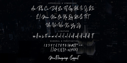 Dellamonde is a Classy Script font with 2 styles: regular and italic. Inspired by luxury and branded stuff which makes this font looks classy and awesome in many ways to your latest project. Dellamonde is perfect for logos & branding, photography, invitation, watermark, advertisements, product designs, stationery, wedding designs, label, product packaging, special events or anything that need handwriting taste.
 - Steel Grrrder Groove by ULGA Type,
$9.00 A single-weight display font, Steel Grrrder Groove is a constructivist inline stencil design best used in short display settings or as an introductory drop cap to grab attention. The design is sharp, angular and slightly condensed with a striking inline groove giving it an air of chiselled chunkiness. It’s groovy but in a slightly robotic way.
 - Danger Girl by Comicraft,
$19.00 Ancient Evil! Nazi Spies! High Adventure! Spandex! As the sun sets and the sky fades from 100Y, 50M to 100Y, Jeff Campbell's Warm and Friendly Display Letterforms are already receding over the far horizon in a Dakota, trailing a long broken red line all the way from Venice to Cairo! This font really does not belong in a museum!
 - Ungap Blocks Variable by Pedro Teixeira,
$25.00 This font was designed by blocks, square glyphs. Terminals/crossbars of some glyphs can be extended in a way that you can customize the text of your design by using the selection bars in "variable font" button. That button will appear in the text editor of your program, if such option is available, like in recente illustrator and photoshop.
 - Railway Point by Melissa Lapadula,
$11.95This typeface has been influenced by the ongoing traffic congestion in Melbourne, and its lack of functional and reliable public transport as a possible solution. The font shapes are square-edged constrained angles, reflecting the way the Melbourne population feels when using the public transport system or roads. Use as headings and body copy in any graphic situation. - Parler Fraktur by RMU,
$25.00 Friedrich Poppl’s blackletter font, carefully redrawn and redesigned for modern use, named after the Parler master builder family who built the Schwaebisch Gmuend cathedral. This font contains the letter ‚long s‘ which can be reached in two ways. Either you use the OpenType feature ‚historical forms‘, or you type the integral sign + the option key on your keyboard.
 - Amazed Breath by Almarkha Type,
$29.00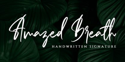 Amazed Breath is a classy script font that comes in Regular and Slant. Inspired by luxury, this font will look classy and awesome in many ways in your latest project. Amazed Breath is perfect for logos and branding, photography, invitations, watermark, advertisements, product designs, stationery, wedding designs, labels, product packaging, special events or anything that needs a handwritten taste.
 - Axelby JNL by Jeff Levine,
$29.00 Axelby JNL was modeled from a set of die-cut, self-adhesive cardboard letters from the 1960s. The design is reminiscent of some early wood type in the way it has letters of varying widths that do not conform to any set standard. The font is perfect for plain, easy-to-read and attention-getting headlines.
 - Moki by FaceType,
$25.00 The seven ways of Moki. Moki comes in seven different styles: Base, Cut, Dust, Lean, Mono, Soft and Uni. Moki is a display expert – with a wide range of languages covered, the family offers a style for every purpose. You are a SciFi movie director and are looking for an alternative to the inevitable Eurostile? Now you have!
 - Ethnicity by Eurotypo,
$21.00This font is inspired and based on many indigenous geometric shapes (Mapuche and Diaguitas from South America). A collection of more than 50 glyphs that you may combine in different and creative ways, alternating the position of the modules is possible to produced a wide variety of linear strips or closed figures, frames, modular grids, textures, etc. - UT Sugar Cane by Uniontype,
$15.00 Sugar Cane by Uniontype is a fresh and light multilingual script inspired by vintage monoline fonts. It provides advanced typographical support with contextual alternates, ligatures and swashes. That way, you’ll have automatic access to the dozens of extra glyphs in each of the fonts. This font is good for menu, signs, packaging, posters, letterings and logos.
 - SusiScript by Ingrimayne Type,
$9.00 SusiScript is an friendly, informal typeface family with three weights, each with an oblique style. The idea for SusiScript came from a girl named Suzi who wrote her "e"s in a peculiar way. The typeface does not replicate her handwriting, which was very hard to read; it merely drew inspiration from several of her letters.
 - Abracadabra PW by Patty Whack Fonts,
$29.00This font is made of many unrestrained strokes of the pen and it is perfect for a freestyle look. It would be great to use for projects that you would want to look handwritten, lively and even calligraphic. It's very playful and mysterious. It's so much fun to use and can be used in a variety of ways! - Retirement JNL by Jeff Levine,
$29.00 The hand lettered film credits for 1937’s “Make Way for Tomorrow” were done in a sans serif design with an ever-so-slight flare and a slightly semi-calligraphic look. Unusual in both style and varying character thicknesses, the lettering has been digitally redrawn as Retirement JNL, which is available in both regular and oblique versions.