10,000 search results
(0.023 seconds)
- Sparticus by Solotype,
$19.95A European font from Bauer's foundry was the inspiration for the caps in the font. There was no lowercase, so we designed one. Although the original font was intended for display lines in advertising, our version reads quite well in smaller point sizes, too. - Trio CT by CastleType,
$39.00 I was commissioned by Publish magazine to digitize Trio in 1990. Originally designed in a Light weight only, Trio is now available in Medium and Bold weights as well. Uppercase only, but each weight includes two alphabets, one more "deco," the other more "modern."
 - farloni by Justi,
$15.00 farloni is a monospaced monoline typeface family that can be used in a variety of typographic environments. it comes in four weights, from light to bold. the typeface is intended for use in display sizes, but looks quite legible in text and it works well for editorial and brand design.
 - Neo Neo by ITC,
$29.99Neo Neo is the work of British designer Timothy Donaldson, a type style straight out of a 1950s time capsule. It can be set in all caps or a mixture of capitals and lowercase. The casual, slightly condensed forms with their smooth, soft lines are reminiscent of highway diners and motel ads of the time and convey a bright, inviting mood. - Backstage Pass NF by Nick's Fonts,
$10.00Turn on the mirrored ball, and haul out the gold chains and white suits! This Disco dazzler is a new take on Bass Rainbow, designed by Saul Bass in the 1970s. Hip, hot and heavy, this typeface is ready to get down. This font contains the complete Latin language character set (Unicode 1252) plus support for Central European (Unicode 1250) languages as well. - Import Stencil JNL by Jeff Levine,
$29.00 Dollar Tree Stores imports a number of items from China, and many times these are limited-run products only available until the existing supplies run out. One such item was a sans serif stencil lettering guide with rounded ends that takes on the look of 1980s-influenced techno lettering. This is now available as Import Stencil JNL, in both regular and oblique versions.
 - Shine of Love by Namara Creative Studio,
$9.00 Cute and Playful display fonts crafted with heart, especially for you. It is perfect for children-themed designs, Such as t-shirt designs, story books, packaging, children’s activity or school projects, posters, greeting cards, valentine’s crafts, and more! Come in 03 variants : Regular, Shadow and Fun. So add it to your creative ideas and notice how it makes them stand out!
 - Danni Hand by danni.creative,
$29.00 Thx for checking out DANNI HAND! This hand written font gives a personal feeling to any project. Perfect for logos, initial logos, posters, text copy, printed quotes, t-shirt design and whatever your imagination holds. DANNI HAND comes in 3 font stylesnwith a complete set of uppercase and lowercase alternates, which can easily be accessed through the glyphs panel. Enjoy!
 - Molagane by Qaratype,
$18.00 Molagane is a Bold Minimalist Elegant Modern vintage font with beautiful ligatures, tons of special alternative glyphs, ornament and multilingual support. It’s a very versatile font that works great in large and small sizes. It can easily be matched to an incredibly large set of projects, so add it to your creative ideas and notice how it makes them stand out!
 - Giftbox by Gleb Guralnyk,
$12.00 Introducing a vintage font Giftbox. It's a classic style font with thin lines decoration. Giftbox font set includes a main font file with lots of ligatures and a simple one which will be more usefull in a small size. Giftbox font has a west european multilingual support (please check out a screenshot with all characters). Thank you and have a lovely day!
 - Rianna Pauls by Supfonts,
$12.00 Rianna Pauls is a beautiful signature font, fashionable appearance and elegant simplicity of lines. You will fall in love with this font Font is an open type with clean shapes and precise kerning. It includes ligatures encoded by the PUA. Language support: All European languages Don't forget to subscribe so you don't miss out on the new awesome fonts Dima
 - Pocket Px by Letradora,
$18.00 Inspired by illustration lettering, Pocket has a contemporary, quirky feel. Its combination of narrow and round forms give it a humorous feel.It has support for most western and central European languages, and has alternates for most letterforms, allowing for variations that make it look authentically hand-drawn. Check out other fonts in the Pocket family: Pocket Serif and Pocket Swash
 - Basketto by Mike Zuidgeest,
$12.50 Basketto is a carefully crafted, handmade sans serif font. Completely built from scratch in Adobe Illustrator. The glyphs are nice and bold, with sharp corners. Use Basketto for your product packaging, out of home adverting, food truck posters, festivals or the travel industry. This is my official font debut, I would love to hear from you to see my font on your product!
 - Brignell Square by IB TYPE Inc.,
$40.00 BRIGNELL SQUARE is a ten font family designed by Ian Brignell. Modern and crisp, this strong-shouldered sans serif offers tonal neutrality. Like Helvetica, Brignell Square is a classic "do anything" font. Spatial balance defines these letter shapes. Creatively, this typeface was born in 1990 out of Ian’s frustration with ubiquitous, barely readable highway signage. Use everywhere. Extended Latin set.
 - Elston Pro by Red Rooster Collection,
$60.00 Originally designed by Les Usherwood for a famous European car company, Elston Pro has been completely redrawn and remastered by Steve Jackaman and Ashley Muir. The new Elston Pro family has been fleshed out with a glyph set that is over 40% larger than the original Elston release, and contains all the high-end features expected in a quality OpenType Pro font.
 - Hybi12 Arome by Hybi-Types,
$12.50 The Hybi12-Arome is another crossover font family with characteristics of Grotesque and Brushscript. It’s friendly and charming look is built out of geometrical and free-hand details. The fonts are offering a huge character set for usage in many languages. Also thousands of kerning pairs within each style are obligatory. Hybi12-Arome is perfectly suitable for advertising, posters and private printings.
 - Pipetton by Letterhend,
$16.00 This family consist of two fonts, the main script font and complementary sans font which is perfectly matched with the script font. This font is suitable to use as a logotype / wordmark / label, etc with its unique and bold characters makes it stand out from the crowd. This font is comes in uppercase, lowercase, punctuations, symbols & numerals, stylistic set alternate, ligatures, and swashes.
 - Bicillesta by Hikhcreative,
$12.00 Introducing a new modern script, Bicillesta! Bicillesta is perfect for elegant logos, upscale packaging, wedding stationery, websites, and any other projects requiring a handwritten and luxurious touch. Alternates and ligatures are included so that you can give your logo or name a custom, calligraphic look. Thanks for checking out my shop, and feel free to get in touch if you have any questions!
 - Fox Cherry by Fox7,
$14.00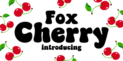 Fox Cherry is a groovy and playful display font that captures the cool, and retro style. Fun and funky, this font is perfect for adding a touch of personality to any design project. Whether you’re creating T-shirts, stickers, children’s book covers, social media posts, or anything in between, Fox Cherry is the perfect choice for making your designs stand out.
 - Toddler JNL by Jeff Levine,
$29.00The fun, lighthearted appeal of Toddler JNL will bring out the inner child in you. Perfect for any layout or project that has to do with newborns, toddlers, preschool, playtime or anything related to little ones. There's a fairly complete character set - and two different width blank boxes on the brace keys - which can be used as spaces between words. - Mint Monday by Supfonts,
$12.00 Mint Monday is a beautiful handwritten font, fashionable appearance and elegant simplicity of lines. You will fall in love with this font Font is an open type with clean shapes and precise kerning. It includes ligatures encoded by the PUA. Language support: All European languages Don't forget to subscribe so you don't miss out on the new awesome fonts Dima
 - Felt Noisy by PintassilgoPrints,
$24.00 Counting four variations for each letter and two for the numbers, Felt Noisy delivers a cool organic feel with a strong and spontaneous attitude. The typeface was drawn with a bad felt tip pen and resulted in two rather nice fonts that will stylishly fit many visual projects out there that don't look for any transparency at all. Give it a go!
 - Allograph JNL by Jeff Levine,
$29.00According to the dictionary, the way a letter is formed or shaped within a writing system is an allograph... and Allograph JNL from Jeff Levine takes on unusual shapes. Using characters from Jeff's Printing Set JNL font, they were printed out white-on-black, and the paper was torn into abstract pieces and then scanned in order to create this edgy looking font. - African Jazz by Scholtz Fonts,
$19.00African Jazz is an informal and vigorous font that moves to the rhythms of Africa. Its angular shapes are reminiscent of the syncopated jazz beat that grew out of the heart of Africa. African Jazz has carefully crafted spacing and kerning, making it easy to use in any display setting. It also includes all punctuation, symbols, special characters and diacritical marks. - Backy by Canden Meutuah,
$20.00 Introducing Bucky is a simple, minimalist and neat Display font. It can be easily adapted to a very large range of projects, such as advertising, titles, blogs, logos, branding, invitations, business cards and more! So add it to your creative ideas and watch how it makes it stand out! are also used in various languages. you will not be disappointed with the results.
 - Nanquim by PintassilgoPrints,
$18.00 Nanquim is a versatile font, available in three sketchy options. At display sizes the line art is very eye-catching. At smaller sizes it turns out like textured faces. Always with a pleasant handmade feel. Nanquim characters were hand drawn with pen and India ink on film, like we use to do when preparing artwork for screenprint. Hope you enjoy!
 - Prince Frog by Hanoded,
$15.00 Prince Frog started out as an attempt to 'pimp' Rabbit On The Moon font. It quickly evolved into an entirely different typeface with just a hint of 'Rabbit' in it. Prince Frog is a very happy, very legible font and would be ideal for children's book covers, posters and packaging. It comes with enough diacritics to keep even the most spoiled princess happy.
 - Ulga Grid by ULGA Type,
$19.00 Update November 2022: ULGA Grid now features an oblique variant. It’s also been expanded into a family of different but related designs with the addition of ULGA Grid Solid and ULGA Grid Rounded typeface families. All variants and new designs are monospaced, sharing the same width as the original ULGA Grid font and matching character sets. The character set has also been enlarged and now supports Western Europe, Vietnamese, Central/Eastern Europe, Baltic, Turkish and Romanian. ULGA Grid is a modular, monospaced typeface reminiscent of the old Letraset LCD & Quartz typefaces from the 1970/80s with lots of alternative characters and ornaments to bring a fresh twist to the genre. The idea’s seed germinated while I was going through a phase of binge watching my favourite 1980/90s sci-fi movies (classics such as Terminator, Total Recall and RoboCop). However, perception and reality don’t always align. Thirty years later, when compared to today’s technology, some visual elements look kind of outdated, almost Retro Futuristic. The initial design process started out in Adobe Illustrator when I constructed letters from a few geometric shapes within a square block. Just playing around with different shapes was so engrossing that it wasn’t long before there were enough characters for a basic typeface. The project grew again as I experimented with designs within the shapes and set paragraphs of text in patterns, resulting in over a hundred alternative characters and ornaments, some of which double up as border designs. This typeface may be square but it’s anything but boring. What it lacks in legibility ULGA Grid makes up for in style and the end result is a surprisingly versatile typeface that you'll have fun using for a wide range of display purposes including CD covers, posters, packaging, advertising, brochures and film titles. Ironically, the fixed grid structure frees the characters to create patterns of text not possible with variable widths.
 - Klothilde by Fontroll,
$20.00 Klothilde is a handwriting font which came to life in one of my doodling sessions (I must admit I still doodle with pen and paper). The idea was to create a font which resembles writing with a quill on paper with exaggerated ball terminals. Sometimes there is too much ink which makes the letters fat and the strokes uneven. The paper soaks the ink resulting in blurred line crossings. The form gets blurry. On the other hand, when the quill runs out of ink the stroke gets thinner looking like the light version of Klothilde. In order to emulate the different looks, I created six fonts with a common skeleton but different appearance which can be altered seamlessly by using the Variable Fonts technology (e.g. in latest Adobe apps or CorelDRAW Graphics Suite) along the Weight and Blurred sliders. But even without, Klothilde can be used even in longer copy. Use it from 18 pt upwards, flush left with tight leading and intersecting ascenders and descenders. Due to extensive manual kerning, it gives your text an even colour. To my knowledge, Klothilde is one of the first script Variable fonts in different weights. No, Klothilde’s letters are not connecting. But I added a whole bunch of connecting ligatures which are simply activated by the ligature feature of your app. Even Microsoft Word can do that. Thus Klothilde comes to life, as it should be expected from a handwriting font. In order to add to variety there are additional glyphs for some critical initial and standalone letters. Repeating letter combinations like nn, mm or rr are avoided by replacing the second letter by an alternative form. All features are activated by the standard ligature feature. Ligatures are available for most European languages, some even in Cyrillic (some special Serbo-Croat letters included and accessible through localization or Style Set 08 features). Romanian comma-accent characters and ligatures are accessible through the OpenType locl feature. For the topping on the cake, I added an alternate ampersand (stylistic set 1) and asterisk (ss04), an alternate Cyrillic b (ss02) and t (ss03), a few fleurons, arrows and a skull (OpenType feature ornm), fractions (frac feature), circled numbers (ss06) and an interrobang (ss07) which result in exactly 900 glyphs in each of the six fonts. There should be enough to play with. Should you be missing a special character, do give me a hint.
 - Blah Blah Upper by Comicraft,
$49.00 Because You Demanded It! The Collectors Item Classic BLAH BLAH BLAH makes a triumphant return as an all-uppercase comic book lettering workhorse. Complete with auto-ligatures and our groundbreaking Crossbar I Technology, to put that sneaky & enigmatic character exactly where it belongs! Includes full sets of Western & Central European accents.
 - Faceless by Gassstype,
$29.00 Hello Everyone, introduce our new product Font Faceless it is lack metal Typeface, Rooted, but still readable.This is a Textured Natural Style and classy style with a clear style and dramatic movement. This font Faceless is great for your next creative project such as logos, printed quotes, invitations, cards, product .
 - Sixty Niners by Putracetol,
$24.00 Introducing Sixty Niners - a retro display font that draws inspiration from unique typography and lettering found in vintage magazines, combined with modern typography styles. This font features modern ligatures that allow you to create beautiful lettering and artwork. With its open type features, including a variety of alternates and end swashes, Sixty Niners provides ample options for customization and creativity. Sixty Niners is perfect for a wide range of design purposes, including logotypes, headings, covers, posters, logos, quotes, product packaging, headers, merchandise, social media posts, greeting cards, and more. Its distinctive retro style adds a touch of nostalgia and elegance to your designs, making them stand out and capture attention. To access the alternate glyphs in Sixty Niners, you can use design programs that support OpenType features, such as Adobe Illustrator CS, Adobe Photoshop CC, Adobe InDesign, and Corel Draw. This allows you to easily switch between uppercase and lowercase letters, apply alternates and ligatures, and create unique and customized lettering compositions that suit your design needs. In your zip package, you'll find the Sixty Niners font files in otf, ttf, and woff formats, providing versatility for different design projects. The font includes uppercase and lowercase letters, numerals, punctuation, and symbols, ensuring that you have all the elements you need for your designs. Sixty Niners also offers multilingual support, making it accessible for designers around the world to create designs in different languages. Whether you're designing for English, Spanish, French, or any other language, Sixty Niners has got you covered. In summary, Sixty Niners is a retro display font that combines vintage and modern typography styles, providing a unique and elegant look to your designs. With its open type features, multilingual support, and versatile design options, Sixty Niners is perfect for various design purposes. So, elevate your designs with Sixty Niners and create stunning artwork that captures attention and stands out from the crowd! Thank you for choosing Sixty Niners from our collection. Happy designing!
 - Sagittarius by Hoefler & Co.,
$51.99 A typeface with lightly-worn futurism, Sagittarius is equally at home among the beauty and wellness aisles, or the coils of the warp core. The Sagittarius typeface was designed by Jonathan Hoefler in 2021. A decorative adaptation of Hoefler’s Peristyle typeface (2017), Sagittarius’s rounded corners and streamlined shapes recall the digital aesthetic of the first alphabets designed for machine reading, a style that survives as a cheeky Space Age invocation of futurism. Sagittarius was created for The Historical Dictionary of Science Fiction, where it first appeared in 2021. From the desk of the designer: Typeface designers spend a lot of time chasing down strange valences. We try to figure out what’s producing that whiff of Art Deco, or that vaguely militaristic air, or what’s making a once solemn typeface suddenly feel tongue-in-cheek. If we can identify the source of these qualities, we can cultivate them, and change the direction of the design; more often, we just extinguish them without mercy. Sometimes, we get the chance to follow a third path, which is how we arrived at Sagittarius. During the development of Peristyle, our family of compact, high-contrast sans serifs, I often found myself unwittingly humming space-age pop songs. Nothing about Peristyle’s chic and elegant letterforms suggested the deadpan romp of “The Planet Plan” by United Future Organization, let alone “Music To Watch Space Girls By” from the ill-advised (but delicious) Leonard Nimoy Presents Mr. Spock’s Music from Outer Space, but there they were. Something in the fonts was provoking an afterimage of the otherworldly, as if the typeface was sliding in and out of a parallel universe of high-tech spycraft and low-tech brawls with rubber-masked aliens. It might have had something to do with a new eyeglass prescription. But I liked the effect, and started thinking about creating an alternate, space-age version of the typeface, one with a little more funk, and a lot more fun. I wondered if softer edges, a measured dose of seventies retrofuturism, and some proper draftsmanship might produce a typeface not only suitable for sci-fi potboilers, but for more serious projects, too: why not a line of skin care products, a fitness system, a high-end digital camera, or a music festival? I put a pin in the idea, wondering if there’d ever be a project that called for equal parts sobriety and fantasy. And almost immediately, exactly such a project appeared. The Historical Dictionary of Science Fiction Jesse Sheidlower is a lexicographer, a former Editor at Large for the Oxford English Dictionary, and a longtime friend. He’s someone who takes equal pleasure in the words ‘usufructuary’ and ‘megaboss,’ and therefore a welcome collaborator for the typeface designer whose love of the Flemish baroque is matched by a fondness for alphabets made of logs. Jesse was preparing to launch The Historical Dictionary of Science Fiction, a comprehensive online resource dedicated to the terminology of the genre, whose combination of scholarship and joy was a perfect fit for the typeface I imagined. For linguists, there’d be well-researched citations to explain how the hitherto uninvented ‘force field’ and ‘warp speed’ came to enter the lexicon. For science fiction fans, there’d be definitive (and sometimes surprising) histories of the argot of Stars both Trek and Wars. And for everyone, there’d be the pleasure of discovering science fiction’s less enduring contributions, from ‘saucerman’ to ‘braintape,’ each ripe for a comeback. A moderated, crowdsourced project, the dictionary is now online and growing every day. You’ll find it dressed in three font families from H&Co: Whitney ScreenSmart for its text, Decimal for its navigational icons, and Sagittarius for its headlines — with some of the font’s more fantastical alternate characters turned on. The New Typeface Sagittarius is a typeface whose rounded corners and streamlined forms give it a romantically scientific voice. In the interest of versatility, its letterforms make only oblique references to specific technologies, helping the typeface remain open to interpretation. But for projects that need the full-throated voice of science fiction, a few sets of digital accessories are included, which designers can introduce at their own discretion. There are alternate letters with futuristic pedigrees, from the barless A popularized by Danne & Blackburn’s 1975 ‘worm’ logo for NASA, to a disconnected K recalling the 1968 RCA logo by Lippincott & Margulies. A collection of digitally-inspired symbols are included for decorative use, from the evocative MICR symbols of electronic banking, to the obligatory barcodes that forever haunt human–machine interactions. More widely applicable are the font’s arrows and manicules, and the automatic substitutions that resolve thirty-four awkward combinations of letters with streamlined ligatures. About the Name Sagittarius is one of thirteen constellations of the zodiac, and home to some of astronomy’s most inspiring discoveries. In 1977, a powerful radio signal originating in the Sagittarius constellation was considered by many to be the most compelling recorded evidence of extraterrestrial life. Thanks to an astronomer’s enthusiastically penned comment, the 72-second transmission became known as the Wow! signal, and it galvanized support for one of science’s most affecting projects, the Search for Extraterrestrial Intelligence (SETI). More recently, Sagittarius has been identified as the location of a staggering celestial discovery: a supermassive black hole, some 44 million kilometers in diameter, in the Galactic Center of the Milky Way. <
 - Reba Samuels by Samuelstype,
$24.00 Reba Samuels is based on the 2007 release Rebecca Samuels. While Rebecca was largely intended for text use Reba aims to be more versatile with an extended weight scope and added cut varieties. While Rebecca’s slab character is developed in the Reba serif, the ’seriffed’ italic of Rebecca is abandoned in favor of a simple italic sans, better matching the serif in plain text. The weight extremes are very useful for headlines while the middles do better in text. The robust and angular shapes of the serif matches the straightforward sans. The extreme contrast between the thin and the black cuts opens up great opportunities in any design project.
 - PL Behemoth by Monotype,
$29.99Dave West released the Behemoth Semi-Condensed font in 1960. With nineteenth-century wood-cut influence PL Behemoth Semi-Condensed is an example of the revival of slab serif styles, popular in the sixties and seventies. - Termit by Ditatype,
$29.00 Termit is a striking display font designed with a game theme, featuring large letters with a fairly thick weight and a rectangular shape with sharp corners. This font shows large letters that demand attention and create a bold statement. The rectangular shape with sharp corners in Termit adds a sense of structure and stability to the font. The clean lines and defined angles create a visually bold and impactful appearance. This unique feature evokes a sense of strength and resilience, reflecting the competitive and strategic nature of the gaming world. Each character shares the same height and width, creating a cohesive and pleasing visual experience. With its low-contrast design, it offers a subtle and understated look. The minimal variation in stroke width adds a sense of uniformity and simplicity to the font, allowing the overall design to take center stage. This feature ensures that the focus remains on the content while still maintaining a strong visual impact. Enjoy the available features here. Features: Stylistic Sets Multilingual Supports PUA Encoded Numerals and Punctuations Termit fits in headlines, logos, posters, titles, branding materials, print media, editorial layouts, website headers, and any other game-themed projects. Find out more ways to use this font by taking a look at the font preview. Thanks for purchasing our fonts. Hopefully, you have a great time using our font. Feel free to contact us anytime for further information or when you have trouble with the font. Thanks a lot and happy designing.
 - First March by Nathatype,
$29.00 First March is a captivating display serif font designed with elegance and a touch of modernity. This typeface combines classic serif elements with a contemporary twist, offering a unique and refined look to your creative projects. The elegant letterforms with clean lines and balanced proportions adding a sense of sophistication and grace to your typography. The serif details provide a timeless appeal, while the modern twist brings a fresh and current vibe to the font. This combination creates a harmonious balance between tradition and innovation. What sets First March apart are its swinging endings in select letters. These graceful and subtle flourishes add a touch of dynamism and playfulness to the font, creating an engaging visual experience. The swinging endings bring a sense of movement and fluidity to the letterforms, enhancing the overall elegance of the typeface. Because of its legibility you can use this font in a variation of text sizes. Enjoy the available features here. Features: Ligatures Stylistic Sets Multilingual Supports PUA Encoded Numerals and Punctuations First March fits in headlines, logos, posters, titles, invitations, branding materials, print media, editorial layouts, website headers, and many more. Find out more ways to use this font by taking a look at the font preview. Thanks for purchasing our fonts. Hopefully, you have a great time using our font. Feel free to contact us anytime for further information or when you have trouble with the font. Thanks a lot and happy designing.
 - Hostrange by Ditatype,
$29.00 Hostrange is a captivating handwritten font that brings a touch of authenticity and personality to your designs. With its brush-style letterforms and varying brush stroke thicknesses, this typeface captures the essence of handcrafted charm. The special feature of this handwriting lies in its dynamic brush stroke variations, where each letter showcases a range of thicknesses. This adds a sense of organic movement and visual interest to the font, mimicking the natural variations found in hand-drawn brush calligraphy. The result is a font that feels alive and full of character. The brush strokes create a natural and flowing appearance, as if they were crafted by hand with a brush. The varying thicknesses add depth and dimension, enhancing the font's authenticity and handcrafted feel. The letterforms of Hostrange strike a balance between legibility and artistic expression. While each letter maintains its distinctive shape, the varying brush stroke thicknesses bring a sense of uniqueness to each character. Features: Alternates Ligatures Multilingual Supports PUA Encoded Numerals and Punctuations Hostrange fits in headlines, logos, posters, invitations, packaging, branding materials, or any project that calls for a handwritten aesthetic. Find out more ways to use this font by taking a look at the font preview. Thanks for purchasing our fonts. Hopefully, you have a great time using our font. Feel free to contact us anytime for further information or when you have trouble with the font. Thanks a lot and happy designing.
 - Graviola Soft by Harbor Type,
$30.00 🏆 Selected for the 12th Biennial of Brazilian Graphic Design. Graviola Soft is a juicy type family. It is based on our Graviola typeface, but we didn’t just round its corners. We redrew every stem and terminal so they would look just right. Combined with curved diagonal strokes and alternate glyphs, Graviola Soft makes for a super friendly typeface. The family consists of 16 fonts, from Thin to Black and matching italics. While the intermediate ones work for body text, the extreme weights look specially beautiful at display sizes. Each font contains 530+ glyphs, supporting more than 90 languages. Stylistic sets provide alternates in two groupings (a, v, w, y and G, g, &). We think Graviola Soft works best on packaging, logotypes and headlines, but we’re eager to see what else you can do with it.
 - Meno Text by Lipton Letter Design,
$29.00 Richard Lipton designed Meno in 1994 as a modest yet elegant workhorse serif family in seven styles. In 2016, he expanded this spirited oldstyle into a 78–style superfamily. The romans gain their energy from French baroque forms cut late in the 16th century by Robert Granjon, the italics from Dirk Voskens’ work in 17th-century Amsterdam. Meno consists of three carefully drawn optical sizes—Text, Display, and Banner, with Condensed and Extra Condensed widths added to the latter two cuts. Steadfast in text settings, Meno is replete with alternate forms, swashes, and other enhancements that showcase Lipton’s masterful calligraphic hand. The series offers a complete solution for achieving high-end editorial typography.