10,000 search results
(0.036 seconds)
- Flat10 Holly by Dharma Type,
$14.99 Very decorative pixel font which has organic and soft impressions. The best pixel font for Christmas. This 8-bit pixel font is designed with respect for 80s game designers and the pixel font pioneers in middle 90s. Use at size 10 pixels or multiples of 10 and anti-alias off is recommended. List of our Pixel Font Project. ·Flat10 Antique ·Flat10 Artdeco ·Flat10 Arts&Crafts ·Flat10 fraktur ·Flat10 Holy ·Flat10 Holly ·Flat10 Segments ·Flat10 Stencil ·Flat20 Gothic ·Flat20 Headline ·Flat20 Hippies ·Flat20 Streamer ·Behrensmeyer Vigesimals ·Civilite Vigesimals
 - Polke by ArtyType,
$29.00 Polke is a single weight display face brimming with style and charm but simultaneously exuding impressive core strength and a vibrant personality. Floating ball terminals rub shoulders with contrasting sharp and rounded letterforms to produce a distinctively decorative headline font built on robust foundations. Polke's name is derived from the striking terminal dots which dominate the character set, creating a Polka-Dot effect throughout. I also had the artist Sigmar Polke in mind which explains the spelling, and so the two ideas simply morphed together.
 - Eve Bells by Senekaligrafika,
$12.00 “Eve Bells” is a playful handwriting font special for holiday dan christmas display, that puts a smile on your project and will inspire you to create something fun and memorable. “Eve Bells” will help you to create special and touching typographical design for holiday projects, for every day or the happiest day in life, happy birthday cards, baby shower, greeting card, headings, flyer, product packaging, book cover, printed quotes, logos, christmas project, and many more. It is really universal and modern font. The owner of endless possibilities!
 - Genilla by Fatamorkidd,
$11.00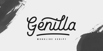 Genilla monoline script. It is perfect for branding, logo, invitation, stationery, wedding designs, social media post, handwritten quotes, product packaging etc. Comes with full set of gorgeous uppercase and lowercase letters, numerals, a large range of punctuation, ligatures and also swash. In order to use the beautiful swashes, you need a program that supports OpenType features such as Adobe Illustrator CS, Adobe Photoshop CC, Adobe Indesign and Corel Draw. but if your software doesn't have Glyphs panel, you can install additional swashes font files.
 - Voltdeco V02 by Owl king project,
$29.00 Finally, voltdeco V02 is basically capital letters (all-caps) for display, then to complement various needs for body text and headline layouts, it is developed into a font family. Voltdeco is an art deco uppercase font with a modern style, Voltdeco works great in short sentences or words, but the (20 weight) fonts allow for more options for exploration. Voltdeco can also work well for medium or regular text. Explore with voltdeco for creative works, whether printing the final design or digital design, happy exploring with voltdeco.
 - Tacky Shoes by PizzaDude.dk,
$18.00 May I present to you: Tacky Shoes. Actually there's nothing tacky here - just liked the sound of that :) Just like the letters may look quite straight-forward, but here and there the lines are a bit off, which enhances the handmade look - which makes it great for work like posters, invitations, flyers, stickers or something that has to do with creativity. Each letter has 6 variants (in all 6 versions!) which makes the text look more natural and random - because these variants cycle as you type!
 - Spooky Hill by Attype Studio,
$10.00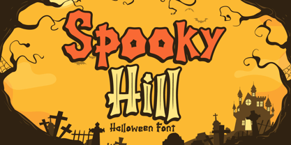 Hello! Spooky Hill is an incredibly unique and playful display font. Fall in love with its authentic feel and use it to create spectacular Halloween designs! Spooky Hill is perfect for branding, logo, invitation, stationery, social media post, product packaging, merchandise, blog design, game titles, cute style design, Book/Cover Title and more. What's Included : - Spooky Hill.otf - Spooky Hill Inline.otf - Multilingual Support (Afrikaans, Albanian, Catalan, Danish, Dutch, English, Estonian, Finnish, French, German, Icelandic, Italian, Norwegian, Portugese, Spanisch, Swedish, Zulu) --- Hope you enjoy with our font! Attype Studio
 - Saffron Walden by Hanoded,
$15.00 Saffron Walden is a small market town in Essex, England. When I created my first ever connected script font, I decided that a 'flowery' name would be best (since that seems to be the most popular choice for connected fonts….). Saffron Walden is a fattish, inky brush font, with a slight tilt to the right. It would be perfect for book covers, magazines, headlines and posters, but could also be used for packaging. Comes with a bunch of ligatures and a heap of diacritics.
 - Euphoria Party by Putracetol,
$36.00 Euphoria Party is a psychedelic style font. This font is inspired by vintage albums and posters from 1960s music bands. The classic, fun and groovy impression is very visible. But in this font I combine several variations such as the ligature. It makes this font even more unique and different. Euphoria Party is also great for any kind of display purpose from album, cover,poster, label, tshirt, apparel, signage, quote, logo, greeting card,logotype and many more. This font is also support multi language.
 - Carniola by Linotype,
$29.99Franko Luin, Carniola's designer, on this typeface: Carniola is a pastiche of different type designs from the beginning of the 20th century, mostly American. I am not very fond of it, but was convinced to release it by someone who needed a typeface with a time typical feeling. On the other hand: why not use the original typefaces from that period? Carniola has its name from the Latin name of Kranjska/Krain, a principality in the former Habsburg monarchy (Austria-Hungary), now part of modern Slovenia. - Supra Rounded by Wiescher Design,
$25.00 Supra Rounded is the newest addition to my big SUPRA-family. It really rounds of the huge family with a friendly design, that makes it an excellent and elegant text-typeface. It is an OpenType family for professional typography with an extended character set of over 700 glyphs and extensive kerning. It supports more than 40 Central- and Eastern-European as well as many Western languages (except Greek and Cyrillic). Ligatures, different figures, fractions, currency symbols and small caps can be found in all cuts.
 - Rockhard by Silverdav,
$18.00 Introducing the “ROCKHARD” font, a type of display font with a strong and modern shape, you can find a lot of uniqueness in it, this font is intended for designers who like strong but still elegant fonts with a unique shape that will add an elegant impression to the design you and different from others. This font is very suitable for design needs such as logos, branding, magazine covers, and others, please try it yourself. If you have any questions, don’t hesitate to contact us.
 - Finalist Round Slab Variable by Bülent Yüksel,
$79.00 The font was intended primarily to have a stronger body. It has a simple geometrical surface. This font has a strong personality, that makes it perfect for use in headline sizes but means it also works gracefully within text blocks. Finalists Round Slab is carefully crafted and a unique slab serif. Use for websites, print, motion graphics, logo design, packaging design, t-shirts and more. **UPDATES:** -16 Agust 2021: New version 2.0 Variable Font -28 January 2022: Some bug fixes You can enjoy using it.
 - Revla Serif by Eclectotype,
$40.00 Meet Revla Serif, an unashamedly spirited font, with a spring in its step and a lust for life. Loosely based on a few letterforms from a mid century poster, it takes the feel of Madison Avenue print ads and runs with it. OpenType acrobatics ensure letters don't repeat monotonously, using the contextual alternates feature. Also included for your viewing pleasure - automatic fractions, case sensitive forms and one solitary stylistic alternate, an alternative ampersand. And that's it! Put the fun back into your text with Revla Serif.
 - Chipping by Greater Albion Typefounders,
$13.95 Chipping is a brand new face inspired by Edwardian and 1920s letterforms. It's good for clear and legible headings which need a gentle and unobtrusive period touch, and is the latest is Greater Albion's line of faces to explore the 'small capitals' idea. You will see a broad similarity with our Chipperly family, and the two work well together in combined projects. Four faces are offered: regular and bold, as well as Black with a heavy drop shadow and white which explores the idea of 'whitespace' design.
 - Blackthorn by Scriptorium,
$24.00Blackthorn draws on the tradition of Art Nouveau font design with some elements of western or circus style fonts, but an overall effect which may have more in common with the psychedelic era than anything else. It has a feel somewhat akin to some of the lettering of Alphons Mucha particularly the Abaddon and Gehenna fonts. It's very stylized and kind of wicked looking. You can see where the name comes from if you note the thorn-like spurs on the upper part of each character. - Automata by NOS,
$29.00 Introducing Automata, the typeface that combines futuristic appearance and easy readability. Great for titles but also for logos and text at medium/small sizes, making Automata suitable for a wide range of applications. In addition to its smooth, clean lines and geometric aesthetic, Automata offers a variety of customizable options such as stylistic alternates, logo discretionary ligatures and multiple weights including extra-light and black. The support for many languages makes Automata a global typeface. Add a touch of the future to your design work.
 - Bulgattie by Alcode,
$20.00 Bulgattie is actually a unique font, I build it with the spontaneity of my relaxed hands. designing a formal font but having a classic element, which makes it particularly suitable for wedding media, book covers, greeting cards, logos, branding, business cards and certificates, in fact for any design work that requires a clasik, formal or luxury look. Try Bulgattie, enjoy its wealth of OpenType features and let its vigorous yet elegant exuberance delight you and enhance your creativity! You can use this font very easily.
 - Robolt by Typesketchbook,
$39.00 It starts with the idea that different things can be mixed infinitely. Robolt comprises four designs with multiple options to add variety and playfulness. Battery and Machine have a retro touch which reminds one of toy labels from the '80s, while Vintage is rendered a Didot style with different textures to choose. Streamlined Handdrawn style is nicely put in contrast with the solid types. Elements are also available to complement the letters. The set is made up of 29 letters of four families to serve your creativity.
 - Brozas by Pesotsky Victor,
$12.00 «Brozas» is a contemporary font for modern design. Created for digital art, Web-design, magazine layout. Brozas font is an unusual experience and an experiment on the edge of decorativeness. Drawing letters has a sharp, contrasting character and combined with smooth arcs. Different weights change not only the thickness of the strokes but also their shape. Brozas supports Basic Latin and Extended Latin, Cyrillic — in total about 200 languages are supported. The font has three weights: Thin, Regular and Black. Brozas font was designed by Viktor Pesotsky.
 - Lauderdale JNL by Jeff Levine,
$29.00 It was a series of three different forts on various spots on the New River built during the Second Seminole War [in Florida] named for Major William Lauderdale. It was launched as the college students' spring break destination for many years thanks to the film "Where the Boys Are". It's the major city 23 miles North of Miami. But wait! There's more! Now it's an eclectic Art Deco-inspired typeface. Lauderdale JNL is based on vintage source material with many unusual letter shapes and angles.
 - Guerrilla Handshake by Hanoded,
$15.00 Shaking hands is quite a complicated process: do it too lightly and you appear weak, grab too hard and you’re too eager. There are also those with a ‘Guerrilla Handshake’ - grabbing your hand unexpectedly, shaking it vigorously and yanking it toward them. Guerrilla Handshake font was actually made by hand, using Chinese ink and a brush. I did use the brush vigorously, but I made sure not to shake or yank it too much! Guerrilla Handshake comes in a slightly backslanted ‘regular’ version and an italic version.
 - Nevolasty by Glukfonts,
$10.00 Nevolasty is a geometric sans serif (uppercase) family. It comes in 9 weights - from Thin to Black. Perfect for graphic design, branding, packaging design but very versatile. With over 1000 alternate glyphs, this font has extensive Latin language support for Western, Central, and Eastern European and gives text a unique, elegant and modern feel. Try magical Stylistic Set01 with more extreme automatic contextual alternates. Technical info: To be able to use Nevolasty fonts you need to have installed program with Opentype features (Contextual Alternates) support.
 - Transat Text by Typetanic Fonts,
$29.00 Transat Text is a geometric sans serif typeface, and is the more rational sibling to the unabashedly Art Deco "Transat". Transat Text has a slightly taller x-height than its counterpart, making it easier to read at small sizes, but also performs admirably in larger display settings. Transat Text includes many OpenType features, such as ligatures, small capitals, case sensitive forms, stylistic alternates, arbitrary fractions, and a full complement of proportional, tabular, and oldstyle figures. The Transat Text family includes 5 weights plus optically-corrected obliques.
 - Deadfrog by Ilhamtaro,
$23.00 DEADFROG is a simple classic font, the base is a super bold serif font that is given a grunge texture effect, resulting in a vintage font, which is suitable for supporting designs related to the world of motorcycle custom. But it can also be used for other designs that require a vintage, bold design style, such as magazine headlines or posters. To enable the OpenType Stylistic alternates, you need a program that supports OpenType features such as Adobe Illustrator CS, Adobe Indesign & CorelDraw X6-X7. Cheers!
 - Angela Sweet by Illushvara,
$12.00 Hello, Happy to share our new font "Angela Sweet" is a beautiful modern font, described by an crafty touch, perfect for your favorite projects. Fall in love with its incredibly distinct and timeless style and use it to create spectacular designs! Angela Sweet is perfect for product packaging, branding project, magazine, social media, wedding, or just used to express words above the background Features : - Uppercase and lowercase - Numbers - Symbols - Multilingual Accent If you have any question, don’t hesitate to contact me. Happy Designing !!! Thank You, Bayu Suwirya
 - Delisha by Nissa Nana,
$20.00 Delisha is a beautiful script font. It has a classy, elegant, and modern look which can be used for logos, branding, invitations, stationary, wedding designs, social media posts, and every other design which needs a handwritten touch. What's included: Delisha OTF Numeral and Punctuation Stylistic Alternates , Ligatures, and Swashes International Language Works on PC & Mac Simple installations Accessible in Adobe Illustrator, Adobe Photoshop, Adobe InDesign, even works on Microsoft Word. Thank you for your purchase! Hope you enjoy with our font! Best Regards, Nissa Studio
 - SbB Intermodal Stencil by Sketchbook B,
$9.00 Inspired by stenciled lettering on crates and shipping containers, Intermodal is a 18-typeface family consisting of six widths and corresponding italics in two different angles. Intermodal uses only vertical stencil cuts— creating a dynamic rhythm and a unique, industrial feel. The variable font allows for customization of weight, slant and stencil opening size. 18 fonts Six widths: A-F Regular and two different oblique angles Tabular Opentype Numbers and an alternate "9" Variable font allows you to change weight, slant and stencil opening size
 - Grillmaster by FontMesa,
$25.00 Grillmaster is a nice clean sans serif that you'll find many uses for with eight widths and eight weights in each width set plus italics. It’s always grillin' season with Grillmaster; at 128 font files strong Grillmaster is ready to serve large crowds and dinner parties. So put on some cheap shades and cutoff jeans, then fire up the grill and turn up that perfect song on the radio: the Grillmaster is here to satisfy your appetite; I guarantee you won't go home hungry.
 - MVB Calliope by MVB,
$39.00Gayle Sato, longtime friend of MVB Fonts, has amazing handwriting. It’s a natural, simple hand, with perfect rhythm. Devoid of flourishes, it doesn’t try to be beautiful. It’s just genuine, quick, and clean — the handwriting we all wish we had. The digitization by Mark van Bronkhorst captures these qualities. Retaining the roughness of a felt pen, MVB Calliope is a handwriting typeface that feels much more authentic than most, highly legible but still raw. The Regular was released in 2005, with the other weights shortly thereafter. - Fixga by Formatype Foundry,
$24.00 Behance Fixiga is a Modern rounded geometric sans with experiment forms to make powerful visual, a combining with the rounded and some sharp cutting edges. Fixga family comes with 8 weights, from ExtraLight to Black upright Italic, In addition Fixga also support OpenType alternate characters, Alternate SS.01 is offer with typewriter look and SS.02 is offer with neutral look with single storey "a" and "g" Fixga also support several OpenType features include: ligatures, tabular figures, fractions, and language support for extended Latin Icons and symbols.
 - Snow Mountain by Senekaligrafika,
$12.00 “Snow Mountain” is a playful handwriting font special for winter display,that puts a smile on your project and will inspire you to create something fun and memorable. “Snow Mountain” will help you to create special and touching typographical design for vacation and new year projects, for every day or the happiest day in life, happy birthday cards, winter project, greeting card, headings, flyer, product packaging, book cover, printed quotes, logos, and many more. It is really universal and modern font. The owner of endless possibilities!
 - Tello Mallo by Greentrik6789,
$9.00 Just write, I just want to write, I took a pen, I write the words with punctuation, I write the numbers, symbols and some currencies. No matter about My writing is ugly or very ugly, but sharing this handwriting to the world is my best wish. Tello Mallo comes in regular and italic style for every word you type. Do you like it? Hope you enjoy this, if you have problems or questions, please don't hesitate to contact me. Thank you and have a nice day :) ;)
 - Cheesy Fingers by PizzaDude.dk,
$18.00 I love cheese snacks in all kinds of variations. As a kid I even loved having chessy fingers, but as an adult I prefer to wash my hands (instead of licking and sucking each finger "clean") So, as a loving memory of an all time favourite snack, I made this all caps organic looking sans. Obviously handmade, and cleaned up digitally...just a little bit. Furthermore I have made 5 different versions of each letter and made sure that there is plenty of multilingual support!
 - MVB Chanson d'Amour by MVB,
$39.00An old book found at a Paris bouquiniste contained samples of the typeface “Caractère de finance,” a bâtarde design by 18th century typefounder Pierre Simon Fournier. Rather than revive the type, Kanna Aoki decided to reinvent it, using a felt pen to achieve a rustic, handwritten quality, departing from the 18th century model as she saw fit. MVB Chanson d'Amour conveys a soulful elegance that stops short of the ostentatious, overwrought found in many formal scripts. It is lovely and sweet, but never saccharine. - Jana Thork by Outras Fontes,
$26.90 Jana Thork is a synthesis of stone engraved capital letterforms and uncial and half-uncial calligraphic styles. The idea of the typeface designer Ricardo Esteves was to seek for the limits between our uppercase and lowercase mental concepts. This family can be useful to compose titles, short texts, labels and letterings that need to look attractive to the eye. The family includes Regular and Bold styles, so it can be used in graphic designs that need more complex hierarchic relations or greater visual impact.
 - Stones by Fana Studio,
$20.00 STONES is a supercharged, street-wise brush font bursting with energy. With extra attention to quick strokes and sharp details, STONES is guaranteed to deliver an unapologetically loud & fast-paced message; ideal for logos, apparel, quotes, product packaging, or anything which needs a typographic turbo-boost. What you get : Numeral and Punctuation International Language Works on PC & Mac Simple installations Accessible in the Adobe Illustrator, Adobe Photoshop, Adobe InDesign, even works on Microsoft Word. Thank you for your purchase! Hope you enjoy with our font!
 - Maine by Fenotype,
$25.00 Maine is a modernized book antiqua consisting of six styles and matching italics. Maine's cuts are from Light to Extrabold, of which Regular and Slightly Bolder Book are especially suitable for longer texts. Thanks to its clear features and high x-height, Maine creates a beautiful and legible body text. Maine gives a professional, no-nonsense impression and it’s best used in editorial, books, magazines and everywhere where you can use many different styles and sizes of the same typeface. Go dignified with Maine.
 - Rufina Stencil by TipoType,
$14.00 Simplicity, delicacy and elegance are the words that best characterize Rufina. Based on an idea that was conceived long before its “birth”, Rufina was created from dark-text on light-background combinations. Refined and at the same time distant, Rufina seduces the viewer in a subtle and elegant manner. Blending of contrasty, Bodoni-influenced forms with the emotive touch of the calligraphers pen. This family consists of two weights, their italic counterparts, plus a set of alternate cuts — each containing a selection of illustrative ornaments.
 - Cowboy Rodeo by FontMesa,
$29.00 Cowboy Rodeo is based on an old woodtype font from the late 1800’s Saddle up boys and girls the new Cowboy Rodeo is here, the perfect font for when you need to put a little giddy up in your chickabiddy. The fonts include alternate letters, additional language support for eastern, central and western European countries. The glyph set includes Latin extended A, B and Latin extended additional for Vietnamese plus Pinyin support for Chinese transliteration, finally we've finished the set with some discretionary ligatures.