10,000 search results
(0.033 seconds)
- Quiroga Serif Pro by TipoType,
$29.00 Quiroga Serif began in 2007 with the name Quadratta Serif. This typography was designed for continuous text, legible at medium and small sizes, with great saving of space, optimized for 6, 8, 10 and 12 points. The morphology is a mix between tradition and innovation; it has a vertical axis, thick serifs, tall x-height, light modulation and a lot of internal space between letters: key to improve legibility at small sizes. Formally, my idea was to make a serif type that had a unique color, this is visible due to the light modulation. This is also complemented with the incorporation of not common, alternative signs. Some parts of the letters that are usually curb or diagonal where made horizontal (for example: a, q, p, etc.), this makes the eye of each character to be wide and unique. The serifs (wedge type) suffered diverse variations during the process. At the begining they where thicker and ended vertically, but this caused a great deal of printing errors. And so we decided to modify them by giving them an angle to avoid visible errors in medium and small sizes. The ch, and ll ligatures where rescued because they are a part of our current spanish alphabet. The historic ligatures and stylistic alternates give different options to users who want different alternatives within a text. The accentuation signs were composed in a middle line above all signs to avoid visual shock. We also gave plenty of importance to small caps numbers, mathematical signs and currency signs so that the could interact well.
 - Freigeist by René Bieder,
$29.00 The story of Freigeist is a journey into the past, back to the early grotesk fonts and long before Helvetica and Co were standard fonts in operating systems. For what we take for granted today is the result of innovation and pioneering spirit of type foundries such as Caslon or Stephenson Blake in the 19th century, whose expressive designs are mostly forgotten today. The Freigeist family captures this untamed spirit — hence the name (German for “free spirit”) — and puts it into a contemporary context, resulting in a multi-faceted family with a wide range of applications, font styles and features for modern typesetting. Design Details Unlike other modern grotesk typefaces like Helvetica or Univers, Freigeist is characterized by a warm and dynamic appearance. It draws inspiration from various historical models such as Caslon’s Doric or the Grotesque variants of Stephenson Blake. Particularly noticeable are the narrow terminals, the serpentine S or the dynamic g in combination with ascenders that reach to the cap-height only. Italics Many italic grotesk fonts are strongly oriented towards their upright counterparts. Unfortunately, this often means that they cannot do justice to their actual task, which is to highlight words or sections of a text. The italic cuts of Freigeist try to remedy this situation by using the greatest possible formal distance while reinforcing the untamed spirit. What adds to this, is a reminiscent of handwritten forms, which can be found in a, n, y or g, as well as the German sharp s or the ampersand. Alternate Characters Alternative letterforms are ideal for customizing the overall appearance of a text, for usage in logos or they can even work as custom fonts for companies. Freigeist comes with ten stylistic alternatives that are easy to insert via the Opentype window, such as the single-storey a, a tail-less version of the a for compact text, when uses in condensed widths or a dialed down version of the r. Languages Freigeist has a built-in support for Latin and Cyrillic based languages and covers more than 210 languages. Opentype Features and Symbols The family comes with many opentype features to support modern typesetting. This includes ligatures, different number sets or alternative shapes for texts set in all caps. Styles Freigeist is available in five widths (XCon, Con, Normal, Wide, XWide) and six weights (Thin, Light, Regular, Medium, Bold, Black). Including the accompanying italics, the family comes in 60 cuts that are suitable for any application. Testfonts If you like to test the fonts before buying the full version, please follow the link below: https://www.renebieder.com/test-fonts Update 1 A lot has changed in this first update. It is more than just a 1.01 or 1.02. It is actually the 2.0! I’ve gone through all! single glyphs of the 18 master files, making the family more sharp and even a bit more modern. I’ve added some new opentype features and redesigned the italics, because I wasn’t happy enough with the result. I’ve added new kerning pairs, new metrics, and even new glyphs. Please check my website for more details on the new design and overview about the opentype features and alternate shapes. If you purchased the Freigeist family already, thanks a lot!! It is the most advanced family that I published so far. I hope that you’re happy with this new version. Thanks!
 - Pergamon by URW Type Foundry,
$39.99 The Pergamon series is a creation of Alfons Schneider (1890–1946) and was issued by the foundry of Ludwig Wagner in Leipzig in 1937/1940, though the website of the Klingspor-Museum says that several of the faces were probably produced after the death of Schneider. This digital version is extended with the necessary OT characters and signs, while also the “символы кириллицы” are added. Also, in addition to the members of the family designed by Schneider, regular, italic, bold and bold italic extended versions were produced. The specimens of Ludwig Wagner stated emphatically: “In allen Graden werden beide K K geliefert”, so these two forms are in all the faces, while the two condensed members also have k k, as the specimens said that this alternative character was also in these two faces.
 - Teimer Std by Suitcase Type Foundry,
$75.00Typographer and graphic designer Pavel Teimer (1935-1970) designed a modern serif roman with italics in 1967. For the drawing of Teimer he found inspiration in the types of Walbaum and Didot, rather than Bodoni. He re-evaluated these archetypes in an individual way, adjusting both height and width proportions and modifying details in the strokes, thus effectively breaking away from the historical models he used as a starting point. Teimer's antiqua has less contrast; the overall construction of the characters is softer and more lively. The proportions of the italics are rather wide, making them stand out by their calm and measured rhythm. This was defined by the purpose of the typeface, as it was to be utilised for two-character matrices. The long serifs are a typical feature noticeable throughout the complete family of fonts. In 1967, a full set of basic glyphs, numerals and diacritics of Teimer's antiqua was submitted to the Czechoslovak Grafotechna type foundry. However, the face was never cast. At the beginning of 2005 we decided to rehabilitate this hidden gem of Czech typography. We used the booklet "Teimer's antiqua - a design of modern type roman and italics", written by Jan Solpera and Kl‡ra Kv’zov‡ in 1992, as a template for digitisation. The specimen contains an elementary set of roman and italics, including numerals and ampersands. After studying the specimen, we decided to make certain adjustments to the construction of the character shapes. We slightly corrected the proportions of the typeface, cut and broadened the serifs, and slightly strengthened the hair strokes. In the upper case we made some significant changes in the end serifs of round strokes in C, G and S, and the J was redrawn from the scratch. The top diagonal arm of the K was made to connect with the vertical stem, while the tail of Q has received a more expressive tail. The stronger hairlines are yet more apparent in the lower case, which is why we needed to further intervene in the construction of the actual character shapes. The drawing of the f is new, with more tension at the top of the character, and the overall shape of the g is better balanced. We also added an ear to the j, and curves in the r have become more fluent. To emphasise the compact character of the family, the lining numerals were thoroughly redrawn, with the finials being replaced by vertical serifs. The original character of the numerals was preserved in the new set of old-style figures. To make the uppercase italics as compact as possible, they were based on the roman cut rather than on the original design. The slope of lowercase italics needed to be harmonised. The actual letter forms are still broader than the characters in the original design, and the changes in construction are more noticeable. The lower case b gained a bottom serif, the f has a more traditional shape as it is no longer constricted by the demands of two-matrice casting, the g was redrawn and is a single storey design now. The serifs on one side of the descenders of the p and q were removed, the r is broader and more open. The construction of s, v, w, x, y, and z is now more compact and better balanced. Because Teimer was designed to make optimal use of the OpenType format, it was deemed necessary to add a significant amount of new glyphs. The present character set of one font comprisess over 780 glyphs, including accented characters for typesetting of common Latin script languages, small caps and a set of ligatures, tabular, proportional, old style and lining, superscript and fraction numerals. It also contains a number of special characters, such as arrows, circles, squares, boxed numerals, and ornaments. Because of its fine and light construction, the original digitised design remained the lightest of the family. Several heavier weights were added, with the family now comprising Light, Light Italic, Medium, Medium Italic, Semibold, Semibold Italic, Bold, and Bold Italic. - Almoneda by Sudtipos,
$49.00 Almoneda: Sale at public auction of movable goods, generally used. And also: private and voluntary sale of jewelry and junk that is made without the intervention of justice. Formerly, it was nothing more than the market or sale of things and spoils won from the enemy in war. Nowadays, the almoneda is practically associated with spaces where the sale of "old things" takes place and, in Madrid, they are usually concentrated in the area of El Rastro, an open-air market that is set up on Sundays and some holidays in the center of Madrid. There, you can find everything and, if you walk around a lot and look hard enough, great typographic finds. It is there where I find a large number of elements (usually from the late nineteenth and early twentieth century) such as boxes, posters, books, etc.. in which appear uppercase letters with a variety of shapes, letters embedded, rare ligatures ... In addition, many elements extracted from street signs, tiles from bars and commemorative elements of Madrid have been used to complete this font design made with care and patience. Thus was born Almoneda, a modern typeface with a marked axis and great contrast, and an uppercase with several sets of characters to play with and enjoy. It also includes a large number of ligatures and discretionary ligatures. A Variable font is included with the full package license. Almoneda, a typeface that will not leave you indifferent. They take it out of my hands, hey!
 - Sea Dreams - 100% free

- Raffadyn by Attype Studio,
$16.00 Raffadyn is a wedding font perfect for your wedding dream. Combine Raffadyn with stylistic set to create amazing script font for wedding! Fall in love with its incredibly versatile style and use it to create spectacular designs! Raffadyn is perfect for branding, logo, invitation, quotes, apparel design, product packaging, merchandise, game titles, cute style design, Book/Cover Title and more. What's Included : - Stylistic Set character - Multilingual Support --- Hope you enjoy with our font! Attype Studio
 - Auline by Sensatype Studio,
$15.00 Auline is Modern Luxury Serif Font is a well-balanced contemporary font with a fancy, unique, and versatile Luxury serif, font that you can combine to get any variations and unique shapes easily just in seconds with choose alternates of them. What's Included: Character set A-Z Normal & Italic Style Numerals & Punctuation Accented Characters (West Europe) Stylistic alternates Works on PC & Mac Recommended using Adobe Illustrator or Adobe Photoshop. Wish you enjoy our font. :)
 - Allergic to Waffles by PizzaDude.dk,
$15.00 Luckily, I am not allergic to waffles - but a guy named Ethan Tremblay is...and if you know the story about that guy, you know the name of this font is from! What can I say? A handmade font full of quirkiness and a rough outline. Comes in both Regular (outline) and Solid. Use both versions as they are, or combine them. I've added 4 different versions of each lowercase letter and multilingual support!
 - Simppeli by Morganismi,
$9.00 Simppeli is a simple-lined but rough font. As written text it gives an impression of drawn lines on cross-ruled paper. You can fill the entire text area: the space key gives an "empty" grid. You may have to change the settings of some text applications in order to eliminate the marginals and/ or the line spacing. Combining glyphs provides you with endless assortment of patterns for ornamental decoration, prints etc.
 - Goolage by Beary,
$15.00 Introducing Goolage: A Modern Serif Font for Elegance! Goolage is our latest font creation, blending the aesthetics of modern serif with an unmatched touch of elegance. Goolage is the top choice to elevate the look of your designs with a touch of elegant modern serif. Start using Goolage in your projects and let this font bring a unique and beautiful aesthetic to your work. Get Goolage now and witness how your designs become extraordinary!
 - Arrear by Kirill Malykhin,
$15.00 Arrear is a modern sans-serif font family. It includes three weights: regular, medium and bold. Has cut corners for lowercase letters. This is a versatile font that suits any project and is modern and easy to read. With it, you can create websites, logos, use in advertising, packaging, magazines and much more. This font will inspire you to create impressive designs that will amaze everyone! Multilingual support: extended latin and cyrillic.
 - Nicolas Cochin by Linotype,
$40.99Georges Peignot designed the font Nicolas Cochin based on copper engravings of the 18th century and Charles Malin cut the typeface in 1912 for the Paris foundry Deberny & Peignot. The font is named after the French engraver Charles Nicolas Cochin (1715-1790) although its style had little to do with that of the copper artist. Nicholas Cochin is a freer variation of another Peignot font, Cochin, a bit more balanced and elegant. - TE Rekaah by Tharwat Emara,
$49.00 This font may be conservative and classic, but also may be more playful and modern. It is good for theater or art posters and for modern music, web-pictures or vinyl covers. Of course it also will be good for coffee shops, cafe's, restaurants, magazine's headers, signs or gift/post cards and weddings. Try to use it in your beauty or travel blogs, you will see how many options you will have with stylish REKAAH
 - TE Sarah by Tharwat Emara,
$35.00 This font may be conservative and classic, but also may be more playful and modern. It is good for theater or art posters and for modern music, web-pictures or vinyl covers. Of course it also will be good for coffee shops, cafe's, restaurants, magazine's headers, signs or gift/post cards and weddings. Try to use it in your beauty or travel blogs, you will see how many options you will have with stylish Sarah.
 - Micaroline by Martype co,
$19.00 MICAROLINE The Classic Art Deco Font with Alternates & Ligatures Micaroline is a family Sans Serif font designed with carefully handcrafted. Also suitable for branding, T-shirt, Wedding Invitation, Classic Design, Logotype, and any project. Comes with a tons of ligature make your life more than comfortable, easier to design and adjust frustrating space in font. All Caps Fonts. You can access the stars by typing (S+1) and then put it anywhere you want.
 - Kwaliteit by Fabulous Rice,
$20.00Kwaliteit is the result of a love story. The love story between a font designer and an old embossing label machine. The big bold letters produced by such machines are wonderful to convey a big bold message (big bold messages are fun!), but sometimes you just can't walk around with one of those antique label machines… That's why this font can come in handy! Its uses are numerous… be the boss of emboss! - Hesster Mofet by JOEBOB graphics,
$20.00 Hesster Mofet is what I got after writing with an old and weathered calligraphic marker on textured paper. The characters were smoothened for a clean result, but since the original sketches had such a nice rough, edgy feel to them, they were also made into a complete font set. A couple of ligatures and a Hannibal Lecter reference were thrown in the mix as well. You can get both versions at a discount.
 - MPI Tuscan Extra Condensed by mpressInteractive,
$5.00 Tuscan X Condensed (whose actual name is Gothic Concave Tuscan Extra Condensed) was first produced in wood type by William H. Page & Company around 1872. The design is derived from a Gothic Condensed typeface, but with vertical stokes bowing inwards at the center. We modified the weight of the uppercase characters (since the original wood type has a lowercase much thinner than the caps) to harmonize with the lowercase when used digitally.
 - Bloemgracht by Hanoded,
$15.00 In the old Amsterdam neighborhood of 'De Jordaan', you will find a canal called Bloemgracht (Flower Canal). For many years, a coffee store called Schildmeijer could be found here. Their paper coffee bags and advertisements sported a hand made font which I have tried to recreate and the result is Bloemgracht typeface. It is an all caps art deco font, quite angular, but very legible and distinct. Bloemgracht comes with extensive language support.
 - Fd Moller by Fortunes Co,
$10.00 Moller has a strong but soft character, with a cheerful and fresh theme, supported by 2 Style. Moller is able to answer your current needs who are designing something great. Moller is a bold and unique display font. Masterfully designed to become a true favorite character, moller is able to answer your current needs who are designing something great Its weight is superior in posters, social media, headlines, magazine titles, clothing, large print formats.
 - Pinky Cupid by Attype Studio,
$15.00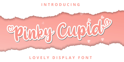 Pinky Cupid is lovely display font, including stylistic alternates that perfect for any combination for your design. Pinky Cupid perfectly macth for design with valentine theme, any product like book cover, t-shirt, branding, promotion, social media post, quotes, wedding, photography and more. What's included: - Multilingual Support - Support OpenType features - Works on PC & Mac - Simple installations - Accessible in the Adobe Illustrator, Adobe Photoshop, Adobe InDesign --- Hope you enjoy with our font! Attype Studio
 - Bilibin by Scriptorium,
$12.00Ivan Bilibin was one of the best artists and designers of the Russian folk art movement of the early 1900s. His posters and his illustrative work are exceptional, and like many of the artists of the period he did a lot of hand lettering in various old-fashioned and modernistic interpretations of traditional Russian folk calligraphy. Our first Bilibin font is based on his lettering from an illustrated folk story by Alexander Pushkin. - Umbilical Noose by Hanoded,
$15.00 Umbilical Noose is a rather scary typeface. It is quite similar to an older font of mine: Nyctophobia. The name comes from a Nirvana song called Heart Shaped Box, in which Kurt Cobain sings: "throw down your umbilical noose, so I can climb right back". I have always liked that phrase a lot. Umbilical Noose is an all caps font, but upper and lower case are different and you can easily interchange the glyphs.
 - Same Old Joke by Bogstav,
$15.00 Same Old Joke is a happy and handmade font. Use it for anything that needs a hand lettered expression. Works well with prints, cards, packaging or perhaps even a poster of your favourite chocolate! Each version of the font is full of personality, and was carefully handdrawn to keep both the legibility and the handmade feeling. I put in ligatures to substitute the most common letter repeating - to make it look even more handmade!
 - MBF Avee by Moonbandit,
$42.00 Presenting MBF Avee – a cutting-edge sans-serif font meticulously crafted to embody the essence of modernity and versatility. With its clean lines and minimalist design, MBF Avee offers a sleek typographic solution for a wide range of applications. Whether used in print or digital media, its timeless aesthetic ensures a sophisticated and impactful presentation. Elevate your design projects with MBF Avee, where clarity meets contemporary style for a truly refined visual experience.
 - Quan by Typesketchbook,
$40.00 The complete Quan font family designed by Chatnarong Jingsuphatada of Bangkok-based Typesketchbook consists of a very usable, clean and modern sans typeface and a rounded sub-family. The font looks clean and geometric but it’s designed with unusual stylistic features to give the Quan font a special and unique touch. The complete Quan type family includes eight weights with obliques and rounded versions for each of them all in all 32 fonts.
 - Clunic by Greater Albion Typefounders,
$16.95 Clunic is a Blackletter font in the best traditions of Victorian Gothic revival—that is to say aesthetically marvelous but no historical basis whatsoever. The design combines the perpendicular character of medieval manuscripts with modern legibility and a healthy respect for calligraphic principles. There are alternate large and small forms of some glyphs. Clunic is ideal for use on certificates, themed invitations, posters, headings, initial capitals or sign-writing with an historic theme.
 - My Sister by Fontdroe,
$15.00 My Sister is a new modern calligraphy typeface built in 658 glyphs. It has OpenType features with PUA encode. This is a smart font works with popular design software such as Photoshop, Corel Draw X version, Illustrator, Microsoft Office, etc. This modern calligraphy typeface welcomes you to use it for various purposes such as logo, card, wedding invitation, headings, signatures, t-shirt, letterhead, cutting, hot stamping, signage, labels, posters and more. It's very craft friendly.
 - Supra Compressed by Wiescher Design,
$29.00 Supra-compressed – designed by Gert Wiescher in 2013 – is the extreme version of this family. But despite it being very slim it is still – because of its openness – a very readable font. The light and normal weights and the dominant x-height with its high ascenders make for easy reading of long copy. The heavy and x-light weights are great for elegant headlines. Supra is a versatile OpenType family with lots of different weights.
 - Maraka by Rosario Nocera,
$12.00 Maraka is a handwritten font family, drawn with a paint marker on rough paper, then scanned and turned into vector format. Maraka has a lot of alternative letters and is available in three versions: “Regular”, characterized by an unique look obtained by drawing the letters on a rough sheet, "Solid" and "Serif". Maraka is ideal for large headers, straplines and typographic compositions, but it still gives a great dynamic effect when writing wordy paragraphs.
 - Funny Business JNL by Jeff Levine,
$29.00 The hand lettered title on the sheet music for "Gee, But I'd Like to Make You Happy" (from the 1930 MGM motion picture "Good News") presented a conundrum. Some of the lettering was a classic Art Deco "thick and thin" design while the others resembled comic book title lettering. Leaning toward the comic book style, the conflicting letters were revised and the finished result became Funny Business JNL; available in both regular and oblique versions.
 - Floryn by Sensatype Studio,
$15.00 Glorify is Modern Elegant Luxury Sans Serif Font is a well-balanced contemporary font with a fancy, unique, and versatile Luxury Sans serif, font that you can combine to get any variations and unique shapes easily just in seconds with choose alternates of them. What's Included: Character set A-Z Numerals & Punctuation Accented Characters (West Europe) Works on PC & Mac Recommended using Adobe Illustrator or Adobe Photoshop. Wish you enjoy our font. :)
 - Swing Era JNL by Jeff Levine,
$29.00 Hand lettered Art Deco lettering for the title on the cover of the 1930s-era song "And I Still Do" provided the inspiration for Swing Era JNL. A bold, casual and friendly typeface, it features an intersecting inline through some of the characters. One could almost picture the hottest big band of the day promoted on a lobby card with this alphabet, beckoning all to come on in and "cut a rug".
 - TE Start1 by Tharwat Emara,
$35.00 This font may be conservative and classic, but can also be more playful and modern. It is good for theater or art posters and for modern music, web-pictures or vinyl covers. Of course it also will be good for coffee shops, cafe's, restaurants, magazine's headers, signs or gift/post cards and weddings. Try to use it in your beauty or travel blogs, you will see how many options you will have with stylish Start.
 - March by Din Studio,
$25.00 March is a modern and clean display (Serif) font create from our talented font designer. The design of March will make your design more beautiful and inspiring. This font will suitable for any project, like branding, print template, logo and etc. The font also available in a rough version. Features: Accents (Multilingual characters) 66 Alternates PUA encoded Numerals and Punctuation (OpenType Standard) Thanks for visiting and purchasing my font! Donis M Din Studio
 - Qicka by Attype Studio,
$16.00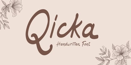 Qicka is a Handwritten Font. Perfect font for business brand. Combine Qicka stylistic set to create amazing script font! Fall in love with its incredibly versatile style and use it to create spectacular designs! Qicka is perfect for branding, logo, invitation, quotes, wedding invitation, cricut font, silhouette font, product packaging, merchandise, game titles, cute style design, Book/Cover Title and more. What's Included : - Ligatures - Multilingual Support --- Hope you enjoy with our font! Attype Studio
 - Tuesday Jingle by Attype Studio,
$13.00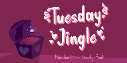 Tuesday Jingle is an exquisite font for Valentine theme design, with dingbats heart on character "{}[]" Fall in love with it and bring your projects to the highest levels! Tuesday Jingle is perfect for branding, logo, invitation, stationery, social media post, product packaging, merchandise, blog design, game titles, cute style design, Book/Cover Title and more. What's Included : - Tuesday Jingle.otf - Heart dingbats on character "{}[]" - Multilingual Support --- Hope you enjoy with our font! Attype Studio
 - Energy Grotesk by Tall Chai,
$9.00Energy Grotesk is a modern grotesque family. It is an OpenType Variable font with weight axis going from 100 to 900. Energy Grotesk is extrovert, bold and full of energy. Most wide, grotesque fonts are uppercase only, but Energy embraces upper and lowercase. Available in 9 weights Over 1000 glyphs supporting extended Latin Ideal for display texts: Titles, Logos and Headlines etc. Supports OpenTypes features like Ligatures and Stylistic Alternates Tabular Numerals included - Scramble Storm by Gassstype,
$27.00 Introducing of our new product **Scramble Storm** Horror brush Font is handmade Rough Brush Font with ligature and Multilanguage support. Can make it easier to convey the message in your design. use for awesome display, labeling, movie sceen, poster, movie title,quotes, posters, DIY projects, branding, packaging, greeting cards, websites, photos, photography overlays, signs, window art, tags and so much more! Best for project that need horror vibes , horror poster, childrenbook, cartoon, comic etc
