10,000 search results
(0.028 seconds)
- Cat e Poultry by Proportional Lime,
$19.99 Love them or hate them Cats are one of the most successful animals on the planet. If they had thumbs we would all be in trouble. Fortunately for us these four legged sharks have managed to domesticate us and we are able to coexist peacefully. So this font is to share the joy of being blessed with the presence of such noble animals be it those of the Pantherinae Felidae or the not so humble Felis Catus (Domestic Cat). Why the Turkey? Well... you will have to buy the font to find out.
 - Bluzonir by Typebae,
$15.00 Bluzonir is an exquisite sans-serif font that effortlessly blends elegance and style. Featuring 52 style alternatives and 26 ligatures included in the regular variant, as well as provided separately for ease of use, with no special software needed to access them. Its versatility allows you to create visually stunning designs that stand out. Elevate your projects with the impeccable elegance and style of Bluzonir. What Includes? Character Map Features: Standard alphabet and punctuation Stylistic Alternates and Ligatures PUA Encoded - no special software is needed to access extra characters Multilingual Characters
 - Roundabout by URW Type Foundry,
$35.99 Roundabout is a typeface that is extracted from an ellipse shape. Each and every character started at the same geometrical figure. By cutting it up in sections, twist and rotate the separate characters could be build. The ellipse provides this typeface with evident and smooth looking features. The name Roundabout is misleading, an ellipse is not round. But the word Roundabout has a nice ring to it and it seems to fit this typeface perfectly. The Roundabout as we know it is a place where the traffic circles. Sometimes in the greater metropoles it jams like clotting veins. Various exits are presented for those who know which way to go, for those who don’t it seems an eternal treadmill. Unlike my typeface, that seems rather careless, light weighted and knows her way around. A roundabout in a child’s mind is a playful carrousel or a merry go round. Merry go round has the sweetest sound and a match is found. My Roundabout is a joyful, optimistic and open typeface, which can be used over and over and over again for many or any purposes. ----- Roundabout ist eine Schrift die aus der Form einer Ellipse entstand. So teilen alle einzelnen Zeichen denselben geometrischen Ursprung. Durch das zerteilen, verdrehen und verflechten der elliptischen Grundform konnten die separaten Zeichen so geformt werden, dass sie einen klaren und weichen Charakter erhielten. Der Name Roundabout scheint auf den ersten Blick etwas irreleitend - ist eine Ellipse ja nicht wirklich rund. Er hat aber einen schönen Klang und doch eine tiefe Verbindung zu dieser Schrift. In unseren Gedanken ist Roundabout ein Kreisverkehr: Manchmal, in großen Städten, kann er blockieren, so wie eine verstopfte Ader. Verschiedenste Auswege zeigen sich denen, die ihr Ziel kennen; für alle anderen erscheint dieser Ort wie eine endlose Schlaufe. Dieses Bild widerspricht dem Auftreten meiner Schrift, welche eher sorglos und leichtfüßig ist; sie kennt ihren Weg. In dem Kopf eines Kindes jedoch ist ein Roundabout ein verspieltes Karussell, ein „merry go round“. ,,Merry go round“ klingt bezaubernd und so fiel die Entscheidung. Meine Roundabout ist eine fröhliche, optimistische und offene Schrift, die immer und immer wieder genutzt werden kann, zu jedem erdenklichen Zweck.
 - Alter Gotisch by Alter Littera,
$25.00 This is Alter Littera’s first original design. The font has been created by attempting not to reproduce any historical typeface in particular, but only to re-create the overall forms and style of classic black-letters from different time periods and places. Two specific sources must be acknowledeged nonetheless: (1) the “Black” type from William Caslon’s A Specimen of Printing Types (1785), and (2) the “Caslon Gotisch” type by D. Stempel A.G. (1926). In addition to the usual standard characters for typesetting in modern Western languages, the font includes a comprehensive set of special characters, alternates and ligatures, plus Opentype features, that can be used for typesetting as in antique writings and printings. The glyphs are clean, smooth and definitely readable, so the font will be suitable not only for large titles and headings, but also for full text pages. Specimen, detailed character map, OpenType features, and font samples available at Alter Littera’s The Oldtype “Alter Gotisch” Font Page.
 - CA Texteron by Cape Arcona Type Foundry,
$40.00 CA Texteron is a modern text font family to cover the most common typographical needs with a minimum of weights. It is aiming for a serious but unconventional look, which is achieved by combining round and edgy forms in the same font, often in the same glyph, and by using Humanist and modern form-principles at the same time. It merges classical type-design with an experimental spirit. CA Texteron combines elements of the dynamic renaissance principle with the static neo-classic style, which makes it hard to classify. The result is a post-modern hybridization. The Regular weight works best in text size, and with more letter-space also for footnotes. The low contrast makes it robust and legible even in very small sizes. Bold, Italic and Small Caps are intended for emphasis. Bold, Bold Italic and Heavy make good headlines, that reveal the unconventional details. The Italic is not just a slanted version of the Regular weight but has individual forms and typical italic characteristics.
 - Librum Sans by Hackberry Font Foundry,
$24.95 This is the companion sans family to make the Librum serif families work as well as they do. By companion, I do mean stylistically compatible. But mainly, they have the same vertical metrics. So they work very well for run-in heads, inline character styles, and all the rest of the needs in large books with complex formatting. They are designed for use in InDesign, and they work very well in that environment. The fonts use the same OpenType feature files as the rest of the Librum families. The feature files for the italic and bold are more limited—as I have rarely used things like that [over the past 20+ years]. The character shapes are a bit whimsical. The original ancestor of this book design sans was a very playful font I released as Aerle. It’s been calmed down a lot but is still loose and friendly. For a great deal, see Librum Book Design Group , for a package containing all fifteen fonts!
 - Katsudon by Hanoded,
$15.00 Katsudon is a Japanese crumbed and deep fried pork cutlet, typically served on rice with egg drizzled over it. There is also a chicken variety. I have been to Japan numerous times (it is my favourite country) and each time I revelled in the great variety of foods being served in street stalls and hole-in-the-wall eateries. I especially love the grandma-and-grandpa eateries that are tucked away in alleys behind the major shopping streets. They never speak English and my Japanese is shaky (to say the least), but the food is always good and we always seem to understand each other. This year, I couldn’t travel to Japan, because of the Covid outbreak, but I can tell you that I miss Japan a lot! Katsudon is a crumbed and deep fried font. It comes with a splash of authenticity, a sprinkling of cheekiness and a generous dose of oomph. Oh, yeah, and double letter ligatures, plus a few alternates as well.
 - Ressonant by Octopi,
$9.00 With reference to the Type Heritage Project, this font (designer unknown) was cut by Henry Brehmer of New York for the Dickinson Type Foundary of Boston in c1879 and had the original trade name of Renaissant. John F. Cumming later cut a light-face derivative called “Artistic.” A history of the un-patented face can be found at the Type Heritage Project website. Ressonant has a full character set as well as ligatures, superiors, inferiors, numerators, denominators, old style figures, and auto-fractions. There are also alternate caps for N and M as in the original, and, unlike the original, comes in four weights. This font is a documented revival of a 19th-century typeface. The year, country, designer and/or foundry of origin will be published in a series of textbooks entitled “The Type Heritage Project.” Volume I explores quintessential Victorian faces, a spectacular trove of innovative gems; you can see samples by clicking the Type Heritage Project link above.
 - Alien Alphabet by ParaType,
$25.00Alien Alphabet is inspired by the ideas of change, transformation, creative deconstruction and mutual penetration of various cultures, languages, and opposing cognitive systems, which seem to be prevalent in our 'globalized' civilization. It appears as various visual constructs -- archetypal symbolism, pieces of the world alphabets, socio-cultural icons, mathematical formulae, etc., -- broke down into pieces and were reassembled in a way that carried traces of previous meanings. However, this contradictory mutation invokes enigmatic meanings and emotions begging for further definition and interpretation. Alien Alphabet shapes arranged in linear sequential manner tend to evoke a sense of written language. The fact that a message cannot be understood does not really change its emotional appeal. Moreover, the less message can be deciphered, the more seems to be the appeal -- for it triggers our imagination. In fact, we may not want to know the actual meaning because deep inside we are afraid that this might be just another alien dry-cleaning receipt. - Inglesa by Sudtipos,
$59.00 In the past, in Argentina, it was common to attend to calligraphy classes during the first years of high school. That experience left a mark on me that over the years mixed up with my practice as a type designer. “Caligrafía Inglesa” is, basically, the spanish translation for the copperplate calligraphic style. This was the initial idea that led the spirit of the project, but from the beginning it started to develop a typographic personality of its own. The new Inglesa font comes in 6 weights –from a skinny monolinear to an elegant black– with a companion set of roman caps. The harmony in both styles transmits as a result, a strong english spirit but with a fresh latin spice, assuring the perfect combination for any elegant design. Inglesa Script includes a vast amount of alternates, endings and swashes, allowing the designers to create infinite combinations making any design unique. The Inglesa family supports a wide range of Latin alphabet-based languages.
 - Jenson Classico by Linotype,
$29.99In 1458, Charles VII sent the Frenchman Nicolas Jenson to learn the craft of movable type in Mainz, the city where Gutenberg was working. Jenson was supposed to return to France with his newly learned skills, but instead he traveled to Italy, as did other itinerant printers of the time. From 1468 on, he was in Venice, where he flourished as a punchcutter, printer and publisher. He was probably the first non-German printer of movable type, and he produced about 150 editions. Though his punches have vanished, his books have not, and those produced from about 1470 until his death in 1480 have served as a source of inspiration for type designers over centuries. His Roman type is often called the first true Roman." Notable in almost all Jensonian Romans is the angled crossbar on the lowercase e, which is known as the "Venetian Oldstyle e." In the 1990s, Robert Slimbach designed his contemporary interpretation, Adobe Jenson™. It was first released by Adobe in 1996, and re-released in 2000 as a full-featured OpenType font with extended language support and many typographic refinements. A remarkable tour de force, Adobe Jenson provides flexibility for a complete range of text and display composition; it has huge character sets in specially designed optical sizes for captions, text, subheads, and display. The weight range includes light, regular, semibold, and bold. Jenson did not design an italic type to accompany his roman, so Slimbach used the italic types cut by Ludovico degli Arrighi in 1524-27 as his models for the italics in Adobe Jenson. Use this family for book and magazine composition, or for display work when the design calls for a sense of graciousness and dignity. - Trump Mediaeval Office by Linotype,
$50.99The Trump Mediaeval Office family is designed after the model of the original serif family produced by Georg Trump in 1954. Trump released this typeface through the C.E. Weber type foundry in Stuttgart, and Linotype quickly cut the face for mechanical composition. Thereafter it became popular around the world. One of the most prolific German type designers of the 20th century, Trump created numerous typefaces in several different styles, but Trump Mediaeval is often regarded as his best work. Trump Mediaeval is an old style serif typeface, with new inherent quality that could only have come about after centuries of variation on this theme. It bears some resemblance to the classic Garamond typefaces, yet its characteristic letters set it apart in a positive way. Akira Kobayashi, Linotype’s Type Director, released his own revived design, Trump Mediaeval Office, in 2006. Trump Mediaeval Office has two weights, each with an italic companion. Unlike the original design, Kobayashi has harmonized the varying letterforms across the two weights, allowing Regular and Bold text to stand side by side harmoniously. Trump Mediaeval’s numbers now match across weights as well, optimizing their legibility in sizes large and small. Decades ago, Trump Mediaeval was a popular choice for setting book texts, because of its robust serifs. These are exactly what make the face a good choice for office application today; on lower-resolution printers, these serifs will still remain a strong feature on the letterform, increasing legibility along the line of text. - Great Outback by Epiclinez,
$18.00 Great Outback is a display typeface that's bold, fun and playful. It's also clean and versatile, making it a perfect addition to any designer's kit. Packed with personality, this typeface screams out loud. Great Outback is suitable for headlines, packaging, logo etc. Use it to give your design that memorable edge. Out of the ordinary and into the great outdoors! So what’s included : Standard Latin Numbers, symbols, and punctuations Multilingual Support. Accented Characters : ÀÁÂÃÄÅÆÇÈÉÊËÌÍÎÏÑÒÓÔÕÖØŒŠÙÚÛÜŸÝŽàáâãäåæçèéêëìíîïñòóôõöøœšùúûüýÿžß PUA Encoded and fully accessible without additional design software Simple Installations Works on PC & Mac Thank You!
 - Bryzhi by Gleb Guralnyk,
$15.00 Hello! Presenting an originally designed, decorative font, named Bryzhi. The main goal of this font is a flowing liquid reflection of characters. Most of the letters have five variations that switch automatically to create a seamless effect. Check out that the "Context Alternates" OpenType feature is activated to achieve the necessery result. Also simple letters without reflection effect are available using the "Stylistic Alternates" feature. Bryzhi font supports most of the European languages, please check out all the available characters on the screenshots. Thank you and wish you a peaceful sky!
 - Mondrake by Flawlessandco,
$9.00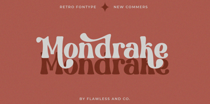 Mondrake is a modern retro with a fun and bold style that perfect for your retro-themed projects. Try out some alternate characters for another visual result! There's some connected letters and some alternates that suitable for any graphic designs such as branding materials, t-shirt, print, business cards, logo, poster, t-shirt, photography, quotes .etc This font support for some multilingual. Also contains uppercase A-Z and lowercase a-z, alternate character, numbers 0-9, and some punctuation. If you need help, just write me! Thanks so much for checking out my shop!
 - Jonathan by Supfonts,
$10.00 Hi everyone. This is my new signature style script. Any inscription will look like a natural stroke. This will give a unique look to your projects. Try my new font, it is lined with all the distances and it looks professional and at ease. It is ideal for signature or design, postcards and greetings, websites or blogs. Test it out below to see how it could look for your next project! Includes: Uppercase and lowercase Numbers and punctuation Foreign language support Ligatures Check out my blog: https://www.instagram.com/zloillev pinterest.com/dmitriychirkov7 Enjoy
 - Winter Delight by Supfonts,
$15.00 Winter Delight / Casual handwritten font Winter Delight it is a casual handwritten font with exquisite accents. The font is very cute and contains a huge number of ligatures. It is perfect for branding, wedding invitations and invitation cards and many more Font includes a full set of gorgeous uppercase and lowercase letters, numbers & large selection of punctuation marks Test it out below to see how it could look for your next project! Includes: Regular Script All latin languages support Uppercase and lowercase Numbers and punctuation Check out my blog: https://www.instagram.com/leopardletters pinterest.com/dmitriychirkov7 Enjoy
 - Croist by Flawlessandco,
$9.00 Croist is a modern retro with a fun and bold style that perfect for your retro-themed projects. Try out some alternate characters for another visual result! There's some connected letters and some alternates that suitable for any graphic designs such as branding materials, t-shirt, print, business cards, logo, poster, t-shirt, photography, quotes .etc This font support for some multilingual. Also contains uppercase A-Z and lowercase a-z, alternate character, numbers 0-9, and some punctuation. If you need help, just write me! Thanks so much for checking out my shop!
 - Helios Retro by Flawlessandco,
$9.00 Helios Retro is a modern retro with a fun and bold style that perfect for your boho-themed projects. Try out some alternate characters for another visual result! There's some connected letters and some alternates that suitable for any graphic designs such as branding materials, t-shirt, print, business cards, logo, poster, t-shirt, photography, quotes .etc This font support for some multilingual. Also contains uppercase A-Z and lowercase a-z, alternate character, numbers 0-9, and some punctuation. If you need help, just write me! Thanks so much for checking out my shop!
 - Jenson by Supfonts,
$22.00 Introducing the elegant new Jenson Font! For those of you who are needing a touch of elegance and modernity for your designs, this font was created for you! Jenson was built with OpenType features and includes beginning and ending swashes, alternate swash characters for most lowercase letters, numbers, punctuation, alternates, ligatures and it also supports all latin languages :) What's Included Jenson TTF Jenson OTF Multilingual support all Latin languages Check out my blog: www.instagram.com/youthlettering pinterest.com/dmitriychirkov7 Thanks so much for checking out my shop! All the best, Dmitrii
 - Magic Daisy by Supfonts,
$10.00 Hello, friends. I keep experimenting with handwritten fonts, shapes and lines. I want the font to set the tone, the atmosphere, look defiant, and read well. Try my new font, I think it combines all these qualities. Simple and clear, looks at ease. It is perfect for decoration or design where you don't need strict style :) Test it out below to see how it could look for your next project! Includes: Uppercase and lowercase Numbers and punctuation Foreign language support Ligatures Check out my blog: https://www.instagram.com/zloillev pinterest.com/dmitriychirkov7 Enjoy
 - Mr Chalk by Thinkdust,
$10.00 Mr Chalk has a simple goal: being Mr Chalk. This font sets out to occupy a form indistinguishable from the real thing, and comes as close as ink will get. Looking at this font you can hear the scrabble of writing on a chalkboard, though the character is more of a mischievous child than a strict teacher. Round and free, Mr Chalk is a light and fluffy font ideal for an impersonal and friendly tone. If you're looking for another Chalk based font check out Lippy, a typeface for both lipstick and chalk based finishes!
 - Brahmasta by Flawlessandco,
$9.00 Brahmasta is a modern serif with a classic retro style that perfect for your retro-themed projects. Try out some alternate characters for another visual result! There's some connected letters and some alternates that suitable for any graphic designs such as branding materials, t-shirt, print, business cards, logo, poster, t-shirt, photography, quotes .etc This font support for some multilingual. Also contains uppercase A-Z and lowercase a-z, alternate character, numbers 0-9, and some punctuation. If you need help, just write me! Thanks so much for checking out my shop!
 - Alaya Roza by Supfonts,
$15.00 Alaya Roza supports both Cyrillic and Latin layout. You can write an attractive invitation or issue menu. It is of a classic style that will fit perfectly into any project. Шрифт поддерживает как кириллическую так и латинскую раскладку. Вы можете писать привлекательные приглашения или оформлять меню. Классическое начертание идеально впишется в любой проект :) Test it out below to see how it could look for your next project! Includes: Regular Script Latin languages support Cyrillic languages support Uppercase and lowercase Numbers and punctuation Ligatures Check out my blog: https://www.instagram.com/di.zigner pinterest.com/dmitriychirkov7 Enjoy
 - Al Lebaker by Aluyeah Studio,
$80.00 Al LeBaker is a sassy script brush font! Allowing you to create sassy handwriting. With ligature that give it special touch. LeBaker script is guaranteed to make your text stand out - perfect for printed quotes, posters, cards, product packaging, headers, branding and whatever your imagination holds. Al LeBaker has OpenType support, Multilingual support for 15 languages and is PUA Encoded. Thanks for checking out LeBaker. I really hope you enjoy using it! If you have any questions I'd be more than happy to answer them, just send me a message!
 - Galaktik by ExFour,
$19.00 Galaktik is a fresh embodiment of the monospace font. Born out of creative ideation, it attempts to pay homage to a long history of display fonts while exhibiting contemporary, playful accents. This balance of geometric shapes and creative expression allows Galaktik to feel both familiar and yet unique. Features Numerals Punctuations Special Characters Galaktik's freshness fits modern typographic schemes, futuristic logos, and even command-line consoles. The limits are boundless. Thank you for your purchase! Feel free to reach out for any issues or if need any assistance.
 - JulesLove - Unknown license

- Kinfolk Pro by Fontforecast,
$29.00 Kinfolk Pro is a font collection of six fonts. The main styles Rough and Smooth are extremely sturdy and bold brush fonts. As the name suggests the smooth style has clean, crisp contours and the rough version has the authentic strokes of a slightly dried out brush. Both versions have 606 glyphs and 4 alternate ornamented capital letters to play with, organized in stylistic sets. With Discretionary Ligatures and Contextual Alternates activated you can access elongated swashes by simply typing +1 (+2, +3, +4, +5) in front of any letter and =1 (=2, =3, =4, =5) at the back. On top of that Kinfolk Pro Rough and Smooth have some extra stand alone swashes that can be accessed via the glyphs panel or by typing _1, _2 ,_3 _4 _5. Kinfolk Pro Script is a fully connected script that goes together beautifully with the other styles. For the best connections, activate Discretionary Ligatures and Contextual Alternates. Additionally there is Kinfolk Pro Ornaments for extra swashes, ink blobs and interesting strokes. Kinfolk Pro Arrows and Kinfolk Pro Flowers both offer 230 glyphs to further juice up your designs. You'll need an Open Type savvy application to get the most out of Kinfolk Pro.
 - H-AND-S by AND,
$89.00 A common creation: (to pass from one hand to the other): For the first time, various hand-signs from diverse sources are unified into one single visual style. This compendium is the result of 15 years of incubation and 7 years of creation. In his travels throughout the world, graphic designer Jean-Benoit Levy, principal of the visual studio AND, has collected pictures of multiple hand signage. Uncertain what to do with those signs, he kept them year after year until the idea came to unify almost 200 handsigns into one single family. In accordance with this entire collection, the name of the typeface is a mix: "h-and-s". A global collection: (To put in good hands): We all have one thing in common: Hand-signs are an international language, they are meant to be understood by all of us. Each of us regularly comes in contact with modern hieroglyphs such as the hand-sign-codes that are so prevalent in our daily life. This way of communication belongs to no one in particular and to all of us in general. Even if the sense of certain signs varies from one culture to the other, there is a common hand-sign language. We are surrounded by this language of handsigns each time we step in a store, we eat, open a container of milk, we clean up, use package of wash-powder, by shaving, when we work, use tools, at home, by tearing the envelope of a condom, by traveling, etc. When we encounter these signs, we all understand them easily. A visual connection: (To go hand in hand): This typeface is a global visual statement. Collecting, ordering, redrawing, unifying. Reconstructed and assembled into one original alphabet, H-AND-S is a unique and complex signs program. Our choice is based on daily gestures and global hand-codes. Logically this typeface starts with the "American Sign Language" and expands on two type-variations, each on two levels of keyboard. The international team of H-AND-S would like to send his special thanks to all of the anonymous graphic designers throughout the world who designed different hand-signage and who influenced and inspired to create such a sign collection into one unified family. We, the global nomad team of AND, hope that you will enjoy our H-AND-S. Additional Credits Production: Studio AND. www.and.ch. Concept, Idea & Creative Direction: Jean-Benoît Lévy, Switzerland / USA. Research & Sketches: Eva Schubert, Germany. Illustration, Graphic Design & Visual Fusion: Diana Stoen, USA. Transfer, Adaptation & Refining: Moonkyung Choi, Korea. Finalization & Checking: Sylvestre Lucia, Switzerland. Coaching & Technical Advice: Mike Kohnke, USA. Creative Energy & Implementation: Joachim Müller-Lancé, Germany / USA.
 - TT Octosquares by TypeType,
$35.00 TT Octosquares useful links: Specimen | Graphic presentation | Customization options TT Octosquares is a fresh, revised, expanded, and significantly improved version of our first commercial typeface TT Squares and its narrow version TT Squares Condensed. With all our love for the original font family, it felt there was a lack of functionality, character composition, features, and design freshness, which prompted us to the idea of a complete restart. Now TT Octosquares can be safely called a superfamily consisting of 4 widths (Compressed, Condensed, Standard, Expanded), 72 faces (18 in each width), and 1 incredible variable font in which variability works jointly on three axes. In addition to working on the contours themselves and their design, we completely revised the composition of the typeface. First, we added two completely new widths: Compressed and Expanded. Secondly, we increased the number of weights in each of the subfamilies—while in the old versions there were 5 weights, now in each of the subfamilies there are 9 weights. At the stage of working with the contours of characters, we revised the roundings, changed the forms of shoulder and stem crossings, added noticeable shelves at the letters, removed the sharpness from the triangular characters and cut off all sharp endings. From the very beginning of work on TT Octosquares, we planned to make a variable 3-axis version of it sewn into 1 font file. This means that by installing just one variable font file, you get access to three axial adjustment of the font: by thickness, width and inclination. Thanks to this flexibility in settings, you can always choose a custom combination of thickness, width or inclination that best suits your tasks. Due to the increased language support and the appearance of a bunch of useful OpenType features, the number of glyphs in the typeface has increased from 480 to 825 in each style. Now you can use stylistic alternates, standard and discretionary ligatures, or use old-style figures, numbers in circles and even slashed zeros in your design. Full list of features: aalt, mark, mkmk, ccmp, subs, sinf, sups, numr, dnom, frac, ordn, lnum, pnum, tnum, onum, case, zero, dlig, liga, salt, ss01, ss02, ss03, ss04, ss05, ss06, ss07, ss08, ss09, ss10, ss11, ss12, calt, locl. To use the variable font with three variable axes on Mac you will need MacOS 10.14 or higher. For other software and browsers, you can check the support status here: v-fonts.com/support/.
 - 1584 Pragmatica Lima by GLC,
$42.00 This family was created from the set of font faces used in Lima (Peru) by Antonio Ricardo in 1584 for the first publication ever printed in Southern America: a four-page leaflet in Spanish entitled "Pragm·tica sanciÛn" with information about the new Georgian calendar of 1582 which had not yet been communicated to the colonies. In our two styles (Regular & Italic), font faces, kernings and spacing are as close as possible to the original. This Pro font covers Western, Eastern and Central European languages (including Celtic), Baltic and Turkish, with standard and “long s” ligatures in each of the two styles. A,B,D,E,F,M,N,P,R,V,W swashed capitals in the italic style.
 - Holgada by Graviton,
$24.00 Holgada font family has been designed for Graviton Font Foundry by Pablo Balcells in 2020. It is a geometric sans serif typeface with refined rounded endings that provide a soft and friendly appearance. Its generic shapes make it suitable for any kind of project, text length and size. Thanks to its clear legibility, it can be used in long body texts in very small sizes, in big size headlines and everything in between. The rounded endings not only provide a particular softness when used in body text, but also a distinctive touch when used in display situations such as logos and headlines. Holgada consists of 12 styles, each containing small caps and glyph coverage for several languages.
 - Casta by Dirtyline Studio,
$39.00 Casta is strong Modern contrasts make this typeface both impressive at display sizes and easily readable in text size, while the sharp shapes of the triangular serifs and the distinctive letter shapes show their strength in logo design and impressive editorial use. Casta come with elegant style, strength and contrasts, with features an extended latin character set of 429 glyphs covering over 28 languages, and includes advanced open type features like standard and discretionary ligatures, positional numerals, stylistic alternates and case sensitive brackets. Mixing versatility and personality, Casta is ready to be like a top model on the design catwalk, making your projects looking classic but contemporary, finely tuned but assertive, and elegant as the best luxury fashion.
 - Jorge by Galapagos,
$39.00(pronounced hor-hay) Some years ago my wife and I had our evening meal in a restaurant on what is called the northshore of Massachusetts. Of course, if you check a globe or map you'll see that the pilgrims needed a compass, it should have been called the eastshore as it's on the east end of the rectangle/hook we call the Commonwealth of Mass. In any event, the menu our waitress gave us was hand-lettered with shapes that I used to develop the 4 fonts called Jorge. When I brought the preliminary drawings into the office Steve Zafarana, a designer and cartoonist referred to them as Jorge's new design, the name stuck. - Rhythmic Revue JNL by Jeff Levine,
$29.00 The vintage sheet music for "Between the Devil and the Deep Blue Sea" yielded another bit of Art Deco-era lettering perfect for developing into a digital font. This time it wasn't the song title, but rather the name of the show it was from serving as the type inspiration - the Cotton Club's 1931 revue "Rhythm-Mania". Harlem's Cotton Club was an "exclusive, whites only" club; both famous for its talent and shows, yet infamous for hiring black acts but not allowing black patronage. On the sheet music, the show title was hand lettered in a bold, slightly stylized fashion which became the basis for Rhythmic Revue JNL; available in both regular and oblique versions.
 - Anago by Positype,
$16.00 Anago shares the same DNA as its sibling Macha, but is a completely different species than the former or any of my other sans serifs (Aaux Next, Air, Akagi Pro or Wasabi). Soft, ample letterforms are casually constructed and the end result produces a typeface that changes color as it varies in size — allowing the type family to work well in both text and display settings as long as attention is given to size. Anago takes a little but gives a lot. The 10-style typeface features a fully-loaded character set that includes: Small Caps, Proportional Lining and Oldstyle Numerals, Tabular Lining and Oldstyle Numerals, Fractions, Ordinals, Inferiors, Superiors, Stylistic Alternates, Ligatures, Case-sensitive, and more.
 - CA Postal by Cape Arcona Type Foundry,
$39.00 CA Postal is a cute and clever little stamp-font. It was originally intended for a record-cover only, but when the artist wanted all lyrics printed in the booklet, it was time for a font. The initial inspiration was a moveable-stamp printing-set, which had a nice Futura-like style, being very pleasant to read, especially in small sizes. But of course it’s the loose and irregular outlines that give the font its special charms. CA Postal features two sets of characters and the "Contextual Alternates" feature will make sure that never two identical characters will stand next to each other, so that the stamp-look becomes even more authentic.
 - Kristall Now Pro by Elsner+Flake,
$49.00 The design of Kristall Grotesk Now is based on a cut by Wagner & Schmidt, Leipzig, from the 30s of the last century as well as the digital version Kristall Grotesk MdK, created for the Stiftung Werkstattmuseum für Druckkunst. The implementation of the Kristall Grotesk MdK, a headline font, was deliberately created as a replica to create a faithful reproduction of the original. The design of the complete family Kristall Grotesk Now is based on the one cut Kristall Grotesk Buchschrift by Johannes Wagner GmbH, 1937, with its function as a text family. Designer: in parts Johannes Wagner GmbH, Redesign Elsner+Flake, Hamburg Designdate: 1937, 2009 Publisher: Elsner+Flake Design Owner: Elsner+Flake Original Foundry: in parts Johannes Wagner GmbH
 - Takashimura by Alit Design,
$12.00 Introducing Takasimura Typeface Takasimura was inspired by unique and cool Japanese calligraphy. We created the Takasimura font for a design solution with a Japanese concept but internationally readable. Of course, this font is very suitable for designs with Japanese, Asian and Eastern concepts. Apart from that this font is very easy to use in both design and non-design programs because all alternates and glyphs are supported by Unicode (PUA). In order to use the beautiful swashes, you need a program that supports OpenType features such as Adobe Illustrator CS, Adobe Photoshop CC, Adobe Indesign and Corel Draw. but if your software doesn't have Glyphs panel, you can install additional swashes font files.
 - Seebad by Linotype,
$29.99Silvan Kaesar designed Seedbad after observing the unique sign lettering along the shores of Lake Geneva's bathing area. Seebad's four different settings represent the cutting edge new style of Swiss design, which spans the bridge between modern and contemporary. Containing geometrically forms, Seebad has a narrow base. Some characters (the lowercase t", for example) display unicase, even uncial-like tendencies. If you are looking for a face to spice up your layouts with an ultra-modern, cutting-edge flair, while not sacrificing copy length, Seebad is the face for you! The four fonts making up the Seebad family are all included in the Take Type 5 collection, released by Linotype GmbH in 2003."
