10,000 search results
(0.027 seconds)
- Heinemann by Heinemann Collection,
$39.00 The Heinemann fonts were initially developed by the in-house design team at Heinemann educational publishing out of the necessity to find the perfect font for use in early primary reading books and literacy products. Basic Heinemann is defined by longer ascenders and descenders which help children to distinguish between letters; rounded edges on all letterforms help focus the reader on the individual letter shape; and modified characters (eg. a, g,) ensure instant recognition of letterforms. Heinemann Special offers further modified characters and kerning pairs ideal for dyslexic or special needs use (eg a, d, b). The Heinemann fonts were developed in partnership with children, literacy advisors, teachers of special needs/dyslexia and primary school teachers, and are now released in response to hundreds of requests from publishers, designers and teachers to purchase them. They have been trialled in schools and learning institutions over an 8 year period, and are a favorite for use in both print and electronic product. The modern, clean aesthetic of the fonts ensures that their use can span beyond educational application.
 - Futura Maxi by Monotype,
$29.00 First presented by the Bauer Type Foundry in 1928, Futura is commonly considered the major typeface development to come out of the Constructivist orientation of the Bauhaus.movement in Germany. Paul Renner (type designer, painter, author and teacher) sketched the original drawings and based them loosely on the simple forms of circle, triangle and square. The design office at Bauer assisted him in turning these geometric forms into a sturdy, functioning type family, and over time, Renner made changes to make the Futura fonts even more legible. Its long ascenders and descenders benefit from generous line spacing. The range of weights and styles make it a versatile family. Futura is timelessly modern; in 1928 it was striking, tasteful, radical - and today it continues to be a popular typographic choice to express strength, elegance, and conceptual clarity. The PL Futura Maxi font family was created by Victor Caruso in 1960 to add more display weights to Paul Renner's 1927 Futura family. Typefaces in the same style like Futura are: Avenir, Metromedium, Neuzeit Grotesk,
 - Bernhard Gothic SG by Spiece Graphics,
$39.00 This design is one of the true gems to come out of the 1930s typeface era. Even though the face was originally designed to counter the invasion of European sans-serifs, it remains faithful to the principles found in its creator's poster work. Lucian Bernhard's lettering creation for American Type Founders is to this day a favorite among font connoisseurs worldwide. It has a unique personality. This deluxe version is packed with extras including the original oldstyle figures, alternates, and ligatures. A number of styles and alternate characters have been added to the family such as heavy italics, extra heavy italics, and capital figures. And an easier-to-identify "flagged" figure one and the new euro symbol are now located in each individual style. Bernhard Gothic is also available in the OpenType Std format. Lining and oldstyle figures, stylistic alternates, and additional discretionary ligatures are now combined in each style. These advanced features currently work in Adobe Creative Suite InDesign, Creative Suite Illustrator, and Quark XPress 7. Check for OpenType advanced feature support in other applications as it gradually becomes available with upgrades.
 - Heinemann Special by Heinemann Collection,
$39.00 The Heinemann fonts were initially developed by the in-house design team at Heinemann educational publishing out of the necessity to find the perfect font for use in early primary reading books and literacy products. Basic Heinemann is defined by longer ascenders and descenders, which help children to distinguish between letters; rounded edges on all letterforms, which help the reader focus on the individual letter shape; and modified characters (eg., a and g), which ensure instant recognition of letterforms. Heinemann Special offers further modified characters and kerning pairs ideal for dyslexic or special-needs use (eg., a, d, and b). The Heinemann fonts were developed in partnership with children, literacy advisors, teachers of special needs/dyslexia, and primary-school teachers and are now available in response to hundreds of requests from publishers, designers, and teachers to purchase them. They have been tested in schools and learning institutions over an 8-year period, and they are a favorite for use in both print and electronic products. The modern, clean aesthetic of the fonts ensures that their use can spread beyond educational applications.
 - Aquatix by ryan creative,
$10.00 Aquatix which has a simple and minimalist design. In this font, there are no serifs or extra lines that stand out at the ends of the letters, making them appear more defined and easier to read. Aquatix can be used in both modern and contemporary designs, and is suitable for use on a variety of media such as computer screens, display posters, magazines, typography and other digital media. so it is suitable for use in designs that require clarity and firmness in each letter. FEATURES; -Uppercase, -Support Foreign, Numbers and Punctuation -Regular, Italic. -Input Otf, ttf & Woff Files. -Works on PC. -Simple installation. -Accessible in Adobe Illustrator, Adobe Photoshop. Adobe InDesign, it even works in Microsoft Word. -Fully accessible without additional design software. Aquatix is coded with Unicode PUA, which allows full access to all additional characters without having to design any special software. Mac users can use the Font book, and Windows users can use the Character map to view and copy any extra characters to paste into your favorite text editor/app. Thank you for visiting ;)
 - Boopee by Typodermic,
$11.95 Today, we’re here to talk about Boopee, a font that’s unique in every way. You may have noticed its flaws, but let us tell you, those imperfections are what make Boopee so charming. Boopee is a personable typeface that’s messy yet easy to read. Its quirky shapes and uneven lines give it a human touch that’s hard to find in other fonts. Despite its playful appearance, Boopee remains legible and functional, making it a versatile choice for various design applications. One of Boopee’s best features is its custom ligatures. With unique letter combinations that add a touch of personalization to your designs, you can truly make Boopee your own. Whether you’re creating logos, posters, or social media graphics, Boopee has got you covered. Plus, Boopee comes in both standard and bold versions, giving you even more flexibility in your designs. Use the standard version for a subtle, playful touch or go bold for a more impactful statement. In summary, Boopee may not be perfect, but its imperfections are what make it stand out. Its personable, messy yet legible style and unique custom ligatures make it a font worth exploring. Give Boopee a try and see how it can bring a touch of charm to your designs. Most Latin-based European writing systems are supported, including the following languages. Afaan Oromo, Afar, Afrikaans, Albanian, Alsatian, Aromanian, Aymara, Bashkir (Latin), Basque, Belarusian (Latin), Bemba, Bikol, Bosnian, Breton, Cape Verdean, Creole, Catalan, Cebuano, Chamorro, Chavacano, Chichewa, Crimean Tatar (Latin), Croatian, Czech, Danish, Dawan, Dholuo, Dutch, English, Estonian, Faroese, Fijian, Filipino, Finnish, French, Frisian, Friulian, Gagauz (Latin), Galician, Ganda, Genoese, German, Greenlandic, Guadeloupean Creole, Haitian Creole, Hawaiian, Hiligaynon, Hungarian, Icelandic, Ilocano, Indonesian, Irish, Italian, Jamaican, Kaqchikel, Karakalpak (Latin), Kashubian, Kikongo, Kinyarwanda, Kirundi, Kurdish (Latin), Latvian, Lithuanian, Lombard, Low Saxon, Luxembourgish, Maasai, Makhuwa, Malay, Maltese, Māori, Moldovan, Montenegrin, Ndebele, Neapolitan, Norwegian, Novial, Occitan, Ossetian (Latin), Papiamento, Piedmontese, Polish, Portuguese, Quechua, Rarotongan, Romanian, Romansh, Sami, Sango, Saramaccan, Sardinian, Scottish Gaelic, Serbian (Latin), Shona, Sicilian, Silesian, Slovak, Slovenian, Somali, Sorbian, Sotho, Spanish, Swahili, Swazi, Swedish, Tagalog, Tahitian, Tetum, Tongan, Tshiluba, Tsonga, Tswana, Tumbuka, Turkish, Turkmen (Latin), Tuvaluan, Uzbek (Latin), Venetian, Vepsian, Võro, Walloon, Waray-Waray, Wayuu, Welsh, Wolof, Xhosa, Yapese, Zapotec Zulu and Zuni.
 - Eveningnews by Wiescher Design,
$39.50 Since many years I live in Munich and read the daily newspaper Abendzeitung. One morning they had redesigned the paper, using Eric Gill's Joanna for the body copy and a tweaked version of Franklin Gothic for the headlines. Since both typefaces are my all-time favorites, I was very pleased. The old hand-lettered title lettering designed by in-house designer Ernst Friedrich Adler around 1947 or 48 was untouched as it always was. Adler had worked for the newspaper an incredible 47 years! Ernst Friedrich Adler celebrated his 100th birthday in the summer of 2007 looking very healthy. But someone had adapted his title lettering for use in the chapter headings, and I did not like the way that was done. Every morning I saw those letters and thought "one day I have to clean that up". About 15 years later I finally did it! Being at it, I designed the whole typeface and added a second fancy cut. And, what do you know, the people at the Abendzeitung called me up and said they liked what I did and started using it. So since that day in 2005 I can read my morning paper without having to wonder about the chapter headings. Well maybe one day they will do another redesign and maybe they will use another one of my fonts. Your editorial typeface designer, Gert
 - Astrum Heart by Fontex,
$45.00 Astrum Heart is a very decorative script font using elegant caligraphic handwritten letters, that are all mutually interconnected, creating a unique look & feel of a personalized human handwritting. It’s clean and prefined lines makes Astrum Heart very appealing and modern, although it being very classical in it’s core essence. Capital letters are projected in a way to contain a stylized heart in it’s construction. Heart, as a symbol of love, makes this font unique for writting love letters, Valentine Day postcards, wedding invitations, etc. Idea for the creation of this font had originally came up from the need to create a beautiful design for Saint Valentine’s Day, but none of the existing fonts cut it - so I decided to create a new and unique typeface to fill this need. Letters and other characters are recognizeable by prefined ornaments, incorporated in a very subtle way. Whitespace between capital letters, lower-case letters, numbers and other characters are done in a way to minimize the need for kerning. Font Astrum Heart, besides being a celebration of class and exclusivity, is a very luxurious and elegant handwritten font. Words consisting of lower-case letters have the possibility of being decorated by adding a small heart at the beginning, anywhere between the letters, or at the end of the word. Character set for this font contains all western and central-european latin characters.
 - Grandhappy by Journey's End,
$18.00 Have you ever searched for a font that looked like it was really someone's handwriting, only to find that it was too feminine or too hard to read? I used to want a font like that, too, until I discovered that a font like that had been residing in my attic, in letters to me from my late grandfather. Not only was I thrilled to have a font like this at hand, but also one that would be a memory of my grandfather every time I used it. He was a hard-working man, raising a family during the Depression, yet was still fun-loving, kind, and generous. We called him Grandhappy. As a wedding present, I received from him rolling pins and a cutting board made of 8 different kinds of wood that he pieced together. In this font, the bullet is a rolling pin in honor of that! Other than the fact that this is a font from the hand of one greatly loved, my favorite thing is that although a True Type Font, it has some features of an Open Type font. There are many alternative letter choices available through the use of little-used keys on the keyboard and alt codes. This font was chosen to portray Jay Gatsby's handwriting in The Great Gatsby (2013).
 - 1669 Elzevir by GLC,
$42.00 This family was inspired from the set of font faces used in Amsterdam by Daniel Elzevir to print the famous “Tractatus de corde...” the study on earth anatomy by Richard Lower, in 1669. The punch cutter was the famous Dutch Kristoffel Van Dijk. In our two styles (Normal & Italic), font faces, kernings and spaces are scrupulously the same as in the original. This Pro font covers Western, Eastern and Central European languages (including Celtic), Baltic and Turkish, with standard and “long s” ligatures in each of the two styles. The Roman (Normal) style contains a U stylistic alternate, and the Italique style A.
 - Valentia Nit by Eurotypo,
$59.00 “Valentia Nit” is a copperplate typeface enriched with swashes and extensions in alternate characters. Its main feature is the intense contrast between thick and thin strokes that gives you clarity of reading while providing a delicate and subtle texture in the text. Another feature is the spontaneity of its stems, the agile and casual ties, which in fact, these combinations can offer the designer a variety of possibilities to structure a logo or headline in sophisticated lettering style. “Valentia Nit” was designed to combine with our previous font “Valentia” in order to obtain the necessary hierarchy of texts using changing thicknesses.
 - Berghain by Scratch Design,
$15.00 Introducing Berghain! Modern script handwriting with a beautiful, natural, and cursive style. This font has natural handwriting texture making this font look authentic but still readable and incredibly versatile. This font will look outstanding in any occasion design concept, whether it’s being used on colourful backgrounds or as a stand as a headline in a minimalist set! Berghain has multi-language support, swashes, alternate and beautiful ligature dan you can apply it in OpenType mode in adobe photoshop or adobe illustrator. This font will suit your design, especially in branding, wedding, advertising, headline, poster, book cover, and many more! Enjoy this beautiful font!
 - Anglecia Pro by Mint Type,
$- Anglecia Pro is an exquisite and versatile system of three transitional serif typefaces designed to work together in editorial design. Sharing the same skeleton, vertical axis, and trapezoidal uncurved serifs, each of these faces bears different key dimensions and different contrast typical for three different type epochs. Anglecia Pro Text is a typeface designed for general typesetting in average reading sizes. Although it features a vertical axis, its soft skeleton, relatively small x-height and prominent ascenders and descenders give the typesetting a traditional warm texture with a slight contemporary touch. Anglecia Pro Title incorporates proportions of familiar transitional serif typefaces but exposes higher-than-average vertical contrast which makes it useful for setting captions, pull quotes or general purpose text in sizes of 12 pt and above. Anglecia Pro Display, still having non-rectangular serifs and the same soft skeleton as the rest of Anglecia Pro system, features extreme contrast, much thinner serifs and exaggerated ball terminals typical for Didone modern serif families. Its large x-height and tighter letter spacing suggests larger text sizes e.g. in decorative headlines, extra large pull quotes or logos. Altogether these three typefaces form 36 styles – each supporting numerous Latin-based languages as well as major Cyrillic languages. In roman styles the Cyrillic script comes in two flavours accessible via OpenType alternates – to choose either more traditional and curvy (default) or more formal and rigid type texture. In italics this feature affects uppercase and small caps. Also, each style is packed with OpenType features: ligatures, small caps, six sets of digits, superiors and inferiors, fractions, ordinals, and respective punctuation varieties including all-cap punctuation. There are also language-specific alternates for Polish kreska, Romanian Ș/ș, Catalan punt volat, and correct small-cap versions for Turkish/Azerbaijani i/ı. Some of the styles of Anglecia Pro can be found in Mint Type Editorial Bundle together with other fonts which make some great pairs. Check it out!
 - Metromedium #2 by Linotype,
$29.00American graphic designer William Addison Dwiggins' (W.A.D. for short) first typefaces were the Metro family, designed from 1927 onward. The project grew out of Dwiggins' dissatisfaction with the new European sans serif typefaces of the day, such as Futura, Erbar, and Kabel, a feeling he expressed in his seminal book Layout in Advertising. Urged by Mergenthaler Linotype to create a solution for the problem, Dwiggins began a professional relationship that would span over the next few decades. The first Metro family typeface to be released was Metroblack, brought to market by Linotype in 1929 (Metroblack #2™ the only one of the two versions that Mergenthaler Linotype eventually put into production which is available in digital form). With more of a humanist quality than the geometric styles popular in Europe at the time, Dwiggins drew what he believed to be the ideal sans serif for headlines and advertising copy. Metroblack has a warmer character than the Modernists' achievements, and the type is full of mannered curves and angled terminals (Metroblack also has an astoundingly beautiful Q). The other weights of the Metro family, Metromedium #2™ and Metrolite #2™, were designed by Mergenthaler Linotype's design office under Dwiggins' supervision. Despite having been created more than three-quarters of a century ago, the Metro family types have aged well, and remain a popular sans serif family. Although spec'd less often than other bestsellers, like Futura, Metro continues to find many diverse uses. The typeface has appeared throughout Europe and the North America for decades in newspapers and magazines, and can even help create a great brand image when used in logos and corporate identity. Dwiggins ranks among the most influential graphic designers and typeface designers of the 20th Century. He has several other quality fonts in the Linotype Originals, including the serif text faces Electra™ and New Caledonia™, as well as Caravan™, a font of typographic ornaments." - FF Attribute Mono by FontFont,
$69.00 FF Attribute™ Mono is a monospaced design with an industrial strength, minimalist vibe, making it perfect for attention getting, theme-based headlines, posters, banners and navigational links. And, because it is such a robust family, FF Attribute can also be used for branding of blogs, games, web sites and tech products. FF Attribute comes in two families; Mono and Text. The Mono is a fixed width (monospace) design, while the Text is a proportional design. FF Attribute was, in fact, initially designed for the use in code editor software. Its seven roman and italic monospaced weights and extended character set supporting many languages also make it a powerful communications tool. But this is only the tip of the iceberg. In addition to the monospaced version, where all characters share a fixed width, there is also a proportional, “faux monospaced” version: FF Attribute Text. The Text family keeps the visual character of a monospaced typeface, but wide letters are given more space while narrow characters have been drawn with correct proportions and spacing. FF Attribute Text looks monospaced – but it’s not. Drawn by Viktor Nübel, FF Attribute Mono’s 14 designs, huge character set, including box-drawing characters and user-interface icons, make it the Swiss Army Knife® of monospaced fonts.
 - White Hiltony by Nathatype,
$29.00 Your selected font type has a big influence on your customers’ perceptions on your designs. It can even beautify or destroy them. With White Hiltony, worry no more about a perfect font for your designs as it is a lovely display sans serif font applicable for elegant, stylish designs. This font has no serif making it look more modern and simple. Furthermore, White Hiltony has regular structures to make it legible enabling you to freely use the font due to its great legibility. Enjoy the features available here. Features: Alternates Ligatures Multilingual Supports PUA Encoded Numerals and Punctuations White Hiltony fits best for various design projects, such as brandings, posters, banners, logos, magazine covers, quotes, headings, printed products, greeting cards, merchandise, social media, etc. Find out more ways to use this font by taking a look at the font preview. Thanks for purchasing our fonts. Hopefully, you have a great time using our font. Feel free to contact us anytime for further information or when you have trouble with the font. Thanks a lot and happy designing.
 - Coomeec by Linotype,
$29.99 Although Andi AW. Masry designed his Coomeec typeface with one eye on comic books, this is more than just another cartoon font. Even in our short profile of the font below, we're sure you'll find enough to be surprised by the calligraphic aesthetic and the wide range of potential uses of Coomeec. Typography had been one of Andy AW. Masry's hobbies before he turned professional in 2008 and formed his own agency in Jakarta in Indonesia. The former construction engineer had already spent many hours of his leisure time in following his pastimes of designing, photography and Latin typography. Fascinated by the close interaction between text and image in comic books, one of his first projects was the development of his font Coomeec™. The condensed letters of Coomeec seem to have more in common with a calligraphic brush typeface than a more conventional cartoon font. With the characteristic line forms of a brush font, the not unextensive variations in line thickness and numerous small embellishments to the glyphs, Coomeec can be used to enhance your projects with animated effects. You can achieve this not just in the larger font sizes; the font is also very legible in small sizes thanks to its large x-height. There are certain unusual letter forms, such as that of lowercase 'g', 's' and uppercase 'Y', that provide Coomeec with a touch of the exotic. As Coomeec has numerous character alternatives, you can use it not only to create diverse designs but also to ring the changes with the character of the text itself. There are variants for most lowercase letters, some of which exhibit only minor differences, such as the lack of a curlicue on the 'b', a modified downstroke on the 'h' and an elongated base for the 'k'. In the case of other letters, such as the 'q' and the 'r', there are significant disparities between variants. The uppercase characters are also available in a lively swash style with significantly extended terminals. Among the range of characters of Coomeec are oldstyle and lining figures designed for proportional and tabular setting. All alternatives are available in the form of the corresponding OpenType versions. Coomeec comes in two weights; Regular and Bold, each with its Italic version. The form of the slightly inclined Italic characters is identical to that of their upright counterparts with the exception of the lowercase 'f', which has an ascender in its Italic version. As an OpenType Pro font, the glyphs available for Coomeec ensure that it can be used to set not only western European but also central European texts. Coomeec is not just at home when used to set headlines. The excellent legibility of this individual and vibrant typeface means that it's also ideal for setting shorter texts. The various alternative letters provide the designer with the opportunity to vary the textual appearance, and to choose between creating a more formal or more light-hearted effect. Coomeec is not only available in an OpenType version but is also obtainable as a web font, so that you can employ its exotic features to good effect when creating internet pages.
 - LiebeChristmas by LiebeFonts,
$19.90 LiebeChristmas is a hand-crafted collection of Santas, Rudolphs, gifts, treats and more Christmas items in countless variations and sizes. Create pretty Christmas greetings with a personal touch. Surprise your family and friends by printing individual cards for everyone. Decorate your blog or website for the holiday season. More than 100 carefully crafted drawings are included in this single font and can be used in any text or graphics application. How about creating your own wrapping paper with LiebeChristmas patterns? Or how about making Christmas cards in combination with our popular typeface LiebeErika?
 - Basile by Tipo,
$85.00 Basile is the conclusion of a process that began with the learning of italic handwriting in a roballos-Naab studio course. In this workshop I developed a variation of chancery handwriting which had a more pronounced wider than its historical model. While making the digitalization, the forms were modified to obtain a similar spirit to the one in the handwriting, but thinking about the text in small sizes. Also incorporating three sets of forms enlarged the family: italic, swash and extra swash. And the addition of initials and terminals sets.
 - 1751 GLC Copperplate by GLC,
$38.00 This family was inspired by an engraved plate from Diderot & Dalembert's Encyclopedia (publication beginning in 1751), illustrating the chapter devoted to letter engraving techniques. The plate bears two engravers names : "Aubin" (may be one of the four St Aubin brothers ?)and "Benard" ( which name is present below all plates of the Encyclopedia printed in Geneva ). It seems to be a transitional type, but different from Fournier or Grandjean. Small caps are included in fonts for TTF and OTF version, separate files are included in the family sets of the Mac TT version.
 - RM Whiteletter by Ray Meadows,
$19.00 It is reasonable to assume that a majority of people interested in typography will attempt some variation on the blackletter theme at some time or another. However, there seems to be a paucity of open-faced designs in this style and, having played around with a few thoughts, eventually I came up with RM Whiteletter. Light in appearance but classical in design, this clean looking open-face font provides a good counterpoint to more traditional blackletter designs. This font includes both the full Latin-1 Supplement & Latin Extended-A sets.
 - PR-Uncial by PR Fonts,
$10.00 This is our first font, based on Peter's own personal way of writing uncials, The rounded letters of the fourth to eighth centuries. The characters in the caps position are more closely related to the classical Roman forms, and the lowercase position has letters that are the more rounded, medieval forms, at the same size, so they can be freely mixed, for a hand lettered appearance. This typeface is currently used for the titles in the TNT Television show "the Librarians". It was originally designed in 1998, and is now available in Open Type Format.
 - Parma Typewriter Pro by No Bodoni,
$35.00 PARMA is a type-writer style face with the form and elegance of a Bodoni. Functional beauty was the aim of mating the two disparate ideas in one type, creating a utilitarian face with graceful features. We�re even converting the keys on our beloved old Olivetti portable to type in Parma Typowriter. And then we�re going to get a Lambretta scooter to go zipping around in and maybe one of those front opening Fiat cars for drives in the countryside. Hey, waiter! Where�s my order of Giambotti? And more Sangiovese for everyone!
 - Minimaly by Luxfont,
$18.00 Introducing clean, minimalistic and actually fonts family. Balanced letter height and width - based on analysis of current design trends. Text typed in this font does not distract attention from design, but organically complements any design. Ideal for short phrases, footnotes and headlines. Font has High readability in large volumes of text. Branding with this font looks trendy and expensive. Minimaly font family is versatile in use and very modern. Features: Clean letters and absolute minimalism 6 fonts in family: - Thin, Thin Italic - Regular, Italic - Bold, Bold Italic Kerning ld.luxfont@gmail.com
 - New Letter Gothic by ParaType,
$30.00 New Letter Gothic was designed for ParaType by Gayaneh Bagdasaryan based on monospaced Letter Gothic font by Roger Roberson, 1956–62. Due to clear and easy-to-read lettershapes of Letter Gothic the font is rather popular now for display and advertising matters. The idea was to create a font similar to Letter Gothic in lettershapes but with proportional widths of letters. For use in both display and text setting. New Letter Gothic has been adjudged an Award for Excellence in Type Design at Kyrillitsa ’99 International Type Design competition in Moscow, 1999.
 - Arquitecta Office by Latinotype,
$16.00 We have adapted the version of our Arquitecta font for use in Microsoft Office™. It only has 4 variants: regular, italic, bold and bold italic. Font weights have been named in a way that can be clearly shown up in the font list in Office™ programs for the sake of a good hierarchy (the bold variant is quite bold and does not look the same as the original font). Arquitecta Office update: Improvements of proportions and drawing. The set was extended to the current one of Latinotype.
 - Crusthy by Scratch Design,
$10.00 Introducing, Crusthy modern handwriting with signature style and brush texture. This font comes with textured handwriting font so natural and this font looks authentic but still readable and incredibly versatile. This font will look outstanding in any occasion design concept, whether it’s being used on colorful backgrounds or as a stand as a headline in a minimalist background! Crushty has multi-language support, swashes, alternate and ligature dan you can apply it in OpenType mode in adobe photoshop or adobe illustrator. Please enjoy the Crushty Font which makes some stunning designs.
 - Monotype Clearface by Monotype,
$29.99A rather narrow and compact design, Monotype Clearface combines both old style and antique characteristics. The lowercase letters are tall, the ascenders and descenders quite short. The intention was to produce a typeface that was easy to read in small sizes, hence the name. Monotype Clearface Bold was first cut for mechanical composition in 1922, and was based on the Clearface Gothic design created by Morris Fuller Benton for ATF in 1910. Although designed as a text face, Monotype Clearface is now more commonly used in advertising and display work. - Marazion by Studio K,
$45.00 Marazion takes its name from a Cornish seaside resort in the UK's West Country. It was inspired by some hand lettering I came across at a local inn on the seafront where I was enjoying a lunchtime pint (always a good place to seek inspiration in my experience!) Being based on a hand drawn script Marazion is a smooth, fluid and rounded font that is both fresh and distinctive. Personally, I think it is well suited to applications in food and fashion, but in practice its uses are more or less universal.
 - Dirty Bakers Dozen by Typodermic,
$- Dirty Baker’s Dozen, was released in 1998 and has since become the gold standard in raunchy stencil fonts. This version of Dirty Baker’s Dozen is pants-full of handy symbols, fractions, accents and what not. Need numeric ordinals? Probably not, but if you do, Dirty Baker’s Dozen will be there with boots on and numeric ordinals a-blazing. Two new styles were introduced in 2009: Scorch & Spraypaint. When you're using Scorch or Spraypaint styles in an OpenType savvy application, common letter pairs will be automatically replaced by custom pairs for a more realistic, filthy effect.
 - ASTYPE Ornaments Accolades C by astype,
$40.00 Accolades C and C2 share the same main ornaments but differ in finishing. Accolades C uses pearls and diamonds, C2 does not. Accolades CX is an additional fitting set of borders. All fonts are available in two variations. A clean one and a distressed, grungy version (old). The layout samples from the PDF-specimen are included in the font packages and stored in InDesign CS3 format. Mostly all of the featured fonts of the specimen are available on MyFonts, too. Have a look at Secca Art Std, Secca Saloon Std, Gracia, Battista and Prillwitz.
 - Ponzastura by Matyáš Bartoň,
$39.99 Ponzastura typeface was inspired by Aldo Novarese's Eurostile, but in this case, monolinear strokes took on contrast and stress. The classical appearance of Ponzastura, whose name is inspired by the Italian city Pontestura where A. Novarese was born, is more of a reaction and interplay. The character set supports most European languages and contains ligatures as well as symbols, figures and alternative characters. Its strength is in a simplicity and format; recommended for use in headlines or short sentences. Ponzastura typeface can fill in a gap of high-contrasted fonts of nowadays.
 - Vicentina by Eurotypo,
$39.00 Vicentina has been created starting from gothic cursive calligraphy, widely used in Italy during XIV century. The ductus of Vicentina has been derived from the documents redacted by Master Domenico Dominici from Vicenza, while most of the inspiration comes from books preserved in the archives of Orvieto Cathedral (Archivi dell'Opera del Duomo di Orvieto). As a result, Vicentina takes form with an elegant, but fast and simplified ductus respect to gothic graphs, rich in ligatures and with over 400 OpenType glyphs, in perfect harmony with the rules of readability of a modern typeface.
 - Poole Chiselcut by Poole,
$36.00The Poole Chiselcut faces are a useful companion to the regular Poole fonts. In the Standard weight, the diamond shapes inside each character, work toward an elegant, sophisticated look. In the Mid and Heavy weights the chisel cut makes the alphabets look Victorian. In particular, the Heavy weight look is that of a circus letter. Of course the 2 color options for this group are endless. Used in concert with the rest of the Poole Family, or as stand alone fonts, the Poole Chiselcut set is a useful addition to your library. - Baltica by ParaType,
$30.00Designed at Polygraphmash type design bureau in 1951-52 by Vera Chiminova, Isay Slutsker, et al. Based on Candida of Ludwig&Mayer, 1936, by Jakob Erbar. This typeface has the characteristics of slab-serif, but serifs are much thinner. The capitals are of generous width, x-height is large. Good legibility in small sizes makes this typeface useful in newspaper and magazine typography, while strong character shapes provide for pleasant display lines. The digital version in 3 weights was designed at Polygraphmash by Alexander Tarbeev in 1988. Small capitals, additional Bold, Extra Bold, and Extra Condensed styles were developed by Manvel Shmavonyan and released by ParaType in 2008. - Moreske 2D by 2D Typo,
$36.00 The name Moreske, Maureske, Morisca, Morisco comes from Spanish “Mauritanian”. This ornament is based on the greenery motif with strongly stylized stems and leaves fancifully interlacing. Such ornaments were widely used in the 16th century in various decorations from architecture to household goods, and book covers in particular. The font contains high quality vector graphics with elaborate attention to details. This collection consists of friezes (borders) and closed compositions in the shape of circles, squares, rectangles and triangles that can be organized into repeats (patterns). Morseke 2D can be easily used not only in a traditional approach, but also in grunge stylistics enriching your compositions.
 - Voter JNL by Jeff Levine,
$29.00 Voter JNL is a collection of fifty-two vintage images selected out of the numerous dingbat offerings from Jeff Levine Fonts and many modified to fit the theme of elections and voting.
 - LDJ Fadoodle by Illustration Ink,
$3.00Do a little digital doodling with this creative font. Download this font and create out of the ordinary lettering for scrapbooking and desktop publishing. It's the perfect choice for adding handwritten appeal. - Rat Infested Mailbox by Hanoded,
$10.00 Rat Infested Mailbox is a strange, exaggerated typeface with a seriously worn-out look. It can be used for posters, cards and websites. It will certainly give your designs an unusual touch.
 - Sabina by HandletterYean,
$14.00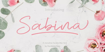 Sabina is a handwritten monoline font, with an elegant and beautiful look. This font also comes with ligatures, alternates, swooshes, and underlines. It will make your design look stand out and unique.